
Search results for "Referenced" in Home Design Ideas

 Casa Dega Design
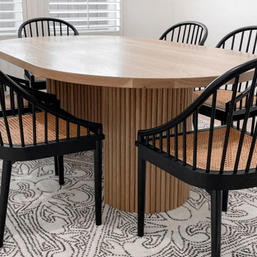
The Aura dining table features a solid wood oval top, with two half-moon fluted legs. Several coats of water-based finish are sprayed on Aura’s natural wood surface & add a layer of extra protection.
Aura was originally commissioned using solid white oak, but can be customized to suit your wood preference.
Aura is an astronomical term referencing an energy field around a given source. (And we know the energy of Aura will knock your houseguests right over).
Material: White Oak
Dimensions: 78”L x 57”W x 30”H
Tabletop thickness: 1.5”
Finish: Natural clear coat
 Axis Mundi | Chicago
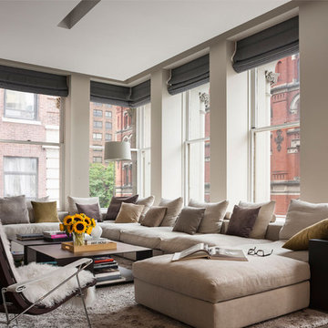
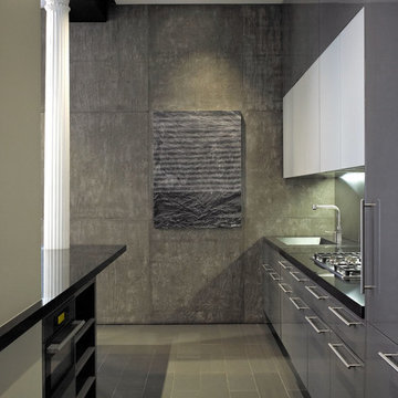
This NoHo apartment, in a landmarked circa 1870 building designed by Stephen Decatur Hatch and converted to lofts in 1987, had been interestingly renovated by a rock musician before being purchased by a young hedge fund manager and his gallery director girlfriend. Naturally, the couple brought to the project their collection of painting, photography and sculpture, mostly by young emerging artists. Axis Mundi accommodated these pieces within a neutral palette accented with occasional flashes of bright color that referenced the various artworks. Major furniture pieces – a sectional in the library, a 12-foot-long dining table–along with a rich blend of textures such as leather, linen, fur and warm woods, helped bring the sprawling dimensions of the loft down to human scale.
Size: 3,400 sf
Design Team: John Beckmann and Nick Messerlian
Architect: Nemaworkshop
Photography: Durston Saylor, and Mark Roskams
© Axis Mundi Design LLC.
Find the right local pro for your project
 Wiebenson & Dorman Architects PC
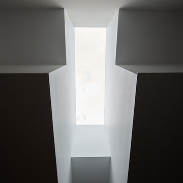
Referencing the wife and 3 daughters for which the house was named, four distinct but cohesive design criteria were considered for the 2016 renovation of the circa 1890, three story masonry rowhouse:
1. To keep the significant original elements – such as
the grand stair and Lincrusta wainscoting.
2. To repurpose original elements such as the former
kitchen pocket doors fitted to their new location on
the second floor with custom track.
3. To improve original elements - such as the new "sky
deck" with its bright green steel frame, a new
kitchen and modern baths.
4. To insert unifying elements such as the 3 wall
benches, wall openings and sculptural ceilings.
Photographer Jesse Gerard - Hoachlander Davis Photography
 Axis Mundi | Chicago
This NoHo apartment, in a landmarked circa 1870 building designed by Stephen Decatur Hatch and converted to lofts in 1987, had been interestingly renovated by a rock musician before being purchased by a young hedge fund manager and his gallery director girlfriend. Naturally, the couple brought to the project their collection of painting, photography and sculpture, mostly by young emerging artists. Axis Mundi accommodated these pieces within a neutral palette accented with occasional flashes of bright color that referenced the various artworks. Major furniture pieces – a sectional in the library, a 12-foot-long dining table–along with a rich blend of textures such as leather, linen, fur and warm woods, helped bring the sprawling dimensions of the loft down to human scale.
Size: 3,400 sf
Design Team: John Beckmann and Nick Messerlian
Architect: Nemaworkshop
Photography: Durston Saylor, and Mark Roskams
© Axis Mundi Design LLC.
 John Lum Architecture, Inc. AIA
Architecture: John Lum Architecture
Interior Design: NicoleHollis
Contractor: Jetton Construction
Landscape: Arterra Landscape Architects
Photography: Adam Rouse Photography
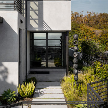
We reworked a spec-level Mediterranean into a design that quietly fits its spectacular bay-side setting. Referencing Sausalito’s fishing village roots, the stucco and styrofoam detailing were replaced with environmentally-conscious materials designed to weather, utilizing a palette of Kebony, cement plaster, and copper standing seam roof.
 Naikoon Contracting Ltd
Architect: M3 Architecture Inc.
Interior Design: Mocoro Studio
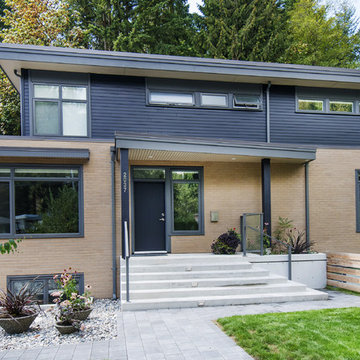
We recently completed a development project in the Pemberton Heights area of North Vancouver. These 2 houses were built to benefit the long-term durability through the selection of efficient materials and process which will give a longer lifespan with lower maintenance and energy costs. This project was a perfect fit for us to assist in the design and execute the construction while working with some outstanding clients and consultants. A win for all of us!
The original home was recycled hitting our target goals of 90%, leading way to a couple of stealth looking homes with performance levels right there with the best of them. Our mechanical engineer designed the mechanical systems to achieve maximum efficiency and hit our internal target goals that we have set for ourselves in accordance with our Vision here at Naikoon. These homes came in at EnerGuide score of 85% which can also be referenced in GJ with a score of 54GJ. To give you an idea of how this rating relates to an average home of this size, these 2 beauties on Mackay are about 80% more efficient. The main components in the design and equipment selection that leads to this are:
1) Space heating and Cooling
2) Water Heating
3) Lights and Appliances
4) Wall assemblies and insulation
Like all of our projects, we take pride in looking at the small details of the house. Things like, insulated water lines, domestic hot water heat recovery units, electric car plug-ins, solar power ready, extensive use of environmentally friendly materials, hot water heat pumps and stringent testing and inspection point along the way, led to a successful completion of 2 certified high-performance homes with Built Green Platinum and EnergyStar certifications.
Photo credits: vopenhouse.ca
 hungryeye
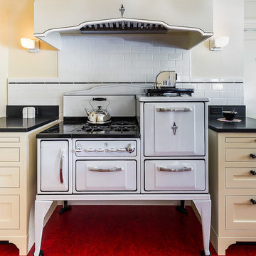
Kitchen in a 1926 bungalow, done to my client's brief that it should look 'original' to the house.
The three 'jewels' of the kitchen are the immaculately restored 1928 Wedgwood high-oven stove, the SubZero refrigerator/freezer designed to look like an old-fashioned ice box, and the island referencing a farmhouse table with pie-save cabinet underneath, done in ebonized oak and painted bead-board.
The red Marmoleum floor has double inlaid borders, the counters are honed black granite, and the walls, cabinets, and trim are all painted a soft ocher-based cream-colour taken from a 1926 DutchBoy paint deck. Virtually everything is custom, save the sink, faucets, and pulls, done to my original designs. The Bosch dishwasher, washer, and dryer are all hidden in the cabinetry.
All photographs courtesy David Duncan Livingston. (Kitchen featured in Fall 2018 AMERICAN BUNGALOW magazine)
 Andra Martens Design Studio
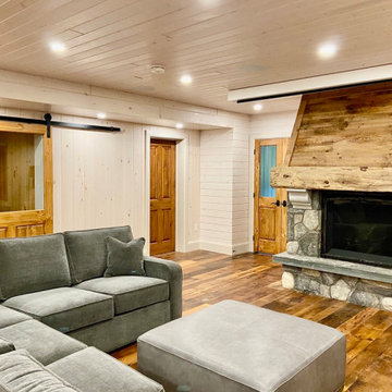
We were hired to finish the basement of our clients cottage in Haliburton. The house is a woodsy craftsman style. Basements can be dark so we used pickled pine to brighten up this 3000 sf space which allowed us to remain consistent with the vibe of the overall cottage. We delineated the large open space in to four functions - a Family Room (with projector screen TV viewing above the fireplace and a reading niche); a Game Room with access to large doors open to the lake; a Guest Bedroom with sitting nook; and an Exercise Room. Glass was used in the french and barn doors to allow light to penetrate each space. Shelving units were used to provide some visual separation between the Family Room and Game Room. The fireplace referenced the upstairs fireplace with added inspiration from a photo our clients saw and loved. We provided all construction docs and furnishings will installed soon.
 Ryan Homes, Inc.
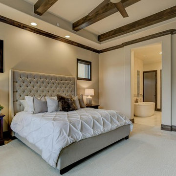
Example of a huge tuscan master carpeted and beige floor bedroom design in Denver with beige walls and no fireplace
 Andra Martens Design Studio
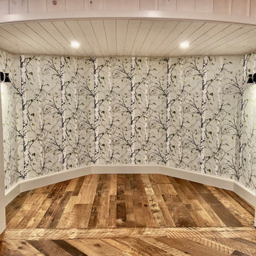
We were hired to finish the basement of our clients cottage in Haliburton. The house is a woodsy craftsman style. Basements can be dark so we used pickled pine to brighten up this 3000 sf space which allowed us to remain consistent with the vibe of the overall cottage. We delineated the large open space in to four functions - a Family Room (with projector screen TV viewing above the fireplace and a reading niche); a Game Room with access to large doors open to the lake; a Guest Bedroom with sitting nook; and an Exercise Room. Glass was used in the french and barn doors to allow light to penetrate each space. Shelving units were used to provide some visual separation between the Family Room and Game Room. The fireplace referenced the upstairs fireplace with added inspiration from a photo our clients saw and loved. We provided all construction docs and furnishings will installed soon.
 Donald Lococo Architects
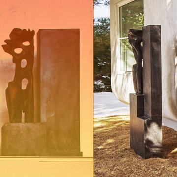
Designed in 1970 for an art collector, the existing referenced 70’s architectural principles. With its cadence of ‘70’s brick masses punctuated by a garage and a 4-foot-deep entrance recess. This recess, however, didn’t convey to the interior, which was occupied by disjointed service spaces. To solve, service spaces are moved and reorganized in open void in the garage. (See plan) This also organized the home: Service & utility on the left, reception central, and communal living spaces on the right.
To maintain clarity of the simple one-story 70’s composition, the second story add is recessive. A flex-studio/extra bedroom and office are designed ensuite creating a slender form and orienting them front to back and setting it back allows the add recede. Curves create a definite departure from the 70s home and by detailing it to "hover like a thought" above the first-floor roof and mentally removable sympathetic add.Existing unrelenting interior walls and a windowless entry, although ideal for fine art was unconducive for the young family of three. Added glass at the front recess welcomes light view and the removal of interior walls not only liberate rooms to communicate with each other but also reinform the cleared central entry space as a hub.
Even though the renovation reinforms its relationship with art, the joy and appreciation of art was not dismissed. A metal sculpture lost in the corner of the south side yard bumps the sculpture at the front entrance to the kitchen terrace over an added pedestal. (See plans) Since the roof couldn’t be railed without compromising the one-story '70s composition, the sculpture garden remains physically inaccessible however mirrors flanking the chimney allow the sculptures to be appreciated in three dimensions. The mirrors also afford privacy from the adjacent Tudor's large master bedroom addition 16-feet away.
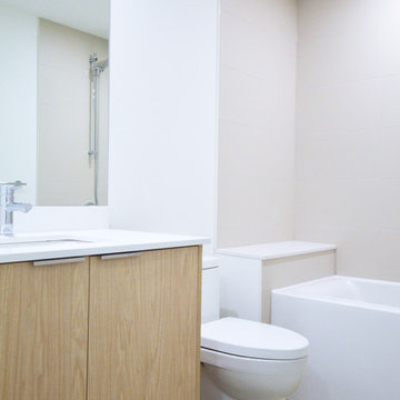 Naikoon Contracting Ltd
Architect: M3 Architecture Inc.
Interior Design: Mocoro Studio
We recently completed a development project in the Pemberton Heights area of North Vancouver. These 2 houses were built to benefit the long-term durability through the selection of efficient materials and process which will give a longer lifespan with lower maintenance and energy costs. This project was a perfect fit for us to assist in the design and execute the construction while working with some outstanding clients and consultants. A win for all of us!
The original home was recycled hitting our target goals of 90%, leading way to a couple of stealth looking homes with performance levels right there with the best of them. Our mechanical engineer designed the mechanical systems to achieve maximum efficiency and hit our internal target goals that we have set for ourselves in accordance with our Vision here at Naikoon. These homes came in at EnerGuide score of 85% which can also be referenced in GJ with a score of 54GJ. To give you an idea of how this rating relates to an average home of this size, these 2 beauties on Mackay are about 80% more efficient. The main components in the design and equipment selection that leads to this are:
1) Space heating and Cooling
2) Water Heating
3) Lights and Appliances
4) Wall assemblies and insulation
Like all of our projects, we take pride in looking at the small details of the house. Things like, insulated water lines, domestic hot water heat recovery units, electric car plug-ins, solar power ready, extensive use of environmentally friendly materials, hot water heat pumps and stringent testing and inspection point along the way, led to a successful completion of 2 certified high-performance homes with Built Green Platinum and EnergyStar certifications.
 Patrician Design
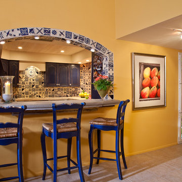
The Sonora Desert in Tucson, Arizona sets the stage for this festive retreat replicating the Mexican interiors so enjoyed by this couple seeking a colorful getaway. Bold colors and an extensive art collection punctuate the space, while tongue and groove wood boards fill between the existing beams for further texture. Read more and see before and after pictures at the above referenced website.
 Brooks + Scarpa Architects
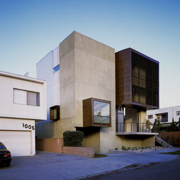
Located in a neighborhood characterized by traditional bungalow style single-family residences, Orange Grove is a new landmark for the City of West Hollywood. The building is sensitively designed and compatible with the neighborhood, but differs in material palette and scale from its neighbors. Referencing architectural conventions of modernism rather than the pitched roof forms of traditional domesticity, the project presents a characteristic that is consistent with the eclectic and often unconventional demographic of West Hollywood. Distinct from neighboring structures, the building creates a strong relationship to the street by virtue of its large amount of highly usable balcony area in the front façade.
While there are dramatic and larger scale elements that define the building, it is also broken down into comprehensible human scale parts, and is itself broken down into two different buildings. Orange Grove displays a similar kind of iconoclasm as the Schindler House, an icon of California modernism, located a short distance away. Like the Schindler House, the conventional architectural elements of windows and porches become part of an abstract sculptural ensemble. At the Schindler House, windows are found in the gaps between structural concrete wall panels. At Orange Grove, windows are inserted in gaps between different sections of the building.
The design of Orange Grove is generated by a subtle balance of tensions. Building volumes and the placement of windows, doors and balconies are not static but rather constitute an active three-dimensional composition in motion. Each piece of the building is a strong and clearly defined shape, such as the corrugated metal surround that encloses the second story balcony in the east and north facades. Another example of this clear delineation is the use of two square profile balcony surrounds in the front façade that set up a dialogue between them—one is small, the other large, one is open at the front, the other is veiled with stainless steel slats. At the same time each balcony is balanced and related to other elements in the building, the smaller one to the driveway gate below and the other to the roll-up door and first floor balcony. Each building element is intended to read as an abstract form in itself—such as a window becoming a slit or windows becoming a framed box, while also becoming part of a larger whole. Although this building may not mirror the status quo it answers to the desires of consumers in a burgeoning niche market who want large, simple interior volumes of space, and a paradigm based on space, light and industrial materials of the loft rather than the bungalow.
 Frankel Design Build
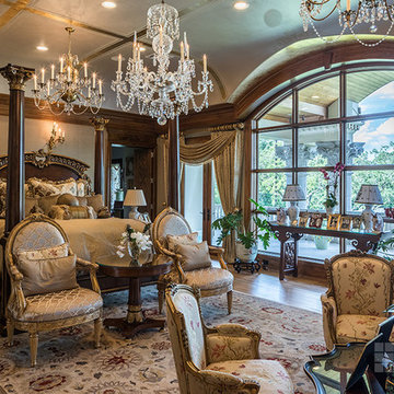
This estate on Rivercrest incorporates more than 27,000. The house is 26,369, the Pool House is 2,181, the stables are 3,597 (total covered area) square feet of covered structure, including poolside entertaining space, and stables.
This home is very much a traditional meets modern layout. It’s formalized. Referencing heavily upon Andrea Palladio, the home uses symmetry as a major design element.
Connie Anderson Photography
 Drake House Construction & Design
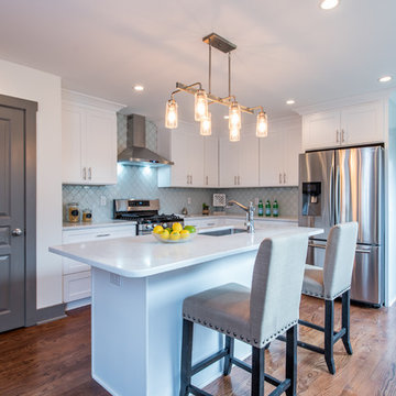
Mid-sized transitional l-shaped dark wood floor and brown floor open concept kitchen photo in Atlanta with an undermount sink, shaker cabinets, white cabinets, gray backsplash, glass tile backsplash, stainless steel appliances, an island and white countertops
 Axis Mundi
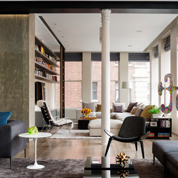
This NoHo apartment, in a landmarked circa 1870 building designed by Stephen Decatur Hatch and converted to lofts in 1987, had been interestingly renovated by a rock musician before being purchased by a young hedge fund manager and his gallery director girlfriend. Naturally, the couple brought to the project their collection of painting, photography and sculpture, mostly by young emerging artists. Axis Mundi accommodated these pieces within a neutral palette accented with occasional flashes of bright color that referenced the various artworks. Major furniture pieces – a sectional in the library, a 12-foot-long dining table–along with a rich blend of textures such as leather, linen, fur and warm woods, helped bring the sprawling dimensions of the loft down to human scale.
Photography: Durston Saylor
 Andra Martens Design Studio
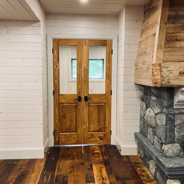
We were hired to finish the basement of our clients cottage in Haliburton. The house is a woodsy craftsman style. Basements can be dark so we used pickled pine to brighten up this 3000 sf space which allowed us to remain consistent with the vibe of the overall cottage. We delineated the large open space in to four functions - a Family Room (with projector screen TV viewing above the fireplace and a reading niche); a Game Room with access to large doors open to the lake; a Guest Bedroom with sitting nook; and an Exercise Room. Glass was used in the french and barn doors to allow light to penetrate each space. Shelving units were used to provide some visual separation between the Family Room and Game Room. The fireplace referenced the upstairs fireplace with added inspiration from a photo our clients saw and loved. We provided all construction docs and furnishings will installed soon.
 John Lum Architecture, Inc. AIA
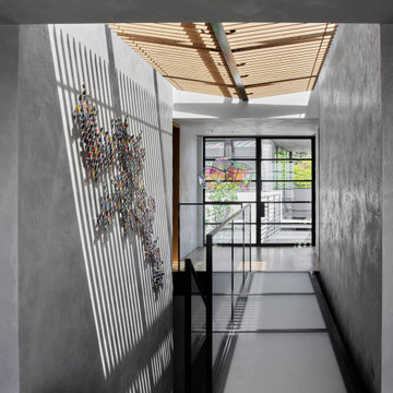
Architecture: John Lum Architecture
Interior Design: NicoleHollis
Contractor: Jetton Construction
Landscape: Arterra Landscape Architects
Photography: Douglas Friedman
We reworked a spec-level Mediterranean into a design that quietly fits its spectacular bay-side setting. Referencing Sausalito’s fishing village roots, the stucco and styrofoam detailing were replaced with environmentally-conscious materials designed to weather, utilizing a palette of Kebony, cement plaster, and copper standing seam roof.
23