
Search results for "Referenced" in Home Design Ideas
 Luxoria
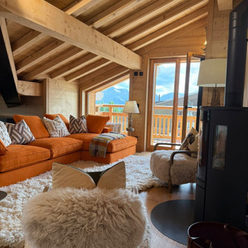
The living room centres on a cylindrical wood-burning stove finished in matte black. Its clean lines contrast with the pale timbers above, while the flicker of firelight animates the simple plaster walls. We paired the stove with a streamlined sofa in a vibrant orange fabric—no boucle here—choosing a smooth weave that’s easy to maintain yet striking against the neutral backdrop. A low coffee table in dark ash sits nearby, flanked by a pair of lounge chairs dressed in soft sheepskin throws. Overhead, an antler-inspired light fitting casts a warm, even glow, referencing alpine character without feeling cliché.
 Axis Mundi Design
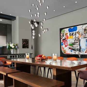
This NoHo apartment, in a landmarked circa 1870 building designed by Stephen Decatur Hatch and converted to lofts in 1987, had been interestingly renovated by a rock musician before being purchased by a young hedge fund manager and his gallery director girlfriend. Naturally, the couple brought to the project their collection of painting, photography and sculpture, mostly by young emerging artists. Axis Mundi accommodated these pieces within a neutral palette accented with occasional flashes of bright color that referenced the various artworks. Major furniture pieces – a sectional in the library, a 12-foot-long dining table–along with a rich blend of textures such as leather, linen, fur and warm woods, helped bring the sprawling dimensions of the loft down to human scale.
Size: 3,400 sf
Design Team: John Beckmann and Nick Messerlian
Architect: Nemaworkshop
Photography: Durston Saylor, and Mark Roskams
© Axis Mundi Design LLC
 Clawson Architects, LLC
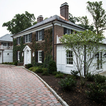
Significant Additions to a Georgian Revival House: The original house was constructed by a sea captain and many of the details are a nod to nautical details fabricated by shipwrights. The new owners wanted to improve the internal circulation and interior proportions of the house. The front entry and family room addition respond to near and distance views of the surrounding landscape and the historic Hobart Gap. The side French doors open onto a private garden and serpentine wall referencing the historical gardens of the Lawn at University of Virginia, where the owner attend.
Find the right local pro for your project

 Donald Lococo Architects
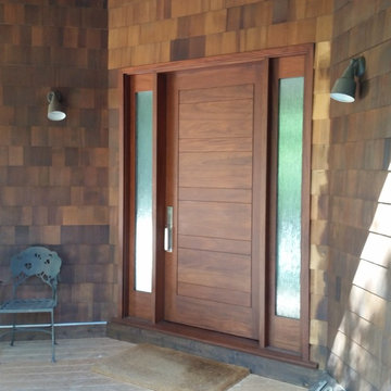
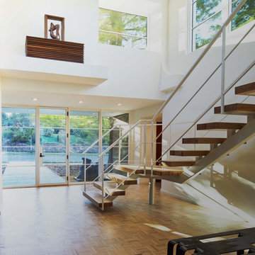
Designed in 1970 for an art collector, the existing referenced 70’s architectural principles. With its cadence of ‘70’s brick masses punctuated by a garage and a 4-foot-deep entrance recess. This recess, however, didn’t convey to the interior, which was occupied by disjointed service spaces. To solve, service spaces are moved and reorganized in open void in the garage. (See plan) This also organized the home: Service & utility on the left, reception central, and communal living spaces on the right.
To maintain clarity of the simple one-story 70’s composition, the second story add is recessive. A flex-studio/extra bedroom and office are designed ensuite creating a slender form and orienting them front to back and setting it back allows the add recede. Curves create a definite departure from the 70s home and by detailing it to "hover like a thought" above the first-floor roof and mentally removable sympathetic add.Existing unrelenting interior walls and a windowless entry, although ideal for fine art was unconducive for the young family of three. Added glass at the front recess welcomes light view and the removal of interior walls not only liberate rooms to communicate with each other but also reinform the cleared central entry space as a hub.
Even though the renovation reinforms its relationship with art, the joy and appreciation of art was not dismissed. A metal sculpture lost in the corner of the south side yard bumps the sculpture at the front entrance to the kitchen terrace over an added pedestal. (See plans) Since the roof couldn’t be railed without compromising the one-story '70s composition, the sculpture garden remains physically inaccessible however mirrors flanking the chimney allow the sculptures to be appreciated in three dimensions. The mirrors also afford privacy from the adjacent Tudor's large master bedroom addition 16-feet away.

 LiLu Interiors
LiLu transformed a St. Anthony Park neighborhood church into this sanctuary for treatment. The interior offers a balance of old and new: referencing the historic setting while creating a contemporary environment that appeals to a youthful spirit. LiLu’s design also meets the residents’ medical needs, offering space for social interaction and self-reflection to enhance both physical and emotional healing.
----
Project designed by Minneapolis interior design studio LiLu Interiors. They serve the Minneapolis-St. Paul area including Wayzata, Edina, and Rochester, and they travel to the far-flung destinations that their upscale clientele own second homes in.
----
For more about LiLu Interiors, click here: https://www.liluinteriors.com/
---
To learn more about this project, click here:
https://www.liluinteriors.com/blog/portfolio-items/healing-haven/
 User
UserEvery design decision for this Caribbean beach residence was guided by the desire to maximize the views of the property’s breathtaking natural surroundings.
To connect the spaces and reveal the views from every vantage point, the team reconfigured the layout to create vistas, and installed window film to reduce solar heat gain. These modifications increased efficiencies, reused 90% of the interior envelope and did not impact the exterior structure of the building. In addition to providing incredible views, opening up the plan allows cross ventilation, maximizing the use of ocean breezes to cool the interior. The result is an effortless flow and maximization of space.
Throughout the interior, dark materials express the concept of respite in the shade, and emphasize the sweeping views of the Caribbean Sea. Millwork crafted by local artisans from local materials establishes hierarchy – providing a clear understanding of the layout – and filters light to create privacy and drama. Screens help define the spaces and create suspense.
Varying screen opacities serve specific functions: nearly opaque screens build suspense, translucent screens provide privacy, and reflective screens – as seen in the kitchen ceiling – create mystery in the core where light and views
are challenged. Referencing the seaside location, the baseboards create a sense of being in a deep shallow. The 16” tall baseboards create a pool effect, engaging the walls with Cradle to Cradle certified Mosa tile flooring. The irregular height also conceals power and data cabling. The resulting space is a contemporary oasis that offers a high-level of comfort and functionality.
Anne Rausch Photography
 Axis Mundi Design
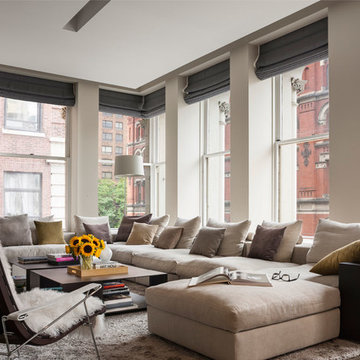
This NoHo apartment, in a landmarked circa 1870 building designed by Stephen Decatur Hatch and converted to lofts in 1987, had been interestingly renovated by a rock musician before being purchased by a young hedge fund manager and his gallery director girlfriend. Naturally, the couple brought to the project their collection of painting, photography and sculpture, mostly by young emerging artists. Axis Mundi accommodated these pieces within a neutral palette accented with occasional flashes of bright color that referenced the various artworks. Major furniture pieces – a sectional in the library, a 12-foot-long dining table–along with a rich blend of textures such as leather, linen, fur and warm woods, helped bring the sprawling dimensions of the loft down to human scale.
Size: 3,400 sf
Design Team: John Beckmann and Nick Messerlian
Architect: Nemaworkshop
Photography: Durston Saylor, and Mark Roskams
© Axis Mundi Design LLC
 Andra Martens Design Studio
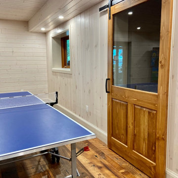
We were hired to finish the basement of our clients cottage in Haliburton. The house is a woodsy craftsman style. Basements can be dark so we used pickled pine to brighten up this 3000 sf space which allowed us to remain consistent with the vibe of the overall cottage. We delineated the large open space in to four functions - a Family Room (with projector screen TV viewing above the fireplace and a reading niche); a Game Room with access to large doors open to the lake; a Guest Bedroom with sitting nook; and an Exercise Room. Glass was used in the french and barn doors to allow light to penetrate each space. Shelving units were used to provide some visual separation between the Family Room and Game Room. The fireplace referenced the upstairs fireplace with added inspiration from a photo our clients saw and loved. We provided all construction docs and furnishings will installed soon.
 Brothers Construction
Andrew J Hathaway (Brothers Construction)
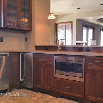
Example of a large mountain style walk-out carpeted basement design in Denver with gray walls, a standard fireplace and a stone fireplace
Example of a large mountain style walk-out carpeted basement design in Denver with gray walls, a standard fireplace and a stone fireplace
 Clawson Architects, LLC
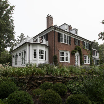
Significant Additions to a Georgian Revival House: The original house was constructed by a sea captain and many of the details are a nod to nautical details fabricated by shipwrights. The new owners wanted to improve the internal circulation and interior proportions of the house. The front entry and family room addition respond to near and distance views of the surrounding landscape and the historic Hobart Gap. The side French doors open onto a private garden and serpentine wall referencing the historical gardens of the Lawn at University of Virginia, where the owner attend.
 Donald Lococo Architects
Designed in 1970 for an art collector, the existing referenced 70’s architectural principles. With its cadence of ‘70’s brick masses punctuated by a garage and a 4-foot-deep entrance recess. This recess, however, didn’t convey to the interior, which was occupied by disjointed service spaces. To solve, service spaces are moved and reorganized in open void in the garage. (See plan) This also organized the home: Service & utility on the left, reception central, and communal living spaces on the right.
To maintain clarity of the simple one-story 70’s composition, the second story add is recessive. A flex-studio/extra bedroom and office are designed ensuite creating a slender form and orienting them front to back and setting it back allows the add recede. Curves create a definite departure from the 70s home and by detailing it to "hover like a thought" above the first-floor roof and mentally removable sympathetic add.Existing unrelenting interior walls and a windowless entry, although ideal for fine art was unconducive for the young family of three. Added glass at the front recess welcomes light view and the removal of interior walls not only liberate rooms to communicate with each other but also reinform the cleared central entry space as a hub.
Even though the renovation reinforms its relationship with art, the joy and appreciation of art was not dismissed. A metal sculpture lost in the corner of the south side yard bumps the sculpture at the front entrance to the kitchen terrace over an added pedestal. (See plans) Since the roof couldn’t be railed without compromising the one-story '70s composition, the sculpture garden remains physically inaccessible however mirrors flanking the chimney allow the sculptures to be appreciated in three dimensions. The mirrors also afford privacy from the adjacent Tudor's large master bedroom addition 16-feet away.
 Axis Mundi Design
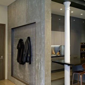
This NoHo apartment, in a landmarked circa 1870 building designed by Stephen Decatur Hatch and converted to lofts in 1987, had been interestingly renovated by a rock musician before being purchased by a young hedge fund manager and his gallery director girlfriend. Naturally, the couple brought to the project their collection of painting, photography and sculpture, mostly by young emerging artists. Axis Mundi accommodated these pieces within a neutral palette accented with occasional flashes of bright color that referenced the various artworks. Major furniture pieces – a sectional in the library, a 12-foot-long dining table–along with a rich blend of textures such as leather, linen, fur and warm woods, helped bring the sprawling dimensions of the loft down to human scale.
Size: 3,400 sf
Design Team: John Beckmann and Nick Messerlian
Architect: Nemaworkshop
Photography: Durston Saylor, and Mark Roskams
© Axis Mundi Design LLC
 Modern Room Remodels
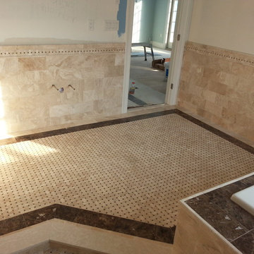
View of the bathroom from the shower. Basket weave marble is throughout the main field of the floor. The crema marfil marble is all on offset pattern 6x12 This is art work from yours truly!
 CITYDESKSTUDIO, Inc.
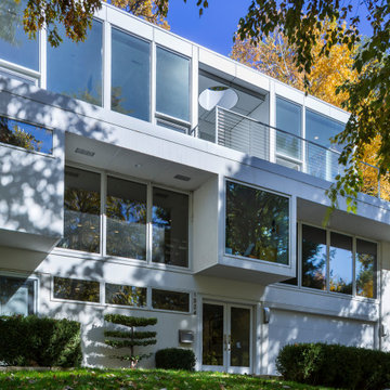
A beautiful, steeply sloped property provides this 1960’s home with wonderful views and secluded privacy. In addition to their day jobs she is an award winning gardener, and he a self-taught home remodeler. Over time they have transformed this home into a place of retreat. However, the home lacked connection to the garden in the rear – their pride and joy. The final wish for the home was a place to capture the views, bringing the garden inside, and to take advantage of the dramatic height towards the street and the natural pond beyond.
Entering below, the main floor is one level above, set on grade with the rear garden. The new level was to be up another floor still. The program for the space included a spare bedroom, a home office, and the main goal of an entertainment room and rooftop terrace.
The home already had a strong modern boxy aesthetic and the homeowners hoped to extend and heighten this feel. The new level pushes this to the limit with crisp white cladding made distinctive with contrasted black reveals, creating a digital high definition image. In contrast, the garden is referenced in the artificial turf used for the terrace – a remarkably comfortable surface that has proven to be one of the most enjoyed elements of the project. A new stair was inserted top to bottom within the existing central stair footprint. The walls, once closed and confined, were opened up both internally to the spaces around, and also to the outside, with a two story glass wall facing the garden, bringing news view and needed light deep into the house.
Pro
 Naikoon Contracting Ltd
Architect: M3 Architecture Inc.
Interior Design: Mocoro Studio
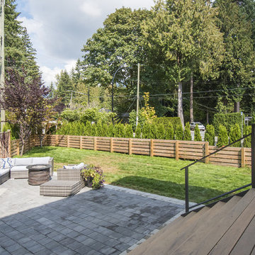
We recently completed a development project in the Pemberton Heights area of North Vancouver. These 2 houses were built to benefit the long-term durability through the selection of efficient materials and process which will give a longer lifespan with lower maintenance and energy costs. This project was a perfect fit for us to assist in the design and execute the construction while working with some outstanding clients and consultants. A win for all of us!
The original home was recycled hitting our target goals of 90%, leading way to a couple of stealth looking homes with performance levels right there with the best of them. Our mechanical engineer designed the mechanical systems to achieve maximum efficiency and hit our internal target goals that we have set for ourselves in accordance with our Vision here at Naikoon. These homes came in at EnerGuide score of 85% which can also be referenced in GJ with a score of 54GJ. To give you an idea of how this rating relates to an average home of this size, these 2 beauties on Mackay are about 80% more efficient. The main components in the design and equipment selection that leads to this are:
1) Space heating and Cooling
2) Water Heating
3) Lights and Appliances
4) Wall assemblies and insulation
Like all of our projects, we take pride in looking at the small details of the house. Things like, insulated water lines, domestic hot water heat recovery units, electric car plug-ins, solar power ready, extensive use of environmentally friendly materials, hot water heat pumps and stringent testing and inspection point along the way, led to a successful completion of 2 certified high-performance homes with Built Green Platinum and EnergyStar certifications.
Photo credits: vopenhouse.ca
 Frankel Design Build
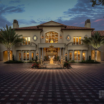
This estate on Rivercrest incorporates more than 27,000. The house is 26,369, the Pool House is 2,181, the stables are 3,597 (total covered area) square feet of covered structure, including poolside entertaining space, and stables.
This home is very much a traditional meets modern layout. It’s formalized. Referencing heavily upon Andrea Palladio, the home uses symmetry as a major design element.
Connie Anderson Photography
 User
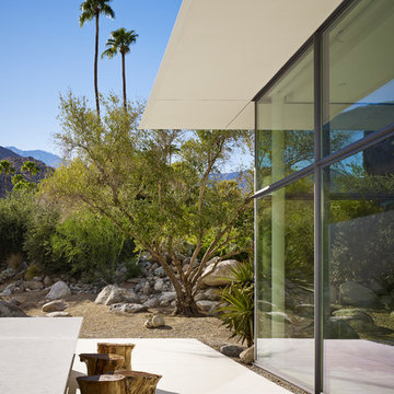
UserAnchored by the homeowner’s 42-foot-long painting, the interiors of this Palm Springs residence were designed to showcase the owner’s art collection, and create functional spaces for daily living that can be easily adapted for large social gatherings.
Referencing the environment and architecture in both form and material, the finishes and custom furnishings bring the interior to life. Alluding to the roofs that suspend over the building, the sofas seem to hover above the carpets while the knife-edge table top appears to float above a metal base. Bleached and cerused wood mimic the “desert effect” that would naturally occur in this environment, while the textiles on the sofa are the same shade as the rocks of the landscape.
Monolithic concrete floors connect all of the spaces while concealing mechanical systems, and stone thresholds signal vertical level changes and exterior transitions. Large wall masses provide the optimal backdrop for the homeowner’s oversized art. The wall structures ground the interior, while the opposing expanses of glass frame the desert views. The location and use of operable doors and windows allows the house to naturally ventilate, reducing cooling loads. The furnishings create spaces in an architectural fashion.
Designed and fabricated for flexibility, the pieces easily accommodate the owners’ large social gatherings. The dining table can be split into two and the sofas can be pushed out along the walls, opening the center of the space to entertain. The design of the interior spaces and furnishings seamlessly integrates the setting, architecture, artwork and spaces into a cohesive whole.
 Patrician Design
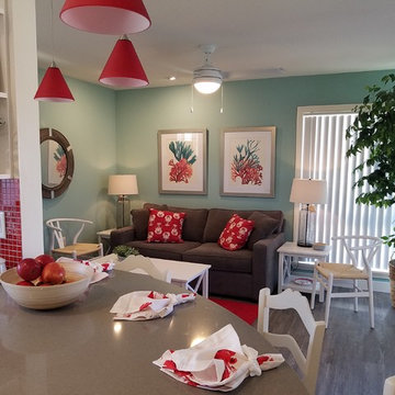
When designing for a vacation rental property, the first order of business is to select things that are durable and easy to maintain. This means finishes to furnishings. I know this from practical life experiences and also working with commercial/hospitality interiors. Here, an owner in Maine with property in San Diego wanted to bring her beloved Lobster to Pacific Beach. Read more and see more photographs at the above referenced website.
 Deik
DeikProject: Residential interior refurbishment
Site: Kensington, London
Designer: Deik (www.deik.co.uk)
Photographer: Anna Stathaki
Floral/prop stylish: Simone Bell
We have also recently completed a commercial design project for Café Kitsuné in Pantechnicon (a Nordic-Japanese inspired shop, restaurant and café).
Simplicity and understated luxury
The property is a Grade II listed building in the Queen’s Gate Conservation area. It has been carefully refurbished to make the most out of its existing period features, with all structural elements and mechanical works untouched and preserved.
The client asked for modest, understated modern luxury, and wanted to keep some of the family antique furniture.
The flat has been transformed with the use of neutral, clean and simple elements that blend subtly with the architecture of the shell. Classic furniture and modern details complement and enhance one another.
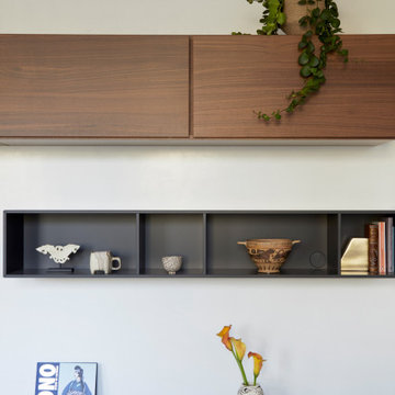
The focus in this project is on craftsmanship, handiwork and the use of traditional, natural, timeless materials. A mix of solid oak, stucco plaster, marble and bronze emphasize the building’s heritage.
The raw stucco walls provide a simple, earthy warmth, referencing artisanal plasterwork. With its muted tones and rough-hewn simplicity, stucco is the perfect backdrop for the timeless furniture and interiors.
Feature wall lights have been carefully placed to bring out the surface of the stucco, creating a dramatic feel throughout the living room and corridor.
The bathroom and shower room employ subtle, minimal details, with elegant grey marble tiles and pale oak joinery creating warm, calming tones and a relaxed atmosphere.
24