
Search results for "Reflective add ons" in Home Design Ideas
 Urbanology Designs
A captivating transformation in the coveted neighborhood of University Park, Dallas
The heart of this home lies in the kitchen, where we embarked on a design endeavor that would leave anyone speechless. By opening up the main kitchen wall, we created a magnificent window system that floods the space with natural light and offers a breathtaking view of the picturesque surroundings. Suspended from the ceiling, a steel-framed marble vent hood floats a few inches from the window, showcasing a mesmerizing Lilac Marble. The same marble is skillfully applied to the backsplash and island, featuring a bold combination of color and pattern that exudes elegance.
Adding to the kitchen's allure is the Italian range, which not only serves as a showstopper but offers robust culinary features for even the savviest of cooks. However, the true masterpiece of the kitchen lies in the honed reeded marble-faced island. Each marble strip was meticulously cut and crafted by artisans to achieve a half-rounded profile, resulting in an island that is nothing short of breathtaking. This intricate process took several months, but the end result speaks for itself.
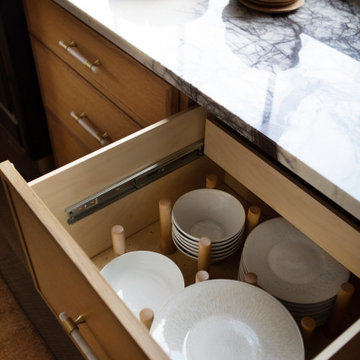
To complement the grandeur of the kitchen, we designed a combination of stain-grade and paint-grade cabinets in a thin raised panel door style. This choice adds an elegant yet simple look to the overall design. Inside each cabinet and drawer, custom interiors were meticulously designed to provide maximum functionality and organization for the day-to-day cooking activities. A vintage Turkish runner dating back to the 1960s, evokes a sense of history and character.
The breakfast nook boasts a stunning, vivid, and colorful artwork created by one of Dallas' top artist, Kyle Steed, who is revered for his mastery of his craft. Some of our favorite art pieces from the inspiring Haylee Yale grace the coffee station and media console, adding the perfect moment to pause and loose yourself in the story of her art.
The project extends beyond the kitchen into the living room, where the family's changing needs and growing children demanded a new design approach. Accommodating their new lifestyle, we incorporated a large sectional for family bonding moments while watching TV. The living room now boasts bolder colors, striking artwork a coffered accent wall, and cayenne velvet curtains that create an inviting atmosphere. Completing the room is a custom 22' x 15' rug, adding warmth and comfort to the space. A hidden coat closet door integrated into the feature wall adds an element of surprise and functionality.
This project is not just about aesthetics; it's about pushing the boundaries of design and showcasing the possibilities. By curating an out-of-the-box approach, we bring texture and depth to the space, employing different materials and original applications. The layered design achieved through repeated use of the same material in various forms, shapes, and locations demonstrates that unexpected elements can create breathtaking results.
The reason behind this redesign and remodel was the homeowners' desire to have a kitchen that not only provided functionality but also served as a beautiful backdrop to their cherished family moments. The previous kitchen lacked the "wow" factor they desired, prompting them to seek our expertise in creating a space that would be a source of joy and inspiration.
Inspired by well-curated European vignettes, sculptural elements, clean lines, and a natural color scheme with pops of color, this design reflects an elegant organic modern style. Mixing metals, contrasting textures, and utilizing clean lines were key elements in achieving the desired aesthetic. The living room introduces bolder moments and a carefully chosen color scheme that adds character and personality.
The client's must-haves were clear: they wanted a show stopping centerpiece for their home, enhanced natural light in the kitchen, and a design that reflected their family's dynamic. With the transformation of the range wall into a wall of windows, we fulfilled their desire for abundant natural light and breathtaking views of the surrounding landscape.
Our favorite rooms and design elements are numerous, but the kitchen remains a standout feature. The painstaking process of hand-cutting and crafting each reeded panel in the island to match the marble's veining resulted in a labor of love that emanates warmth and hospitality to all who enter.
In conclusion, this tastefully lux project in University Park, Dallas is an extraordinary example of a full gut remodel that has surpassed all expectations. The meticulous attention to detail, the masterful use of materials, and the seamless blend of functionality and aesthetics create an unforgettable space. It serves as a testament to the power of design and the transformative impact it can have on a home and its inhabitants.
Project by Texas' Urbanology Designs. Their North Richland Hills-based interior design studio serves Dallas, Highland Park, University Park, Fort Worth, and upscale clients nationwide.
 Urbanology Designs
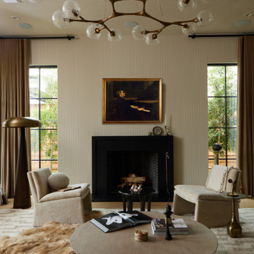
We transformed a cold modern space into a warm retreat. With earthy tones, rich textures, and thoughtful accessories, the home reflects the homeowners' personalities, creating a serene sanctuary full of life and personal touches.
This cozy living room features comfortable seating, eye-catching lighting, and a fireplace as the focal point. Carefully curated decor adds warmth, creating an inviting and stylish space.
 Urbanology Designs
A captivating transformation in the coveted neighborhood of University Park, Dallas
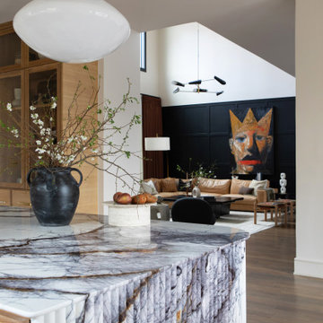
The heart of this home lies in the kitchen, where we embarked on a design endeavor that would leave anyone speechless. By opening up the main kitchen wall, we created a magnificent window system that floods the space with natural light and offers a breathtaking view of the picturesque surroundings. Suspended from the ceiling, a steel-framed marble vent hood floats a few inches from the window, showcasing a mesmerizing Lilac Marble. The same marble is skillfully applied to the backsplash and island, featuring a bold combination of color and pattern that exudes elegance.
Adding to the kitchen's allure is the Italian range, which not only serves as a showstopper but offers robust culinary features for even the savviest of cooks. However, the true masterpiece of the kitchen lies in the honed reeded marble-faced island. Each marble strip was meticulously cut and crafted by artisans to achieve a half-rounded profile, resulting in an island that is nothing short of breathtaking. This intricate process took several months, but the end result speaks for itself.
To complement the grandeur of the kitchen, we designed a combination of stain-grade and paint-grade cabinets in a thin raised panel door style. This choice adds an elegant yet simple look to the overall design. Inside each cabinet and drawer, custom interiors were meticulously designed to provide maximum functionality and organization for the day-to-day cooking activities. A vintage Turkish runner dating back to the 1960s, evokes a sense of history and character.
The breakfast nook boasts a stunning, vivid, and colorful artwork created by one of Dallas' top artist, Kyle Steed, who is revered for his mastery of his craft. Some of our favorite art pieces from the inspiring Haylee Yale grace the coffee station and media console, adding the perfect moment to pause and loose yourself in the story of her art.
The project extends beyond the kitchen into the living room, where the family's changing needs and growing children demanded a new design approach. Accommodating their new lifestyle, we incorporated a large sectional for family bonding moments while watching TV. The living room now boasts bolder colors, striking artwork a coffered accent wall, and cayenne velvet curtains that create an inviting atmosphere. Completing the room is a custom 22' x 15' rug, adding warmth and comfort to the space. A hidden coat closet door integrated into the feature wall adds an element of surprise and functionality.
This project is not just about aesthetics; it's about pushing the boundaries of design and showcasing the possibilities. By curating an out-of-the-box approach, we bring texture and depth to the space, employing different materials and original applications. The layered design achieved through repeated use of the same material in various forms, shapes, and locations demonstrates that unexpected elements can create breathtaking results.
The reason behind this redesign and remodel was the homeowners' desire to have a kitchen that not only provided functionality but also served as a beautiful backdrop to their cherished family moments. The previous kitchen lacked the "wow" factor they desired, prompting them to seek our expertise in creating a space that would be a source of joy and inspiration.
Inspired by well-curated European vignettes, sculptural elements, clean lines, and a natural color scheme with pops of color, this design reflects an elegant organic modern style. Mixing metals, contrasting textures, and utilizing clean lines were key elements in achieving the desired aesthetic. The living room introduces bolder moments and a carefully chosen color scheme that adds character and personality.
The client's must-haves were clear: they wanted a show stopping centerpiece for their home, enhanced natural light in the kitchen, and a design that reflected their family's dynamic. With the transformation of the range wall into a wall of windows, we fulfilled their desire for abundant natural light and breathtaking views of the surrounding landscape.
Our favorite rooms and design elements are numerous, but the kitchen remains a standout feature. The painstaking process of hand-cutting and crafting each reeded panel in the island to match the marble's veining resulted in a labor of love that emanates warmth and hospitality to all who enter.
In conclusion, this tastefully lux project in University Park, Dallas is an extraordinary example of a full gut remodel that has surpassed all expectations. The meticulous attention to detail, the masterful use of materials, and the seamless blend of functionality and aesthetics create an unforgettable space. It serves as a testament to the power of design and the transformative impact it can have on a home and its inhabitants.
Project by Texas' Urbanology Designs. Their North Richland Hills-based interior design studio serves Dallas, Highland Park, University Park, Fort Worth, and upscale clients nationwide.
Find the right local pro for your project
 Haven Design and Construction
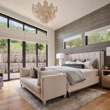
The primary bedroom suite in this mountain modern home is the picture of comfort and luxury. The striking wallpaper was selected to represent the textures of a rocky mountain's layers when it is split into. The earthy colors in the wallpaper--blue grays, rusts, tans and creams--make up the restful color scheme of the room. Textural bedding and upholstery fabrics add warmth and interest. The upholstered channel-back bed is flanked with woven sisal nightstands and substantial alabaster bedside lamps. On the opposite side of the room, a velvet swivel chair and oversized artwork add additional color and warmth. The home's striking windows feature remote control privacy shades to block out light for sleeping. The stone disk chandelier repeats the alabaster element in the room and adds a finishing touch of elegance to this inviting suite.
 Studio Aubergine Interior Design
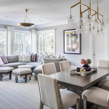
A large family sized gray sectional fits this family of 6 comfortably during movie nights while everyone fights over who gets to sit in the cozy corner wedge. Plus there are plenty of star shaped ottomans to go around, perfect to rest your feet on. All fabrics are stain treated and protected. The striped Stark rug creates dimension and interest. while original contemporary paintings add the perfect backdrop to this space.
 Kitchen Design Concepts
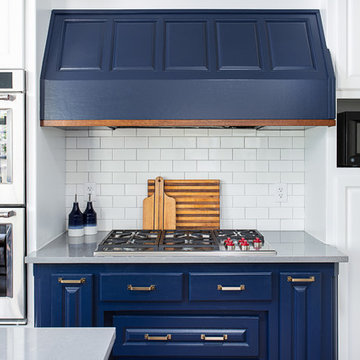
We introduce to you one of our newer services we are providing here at Kitchen Design Concepts: spaces that just need a little reviving! As of recent, we are taking on projects that are in need of minimal updating, as in, spaces that don’t need a full-on remodel. Yes, you heard right! If your space has good bones, you like the layout of your kitchen, and you just need a few cosmetic changes, then today’s feature is for you! Recently, we updated a space where we did just this! The kitchen was in need of a little love, some fresh paint, and new finishes. And if we’re being honest here, the result looks almost as if the kitchen had a full-on remodel! To learn more about this space and how we did our magic, continue reading below:
The Before and After
First, see what an impact new finishes can make! The “before” image shows a kitchen with outdated finishes such as the tile countertops, backsplash, and cabinetry finish. The “after” image, is a kitchen that looks almost as if its brand new, the image speaks for itself!
Cabinetry
With the wooden cabinetry in this kitchen already having great bones, all we needed to do was our refinishing process that involved removing door and drawer fronts, sanding, priming, and painting. The main color of the cabinetry is white (Sherwin Williams Pure White 7005) and as an accent, we applied a deep navy blue that really pops in this space (Sherwin Willaims Naval 6244). As a special design element, we incorporated a natural wooden band across the hood which is subtle but adds an element of surprise.
Countertops
The original countertops in this space were a 12×12 tile with cracks and discolored grout from all the wear and tear. To replace the countertops, we installed a clean and crisp quartz that is not only durable but easy to maintain (no grout here!). The 3cm countertops are a Cambria quartz in a grey-tone color (Carrick).
Backsplash
Keeping things simple, yet classic, we installed a 3×6 subway tile from Interceramic. The crisp white pairs well with all the other finishes of the space and really brighten the space up! To spice things up, we paired the white tile with a contrasting grout color (Cape Grey) that matches the countertop. This is a simple method to add interest to your white backsplash!
Fixtures and Fittings
For the fixtures and fittings of the kitchen, we wanted pieces that made a statement. That’s why we selected this industrial style faucet from Brizo! The faucet is a Brizo LITZE™ PULL-DOWN FAUCET WITH ARC SPOUT AND INDUSTRIAL HANDLE (63044LF-BLGL). The matte black paired with the luxe gold elements really make a statement! To match the gold elements of the faucet, we installed cabinetry hardware from Topknobs in the same gold finish. The hardware is a Channing pull TK743HB. Lastly, the large single bowl sink (who doesn’t want a large sink?!) is a great functional touch to the kitchen. The sink is a Blanco Precision 16″ R10 super single with 16″ Drainer in stainless steel (516216).
 KED Interiors
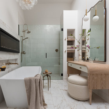
This primary bath remodel balanced luxury with functionality to become a spa-like retreat. Custom cabinetry, sleek hardware, and textured tiles harmonize with a monochromatic palette. A fireplace and arched closet doors add unique focal points. The result is a serene, elegant space that reflects the client’s style and goals.

 FINNE Architects
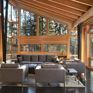
The Mazama house is located in the Methow Valley of Washington State, a secluded mountain valley on the eastern edge of the North Cascades, about 200 miles northeast of Seattle.
The house has been carefully placed in a copse of trees at the easterly end of a large meadow. Two major building volumes indicate the house organization. A grounded 2-story bedroom wing anchors a raised living pavilion that is lifted off the ground by a series of exposed steel columns. Seen from the access road, the large meadow in front of the house continues right under the main living space, making the living pavilion into a kind of bridge structure spanning over the meadow grass, with the house touching the ground lightly on six steel columns. The raised floor level provides enhanced views as well as keeping the main living level well above the 3-4 feet of winter snow accumulation that is typical for the upper Methow Valley.
To further emphasize the idea of lightness, the exposed wood structure of the living pavilion roof changes pitch along its length, so the roof warps upward at each end. The interior exposed wood beams appear like an unfolding fan as the roof pitch changes. The main interior bearing columns are steel with a tapered “V”-shape, recalling the lightness of a dancer.
The house reflects the continuing FINNE investigation into the idea of crafted modernism, with cast bronze inserts at the front door, variegated laser-cut steel railing panels, a curvilinear cast-glass kitchen counter, waterjet-cut aluminum light fixtures, and many custom furniture pieces. The house interior has been designed to be completely integral with the exterior. The living pavilion contains more than twelve pieces of custom furniture and lighting, creating a totality of the designed environment that recalls the idea of Gesamtkunstverk, as seen in the work of Josef Hoffman and the Viennese Secessionist movement in the early 20th century.
The house has been designed from the start as a sustainable structure, with 40% higher insulation values than required by code, radiant concrete slab heating, efficient natural ventilation, large amounts of natural lighting, water-conserving plumbing fixtures, and locally sourced materials. Windows have high-performance LowE insulated glazing and are equipped with concealed shades. A radiant hydronic heat system with exposed concrete floors allows lower operating temperatures and higher occupant comfort levels. The concrete slabs conserve heat and provide great warmth and comfort for the feet.
Deep roof overhangs, built-in shades and high operating clerestory windows are used to reduce heat gain in summer months. During the winter, the lower sun angle is able to penetrate into living spaces and passively warm the exposed concrete floor. Low VOC paints and stains have been used throughout the house. The high level of craft evident in the house reflects another key principle of sustainable design: build it well and make it last for many years!
Photo by Benjamin Benschneider
 Techo-Bloc
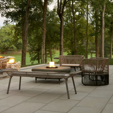
Perfect paving slab for modern poolsides and backyard design, Blu Grande Smooth is a large concrete patio stone available in multiple colors. It's smooth texture is sleek to the eye but rougher to the touch which avoids it from getting slippery when wet. The large rectangular shape works as an easy add-on into Blu 60 regular modular patterns but can also work as a stand-alone to create a very linear look. Check out the HD2 Blu Grande Smooth which is all about seamless looks with a tighter/poreless texture and anti-aging technology. Check out our website to shop the look! https://www.techo-bloc.com/shop/slabs/blu-grande-smooth/
 Beautiful Habitat: Design & Decoration
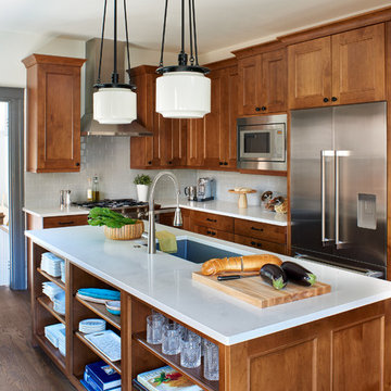
The existing kitchen was completely remodeled to create a compact chef's kitchen. The client is a true chef, who teaches cooking classes, and we were able to get a professional grade kitchen in an 11x7 footprint!
The new island creates adequate prep space. The bookcases on the front add a ton of storage and interesting display in an otherwise useless walkway.
The South wall is the exposed brick original to the 1900's home. To compliment the brick, we chose a warm nutmeg stain in cherry cabinets.
The countertops are a durable quartz that look like marble but are sturdy enough for this work horse kitchen.
The retro pendants are oversized to add a lot of interest in this small space.
Complete Kitchen remodel to create a Chef's kitchen
Open shelving for storage and display
Gray subway tile
Pendant lights
 JRP Design & Remodel
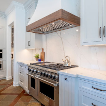
Our clients wanted to incorporate an East Coast vibe into their home. The kitchen had a great layout, but a wilted palette of earth tones looked outdated and uninspired. With a busy lifestyle and two kids in school, the couple needed a highly functional space that didn't skimp on style. Their research of design-build firms led them to the JRP website, and they called for a consultation the same day. After years of living with dark cabinets and a mix of heavy colors, the couple craved lightness. They wanted an airy kitchen with smooth, light-reflecting surfaces and a full-slab backsplash. A plan was drawn up for a complete rebuild that would change everything in the kitchen except the layout and the original tile-and-wood floors.
Now bright and uncluttered, this transitional kitchen is truly a space where the family can gather for years to come. Every part of the room draws you in, creating an atmosphere that embraces lingering conversations. The holistic design balances East Coast cool with California chic. Layers of contrasting textures achieve a high level of polish that looks and feels exceptional. The full-slab backsplash in Calacatta quartz stands out as a work of art, its glossy surface softly reflecting natural light. Matching quartz countertops add lustrous movement, where painted and natural wood textures quietly anchor the room. New, two-tone cabinetry is fresh and on-trend. A stunning linear chandelier in bronze evokes classical warmth. Where a built-in desk once collected clutter, stacked shaker cabinets now incorporate storage and visual interest. Integrated appliances, beautifully concealed behind DeWils cabinetry, hint at minimalist sophistication.
Cabinets (Manufacturer, Door Style, Material, Color/Stain or Finish)
- KITCHEN PERIMETER & PANTRY: DeWils, Sheffield, Maple, Limestone
- KITCHEN ISLAND: DeWils, Sheffield, Walnut, Nutmeg
Countertops (Material Type - Manufacturer, Collection, Color)
- Quartz – Vadara, Paris Collection, Calacatta Blanco
Light Fixture (Type - Manufacturer, Collection, Color)
- Chandelier - Visual Comfort & Co, Darlana Large Linear Lantern
Plumbing Fixture (Type - Manufacturer, Color)
- Faucet – Grohe, Antique Bronze
Sink (Type – Manufacturer, Material)
- Undermount - Kohler, Cast Iron
Hardware (Type – Manufacturer, Color)
- Cabinet Pulls - Top Knobs, Oil Rubbed Bronze
- Cabinet Knobs - Top Knobs, Oil Rubbed Bronze
Color of wall:
- Dunn Edwards Bone China
Photographer: J.R. Maddox
 Cusp Interiors
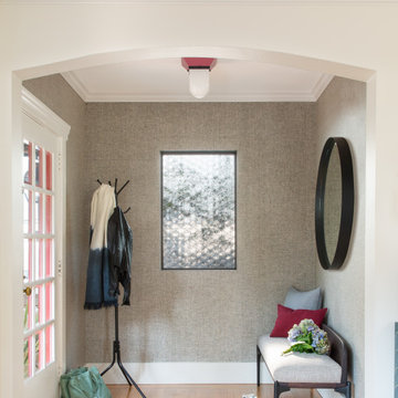
This lovely craftsman style home provided the perfect blank slate for us to elevate with our clients' personalities. On the "must haves" list was add color, make it approachable and cozy, and keep the sunshine pouring in. The front rooms open to each other, so creating a flow connecting the spaces was important - however, giving each space its own twist was priority.
We selected a bold red paint on the exterior of the front door and a classic, chevron-patterned, textured grasscloth for the Entry to set the stage. Lighting and furnishings were layered in for added pops of color and functionality.
The Living Room furnishings were selected to maximize seating and relaxation. We delivered on color with the addition of an uber comfy, lime green swivel chair and placed it bordering the Living Room and Dining Room so one could join both conversations. The Dining Room walls were painted a moody blue to create a backdrop for chic dinner parties and record listening sessions. Reupholstered vintage dining chairs brought their own stories to the table while a custom made buffet stores oodles of board games and records. Custom window treatments in both spaces added the necessary privacy while allowing the sun to shine through and create the perfect sunny spots for their sweet dog to nap. Adding in artwork provided the fun punctuations in these two areas.
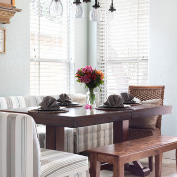
When my client mentioned that she loves to sit out on the deck with a cup of tea and listen to the birds sing, my first thought was - let's have them join you inside! We reimagined the Breakfast Nook seating and created a custom banquette to perch on amongst the sweetest bird themed wallpaper. The Breakfast Nook's color palette of olive green and saturated orange paired with the lovely natural light is calming and perfectly reflective of our client's disposition.
 Twelve Stones Designs, LLC
The owners of this kitchen had spent the money to upgrade the finishes in their kitchen upon building the home 12 years ago, but after living in the space for several years they realized how nonfunctional the layout really was. The (then) two preschool aged children had grown into busy, hungry teenagers with many friends who also liked to hang out at the house. So the family needed a more functional kitchen with better traffic flow, space for daily activities revolving around the kitchen at different times of day, and a kitchen that could accommodate cooking for and serving large groups. Furthermore, the dark, traditional finishes no longer reflected the homeowners’ style. They requested a brighter, more relaxed, coastal style that reflected their love of the seaside cities they like to visit.
Originally, the kitchen was U-shaped with a narrow island in the middle. The island created narrow aisles that bottle-necked at the dishwasher, refrigerator, and cooktop areas. There was a pass-through from the foyer into the kitchen, but the owners never liked that the pass-through was also located so close to the powder room. The awkward proximity was unappealing and made guests feel uncomfortable.
The kitchen’s storage was made up of lots of narrow cabinets, apothecary drawers, clipped corner units, and very few drawers. It lacked useful storage for the larger items the family used on a daily basis. And the kitchen’s only pantry was small closet that had only builder-grade, narrow shelving with no illumination to be able to see the contents inside.
Overall, the kitchen’s lighting plan was poorly executed. Only six recessed cans illuminated the entire kitchen and nook areas. The under cabinet lighting was not evenly distributed either. In fact, the builder had mis-placed the under cabinet lighting around the decorative pilasters which made for choppy, dark cubbies. Further, the builder didn’t include any lighting over the sink or the bar area, which meant whoever was doing the dishes was always in their own shadow. That, coupled with the steep overhang of the game room above made the bar area feel like a dim, cavernous space that wasn’t inviting or task oriented. The kitchen looked out into the main living space, but the raised bar and a narrow wall (which held the only large cabinet in the kitchen) created more of a barrier than a relationship to the living room or breakfast nook. In fact, one couldn’t even see the breakfast nook from the cooktop or sink areas due to its orientation. The raised bar top was too narrow to comfortably sit to either dine at or chat from due to the lack of knee space. The the homeowners confided that the kitchen felt more like a dark, dirty prison than place where the family, or their guests, wanted to gather and commune.
The clients' needs and desires were:
➢ to create a kitchen that would be a space the family loved to be in; to relate to the adjacent spaces all around, and to have better flow for entertaining large groups
➢ to remove the walls between the breakfast nook and living area and to be able to utilize the natural light from the windows in both those areas
➢ to incorporate a functional chopping block for prepping fresh food for home cooked meals, an island with a large sink and drain board, 2 pull out trash cans, and seating for at least the 2 teens to eat or do homework
➢ to design a kitchen and breakfast nook with an airy, coastal, relaxed vibe that blended with the rest of the house's coastal theme
➢ to integrate a layered lighting plan which would include ample general illumination, specific task lighting, decorative lighting, and lots of illuminated storage
➢ to design a kitchen with not only more storage for all the husband’s kitchen gadgets and collection of oils and spices, but smart storage, including a coffee/breakfast bar and a place to store and conceal the toaster oven and microwave
➢ to find a way to utilize the large open space between the kitchen, pantry area, and breakfast nook
Twelve Stones Designs achieved the owner's goals by:
➢ removing the walls between the kitchen and living room to allow the natural light to filter in from the adjacent rooms and to create a connection between the kitchen, nook, and living spaces for a sense of unity and communion
➢ removing the existing pantry and designing 3 large pantry style cabinets with LED tape lights and rollout drawers to house lots of kitchen appliances, gadgets, and tons of groceries. We also took the cabinets all the way up to the 9’ ceiling for additional storage for seasonal items and bulk storage.
➢ designing 2 islands - 1 with a gorgeous black walnut chopping block that houses a drawer for chopping and carving knives and a custom double pull out trash unit for point of use utilization - and 1 that houses the dishwasher, a large Blanco Gourmet sink with integrated drain board, woven baskets for fresh root vegetables and kitchen towels, plenty of drawer storage for kitchen items, and bar seating for up to 4 diners.
➢ closing off the space between the kitchen and the powder room to create a beautiful new private alcove for the powder room as well as adding some decorative storage. This also gave us space to include more tall storage near the new range for precision placement of the husband’s extensive oil and spice collection as well as a location for a combo-steam oven the wife wanted for baking and cooking healthy meals.
The project is enhanced functionally by:
➢ incorporated USB and standard receptacles for the kids’ laptops and phone charging in the large island
➢ designing the small island to include additional open shelving for items used on a daily basis such as a variety of bowls, plates, and colanders. This set up also works well for the husband who prefers to “plate” his dinners in restaurant-style fashion before presenting them to the table.
➢ the integration of specific storage units, such as double stacked cutlery drawers, a custom spice pull-out, a Kuerig coffee and tea pod drawer, and custom double stacked utensil drawers
➢ moving the refrigerator to the old oven location - this eliminated the bottle neck as well as created a better relationship to the eating table. It also utilizes the floor space between the pantry, nook, and kitchen
➢ creating a banquet style breakfast nook - this banquette seating not only doubles the amount of seating for large gatherings but it better utilizes the odd space between the kitchen and the previous nook area. It also helps to create a distinct pathway from the mudroom room through the pantry area, kitchen, nook, and living room.
➢ the coffee/breakfast bar area which includes the perfect location for the concealed microwave and toaster oven, convenient storage for the coffee pods and tea accoutrements. Roll-out drawers below also house the smoothie maker, hot water kettle, and a plethora of smoothie-making ingredients such as protein powders, smoothie additives, etc. Furthermore, the drawers below the Keurig house measuring utensil, cutlery, baking supplies and tupperware storage.
➢ incorporating lots of wide drawers and pullouts to accommodate large cookware.
➢ utilizing as much vertical space as possible by building storage to the ceiling which accommodates the family’s abundant amount of serving platters, baking sheets, bakeware, casserole dishes, and additional cutting boards.
The project is enhanced aesthetically by:
➢ new 5-piece Versailles pattern porcelain tile that now seamlessly joins the entire down stairs area together creating a bright, cohesiveness feeling instead of choppy separated spaces - it also adds a coastal feeling
➢ designing a cabinet to conceal the microwave and toaster oven
➢ the coastal influenced light fixtures over the nook table and island
➢ the sandy colors of the Langdon Cambria countertops. The swirling pattern and sparkling quartz pieces remind the homeowner of black-and-tan sandy beaches
➢ the striped banquet seating whose creamy white background and blue-green stripes were the inspiration for the cabinet and wall colors.
➢ All the interior doors were painted black to coordinate with the blacks and grays in the backsplash tile and countertop. This also adds a hint of tailored formality to an otherwise casual space.
➢ the use of WAC's Oculux small aperture LED units for the overhead lighting complimented with Diode LED strips for task lighting under the cabinets and inside the pantry and glass wall cabinets. All of the lighting applications are on separate dimmer switches.
Innovative uses of materials or construction methods by Realty Restoration LLC:
➢ Each 1-1/2” x 3” block of reclaimed end-grain black walnut that makes up the center island chopping block was hand milled and built in the shop. It was designed to look substantial and proportional to the surrounding elements, executed by creating the 4 inch tall top with a solid wood chamfered edge band.
➢ The metal doors on either side of the vent hood were also custom designed for this project and built in the Realty Restoration LLC shop. They are made 1x2, 11-gauge mild steel with ribbed glass. Weighing 60 lbs a piece, heavy duty cabinet hinges were added to support the weight of the door and keep them from sagging.
➢ Under-cabinet receptacles were added along the range wall in order to have a clean, uninterrupted backsplash.
Design obstacles to overcome:
➢ Because we were removing the demising walls between the kitchen and living room, we had to find a way to plumb and vent the new island. We did this by tunneling through the slab (the slab had post tension cables which prevented us from just trenching) to run a new wet vent through a nearby structural wall. We pulled the existing hot and cold lines between upper floor joists and ran them down the structural wall as well and up through a conduit in the tunnel.
➢ Since we were converting from wall overs to a gas range it allowed us to utilize the 220 feed for the wall ovens to provide a new sub panel for all the new kitchen circuits
➢ Due to framing deficiencies inherited from the original build there was a 1-1/2” differential in the floor-to-ceiling height over a 20 foot span; by utilizing the process of cutting and furring coupled with the crown moulding details on the cabinet elevations we were able to mask the problem and provide seamless transitions between the cabinet components.
Evidence of superior craftsmanship:
➢ uniquely designed, one-of-a-kind metal “X” end panels on the large island. The end panels were custom made in the Realty Restoration LLC shop and fitted to the exact dimensions of the island. The welding seams are completely indistinguishable - the posts look like they are cut from a single sheet of metal
➢ square metal posts on the small island were also custom made and designed to compliment and carry through the metal element s throughout the kitchen
➢ the beautiful, oversized end panels on the pantry cabinets which give the breakfast nook a tailored look
➢ integrating a large format 5 piece Versailles tile pattern to seamlessly flow from the existing spaces into the new kitchen space
➢ By constructing a custom cabinet that jogged around a corner we could not remodel (housing the entry way coat closet) we were able to camouflage the adjacent wall offset within the upper and lower cabinets. By designing around the existing jog in the structural walls we accomplished a few things: we were able to find the space to house, and hide, the microwave and toaster oven yet still have a clean cohesive appearance from the kitchen side. Additionally, the owners were able to keep their much needed coat closet and we didn’t have to increase the budget with unnecessary structural work.


 Cape Associates, Inc.
As innkeepers, Lois and Evan Evans know all about hospitality. So after buying a 1955 Cape Cod cottage whose interiors hadn’t been updated since the 1970s, they set out on a whole-house renovation, a major focus of which was the kitchen.
The goal of this renovation was to create a space that would be efficient and inviting for entertaining, as well as compatible with the home’s beach-cottage style.
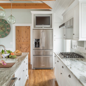
Cape Associates removed the wall separating the kitchen from the dining room to create an open, airy layout. The ceilings were raised and clad in shiplap siding and highlighted with new pine beams, reflective of the cottage style of the home. New windows add a vintage look.
The designer used a whitewashed palette and traditional cabinetry to push a casual and beachy vibe, while granite countertops add a touch of elegance.
The layout was rearranged to include an island that’s roomy enough for casual meals and for guests to hang around when the owners are prepping party meals.
Placing the main sink and dishwasher in the island instead of the usual under-the-window spot was a decision made by Lois early in the planning stages. “If we have guests over, I can face everyone when I’m rinsing vegetables or washing dishes,” she says. “Otherwise, my back would be turned.”
The old avocado-hued linoleum flooring had an unexpected bonus: preserving the original oak floors, which were refinished.
The new layout includes room for the homeowners’ hutch from their previous residence, as well as an old pot-bellied stove, a family heirloom. A glass-front cabinet allows the homeowners to show off colorful dishes. Bringing the cabinet down to counter level adds more storage. Stacking the microwave, oven and warming drawer adds efficiency.
 JMorris Design LLC
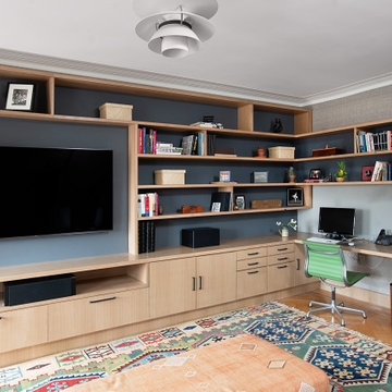
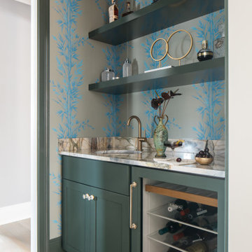
Custom Built ins create a media and desk area for two. Magnetic wallpaper at the desk area adds purpose and flexible display opportunities. The green Eames chairs add character and plays with colorful rug.
 TKS Design Group
Download our free ebook, Creating the Ideal Kitchen. DOWNLOAD NOW
The homeowners built their traditional Colonial style home 17 years’ ago. It was in great shape but needed some updating. Over the years, their taste had drifted into a more contemporary realm, and they wanted our help to bridge the gap between traditional and modern.
We decided the layout of the kitchen worked well in the space and the cabinets were in good shape, so we opted to do a refresh with the kitchen. The original kitchen had blond maple cabinets and granite countertops. This was also a great opportunity to make some updates to the functionality that they were hoping to accomplish.
After re-finishing all the first floor wood floors with a gray stain, which helped to remove some of the red tones from the red oak, we painted the cabinetry Benjamin Moore “Repose Gray” a very soft light gray. The new countertops are hardworking quartz, and the waterfall countertop to the left of the sink gives a bit of the contemporary flavor.
We reworked the refrigerator wall to create more pantry storage and eliminated the double oven in favor of a single oven and a steam oven. The existing cooktop was replaced with a new range paired with a Venetian plaster hood above. The glossy finish from the hood is echoed in the pendant lights. A touch of gold in the lighting and hardware adds some contrast to the gray and white. A theme we repeated down to the smallest detail illustrated by the Jason Wu faucet by Brizo with its similar touches of white and gold (the arrival of which we eagerly awaited for months due to ripples in the supply chain – but worth it!).
The original breakfast room was pleasant enough with its windows looking into the backyard. Now with its colorful window treatments, new blue chairs and sculptural light fixture, this space flows seamlessly into the kitchen and gives more of a punch to the space.
The original butler’s pantry was functional but was also starting to show its age. The new space was inspired by a wallpaper selection that our client had set aside as a possibility for a future project. It worked perfectly with our pallet and gave a fun eclectic vibe to this functional space. We eliminated some upper cabinets in favor of open shelving and painted the cabinetry in a high gloss finish, added a beautiful quartzite countertop and some statement lighting. The new room is anything but cookie cutter.
Next the mudroom. You can see a peek of the mudroom across the way from the butler’s pantry which got a facelift with new paint, tile floor, lighting and hardware. Simple updates but a dramatic change! The first floor powder room got the glam treatment with its own update of wainscoting, wallpaper, console sink, fixtures and artwork. A great little introduction to what’s to come in the rest of the home.
The whole first floor now flows together in a cohesive pallet of green and blue, reflects the homeowner’s desire for a more modern aesthetic, and feels like a thoughtful and intentional evolution. Our clients were wonderful to work with! Their style meshed perfectly with our brand aesthetic which created the opportunity for wonderful things to happen. We know they will enjoy their remodel for many years to come!
Photography by Margaret Rajic Photography
 LuxeMark Company
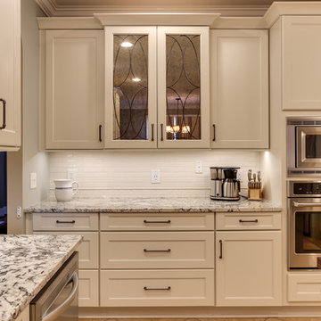
Antique mirror with lead on-lay adds interest and reflection in place of the typical glass door cabinet.
Drawers provide the most efficient kitchen storage in most cases.
Photos by Tad Davis

Sponsored
Sunbury, OH

J.Holderby - Renovations
Franklin County's Leading General Contractors - 2X Best of Houzz!
 Advance Design Studio, Ltd.
Mike and Anne of Barrington Hills desperately needed to update and renovate both their kid’s hall bath and guest bath, and in their 1980’s home each project presented a different set of unique challenges to overcome. When they set out to identify the right remodeling company to partner with, it was important to find a company that could help them to visualize design solutions for the bath renovations. When they came across Advance Design Studio’s website, they were immediately drawn to the solution-oriented remodeling process and the family friendly company.
They say they chose Advance Design because of the integrated approach of “Common Sense Remodeling”, making the design, project management and construction all happen in one place. When they met with Project Designer Michelle Lecinski, they knew they chose the right company. “Michelle’s excellent work on the initial designs made it easy to proceed with Advance Design Studio,” Mike said.
Like most homeowners anticipating a big renovation project, they had some healthy fears; with two bathrooms being remodeled at the same time they worried about timeframes and staying within budget. With the help of Michelle, and the “Common Sense” guidelines, they were confident that Advance Design would stay true, orchestrating all the moving parts to stay within both the estimated timeline and budget.
The guest bath offered the biggest design challenge. A dormer obstruction made the already cramped shower awkward to access. Mike and Anne also wanted the shower size to be expanded, making it more accommodating. Working with Advance’s construction expert DJ Yurik, Michelle relocated the shower concealing the original dormer and creating a larger, more comfortable and aesthetically pleasing guest shower.
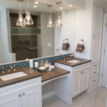
The unsightly and not at all user-friendly closet was removed and replaced with elegant White Maple Dura Supreme cabinetry with much improved function featuring dual tall linen cabinets, a special makeup area and two sinks, providing a dual vanity which was extremely important for better guest use.
The Fossil Brown quartz countertop is in pleasing contrast to the white cabinetry, and coordinates nicely with the mocha porcelain tile gracing the shower for an accent. The decorative glazed turquoise tile backsplash, tile border, and bottle niche adds a taste of marine green to the room, while marble-looking porcelain tile makes guests feel they are staying in a 5-star hotel. Polished nickel Kohler plumbing fixtures were chosen to add a touch of sophistication. This renovated guest bath is comfortable and elegant, and Anne and Mike’s house guests may never want to leave!
“The end result was updated and restyled bathrooms that the client will enjoy and increase the value of their home,” Designer Michelle said.
The children’s hall bath had its own set of challenges. The current placement of the sink was not conducive to the best use of the existing space, nor did it allow for any visual interest, something Advance’s designers always work to achieve even within the tight confines of a small bath. Advance removed the linen closet and used the gain in wall space to create a dramatic focal point on the vanity wall. They also took additional space that wasn’t being used for new Storm Gray Dura Supreme tall built-in linen cabinets, creating functional storage space that the former bath lacked. A customized glass splash panel was created for the bath, and the high ceilings with skylights were accented with a custom-made track lighting fixture featuring industrial pipe and cage materials.
Authentic cement encaustic tile was used wall to wall surrounding the vanity to create a dramatic and interesting back drop for the new elegant and stately furniture-like double sink wall. Hand-made encaustic tile originated in Western Europe beginning in the 1850’s and reminded Mike and Anne of tile they had seen and loved from their travels overseas. Today, encaustic tile has made a re-appearance in today’s modern bath design with its wide array of appealing patterns and artistic use of color.
Oil rubbed bronze Kohler fixtures echo the black accents in the beautiful tile pattern and reflect the matte black of the unique lighting detail. Easy to maintain Blanca Arabescato Quartz countertops add practicality and natural beauty and compliments the warm wood porcelain tile floors. This handsome bath has generated praise from friends and family even before it’s complete unveiling as photos of the space leaked out on social media! It’s not only completely functional to use, but especially pretty to look at.
“Advance Design Studio did a terrific job for us. We really appreciated how easy it was to work with them on a complex project of the complete remodeling of two bathrooms. They very capably handled all the details from design, to project management, to construction. It is a great group of people to work with and we would welcome the opportunity to work with them again anytime,” Mike said.
 Native Edge Landscape
Another fun Crestview project! This young couple wanted a back yard that reflected their bohemian-eclectic style and could add additional privacy from the ever climbing construction around them. A place for “hanging out and drinking coffee or beer in the backyard.” But what was most exciting, was the air stream they had just purchased and were in the process of restoring. With the end goal of using it as a guest home for family and friends, we were challenged with creating a space that was cohesive and connected this new living space with the rest of the yard.
In the front we had another quark to fix. The sidewalk from their front door to the street suddenly stopped 5 feet from the curb, making a less than inviting entry for guests. So, creating a new usable entryway with additional curb appeal was a top priority.
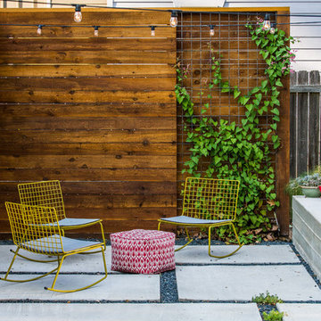
We managed the entertainment space by using modern poured concrete pad’s as a focal. A poured concrete wall serves as a bench as well as creates a visual anchor for the patio area. To soften the hard materials, small plantings of succulents and ground cover were planted in the spaces between the pads. For a backdrop, a custom Cedar Plank wall and trellis combined to soften the vertical space and add plenty of privacy. The trellis is anchored by a Coral Vine to add interest. Cafe style lighting was strung across the area create a sense of intimacy.
We also completed the fence transition, and eliminated the grass areas that were not being utilized to reduce the amount of water waste in the landscape, and replaced these areas with beneficial plantings for the wildlife.
Overall, this landscape was completed with a cohesive Austin-friendly design in mind for these busy young professionals!
Caleb Kerr - http://www.calebkerr.com
 Mark Thomas Home
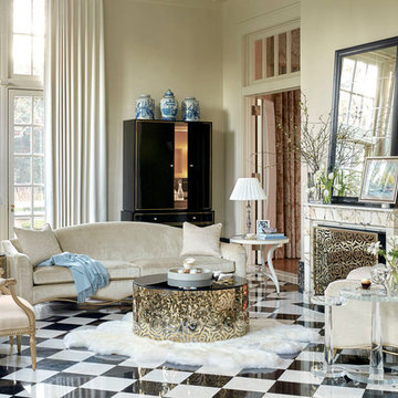
Caracole The Rose Cocktail Table
PRODUCT SIG-416-406
Majestic Gold Finish, 1'' thick black glass top.
Caracole The Sophisticated Side Table
PRODUCT SIG-416-413
In the same way that Austrian cut crystal adds drama to the most beautiful chandeliers, this crystal glass end table has artfully cut edges at its top and base that bring out a rainbow of reflective light.
Caracole The Ladies Side Table
PRODUCT SIG-416-412
This pretty side table is a must-have in the collection. Its beautiful white crystal stone top is offset by a base in Creme De La Creme that is trimmed in Gold Bullion Leaf. It's delicately curved contemporary cabriole legs are joined by a stretcher that is finished in a glittering cut crystal finial. This piece is a vision of loveliness in any refined space.
Caracole The Gilded Chair
PRODUCT SGU-416-132-A
This French fauteuil's intricately carved woodwork is gloriously gilded in a warm Sterling Silver to be the perfect accent next to a glowing fire. This classically French frame has Greco Roman coin, leaf and flower details that encircle the upholstered back and extend down the upholstered arm insets and fluted tapered legs. This is a comfortable open-armed piece with an elegance all its own. Upholstered in a woven navy and gold fabric. Body Fabric: 3122-34CC
Caracole The Ribbon Sofa
PRODUCT SGU-416-013-A
Classically French with its soft camel-curved back and sweeping arms, The Ribbon Sofa is a thing of beauty, enhanced by the luxurious buff-colored velvet that surrounds the frame. The collection's signature deeply carved ribbon runs around the base of the sofa in a hand-applied Gold Bullion Leaf. The entire piece takes a welcoming position atop rounded trapeze feet.
Body Fabric: 2432-35CC; Pillow Fabric: 2-20" x 20" Pillows 3105-41CC
16