
Search results for "Relocation" in Home Design Ideas
 TKS Design Group
Download our free ebook, Creating the Ideal Kitchen. DOWNLOAD NOW
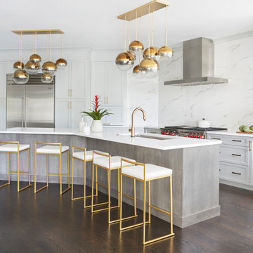
This client was referred to us from a past client. They are a busy 2-career household with young children and enjoy entertaining friends and family in their home. They have a beautiful open concept home but unfortunately the kitchen was not fitting for the rest of the home. They were not quite sure what to do with the space. We talked about trying to refresh it or do more of a minor remodel, but in the end they decided a full gut would get them to where they wanted to be.
One problem was there was no place for guests to hang out other than the large and awkward banquette area. The brick wall and tiled hood area were feeling a bit dated and tired. The space was just not functional for their lifestyle. There was no prep space near the cooktop and no landing area for items coming out of the ovens or refrigerator, plus a big dead zone in the center of the room.
Banquettes, like the one they previously had in the space, are great for small spaces, but when they get really large like this one, it makes getting in and out of the seating area awkward and uncomfortable. Plus, there was room for a large table, so we eliminated the awkward built in.
We started by removing the faux brick wall between the kitchen and back entry. We relocated the entry to the garage over a couple feet in order to get every last inch out of the new kitchen. We also made the decision to close up the primary window that faced the pretty ho hum brick wall of the neighbor’s house. There was plenty of light coming in from the seating area, so we just didn’t feel the window was adding much to the room.
Construction went smoothy. There was a bit of rework with electrical, flooring and HVAC, but in the end, we think it was well worth it.
The clients really wanted a sleek contemporary look, and we originally had planned for a full height slab backsplash, but due to it’s size, it was a budget buster. Instead, we got creative and settled on large format porcelain tiles that have a similar feel but were a fraction of the cost. We made sure the wall was plumb and level so that the fit and finish would mimic that of slab material.
The final space was quite a change. A large prep sink sits directly across from the new pro-style range with plenty additional prep space on the large island. The refrigerator and ovens now have miles of landing space, and a nice tight work triangle makes cooking a breeze.
Since we wanted a more contemporary feel, not many wall cabinets were included. Instead, we outfitted some of the drawers for dish storage with a peg system. Two large pantries flanking the refrigerator hold baking supplies and small appliances. Large drawers by the cooktop hold pots and pans, and an appliance garage tucked away to the left of the range hides away miscellaneous items. The large island also houses a microwave drawer and tons of storage, most of which is drawers offering maximum convenience.
The island now seats 5-6 people comfortably along with the new table in the seating area which can seat up to 8. Entertaining will be a breeze in this space. With such a clean backdrop, we knew we would need some drama with the lighting, so we chose two sets of staggered pendants, which we adjusted for the right visual balance above the island.
We also included a small coffee station to the right of the main kitchen, which helps keep the coffee clutter out of the kitchen proper. Two tones of complimentary gray are featured in this kitchen. The perimeter is a light gray that reads almost white. The island is a gray stain that adds some depth and interest with the visible wood texture. The countertops are clean white quartz, and the hardware, barstools and light fixtures add warm brass tones. I see lots of cooking and entertaining with family and friends in the near future in this bright and airy new space.
Designed by: Susan Klimala, CKD, CBD
Photography by: Michael Kaskel
For more information on kitchen and bath design ideas go to: www.kitchenstudio-ge.com

 a Blade of Grass
Raised bluestone patio with granite sitting walls and custom granite fireplace.
Mountain style patio photo in Boston with a fire pit
Mountain style patio photo in Boston with a fire pit

 SV Design
The layout of this colonial-style house lacked the open, coastal feel the homeowners wanted for their summer retreat. Siemasko + Verbridge worked with the homeowners to understand their goals and priorities: gourmet kitchen; open first floor with casual, connected lounging and entertaining spaces; an out-of-the-way area for laundry and a powder room; a home office; and overall, give the home a lighter and more “airy” feel. SV’s design team reprogrammed the first floor to successfully achieve these goals.
SV relocated the kitchen to what had been an underutilized family room and moved the dining room to the location of the existing kitchen. This shift allowed for better alignment with the existing living spaces and improved flow through the rooms. The existing powder room and laundry closet, which opened directly into the dining room, were moved and are now tucked in a lower traffic area that connects the garage entrance to the kitchen. A new entry closet and home office were incorporated into the front of the house to define a well-proportioned entry space with a view of the new kitchen.
By making use of the existing cathedral ceilings, adding windows in key locations, removing very few walls, and introducing a lighter color palette with contemporary materials, this summer cottage now exudes the light and airiness this home was meant to have.
© Dan Cutrona Photography
Find the right local pro for your project

 Amy Pearson Design
Relocating to Portland, Oregon from California, this young family immediately hired Amy to redesign their newly purchased home to better fit their needs. The project included updating the kitchen, hall bath, and adding an en suite to their master bedroom. Removing a wall between the kitchen and dining allowed for additional counter space and storage along with improved traffic flow and increased natural light to the heart of the home. This galley style kitchen is focused on efficiency and functionality through custom cabinets with a pantry boasting drawer storage topped with quartz slab for durability, pull-out storage accessories throughout, deep drawers, and a quartz topped coffee bar/ buffet facing the dining area. The master bath and hall bath were born out of a single bath and a closet. While modest in size, the bathrooms are filled with functionality and colorful design elements. Durable hex shaped porcelain tiles compliment the blue vanities topped with white quartz countertops. The shower and tub are both tiled in handmade ceramic tiles, bringing much needed texture and movement of light to the space. The hall bath is outfitted with a toe-kick pull-out step for the family’s youngest member!

 Relocated Living
Living room - large 1950s formal and open concept dark wood floor living room idea in San Francisco with gray walls, a standard fireplace, a brick fireplace and no tv
Living room - large 1950s formal and open concept dark wood floor living room idea in San Francisco with gray walls, a standard fireplace, a brick fireplace and no tv
 Blackline Renovations
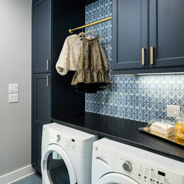
The homeowner was used to functioning with a stacked washer and dryer. As part of the primary suite addition and kitchen remodel, we relocated the laundry utilities. The new side-by-side configuration was optimal to create a large folding space for the homeowner.
Now, function and beauty are found in the new laundry room. A neutral black countertop was designed over the washer and dryer, providing a durable folding space. A full-height linen cabinet is utilized for broom/vacuum storage. The hand-painted decorative tile backsplash provides a beautiful focal point while also providing waterproofing for the drip-dry hanging rod. Bright brushed brass hardware pop against the blues used in the space.

 Studio Dearborn
MULTIPLE AWARD WINNING KITCHEN. 2019 Westchester Home Design Awards Best Traditional Kitchen. KBDN magazine Award winner. Houzz Kitchen of the Week January 2019. Kitchen design and cabinetry – Studio Dearborn. This historic colonial in Edgemont NY was home in the 1930s and 40s to the world famous Walter Winchell, gossip commentator. The home underwent a 2 year gut renovation with an addition and relocation of the kitchen, along with other extensive renovations. Cabinetry by Studio Dearborn/Schrocks of Walnut Creek in Rockport Gray; Bluestar range; custom hood; Quartzmaster engineered quartz countertops; Rejuvenation Pendants; Waterstone faucet; Equipe subway tile; Foundryman hardware. Photos, Adam Kane Macchia.

 Linda Cava
Kitchen - eclectic galley dark wood floor and brown floor kitchen idea in New York with an island, a single-bowl sink, flat-panel cabinets, white cabinets, white backsplash, glass sheet backsplash and stainless steel appliances





 Randy Angell Designs
The planning phase of this modern retreat was an intense collaboration that took place over the course of more than two years. While the initial design concept exceeded the clients' expectations, it also exceeded their budget beyond the point of comfort.
The next several months were spent modifying the design, in attempts to lower the budget. Ultimately, the decision was made that they would hold off on the project until they could budget for the original design, rather than compromising the vision.
About a year later, we repeated that same process, which resulted in the same outcome. After another year-long hiatus, we met once again. We revisited design thoughts, each of us bringing to the table new ideas and options.
Each thought simply solidified the fact that the initial vision was absolutely what we all wanted to see come to fruition, and the decision was finally made to move forward.
The main challenge of the site was elevation. The Southeast corner of the lot stands 5'6" above the threshold of the rear door, while the Northeast corner dropped a full 2' below the threshold of the door.
The backyard was also long and narrow, sloping side-to-side and toward the house. The key to the design concept was to deftly place the project into the slope and utilize the elevation changes, without allowing them to dominate the yard, or overwhelm the senses.
The unseen challenge on this project came in the form of hitting every underground issue possible. We had to relocate the sewer main, the gas line, and the electrical service; and since rock was sitting about 6" below the surface, all of these had to be chiseled through many feet of dense rock, adding to our projected timeline and budget.
As you enter the space, your first stop is an outdoor living area. Smooth finished concrete, colored to match the 'Leuder' limestone coping, has a subtle saw-cut pattern aligned with the edges of the recessed fire pit.
In small spaces, it is important to consider a multi-purpose approach. So, the recessed fire pit has been fitted with an aluminum cover that allows our client to set up tables and chairs for entertaining, right over the top of the fire pit.
From here, it;s two steps up to the pool elevation, and the floating 'Leuder' limestone stepper pads that lead across the pool and hide the dam wall of the flush spa.
The main retaining wall to the Southeast is a poured concrete wall with an integrated sheer descent waterfall into the spa. To bring in some depth and texture, a 'Brownstone' ledgestone was used to face both the dropped beam on the pool, and the raised beam of the water feature wall.
The main water feature is comprised of five custom made stainless steel scuppers, supplied by a dedicated booster pump.
Colored concrete stepper pads lead to the 'Ipe' wood deck at the far end of the pool. The placement of this wood deck allowed us to minimize our use of retaining walls on the Northeast end of the yard, since it drops off over three feet below the elevation of the pool beam.
One of the most unique features on this project has to be the structure over the dining area. With a unique combination of steel and wood, the clean modern aesthetic of this structure creates a visual stamp in the space that standard structure could not accomplish.
4" steel posts, painted charcoal grey, are set on an angle, 4' into the bedrock, to anchor the structure. Steel I-beams painted in green-yellow color--aptly called "frolic"--act as the base to the hefty cedar rafters of the roof structure, which has a slight pitch toward the rear.
A hidden gutter on the back of the roof sends water down a copper rain chain, and into the drainage system. The backdrop for both this dining area , as well as the living area, is the horizontal screen panel, created with alternating sizes of cedar planks, stained to a calm hue of dove grey.

 Meregalli Merlo Architetti Associati
Laura Scaccabarozzi
Inspiration for a small contemporary light wood floor living room remodel in Milan with white walls and a wall-mounted tv
Inspiration for a small contemporary light wood floor living room remodel in Milan with white walls and a wall-mounted tv


26