
Search results for "Sense running" in Home Design Ideas

 Madson Design
Front entry. We were really aiming for a sense of continuity between the exterior and interior in this house--an indoor/ outdoor flow throughout. So at the front entry this desire was manifested in the design of the ceiling: Tongue in groove stained cedar runs continuously (in appearance at least) from porch ceiling to entry hall ceiling. The transom window frame is partially buried in the ceiling so as to create the impression of uninterrupted flow between the two spaces. This effect is complimented by the large porch beam, which continues through to the interior: The drywall runs up only to the bottom of beam, leaving it fully exposed.
Photographer: Eric Rorer

 Powell Construction
The kitchen is a mix of existing and new cabinets that were made to match. Marmoleum (a natural sheet linoleum) flooring sets the kitchen apart in the home’s open plan. It is also low maintenance and resilient underfoot. Custom stainless steel countertops match the appliances, are low maintenance and are, uhm, stainless!

 Paul Lopa Designs
Traditional Kitchen Renovation & Design Of A First Floor Ranch.
See what our client say about Paul Lopa Designs:
It went as smooth as it possibly could go. The only bumps in the road was with what we found during demolition, you never know what your gonna run into when all the walls,floors and fixtures come out. Paul had explained to us that depending on what we found under all the out dated stuff it might take a little longer. Paul was there doing the work with his workers he showed up on time and finished on schedule. It was no problem being in touch with Paul because he answered his phone or got back to us in a timely fashion. He has an excellent sense of design he knows what goes well together and makes the house flow with comfort and usability.
(R)Haw Ron
Find the right local pro for your project

 d KISER design.construct, inc.
poject by d KISER design.construct, inc.
Photography by Colin Conces
Small trendy porcelain tile and white floor bathroom photo in Omaha with flat-panel cabinets, dark wood cabinets, white walls, an undermount sink, quartzite countertops and white countertops
Small trendy porcelain tile and white floor bathroom photo in Omaha with flat-panel cabinets, dark wood cabinets, white walls, an undermount sink, quartzite countertops and white countertops

 Red Pepper Design & Cabinetry
Horizontal lines are in general calming. This White Anigre kitchen with the grain running horizontally creates a gentle sense of calm in the center of a large open space. Red Pepper Cabinetry uses only water-borne finishes leaving the true color of the wood to come through.

 Advance Design Studio, Ltd.
Brown luxury vinyl wood-look planking runs throughout the Elgin basement.
Example of a large transitional look-out vinyl floor and brown floor basement design in Chicago with gray walls
Example of a large transitional look-out vinyl floor and brown floor basement design in Chicago with gray walls

 Cummings Architecture + Interiors
Situated in a neighborhood of grand Victorians, this shingled Foursquare home seemed like a bit of a wallflower with its plain façade. The homeowner came to Cummings Architects hoping for a design that would add some character and make the house feel more a part of the neighborhood.
The answer was an expansive porch that runs along the front façade and down the length of one side, providing a beautiful new entrance, lots of outdoor living space, and more than enough charm to transform the home’s entire personality. Designed to coordinate seamlessly with the streetscape, the porch includes many custom details including perfectly proportioned double columns positioned on handmade piers of tiered shingles, mahogany decking, and a fir beaded ceiling laid in a pattern designed specifically to complement the covered porch layout. Custom designed and built handrails bridge the gap between the supporting piers, adding a subtle sense of shape and movement to the wrap around style.
Other details like the crown molding integrate beautifully with the architectural style of the home, making the porch look like it’s always been there. No longer the wallflower, this house is now a lovely beauty that looks right at home among its majestic neighbors.
Photo by Eric Roth
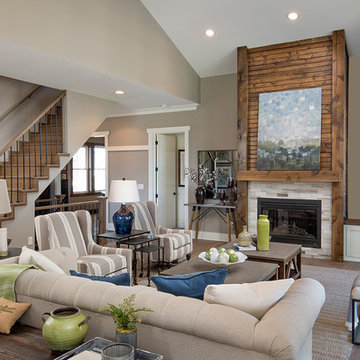


 Hamilton-Gray Design, Inc.
Nestled in Palm trees on top of a hill overlooking the Pacific Ocean our client bought a beautifully Spanish styled home. The exteriors have all the wonderful exterior trimmings of arches, mission bells and colorful tile work.
Photo Credit: Preview First

 Bosch Home Appliances
Bosch is committed to pure, purposeful European design that perfectly fits people’s lives. One of the
current U.S. trends is small spaces. Popular in places like Manhattan, the movement is now catching on
in more U.S. cities where small spaces are expanding to include guest suites, media rooms, secondary
vacation homes and other ancillary spaces.
Bosch is satisfying this ever-growing lifestyle trend with modern design, innovation and efficiency you’d
expect. As the 24" Bosch kitchen is specifically designed for small spaces, this is undeniable proof
that a smaller space doesn’t mean a smaller sense of style. Whether it’s city dwellers living in an urban
condo or loft, empty nesters or retirees desiring to downsize, or vacationers enjoying time in a compact
residence club, Bosch brings a premium experience to any kitchen. No matter the size.

 Kon-strux Developments
This laundry room-pantry combo space makes so much sense.
Designer: Nicole Muzechka
(Calgary Photos)
Inspiration for a transitional single-wall ceramic tile utility room remodel in Calgary with an undermount sink, flat-panel cabinets, gray cabinets, gray walls, a side-by-side washer/dryer and quartzite countertops
Inspiration for a transitional single-wall ceramic tile utility room remodel in Calgary with an undermount sink, flat-panel cabinets, gray cabinets, gray walls, a side-by-side washer/dryer and quartzite countertops

 Zoe Feldman Design, Inc.
Example of a transitional carpeted family room design in DC Metro with gray walls, no fireplace and a wall-mounted tv

 Pennsylvania Landscape & Nursery Association
Terran Landscapes http://www.terranlandscapes.com
Project Entry: Fishers Woodland Garden
2014 PLNA Awards for Landscape Excellence Winner
Category: Theme Garden $15,000-$30,000
Award Level: Bronze
Photo Description:
We were contracted by the client to design a calming space for their staff to relax, take a walk, and enjoy a leisurely lunch as well as to provide their grandchildren a place to run and pick flowers. The space was originally dominated by large trees and had been overgrown with ivy, sumac and aggressive vines, providing an unwelcome, dark space with little color or visual appeal. The client requested a colorful blend of shrubs and perennials that would provide interest throughout the seasons, as well as provide privacy by screening the street traffic along Carisbrooke Road.
Our goal was to create the privacy screen along the road by layering plants from the ground to the tree canopy. The theme was to let nature inspire the landscape, allowing a space that was originally woodland to become an enhanced version of itself, creating a beautiful habitat for birds and butterflies to excite the senses and satisfy all who enjoy the beauty of nature.
We began by clearing the brush and removing all aggressive vines and ivy that jeopardized the health of the trees. We kept and transplanted all non- invasive or native plant material in the area to various locations throughout the property. Several yards of compost were then tilled into the soil and the existing trees fertilized to provide a rich growing environment.
A few challenges occurred during the design process. It was decided that a new generator was to be installed in the woodland and due to a future addition to the house, we were forced to eliminate planned additional impervious pathway surfaces. We provided screening to hide the generator and buffer the noise, and created a meandering path and sitting area out of natural woodchips instead of the proposed bluestone to solve the impervious space issue. The woodchips add a sense of informality and invite the viewer to walk slowly through the space. The reduced noise from the additional screening of the generator allows for quiet reflection as chipmunks scurry and hummingbirds dart about between the flowers.
Our plant palette consists of shady understory plants that thrive and flower vigorously from spring through fall. A tall, lush, evergreen backdrop of Ilex opaca and Prunus laurocerasus ‘Schipkaensis’ provides the screening and blends into a middle layer of ‘Ivory Halo’ dogwood, hydrangeas and winterberry hollies. Beautiful perennials and groundcovers bloom along the woodland path, providing a low visual layer of color and texture. Movement throughout the garden is provided by the graceful Calamagrostis brachytricha and Hakenchloa that soften the nearby hardscaping. The woodland floor is full of shade-loving Solomon’s seal, hosta, astilbe, ferns, bleeding heart, Tiarella and Aconitum.
The street side of this woodland required plants with a preference for a little more sun and drought tolerance. A palette of oakleaf hydrangea, Agastache, Liatris and Rudbeckia softens the fence line and provides the desired color.
As designed and installed, the woodland garden successfully provides the client’s family and office staff a quiet space where they can take a peaceful moment and enjoy nature.
Photo Credit: Lisa C. Falls

 Shaw Design Associates, P.A.
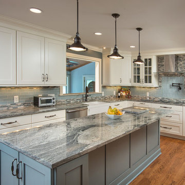
The central corridor that runs down the length of the house is clearly delineated. This traffic pattern creates a sense of "journey" from the back entrance/pantry area, past the kitchen, through the dining room, and into the living room. The concave crown molding creates a visual rhythm along the corridor. (Courtesy Shaw Design Associates)
Sponsored
Columbus, OH

Trish Takacs Design
Award Winning & Highly Skilled Kitchen & Bath Designer in Columbus

 Beco Kitchens and Baths
Although the size of the bathroom stayed the same it feels much bigger. The custom shower enclosure creates a sense of space. The subway tile covers not only the wall, but hugs the curve of the ceiling. Finally the furniture like vanity has lots of space since it has multiple drawers and a shelf for additional storage that runs the whole length of the vanity.
Photo by Bill Cartledge


 Mackenzie Collier Interiors
Warm wood tones, pops of color, and sleek midcentury style give this dining room an inviting atmosphere.
Image: Agnes Art & Photo
Inspiration for a 1950s concrete floor and gray floor dining room remodel in Phoenix with white walls
Inspiration for a 1950s concrete floor and gray floor dining room remodel in Phoenix with white walls

 Sarah Berghorst, Birch & Sable Interiors
Sarah Berghorst
Inspiration for a small rustic 3/4 gray tile and pebble tile ceramic tile corner shower remodel with an undermount sink, furniture-like cabinets, dark wood cabinets, quartz countertops, a one-piece toilet and beige walls
Inspiration for a small rustic 3/4 gray tile and pebble tile ceramic tile corner shower remodel with an undermount sink, furniture-like cabinets, dark wood cabinets, quartz countertops, a one-piece toilet and beige walls
 Cummings Architecture + Interiors
Situated in a neighborhood of grand Victorians, this shingled Foursquare home seemed like a bit of a wallflower with its plain façade. The homeowner came to Cummings Architects hoping for a design that would add some character and make the house feel more a part of the neighborhood.
The answer was an expansive porch that runs along the front façade and down the length of one side, providing a beautiful new entrance, lots of outdoor living space, and more than enough charm to transform the home’s entire personality. Designed to coordinate seamlessly with the streetscape, the porch includes many custom details including perfectly proportioned double columns positioned on handmade piers of tiered shingles, mahogany decking, and a fir beaded ceiling laid in a pattern designed specifically to complement the covered porch layout. Custom designed and built handrails bridge the gap between the supporting piers, adding a subtle sense of shape and movement to the wrap around style.
Other details like the crown molding integrate beautifully with the architectural style of the home, making the porch look like it’s always been there. No longer the wallflower, this house is now a lovely beauty that looks right at home among its majestic neighbors.
Photo by Eric Roth
 Twelve Stones Designs, LLC
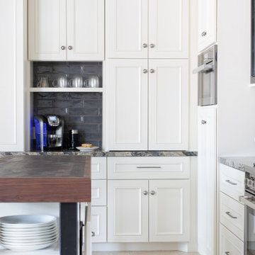
The owners of this kitchen had spent the money to upgrade the finishes in their kitchen upon building the home 12 years ago, but after living in the space for several years they realized how nonfunctional the layout really was. The (then) two preschool aged children had grown into busy, hungry teenagers with many friends who also liked to hang out at the house. So the family needed a more functional kitchen with better traffic flow, space for daily activities revolving around the kitchen at different times of day, and a kitchen that could accommodate cooking for and serving large groups. Furthermore, the dark, traditional finishes no longer reflected the homeowners’ style. They requested a brighter, more relaxed, coastal style that reflected their love of the seaside cities they like to visit.
Originally, the kitchen was U-shaped with a narrow island in the middle. The island created narrow aisles that bottle-necked at the dishwasher, refrigerator, and cooktop areas. There was a pass-through from the foyer into the kitchen, but the owners never liked that the pass-through was also located so close to the powder room. The awkward proximity was unappealing and made guests feel uncomfortable.
The kitchen’s storage was made up of lots of narrow cabinets, apothecary drawers, clipped corner units, and very few drawers. It lacked useful storage for the larger items the family used on a daily basis. And the kitchen’s only pantry was small closet that had only builder-grade, narrow shelving with no illumination to be able to see the contents inside.
Overall, the kitchen’s lighting plan was poorly executed. Only six recessed cans illuminated the entire kitchen and nook areas. The under cabinet lighting was not evenly distributed either. In fact, the builder had mis-placed the under cabinet lighting around the decorative pilasters which made for choppy, dark cubbies. Further, the builder didn’t include any lighting over the sink or the bar area, which meant whoever was doing the dishes was always in their own shadow. That, coupled with the steep overhang of the game room above made the bar area feel like a dim, cavernous space that wasn’t inviting or task oriented. The kitchen looked out into the main living space, but the raised bar and a narrow wall (which held the only large cabinet in the kitchen) created more of a barrier than a relationship to the living room or breakfast nook. In fact, one couldn’t even see the breakfast nook from the cooktop or sink areas due to its orientation. The raised bar top was too narrow to comfortably sit to either dine at or chat from due to the lack of knee space. The the homeowners confided that the kitchen felt more like a dark, dirty prison than place where the family, or their guests, wanted to gather and commune.
The clients' needs and desires were:
➢ to create a kitchen that would be a space the family loved to be in; to relate to the adjacent spaces all around, and to have better flow for entertaining large groups
➢ to remove the walls between the breakfast nook and living area and to be able to utilize the natural light from the windows in both those areas
➢ to incorporate a functional chopping block for prepping fresh food for home cooked meals, an island with a large sink and drain board, 2 pull out trash cans, and seating for at least the 2 teens to eat or do homework
➢ to design a kitchen and breakfast nook with an airy, coastal, relaxed vibe that blended with the rest of the house's coastal theme
➢ to integrate a layered lighting plan which would include ample general illumination, specific task lighting, decorative lighting, and lots of illuminated storage
➢ to design a kitchen with not only more storage for all the husband’s kitchen gadgets and collection of oils and spices, but smart storage, including a coffee/breakfast bar and a place to store and conceal the toaster oven and microwave
➢ to find a way to utilize the large open space between the kitchen, pantry area, and breakfast nook
Twelve Stones Designs achieved the owner's goals by:
➢ removing the walls between the kitchen and living room to allow the natural light to filter in from the adjacent rooms and to create a connection between the kitchen, nook, and living spaces for a sense of unity and communion
➢ removing the existing pantry and designing 3 large pantry style cabinets with LED tape lights and rollout drawers to house lots of kitchen appliances, gadgets, and tons of groceries. We also took the cabinets all the way up to the 9’ ceiling for additional storage for seasonal items and bulk storage.
➢ designing 2 islands - 1 with a gorgeous black walnut chopping block that houses a drawer for chopping and carving knives and a custom double pull out trash unit for point of use utilization - and 1 that houses the dishwasher, a large Blanco Gourmet sink with integrated drain board, woven baskets for fresh root vegetables and kitchen towels, plenty of drawer storage for kitchen items, and bar seating for up to 4 diners.
➢ closing off the space between the kitchen and the powder room to create a beautiful new private alcove for the powder room as well as adding some decorative storage. This also gave us space to include more tall storage near the new range for precision placement of the husband’s extensive oil and spice collection as well as a location for a combo-steam oven the wife wanted for baking and cooking healthy meals.
The project is enhanced functionally by:
➢ incorporated USB and standard receptacles for the kids’ laptops and phone charging in the large island
➢ designing the small island to include additional open shelving for items used on a daily basis such as a variety of bowls, plates, and colanders. This set up also works well for the husband who prefers to “plate” his dinners in restaurant-style fashion before presenting them to the table.
➢ the integration of specific storage units, such as double stacked cutlery drawers, a custom spice pull-out, a Kuerig coffee and tea pod drawer, and custom double stacked utensil drawers
➢ moving the refrigerator to the old oven location - this eliminated the bottle neck as well as created a better relationship to the eating table. It also utilizes the floor space between the pantry, nook, and kitchen
➢ creating a banquet style breakfast nook - this banquette seating not only doubles the amount of seating for large gatherings but it better utilizes the odd space between the kitchen and the previous nook area. It also helps to create a distinct pathway from the mudroom room through the pantry area, kitchen, nook, and living room.
➢ the coffee/breakfast bar area which includes the perfect location for the concealed microwave and toaster oven, convenient storage for the coffee pods and tea accoutrements. Roll-out drawers below also house the smoothie maker, hot water kettle, and a plethora of smoothie-making ingredients such as protein powders, smoothie additives, etc. Furthermore, the drawers below the Keurig house measuring utensil, cutlery, baking supplies and tupperware storage.
➢ incorporating lots of wide drawers and pullouts to accommodate large cookware.
➢ utilizing as much vertical space as possible by building storage to the ceiling which accommodates the family’s abundant amount of serving platters, baking sheets, bakeware, casserole dishes, and additional cutting boards.
The project is enhanced aesthetically by:
➢ new 5-piece Versailles pattern porcelain tile that now seamlessly joins the entire down stairs area together creating a bright, cohesiveness feeling instead of choppy separated spaces - it also adds a coastal feeling
➢ designing a cabinet to conceal the microwave and toaster oven
➢ the coastal influenced light fixtures over the nook table and island
➢ the sandy colors of the Langdon Cambria countertops. The swirling pattern and sparkling quartz pieces remind the homeowner of black-and-tan sandy beaches
➢ the striped banquet seating whose creamy white background and blue-green stripes were the inspiration for the cabinet and wall colors.
➢ All the interior doors were painted black to coordinate with the blacks and grays in the backsplash tile and countertop. This also adds a hint of tailored formality to an otherwise casual space.
➢ the use of WAC's Oculux small aperture LED units for the overhead lighting complimented with Diode LED strips for task lighting under the cabinets and inside the pantry and glass wall cabinets. All of the lighting applications are on separate dimmer switches.
Innovative uses of materials or construction methods by Realty Restoration LLC:
➢ Each 1-1/2” x 3” block of reclaimed end-grain black walnut that makes up the center island chopping block was hand milled and built in the shop. It was designed to look substantial and proportional to the surrounding elements, executed by creating the 4 inch tall top with a solid wood chamfered edge band.
➢ The metal doors on either side of the vent hood were also custom designed for this project and built in the Realty Restoration LLC shop. They are made 1x2, 11-gauge mild steel with ribbed glass. Weighing 60 lbs a piece, heavy duty cabinet hinges were added to support the weight of the door and keep them from sagging.
➢ Under-cabinet receptacles were added along the range wall in order to have a clean, uninterrupted backsplash.
Design obstacles to overcome:
➢ Because we were removing the demising walls between the kitchen and living room, we had to find a way to plumb and vent the new island. We did this by tunneling through the slab (the slab had post tension cables which prevented us from just trenching) to run a new wet vent through a nearby structural wall. We pulled the existing hot and cold lines between upper floor joists and ran them down the structural wall as well and up through a conduit in the tunnel.
➢ Since we were converting from wall overs to a gas range it allowed us to utilize the 220 feed for the wall ovens to provide a new sub panel for all the new kitchen circuits
➢ Due to framing deficiencies inherited from the original build there was a 1-1/2” differential in the floor-to-ceiling height over a 20 foot span; by utilizing the process of cutting and furring coupled with the crown moulding details on the cabinet elevations we were able to mask the problem and provide seamless transitions between the cabinet components.
Evidence of superior craftsmanship:
➢ uniquely designed, one-of-a-kind metal “X” end panels on the large island. The end panels were custom made in the Realty Restoration LLC shop and fitted to the exact dimensions of the island. The welding seams are completely indistinguishable - the posts look like they are cut from a single sheet of metal
➢ square metal posts on the small island were also custom made and designed to compliment and carry through the metal element s throughout the kitchen
➢ the beautiful, oversized end panels on the pantry cabinets which give the breakfast nook a tailored look
➢ integrating a large format 5 piece Versailles tile pattern to seamlessly flow from the existing spaces into the new kitchen space
➢ By constructing a custom cabinet that jogged around a corner we could not remodel (housing the entry way coat closet) we were able to camouflage the adjacent wall offset within the upper and lower cabinets. By designing around the existing jog in the structural walls we accomplished a few things: we were able to find the space to house, and hide, the microwave and toaster oven yet still have a clean cohesive appearance from the kitchen side. Additionally, the owners were able to keep their much needed coat closet and we didn’t have to increase the budget with unnecessary structural work.

17