
Search results for "Sequence" in Home Design Ideas
 Joshua Zinder Architecture + Design
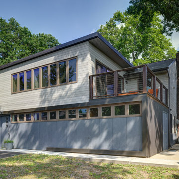
A married pair of artists sought to expand and adapt this salt box-style house into a functional, attractive live/work space while retaining certain nostalgic elements (this was the wife’s childhood home.) Their objectives included adding on a dining room; expanding the master bedroom and downstairs studio spaces; maximizing natural light; and continuing occupancy throughout.
The through-block property is sited between a high-traffic road and another that provides vehicular access to the house. The architect’s solution effectively reversed the entry sequence. The studio elevation, with the master bedroom, dining room and terrace above, is now the formal front of the house, while the former front entrance from the busy road is now secondary.
Today, visitors arrive at the new primary entrance, greeted by a façade suggesting a simple folded ribbon: metal panels that wrap the expanded master bedroom and the new terrace.
Recladding with fiber cement composite rainscreen (a choice inspired by the clients’ travels in Finland) unifies the addition with the existing. The new dining room enjoys views of Meadowlands sunsets through the 12-foot length of full-height glass and the cable rails of the new deck outside. The L-shaped artist studio/office downstairs now gains light from transom-height windows running the width of the house.


 Hush House
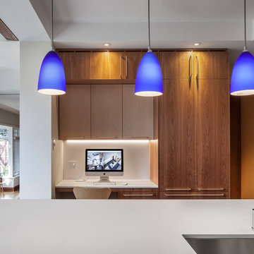
The Pool Box sites a small secondary residence and pool alongside an existing residence, set in a rolling Hill Country community. The project includes design for the structure, pool, and landscape - combined into a sequence of spaces of soft native planting, painted Texas daylight, and timeless materials. A careful entry carries one from a quiet landscape, stepping down into an entertainment room. Large glass doors open into a sculptural pool.
Find the right local pro for your project
 LEAP Architecture
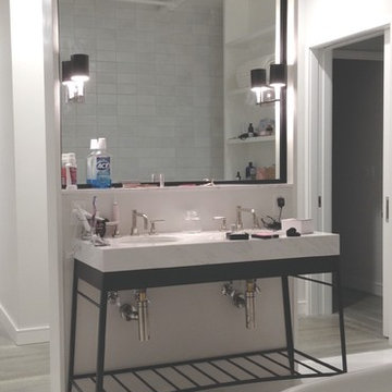
Before and After sequence. Custom vanity! Island design for the vanity is very luxurious. Almost complete. 90% construction - unpacking and almost moved in. Final photos pending.
 Lim Design Studio, Inc
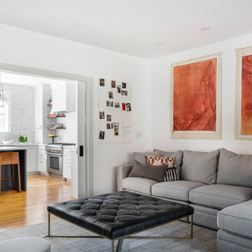
Located just outside of Boston, this home was built from the ground up to serve a bustling working family. The home contains a work/office space for client visits and an asymmetrical floor plan that distinguishes itself from typical New England vernacular. The entry sequence creates an enfilade to the main living spaces of the house. Smaller programmatic spaces such as the indoor pool, office, mud room, and staircase are kept to the perimeter of the main living areas on the lower floor. Upstairs, the stair ends at a reading nook and crafts area for children. Project featured in The Boston Globe. Completed in 2020. Photography by Sabrina Cole Quinn.
 Woolems Luxury Builders
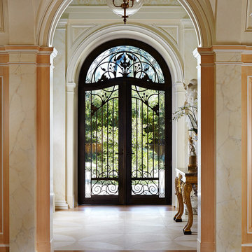
New 2-story residence consisting of; kitchen, breakfast room, laundry room, butler’s pantry, wine room, living room, dining room, study, 4 guest bedroom and master suite. Exquisite custom fabricated, sequenced and book-matched marble, granite and onyx, walnut wood flooring with stone cabochons, bronze frame exterior doors to the water view, custom interior woodwork and cabinetry, mahogany windows and exterior doors, teak shutters, custom carved and stenciled exterior wood ceilings, custom fabricated plaster molding trim and groin vaults.
 Joshua Zinder Architecture + Design
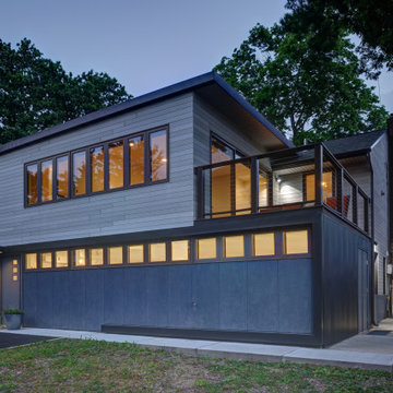
A married pair of artists sought to expand and adapt this salt box-style house into a functional, attractive live/work space while retaining certain nostalgic elements (this was the wife’s childhood home.) Their objectives included adding on a dining room; expanding the master bedroom and downstairs studio spaces; maximizing natural light; and continuing occupancy throughout.
The through-block property is sited between a high-traffic road and another that provides vehicular access to the house. The architect’s solution effectively reversed the entry sequence. The studio elevation, with the master bedroom, dining room and terrace above, is now the formal front of the house, while the former front entrance from the busy road is now secondary.
Today, visitors arrive at the new primary entrance, greeted by a façade suggesting a simple folded ribbon: metal panels that wrap the expanded master bedroom and the new terrace.
Recladding with fiber cement composite rainscreen (a choice inspired by the clients’ travels in Finland) unifies the addition with the existing. The new dining room enjoys views of Meadowlands sunsets through the 12-foot length of full-height glass and the cable rails of the new deck outside. The L-shaped artist studio/office downstairs now gains light from transom-height windows running the width of the house.
 SCJ Studio Landscape Architecture
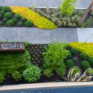
This newly constructed home was in need of an outdoor living space and streetscape in a matching contemporary Northwest style. Our studio composed a landscape with an improved entry sequence, balancing the need for personal privacy alongside a distinctive public face. A courtyard oasis with a new deck is enclosed by warm wooden fencing set on top of the contrasting raw texture of a gabion retaining wall that acts as a backdrop to bold streetscape plantings.
 TRE Architecture
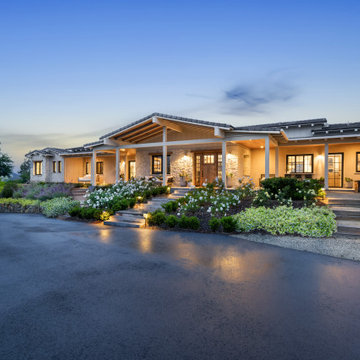
Situated on a gently sloping site in the heart of the Rancho Santa Fe Covenant, the El Camino del Norte Residence takes cues from the structural clarity and purposeful simplicity of California's mid-century modern architecture. Clean lines and generous overhangs frame views of the landscape while allowing the site's natural topography to shape the sequence of spaces and the home to perform naturally with Southern California's light and climate. The design reflects the client's active engagement with the outdoors, where inside and outside are in constant conversation.
Design Challenges
Rancho Santa Fe Art Jury approval - Material and massing refinements that honored covenant guidelines
Grade change - Strategic site planning that engages the sloping topography as an integral part of the design rather than a constraint to overcome.
Rancho Santa Fe Fire safety compliance - Material selection and site planning that absorbed code requirements into the architecture
 Roka Projects Inc
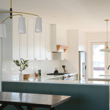
Full home renovation of a Burnaby single-family home completed over nine months. The project involved a complete structural rework of the main floor to create an open-concept layout, including steel beam installation to remove load-bearing walls, a full kitchen renovation, 4.5 bathroom renovations, new HVAC throughout, and structural repairs across the home.
The scale and complexity of this project required careful sequencing — structural work, mechanical systems, and finish trades coordinated across an occupied neighbourhood site over a nine-month build. Every scope was managed under one process by Roka Projects, from engineer coordination and permit applications through to final finishes. Photography by Tracey Ayton Photography, interiors by JJ Interiors.
 Shuler Architecture
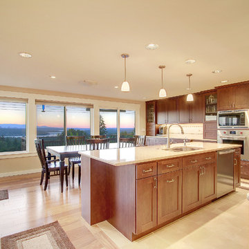
This classic 1970's rambler was purchased by our clients as their 'forever' retirement home and as a gathering place for their large, extended family. Situated on a large, verdant lot, the house was burdened with extremely dated finishes and poorly conceived spaces. These flaws were more than offset by the overwhelming advantages of a single level plan and spectacular sunset views. Weighing their options, our clients executed their purchase fully intending to hire us to immediately remodel this structure for them.
Our first task was to open up this plan and give the house a fresh, contemporary look that emphasizes views toward Lake Washington and the Olympic Mountains in the distance. Our initial response was to recreate our favorite Great Room plan. This started with the elimination of a large, masonry fireplace awkwardly located in the middle of the plan and to then tear out all the walls. We then flipped the Kitchen and Dining Room and inserted a walk-in pantry between the Garage and new Kitchen location.
While our clients' initial intention was to execute a simple Kitchen remodel, the project scope grew during the design phase. We convinced them that the original ill-conceived entry needed a make-over as well as both bathrooms on the main level. Now, instead of an entry sequence that looks like an afterthought, there is a formal court on axis with an entry art wall that arrests views before moving into the heart of the plan. The master suite was updated by sliding the wall between the bedroom and Great Room into the family area and then placing closets along this wall - in essence, using these closets as an acoustical buffer between the Master Suite and the Great Room. Moving these closets then freed up space for a 5-piece master bath, a more efficient hall bath and a stacking washer/dryer in a closet at the top of the stairs.
 3 Oak Wood Flooring
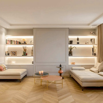
Each plank is 600mm in height, a sleek 90mm in width, and a robust 16mm in thickness, and interlocks in a harmonious sequence, creating a mesmerizing chevron pattern that guides the eye through the luxurious expanse of the room. In this project, our commitment to quality and attention to detail shines through the seamless integration of flooring with the home's chic and sophisticated design palette.
Light washes over the natural grain of the wood, bringing out the rich textures and warmth that only genuine oak can offer. It's the perfect foundation for a range of interior styles—from the classic to the modern. This installation reflects our dedication to providing not just a product, but a crucial element of a home's soul.
 The Cultural Landscape Foundation
Saturday, March 28, 1:00 to 2:30pm
Register Online: https://tclf.org/event/garden-dialogues-florida-gulf-coast-2015
Aquadisia by David Young of DWY Landscape Architects, with David Lowe, Interior Designer, David K. Lowe Interior Design
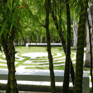
Situated on a barrier island overlooking the Gulf of Mexico, this landscape is a dazzling mix of geometric form, carefully manicured lawns and the shaggy manes of numerous bamboo trees. The landscape architects collaborated closely with the owner to create a garden that takes full advantage of the site’s location, views and climate. The site’s sequence of designed spaces carefully balances large but simple geometric shapes with a well calibrated plant palette. Entry to the house is gained via a concrete walkway that passes over a water garden and through a glass cube flanked by marble Foo Dogs. The water garden continues to a glass-enclosed lower-level where a waterwall provides the perfect backdrop for a beachside spa and fire pit. The experience of this exquisite landscape is not limited to the ground; a wooden terrace allows full view of the Gulf and a new spiral glass staircase leads to a crow’s nest overlooking the property.
photo by SRQ360 Photography
 Eilering Architecture
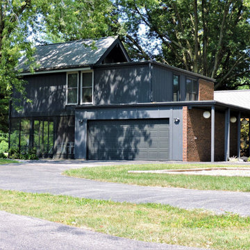
A reduced footprint, sustainable home with a fantastic entry sequence. Flat roofs accentuated with clerestory pitched roofs. A unique blend of wood siding, brick, and shingle.
 One World Architecture - California
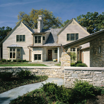
A sequence of specifically designed moments and views were created to bring the guest into the home, allowing the experience of the home to begin from the moment one steps onto the property.
 Studio TOOP
design: Studio TOOP, 2008
location: Driebergen, NL
status: built in 2008, Tuinvreugd
photo: Jolanthe Lalkens, 2010
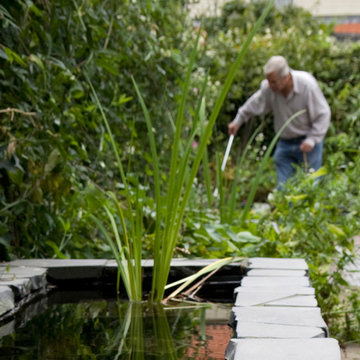
A letter from the town of Driebergen explaining that there were subsidies available if residents wanted to build a rainwater catchment in their garden was the impulse necessary for Ben and Ine to finally redo their garden. About to start retirement they had more time to garden and enjoy being at home. Ine hd been a gardener for years and looked for the opportunity to spend more time on the hobby and Ben was already working out the technical details of the rainwater catchment and ponds.
Studio TOOP helped them translate their wishes and interests into a clear design that made smart use of the small elevation change in the garden. Sequences of steps and raised beds separate each section of the garden. Three lines - a row of three ponds, a row of crab apple trees and a rose covered pergola - emphasize the gardens length. Each pond is 15 cm lower than the next, allowing the water to flows from one to another, and then to another lower lying pond at the end of the pergola. Under a lid that works as a bench integrated into two of the raised beds are the rainwater tanks.
 Winder Gibson Architects
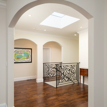
This project is the remaking and reimagining of an historically-rated storybook house in one of San Francisco’s first planned neighborhoods for a 21st century family. Strange half-levels and poor previous remodels were removed. The historic materials and forms of the house were studied and extended while creating a flowing sequence of spaces and a massive new kitchen. White painted cabinets, arched openings and wrought iron railings pull the house together.
 Woolems Luxury Builders
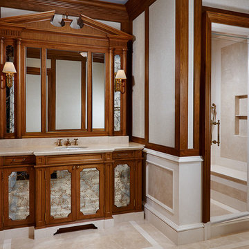
New 2-story residence consisting of; kitchen, breakfast room, laundry room, butler’s pantry, wine room, living room, dining room, study, 4 guest bedroom and master suite. Exquisite custom fabricated, sequenced and book-matched marble, granite and onyx, walnut wood flooring with stone cabochons, bronze frame exterior doors to the water view, custom interior woodwork and cabinetry, mahogany windows and exterior doors, teak shutters, custom carved and stenciled exterior wood ceilings, custom fabricated plaster molding trim and groin vaults.
 George Ocampo
Upper Valley Estate Curb Appeal – El Paso, Texas
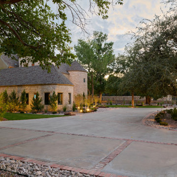
This curb appeal transformation was conceived as a deliberate sequence—an arrival experience where architecture, landscape, and lighting work together as one. Every element was designed to honor the home’s stone construction, turreted forms, and Old World character while responding precisely to the Upper Valley climate and lifestyle.
By day, the experience is grounded and composed. Brick-edged concrete drives establish order and permanence, guiding movement through the property with clarity and intention. Natural stone walls and columns anchor the architecture, while layered gravel beds, drought-tolerant plantings, and manicured turf soften transitions and connect the home to its desert setting. Mature trees were preserved and carefully integrated, providing scale, shade, and a sense of continuity.
As afternoon shifts toward sunset, the materials begin to speak differently. Stone warms, textures deepen, and sightlines subtly draw the eye toward the front entry. The landscape narrows the focus, creating a moment of pause before arrival—calm, quiet, and refined.
At night, the design reveals its final layer. Low-voltage lighting is integrated with precision, washing stone surfaces, tracing architectural curves, and uplighting specimen trees to create depth without glare. The drive, walkways, and entry feel safe, legible, and inviting, while the home itself glows with a restrained elegance. Coming home after dark feels intentional—protected, welcoming, and unmistakably yours.
What was created is more than curb appeal. It is a cohesive design-build solution where nothing is ornamental without purpose and nothing is built without intention. A daily experience of arrival that reflects craftsmanship, care, and the enduring character of the Upper Valley.
 Saikley Architects
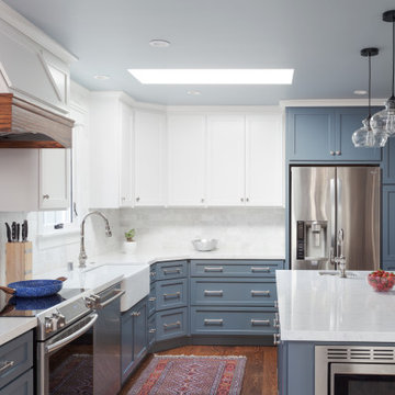
This house was a very small mid-century bungalow with previous additions that resulted in a large but chaotic layout. The owners wanted to convert the house to a super-efficient, and charming Craftsman-style, 6 bedroom home for their large family and work at home.
We achieved the space needs by moving a few walls for a more efficient, organized layout, setting up spaces for overlapping uses, and making a small upstairs addition. Every bit of square footage was optimized to meet the goals of the project without making the house huge or adding unnecessary cost.
Much thought was given to the entry sequence near the front door. A large flow-through mudroom with storage for each family member, and adjacent laundry, make it easy for children to be taught to keep their things organized and to contribute to household chores. A mail station and central home admin area at the mudroom help keep clutter down at other areas and minimize home management tasks. A garage door near the kitchen gives quick access to bulk items.
The existing house had too much view to the street from the living room through large corner windows, and too little entry transition, to the extent that the family did not feel comfortable using the living room much without shades drawn. We raised the window sills and brought the new windows in from the corner of the house, allowing plenty of light while protecting privacy and a sense of enclosure in the living room. We enlarged the front porch to create a more graceful transition from the public to private space. We located the front door so that the circulation from entry into the house would allow for furnishing the living room with a sitting circle that is not intruded upon by people walking through the room.
Sight lines through the living spaces were an important consideration in the design. The owners wanted discreet spaces for living room, kitchen, dining and family room, but also wanted the living spaces to feel connected and to be able to easily watch their children. Being able to see the children playing in the yard while getting things done inside the house was also important. While largely working with the existing structure, we opened walls and rearranged the use of spaces to make a series of connected living spaces with long views through them.
The character of the remodeled house is a contemporary Craftsman with classic materials and cool, consistent colors. A few arches echo through the house to frame spaces and soften the feeling of the rooms.
Photography: Kurt Manley
https://saikleyarchitects.com/portfolio/bungalow-expansion/
66