
Search results for "Setting process" in Home Design Ideas

 APlus Interior Design & Remodeling
After purchasing their home this San Clemente couple began looking to have their dated kitchen refaced. Having explored other remodeling companies they hired APlus to build their dream kitchen. APlus offers competitive pricing which made the upgrade to new custom cabinets an easy choice. This thirteen year old kitchen was updated to Maple cabinets in a Swiss Coffee finish. They chose the Shaker doors and some of the upper cabinet doors are accented with seeded glass panels. APlus interior designers’ space planned the kitchen to incorporate a kitchen nook for the family of five. Although it was difficult to live without a kitchen, especially with three kids under the age of seven, the process was well worth having the kitchen of their dreams.
 Make A Dream Home
In this stunning image, you'll discover a Fully Refinished Standing Shower designed with the highest quality Carrara marble and adorned with contemporary matte gold fixtures. The shower is an embodiment of sophistication and luxury, serving as a prime example of modern bathroom elegance.
The focal point of the image is the grand, spacious shower area. Crafted from world-renowned Carrara marble, its delicate veining adds a distinct, regal look. This opulent white marble, with subtle gray veins throughout, creates a serene, spa-like ambiance that encourages relaxation and rejuvenation.
The shower space is highlighted by a set of matte gold fixtures that exude a sense of understated luxury. These fixtures include a minimalist, high-end rain shower head, a sleek shower wand, and chic controls that add a touch of modern opulence. The brilliance of the gold beautifully contrasts the marble, illuminating the shower with a warm glow.
To the side, a built-in marble bench is perfect for relaxation, featuring the same Carrara marble construction. The bench is paired with recessed shelves, seamlessly integrated into the shower wall, offering a convenient place for bath essentials. These fixtures share the same matte gold accents, perfectly tying together the shower's design elements.
The image also captures the clean lines and smooth curves of the shower, the result of the meticulous refinishing process. This process amplifies the marble's innate allure, resulting in a polished, refined appearance that exudes an air of sophistication.
A frameless glass partition elegantly encloses the shower area, allowing clear visibility of the shower's interior and the stunning Carrara marble.
This image of the Luxury Carrara Marble Fully Refinished Standing Shower with Matte Gold Fixtures encapsulates the perfect fusion of luxury, comfort, and style. It invites viewers to envision transforming their bathroom into a private, spa-like sanctuary of indulgence and relaxation.

 MIG Furniture Design, Inc.
Modern Italian Living Room Set 01 Palmira by LC Mobili. This super cool italian dining & living room furniture collection will turn your entire home into a beautiful and functionally organized place. Palmira line features very modern design with a bit contemporary flavor, making this furniture collection timeless. The Palmira Living Room Set 01 consists of Large TV Stand (W75.2") and Vitrine. Large tv stand features two doors, providing lots of internal hidden storage space for your DVDs, while its spacious open area gives enough space for your media electronic devices with remote-control. The open space is divided with a shelf. Vitrine is also great for living room, combining lots of hidden and and exposed storage opportunities and even featuring two drawers. However, except these pieces, the Palmira line offers: Sideboard, Highboard, Vitrine, TV Stand (two sizes), Dining Table (three sizes), Coffee Table and even Wall Unit Composition. Feel free adding extra unit, making this living room set even more functional!
MATERIAL/CONSTRUCTION:
E1-Class ecological panels, which are produced exclusively trough a wood recycling production process
Structure panels - 16mm (0.63") thick / Front doors - 22mm (0.87") thick
Soft-closing hardware
Unassembled, Ready-To-Assemble
The starting price is for the Palmira Living Room Set 01. (Includes: Large TV Stand and Vitrine).
Dimensions:
Small TV Stand: W55" x D20" x H17.7"
Large TV Stand: W75.2" x D20" x H17.7"
Vitrine: W48.5" x D20" x H67"
Highboard: W47" x D20" x H55"
Sideboard: W82.7" x D20" x H32.7"
Coffee Table: W34" x D34" x H15.8"
Dining Table: W65" x D34.6" x H30"
Dining Table: W74.5" x D34.6" x H30"
Extendable Dining Table: W55"-->86.5" x D34.6" x H30"
Wall Unit Composition: W110" x D17" x H81"
Find the right local pro for your project

 Hearthstone Inc
Richard Herman is in the hospitality business and owns several upscale hotels in Florida and in other states as well as cattle ranches in both Florida and Missouri. Their farm in Ocala is by farm their most unique. The property serves as a 4-H demonstration project for the purpose of children’s education. They have been working with the Academy Prep of St. Pete which is dedicated to inner-city youths that are selected on the basis of need and achievement. Wife Diane spends her time on the farm raising Gypsy Vanners, a diminutive draft horse named after the job they did in Eastern Europe, pulling the wagons (vans) for gypsies that wandered across the continent. On the Ocala farm, there are several mules with a unique profession.
Richard had visited the Hearthstone display at a Log & Timber Home Shows at the Orlando Convention Center many years ago. He was impressed that Hearthstone had stayed in touch with him over the years by mailings, invitations to shows, and periodic phone calls. When the time came to start serious consideration of the design of barn, Hearthstone responded promptly and professionally to Richard and Diane’s requests for information and a review of their ideas for their barn, which would serve as the centerpiece for their new farm.
They wanted a multipurpose facility that could accommodate an educational environment and a large hall suitable for the fundraising events for his charities. Richard wanted a barn that reflected the look and feel of barns built at the dawn of the 20th century. Besides the rustic chicken houses and vegetable gardens, they have completely renovated a 1020’s era farmhouse to be as historically correct as possible and serves as the entry to the farm.
“They very careful to feel us out, get comfortable with our capabilities, and be convinced that we could perform as promised,” said Project Manager John Ricketson of Hearthstone.
Design Process
There were some initial drawings that gave us a start on the basic shape and size of the barn. From there, it was a process of narrowing down the uses of each area and the spans that could be achieved. The barn was going to have the traditional “board & batten” exterior siding and a metal roof. There is a cantilevered ‘hay hood” on the north gable end above the large sliding barn doors that open into the foyer and horse stalls. The wings house a combination of areas, beginning with the large restrooms to accommodate crowds for events. Other parts of the wings have garage areas for the farm vehicles, feed room, tack room, wash rack, storage, offices, and smaller restrooms.
Keeping with the look and feel of the turn of the century, Hearthstone developed a process for giving the timbers a surface texture that mimicked the circular cuts of timbers that had just come out of an old sawmill. This was easier said than done. Randy Giles guided his millwright (Wolfgang) in designing a machine that would do this effectively.
The barn was delivered in October of 2014 and was erected over the course of two weeks, thanks to a hardworking crew (Eric Foster) and near-perfect weather. After the Hearthstone crew completed the erection and roof dry-in, it was time for the local carpenters to step up and install some light conventional framing on the gable ends before applying the roof fascia and exterior board & batten siding. Next came the big sliding barn doors, plumbing, electrical, heating, and cooling. Large rustic fixtures were hung from the great hall roof timbers.
Exterior
The board & batten siding was cypress and allowed to turn color naturally as rain hit it and the sun started working on it with UV rays. This method causes a much grayer look closer to the ground and less so where the roof overhang provides protection. The North end has some large limestone boulders and planters arranged around the pad with tall pampas grass. The planters provide casual seating before events and during outside receptions. The entire area was sodded with lush St. Augustine grass and split rail fences were added to enclose the barn area. The corrugated metal roof was a special order material that immediately rusted after being exposed to moisture. The layer of rust protects the metal from the elements.
Interior
The board & batten theme was carried throughout most of the interior with the timbers left natural to show off the circular saw texture. All of the tongue & groove decking was shipped in advance to allow the local painter to pre-stain it with a dark brown transparent stain that is a beautiful background to the light color Eastern White Pine timbers.
“Everything was unique in this project” said Project Manager John Ricketson. “The setting on a small demonstration farm close to Ocala, the multipurpose design, the circular saw texture on the timbers.”
The Hermans are very proud of their farm’s outcome. Richard sent a note to Randy Giles, owner of Hearthstone: “The Barn is fantastic, not a single problem, period. Next month, we have Jo Dee Messina coming in to help with a fundraiser for a local center for abused kids. Folks love the farm, ...... but that barn gets all of the attention. I would encourage you to use me as a reference for your sales team, feel free to extend my cell phone to any prospective purchasers.”
 The Olde Mill - Box Beams, Mantels & Shelves
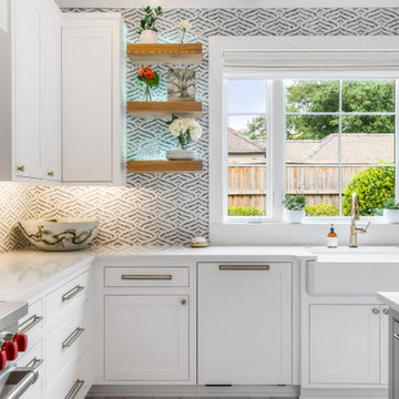
This gorgeous Bocage home was originally too compartmentalized for entertaining guests. The kitchen itself and the opening between the kitchen and family area were both small, making the space feel closed in and cut off from the rest of the house. Our goal was to open the space as much as possible and give the clients everything they needed to entertain. Early in the design process, we decided it was necessary to add square footage to give these clients their dream kitchen. Adding this space allowed for a large kitchen island, tons of cabinet storage, a walk-in pantry, half bath and small office, all accessible from the focal kitchen. Flanking the kitchen window are sets of floating shelves from The Olde Mill. The hollow floating shelf design allowed for color-changing LED lights to be set into the shelves, allowing for a change of mood at the press of a button. We were able to widen the opening between the kitchen and family room to allow the spaces to flow together. The doorway was framed with reclaimed wood posts and headers, also from The Olde Mill. After the expansion, a structural beam was added to support the second floor, and the clients decided to cover it with a beautiful reclaimed wood beam as well. To wrap the laminated structural beam, this beam was made 22″ wide. All of these elements gave the clients a large, show-stopping kitchen with tons of storage and plenty of room to entertain family and friends.
Space Planning by Ourso Designs
Designer: Rachel Cannon Limited
Builder/Remodeler: Bertell Cook Construction
Beams, Mantel, and Floating Shelves: The Olde Mill
Photos: Collin Richie Photography
 Glenview Haus – Custom Doors & Wine Cellars
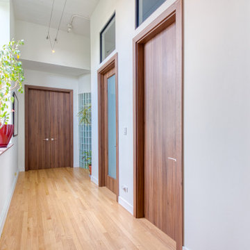
We were pleased to be brought in on this penthouse renovation in the heart of Bucktown, Chicago. The goal of this project was to revamp the space and add an additional touch of modern design through the use of warm Walnut Eco-Veneer doors. With warm tones, we were able to play on the traditional feel of the space, yet bring in modern touches with the magnetic latch hardware, concealed hinges, and flush designs. The seamlessly matching frames give an added touch of style, making these door units appear intentional and luxe. Noticed by every individual who walks through space, our Modern Interior doors are made to be an additional form of design that should complement and elevate your space.
Whenever we encounter a renovation project, we often anticipate certain obstacles. Existing design elements (flooring, wall thickness, building codes, etc.) and limited budgets can usually be tough to overcome. However, with our Modern Interior door package, we can provide flexible pricing and flexible styles and finishes that are guaranteed to complement any residence. Each door line has several different complementary designs to choose from, which can add variation throughout your home, while still providing a cohesive style that creates a meaningful flow.
Our Modern Interior door line comes equipped with everything you need for a no-fuss and effortless door buying process. One set price includes the door slab with desired solid wood veneer in finish of your choice, a matching adjustable frame, concealed hinges, and a magnetic lever set. Each door style provides a top of the line product and can exceed any and all expectations you might have. Our Modern Interior doors can provide an updated feel to your home, whether it is modern, contemporary or traditional. All elements of our Modern Interior Doors are geared towards updating your space and adding a luxury feel at an affordable price point. Glenview Haus has a mission to provide all design-savvy individuals with design elements that are highly coveted and unique to your home. Why blend in when you can stand out?
 Tile Doctor Ltd
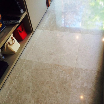
I was recently engaged to refresh the Limestone tiled floor at a house in St. John’s Wood, which is a very affluent area and apparently has the 5th most expensive postcode in London so as you can imagine this was a very expensive floor. The client had requested an improvement condition of the Limestone tiles in the living room and a thorough clean, polishing and seal was required. Over time, the floor in this busy living room – which was also used as a play area for young children – had become dirty and certainly worse for wear with all the use it had been getting. So, I set about my work to get this floor back to looking its best.
Cleaning and burnishing a Limestone floor
My initial task before beginning the cleaning process was to remove any furniture (as well as toys) from the room so I would have a clear area to work in. I then applied a layer of Tile Doctor Pro-Clean cleaner, diluted with water, to the floor. Pro-Clean is also suitable for use on other natural stone floors such as Slate, Granite and Travertine.
After leaving the solution to dwell for a period of a few minutes, I began to scrub the floor with a stiff hand brush. Whilst helping to remove a lot of the built up dirt on the surface of the tiles, the product also stripped off the old sealer and polish. Following this, I paid special attention to the dirty grout lines, cleaning them with Tile Doctor Oxy-Pro, a powerful, high-alkaline cleaner.
After completing the cleaning, I rinsed the floor with clean water to remove any excess cleaning products. I then began to burnish the floor using Tile Doctor Diamond encrusted burnishing pads. This was done in four steps, as I used four different pads (coarse, medium, fine and very fine) rinsing the floor with water between each pad. I would recommend using this setup of four pads for restoring the appearance of polished stone floors; you starting with a coarse pad and the gradually work your way up to the very fine pad achieving a high polish finish in the process. I finished of the process with a quick rinse and a buffing pad to give the floor a final polish before I commenced the sealing.
Sealing a Limestone floor
My choice of sealer was Tile Doctor Colour Grow, which is specifically designed to not only provide durable surface protection, but also to intensify the colour of the tiles. The sealer penetrates deep into the pores of the stone, providing water resistance and long-term protection from ingrained dirt and stains. As you can see from the photos, the sealer really helped to accentuate the fantastic natural colours in the Limestone.
My client was very pleased with the final result, and was amazed by how quickly I had been able to improve the state of her floor which, with a colourful and shiny finish, has really brightened up the living room.
Sponsored
Columbus, OH
Free consultation for landscape design!

Peabody Landscape Group
Columbus' Reliable Landscape Design & Contracting

 Advance Design Studio, Ltd.
After six years of living in their Huntley IL home, Chris and Meghan were tired of their dark, dingy, outdated kitchen and it was finally time for a long-anticipated change. “The kitchen is the place where we live, it’s where we do everything,” Meghan said. “It was important that it be a space where we wanted to be.” Meghan loves cooking and enjoys including their girls in healthy meal prepping, this led them to want a brighter, more enjoyable kitchen with increased functionality and improved storage.
For Chris especially, the laundry room was an entirely dysfunctional eyesore. “We had a washer and a dryer, but it was all kind-of cobbled together!” Chris said. “There were always laundry piles everywhere, we weren’t really sure what we wanted to do in there, but it was time for us to make a change.” The mess of the space was stressful every time they walked in the door from the garage each day. Kids’ backpacks and shoes piled up haphazardly in the makeshift boot-bench closet left the family feeling disorganized and stressed. They needed space for folding clothes and locker cubbies to help keep the family organized.
Having known Christine and Todd in the Huntley community for years, Chris and Meghan were familiar with their work. “We already trusted them personally and having seen their projects for years we knew they did top notch work. After we reviewed the initial round of designs, we knew that hiring them was definitely the right choice,” Meghan and Chris said. Although Chris had done a lot of work in their home himself, the kitchen and laundry room renovation was such a large undertaking that he didn’t want to steal time away from his family to spend what would surely be many long weekends doing the job himself. “That would not have been a wise choice for us,” Chris laughed.
“Our designer, Michelle was very, very, easy to work with; anything we wanted to see or weren’t sure about, she went above and beyond to make this easy for us. She was easy to get hold of and always quick to respond,” the couple said. Michelle pulled ideas that mirrored the couple’s taste and style and was adept at directing the couple to limited choices that didn’t overwhelm them and kept the process moving. “I have a hard time making decisions. Michelle made the decision-making process so easy. I loved how she listened to what I liked and then presented three great options for me to choose from,” Meghan said.
The main objectives for the kitchen were better storage solutions, they wanted the space to reflect their lifestyle and taste, and they wanted it to last for years with low maintenance. One of the first steps in creating a more functional kitchen was relocating the refrigerator, creating an improved workflow for the busy family.
“We didn’t know that we could even move the refrigerator to a new location where it is now, that was something that we never would have thought of,” Chris said. “The new refrigerator location makes the kitchen feel so much bigger. We didn’t add any space, but our whole kitchen with the new design just seems like it’s so much larger than before!” Meghan said.
The perimeter mist colored cabinets helped warm and brighten the entire room, while the graphite colored cabinets on the island added contrast. Using this fresh, clean color palette satisfied the couple’s desire for a bright space that was the exact opposite of what they had before. Organization accessories were also added to the cabinets such as a spice drawer tray and roll outs to create hidden convenience.
“I absolutely love the hidden spices – it makes cooking so much more enjoyable!” Chris said. “And all the pull outs, and the double trash bin, who would think you could get so excited about organization!” the couple said in unison.
One thing they hated in their original kitchen was how dark the space felt. Added lighting on the ceiling with the new light fixtures combined with the lighter cabinetry colors throughout solved this problem. “Our new kitchen has this warm, almost cozy feeling that our old kitchen never had, it’s just a space that I love spending my time in now,” Meghan said. The light airy feeling was accentuated with the use of floating white shelves on either side of the decorative range hood. “We have so much cabinetry space, the new design is amazing we actually have more storage space than we will ever need,” Meghan said.
The island was extended to create more work surface and added space for stool seating. “The new island changes how we live. Now the kids can be in the kitchen with us, doing homework, eating breakfast, and the three of us have special dinners there when Chris is working late,” Meghan said.
The Carrara Marmi Quartz countertops were chosen because they are, not only beautiful, but are made from hard-working material that doesn’t require maintenance. The white subway tile backsplash that wraps to the ceiling behind the focal point cooktop range/hood compliments the crisp white countertops perfectly, while brushed brass hardware and light fixtures keep the design fresh and new.
The couple had a few fears at the beginning of the project, as most homeowners do. Their biggest fear was being out of their kitchen and laundry room for an extended time. The crew made it very easy for the family to work in a limited space keeping the washer and dryer hooked up the majority of the time, and also getting appliances working with minimal downtime.
“They above and beyond accommodated us to get us through the process,” Meghan said. “They did a great job making sure we were as comfortable as possible throughout the process,” Chris added.
“Our project manager DJ did a great job. He was very good at updating us on schedule changes, getting guys in as quickly as possible. Everyone that stepped in the house was nice and did great work,” said Chris. They thought Advance’s carpenter was phenomenal and were impressed when he took a conceptual idea from a photograph and worked with designer Michelle to create a one of a kind range/hood that has become the topic of conversation with friends and family who visit the new kitchen. “He was in our house literally every day for several weeks. He was easy to work with and good at what he did,” Meghan and Chris said.
The focal point of the kitchen; a hand-crafted, custom-built ventilation hood was clad with handpicked reclaimed barnwood. Advance Design’s carpenter built the framework and the cladding to create a one-of-a-kind design element that the couple loves.
“I think it was especially fun for him to create something unique from scratch, showcasing his talent in this area,” Meghan said. “I love that my kitchen is not like everyone else’s. I got to pick out the wood on my hood and watch it being built and was able to choose what pieces of wood went where on it. It’s totally unique.”
Red Oak flooring was toothed-in throughout the kitchen and the rest of the first floor anywhere changes were made. Then the whole floor was refinished to tone down the orange undertones in the existing floor stain, ultimately changing the color complexion of the entire first floor. The result is a completely new feeling to the entire home.
Renovating the laundry room was extremely important to Meghan and Chris, but they had trouble visualizing what the possibilities were for the seemingly small space. Michelle produced beautiful 3D illustrations that helped them envision the space in a whole new way.
“I must have told Michelle 100 times that I am a visual person, seeing the designs in 3D made it so easy to make decisions and see what we could really do with our space,” Meghan said.
A dividing wall and doorway were removed between the existing laundry room and hallway formerly containing a coat closet, providing space to design specialized graphite colored cabinetry matching the kitchen island to house custom storage cubbies for each family member. Adding the tall utility cabinetry in the new laundry area helped solve the storage issue, tucking away cleaning supplies, household items, and even the cat got its own cubby.
“I love how everything is now hidden in its own space. I can’t tell you how much I hated coming home and seeing everything sitting around on counters,” Chris said.
Electrical outlets were planned for the inside of utility cabinets, so devices could charge in hidden locations. Stacking the washer and dryer allowed for wider countertop space to provide a folding area and a special space for clothes to hang. “The way I do laundry has been completely transformed! I can actually fold clothes and hang them now right out of the washer and dryer,” Meghan said.
“The end result in the kitchen and the laundry/mud room was an updated light and bright space, with a smarter work flow that better meets the needs of this family,” Michelle said.
“I would totally recommend Advance Design,” Meghan said. “Sometimes I sit and just look at my kitchen and laundry room and think ‘Wow, I can’t believe I get to live here!’ It’s an understatement to say we love our new space.”

 TOC design & construction inc.
Formal Dining in a relax setting by Tania Scardellato – TOC design
Remodeling your home can be a lengthy and time consuming process, especially if you opt to renovate the entire house rather than just one room. However, even just by updating the decor in your home you can create a beautiful and fresh looking space. One space that is particularly easy to overhaul is the dining room. This is one of the smaller rooms in the home and contains a minimal amount of furniture, making the remodeling process quick and simple.
An essential factor of dining room design is the color scheme of this space. When searching for the best paint colors for a dining room you should keep a few things in mind, including your design, the size of the room, and the décor of the rest of your house. Because it tends to be smaller than most rooms in the home you do not want to choose a really dark or overwhelming color like black or bright fuchsia. Rather save these hues as accents in dark wood furniture, curtains, pictures, and other wall art. In this dining room we kept the colors neutral and added more accents to hi-gloss moldings, highlighting the architecture of the space and creating space definition with a TOUCH OF CLASS - TOC
When it comes to lighting for the dining room you have a lot of options such as chandeliers or wall sconces, however natural light is always best. If you already have windows in this space try to keep them uncovered or use sheer fabric curtains to allow optimum illumination in throughout the day. If your dining room does not have windows there are other options available that can help to brighten and open up this area
Accessorizing your dining room with the right accents is very important to tie in all aspects of the design. For example, an elegant table centerpiece can make the dining space feel more homey and relaxed. You can accent a kitchen island or dining table with a stunning vase of festive flowers, ornamental fruits and vegetables, or a basket of decorative glass ornaments. However, try to keep the ornamentation to a minimum to prevent cluttering the countertops. Sometimes the table itself can be an accent piece. The dining room creates an elegant focal point that contains different colors, textures, and patterns. Similarly, leather chairs surrounding solid oak dining room furniture add the element of texture and color while creating a rustic, old world atmosphere. Regardless of the look you are trying to obtain, or the room in which you are redecorating, we can help create the style custom to suit your needs

 TKS Design Group
Free ebook, Creating the Ideal Kitchen. DOWNLOAD NOW
The Klimala’s and their three kids are no strangers to moving, this being their fifth house in the same town over the 20-year period they have lived there. “It must be the 7-year itch, because every seven years, we seem to find ourselves antsy for a new project or a new environment. I think part of it is being a designer, I see my own taste evolve and I want my environment to reflect that. Having easy access to wonderful tradesmen and a knowledge of the process makes it that much easier”.
This time, Klimala’s fell in love with a somewhat unlikely candidate. The 1950’s ranch turned cape cod was a bit of a mutt, but it’s location 5 minutes from their design studio and backing up to the high school where their kids can roll out of bed and walk to school, coupled with the charm of its location on a private road and lush landscaping made it an appealing choice for them.
“The bones of the house were really charming. It was typical 1,500 square foot ranch that at some point someone added a second floor to. Its sloped roofline and dormered bedrooms gave it some charm.” With the help of architect Maureen McHugh, Klimala’s gutted and reworked the layout to make the house work for them. An open concept kitchen and dining room allows for more frequent casual family dinners and dinner parties that linger. A dingy 3-season room off the back of the original house was insulated, given a vaulted ceiling with skylights and now opens up to the kitchen. This room now houses an 8’ raw edge white oak dining table and functions as an informal dining room. “One of the challenges with these mid-century homes is the 8’ ceilings. I had to have at least one room that had a higher ceiling so that’s how we did it” states Klimala.
The kitchen features a 10’ island which houses a 5’0” Galley Sink. The Galley features two faucets, and double tiered rail system to which accessories such as cutting boards and stainless steel bowls can be added for ease of cooking. Across from the large sink is an induction cooktop. “My two teen daughters and I enjoy cooking, and the Galley and induction cooktop make it so easy.” A wall of tall cabinets features a full size refrigerator, freezer, double oven and built in coffeemaker. The area on the opposite end of the kitchen features a pantry with mirrored glass doors and a beverage center below.
The rest of the first floor features an entry way, a living room with views to the front yard’s lush landscaping, a family room where the family hangs out to watch TV, a back entry from the garage with a laundry room and mudroom area, one of the home’s four bedrooms and a full bath. There is a double sided fireplace between the family room and living room. The home features pops of color from the living room’s peach grass cloth to purple painted wall in the family room. “I’m definitely a traditionalist at heart but because of the home’s Midcentury roots, I wanted to incorporate some of those elements into the furniture, lighting and accessories which also ended up being really fun. We are not formal people so I wanted a house that my kids would enjoy, have their friends over and feel comfortable.”
The second floor houses the master bedroom suite, two of the kids’ bedrooms and a back room nicknamed “the library” because it has turned into a quiet get away area where the girls can study or take a break from the rest of the family. The area was originally unfinished attic, and because the home was short on closet space, this Jack and Jill area off the girls’ bedrooms houses two large walk-in closets and a small sitting area with a makeup vanity. “The girls really wanted to keep the exposed brick of the fireplace that runs up the through the space, so that’s what we did, and I think they feel like they are in their own little loft space in the city when they are up there” says Klimala.
Designed by: Susan Klimala, CKD, CBD
Photography by: Carlos Vergara
For more information on kitchen and bath design ideas go to: www.kitchenstudio-ge.com
 Twelve Stones Designs, LLC
The owners of this kitchen had spent the money to upgrade the finishes in their kitchen upon building the home 12 years ago, but after living in the space for several years they realized how nonfunctional the layout really was. The (then) two preschool aged children had grown into busy, hungry teenagers with many friends who also liked to hang out at the house. So the family needed a more functional kitchen with better traffic flow, space for daily activities revolving around the kitchen at different times of day, and a kitchen that could accommodate cooking for and serving large groups. Furthermore, the dark, traditional finishes no longer reflected the homeowners’ style. They requested a brighter, more relaxed, coastal style that reflected their love of the seaside cities they like to visit.
Originally, the kitchen was U-shaped with a narrow island in the middle. The island created narrow aisles that bottle-necked at the dishwasher, refrigerator, and cooktop areas. There was a pass-through from the foyer into the kitchen, but the owners never liked that the pass-through was also located so close to the powder room. The awkward proximity was unappealing and made guests feel uncomfortable.
The kitchen’s storage was made up of lots of narrow cabinets, apothecary drawers, clipped corner units, and very few drawers. It lacked useful storage for the larger items the family used on a daily basis. And the kitchen’s only pantry was small closet that had only builder-grade, narrow shelving with no illumination to be able to see the contents inside.
Overall, the kitchen’s lighting plan was poorly executed. Only six recessed cans illuminated the entire kitchen and nook areas. The under cabinet lighting was not evenly distributed either. In fact, the builder had mis-placed the under cabinet lighting around the decorative pilasters which made for choppy, dark cubbies. Further, the builder didn’t include any lighting over the sink or the bar area, which meant whoever was doing the dishes was always in their own shadow. That, coupled with the steep overhang of the game room above made the bar area feel like a dim, cavernous space that wasn’t inviting or task oriented. The kitchen looked out into the main living space, but the raised bar and a narrow wall (which held the only large cabinet in the kitchen) created more of a barrier than a relationship to the living room or breakfast nook. In fact, one couldn’t even see the breakfast nook from the cooktop or sink areas due to its orientation. The raised bar top was too narrow to comfortably sit to either dine at or chat from due to the lack of knee space. The the homeowners confided that the kitchen felt more like a dark, dirty prison than place where the family, or their guests, wanted to gather and commune.
The clients' needs and desires were:
➢ to create a kitchen that would be a space the family loved to be in; to relate to the adjacent spaces all around, and to have better flow for entertaining large groups
➢ to remove the walls between the breakfast nook and living area and to be able to utilize the natural light from the windows in both those areas
➢ to incorporate a functional chopping block for prepping fresh food for home cooked meals, an island with a large sink and drain board, 2 pull out trash cans, and seating for at least the 2 teens to eat or do homework
➢ to design a kitchen and breakfast nook with an airy, coastal, relaxed vibe that blended with the rest of the house's coastal theme
➢ to integrate a layered lighting plan which would include ample general illumination, specific task lighting, decorative lighting, and lots of illuminated storage
➢ to design a kitchen with not only more storage for all the husband’s kitchen gadgets and collection of oils and spices, but smart storage, including a coffee/breakfast bar and a place to store and conceal the toaster oven and microwave
➢ to find a way to utilize the large open space between the kitchen, pantry area, and breakfast nook
Twelve Stones Designs achieved the owner's goals by:
➢ removing the walls between the kitchen and living room to allow the natural light to filter in from the adjacent rooms and to create a connection between the kitchen, nook, and living spaces for a sense of unity and communion
➢ removing the existing pantry and designing 3 large pantry style cabinets with LED tape lights and rollout drawers to house lots of kitchen appliances, gadgets, and tons of groceries. We also took the cabinets all the way up to the 9’ ceiling for additional storage for seasonal items and bulk storage.
➢ designing 2 islands - 1 with a gorgeous black walnut chopping block that houses a drawer for chopping and carving knives and a custom double pull out trash unit for point of use utilization - and 1 that houses the dishwasher, a large Blanco Gourmet sink with integrated drain board, woven baskets for fresh root vegetables and kitchen towels, plenty of drawer storage for kitchen items, and bar seating for up to 4 diners.
➢ closing off the space between the kitchen and the powder room to create a beautiful new private alcove for the powder room as well as adding some decorative storage. This also gave us space to include more tall storage near the new range for precision placement of the husband’s extensive oil and spice collection as well as a location for a combo-steam oven the wife wanted for baking and cooking healthy meals.
The project is enhanced functionally by:
➢ incorporated USB and standard receptacles for the kids’ laptops and phone charging in the large island
➢ designing the small island to include additional open shelving for items used on a daily basis such as a variety of bowls, plates, and colanders. This set up also works well for the husband who prefers to “plate” his dinners in restaurant-style fashion before presenting them to the table.
➢ the integration of specific storage units, such as double stacked cutlery drawers, a custom spice pull-out, a Kuerig coffee and tea pod drawer, and custom double stacked utensil drawers
➢ moving the refrigerator to the old oven location - this eliminated the bottle neck as well as created a better relationship to the eating table. It also utilizes the floor space between the pantry, nook, and kitchen
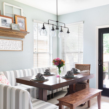
➢ creating a banquet style breakfast nook - this banquette seating not only doubles the amount of seating for large gatherings but it better utilizes the odd space between the kitchen and the previous nook area. It also helps to create a distinct pathway from the mudroom room through the pantry area, kitchen, nook, and living room.
➢ the coffee/breakfast bar area which includes the perfect location for the concealed microwave and toaster oven, convenient storage for the coffee pods and tea accoutrements. Roll-out drawers below also house the smoothie maker, hot water kettle, and a plethora of smoothie-making ingredients such as protein powders, smoothie additives, etc. Furthermore, the drawers below the Keurig house measuring utensil, cutlery, baking supplies and tupperware storage.
➢ incorporating lots of wide drawers and pullouts to accommodate large cookware.
➢ utilizing as much vertical space as possible by building storage to the ceiling which accommodates the family’s abundant amount of serving platters, baking sheets, bakeware, casserole dishes, and additional cutting boards.
The project is enhanced aesthetically by:
➢ new 5-piece Versailles pattern porcelain tile that now seamlessly joins the entire down stairs area together creating a bright, cohesiveness feeling instead of choppy separated spaces - it also adds a coastal feeling
➢ designing a cabinet to conceal the microwave and toaster oven
➢ the coastal influenced light fixtures over the nook table and island
➢ the sandy colors of the Langdon Cambria countertops. The swirling pattern and sparkling quartz pieces remind the homeowner of black-and-tan sandy beaches
➢ the striped banquet seating whose creamy white background and blue-green stripes were the inspiration for the cabinet and wall colors.
➢ All the interior doors were painted black to coordinate with the blacks and grays in the backsplash tile and countertop. This also adds a hint of tailored formality to an otherwise casual space.
➢ the use of WAC's Oculux small aperture LED units for the overhead lighting complimented with Diode LED strips for task lighting under the cabinets and inside the pantry and glass wall cabinets. All of the lighting applications are on separate dimmer switches.
Innovative uses of materials or construction methods by Realty Restoration LLC:
➢ Each 1-1/2” x 3” block of reclaimed end-grain black walnut that makes up the center island chopping block was hand milled and built in the shop. It was designed to look substantial and proportional to the surrounding elements, executed by creating the 4 inch tall top with a solid wood chamfered edge band.
➢ The metal doors on either side of the vent hood were also custom designed for this project and built in the Realty Restoration LLC shop. They are made 1x2, 11-gauge mild steel with ribbed glass. Weighing 60 lbs a piece, heavy duty cabinet hinges were added to support the weight of the door and keep them from sagging.
➢ Under-cabinet receptacles were added along the range wall in order to have a clean, uninterrupted backsplash.
Design obstacles to overcome:
➢ Because we were removing the demising walls between the kitchen and living room, we had to find a way to plumb and vent the new island. We did this by tunneling through the slab (the slab had post tension cables which prevented us from just trenching) to run a new wet vent through a nearby structural wall. We pulled the existing hot and cold lines between upper floor joists and ran them down the structural wall as well and up through a conduit in the tunnel.
➢ Since we were converting from wall overs to a gas range it allowed us to utilize the 220 feed for the wall ovens to provide a new sub panel for all the new kitchen circuits
➢ Due to framing deficiencies inherited from the original build there was a 1-1/2” differential in the floor-to-ceiling height over a 20 foot span; by utilizing the process of cutting and furring coupled with the crown moulding details on the cabinet elevations we were able to mask the problem and provide seamless transitions between the cabinet components.
Evidence of superior craftsmanship:
➢ uniquely designed, one-of-a-kind metal “X” end panels on the large island. The end panels were custom made in the Realty Restoration LLC shop and fitted to the exact dimensions of the island. The welding seams are completely indistinguishable - the posts look like they are cut from a single sheet of metal
➢ square metal posts on the small island were also custom made and designed to compliment and carry through the metal element s throughout the kitchen
➢ the beautiful, oversized end panels on the pantry cabinets which give the breakfast nook a tailored look
➢ integrating a large format 5 piece Versailles tile pattern to seamlessly flow from the existing spaces into the new kitchen space
➢ By constructing a custom cabinet that jogged around a corner we could not remodel (housing the entry way coat closet) we were able to camouflage the adjacent wall offset within the upper and lower cabinets. By designing around the existing jog in the structural walls we accomplished a few things: we were able to find the space to house, and hide, the microwave and toaster oven yet still have a clean cohesive appearance from the kitchen side. Additionally, the owners were able to keep their much needed coat closet and we didn’t have to increase the budget with unnecessary structural work.

 Ginkgo Leaf Studio
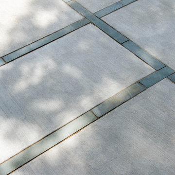
Close-up of the bluestone inlays within the concrete patio.
Renn Kuhnen Photography
Example of a mid-sized 1960s backyard concrete patio design in Milwaukee
Example of a mid-sized 1960s backyard concrete patio design in Milwaukee


 ShoreCoasterz
Hits all the marks in coziness and design. This living room combines wood, metal, leather, wool and other durable and comfortable fabric choices, in light and dark hues, creating a perfect mixture of textures that compliment each other beautifully.
The selections from various manufacturers include a Hancock and Moore leather sofa, wood chairs by Lexington, Tommy Bahama Collection, 2 High-back swivel chairs in a neutral fabric by Century, and Palecek petrified wood waterfall tables on hand-hammered wrought iron bases in a bronze finish and branch floor lamp. A Global View two-drawer chest with inn pulls separates the century swivels. Everything works in unison to create a whimsical yet rustic feel.
Many of the clients personal items were included in the design process to make this space unique and interesting. The antique bench makes a perfect coffee table.
The hide rug adds interest and sets wood-encased swivel chairs apart and the wheel end table brings in a "Motor City" influence. It can be placed in front of or behind the chairs in this design.
The exceptional, custom-built Rough Sawn wood bookcase by Harborview Building of Petoskey, houses a 60" TV behind sliding barn doors on Aspen black-iron hardware. The added beams and frames to display an antique postcard collection, add warmth to this large space surrounded by windows.
Two pillows in hide on the sofa and with sewn-on embellishments on the Century swivel, high-back chairs complete the look.
Neutrals have been contrasted with a patterned Loloi (Hermitage Tobacco) rug to add a splash of color and highlight different finishes throughout the room. As a bonus, this patterned rug will hide just about anything.
The hide rug under the wood-framed chairs adds interest and sets apart a separate sitting area while complimenting the overall look of the room.
©2018 All Rights Reserved, Photography by Mike Gullon
 Housing & Building Association of Colorado Springs
The Home
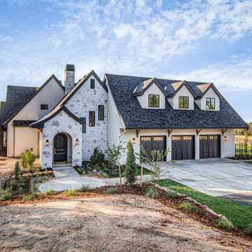
While looking for space where their active family could expand, these homeowners turned to Black Forest, with trees that remind them of their Indiana years. A stunning Pikes Peak view underscores how fortunate they are to live in Colorado. This home features classic nods to the owner’s French heritage while embracing a thoroughly of-the-moment Colorado lifestyle. Priorities for these homeowners included blending outdoor and indoor spaces wherever possible with generously proportioned windows and doors, porches, patios and balconies.
A gracious lime-washed brick entry punctuates a simplified white stucco and black-frame-windowed exterior with traditional
rooflines. Dramatic open spaces on the main floor comfortably accommodate the everyday activities of this busy family of four, while
providing for welcomed visits from family and friends. A functional, open kitchen is designed for serious cooking, a butler’s pantry for
staples, and serveware storage and dining spaces that effortlessly host after-school snacking to multi-course meals. A main-level,
Peak-view office comfortably supports working at home, complete with a beer cave and tasting nook for hosting fellow aficionados
after work is done. Guests will find comfort and privacy in a ma in-level guestroom suite or sleepover fun in the built-in bunks of the
expansive over-garage bonus room.
This home is a true collaboration that blends the homeowner’s long-held vision of their ideal home brought to life by the builder’s vision
and design/build process that achieves something truly…Warm and welcoming in the Forest.
The Builder
Stauffer & Sons Construction is a true Design-Build team creating some of the finest living spaces in the Pikes Peak region for over twenty years. We’ve developed an easy point-of-entry to the Design-Build process that begins with our very popular Conceptual Design and Budgeting Agreement. This affordable, low-commitment step provides answers to the early-stage questions of “what and how much?” With this critical information in place, a robust collaboration between client and builder ensues, resulting in a thoughtfully designed home that strikes a balance between size and scope and budget.
The Interior Design
Family, friends and soon-to-be friends are welcomed into this updated version of a French country farmhouse through a bricked archway and a solid arch-top entry door. Once inside, a sweeping gallery of windows adorned with flower-filled window boxes sets a nice foreground to the ponderosa pine forest. A great room with a two-story, lime-washed, brick fireplace sits juxtaposed to a cozy farm-styled kitchen with large island, plenty of storage and a Pikes Peak view. This family home features a simple, clean design with warm, wooden beams and solid, white-oak flooring. This home is designed to be lived in. Wherever you go, downstairs, upstairs or out on the porch, this home wraps around you and is a delightful place to enjoy.
 The Olde Mill - Box Beams, Mantels & Shelves
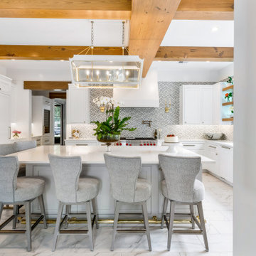
This gorgeous Bocage home was originally too compartmentalized for entertaining guests. The kitchen itself and the opening between the kitchen and family area were both small, making the space feel closed in and cut off from the rest of the house. Our goal was to open the space as much as possible and give the clients everything they needed to entertain. Early in the design process, we decided it was necessary to add square footage to give these clients their dream kitchen. Adding this space allowed for a large kitchen island, tons of cabinet storage, a walk-in pantry, half bath and small office, all accessible from the focal kitchen. Flanking the kitchen window are sets of floating shelves from The Olde Mill. The hollow floating shelf design allowed for color-changing LED lights to be set into the shelves, allowing for a change of mood at the press of a button. We were able to widen the opening between the kitchen and family room to allow the spaces to flow together. The doorway was framed with reclaimed wood posts and headers, also from The Olde Mill. After the expansion, a structural beam was added to support the second floor, and the clients decided to cover it with a beautiful reclaimed wood beam as well. To wrap the laminated structural beam, this beam was made 22″ wide. All of these elements gave the clients a large, show-stopping kitchen with tons of storage and plenty of room to entertain family and friends.
Space Planning by Ourso Designs
Designer: Rachel Cannon Limited
Builder/Remodeler: Bertell Cook Construction
Beams, Mantel, and Floating Shelves: The Olde Mill
Photos: Collin Richie Photography

 INSPIRED KITCHEN DESIGN
Of course, he credits IKD’s certified designers for guidance during the process as well as his own research.
“We used design Web sites like HOUZZ to help inform our decision about using IKD, for tips about installation techniques, and for suggestions about how to overcome installation challenges. HOUZZ was the most regular online resource we used throughout our design and installation process,” he says.
Notably, Adam did not set a budget. Rather, he did calculations during the planning stages to know what price range he was comfortable with for his IKEA purchases.
“We even went up a level on our cabinets when saw the first revision of our design from IKD. The change was financially feasible for us and we were happy with the final estimate on our design. When we ended up purchasing our cabinets, the estimate and final cost were very close to each other,” he says.
Rounding out the product lineup are an IKEA NUTID microwave; Samsung stainless steel appliances; luxury vinyl flooring (that was installed ahead of the kitchen) and granite countertops from a local third-party, non-IKEA affiliated vendor.
“We did not hire a cabinet installer and I proudly state that we did it ourselves” he concludes.
For Adam, the previous kitchen was drab, outdated and completely inefficient with narrow passageways around the refrigerator and previous island.
Therefore, he discovered that IKEA cabinetry was ideal from a style and budget standpoint for his kitchen remodel.
“We were impressed with the quality of the cabinets at the price point. We were also able to plan well in advance of IKEA’s Spring kitchen sale to enable us to purchase our cabinets at a lower price point,” he says.
To that end, the IKEA BODBYN Off White cabinetry runs along the upper perimeter of the kitchen, from the Samsung refrigerator, over the stainless steel stove and above the sink and granite countertops.
Sponsored
Columbus, OH
Free consultation for landscape design!
Peabody Landscape Group
Columbus' Reliable Landscape Design & Contracting

 J Design Group - Interior Designers Miami - Modern
Modern Interior Designs in Miami FL. by J Design Group in Miami.
Home is an incredible or lovely place where most of the people feel comfortable. Yes..! After a long and hectic day, house is the one place where you can relax. Gone are the days, when a “home” meant just a ceiling with four walls. Yes..! That's true, but nowadays a “house” is something beyond your expectation. Therefore, most of the people hire “premises decoration” services.
Nowadays, unlike old-age properties, various new apartments and homes are built to optimize the comfort of modern housing. Yes...! Everyone knows that “Home Decoration” is considered to be one of the most important and hottest trends all over the world. This is an amazing process of using creativity, imaginations and skills. Through this, you can make your house and any other building interesting and amazing. However, if you are looking for these kinds of services for your premises, then “J Design Group” is here just for you.
We are the one that provides renovation services to you so that you can make a building actually look like a house. Yes..! Other ordinary organizations who actually focus on the colors and other decorative items of any space, but we provide all these solutions efficiently. Creative and talented Contemporary Interior Designer under each and every requirement of our precious clients and provide different solutions accordingly. We provide all these services in commercial, residential and industrial sector like homes, restaurants, hotels, corporate facilities and financial institutions remodeling service.
Everyone knows that renovation is the one that makes a building actually look like a house. That's true “design” is the one that complement each and every section of a particular space. So, if you want to change the look of your interior within your budget, then Miami Interior Designers are here just for you. Our experts carefully understand your needs and design an outline plan before rendering outstanding solutions to you.
Interior design decorators of our firm have the potential and appropriate knowledge to decorate any kind of building. We render various reliable and credible solutions to our esteemed customers so that they can easily change the entire ambiance of their premises.
J Design Group – Miami Interior Designers Firm – Modern – Contemporary
Contact us: 305-444-4611
www.JDesignGroup.com
“Home Interior Designers”
"Miami modern"
“Contemporary Interior Designers”
“Modern Interior Designers”
“House Interior Designers”
“Coco Plum Interior Designers”
“Sunny Isles Interior Designers”
“Pinecrest Interior Designers”
"J Design Group interiors"
"South Florida designers"
“Best Miami Designers”
"Miami interiors"
"Miami decor"
“Miami Beach Designers”
“Best Miami Interior Designers”
“Miami Beach Interiors”
“Luxurious Design in Miami”
"Top designers"
"Deco Miami"
"Luxury interiors"
“Miami Beach Luxury Interiors”
“Miami Interior Design”
“Miami Interior Design Firms”
"Beach front"
“Top Interior Designers”
"top decor"
“Top Miami Decorators”
"Miami luxury condos"
"modern interiors"
"Modern”
"Pent house design"
"white interiors"
“Top Miami Interior Decorators”
“Top Miami Interior Designers”
“Modern Designers in Miami”

 JRP Design & Remodel
Our clients are seasoned home renovators. Their Malibu oceanside property was the second project JRP had undertaken for them. After years of renting and the age of the home, it was becoming prevalent the waterfront beach house, needed a facelift. Our clients expressed their desire for a clean and contemporary aesthetic with the need for more functionality. After a thorough design process, a new spatial plan was essential to meet the couple’s request. This included developing a larger master suite, a grander kitchen with seating at an island, natural light, and a warm, comfortable feel to blend with the coastal setting.
Demolition revealed an unfortunate surprise on the second level of the home: Settlement and subpar construction had allowed the hillside to slide and cover structural framing members causing dangerous living conditions. Our design team was now faced with the challenge of creating a fix for the sagging hillside. After thorough evaluation of site conditions and careful planning, a new 10’ high retaining wall was contrived to be strategically placed into the hillside to prevent any future movements.
With the wall design and build completed — additional square footage allowed for a new laundry room, a walk-in closet at the master suite. Once small and tucked away, the kitchen now boasts a golden warmth of natural maple cabinetry complimented by a striking center island complete with white quartz countertops and stunning waterfall edge details. The open floor plan encourages entertaining with an organic flow between the kitchen, dining, and living rooms. New skylights flood the space with natural light, creating a tranquil seaside ambiance. New custom maple flooring and ceiling paneling finish out the first floor.
Downstairs, the ocean facing Master Suite is luminous with breathtaking views and an enviable bathroom oasis. The master bath is modern and serene, woodgrain tile flooring and stunning onyx mosaic tile channel the golden sandy Malibu beaches. The minimalist bathroom includes a generous walk-in closet, his & her sinks, a spacious steam shower, and a luxurious soaking tub. Defined by an airy and spacious floor plan, clean lines, natural light, and endless ocean views, this home is the perfect rendition of a contemporary coastal sanctuary.
PROJECT DETAILS:
• Style: Contemporary
• Colors: White, Beige, Yellow Hues
• Countertops: White Ceasarstone Quartz
• Cabinets: Bellmont Natural finish maple; Shaker style
• Hardware/Plumbing Fixture Finish: Polished Chrome
• Lighting Fixtures: Pendent lighting in Master bedroom, all else recessed
• Flooring:
Hardwood - Natural Maple
Tile – Ann Sacks, Porcelain in Yellow Birch
• Tile/Backsplash: Glass mosaic in kitchen
• Other Details: Bellevue Stand Alone Tub
Photographer: Andrew, Open House VC

 Vetter Architects
The client’s request was quite common - a typical 2800 sf builder home with 3 bedrooms, 2 baths, living space, and den. However, their desire was for this to be “anything but common.” The result is an innovative update on the production home for the modern era, and serves as a direct counterpoint to the neighborhood and its more conventional suburban housing stock, which focus views to the backyard and seeks to nullify the unique qualities and challenges of topography and the natural environment.
The Terraced House cautiously steps down the site’s steep topography, resulting in a more nuanced approach to site development than cutting and filling that is so common in the builder homes of the area. The compact house opens up in very focused views that capture the natural wooded setting, while masking the sounds and views of the directly adjacent roadway. The main living spaces face this major roadway, effectively flipping the typical orientation of a suburban home, and the main entrance pulls visitors up to the second floor and halfway through the site, providing a sense of procession and privacy absent in the typical suburban home.
Clad in a custom rain screen that reflects the wood of the surrounding landscape - while providing a glimpse into the interior tones that are used. The stepping “wood boxes” rest on a series of concrete walls that organize the site, retain the earth, and - in conjunction with the wood veneer panels - provide a subtle organic texture to the composition.
The interior spaces wrap around an interior knuckle that houses public zones and vertical circulation - allowing more private spaces to exist at the edges of the building. The windows get larger and more frequent as they ascend the building, culminating in the upstairs bedrooms that occupy the site like a tree house - giving views in all directions.
The Terraced House imports urban qualities to the suburban neighborhood and seeks to elevate the typical approach to production home construction, while being more in tune with modern family living patterns.
Overview:
Elm Grove
Size:
2,800 sf,
3 bedrooms, 2 bathrooms
Completion Date:
September 2014
Services:
Architecture, Landscape Architecture
Interior Consultants: Amy Carman Design
79