
Search results for "Sharp decision making" in Home Design Ideas
 Advance Design Studio, Ltd.
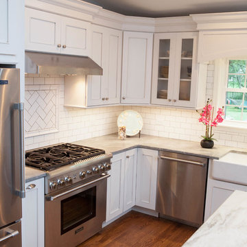
Quinn and Paige, residents of this tired 1960’s tri-level home hated their kitchen. As a matter of fact, prior to making plans to renovate the first floor - they considered selling the home, but were reluctant because of its enviable location near the heart of downtown Barrington which was within walking distance to local stores and all their favorite places. So instead they contacted Advance Design Studio after hearing about them from a neighbor, to rescue their tired home and give it new life.
The very first plan was to remove the constricting walls surrounding the original kitchen, and open the expansive first floor living room and dining area to the new heart of the space; a stunning state of the art coastal designed kitchen. Exposing attractive beams in the vaulted ceiling created an interesting structural detail that suits the open plan and salutes the original architecture of the home, further emphasizing the height of the new space enjoyed now by the family as a great room.
The stage was set for the seaside feel of this kitchen by pairing crisp white painted maple cabinets with Dura Supreme’s one of kind hand weathered finish on the island in soft blue-green finish. But the authentic feeling of being on your favorite beach was supremely achieved by the matching of unique Mt. Claire marble on the island and the specialty Wareham acid washed stone on the perimeter counter tops. Pictures don’t do justice to the feel of this stone under your hand; its water-washed texture reminds instantly of summer vacations collecting rocks softly etched by hundreds of waves.
Stainless steel appliances and satin nickel hardware shine brightly against the backdrop of bright white subway tiles accentuated by subtle grey grout lines contributing to the nautical feel of this comfortable kitchen. Seeded glass door cabinetry reminiscent of beach grasses dress up the space just enough, and a proud 6” stacked crown molding extends above 36” wall cabinets into the expanse of the now taller space; balancing this kitchen nicely within its newly integrated home.
Features in this kitchen include a built in standard depth refrigerator, pull out spice racks, tall tray dividers and wood super Susan with double pull out trash and recycling. A cutlery divider holds sharp knives, and an angled cabinet was customized to hold a secret USB charging station. The bright white Kohler farm sink is graced by an elegant bridge faucet in brushed nickel. This now airy and spacious kitchen has room for guest and family to congregate around the large island, complete with stools and attractive hidden storage for seldom used entertainment pieces.
“I was sold when I saw the drawings. My designer nailed it, down to every last storage idea and coastal detail I envisioned, it was all in there. It was unbelievable how accurate her interpretation was of what was in my head; working with her made my kitchen renovation so easy, it’s as if she literally read my mind”, said Paige enthusiastically.
The woman of the house expressed upon completion not only her love for her fantastic new cooking space, but how renovating her kitchen has given new life to the entire home. Talk of moving has been relegated to the recycling bin, and instead the family is discussing plans to renovate the master bath now that they’ve decided to stay for the long term. Friends who visit the home do a double-take as they recognize the new space’s dramatic transformation from original cramped and closed spaces - to the now amazingly fresh open kitchen that has become the center of every gathering and family meal.
Designer: Nicole Ryan
Photographer: Joe Nowak
 Sweetlake Interior Design LLC
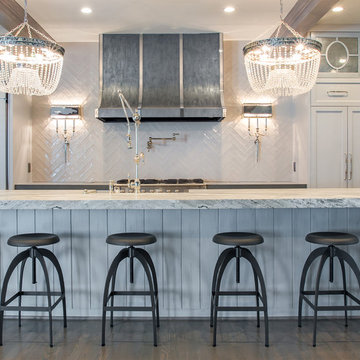
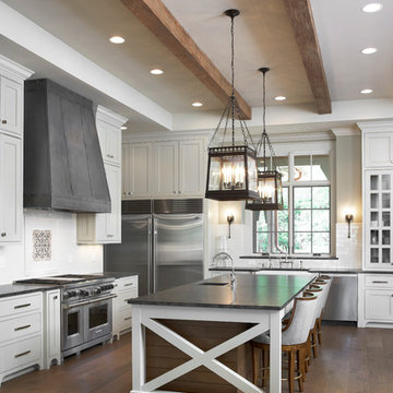
This amazing, U-shaped Memorial (Houston, TX 77024) custom kitchen design was influenced by the "The Great Gatsby" era with its custom zinc flared vent hood with nickel plated laminate straps. This terrific hood flares in on the front and the sides. The contrasting finishes help to add texture and character to this fully remodeled kitchen. This hood is considerably wider than the cooktop below. It's actually 60" wide with an open back splash and no cabinets on either side. We love to showcase vent hoods in most of our designs because it serves as a great conversation piece when entertaining family and friends. A good design tip is to always make the vent hood larger than the stove. It makes an incredible statement! The antiqued, mirror glass cabinets feature a faux finish with a furniture like feel. The large back splash features a zig zag design, often called "chevron pattern." The french sconces with nickel plated shades are beautifully displayed on each side of the gorgeous "La Cornue" stove adding bling to the kitchen's magnificence and giving an overall elegant look with easy clean up. Additionally, there are two (2) highbrow chandeliers by Curry & Company, gives the kitchen the love needed to be a step above the norm. The island bar has a farmhouse sink and a full slab of "Fantasy Brown" marble with seating for five. There is tons of storage throughout the kitchen with plenty of drawer and cabinet space on both sides of the island. The sub-zero refrigerator is totally integrated with cupboards and drawers to match. Another advantage of this variety of refrigeration is that you create furniture-style cabinetry. This is a truly great idea for a dateless design transformation in Houston with raised-panel cupboards and paneled appliances. Polished nickel handles, drawer pulls and faucet hardware complete the design.
 Revision LLC
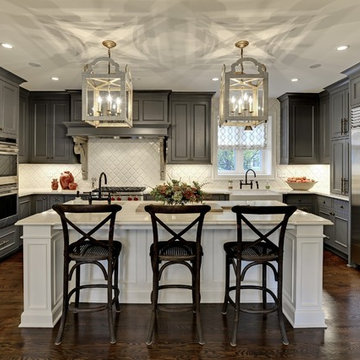
Large transitional u-shaped dark wood floor and brown floor kitchen photo in Minneapolis with gray cabinets, white backsplash, stainless steel appliances, an island, raised-panel cabinets, a farmhouse sink, solid surface countertops, white countertops and ceramic backsplash
Find the right local pro for your project
 Nar Design Group
Our carpenters labored every detail from chainsaws to the finest of chisels and brad nails to achieve this eclectic industrial design. This project was not about just putting two things together, it was about coming up with the best solutions to accomplish the overall vision. A true meeting of the minds was required around every turn to achieve "rough" in its most luxurious state.
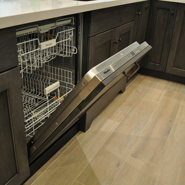
Featuring multiple Columbia Cabinet finishes; contrasting backsplashes, wall textures and flooring are all part of what makes this project so unique! Features include: Sharp microwave drawer, glass front wine fridge, fully integrated dishwasher, Blanco compost bin recessed into the counter, Walnut floating shelves, and barn house lighting.
PhotographerLink
 Markalunas Architecture and Design, LLC
Lake Front Country Estate Kitchen, designed by Tom Markalunas, built by Resort Custom Homes. Photography by Rachael Boling.
Inspiration for a large timeless l-shaped medium tone wood floor kitchen remodel in Other with shaker cabinets, white cabinets, granite countertops, white backsplash, subway tile backsplash, stainless steel appliances and an island
Inspiration for a large timeless l-shaped medium tone wood floor kitchen remodel in Other with shaker cabinets, white cabinets, granite countertops, white backsplash, subway tile backsplash, stainless steel appliances and an island
 Normandy Remodeling
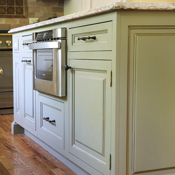
Incorporating a microwave into the island frees up the kitchen for more upper cabinetry and makes the space look less appliance heavy.
Inspiration for a mid-sized timeless l-shaped dark wood floor eat-in kitchen remodel in Chicago with a farmhouse sink, recessed-panel cabinets, white cabinets, quartz countertops, metallic backsplash, metal backsplash, stainless steel appliances and an island
Inspiration for a mid-sized timeless l-shaped dark wood floor eat-in kitchen remodel in Chicago with a farmhouse sink, recessed-panel cabinets, white cabinets, quartz countertops, metallic backsplash, metal backsplash, stainless steel appliances and an island
 TaskRabbit
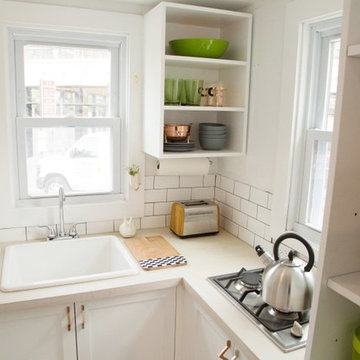
Recently, TaskRabbit challenged a group of 10 Taskers to build a Tiny House in the middle of Manhattan in just 72 hours – all for a good cause.
Building a fully outfitted tiny house in 3 days was a tall order – a build like this often takes months – but we set out to prove the power of collaboration, showing the kind of progress that can be made when people come together, bringing their best insights, skills and creativity to achieve something that seems impossible.
It was quite a week. New York was wonderful (and quite lovely, despite a bit of rain), our Taskers were incredible, and TaskRabbit’s Tiny House came together in record time, due to the planning, dedication and hard work of all involved.
A Symbol for Change
The TaskRabbit Tiny House was auctioned off with 100% of the proceeds going to our partner, Community Solutions, a national nonprofit helping communities take on complex social challenges – issues like homelessness, unemployment and health inequity – through collaboration and creative problem solving. This Tiny House was envisioned as a small symbol of the change that is possible when people have the right tools and opportunities to work together. Through our three-day build, our Taskers proved that amazing things can happen when we put our hearts into creating substantive change in our communities.
The Winning Bid
We’re proud to report that we were able to raise $26,600 to support Community Solutions’ work. Sarah, a lovely woman from New Hampshire, placed the winning bid – and it’s nice to know our tiny home is in good hands.
#ATinyTask: Behind the Scenes
The Plans
A lot of time and effort went into making sure this Tiny Home was as efficient, cozy and welcoming as possible. Our master planners, designer Lesley Morphy and TaskRabbit Creative Director Scott Smith, maximized every square inch in the little house with comfort and style in mind, utilizing a lofted bed, lofted storage, a floor-to-ceiling tiled shower, a compost toilet, and custom details throughout. There’s a surprising amount of built-in storage in the kitchen, while a conscious decision was made to keep the living space open so you could actually exist comfortably without feeling cramped.
The Build
Our Taskers worked long, hard shifts while our team made sure they were well fed, hydrated and in good spirits. The team brought amazing energy and we couldn’t be prouder of the way they worked together. Stay tuned, as we’ll be highlighting more of our Tiny House Taskers’ stories in coming days – they were so great that we want to make sure all of you get to know them better.
The Final Product
Behold, the completed Tiny House! For more photos, be sure to check out our Facebook page.
This was an incredibly inspiring project, and we really enjoyed watching the Tiny House come to life right in the middle of Manhattan. It was amazing to see what our Taskers are capable of, and we’re so glad we were able to support Community Solutions and help fight homelessness, unemployment and health inequity with #ATinyTask.


 Advance Design Studio, Ltd.
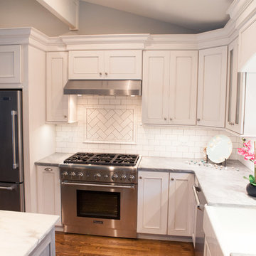
Quinn and Paige, residents of this tired 1960’s tri-level home hated their kitchen. As a matter of fact, prior to making plans to renovate the first floor - they considered selling the home, but were reluctant because of its enviable location near the heart of downtown Barrington which was within walking distance to local stores and all their favorite places. So instead they contacted Advance Design Studio after hearing about them from a neighbor, to rescue their tired home and give it new life.
The very first plan was to remove the constricting walls surrounding the original kitchen, and open the expansive first floor living room and dining area to the new heart of the space; a stunning state of the art coastal designed kitchen. Exposing attractive beams in the vaulted ceiling created an interesting structural detail that suits the open plan and salutes the original architecture of the home, further emphasizing the height of the new space enjoyed now by the family as a great room.
The stage was set for the seaside feel of this kitchen by pairing crisp white painted maple cabinets with Dura Supreme’s one of kind hand weathered finish on the island in soft blue-green finish. But the authentic feeling of being on your favorite beach was supremely achieved by the matching of unique Mt. Claire marble on the island and the specialty Wareham acid washed stone on the perimeter counter tops. Pictures don’t do justice to the feel of this stone under your hand; its water-washed texture reminds instantly of summer vacations collecting rocks softly etched by hundreds of waves.
Stainless steel appliances and satin nickel hardware shine brightly against the backdrop of bright white subway tiles accentuated by subtle grey grout lines contributing to the nautical feel of this comfortable kitchen. Seeded glass door cabinetry reminiscent of beach grasses dress up the space just enough, and a proud 6” stacked crown molding extends above 36” wall cabinets into the expanse of the now taller space; balancing this kitchen nicely within its newly integrated home.
Features in this kitchen include a built in standard depth refrigerator, pull out spice racks, tall tray dividers and wood super Susan with double pull out trash and recycling. A cutlery divider holds sharp knives, and an angled cabinet was customized to hold a secret USB charging station. The bright white Kohler farm sink is graced by an elegant bridge faucet in brushed nickel. This now airy and spacious kitchen has room for guest and family to congregate around the large island, complete with stools and attractive hidden storage for seldom used entertainment pieces.
“I was sold when I saw the drawings. My designer nailed it, down to every last storage idea and coastal detail I envisioned, it was all in there. It was unbelievable how accurate her interpretation was of what was in my head; working with her made my kitchen renovation so easy, it’s as if she literally read my mind”, said Paige enthusiastically.
The woman of the house expressed upon completion not only her love for her fantastic new cooking space, but how renovating her kitchen has given new life to the entire home. Talk of moving has been relegated to the recycling bin, and instead the family is discussing plans to renovate the master bath now that they’ve decided to stay for the long term. Friends who visit the home do a double-take as they recognize the new space’s dramatic transformation from original cramped and closed spaces - to the now amazingly fresh open kitchen that has become the center of every gathering and family meal.
Designer: Nicole Ryan
Photographer: Joe Nowak
 We Make It Our Home
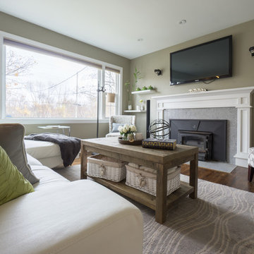
The living room was long and narrow but with an amazing bay window. Instead of a galley style living room used by the previous owner, we decided to change the furniture arrangement by putting one big comfy L-shaped sectional all the way to one side to create a pass-through area enabling a better foot traffic. We then added two side chairs for extra seats. We also mounted our TV on top of the fireplace to gain more space. Although it's not my favorite design choice to have TV on top of the fireplace because I think it takes away from the fireplace but we had to work within the limitation of the space.
For the fireplace, we bought wood stove insert and inserted it into the existing masonry fireplace. The look was updated by granite tiles around the insert and custom built wood mantel.
Buying wood fireplace insert was the best decision we made. First of all, it created a memorable space in our home. I LOVE the sound of wood cracking and the smell of wood burning. In winter nights we would sit around the fireplace and make s'mores like it's a campfire. Second, it's a clean burning and efficient heater. You don't lose the majority the fire’s heat up the chimney thereby saving money on your heating bill.
The coffee table is purchased from Wicker Emporium and it's made from reclaimed pine timbers giving the house a rustic feel.
The side chair by the fireplace is the perfect spot for me to relax, put my feet up on the large ball shaped knitted foot rest and enjoy a cup of cappuccino or cozy up with a good book.

 TBS Construction Inc.
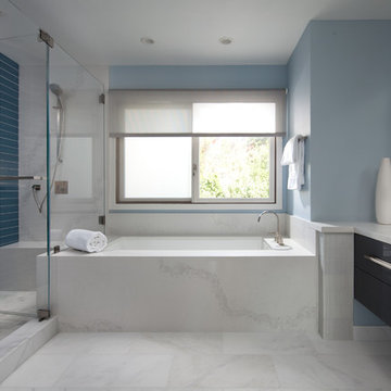
Bathroom is a place where you start and end your day. So how could it be anything short of perfection?! We took this inspiration and transformed one Stanford home’s master bathroom from outdated to sleek and elegant place. Designed according to its function bathroom is also well suited to homeowner’s style preferences. It was a great pleasure working on this project! Owners were highly involved in decision making process and their taste in design turned out to be exquisite!
High end custom materials from leading names:
Caesarstone US, Crystal Cabinet Works Inc., Da Vinci Marble Inc, AKDO, California Faucets, Isenberg Water Experience
Designed and built by TBS Construction Inc
Interior Designers: Krishna Shah & Michelle Talley
Project Manager: Doug Mszanowski
Thanks to Agnieszka Jakubowicz Photography for these gorgeous photos!
 TKS Design Group
Download our free ebook, Creating the Ideal Kitchen. DOWNLOAD NOW
This homeowner’s daughter originally contacted us on behalf of her parents who were reluctant to begin the remodeling process in their home due to the inconvenience and dust. Once we met and they dipped their toes into the process, we were off to the races. The existing bathroom in this beautiful historical 1920’s home, had not been updated since the 70’/80’s as evidenced by the blue carpeting, mirrored walls and dropped ceilings. In addition, there was very little storage, and some health setbacks had made the bathroom difficult to maneuver with its tub shower.
Once we demoed, we discovered everything we expected to find in a home that had not been updated for many years. We got to work bringing all the electrical and plumbing up to code, and it was just as dusty and dirty as the homeowner’s anticipated! Once the space was demoed, we got to work building our new plan. We eliminated the existing tub and created a large walk-in curb-less shower.
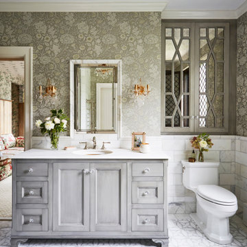
An existing closet was eliminated and in its place, we planned a custom built in with spots for linens, jewelry and general storage. Because of the small space, we had to be very creative with the shower footprint, so we clipped one of the walls for more clearance behind the sink. The bathroom features a beautiful custom mosaic floor tile as well as tiled walls throughout the space. This required lots of coordination between the carpenter and tile setter to make sure that the framing and tile design were all properly aligned. We worked around an existing radiator and a unique original leaded window that was architecturally significant to the façade of the home. We had a lot of extra depth behind the original toilet location, so we built the wall out a bit, moved the toilet forward and then created some extra storage space behind the commode. We settled on mirrored mullioned doors to bounce lots of light around the smaller space.
We also went back and forth on deciding between a single and double vanity, and in the end decided the single vanity allowed for more counter space, more storage below and for the design to breath a bit in the smaller space. I’m so happy with this decision! To build on the luxurious feel of the space, we added a heated towel bar and heated flooring.
One of the concerns the homeowners had was having a comfortable floor to walk on. They realized that carpet was not a very practical solution but liked the comfort it had provided. Heated floors are the perfect solution. The room is decidedly traditional from its intricate mosaic marble floor to the calacutta marble clad walls. Elegant gold chandelier style fixtures, marble countertops and Morris & Co. beaded wallpaper provide an opulent feel to the space.
The gray monochromatic pallet keeps it feeling fresh and up-to-date. The beautiful leaded glass window is an important architectural feature at the front of the house. In the summertime, the homeowners love having the window open for fresh air and ventilation. We love it too!
The curb-less shower features a small fold down bench that can be used if needed and folded up when not. The shower also features a custom niche for storing shampoo and other hair products. The linear drain is built into the tilework and is barely visible. A frameless glass door that swings both in and out completes the luxurious feel.
Designed by: Susan Klimala, CKD, CBD
Photography by: Michael Kaskel
For more information on kitchen and bath design ideas go to: www.kitchenstudio-ge.com
 Advance Design Studio, Ltd.
Jennifer and Dan have lived in their Deer Park Illinois home for 15 years, slowly making minor fixes like painting and decorating; but they had a new plan for their kitchen the entire time. An awkwardly placed garage door, and an island cooktop with a terrible downdraft made a full-scale kitchen remodel an absolute must. Jennifer had many ideas in mind and wanted to work with a company that could provide high-end work, while partnering with a designer that would tailor the kitchen to her ideas.
She was intrigued by the phrase “Common Sense Remodeling” in Advance Design’s feature she discovered while perusing an issue of the community’s Quintessential Barrington Magazine. Doing further research on the company’s website, as she looked through project profiles and read about Advance Design’s “Common Sense Remodeling” philosophy, she promptly scheduled an appointment to see if the people and ideas she read about were truly who they said they were. The more she read, the more she knew that the “Common Sense” approach to remodeling they described was exactly the type of company she was looking for.
The partnership was sealed after an initial consultation with Owner Todd Jurs and Project Designer Michelle Lecinski. They displayed a combination of friendliness, professionalism and respect that was unmatched by any of the other companies Jennifer talked to. She knew that with Advance Design, she would be able to retain the vision that she had in mind with high-quality craftsmanship.
“I reached out to Advance Design because of the ‘Common Sense Remodeling’ tagline,” Jennifer said. “That’s what lingered for me”. “Advance Design was the most respectful- of the house and of my design ideas, and the most professional of the handful of companies that looked at my project”.
Soon after the meeting Jennifer began working with Michelle on the project design. They quickly developed chemistry. Jennifer loved how Michelle researched and located every detail that Jennifer wanted for the kitchen. Between the two of them, every concept and idea was worked through and perfected. “Jennifer had definite ideas about what she wanted the new kitchen to look like, she just didn’t know how to bring it all together. We worked together really well to make her ideas into the practical reality necessary for a well-functioning kitchen, with the look and feel that she had envisioned”, says Michelle.
“Michelle was wonderful in using the CAD system she would show me new drawings every time we changed the layout while working through the design,” Jennifer said. “She was a really wonderful partner in execution, she made sure everything happened quickly and easily.”
The finished design drew out elements of Jennifer’s style and personality. The pair call the look “sophisticated farmhouse” to describe the kitchen renovation to family and friends. The result was a beautifully crafted, authentic-feeling space that satisfied Jennifer’s dreams 15 years in the making. The whole project consisted of a kitchen remodel, mudroom upgrade with powder room, and garage entry relocation. “The projects I personally like the best, are the ones that put the client’s dreams on display,” Project Designer Michelle said. “And this is one of those projects.”
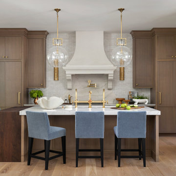
The main focal point of the kitchen is custom zinc and brass ventilation hood with a vintage sheen, which was hand made to order by a small company in Indiana named Vogler Metalworking. “It’s like sculpture, a true work of art”, says Jennifer. Your eye is immediately drawn towards this elegant yet practical hood that eliminated the home’s downdraft problem and added a striking conversation piece at the same time. The carpenters had to use special gloves when transporting and installing it, so they didn’t smudge it with fingerprints. The beautiful hood centers proudly over the stunning black enamel and brass LaCornue Range. “I had a friend who had a LaCornue range and after learning how easy it was to cook perfect meals, I was convinced I wanted to have one”, says Jennifer. This unique, breathtaking combination anchors the entire kitchen and is apparent immediately as you walk into the great room the surrounds the space.
DuraSupreme Crestwood cabinets with a Kendall Panel add function and sophistication. A custom gray paint color paired with a storm blue was developed so that the new kitchen looked like it belonged to the existing space. Unlacquered brass faucets and hardware were important to Jennifer because she wanted the living finishes to age over time. Remarkable brass diamond mesh cabinet door inserts imported from the UK continue to add this one-of-a-kind kitchen renovation; giving it a “you won’t see this everywhere” quality. The use of old railcar flooring for the coffee bar countertop and reclaimed oak for the open shelving gives an authenticity to the space uncommon in kitchens today.
Jennifer and Michelle fell in love with the Limestone Grey Stone while they were investigating unique island countertop ideas. They liked the fact that the limestone as a living finish will age and change over time. Calcutta Miel Quartz countertops made for an excellent pairing around the perimeter, as it’s durable and perfect for cooking preparations. A textured white subway tile backsplash that runs to the ceiling keeps your eye moving towards the open shelving, and to the main focal point of the stunning range hood combination.
“The kitchen functions beautifully, and it’s gorgeous,” beams Jennifer as she gestures with both hands while smiling ear to ear. “The most important thing was I wanted a kitchen that had a wonderful flow, cooked beautiful meals and was a great gathering place for family and friends, and this space does that perfectly! Beauty wise, it turned out exactly how I had envisioned. I felt the function part was the hardest part, and that was nailed”!
Relocating the garage entry to the new mudroom was a huge priority and has finally separated the family’s arriving home functions from their kitchen. Now coats and shoes and bags have their own area for dropping once members arrive home. Matching gray DuraSupreme cabinetry helped create gorgeous, purposeful lockers for the family. A reclaimed vintage sink and custom wall paper were added to the tiny powder room to beautify the once previously only functional space. Advance Design was even able to create a custom space for their dog to sleep while the family is away.
“It was unbelievable that a project of this size was completed in such a short time, and I think that’s because of the large amount of planning and preparation that went into it,” Jennifer marveled, “When we started, we were ready, and everything was prepared”.
When it came to execution, Project Manager Justin Davis and his crew were quick, accessible, and organized. Projects like this kitchen are typically completed in as little as 8-10 weeks. Jennifer’s kitchen however despite the relocation of some challenging HVAC in a soffit and moving of an exterior door was completed remarkably fast in part because the team was working with an existing tile floor that ran throughout the first floor that the client really loved.
“You get to know these people really well because they’re living in your house while you’re living in your house. They were so fast and really good, it didn’t take as long as even planned” reported Jennifer. “I would text Justin and he always responded almost immediately. I got to know all the guys who were working in our house and they were all wonderful people”.
Details in a customized kitchen like this one require skill and care from the people who install it. “All the guys on the job were skilled at what the did. I wanted small details like little feet to look like furniture, that is where their carpentry skill came in to make these all perfect”, said Jennifer. “The tile guys were wonderful. They even let me determine how I wanted the texture with the grout to appear for a salt and pepper look; now that is a very skilled trade person making it custom”.
In Jennifer’s interview, she continued to reference Advance Design’s “Common Sense Remodeling”, so I took a minute to ask her exactly what that phrase meant to her and how it played out in her experience with her project and the Advance Design team. Here is what she said: “I was intrigued about Common Sense Remodeling and in my head that there would be clear costs and prices, great communication between the design team, the execution team and me”, said Jennifer. They did deliver on that, it was so clear about the cost breakdown, what I could expect from everyone who came to my house, and everything that we had ordered. That to me is the Common Sense”!
It’s great to see a client take literally our assertion that a well-planned remodeling project is simply “Common Sense”! She anticipated each step of the way would be clear, concise, and predictable, all the while protecting the outcome due to the careful upfront planning. “Advance Design delivered on their ‘Common Sense Remodeling’ promise,” Jennifer said. “From the design team, to the execution team - everything was straight forward like I imagined. The project turned out exactly how I envisioned, I enjoyed this process and absolutely would recommend Advance Design Studio to anyone.”

Sponsored
Columbus, OH

Wannemacher Interiors
Customized Award-Winning Interior Design Solutions in Franklin Cnty OH
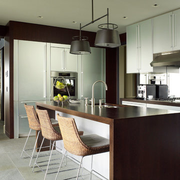
Inspiration for a contemporary galley kitchen remodel in Other with a double-bowl sink, flat-panel cabinets, wood countertops, stainless steel appliances and an island
 Pineapple House Interior Design
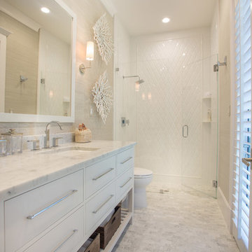
The shower is universally designed and has no curb or step at its entry. The drawer pulls are also designed for easy use.
A Bonisolli Photography
Mid-sized transitional white tile walk-in shower photo in Miami with an undermount sink, flat-panel cabinets, white cabinets and marble countertops
Mid-sized transitional white tile walk-in shower photo in Miami with an undermount sink, flat-panel cabinets, white cabinets and marble countertops
 Paul Lopa Designs
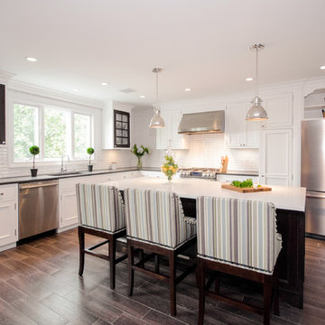
Traditional Kitchen Renovation & Design Of A First Floor Ranch.
See what our client say about Paul Lopa Designs:
It went as smooth as it possibly could go. The only bumps in the road was with what we found during demolition, you never know what your gonna run into when all the walls,floors and fixtures come out. Paul had explained to us that depending on what we found under all the out dated stuff it might take a little longer. Paul was there doing the work with his workers he showed up on time and finished on schedule. It was no problem being in touch with Paul because he answered his phone or got back to us in a timely fashion. He has an excellent sense of design he knows what goes well together and makes the house flow with comfort and usability.
(R)Haw Ron
 TOC design & construction inc.
DESIGNED BY TOC design
CONSTRUCTION BY TOC design & Construction inc.
PHOTOS BY : Tania Scardellato
I was fortunate to have a young family approach me in desperate need to renovate there only 3 piece bathroom. This space was In dire need of a remodel, with old brown wall to wall tiles and a dated bulky yellow brown single sink vanity.
Storage was a must, lighting a necessity, and proper accessibility to the shower bath area.
We had a tight budget to respect, but a full gut of this bathroom was required. And a good thing too, once we started doing the demolition we noticed that mildew and rotting floors and walls had accumulated throughout the years. Doing it right the first time is no joke when dealing with water and electrical issues.
We discarded all reminisce of old and built from scratch, new walls, new plumbing, new electrical ,new insulation and a new window, a new fan that actually exhausted outside ( I say this laughing as you would be amazed at how many fans are installed but don’t exhaust outside, and you the client would never know unless you go inside the attic space.
Once all the hard stuff was done, the rest is just a matter of smart design. If you have a small bathroom here are some tips to guide you.
10 tips for making a small bathroom feel larger
Is your tiny bathroom cramping your functionality and style, leaving you longing for the enormous bathrooms gracing the pages of design magazines? Even if your bathroom is a fraction of the size, all it takes is some design savvy to make the most of the space you have. Consider these 10 smart tips that will help your bathroom look, feel and function like those larger contenders.
1-Get creative with corners
Space is at a premium in small bathrooms, so it's important to maximize every inch. Corners, for example, provide extra space for shelving, storage units and even hooks. Get creative and install unique design solutions that are not only functional, but also eye-catching. If you love the airiness of floating cabinets, add baskets or decorative boxes under for extra storage. If you are installing floating cabinets insure that they are installed securely to studs or plywood at wall.
2- Let solid colors shine
Busy patterns have a shrinking effect and make small bathrooms seem even smaller. Conversely, light natural hues make a space feel more open. If you're itching to get creative with design, experiment with textures but keep overpowering patterns to a minimum. Tone on tone is the best to achieve this.
3 - Maximize your bathtub
A bathtub takes up a significant portion of the room, but modern, compact options with curved basins, can make the tub feel larger when in use, all while conserving space.
4 - Select a smaller faucet
A faucet is jewelry for the bathroom. And just as accessories can overpower an outfit, a big bulky faucet isn't flattering in a small bath. Single-handle designs conserve counter space, while a wall-mount installation frees it up all together and can create quite the wow-factor, if the budget can accommodate the required changes to plumbing behind the wall.
5 - Make vanity storage simple
If you're in a storage war with your small bathroom, you're not alone in the battle. Toiletries and personal supplies without a place to call home only add clutter and chaos. Store smart with a space-saving vanity, the dual sink vanity shown here, looks quite simple, but in reality it has 4 sets of full extension drawers, and the vanity tower adds extra storage without overpowering the use of space.
6 - Show off the shower
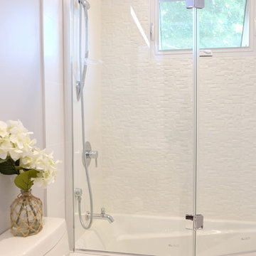
Shower curtains may be pretty, but they interrupt the visual flow of a bathing space and make it feel significantly smaller. In bathrooms with small footprints, opt for a clear glass sliding shower door that doesn't require the clearance of one with a hinged design. Or as shown in this design and for fraction less expensive a half hinged panel installed on a fixed tempered glass panel. If you're embarking on a big remodel, create the illusion of more space by using same tile in the shower that's used throughout; instead of seeing them as two separate zones, the eye will read them as one.
7 - Discover the treasure of hidden storage
Work with a contractor, and you just might find some serious storage potential hidden behind your walls. Whether it's utilizing space between the studs for shallow shelving or a creating a small linen closet by annexing space from an adjacent room, even small additions can make a big difference.
8 - Focal Point
Tile is a beautiful, durable addition to any bathroom. For dainty spaces, consider installing tile at a diagonal to accentuate the focal point or as in this bathroom I used an oversized textured pattern to bring depth to the space at the window wall.
9 - Choose the right lights
Strategically install light to reflect and brighten a small bathroom to make it appear larger. Recessed lighting is an affordable solution for tiny rooms, offering ample light while taking up little space. Wall sconces alongside a mirror also reflect off the walls and make a room feel bright and airy. I always recommend going with LED lighting at 2800 to 3000K.
10 – Accessorize
This is your time to shine in your decorating skills, have fun with your towels, you can change the color scheme daily just by adding pops of color in your accessories, make sure to get items that serve a dual purpose, like baskets, boxes they can always be used as hampers, storing of towels and even a nice display for your guest.

Sponsored
Columbus, OH

Hope Restoration & General Contracting
Columbus Design-Build, Kitchen & Bath Remodeling, Historic Renovations
 Drewett Works
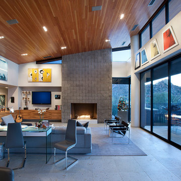
Believe it or not, this award-winning home began as a speculative project. Typically speculative projects involve a rather generic design that would appeal to many in a style that might be loved by the masses. But the project’s developer loved modern architecture and his personal residence was the first project designed by architect C.P. Drewett when Drewett Works launched in 2001. Together, the architect and developer envisioned a fictitious art collector who would one day purchase this stunning piece of desert modern architecture to showcase their magnificent collection.
The primary views from the site were southwest. Therefore, protecting the interior spaces from the southwest sun while making the primary views available was the greatest challenge. The views were very calculated and carefully managed. Every room needed to not only capture the vistas of the surrounding desert, but also provide viewing spaces for the potential collection to be housed within its walls.
The core of the material palette is utilitarian including exposed masonry and locally quarried cantera stone. An organic nature was added to the project through millwork selections including walnut and red gum veneers.
The eventual owners saw immediately that this could indeed become a home for them as well as their magnificent collection, of which pieces are loaned out to museums around the world. Their decision to purchase the home was based on the dimensions of one particular wall in the dining room which was EXACTLY large enough for one particular painting not yet displayed due to its size. The owners and this home were, as the saying goes, a perfect match!
Project Details | Desert Modern for the Magnificent Collection, Estancia, Scottsdale, AZ
Architecture: C.P. Drewett, Jr., AIA, NCARB | Drewett Works, Scottsdale, AZ
Builder: Shannon Construction | Phoenix, AZ
Interior Selections: Janet Bilotti, NCIDQ, ASID | Naples, FL
Custom Millwork: Linear Fine Woodworking | Scottsdale, AZ
Photography: Dino Tonn | Scottsdale, AZ
Awards: 2014 Gold Nugget Award of Merit
Feature Article: Luxe. Interiors and Design. Winter 2015, “Lofty Exposure”
 Serenity Design
There are few things we enjoy nearly as much as helping a homeowner create a statement that is so exclusively them that it’s all but impossible for another to duplicate what they’re creating in their home. Sure, there can be common colors and sometimes even common themes, but for as many homeowners as there are, there are as many individual tastes, thoughts, and ideas that can inspire creativity and design. Tapping into where each homeowner is coming from is what is what brings us so much joy and excitement.
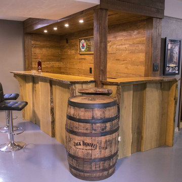
Just imagine the excitement we felt when this homeowner asked us to help him with this unusual project! He received this Jack Daniels barrel as a gift from a close friend and wanted to create a new bar in his basement to entertain family and friends. The initial thought was to have the barrel as a stand alone conversation piece, but after some further discussion we suggested using it as a focal point and thus the project was born.
Jack was known to be a man of refinement and to pay him the appropriate respect it only made sense to approach this project with an equal sense of detail in the crafting of this project, if for no other reason, we hold the same values. To match all of this with our homeowner’s fondness of entertaining friends, the warm and relaxing feeling he was looking for and the aesthetics of the room, the use of reclaimed and live-edge wood made for a natural fit.
In fact aside from a few structural 2x4s beneath the surface, the entire project is built from reused, reclaimed, or re-purposed materials. The most obvious example would be the barrel itself. A bit of research revealed that Jack Daniels only uses their barrels one time before replacing them. Rather than simply destroying them or throwing them away, the barrels are made available to the public to use for other purposes. As a side note we appreciate seeing other companies taking this responsible and earth friendly approach to business.
As a part of our own mission to reduce, reuse, and recycle as often as we can, you’ll note the wall paneling is also re-purposed materials. These particular boards we retrieved from an old building that was being removed and rather than allowing all these materials to be bulldozed with the rest of the old structure, we took as much of the old building materials as we could to use elsewhere. For this project we had the old planks and beams them re-sawn into the wall paneling you see here. Look closely at the picture and you’ll see the original nail holes in the boards that made their new home in this project.
We even incorporated the reclaimed paneling into wrapping the column the previously exposed wood beams above bar area. It adds to the overall feel by incorporating the theme into an otherwise ungainly (and obviously necessary!) part of the house structure.
All the boards in the design of the bar itself come from re-purposed, urban Ash logs. These are either aging and at-risk trees that cities need removed. Ash trees can be subject to assorted infections and diseases and it’s an unfortunate truth that once the disease is discovered, the best way to reduce it’s spreading is to remove the trees in the surrounding area. To further our mission, we take these trees before they end up in a shredder and re-purpose as many of them as we can rather than seeing them simply turned to mulch. We believe this to be a much more responsible use of available materials and just as beautiful.
Each board has so much individual character with their natural knots and swirls. We particularly enjoyed the perfectly sized and shaped piece that became the support at the far end of the bar top. It’s as if nature knew we were going to make this project and grew that board to the perfect dimensions just for this purpose!
We also had a small leftover piece that was extra knotty and so full of character that we incorporated it as a small shelf just above the barrel. Just because it’s small doesn’t mean it can’t make a statement…
Of course no bar would be complete without the top itself. We had a few extra large pieces of Ash with live edges on both sides for the owner to choose from that fit the rough dimensions we needed. His decision made, we added just a very subtle hint of blue and green with our proprietary treatment before the final finishing with epoxy to a mirror finish. We added a few recessed lights to help highlight the natural patterns in the bar top and this bar is ready to serve.
This project was satisfying for several reasons. We were thrilled we were able to complete the project entirely out of reclaimed and re-purposed materials. The homeowner’s desire for a rustic feel made it easier to accomplish this and we appreciate that we can partake in projects like this, particularly one so unique.
Custom doesn’t come out of a catalog. At Serenity Design Studio our number one goal is to see your unique vision come to life.
 Adrienne DeRosa
Adrienne DeRosa © 2014 Houzz Inc.
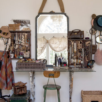
Jennifer's vanity is home to a treasure trove of vintage jewelry, highlighted by creative storage solutions. What was once a tool box now hangs on the wall to house various necklaces. Even with such rugged origins, the display has a decidedly feminine appeal.
"My girlfriend had come across these old tool boxes at an estate sale. The person that owned them painted the tools that hung on each hook, so it makes for a great story," says Jennifer.
Tool box containers: Stash Style
Photo: Adrienne DeRosa © 2014 Houzz
51