
Search results for "Simple minded chatbot" in Home Design Ideas

 Fireclay Tile
Katie Jameson
Example of a mid-sized trendy l-shaped concrete floor and gray floor eat-in kitchen design in Austin with a farmhouse sink, flat-panel cabinets, green cabinets, quartzite countertops, white backsplash, brick backsplash, stainless steel appliances, an island and white countertops
Example of a mid-sized trendy l-shaped concrete floor and gray floor eat-in kitchen design in Austin with a farmhouse sink, flat-panel cabinets, green cabinets, quartzite countertops, white backsplash, brick backsplash, stainless steel appliances, an island and white countertops
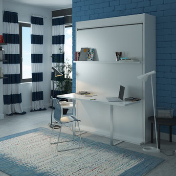
 Wall Bed Place
Does your home computer room, family room, or office need to double as a guest room? Would you like to find an alternative to the uncomfortable sleep sofa or working in a cramped corner of a guest bedroom? Here’s a way to have the best of all worlds. This wall bed has a queen-sized bed neatly stored inside a cabinet that can create an extra wall in your home, or can fit against an existing wall in just 17 ½”x64 ½” of floor space! This collection comes in either a light, natural woodgrain or a high-gloss white laminate finish, which will blend with almost any home color scheme and design. Our wall beds are designed with longevity in mind, using certified, thick laminated chipboard, heavy-duty hardware, and strong aluminum bed frame with solid wood slats. You can even open and close the bed with one hand with our ergonomic new generation gas shocks mechanism! Easy-Elegant Ergonomic! You really can have it all!

 Daniel Antes Marquetry
The flooring that was originally envisioned for this house wasn't Wood Floor of the Year-caliber. When Steve Brattin, president at SVB Wood Floors in Grandview, Mo., got involved in the project, the designers were discussing a simple machine-sanded heart pine or reclaimed wood floor. But once Brattin visited the site—an old world traditional estate set on acreage with its own private lake—he knew it deserved more than a typical floor. "I chatted with the designers and said I would love to meet with the homeowners and have them in our showroom," he recalls. "I said I would really like to do something artistic with it."
Brattin's mind was already envisioning the possibilities—something he says usually happens for him within a half hour of walking through a space. "I don't know how certain things come to me," he says, adding that often he draws things out and the designs don't end up being in the clients' budget. That wasn't the case here, however, and the final plans for the flooring called for five designs in various areas, including this Bordeaux parquet in the foyer.
With the designs finalized, Brattin turned to Distinctive Floors' (Nashville, Tenn.) Dan Antes to create the walnut flooring, which called for hand-beveling with a circle-sawn and wire-brushed surface; in some areas the flooring was 10-inch plank. The width presented a challenge for Antes, as he had planned to contract out the circle-sawing, but the company he had in mind could handle widths only up to 81⁄2 inches. He decided he would have to do it himself. "We spent maybe $1,500 modifying $20,000 worth of equipment to end up with this awesome distressed product," he says. Due to a tight time frame to complete the job, once the flooring was milled, it was shipped to WD Flooring (Laona, Wis.) to be finished with hardwax oil—a choice Antes says he loves for its maintainability.
The actual installation of all 3,000 square feet of flooring was uneventful, Brattin says, crediting his crew, experienced with high-end projects, for a great job. "They had a blast," he says. "They had so much fun out there on the project, and they do it quite frequently; it comes naturally for them at this point."
Given the complexity of this job, from scribing around stone to large-scale chevron and mixed media, that's high praise. Antes, himself a Wood Floor of the Year winner and supplier to many more winning projects, sums up the scope of this job: "I think he could have entered any room in this house, really, and won."—K.M.W.
Find the right local pro for your project

 James McNeal Architecture and Design
My client had recently visited England and wanted an authentic European look, with timber framing and steep pitch roofs. She also wanted lots of craftsman style woodwork in the home, with unique windows, balconies and overlooks.
I designed the home with all this in mind, but also defined the spaces to take advantage of the long views throughout the home. The land was flat, so I created ways to get daylight into the lower level. Without ever compromising the attributes that make a Tudor a Tudor, the home is designed and built to the level of the old Tudors, with the modern, open plan living for today.
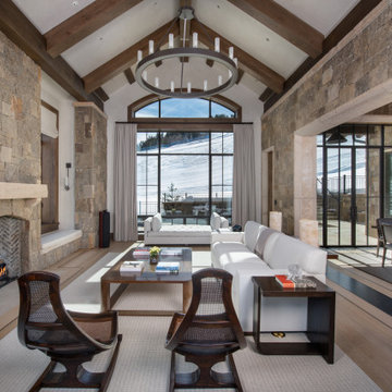
 Natural Stone Institute
Gallegos was contacted by a client about a project where stone was not just to be an accent material, but the main visual and perceived structural element to create a timeless architectural composition. To further the endeavor: all veneers and dimension stone must be locally sourced and sustainably quarried. The design called for a moss rock veneer with cut stone trim. Sourcing the sandstone moss rock was simple because there were several local quarries to use. The problem
was with the trim pieces.
Gallegos selected Colorado Buff sandstone for the trim since the buff body was a good contrast to the moss rock and it is a stone that can be cut to size. One main concern with any sedimentary stone is hitting what is known as a “dry” layer in the ledge. This is an area in the stone between sedimentary layers that has not solidified or cemented. It is still granular and can lead to future stone failure as water penetrates these layers and creates freeze/thaw issues. To avoid this, they used
an epoxy injected into the dry layers to help solidify the material and prevent any future failures.
The client also wanted sustainable materials for their countertops and bathrooms. Many of the interior stones were either reclaimed materials or were sourced from Colorado quarries – Calacatta Lincoln was used extensively.
Gallegos sourced tiles from reclamation projects in Europe and Asia for use in the master bath and front entry areas. For many of the countertops, the owner’s interior designer spent hours looking through remnants and applied several throughout the residence.
Willow Court is a spectacular and dramatic nod to stone masonry, something the owner, architect, and builder can be proud of and, for the most part, was built with the environment in mind.

 Infinite Home
Custom Home Built for Real Life
Our clients came to us with a clear vision: a home that could adapt to their lifestyle and growing family. They needed a home built with intention, designed with the future in mind, and built around the routines they loved and the people they loved more.
Open-Concept Living With Hosting in Mind
Our clients hosted often and lived actively, so the main level had to be flexible for all of life’s moments. The goal was a space that felt grand without losing its warmth.
Cooking together as a family mattered to our clients – the Wolf range, farmhouse sink, integrated appliances, and large island gave them a kitchen that flowed effortlessly while looking beautiful. This space also served as the bridge between other parts of the main level so that they would stay in view of the next. This created the perfect environment for gathering where everyone had their own spot without ever feeling apart from the whole group.
For the living room, our clients wanted space that felt open without losing its warmth. Soaring ceilings created that sense of scale, while warm tones and materials, like the wood coffered ceiling and fireplace wall, kept it grounded. That same warmth carried outside, where an outdoor lounge with a fireplace and dining area made sure guests felt welcomed the moment they stepped out.
A Backyard Built for Real Rest
Every corner of the backyard was designed with one goal: to be the ultimate outdoor retreat. The elevated, white-brick-framed pool and integrated spa hot tub gave them a place to truly exhale. As the sun set, the fire pit lounge next to the pool became the hangout spot when they hosted their youth groups and family gatherings.
Room to Grow
With kids in the house, “custom” had to also mean flexible. Our clients had 2 young sons and needed their rooms to grow with them through the years. The two bedrooms and a full bath sat beside a loft that served as both their hangout-and-homework spot. The guest suite sat on the same level where a four-poster bed, floor-to-ceiling wood-look tile, and a frameless glass shower welcomed their guests from day one.
A Retreat That’s Actually Theirs
Between hosting and raising kids, this couple needed a suite that felt like a true escape. The wood-planked tray ceiling and French doors grounded the room in warmth the moment you walked in, while the ensuite bathroom carried a spa-like feeling with a freestanding soaking tub, custom double vanity, and a glass-enclosed shower.
This Is What Approachable Luxury Looks Like
The approachable luxury experience meant starting with conversations about how they wanted their space to live with them – how they hosted, how their kids played, how they wanted to feel walking through their own front door, and how we took their goals and experience and used it as the foundation of every decision that was made from start to finish. We wanted our clients to feel taken care of through the process and, most importantly, feel heard.

 GlassCrafters Inc
Frameless Mirrored Medicine Cabinet with Vertical LED Task Lights
GlassCrafters’ Vertical LED Task Lights illuminate your daily grooming activities with energy efficient, optimal warm white light and integrate seamlessly into any décor. Providing a minimal, low profile design aesthetic, the 2 - 1/2" wide Vertical LED Task Lights are easy to install and complement GlassCrafters’ 24", 30" and 36" high, frameless flat or beveled mirrored cabinets.


 Renovisions
The owners of this outdated 1960’s kitchen were ready for a change and sought out Renovisions after seeing one of their eye-catching ads in South Shore Living Magazine. It was time to start fresh with a cleaner and brighter look with more functional storage. The professionals at Renovisions worked as a team to accommodate their wishes while being mindful of their existing traditional styled furnishings.
Keeping a similar layout, the old cabinets, flooring, countertops, door, window and appliances were removed as well as the wall between the kitchen and dining room to accommodate additional cabinets while creating an L for more useful countertop space. Replacing the worn stained wooden door and double hung window with a new prairie-style window and breezeway door in white finish was the first order of business. By replacing the tired vinyl floor with new oak wood floors the space became warm & inviting. The beautiful new white painted shaker-style cabinets look fabulous with the natural ivory-tan blend granite countertops and sleek stainless steel appliances. Simple, yet elegant white subway tiles provide a serene and open feel to the space. Creating a small niche area behind the slide-in range was also at the top of our clients list to accommodate the spices they use daily, turning an ordinary look to extraordinary.
Pesto change-o, as if by magic Renovisions transformed this dated tight-fit kitchen into a warm and inviting better functioning space that is definitely pleasing to the eyes of these homeowners who are thrilled with the end result and grateful for the high quality work along with the professional manner in which their project was completed.
“Thanks to you, Ed, Mike, and Liz for all your hard work. The kitchen is beautiful and I love the backsplash! The whole room looks beautiful, I'm so glad that we went with the white subway tiles in the end. They're light and clean and really pretty. Thanks for everything, Cathy. Your team has done a wonderful job! We appreciate all your help and hard work.”
- Bea R. (Hanson)

 Skill Construction & Design, LLC
If you are looking for twice your normal bath experience, look no more. This master bath has plenty of room for two with double the storage, double the mirrors, sinks and faucets, and bathing is done two-way. The colors are warm and inviting, but it’s the subtle patterning that caught my eye. The overall effect is of a soft wash, yet on closer examination, the striations travel across the walls and criss-cross on the floor.
This expansive vanity was created with our homeowner’s needs in mind. Each “side” has a bank of drawers and under sink cabinet storage. A large undermount sink dips below the gorgeous stone counter top. Gently arching faucets in brushed nickel adorn each sink with a framed mirror above for reflection. Individual task lighting shine upon each sink and is reflected back into the room. For additional storage and to keep elbows from connecting, a large shared bank of drawers separate the two areas.
The vanities are rich with color and texture, from the swirling grain of the wood, to the raised panels and beading. The subtle beading is repeated on the drawers for a custom look. Our wood color is a deeper, more intense tone of the colors in our tiling.
Whether in a hurry or needing to relax and unwind, this bath can do both. Despite having two substantial pieces in the same area, the open glass panel that separate leaves each feeling open and airy.
This tub was made for soaking. The sides and back gently mold into arm and neck support for a truly relaxing experience. The lineal movement in the tile backsplash lend a long and lean feeling. For easy reach, toiletries are stored in a niche with accent multicolored mosaics.
On the other side of the half wall a roomy shower awaits. The long tiles were installed in a brick pattern with striations of color wrapping the walls. The oversized tiles reduce the amount of grout, for a cleaner look. Here too we added a niche for maximum storage and a sprinkle more of the accenting mosaic. We capped the half wall and the generous bench with our vanity’s stone for a rich contrast.
We installed the tile up to the ceiling, which adds to the visual height of the room. We went with clean simple controls and showerhead, enhanced in a brushed nickel finish. So as to not obscure the view, we went frameless on our shower door and panels, using brushed nickel hinges and a simple handle.
At the end of our vanity, a half wall adds backsplash on the vanity side and a bit of privacy on the other. A simple toilet in crisp white is out of sight but functional in its own “alcove”.
Despite all the patterning, there is nothing busy about the room. For the floor we decided to change things up, using a large square version of the wall tiles. To keep the room from feeling too long, we installed them on the diagonal and then criss-crossed the lines for a dramatic look.
This bath is twice as nice and ready to be shared!
http://www.designsbyskill.com/
http://www.rjkconstructioninc.com/

 Skill Construction & Design, LLC
If you are looking for twice your normal bath experience, look no more. This master bath has plenty of room for two with double the storage, double the mirrors, sinks and faucets, and bathing is done two-way. The colors are warm and inviting, but it’s the subtle patterning that caught my eye. The overall effect is of a soft wash, yet on closer examination, the striations travel across the walls and criss-cross on the floor.
This expansive vanity was created with our homeowner’s needs in mind. Each “side” has a bank of drawers and under sink cabinet storage. A large undermount sink dips below the gorgeous stone counter top. Gently arching faucets in brushed nickel adorn each sink with a framed mirror above for reflection. Individual task lighting shine upon each sink and is reflected back into the room. For additional storage and to keep elbows from connecting, a large shared bank of drawers separate the two areas.
The vanities are rich with color and texture, from the swirling grain of the wood, to the raised panels and beading. The subtle beading is repeated on the drawers for a custom look. Our wood color is a deeper, more intense tone of the colors in our tiling.
Whether in a hurry or needing to relax and unwind, this bath can do both. Despite having two substantial pieces in the same area, the open glass panel that separate leaves each feeling open and airy.
This tub was made for soaking. The sides and back gently mold into arm and neck support for a truly relaxing experience. The lineal movement in the tile backsplash lend a long and lean feeling. For easy reach, toiletries are stored in a niche with accent multicolored mosaics.
On the other side of the half wall a roomy shower awaits. The long tiles were installed in a brick pattern with striations of color wrapping the walls. The oversized tiles reduce the amount of grout, for a cleaner look. Here too we added a niche for maximum storage and a sprinkle more of the accenting mosaic. We capped the half wall and the generous bench with our vanity’s stone for a rich contrast.
We installed the tile up to the ceiling, which adds to the visual height of the room. We went with clean simple controls and showerhead, enhanced in a brushed nickel finish. So as to not obscure the view, we went frameless on our shower door and panels, using brushed nickel hinges and a simple handle.
At the end of our vanity, a half wall adds backsplash on the vanity side and a bit of privacy on the other. A simple toilet in crisp white is out of sight but functional in its own “alcove”.
Despite all the patterning, there is nothing busy about the room. For the floor we decided to change things up, using a large square version of the wall tiles. To keep the room from feeling too long, we installed them on the diagonal and then criss-crossed the lines for a dramatic look.
This bath is twice as nice and ready to be shared!
http://www.designsbyskill.com/
http://www.rjkconstructioninc.com/

 Amy Martin Landscape Design
Location: Cohasset, MA, USA
When my clients purchased this historic house, they saw that this garden held great potential, even though the property had been somewhat neglected. They wanted the new landscape to evoke the feeling of an Olde Maine house that time had forgotten. Sitting on the front veranda in the shade of the treasured Horse Chestnut and Maple trees that flank each side of the house, we explored the possibilities together.
The front yard sloped a bit too much for comfort, so we determined that building a stone wall in the middle would create a terrace, making both parts of the lawn more usable. Visions of parties and children's weddings came to mind. We put a set of elegant arching steps in the middle, leading down to the sunken garden.
Large, mature Rhododendrons were planted at the base of the Horse Chestnut and Maple trees just off the front veranda. Boxwoods undulate beneath the trees with Vinca as a ground cover.
Ticonderoga stone was used for the walls and steps, which was the closest match to the existing stone foundation. The exquisite masonry by Doug Brooks Masonry makes this staircase as elegant as a tiered wedding cake.
The front veranda is furnished with comfortable pieces and simple ferns, where they sit in the shade, watching sunsets on the harbor.

 Dana King Design Build Remodeling
A fun, hip kitchen with a mid-century modern vibe. The homeowners wanted a kitchen to make them happy. We think you can't help but smile!
NEXT Project Studio
Jerry Voloski
Sponsored
Columbus, OH

Hope Restoration & General Contracting
Columbus Design-Build, Kitchen & Bath Remodeling, Historic Renovations
 catlin stothers design
Well situated in Mont Royal, this split-level home had many positives apart from its dated interior, and layout of many small and inefficient rooms. This was all at odds with the owners’ lifestyle and aesthetic.
The client had architectural plans designed for a third floor addition that were to include a master bedroom and ensuite bathroom. The desired look for the entire house influenced all aspects of construction. Apart from the removal most walls on the main floor, everything was stripped back to the most simple and pure of finishing materials.
The existing floors were refinished in a smoked grey matte palette and offset the rich warm walnut accents in the kitchen and soft white walls.
With an abundance of white walls throughout, feature walls were essential in both the master bedroom and ensuite. The deep charcoal wall in the bedroom provides dramatic contrast to the teak headboard and hammered silver light fixture. The ensuite’s feature wall is made of pewter ceramic tiles that add texture and elegance to this simple space.
Materials and furnishings throughout were selected for their simplicity and form.
Photo : Drew Hadley

 TELFORD+BROWN STUDIO ARCHITECTURE
The Shadowood House is part of a farm that has been in the client's family for generations. At the beginning of the process, the clients were living in a house (where this one now sits) that had been through addition after addition, making the spaces feel cramped and non-cohesive. They wanted a space for family gatherings, that was a modern take on a simple farmhouse. The clients wanted a house that feels comfortable for their children and grandchildren, but also enables them to age-in-place. In short, they wanted a house that would offer generations to come a place to feel at home.
Josh Partee AIAP, ASMP, LEED AP / Architectural Photographer
 Skill Construction & Design, LLC
If you are looking for twice your normal bath experience, look no more. This master bath has plenty of room for two with double the storage, double the mirrors, sinks and faucets, and bathing is done two-way. The colors are warm and inviting, but it’s the subtle patterning that caught my eye. The overall effect is of a soft wash, yet on closer examination, the striations travel across the walls and criss-cross on the floor.
This expansive vanity was created with our homeowner’s needs in mind. Each “side” has a bank of drawers and under sink cabinet storage. A large undermount sink dips below the gorgeous stone counter top. Gently arching faucets in brushed nickel adorn each sink with a framed mirror above for reflection. Individual task lighting shine upon each sink and is reflected back into the room. For additional storage and to keep elbows from connecting, a large shared bank of drawers separate the two areas.
The vanities are rich with color and texture, from the swirling grain of the wood, to the raised panels and beading. The subtle beading is repeated on the drawers for a custom look. Our wood color is a deeper, more intense tone of the colors in our tiling.
Whether in a hurry or needing to relax and unwind, this bath can do both. Despite having two substantial pieces in the same area, the open glass panel that separate leaves each feeling open and airy.
This tub was made for soaking. The sides and back gently mold into arm and neck support for a truly relaxing experience. The lineal movement in the tile backsplash lend a long and lean feeling. For easy reach, toiletries are stored in a niche with accent multicolored mosaics.
On the other side of the half wall a roomy shower awaits. The long tiles were installed in a brick pattern with striations of color wrapping the walls. The oversized tiles reduce the amount of grout, for a cleaner look. Here too we added a niche for maximum storage and a sprinkle more of the accenting mosaic. We capped the half wall and the generous bench with our vanity’s stone for a rich contrast.
We installed the tile up to the ceiling, which adds to the visual height of the room. We went with clean simple controls and showerhead, enhanced in a brushed nickel finish. So as to not obscure the view, we went frameless on our shower door and panels, using brushed nickel hinges and a simple handle.
At the end of our vanity, a half wall adds backsplash on the vanity side and a bit of privacy on the other. A simple toilet in crisp white is out of sight but functional in its own “alcove”.
Despite all the patterning, there is nothing busy about the room. For the floor we decided to change things up, using a large square version of the wall tiles. To keep the room from feeling too long, we installed them on the diagonal and then criss-crossed the lines for a dramatic look.
This bath is twice as nice and ready to be shared!
http://www.designsbyskill.com/
http://www.rjkconstructioninc.com/

 Seattle Staging Company
JIM ARCARI, NW REAL ESTATE PHOTOGRAPHY
The light filled entry features can lighting, glowing hard wood floors, and open tall ceilings which welcome you into the hear of the home.
We kept it simple with a sisal rug, blue mirror and fun coat stand with classic fedora hats.
Sponsored
Sunbury, OH

J.Holderby - Renovations
Franklin County's Leading General Contractors - 2X Best of Houzz!

 Inspired Interiors - Design. Build. Furnish.
Example of a mid-sized transitional master dark wood floor and brown floor bedroom design in Chicago with blue walls and no fireplace
 Schindler Design Co
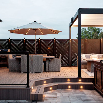
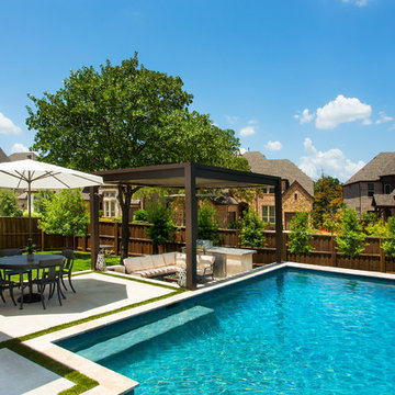
With constraints in every direction, this beautiful contemporary design was developed with entertaining in mind. What was once thought of as a lost cause of a skinny backyard with over 4' of elevation change was uniquly transformed into 6 unique spaces which include an artificial turf lawn, 2 tanning areas, firepit, dining, and bar space. The Equinox structure which transforms from a shade arbor to a fully covered roof with the click of a button adds a perfect compliment to the water & fire.
Designed By: Reid Schindler https://www.houzz.com/pro/schindlerdesignco/schindlerdesignco-pool-and-outdoor-living-design
Constructed By: Claffey Pools https://www.houzz.com/pro/claffeyswimmingpools/claffey-pools
Photos By: Vernon Wentz https://www.houzz.com/pro/adimagery/vernon-wentz
 Marie Burgos Design
Established in 1895 as a warehouse for the spice trade, 481 Washington was built to last. With its 25-inch-thick base and enchanting Beaux Arts facade, this regal structure later housed a thriving Hudson Square printing company. After an impeccable renovation, the magnificent loft building’s original arched windows and exquisite cornice remain a testament to the grandeur of days past. Perfectly anchored between Soho and Tribeca, Spice Warehouse has been converted into 12 spacious full-floor lofts that seamlessly fuse Old World character with modern convenience. Steps from the Hudson River, Spice Warehouse is within walking distance of renowned restaurants, famed art galleries, specialty shops and boutiques. With its golden sunsets and outstanding facilities, this is the ideal destination for those seeking the tranquil pleasures of the Hudson River waterfront.
Expansive private floor residences were designed to be both versatile and functional, each with 3 to 4 bedrooms, 3 full baths, and a home office. Several residences enjoy dramatic Hudson River views.
This open space has been designed to accommodate a perfect Tribeca city lifestyle for entertaining, relaxing and working.
This living room design reflects a tailored “old world” look, respecting the original features of the Spice Warehouse. With its high ceilings, arched windows, original brick wall and iron columns, this space is a testament of ancient time and old world elegance.
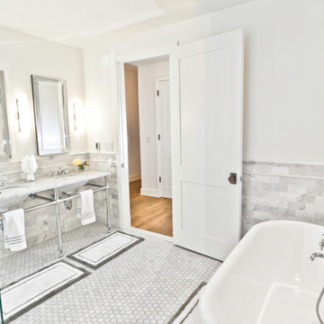
The master bathroom was designed with tradition in mind and a taste for old elegance. it is fitted with a fabulous walk in glass shower and a deep soaking tub.
The pedestal soaking tub and Italian carrera marble metal legs, double custom sinks balance classic style and modern flair.
The chosen tiles are a combination of carrera marble subway tiles and hexagonal floor tiles to create a simple yet luxurious look.
Photography: Francis Augustine
193