
Search results for "Simple short" in Home Design Ideas
 TKS Design Group
Download our free ebook, Creating the Ideal Kitchen. DOWNLOAD NOW
Lakefront property in the northwest suburbs of Chicago is hard to come by, so when we were hired by this young family with exactly that, we were immediately inspired by not just the unusually large footprint of this 1950’s colonial revival but also the lovely views of the manmade lake it was sited on. The large 5-bedroom home was solidly stuck in the 1980’s, but we saw tons of potential. We started out by updating the existing staircase with a fresh coat of paint and adding new herringbone slate to the entry hall.
The powder room off the entryway also got a refresh - new flooring, new cabinets and fixtures. We ran the new slate right through into this space for some consistency. A fun wallpaper and shiplap trim add a welcoming feel and set the tone for the home.
Next, we tackled the kitchen. Located away from the rest of the first floor, the kitchen felt a little isolated, so we immediately began planning for how to better connect it to the rest of the first floor. We landed on removing the wall between the kitchen and dining room and designed a modified galley style space with separate cooking and clean up zones. The cooking zone consists of the refrigerator, prep sink and cooktop, along with a nice long run of prep space at the island. The cleanup side of the kitchen consists of the main sink and dishwasher. Both areas are situated so that the user can view the lake during prep work and cleanup!
One of the home’s main puzzles was how to incorporate the mudroom and area in front of the patio doors at the back of the house. We already had a breakfast table area, so the space by the patio doors was a bit of a no man’s land. We decided to separate the kitchen proper from what became the new mudroom with a large set of barn doors. That way you can quickly hide any mudroom messes but have easy access to the light coming in through the patio doors as well as the outdoor grilling station. We also love the impact the barn doors add to the overall space.
The homeowners’ first words to us were “it’s time to ditch the brown,” so we did! We chose a lovely blue pallet that reflects the home’s location on the lake which is also vibrant yet easy on the eye. Countertops are white quartz, and the natural oak floor works well with the other honey accents. The breakfast table was given a refresh with new chairs, chandelier and window treatments that frame the gorgeous views of the lake out the back.
We coordinated the slate mudroom flooring with that used in the home’s main entrance for a consistent feel. The storage area consists of open and closed storage to allow for some clutter control as needed.
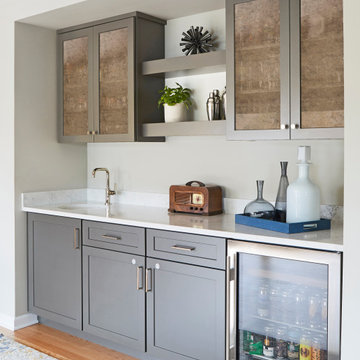
Next on our “to do” list was revamping the dated brown bar area in the neighboring dining room. We eliminated the clutter by adding some closed cabinets and did some easy updates to help the space feel more current. One snag we ran into here was the discovery of a beam above the existing open shelving that had to be modified with a smaller structural beam to allow for our new design to work. This was an unexpected surprise, but in the end we think it was well worth it!
We kept the colors here a bit more muted to blend with the homeowner’s existing furnishings. Open shelving and polished nickel hardware add some simple detail to the new entertainment zone which also looks out onto the lake!
Next we tackled the upstairs starting with the homeowner’s son’s bath. The bath originally had both a tub shower and a separate shower, so we decided to swap out the shower for a new laundry area. This freed up some space downstairs in what used to be the mudroom/laundry room and is much more convenient for daily laundry needs.
We continued the blue palette here with navy cabinetry and the navy tile in the shower. Porcelain floor tile and chrome fixtures keep maintenance to a minimum while matte black mirrors and lighting add some depth the design. A low maintenance runner adds some warmth underfoot and ties the whole space together.
We added a pocket door to the bathroom to minimize interference with the door swings. The left door of the laundry closet is on a 180 degree hinge to allow for easy full access to the machines. Next we tackled the master bath which is an en suite arrangement. The original was typical of the 1980’s with the vanity outside of the bathroom, situated near the master closet. And the brown theme continued here with multiple shades of brown.
Our first move was to segment off the bath and the closet from the master bedroom. We created a short hall from the bedroom to the bathroom with his and hers walk-in closets on the left and right as well as a separate toilet closet outside of the main bathroom for privacy and flexibility.
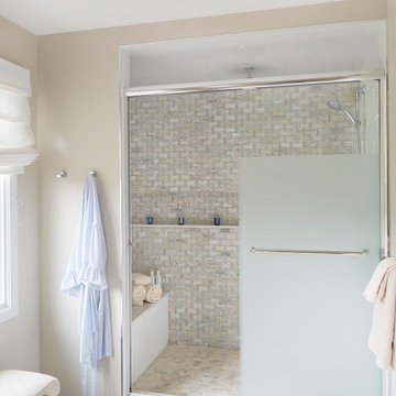
The original bathroom had a giant soaking tub with steps (dangerous!) as well as a small shower that did not work well for our homeowner who is 6’3”. With other bathtubs in the home, they decided to eliminate the tub and create an oversized shower which takes up the space where the old tub was located. The double vanity is on the opposite wall and a bench is located under the window for morning conversations and a place to set a couple of towels.
The pallet in here is light and airy with a mix of blond wood, creamy porcelain and marble tile, and brass accents. A simple roman shade adds some texture and it’s top-down mechanism allows for light and privacy.
This large whole house remodel gave our homeowners not only the ability to maximize the potential of their home but also created a lovely new frame from which to view their fabulous lake views.
Designed by: Susan Klimala, CKD, CBD
Photography by: Michael Kaskel
For more information on kitchen and bath design ideas go to: www.kitchenstudio-ge.com

 Landry & Arcari Rugs and Carpeting
Michael J. Lee Photography. Custom binding and area rug installation by Landry & Arcari Rugs and Carpeting.
Bedroom - traditional bedroom idea in Boston
Bedroom - traditional bedroom idea in Boston

 Sierra Living Concepts Inc
Dimension:
35.5" L X 15.5" D X 70.5" H
Drawer: 13.5" L X 12" D X 2.5" H
Cabinet shelves: 32" L X 14" D X 17" H
Choose accent furniture with an artistic element which delivers dynamism to any room. Our Floral Mandala Handcarved Rustic Solid Wood Display Cabinet Armoire has an antique whitewash finish and clean modern lines. The bottom double doors and middle drawer fronts are carved with an intricate floral design of petals and leaves shaped around a circle that extends beyond the wooden doors. The simple glass pane top doors add a classic contrast.
This large display cabinet armoire with shelves stands off the floor on short legs. The tall breakfront is built with solid Mango wood, a tropical hardwood grown as an eco-friendly renewable crop.
Special Features:
• 100% Handcrafted
• Solid Mango wood
• Accent cabinet
• Display cabinet with 2 large shelves
• Storage cabinet with 2 large and spacious shelves
• 2 drawers in the middle
• Hand rubbed stain and finish
• Interior dark stain finish adds exciting contrast to the light exterior
• Ring pulls and wooden latches
• Can be custom-made to have adjustable/removable shelves upon request
• Premium heirloom quality
• Anti-tip kit included
Note: Real wood is a product of nature, and as such, no two pieces are alike. Variations in solid wood grain patterns are to be expected and make each furniture uniquely beautiful, just like us humans.
Find the right local pro for your project
 Sierra Living Concepts Inc
Dimension: 40" L X 22.5" D X 72" H
Introduce an artfully trendy aesthetic with a homely touch in your interior design with our stunning Indiana Rustic Solid Wood Louvered Door Armoire Wardrobe.
With its louvered doors and sleek metal hardware, this solid hardwood armoire is definitely a breath of fresh air in a world full of typical. The exterior is certainly unique with two large drawers taking center stage at the bottom. Separated by a wooden strip, the wardrobe compartment on top comes with double-leaf shutter doors and a decorative crown on top. Completing the whole look are two, short bun shaped feet and the hand-wrought metal hardware to access the wardrobe and drawers. The whole design is simple with a touch of casual attractiveness.
The large spacious drawers allow for individuality in storage options, and the ergonomics of this solid hardwood wardrobe closet are just as impressive. The large wardrobe compartment comes with a stainless steel hanging rod on top and two open shelves at the bottom.
This louvered door armoire wardrobe has been 100% handcrafted from solid Rosewood, and as such, warrants an excellent heirloom quality along with an amazing strength, sturdiness, and longevity.
Capping off the whole package is the visual versatility of the whole design. Its amazing aesthetics are flexible enough that you easily set this wardrobe armoire up in any number of interior design styles, whether it’s contemporary, rustic, transitional or even industrial.
Special Features:
• 100% Handcrafted
• Solid Rosewood craftsmanship
• Modern rustic style
• Louvered or shutter doors
• 2 large drawers at the bottom
• Hand-wrought metal hardware
• Bun shaped feet
• 1 stainless steel hanging rod
• 2 open shelves inside the wardrobe
• Can be custom-made to add adjustable/removable shelves upon request
• Visually versatile
• Heirloom quality
• Easy maintenance
Note: Real wood is a product of nature, and as such, no two pieces are alike. Variations in solid wood grain patterns are to be expected and make each furniture uniquely beautiful, just like us humans.

 Cameo Kitchens, Inc.
Kelly Keul Duer
Example of a classic medium tone wood floor family room design in DC Metro with a standard fireplace
Example of a classic medium tone wood floor family room design in DC Metro with a standard fireplace
 Klopf Architecture
The Roger Lee designed house from 1962 was purchased by the current homeowners in almost original condition, as the previous owners elected to defer most maintenance projects over the years. The clients were able to see beyond the dated materials and finishes, single-paned glass and uninsulated walls and they approached Klopf Architecture to help them expand and update the entire home, one the family could settle into and enjoy for years to come. It was important that the new designs were aligned with Lee's original intent not only because of the client's appreciation for mid-century modern architecture, but also because the house was deemed historical. The Stanford Real Estate Office requires a stringent design review which safeguards the integrity of the community, which Klopf Architecture was happy to oblige going into their updated designs.
As with many original mid-century modern homes, the house was scaled to the 1960s lifestyle where rooms were smaller and openings to views were limited and tightly framed. The original conditions defined the direction the family of four would take in updating the house and making it comfortable for their modern lifestyle. Klopf designed a full gut remodel and major addition to bring the house into the 21st century and provide the living area needed for the client's family. The newly expanded house added just about 1,100 sf to create an airy, comfortable and family friendly house, taking full advantage of the beautiful southwestern views that extend out to the hills beyond. The enclosed garage created an additional 240 sf of covered space for long-term storage.
A cracked swimming pool created an eyesore taking up a majority of the backyard landscape, so it was one of the first elements to go during the transformation. Working with Outer Space Landscape Architects, the family asked for a mix of relaxing outdoor patio spaces that eventually blend into the native landscaping, extending their views outward toward the natural greenery of the trees beyond their property. Filling in the old pool was a smart way to expand the living spaces outward. The orientation of the house was designed to enjoy the views, but the original architecture provided the first homeowners with mere glimpses of the landscape outside.
Klopf was able to broaden those views, continuing and extending on the original architecture to take full advantage of the unobstructed natural views across the rear facade of the house. Small horizontal openings in the primary bedroom and office were replaced with much taller windows that now follow the angled roof line upward, extending across almost all of the facade. We worked with Western Windows, whose designs included an oblique-shaped, operable casement that allowed our design to rise with the slope. A new corner office added to the primary suite, offers a bright and functional work-from-home solution that looks out at the distant views and added natural light from the expanded window configuration that now wraps around the corner.
The existing lower level was designed by Lee as a utilitarian space, serving as a wet pool room with a drain in the center of the floor, bathroom, laundry and storage areas. Without the need for a pool room, Klopf was able to convert the area into a much more comfortable and functional living space with a new family room and guest suite. The new spaces enjoy easy access to a new outdoor patio through floor to ceiling, full-width glass sliders.
Continuing along the rear facade, a previously exposed deck extending from the living room and hallway provided access to the backyard through a single set of stairs leading toward the side of the house which made sense when the pool was in place. The new deck was re-envisioned as an extension of the main living room and now serves as a second outdoor living room. A new slatted pergola above provides the homeowners welcome relief from the hot afternoon sun. A second set of stairs now creates a better connection to the redesigned lower level. Klopf was able to reconfigure the spaces, extending the living room outward toward the views, where the family now claims it as the heart of the home, spending a large majority of their time outdoors.
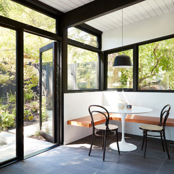
Back inside, the original wood-burning Malm fireplace was beautifully restored and a gas burner installed to comply with California's strict air standards. It now rests in front of a wall of Heath accent tiles where a dated red brick wall used to stand. A new taller window brings more light and views into the refreshed interior living room. The original glass doors opposite the fireplace were replaced by larger sliders that when fully opened, create a seamless transition to the new outdoor living area so the two spaces feel like one connected space. The original utilitarian kitchen was needlessly tucked into the far back corner and closed-off, out of sight from the living room, so the clients asked Klopf to open it up and expand the kitchen forward so it felt more connected. Today the much larger kitchen is connected to the living area where a short wall with a cutout offers a visual glimpse into the kitchen and a handy pass-through counter for serving guests. A new breakfast nook was also added to create another spot where the family can gather for casual meals. Just outside, a new built-in outdoor grill and prep area extends the kitchen outside and connects to a new outdoor dining spot nestled amongst the trees, taking advantage of the views out back.
Klopf was able to expand the other two bedrooms, add a new laundry room and half-bath and convert the carport to an enclosed garage to add more storage areas which was lost when the pool house was converted to the family and guest room.
To maintain a historical connection to the original designs, the exterior siding was repeated on all exterior walls, a full-height stained glass window at the front entryway restored, and an interior slatted screen element repeated outside at the exterior entry courtyard and over the new outdoor living room to create a shade trellis. The new house stands proudly and shines against it's new landscaping features, while respecting and expanding on the original intent of Roger Lee's designs epitomizing the comforts of indoor-outdoor living in Northern California.
Completion year: 2020
Klopf Architecture project team: John Klopf, Klara Kevane, Noel Andrade
Contractor: ORB Construction, Brendan O'Reilly
Structural engineer: Sezen and Moon
Landscape architect: Outer space
Furnishings and decoration: Urbanism Designs
Photographer: Mariko Reed

 Advance Design Studio, Ltd.
Jackie and Sean loved the Algonquin neighborhood they lived in with the peaceful neighborhood and the close proximity to work and school. What they didn’t love was how outdated their home had become. With a cramped kitchen and an unused dining room, they decided a remodel was the perfect solution to their problem. They would be able to continue to live in the area they loved, while at the same time they could have the dream home they envisioned.
After a thorough search, Jackie came across Advance Design Studio. She was impressed by all of the positive reviews she saw on the internet and saw herself identifying with all of the project stories she saw on the website. Once they met with designer Scott Christensen and owner Todd Jurs, they knew Advance Design was the right company to make their dreams a reality.
The project consisted of four main areas: the kitchen/dining/powder room, the laundry room, the master bathroom, and the kid’s bathroom. They wanted to expand the kitchen into the seldom used dining room and add a large island for hosting parties and family gatherings. They also wanted new hardwood flooring throughout the first level. The laundry room needed to be more functional, and all three bathrooms were in dire need of updating.
The closed off kitchen was opened up to create a sweeping space between the new eating area and the much larger kitchen. A handsome dry bar complete with a beverage refrigerator and lighted glass door cabinetry makes an elegant transition across from a peninsula area filled with storage. An additional decorative cabinet lighting up elegant dishware through the mullioned glass sits directly across from the drybar.
An expansive island was critical to the kitchen plans. Jackie, Sean and Scott worked closely together to create just the right details for their design. They wanted the island to be functional in addition to being the centerpiece of the room. Added storage for the kid’s school supplies was hidden behind cabinet doors so the children could do their schoolwork right at the island, and a microwave drawer glides open with the touch of a finger hidden inconspicuously within the island space. The easy to care for Cambria Britannica Quartz island top with its sweeping grey and white marble look perched atop hand-carved Craftsman corbels was absolutely what they were hoping for, blending both beauty and function perfectly.
Adding a nice contrast to the brightness of the quartz and the white cabinetry, Kodiak - Leather granite countertops were used to balance the light and dark tones of the space. Dura Supreme Classic White painted cabinets grace the perimeter, while Maple Poppy Seed stained cabinets with a beautiful soft grey woodgrain were used in the beverage center and island. The two tones compliment the large space balancing it out nicely creating interest and elegance with the simple Craftsman style full overlay doors.
A deep warm Barnwood White Oak flooring was added throughout the lower level. The new floor brings additional contrast to the bright kitchen and provides unity with the now open floorplan as it rolls in to the foyer and family room. Final details like the show-stopping lunar like duo light fixtures complete the space and intermix expertly with crisscross details of the glass door mullions, the island bar seating and even accessories in the space.
The small cluttered laundry room needed more space and more storage. With a busy family it seemed to overflow daily and did not have anywhere to hide the families “in and out stuff.” Scott designed the new space with a stackable washer and dryer and much more efficiently organized cabinetry. Doing laundry is now (almost!) a pleasure and keeping everyone’s “stuff” hidden, but readily accessible is now a snap.
The master bath was not a place where the couple enjoyed spending time getting ready for their day. The tub almost never was used, so removing it made it possible to build an extra-large shower, replacing the small cramped cube of the previous shower they hated. Clean, horizontal lines softly draw your eye around the space with porcelain tile called Driftwood Sea spray. Full overlay cabinetry in a soft white vanity with double sinks makes getting ready for the day much more convenient for the busy couple.
Long floor planks made of porcelain tile mimic real hardwood floors in a soft grey to compliment the shower, but with the ease and care of a tile surface. Cambrian Black Granite counters with a matte finish and under mount porcelain sinks with handsome brushed chrome hardware complete the handsome space. A real bonus in any master bath; a custom built in storage nook was tucked in the corner of the space for linens and heavenly storage.
The kid’s bath was in sad shape because it was original to the house. To keep the budget in control, the tub which was in great condition was retained, but focus was on the new large brick style porcelain charcoal tile on the floor, crisp white new Craftsman style cabinetry with pretty furniture details on the corner base, a striking granite top with white under mount porcelain sinks and fresh hardware and faucets. Some beautiful soft grey wood mirrors to match mom and dads were custom sized and placed under new lighting, and 4 hooks were smartly arranged down the wall for kids’ towels.
This couple was determined not to move, and made their house their dream home. Not only does their home function greatly now, but Jackie says, “When the neighbors come to visit, they’re asking if they can “steal” the design”! The added functionality, elegance, and open floor plan were exactly what this family needed in order to stay.
Advance Design Studio, Joe Nowak

 Lincoln Lighthill Architect
This project is a story of how buildings and relationships evolve over time, and how the two are intertwined in the making of architecture.
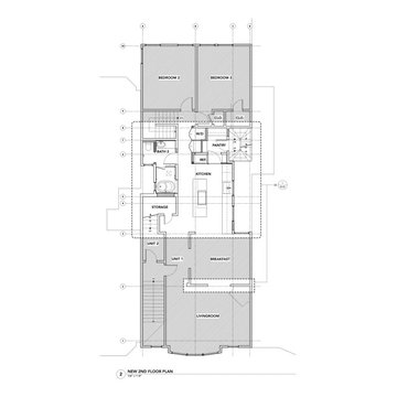
The client, a single man, had just purchased a classic Edwardian flat on San Francisco’s Liberty Street, known for its historic homes and famous neighbors like Tracy Chapman, when his realtor connected him with LLA. The initial brief was to integrate a modern, minimalist kitchen and bathroom with the apartment's traditional aesthetic. The existing condition was a series of cramped rooms and a long hallway that divided the apartment into many separate spaces, some without natural light.
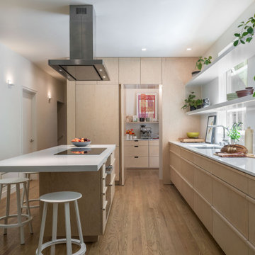
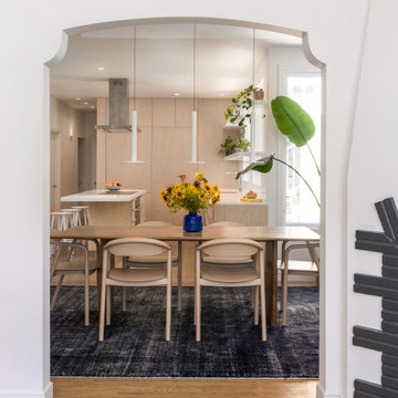
The solution was to remove most of the walls in the middle of the flat, with extensive structural work hidden from view. This created an open connection between the living, dining and kitchen areas that flooded the formerly dark core of the apartment with light.
Midway through the design process, the client and his partner, and avid cook, decided it was time to move in together. The project evolved further and LLA found inventive ways to pack more features and amenities into a design that was fundamentally about simplicity.
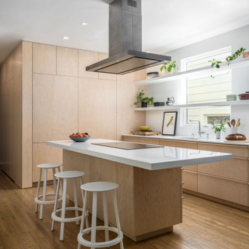
The result of this creative tension is a large open kitchen with deceptively simple forms- a long back counter with three rows of drawers below, an island with a central cooktop and double cantilevers for seating, and a slightly mysterious wood box at the back. The box conceals the refrigerator, storage, linens, and laundry, and through a secret door, a large walk-in pantry.
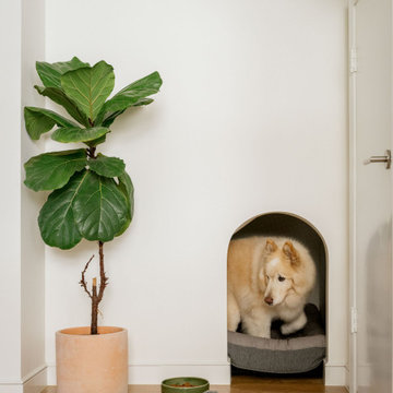
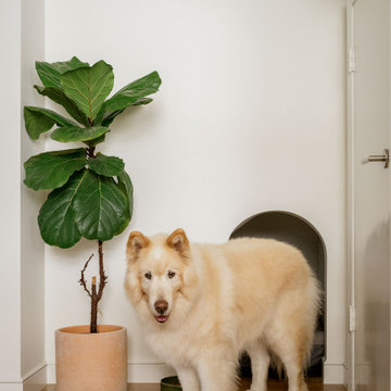
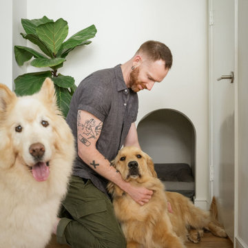
The bathroom evolved into a mini-spa, with a walk-through shower and Japanese-style soaking tub. The space shares light with the kitchen through a floor-to-ceiling translucent glass panel. Each client has a large dog, and so a small sliver of space under the upstairs neighbor's stair was turned into the perfect doggie den, complete with period correct doorway.
The newly blended family moved in together when the project was completed. A poignant footnote, Maverick, the blonder, fluffier dog in the photos, was very old and sadly passed away shortly after they moved in. It made the photoshoot feel like a special event that honored and preserved his memory in pictures. Like all families, theirs continues to evolve and change, just as their home has over its 90 year life.
 TKS Design Group
Download our free ebook, Creating the Ideal Kitchen. DOWNLOAD NOW
Lakefront property in the northwest suburbs of Chicago is hard to come by, so when we were hired by this young family with exactly that, we were immediately inspired by not just the unusually large footprint of this 1950’s colonial revival but also the lovely views of the manmade lake it was sited on. The large 5-bedroom home was solidly stuck in the 1980’s, but we saw tons of potential. We started out by updating the existing staircase with a fresh coat of paint and adding new herringbone slate to the entry hall.
The powder room off the entryway also got a refresh - new flooring, new cabinets and fixtures. We ran the new slate right through into this space for some consistency. A fun wallpaper and shiplap trim add a welcoming feel and set the tone for the home.
Next, we tackled the kitchen. Located away from the rest of the first floor, the kitchen felt a little isolated, so we immediately began planning for how to better connect it to the rest of the first floor. We landed on removing the wall between the kitchen and dining room and designed a modified galley style space with separate cooking and clean up zones. The cooking zone consists of the refrigerator, prep sink and cooktop, along with a nice long run of prep space at the island. The cleanup side of the kitchen consists of the main sink and dishwasher. Both areas are situated so that the user can view the lake during prep work and cleanup!
One of the home’s main puzzles was how to incorporate the mudroom and area in front of the patio doors at the back of the house. We already had a breakfast table area, so the space by the patio doors was a bit of a no man’s land. We decided to separate the kitchen proper from what became the new mudroom with a large set of barn doors. That way you can quickly hide any mudroom messes but have easy access to the light coming in through the patio doors as well as the outdoor grilling station. We also love the impact the barn doors add to the overall space.
The homeowners’ first words to us were “it’s time to ditch the brown,” so we did! We chose a lovely blue pallet that reflects the home’s location on the lake which is also vibrant yet easy on the eye. Countertops are white quartz, and the natural oak floor works well with the other honey accents. The breakfast table was given a refresh with new chairs, chandelier and window treatments that frame the gorgeous views of the lake out the back.
We coordinated the slate mudroom flooring with that used in the home’s main entrance for a consistent feel. The storage area consists of open and closed storage to allow for some clutter control as needed.
Next on our “to do” list was revamping the dated brown bar area in the neighboring dining room. We eliminated the clutter by adding some closed cabinets and did some easy updates to help the space feel more current. One snag we ran into here was the discovery of a beam above the existing open shelving that had to be modified with a smaller structural beam to allow for our new design to work. This was an unexpected surprise, but in the end we think it was well worth it!
We kept the colors here a bit more muted to blend with the homeowner’s existing furnishings. Open shelving and polished nickel hardware add some simple detail to the new entertainment zone which also looks out onto the lake!
Next we tackled the upstairs starting with the homeowner’s son’s bath. The bath originally had both a tub shower and a separate shower, so we decided to swap out the shower for a new laundry area. This freed up some space downstairs in what used to be the mudroom/laundry room and is much more convenient for daily laundry needs.
We continued the blue palette here with navy cabinetry and the navy tile in the shower. Porcelain floor tile and chrome fixtures keep maintenance to a minimum while matte black mirrors and lighting add some depth the design. A low maintenance runner adds some warmth underfoot and ties the whole space together.
We added a pocket door to the bathroom to minimize interference with the door swings. The left door of the laundry closet is on a 180 degree hinge to allow for easy full access to the machines. Next we tackled the master bath which is an en suite arrangement. The original was typical of the 1980’s with the vanity outside of the bathroom, situated near the master closet. And the brown theme continued here with multiple shades of brown.
Our first move was to segment off the bath and the closet from the master bedroom. We created a short hall from the bedroom to the bathroom with his and hers walk-in closets on the left and right as well as a separate toilet closet outside of the main bathroom for privacy and flexibility.
The original bathroom had a giant soaking tub with steps (dangerous!) as well as a small shower that did not work well for our homeowner who is 6’3”. With other bathtubs in the home, they decided to eliminate the tub and create an oversized shower which takes up the space where the old tub was located. The double vanity is on the opposite wall and a bench is located under the window for morning conversations and a place to set a couple of towels.
The pallet in here is light and airy with a mix of blond wood, creamy porcelain and marble tile, and brass accents. A simple roman shade adds some texture and it’s top-down mechanism allows for light and privacy.
This large whole house remodel gave our homeowners not only the ability to maximize the potential of their home but also created a lovely new frame from which to view their fabulous lake views.
Designed by: Susan Klimala, CKD, CBD
Photography by: Michael Kaskel
For more information on kitchen and bath design ideas go to: www.kitchenstudio-ge.com
 Lincoln Lighthill Architect
This project is a story of how buildings and relationships evolve over time, and how the two are intertwined in the making of architecture.
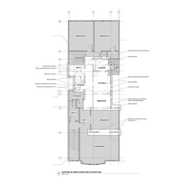
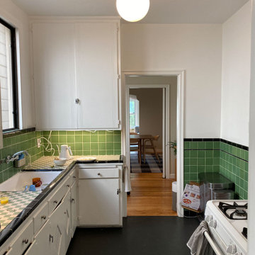
The client, a single man, had just purchased a classic Edwardian flat on San Francisco’s Liberty Street, known for its historic homes and famous neighbors like Tracy Chapman, when his realtor connected him with LLA. The initial brief was to integrate a modern, minimalist kitchen and bathroom with the apartment's traditional aesthetic. The existing condition was a series of cramped rooms and a long hallway that divided the apartment into many separate spaces, some without natural light.
The solution was to remove most of the walls in the middle of the flat, with extensive structural work hidden from view. This created an open connection between the living, dining and kitchen areas that flooded the formerly dark core of the apartment with light.
Midway through the design process, the client and his partner, and avid cook, decided it was time to move in together. The project evolved further and LLA found inventive ways to pack more features and amenities into a design that was fundamentally about simplicity.
The result of this creative tension is a large open kitchen with deceptively simple forms- a long back counter with three rows of drawers below, an island with a central cooktop and double cantilevers for seating, and a slightly mysterious wood box at the back. The box conceals the refrigerator, storage, linens, and laundry, and through a secret door, a large walk-in pantry.
The bathroom evolved into a mini-spa, with a walk-through shower and Japanese-style soaking tub. The space shares light with the kitchen through a floor-to-ceiling translucent glass panel. Each client has a large dog, and so a small sliver of space under the upstairs neighbor's stair was turned into the perfect doggie den, complete with period correct doorway.
The newly blended family moved in together when the project was completed. A poignant footnote, Maverick, the blonder, fluffier dog in the photos, was very old and sadly passed away shortly after they moved in. It made the photoshoot feel like a special event that honored and preserved his memory in pictures. Like all families, theirs continues to evolve and change, just as their home has over its 90 year life.
 Lincoln Lighthill Architect
This project is a story of how buildings and relationships evolve over time, and how the two are intertwined in the making of architecture.
The client, a single man, had just purchased a classic Edwardian flat on San Francisco’s Liberty Street, known for its historic homes and famous neighbors like Tracy Chapman, when his realtor connected him with LLA. The initial brief was to integrate a modern, minimalist kitchen and bathroom with the apartment's traditional aesthetic. The existing condition was a series of cramped rooms and a long hallway that divided the apartment into many separate spaces, some without natural light.
The solution was to remove most of the walls in the middle of the flat, with extensive structural work hidden from view. This created an open connection between the living, dining and kitchen areas that flooded the formerly dark core of the apartment with light.
Midway through the design process, the client and his partner, and avid cook, decided it was time to move in together. The project evolved further and LLA found inventive ways to pack more features and amenities into a design that was fundamentally about simplicity.
The result of this creative tension is a large open kitchen with deceptively simple forms- a long back counter with three rows of drawers below, an island with a central cooktop and double cantilevers for seating, and a slightly mysterious wood box at the back. The box conceals the refrigerator, storage, linens, and laundry, and through a secret door, a large walk-in pantry.
The bathroom evolved into a mini-spa, with a walk-through shower and Japanese-style soaking tub. The space shares light with the kitchen through a floor-to-ceiling translucent glass panel. Each client has a large dog, and so a small sliver of space under the upstairs neighbor's stair was turned into the perfect doggie den, complete with period correct doorway.
The newly blended family moved in together when the project was completed. A poignant footnote, Maverick, the blonder, fluffier dog in the photos, was very old and sadly passed away shortly after they moved in. It made the photoshoot feel like a special event that honored and preserved his memory in pictures. Like all families, theirs continues to evolve and change, just as their home has over its 90 year life.
 Lincoln Lighthill Architect
This project is a story of how buildings and relationships evolve over time, and how the two are intertwined in the making of architecture.
The client, a single man, had just purchased a classic Edwardian flat on San Francisco’s Liberty Street, known for its historic homes and famous neighbors like Tracy Chapman, when his realtor connected him with LLA. The initial brief was to integrate a modern, minimalist kitchen and bathroom with the apartment's traditional aesthetic. The existing condition was a series of cramped rooms and a long hallway that divided the apartment into many separate spaces, some without natural light.
The solution was to remove most of the walls in the middle of the flat, with extensive structural work hidden from view. This created an open connection between the living, dining and kitchen areas that flooded the formerly dark core of the apartment with light.
Midway through the design process, the client and his partner, and avid cook, decided it was time to move in together. The project evolved further and LLA found inventive ways to pack more features and amenities into a design that was fundamentally about simplicity.
The result of this creative tension is a large open kitchen with deceptively simple forms- a long back counter with three rows of drawers below, an island with a central cooktop and double cantilevers for seating, and a slightly mysterious wood box at the back. The box conceals the refrigerator, storage, linens, and laundry, and through a secret door, a large walk-in pantry.
The bathroom evolved into a mini-spa, with a walk-through shower and Japanese-style soaking tub. The space shares light with the kitchen through a floor-to-ceiling translucent glass panel. Each client has a large dog, and so a small sliver of space under the upstairs neighbor's stair was turned into the perfect doggie den, complete with period correct doorway.
The newly blended family moved in together when the project was completed. A poignant footnote, Maverick, the blonder, fluffier dog in the photos, was very old and sadly passed away shortly after they moved in. It made the photoshoot feel like a special event that honored and preserved his memory in pictures. Like all families, theirs continues to evolve and change, just as their home has over its 90 year life.
 Lincoln Lighthill Architect
This project is a story of how buildings and relationships evolve over time, and how the two are intertwined in the making of architecture.
The client, a single man, had just purchased a classic Edwardian flat on San Francisco’s Liberty Street, known for its historic homes and famous neighbors like Tracy Chapman, when his realtor connected him with LLA. The initial brief was to integrate a modern, minimalist kitchen and bathroom with the apartment's traditional aesthetic. The existing condition was a series of cramped rooms and a long hallway that divided the apartment into many separate spaces, some without natural light.
The solution was to remove most of the walls in the middle of the flat, with extensive structural work hidden from view. This created an open connection between the living, dining and kitchen areas that flooded the formerly dark core of the apartment with light.
Midway through the design process, the client and his partner, and avid cook, decided it was time to move in together. The project evolved further and LLA found inventive ways to pack more features and amenities into a design that was fundamentally about simplicity.
The result of this creative tension is a large open kitchen with deceptively simple forms- a long back counter with three rows of drawers below, an island with a central cooktop and double cantilevers for seating, and a slightly mysterious wood box at the back. The box conceals the refrigerator, storage, linens, and laundry, and through a secret door, a large walk-in pantry.
The bathroom evolved into a mini-spa, with a walk-through shower and Japanese-style soaking tub. The space shares light with the kitchen through a floor-to-ceiling translucent glass panel. Each client has a large dog, and so a small sliver of space under the upstairs neighbor's stair was turned into the perfect doggie den, complete with period correct doorway.
The newly blended family moved in together when the project was completed. A poignant footnote, Maverick, the blonder, fluffier dog in the photos, was very old and sadly passed away shortly after they moved in. It made the photoshoot feel like a special event that honored and preserved his memory in pictures. Like all families, theirs continues to evolve and change, just as their home has over its 90 year life.
Sponsored
Columbus, OH

Hope Restoration & General Contracting
Columbus Design-Build, Kitchen & Bath Remodeling, Historic Renovations
 Lincoln Lighthill Architect
This project is a story of how buildings and relationships evolve over time, and how the two are intertwined in the making of architecture.
The client, a single man, had just purchased a classic Edwardian flat on San Francisco’s Liberty Street, known for its historic homes and famous neighbors like Tracy Chapman, when his realtor connected him with LLA. The initial brief was to integrate a modern, minimalist kitchen and bathroom with the apartment's traditional aesthetic. The existing condition was a series of cramped rooms and a long hallway that divided the apartment into many separate spaces, some without natural light.
The solution was to remove most of the walls in the middle of the flat, with extensive structural work hidden from view. This created an open connection between the living, dining and kitchen areas that flooded the formerly dark core of the apartment with light.
Midway through the design process, the client and his partner, and avid cook, decided it was time to move in together. The project evolved further and LLA found inventive ways to pack more features and amenities into a design that was fundamentally about simplicity.
The result of this creative tension is a large open kitchen with deceptively simple forms- a long back counter with three rows of drawers below, an island with a central cooktop and double cantilevers for seating, and a slightly mysterious wood box at the back. The box conceals the refrigerator, storage, linens, and laundry, and through a secret door, a large walk-in pantry.
The bathroom evolved into a mini-spa, with a walk-through shower and Japanese-style soaking tub. The space shares light with the kitchen through a floor-to-ceiling translucent glass panel. Each client has a large dog, and so a small sliver of space under the upstairs neighbor's stair was turned into the perfect doggie den, complete with period correct doorway.
The newly blended family moved in together when the project was completed. A poignant footnote, Maverick, the blonder, fluffier dog in the photos, was very old and sadly passed away shortly after they moved in. It made the photoshoot feel like a special event that honored and preserved his memory in pictures. Like all families, theirs continues to evolve and change, just as their home has over its 90 year life.
 Lincoln Lighthill Architect
This project is a story of how buildings and relationships evolve over time, and how the two are intertwined in the making of architecture.
The client, a single man, had just purchased a classic Edwardian flat on San Francisco’s Liberty Street, known for its historic homes and famous neighbors like Tracy Chapman, when his realtor connected him with LLA. The initial brief was to integrate a modern, minimalist kitchen and bathroom with the apartment's traditional aesthetic. The existing condition was a series of cramped rooms and a long hallway that divided the apartment into many separate spaces, some without natural light.
The solution was to remove most of the walls in the middle of the flat, with extensive structural work hidden from view. This created an open connection between the living, dining and kitchen areas that flooded the formerly dark core of the apartment with light.
Midway through the design process, the client and his partner, and avid cook, decided it was time to move in together. The project evolved further and LLA found inventive ways to pack more features and amenities into a design that was fundamentally about simplicity.
The result of this creative tension is a large open kitchen with deceptively simple forms- a long back counter with three rows of drawers below, an island with a central cooktop and double cantilevers for seating, and a slightly mysterious wood box at the back. The box conceals the refrigerator, storage, linens, and laundry, and through a secret door, a large walk-in pantry.
The bathroom evolved into a mini-spa, with a walk-through shower and Japanese-style soaking tub. The space shares light with the kitchen through a floor-to-ceiling translucent glass panel. Each client has a large dog, and so a small sliver of space under the upstairs neighbor's stair was turned into the perfect doggie den, complete with period correct doorway.
The newly blended family moved in together when the project was completed. A poignant footnote, Maverick, the blonder, fluffier dog in the photos, was very old and sadly passed away shortly after they moved in. It made the photoshoot feel like a special event that honored and preserved his memory in pictures. Like all families, theirs continues to evolve and change, just as their home has over its 90 year life.
 Lincoln Lighthill Architect
This project is a story of how buildings and relationships evolve over time, and how the two are intertwined in the making of architecture.
The client, a single man, had just purchased a classic Edwardian flat on San Francisco’s Liberty Street, known for its historic homes and famous neighbors like Tracy Chapman, when his realtor connected him with LLA. The initial brief was to integrate a modern, minimalist kitchen and bathroom with the apartment's traditional aesthetic. The existing condition was a series of cramped rooms and a long hallway that divided the apartment into many separate spaces, some without natural light.
The solution was to remove most of the walls in the middle of the flat, with extensive structural work hidden from view. This created an open connection between the living, dining and kitchen areas that flooded the formerly dark core of the apartment with light.
Midway through the design process, the client and his partner, and avid cook, decided it was time to move in together. The project evolved further and LLA found inventive ways to pack more features and amenities into a design that was fundamentally about simplicity.
The result of this creative tension is a large open kitchen with deceptively simple forms- a long back counter with three rows of drawers below, an island with a central cooktop and double cantilevers for seating, and a slightly mysterious wood box at the back. The box conceals the refrigerator, storage, linens, and laundry, and through a secret door, a large walk-in pantry.
The bathroom evolved into a mini-spa, with a walk-through shower and Japanese-style soaking tub. The space shares light with the kitchen through a floor-to-ceiling translucent glass panel. Each client has a large dog, and so a small sliver of space under the upstairs neighbor's stair was turned into the perfect doggie den, complete with period correct doorway.
The newly blended family moved in together when the project was completed. A poignant footnote, Maverick, the blonder, fluffier dog in the photos, was very old and sadly passed away shortly after they moved in. It made the photoshoot feel like a special event that honored and preserved his memory in pictures. Like all families, theirs continues to evolve and change, just as their home has over its 90 year life.
 Lincoln Lighthill Architect
This project is a story of how buildings and relationships evolve over time, and how the two are intertwined in the making of architecture.
The client, a single man, had just purchased a classic Edwardian flat on San Francisco’s Liberty Street, known for its historic homes and famous neighbors like Tracy Chapman, when his realtor connected him with LLA. The initial brief was to integrate a modern, minimalist kitchen and bathroom with the apartment's traditional aesthetic. The existing condition was a series of cramped rooms and a long hallway that divided the apartment into many separate spaces, some without natural light.
The solution was to remove most of the walls in the middle of the flat, with extensive structural work hidden from view. This created an open connection between the living, dining and kitchen areas that flooded the formerly dark core of the apartment with light.
Midway through the design process, the client and his partner, and avid cook, decided it was time to move in together. The project evolved further and LLA found inventive ways to pack more features and amenities into a design that was fundamentally about simplicity.
The result of this creative tension is a large open kitchen with deceptively simple forms- a long back counter with three rows of drawers below, an island with a central cooktop and double cantilevers for seating, and a slightly mysterious wood box at the back. The box conceals the refrigerator, storage, linens, and laundry, and through a secret door, a large walk-in pantry.
The bathroom evolved into a mini-spa, with a walk-through shower and Japanese-style soaking tub. The space shares light with the kitchen through a floor-to-ceiling translucent glass panel. Each client has a large dog, and so a small sliver of space under the upstairs neighbor's stair was turned into the perfect doggie den, complete with period correct doorway.
The newly blended family moved in together when the project was completed. A poignant footnote, Maverick, the blonder, fluffier dog in the photos, was very old and sadly passed away shortly after they moved in. It made the photoshoot feel like a special event that honored and preserved his memory in pictures. Like all families, theirs continues to evolve and change, just as their home has over its 90 year life.
Sponsored
Columbus, OH

Structural Remodeling
Franklin County's Heavy Timber Specialists | Best of Houzz 2020!

 R Clary Builders Inc.
Bathroom - mid-sized transitional 3/4 vinyl floor bathroom idea in Hawaii with shaker cabinets, white cabinets, a one-piece toilet, green walls, an undermount sink and quartz countertops
 Urbanology Designs
A captivating transformation in the coveted neighborhood of University Park, Dallas
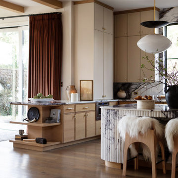
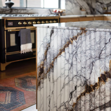
The heart of this home lies in the kitchen, where we embarked on a design endeavor that would leave anyone speechless. By opening up the main kitchen wall, we created a magnificent window system that floods the space with natural light and offers a breathtaking view of the picturesque surroundings. Suspended from the ceiling, a steel-framed marble vent hood floats a few inches from the window, showcasing a mesmerizing Lilac Marble. The same marble is skillfully applied to the backsplash and island, featuring a bold combination of color and pattern that exudes elegance.
Adding to the kitchen's allure is the Italian range, which not only serves as a showstopper but offers robust culinary features for even the savviest of cooks. However, the true masterpiece of the kitchen lies in the honed reeded marble-faced island. Each marble strip was meticulously cut and crafted by artisans to achieve a half-rounded profile, resulting in an island that is nothing short of breathtaking. This intricate process took several months, but the end result speaks for itself.
To complement the grandeur of the kitchen, we designed a combination of stain-grade and paint-grade cabinets in a thin raised panel door style. This choice adds an elegant yet simple look to the overall design. Inside each cabinet and drawer, custom interiors were meticulously designed to provide maximum functionality and organization for the day-to-day cooking activities. A vintage Turkish runner dating back to the 1960s, evokes a sense of history and character.
The breakfast nook boasts a stunning, vivid, and colorful artwork created by one of Dallas' top artist, Kyle Steed, who is revered for his mastery of his craft. Some of our favorite art pieces from the inspiring Haylee Yale grace the coffee station and media console, adding the perfect moment to pause and loose yourself in the story of her art.
The project extends beyond the kitchen into the living room, where the family's changing needs and growing children demanded a new design approach. Accommodating their new lifestyle, we incorporated a large sectional for family bonding moments while watching TV. The living room now boasts bolder colors, striking artwork a coffered accent wall, and cayenne velvet curtains that create an inviting atmosphere. Completing the room is a custom 22' x 15' rug, adding warmth and comfort to the space. A hidden coat closet door integrated into the feature wall adds an element of surprise and functionality.
This project is not just about aesthetics; it's about pushing the boundaries of design and showcasing the possibilities. By curating an out-of-the-box approach, we bring texture and depth to the space, employing different materials and original applications. The layered design achieved through repeated use of the same material in various forms, shapes, and locations demonstrates that unexpected elements can create breathtaking results.
The reason behind this redesign and remodel was the homeowners' desire to have a kitchen that not only provided functionality but also served as a beautiful backdrop to their cherished family moments. The previous kitchen lacked the "wow" factor they desired, prompting them to seek our expertise in creating a space that would be a source of joy and inspiration.
Inspired by well-curated European vignettes, sculptural elements, clean lines, and a natural color scheme with pops of color, this design reflects an elegant organic modern style. Mixing metals, contrasting textures, and utilizing clean lines were key elements in achieving the desired aesthetic. The living room introduces bolder moments and a carefully chosen color scheme that adds character and personality.
The client's must-haves were clear: they wanted a show stopping centerpiece for their home, enhanced natural light in the kitchen, and a design that reflected their family's dynamic. With the transformation of the range wall into a wall of windows, we fulfilled their desire for abundant natural light and breathtaking views of the surrounding landscape.
Our favorite rooms and design elements are numerous, but the kitchen remains a standout feature. The painstaking process of hand-cutting and crafting each reeded panel in the island to match the marble's veining resulted in a labor of love that emanates warmth and hospitality to all who enter.
In conclusion, this tastefully lux project in University Park, Dallas is an extraordinary example of a full gut remodel that has surpassed all expectations. The meticulous attention to detail, the masterful use of materials, and the seamless blend of functionality and aesthetics create an unforgettable space. It serves as a testament to the power of design and the transformative impact it can have on a home and its inhabitants.
Project by Texas' Urbanology Designs. Their North Richland Hills-based interior design studio serves Dallas, Highland Park, University Park, Fort Worth, and upscale clients nationwide.
 Urbanology Designs
A captivating transformation in the coveted neighborhood of University Park, Dallas
The heart of this home lies in the kitchen, where we embarked on a design endeavor that would leave anyone speechless. By opening up the main kitchen wall, we created a magnificent window system that floods the space with natural light and offers a breathtaking view of the picturesque surroundings. Suspended from the ceiling, a steel-framed marble vent hood floats a few inches from the window, showcasing a mesmerizing Lilac Marble. The same marble is skillfully applied to the backsplash and island, featuring a bold combination of color and pattern that exudes elegance.
Adding to the kitchen's allure is the Italian range, which not only serves as a showstopper but offers robust culinary features for even the savviest of cooks. However, the true masterpiece of the kitchen lies in the honed reeded marble-faced island. Each marble strip was meticulously cut and crafted by artisans to achieve a half-rounded profile, resulting in an island that is nothing short of breathtaking. This intricate process took several months, but the end result speaks for itself.
To complement the grandeur of the kitchen, we designed a combination of stain-grade and paint-grade cabinets in a thin raised panel door style. This choice adds an elegant yet simple look to the overall design. Inside each cabinet and drawer, custom interiors were meticulously designed to provide maximum functionality and organization for the day-to-day cooking activities. A vintage Turkish runner dating back to the 1960s, evokes a sense of history and character.
The breakfast nook boasts a stunning, vivid, and colorful artwork created by one of Dallas' top artist, Kyle Steed, who is revered for his mastery of his craft. Some of our favorite art pieces from the inspiring Haylee Yale grace the coffee station and media console, adding the perfect moment to pause and loose yourself in the story of her art.
The project extends beyond the kitchen into the living room, where the family's changing needs and growing children demanded a new design approach. Accommodating their new lifestyle, we incorporated a large sectional for family bonding moments while watching TV. The living room now boasts bolder colors, striking artwork a coffered accent wall, and cayenne velvet curtains that create an inviting atmosphere. Completing the room is a custom 22' x 15' rug, adding warmth and comfort to the space. A hidden coat closet door integrated into the feature wall adds an element of surprise and functionality.
This project is not just about aesthetics; it's about pushing the boundaries of design and showcasing the possibilities. By curating an out-of-the-box approach, we bring texture and depth to the space, employing different materials and original applications. The layered design achieved through repeated use of the same material in various forms, shapes, and locations demonstrates that unexpected elements can create breathtaking results.
The reason behind this redesign and remodel was the homeowners' desire to have a kitchen that not only provided functionality but also served as a beautiful backdrop to their cherished family moments. The previous kitchen lacked the "wow" factor they desired, prompting them to seek our expertise in creating a space that would be a source of joy and inspiration.
Inspired by well-curated European vignettes, sculptural elements, clean lines, and a natural color scheme with pops of color, this design reflects an elegant organic modern style. Mixing metals, contrasting textures, and utilizing clean lines were key elements in achieving the desired aesthetic. The living room introduces bolder moments and a carefully chosen color scheme that adds character and personality.
The client's must-haves were clear: they wanted a show stopping centerpiece for their home, enhanced natural light in the kitchen, and a design that reflected their family's dynamic. With the transformation of the range wall into a wall of windows, we fulfilled their desire for abundant natural light and breathtaking views of the surrounding landscape.
Our favorite rooms and design elements are numerous, but the kitchen remains a standout feature. The painstaking process of hand-cutting and crafting each reeded panel in the island to match the marble's veining resulted in a labor of love that emanates warmth and hospitality to all who enter.
In conclusion, this tastefully lux project in University Park, Dallas is an extraordinary example of a full gut remodel that has surpassed all expectations. The meticulous attention to detail, the masterful use of materials, and the seamless blend of functionality and aesthetics create an unforgettable space. It serves as a testament to the power of design and the transformative impact it can have on a home and its inhabitants.
Project by Texas' Urbanology Designs. Their North Richland Hills-based interior design studio serves Dallas, Highland Park, University Park, Fort Worth, and upscale clients nationwide.
228