
Search results for "Simple short" in Home Design Ideas

 TVL Creative Ltd.
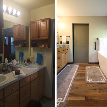
This remodel took a dated and cramped bathroom and transformed it into a classy oasis for our Lowry clients. The clients had a limited budget and wanted to leave the space as in-place as possible. However, the large drop in tub ate valuable floor space and a half wall between the shower and tub had become a holding place for random items without a home. The thick frame on the shower glass made the shower feel extremely small, and the dated lighting and fixtures further depressed the space. We proposed a traditional and elegant design that consider the client's budgetary and spatial constraints. We removed the existing drop-in tub and replaced it with a lovely free-standing soaker. The length of this tub is short, but the depth is exaggerated, making it an ideal replacement in this tiny footprint. The shower glass was swapped for framless glass that boldly expands space. We tore out the existing carpet and installed gorgeous wood-look tile that adds depth and warmth to the room. The clients opted to keep their existing vanity to save cost, so a new top was added to bring the aesthetic up to the level of the new additions. The wall paint was taken from a buttery yellow to a soft gray-green, accented by a darker version of this same color on the siding barn door and toilet room door. New vanity lights, faucets, and storage shelves were installed to help our clients organize and keep things off the counter tops. Finally, new custom up-down window shades were curated for the bathroom to add to the final touch. This space is a simple scope with a dramatic transformation that introduces a timeless look for years to come.
 TVL Creative Ltd.
This remodel took a dated and cramped bathroom and transformed it into a classy oasis for our Lowry clients. The clients had a limited budget and wanted to leave the space as in-place as possible. However, the large drop in tub ate valuable floor space and a half wall between the shower and tub had become a holding place for random items without a home. The thick frame on the shower glass made the shower feel extremely small, and the dated lighting and fixtures further depressed the space. We proposed a traditional and elegant design that consider the client's budgetary and spatial constraints. We removed the existing drop-in tub and replaced it with a lovely free-standing soaker. The length of this tub is short, but the depth is exaggerated, making it an ideal replacement in this tiny footprint. The shower glass was swapped for framless glass that boldly expands space. We tore out the existing carpet and installed gorgeous wood-look tile that adds depth and warmth to the room. The clients opted to keep their existing vanity to save cost, so a new top was added to bring the aesthetic up to the level of the new additions. The wall paint was taken from a buttery yellow to a soft gray-green, accented by a darker version of this same color on the siding barn door and toilet room door. New vanity lights, faucets, and storage shelves were installed to help our clients organize and keep things off the counter tops. Finally, new custom up-down window shades were curated for the bathroom to add to the final touch. This space is a simple scope with a dramatic transformation that introduces a timeless look for years to come.
 Urbanology Designs
A captivating transformation in the coveted neighborhood of University Park, Dallas
The heart of this home lies in the kitchen, where we embarked on a design endeavor that would leave anyone speechless. By opening up the main kitchen wall, we created a magnificent window system that floods the space with natural light and offers a breathtaking view of the picturesque surroundings. Suspended from the ceiling, a steel-framed marble vent hood floats a few inches from the window, showcasing a mesmerizing Lilac Marble. The same marble is skillfully applied to the backsplash and island, featuring a bold combination of color and pattern that exudes elegance.
Adding to the kitchen's allure is the Italian range, which not only serves as a showstopper but offers robust culinary features for even the savviest of cooks. However, the true masterpiece of the kitchen lies in the honed reeded marble-faced island. Each marble strip was meticulously cut and crafted by artisans to achieve a half-rounded profile, resulting in an island that is nothing short of breathtaking. This intricate process took several months, but the end result speaks for itself.
To complement the grandeur of the kitchen, we designed a combination of stain-grade and paint-grade cabinets in a thin raised panel door style. This choice adds an elegant yet simple look to the overall design. Inside each cabinet and drawer, custom interiors were meticulously designed to provide maximum functionality and organization for the day-to-day cooking activities. A vintage Turkish runner dating back to the 1960s, evokes a sense of history and character.
The breakfast nook boasts a stunning, vivid, and colorful artwork created by one of Dallas' top artist, Kyle Steed, who is revered for his mastery of his craft. Some of our favorite art pieces from the inspiring Haylee Yale grace the coffee station and media console, adding the perfect moment to pause and loose yourself in the story of her art.
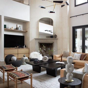
The project extends beyond the kitchen into the living room, where the family's changing needs and growing children demanded a new design approach. Accommodating their new lifestyle, we incorporated a large sectional for family bonding moments while watching TV. The living room now boasts bolder colors, striking artwork a coffered accent wall, and cayenne velvet curtains that create an inviting atmosphere. Completing the room is a custom 22' x 15' rug, adding warmth and comfort to the space. A hidden coat closet door integrated into the feature wall adds an element of surprise and functionality.
This project is not just about aesthetics; it's about pushing the boundaries of design and showcasing the possibilities. By curating an out-of-the-box approach, we bring texture and depth to the space, employing different materials and original applications. The layered design achieved through repeated use of the same material in various forms, shapes, and locations demonstrates that unexpected elements can create breathtaking results.
The reason behind this redesign and remodel was the homeowners' desire to have a kitchen that not only provided functionality but also served as a beautiful backdrop to their cherished family moments. The previous kitchen lacked the "wow" factor they desired, prompting them to seek our expertise in creating a space that would be a source of joy and inspiration.
Inspired by well-curated European vignettes, sculptural elements, clean lines, and a natural color scheme with pops of color, this design reflects an elegant organic modern style. Mixing metals, contrasting textures, and utilizing clean lines were key elements in achieving the desired aesthetic. The living room introduces bolder moments and a carefully chosen color scheme that adds character and personality.
The client's must-haves were clear: they wanted a show stopping centerpiece for their home, enhanced natural light in the kitchen, and a design that reflected their family's dynamic. With the transformation of the range wall into a wall of windows, we fulfilled their desire for abundant natural light and breathtaking views of the surrounding landscape.
Our favorite rooms and design elements are numerous, but the kitchen remains a standout feature. The painstaking process of hand-cutting and crafting each reeded panel in the island to match the marble's veining resulted in a labor of love that emanates warmth and hospitality to all who enter.
In conclusion, this tastefully lux project in University Park, Dallas is an extraordinary example of a full gut remodel that has surpassed all expectations. The meticulous attention to detail, the masterful use of materials, and the seamless blend of functionality and aesthetics create an unforgettable space. It serves as a testament to the power of design and the transformative impact it can have on a home and its inhabitants.
Project by Texas' Urbanology Designs. Their North Richland Hills-based interior design studio serves Dallas, Highland Park, University Park, Fort Worth, and upscale clients nationwide.
Find the right local pro for your project
 TVL Creative Ltd.
This remodel took a dated and cramped bathroom and transformed it into a classy oasis for our Lowry clients. The clients had a limited budget and wanted to leave the space as in-place as possible. However, the large drop in tub ate valuable floor space and a half wall between the shower and tub had become a holding place for random items without a home. The thick frame on the shower glass made the shower feel extremely small, and the dated lighting and fixtures further depressed the space. We proposed a traditional and elegant design that consider the client's budgetary and spatial constraints. We removed the existing drop-in tub and replaced it with a lovely free-standing soaker. The length of this tub is short, but the depth is exaggerated, making it an ideal replacement in this tiny footprint. The shower glass was swapped for framless glass that boldly expands space. We tore out the existing carpet and installed gorgeous wood-look tile that adds depth and warmth to the room. The clients opted to keep their existing vanity to save cost, so a new top was added to bring the aesthetic up to the level of the new additions. The wall paint was taken from a buttery yellow to a soft gray-green, accented by a darker version of this same color on the siding barn door and toilet room door. New vanity lights, faucets, and storage shelves were installed to help our clients organize and keep things off the counter tops. Finally, new custom up-down window shades were curated for the bathroom to add to the final touch. This space is a simple scope with a dramatic transformation that introduces a timeless look for years to come.

 ReVision Design + Build
© Lassiter Photography
Eat-in kitchen - mid-sized transitional u-shaped light wood floor eat-in kitchen idea in Charlotte with an undermount sink, shaker cabinets, white cabinets, granite countertops, gray backsplash, ceramic backsplash, stainless steel appliances and a peninsula
Eat-in kitchen - mid-sized transitional u-shaped light wood floor eat-in kitchen idea in Charlotte with an undermount sink, shaker cabinets, white cabinets, granite countertops, gray backsplash, ceramic backsplash, stainless steel appliances and a peninsula

 River Valley Landscapes
After many years of having no outdoor living space and dealing with overgrown plants and trees the owner’s decided it was time to revitalize their backyard. They knew they wanted a large sitting area with a wood burning fireplace, room for outdoor dining and a place for the grill. A connecting walk would be needed to get guests from the driveway to the outdoor space. Last but not least, the owners wanted the ability to and a reason for stepping out of their unusable patio doors.
The designers decided from the start the fireplace would be the prominent feature and focal point for the entire project. A large fireplace accented with sitting walls and arbors was positioned to anchor the corner of the patio. Stone was chosen to set the fireplace apart as its own element. Brick was used for the sitting walls and brick accents were added to the fireplace to tie into the house. An inlaid herringbone brick detail was incorporated above the stone mantle to simulate artwork which is typically found above indoor fireplaces. Flagstone was used for the wall caps and hearth to match the patio and thicker flagstone tread stock was used for the mantle and top. The arbors were added to visually balance the pergolas at the opposite side of the patio.
For the patio the designers created a series of offset spaces to help subtly divide the space into two areas, sitting and dining. Two large existing trees also help dictate the shape of the patio. Cut flagstone was chosen for the surface bordered by a double soldier edge of brick. The brick edging also surrounds a decorative gravel area topped with an urn fountain which provides a secondary focal point and the sound of water. Large flagstone treads were used for the steps leading to the previously unused patio doors. Opposite the fireplace a short walk leads to a square transition area with a statue chosen by the owner. The statue provides a strong focal point when entering from the driveway. A longer walk leads from this space along the house to the driveway.
The pergolas and arbors were designed by the landscape designer as part of this project but were ultimately contracted separately by the owner. The larger square pergola was intended as an area for a bench or two separate from the main patio. The longer pergola was added later in the design phase to help provide shade to the interior of the house. The arbors at the fireplace were added to balance out the wood elements at the opposite side while adding additional architectural interest to the fireplace.
While this project was predominantly hardscaping, planting and lighting were also incorporated into the design. Several large existing trees were retained and serious of smaller understory trees were added to help enclose the space. The designer’s took advantage of the large trees to place down lights on the branches to achieve a moonlight effect at night. Additional lighting was used on the pergola, to accent focal points, to up light the smaller trees and around the patio. Massed planting of Japanese forest grass provides bold foliage color for the shady garden. A mulch path leads off behind the fireplace to another garden and a secluded area ideal for a bench or small table and chairs. Additional plantings were added along the rear property line to screen and unsightly fence.
This project has obviously completely changed the way the owners use their backyard. They now have a seamless transition from indoors to outdoors with the use of the patio doors. The large patio allows for entertaining small gatherings outdoors for the first time. The fireplace has definitely become the primary gathering place for family and friends.

 KE Interior Solutions
Park Hill Bungalow Masterbath transformed.
These beautiful, but space challenged homes present the opportunity to make more space without stepping out of the current footprint. This project completion shows how it is possible.
Sponsored
Columbus, OH

Hope Restoration & General Contracting
Columbus Design-Build, Kitchen & Bath Remodeling, Historic Renovations

 Visbeen Architects
Builder: Falcon Custom Homes
Interior Designer: Mary Burns - Gallery
Photographer: Mike Buck
A perfectly proportioned story and a half cottage, the Farfield is full of traditional details and charm. The front is composed of matching board and batten gables flanking a covered porch featuring square columns with pegged capitols. A tour of the rear façade reveals an asymmetrical elevation with a tall living room gable anchoring the right and a low retractable-screened porch to the left.
Inside, the front foyer opens up to a wide staircase clad in horizontal boards for a more modern feel. To the left, and through a short hall, is a study with private access to the main levels public bathroom. Further back a corridor, framed on one side by the living rooms stone fireplace, connects the master suite to the rest of the house. Entrance to the living room can be gained through a pair of openings flanking the stone fireplace, or via the open concept kitchen/dining room. Neutral grey cabinets featuring a modern take on a recessed panel look, line the perimeter of the kitchen, framing the elongated kitchen island. Twelve leather wrapped chairs provide enough seating for a large family, or gathering of friends. Anchoring the rear of the main level is the screened in porch framed by square columns that match the style of those found at the front porch. Upstairs, there are a total of four separate sleeping chambers. The two bedrooms above the master suite share a bathroom, while the third bedroom to the rear features its own en suite. The fourth is a large bunkroom above the homes two-stall garage large enough to host an abundance of guests.


 Elle Peters Design
Hi friends! If you hadn’t put it together from the hashtag (#hansonranchoverhaul), this project was literally, quite the overhaul. This full-house renovation was so much fun to be a part of! Not only did we overhaul both the main and second levels, but we actually added square footage when we filled in a double-story volume to create an additional second floor bedroom (which in this case, will actually function as a home office). We also moved walls around on both the main level to open up the living/dining kitchen area, create a more functional powder room, and bring in more natural light at the entry. Upstairs, we altered the layout to accommodate two more spacious and modernized bathrooms, as well as larger bedrooms, one complete with a new walk-in-closet and one with a beautiful window seat built-in.
This client and I connected right away – she was looking to update her '90s home with a laid-back, fresh, transitional approach. As we got into the finish selections, we realized that our picks were taking us in a bit of a modern farmhouse direction, so we went with it, and am I ever glad we did! I love the new wide-plank distressed hardwood throughout and the new shaker-style built-ins in the kitchen and bathrooms. I custom designed the fireplace mantle and window seat to coordinate with the craftsman 3-panel doors, and we worked with the stair manufacturer to come up with a handrail, spindle and newel post design that was the perfect combination of traditional and modern. The 2-tone stair risers and treads perfectly accomplished the look we were going for!
 TKS Design Group
Download our free ebook, Creating the Ideal Kitchen. DOWNLOAD NOW
Lakefront property in the northwest suburbs of Chicago is hard to come by, so when we were hired by this young family with exactly that, we were immediately inspired by not just the unusually large footprint of this 1950’s colonial revival but also the lovely views of the manmade lake it was sited on. The large 5-bedroom home was solidly stuck in the 1980’s, but we saw tons of potential. We started out by updating the existing staircase with a fresh coat of paint and adding new herringbone slate to the entry hall.
The powder room off the entryway also got a refresh - new flooring, new cabinets and fixtures. We ran the new slate right through into this space for some consistency. A fun wallpaper and shiplap trim add a welcoming feel and set the tone for the home.
Next, we tackled the kitchen. Located away from the rest of the first floor, the kitchen felt a little isolated, so we immediately began planning for how to better connect it to the rest of the first floor. We landed on removing the wall between the kitchen and dining room and designed a modified galley style space with separate cooking and clean up zones. The cooking zone consists of the refrigerator, prep sink and cooktop, along with a nice long run of prep space at the island. The cleanup side of the kitchen consists of the main sink and dishwasher. Both areas are situated so that the user can view the lake during prep work and cleanup!
One of the home’s main puzzles was how to incorporate the mudroom and area in front of the patio doors at the back of the house. We already had a breakfast table area, so the space by the patio doors was a bit of a no man’s land. We decided to separate the kitchen proper from what became the new mudroom with a large set of barn doors. That way you can quickly hide any mudroom messes but have easy access to the light coming in through the patio doors as well as the outdoor grilling station. We also love the impact the barn doors add to the overall space.
The homeowners’ first words to us were “it’s time to ditch the brown,” so we did! We chose a lovely blue pallet that reflects the home’s location on the lake which is also vibrant yet easy on the eye. Countertops are white quartz, and the natural oak floor works well with the other honey accents. The breakfast table was given a refresh with new chairs, chandelier and window treatments that frame the gorgeous views of the lake out the back.
We coordinated the slate mudroom flooring with that used in the home’s main entrance for a consistent feel. The storage area consists of open and closed storage to allow for some clutter control as needed.
Next on our “to do” list was revamping the dated brown bar area in the neighboring dining room. We eliminated the clutter by adding some closed cabinets and did some easy updates to help the space feel more current. One snag we ran into here was the discovery of a beam above the existing open shelving that had to be modified with a smaller structural beam to allow for our new design to work. This was an unexpected surprise, but in the end we think it was well worth it!
We kept the colors here a bit more muted to blend with the homeowner’s existing furnishings. Open shelving and polished nickel hardware add some simple detail to the new entertainment zone which also looks out onto the lake!
Next we tackled the upstairs starting with the homeowner’s son’s bath. The bath originally had both a tub shower and a separate shower, so we decided to swap out the shower for a new laundry area. This freed up some space downstairs in what used to be the mudroom/laundry room and is much more convenient for daily laundry needs.
We continued the blue palette here with navy cabinetry and the navy tile in the shower. Porcelain floor tile and chrome fixtures keep maintenance to a minimum while matte black mirrors and lighting add some depth the design. A low maintenance runner adds some warmth underfoot and ties the whole space together.
We added a pocket door to the bathroom to minimize interference with the door swings. The left door of the laundry closet is on a 180 degree hinge to allow for easy full access to the machines. Next we tackled the master bath which is an en suite arrangement. The original was typical of the 1980’s with the vanity outside of the bathroom, situated near the master closet. And the brown theme continued here with multiple shades of brown.
Our first move was to segment off the bath and the closet from the master bedroom. We created a short hall from the bedroom to the bathroom with his and hers walk-in closets on the left and right as well as a separate toilet closet outside of the main bathroom for privacy and flexibility.
The original bathroom had a giant soaking tub with steps (dangerous!) as well as a small shower that did not work well for our homeowner who is 6’3”. With other bathtubs in the home, they decided to eliminate the tub and create an oversized shower which takes up the space where the old tub was located. The double vanity is on the opposite wall and a bench is located under the window for morning conversations and a place to set a couple of towels.
The pallet in here is light and airy with a mix of blond wood, creamy porcelain and marble tile, and brass accents. A simple roman shade adds some texture and it’s top-down mechanism allows for light and privacy.
This large whole house remodel gave our homeowners not only the ability to maximize the potential of their home but also created a lovely new frame from which to view their fabulous lake views.
Designed by: Susan Klimala, CKD, CBD
Photography by: Michael Kaskel
For more information on kitchen and bath design ideas go to: www.kitchenstudio-ge.com

 Kestrel Shutters & Doors
These traditional closet doors feature smaller, fixed louvers in the top and colonial raised panels in the bottom and are custom sized to fit your openings.
To receive a quote on our Fixed Louver over Raised Panel doors follow the "Visit Store" link: below.

 Moderne Builders
Gorgeous master bath with dramatic retro "wave" tile. Peak Photography
Example of a 1950s bathroom design in Los Angeles
Example of a 1950s bathroom design in Los Angeles
Sponsored
Columbus, OH
Hope Restoration & General Contracting
Columbus Design-Build, Kitchen & Bath Remodeling, Historic Renovations

 Moss Yaw Design studio
Engineered cedar siding creates beautiful gray-blue tones at the exterior of the home, while adding a textural element to activate the simple exterior design.
 Murphy Bros. Design | Build | Remodel
The list was long. Very long. And the level of remodeling they needed was a too demanding for these very capable empty nester DIYers to handle on their own. That’s not surprising since they wanted to remodel their kitchen, living room, entryway, and add a garage/office/bedroom addition off the side of their home.
“I think what was really driving this remodel was the shared desire to liberate this home from its 60’s style (dark paneling) and confined layout,” recalls Murphy Bros. designer Courtney Cartee. “They needed more space everywhere, from the kitchen to the adjoining entryway and living room. In short they really needed a whole new look and layout.”
So we suggested a three-part solution. A completely new kitchen, which required the removal of a giant stone fireplace, that was causing all kinds of space issues in both living room, entry and kitchen.
The second part of the design involved an addition to the side of the property, which added another garage stall and an office/bedroom above. “I can remember going in front of the city hall officials to get approval for the variance to add on the garage addition,” remembers Cartee. “They were very impressed with how our design integrated the addition with the existing exterior of the home. They remarked that so many remodels in their city now are just tear downs instead of taking the time and imagination to work with what’s already there.”
The third aspect of the design had to do with the entry and upgrading the exterior of the home. The entry is now wider and the whole house was painted to achieve much better curb appeal, which can have a big impact on first impressions for resale and simple pride.
“Before they had just enough room for barely two people in their kitchen. I mean it was really tight. Once we got that fireplace out, that opened up everything. Now they can have the whole family in that space and still be able to move around and entertain,” says Cartee.
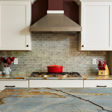
Island & perimeter countertop: Azure Quartzite slab from Brazil.
Backsplash: Dockside Gale Stria porcelain and glass wall tile

 TBS Construction Inc.
Working on this beautiful Los Altos residence has been a wonderful opportunity for our team. Located in an upscale neighborhood young owner’s of this house wanted to upgrade the whole house design which included major kitchen and master bathroom remodel.
The combination of a simple white cabinetry with the clean lined wood, contemporary countertops and glass tile create a perfect modern style which is what customers were looking for.
 Organizare by Clarissa
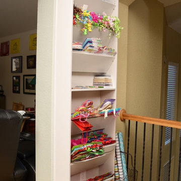
Custom shelf unit specifically designed for all the gift wrapping materials: gift bags, tissue paper, thank you cards, bows, ribbons and other gift wrapping supplies. Notice special basket to hold gift paper rolls.
Photo by: Frank Marrott - Concept 7
www.concept7photo.com


 Custom Corners LLC
Rustic hewn alder mantel with a light brown stain and black glaze. We build these mantels custom size, color & distressing can be made to suite your style.

 Columbia Cabinets
New Twist on Farmhouse Chic
Project Details
Designer: Amy Van Wie
Cabinetry: Brookhaven Framed Cabinetry
Wood: Maple
Finishes: Perimeter – Antique White; Island – Matte Twilight
Door: Kingston Recessed Inset
Countertop: Perimeter – Soapstone; Island – Walnut
Awards
2016 Saratoga Showcase of Homes
For this stunning Showcase Home, we worked to achieve a classic farmhouse look with some new and interesting twists. To enhance a clean aesthetic, we customized the cabinet boxes to avoid any distracting seams, common with inset kitchens. But at the same time, we used decorative feet on the end cabinets and bead board accents to achieve that furniture look common in historic farmhouses. Additional nods to the farmhouse schematic include mullion glass doors, an apron front sink, beveled subway tile, turn latch knobs and bin pulls all in oiled rubbed bronze and a magnificent mushroom wood and copper custom hood.

 CAP Carpet & Flooring
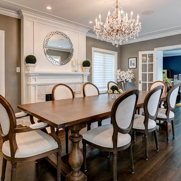
These deep hardwood floors help to open up the space and balance out the light neutral accents found throughout the room.
CAP Carpet & Flooring is the leading provider of flooring & area rugs in the Twin Cities. CAP Carpet & Flooring is a locally owned and operated company, and we pride ourselves on helping our customers feel welcome from the moment they walk in the door. We are your neighbors. We work and live in your community and understand your needs. You can expect the very best personal service on every visit to CAP Carpet & Flooring and value and warranties on every flooring purchase. Our design team has worked with homeowners, contractors and builders who expect the best. With over 30 years combined experience in the design industry, Angela, Sandy, Sunnie,Maria, Caryn and Megan will be able to help whether you are in the process of building, remodeling, or re-doing. Our design team prides itself on being well versed and knowledgeable on all the up to date products and trends in the floor covering industry as well as countertops, paint and window treatments. Their passion and knowledge is abundant, and we're confident you'll be nothing short of impressed with their expertise and professionalism. When you love your job, it shows: the enthusiasm and energy our design team has harnessed will bring out the best in your project. Make CAP Carpet & Flooring your first stop when considering any type of home improvement project- we are happy to help you every single step of the way.
227