
Search results for "Simple short" in Home Design Ideas
 Lincoln Lighthill Architect
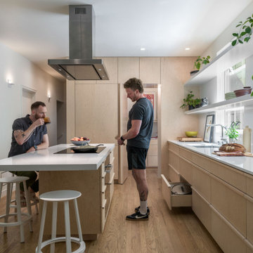
This project is a story of how buildings and relationships evolve over time, and how the two are intertwined in the making of architecture.
The client, a single man, had just purchased a classic Edwardian flat on San Francisco’s Liberty Street, known for its historic homes and famous neighbors like Tracy Chapman, when his realtor connected him with LLA. The initial brief was to integrate a modern, minimalist kitchen and bathroom with the apartment's traditional aesthetic. The existing condition was a series of cramped rooms and a long hallway that divided the apartment into many separate spaces, some without natural light.
The solution was to remove most of the walls in the middle of the flat, with extensive structural work hidden from view. This created an open connection between the living, dining and kitchen areas that flooded the formerly dark core of the apartment with light.
Midway through the design process, the client and his partner, and avid cook, decided it was time to move in together. The project evolved further and LLA found inventive ways to pack more features and amenities into a design that was fundamentally about simplicity.
The result of this creative tension is a large open kitchen with deceptively simple forms- a long back counter with three rows of drawers below, an island with a central cooktop and double cantilevers for seating, and a slightly mysterious wood box at the back. The box conceals the refrigerator, storage, linens, and laundry, and through a secret door, a large walk-in pantry.
The bathroom evolved into a mini-spa, with a walk-through shower and Japanese-style soaking tub. The space shares light with the kitchen through a floor-to-ceiling translucent glass panel. Each client has a large dog, and so a small sliver of space under the upstairs neighbor's stair was turned into the perfect doggie den, complete with period correct doorway.
The newly blended family moved in together when the project was completed. A poignant footnote, Maverick, the blonder, fluffier dog in the photos, was very old and sadly passed away shortly after they moved in. It made the photoshoot feel like a special event that honored and preserved his memory in pictures. Like all families, theirs continues to evolve and change, just as their home has over its 90 year life.
 Lincoln Lighthill Architect
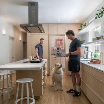
This project is a story of how buildings and relationships evolve over time, and how the two are intertwined in the making of architecture.
The client, a single man, had just purchased a classic Edwardian flat on San Francisco’s Liberty Street, known for its historic homes and famous neighbors like Tracy Chapman, when his realtor connected him with LLA. The initial brief was to integrate a modern, minimalist kitchen and bathroom with the apartment's traditional aesthetic. The existing condition was a series of cramped rooms and a long hallway that divided the apartment into many separate spaces, some without natural light.
The solution was to remove most of the walls in the middle of the flat, with extensive structural work hidden from view. This created an open connection between the living, dining and kitchen areas that flooded the formerly dark core of the apartment with light.
Midway through the design process, the client and his partner, and avid cook, decided it was time to move in together. The project evolved further and LLA found inventive ways to pack more features and amenities into a design that was fundamentally about simplicity.
The result of this creative tension is a large open kitchen with deceptively simple forms- a long back counter with three rows of drawers below, an island with a central cooktop and double cantilevers for seating, and a slightly mysterious wood box at the back. The box conceals the refrigerator, storage, linens, and laundry, and through a secret door, a large walk-in pantry.
The bathroom evolved into a mini-spa, with a walk-through shower and Japanese-style soaking tub. The space shares light with the kitchen through a floor-to-ceiling translucent glass panel. Each client has a large dog, and so a small sliver of space under the upstairs neighbor's stair was turned into the perfect doggie den, complete with period correct doorway.
The newly blended family moved in together when the project was completed. A poignant footnote, Maverick, the blonder, fluffier dog in the photos, was very old and sadly passed away shortly after they moved in. It made the photoshoot feel like a special event that honored and preserved his memory in pictures. Like all families, theirs continues to evolve and change, just as their home has over its 90 year life.
 TKS Design Group
Download our free ebook, Creating the Ideal Kitchen. DOWNLOAD NOW
Lakefront property in the northwest suburbs of Chicago is hard to come by, so when we were hired by this young family with exactly that, we were immediately inspired by not just the unusually large footprint of this 1950’s colonial revival but also the lovely views of the manmade lake it was sited on. The large 5-bedroom home was solidly stuck in the 1980’s, but we saw tons of potential. We started out by updating the existing staircase with a fresh coat of paint and adding new herringbone slate to the entry hall.
The powder room off the entryway also got a refresh - new flooring, new cabinets and fixtures. We ran the new slate right through into this space for some consistency. A fun wallpaper and shiplap trim add a welcoming feel and set the tone for the home.
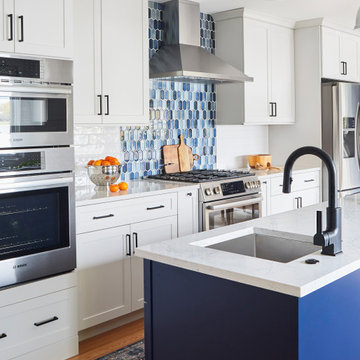
Next, we tackled the kitchen. Located away from the rest of the first floor, the kitchen felt a little isolated, so we immediately began planning for how to better connect it to the rest of the first floor. We landed on removing the wall between the kitchen and dining room and designed a modified galley style space with separate cooking and clean up zones. The cooking zone consists of the refrigerator, prep sink and cooktop, along with a nice long run of prep space at the island. The cleanup side of the kitchen consists of the main sink and dishwasher. Both areas are situated so that the user can view the lake during prep work and cleanup!
One of the home’s main puzzles was how to incorporate the mudroom and area in front of the patio doors at the back of the house. We already had a breakfast table area, so the space by the patio doors was a bit of a no man’s land. We decided to separate the kitchen proper from what became the new mudroom with a large set of barn doors. That way you can quickly hide any mudroom messes but have easy access to the light coming in through the patio doors as well as the outdoor grilling station. We also love the impact the barn doors add to the overall space.
The homeowners’ first words to us were “it’s time to ditch the brown,” so we did! We chose a lovely blue pallet that reflects the home’s location on the lake which is also vibrant yet easy on the eye. Countertops are white quartz, and the natural oak floor works well with the other honey accents. The breakfast table was given a refresh with new chairs, chandelier and window treatments that frame the gorgeous views of the lake out the back.
We coordinated the slate mudroom flooring with that used in the home’s main entrance for a consistent feel. The storage area consists of open and closed storage to allow for some clutter control as needed.
Next on our “to do” list was revamping the dated brown bar area in the neighboring dining room. We eliminated the clutter by adding some closed cabinets and did some easy updates to help the space feel more current. One snag we ran into here was the discovery of a beam above the existing open shelving that had to be modified with a smaller structural beam to allow for our new design to work. This was an unexpected surprise, but in the end we think it was well worth it!
We kept the colors here a bit more muted to blend with the homeowner’s existing furnishings. Open shelving and polished nickel hardware add some simple detail to the new entertainment zone which also looks out onto the lake!
Next we tackled the upstairs starting with the homeowner’s son’s bath. The bath originally had both a tub shower and a separate shower, so we decided to swap out the shower for a new laundry area. This freed up some space downstairs in what used to be the mudroom/laundry room and is much more convenient for daily laundry needs.
We continued the blue palette here with navy cabinetry and the navy tile in the shower. Porcelain floor tile and chrome fixtures keep maintenance to a minimum while matte black mirrors and lighting add some depth the design. A low maintenance runner adds some warmth underfoot and ties the whole space together.
We added a pocket door to the bathroom to minimize interference with the door swings. The left door of the laundry closet is on a 180 degree hinge to allow for easy full access to the machines. Next we tackled the master bath which is an en suite arrangement. The original was typical of the 1980’s with the vanity outside of the bathroom, situated near the master closet. And the brown theme continued here with multiple shades of brown.
Our first move was to segment off the bath and the closet from the master bedroom. We created a short hall from the bedroom to the bathroom with his and hers walk-in closets on the left and right as well as a separate toilet closet outside of the main bathroom for privacy and flexibility.
The original bathroom had a giant soaking tub with steps (dangerous!) as well as a small shower that did not work well for our homeowner who is 6’3”. With other bathtubs in the home, they decided to eliminate the tub and create an oversized shower which takes up the space where the old tub was located. The double vanity is on the opposite wall and a bench is located under the window for morning conversations and a place to set a couple of towels.
The pallet in here is light and airy with a mix of blond wood, creamy porcelain and marble tile, and brass accents. A simple roman shade adds some texture and it’s top-down mechanism allows for light and privacy.
This large whole house remodel gave our homeowners not only the ability to maximize the potential of their home but also created a lovely new frame from which to view their fabulous lake views.
Designed by: Susan Klimala, CKD, CBD
Photography by: Michael Kaskel
For more information on kitchen and bath design ideas go to: www.kitchenstudio-ge.com
Find the right local pro for your project

 ECHT-ARCHITECTS
The Courtyard House, designed in 1964 by Sarasota School of Architecture's Jack West, is a Homes for Better Living Award winner, published in Architectural Record Houses of 1965. Known for it's simple materiality, open plan, and sweeping curving roof shape, the home had seen several renovations before the current owners came to us with a challenge: let us celebrate the spirit of the Courtyard House with a serene reflecting pool at the entry of the home.
The design strategy was to introduce several wall planes, perforated and screened with wood-look aluminum battens, that gradually reveal the home and provide a neutral base for the strong, sweeping curved form of the existing roof.
The introduction of the wall planes allowed for a subtle reorganization of the entry sequence, and a unique opportunity to experience the reflecting pool with a sense of privacy.
A new pool and terrace with integrated fire feature look over the beautiful Dolphin Waterway, and provide for a relaxing evening for the family, or a backdrop for a large gathering.
Winner of 2020 SRQ Magazine Home of the Year Platinum aware for Best Remodel/Renovation and Gold award for Band Best Landscape Design.
 Lincoln Lighthill Architect
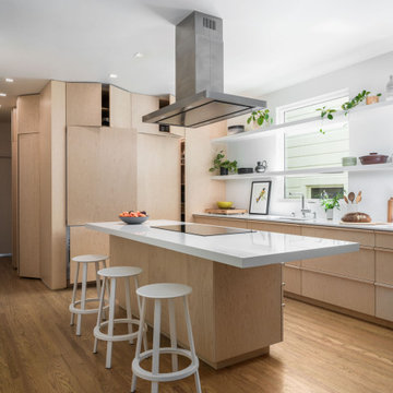
This project is a story of how buildings and relationships evolve over time, and how the two are intertwined in the making of architecture.
The client, a single man, had just purchased a classic Edwardian flat on San Francisco’s Liberty Street, known for its historic homes and famous neighbors like Tracy Chapman, when his realtor connected him with LLA. The initial brief was to integrate a modern, minimalist kitchen and bathroom with the apartment's traditional aesthetic. The existing condition was a series of cramped rooms and a long hallway that divided the apartment into many separate spaces, some without natural light.
The solution was to remove most of the walls in the middle of the flat, with extensive structural work hidden from view. This created an open connection between the living, dining and kitchen areas that flooded the formerly dark core of the apartment with light.
Midway through the design process, the client and his partner, and avid cook, decided it was time to move in together. The project evolved further and LLA found inventive ways to pack more features and amenities into a design that was fundamentally about simplicity.
The result of this creative tension is a large open kitchen with deceptively simple forms- a long back counter with three rows of drawers below, an island with a central cooktop and double cantilevers for seating, and a slightly mysterious wood box at the back. The box conceals the refrigerator, storage, linens, and laundry, and through a secret door, a large walk-in pantry.
The bathroom evolved into a mini-spa, with a walk-through shower and Japanese-style soaking tub. The space shares light with the kitchen through a floor-to-ceiling translucent glass panel. Each client has a large dog, and so a small sliver of space under the upstairs neighbor's stair was turned into the perfect doggie den, complete with period correct doorway.
The newly blended family moved in together when the project was completed. A poignant footnote, Maverick, the blonder, fluffier dog in the photos, was very old and sadly passed away shortly after they moved in. It made the photoshoot feel like a special event that honored and preserved his memory in pictures. Like all families, theirs continues to evolve and change, just as their home has over its 90 year life.

 Advance Design Studio, Ltd.
The couple who embarked on this Lake Zurich Illinois home renovation spent years planning a move from Virginia to the rolling hills of Northern Illinois when their first grandchild was born. Wanting to be closer to their grown children so they could enjoy their new role, they first embarked upon finding the right realtor and the right home. They settled on the “perfect” home; perfect that is to transform.
The seriously outdated 1,800 square foot ranch had a closed outdated kitchen, 3 bedrooms, a living room with a fireplace, a full basement and 2 baths. Although it had “good bones”, it was straight out of a builder’s catalog with wall to wall carpet, standard tile and honey oak everywhere you looked. But this couple had big plans for this home.
In tandem with their home purchase, they began the search for the just the right renovation company. The team they chose needed to be cohesive, as the whole house renovation would be designed hundreds of miles from their home several states away. She found Advance Design Studio, Ltd. online, and was quickly enamored by the team and by Common Sense Remodeling, simply by studying the website. Her decision to choose Advance Design to partner on this complete ranch renovation was confirmed quickly upon her first face to face meeting with owner Todd Jurs, and later by Advance’s designer, Nicole Ryan.
Three bedrooms were converted into a one master suite with ample bath and walk in closet, laundry, and a 2nd multi-purpose room designed for movies and entertainment, a home office, and a guest room all in one. A doorway leading to the garage was reconfigured to create a foyer area, and allowed for a better flow to an open modern kitchen complete with a large island for cooking and entertaining, which included a wide bench seat overlooking the back yard and opening onto an eating area flanked with a fireplace and TV.
The piece de resistance culminated with 3 walls of full glass anchored by a striking fireplace in the new four season’s room where the homeowners enjoy coffee every morning while gazing at the current day’s mid-western landscape. The open floorplan encourages living in “one space” throughout the day.
Ryan worked with the couple remotely, exchanging 3D color renderings and floorplans with detailed budget updates until the project took on the very image they had envisioned. “Working with them was a change from our normal meeting process since they were literally in a different state. We conducted meetings by phone, while reviewing materials and drawings via computer. It was a fun process that necessitated lots of detail and careful coordination, but we made it happen and the process was as smooth as if they were right here like normal”, says Nicole. During a stressful time planning their move, the constant interaction with Nicole assured the couple that all was being addressed by the Advance team and they could relax and focus on other important things (like moving cross country).
The new master bath incorporated heated flooring, a walk in shower with seating and custom shower niches, and an elegant double sink vanity with ample space for two. “The layout of each of the rooms is exactly what I envisioned,” the client said. “Advance’s attention to details such as light switch placement, electrical outlets, and many other minute details you wouldn’t even think of was the icing on the cake. If I didn’t think of it first, they certainly did,” said the happy homeowner. Small details like the crown molding, the custom designed fireplace mantle, the under-cabinet lighting and etched door glass, and even subtle rhinestones shimmering like delicate jewelry in the tile backsplash brought the whole project together. The clients were extremely happy with the way the Advance team made sure these small things were executed perfectly.
“It’s just gorgeous,” they said at a celebratory event in their home hosted shortly after completion for the entire Advance Design team that made it happen. “The entire crew at Advance Design was a pleasure to work with. We couldn’t have done this with a lesser team,” they concluded.
 Lincoln Lighthill Architect
This project is a story of how buildings and relationships evolve over time, and how the two are intertwined in the making of architecture.
The client, a single man, had just purchased a classic Edwardian flat on San Francisco’s Liberty Street, known for its historic homes and famous neighbors like Tracy Chapman, when his realtor connected him with LLA. The initial brief was to integrate a modern, minimalist kitchen and bathroom with the apartment's traditional aesthetic. The existing condition was a series of cramped rooms and a long hallway that divided the apartment into many separate spaces, some without natural light.
The solution was to remove most of the walls in the middle of the flat, with extensive structural work hidden from view. This created an open connection between the living, dining and kitchen areas that flooded the formerly dark core of the apartment with light.
Midway through the design process, the client and his partner, and avid cook, decided it was time to move in together. The project evolved further and LLA found inventive ways to pack more features and amenities into a design that was fundamentally about simplicity.
The result of this creative tension is a large open kitchen with deceptively simple forms- a long back counter with three rows of drawers below, an island with a central cooktop and double cantilevers for seating, and a slightly mysterious wood box at the back. The box conceals the refrigerator, storage, linens, and laundry, and through a secret door, a large walk-in pantry.
The bathroom evolved into a mini-spa, with a walk-through shower and Japanese-style soaking tub. The space shares light with the kitchen through a floor-to-ceiling translucent glass panel. Each client has a large dog, and so a small sliver of space under the upstairs neighbor's stair was turned into the perfect doggie den, complete with period correct doorway.
The newly blended family moved in together when the project was completed. A poignant footnote, Maverick, the blonder, fluffier dog in the photos, was very old and sadly passed away shortly after they moved in. It made the photoshoot feel like a special event that honored and preserved his memory in pictures. Like all families, theirs continues to evolve and change, just as their home has over its 90 year life.
Sponsored
Delaware, OH

Buckeye Basements, Inc.
Central Ohio's Basement Finishing ExpertsBest Of Houzz '13-'21
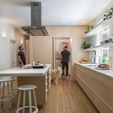 Lincoln Lighthill Architect
This project is a story of how buildings and relationships evolve over time, and how the two are intertwined in the making of architecture.
The client, a single man, had just purchased a classic Edwardian flat on San Francisco’s Liberty Street, known for its historic homes and famous neighbors like Tracy Chapman, when his realtor connected him with LLA. The initial brief was to integrate a modern, minimalist kitchen and bathroom with the apartment's traditional aesthetic. The existing condition was a series of cramped rooms and a long hallway that divided the apartment into many separate spaces, some without natural light.
The solution was to remove most of the walls in the middle of the flat, with extensive structural work hidden from view. This created an open connection between the living, dining and kitchen areas that flooded the formerly dark core of the apartment with light.
Midway through the design process, the client and his partner, and avid cook, decided it was time to move in together. The project evolved further and LLA found inventive ways to pack more features and amenities into a design that was fundamentally about simplicity.
The result of this creative tension is a large open kitchen with deceptively simple forms- a long back counter with three rows of drawers below, an island with a central cooktop and double cantilevers for seating, and a slightly mysterious wood box at the back. The box conceals the refrigerator, storage, linens, and laundry, and through a secret door, a large walk-in pantry.
The bathroom evolved into a mini-spa, with a walk-through shower and Japanese-style soaking tub. The space shares light with the kitchen through a floor-to-ceiling translucent glass panel. Each client has a large dog, and so a small sliver of space under the upstairs neighbor's stair was turned into the perfect doggie den, complete with period correct doorway.
The newly blended family moved in together when the project was completed. A poignant footnote, Maverick, the blonder, fluffier dog in the photos, was very old and sadly passed away shortly after they moved in. It made the photoshoot feel like a special event that honored and preserved his memory in pictures. Like all families, theirs continues to evolve and change, just as their home has over its 90 year life.
 Risa Boyer Architecture
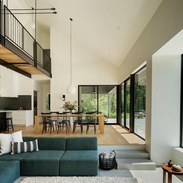
After years of searching for the perfect spot to build their cabin in Hood River Valley, Oregon, Risa discovered a defunct state park for sale known as Dimmick Park. Originally spanning 22 acres, the park had been flooded in the 1980s and was later traded to the Western River Conservancy. To protect the East Fork of the Hood River that boarders the property, the conservancy imposed restrictions on the deed before listing it for sale.
Risa and her family, along with her brother-in-law’s family teamed up to purchase the property. They chose the cabin’s site to take advantage of the best possible view of the majestic Mt. Hood to the south. For several years, the two families camped on the land in a vintage Airstream and a refurbished shipping container while designing and building the house. Construction began shortly after the COVID-19 shutdown in 2020, and the cabin took shape with the help of subcontractors and a lot of sweat equity.
Designed to accommodate the two families as a weekend retreat, the cabin features a bedroom and bathroom at each end and a double-height living space in between. An upper level includes a den and a bunk room connected by a steel and wood staircase and bridge. The house opens up to a view overlooking a meadow, complemented by an in-ground pool and a cedar hot tub that enhance the outdoor space. The simple form of the house was inspired by the classic barn structures commonly found in the surrounding orchards and farmlands.
With a tight budget, much of the finishing work was completed by the two families themselves. Risa’s brother-in-law, a GC who has a steel shop, fabricated and installed all the metalwork, contributing significantly to the project’s personal and budget-conscious approach.
 Urbanology Designs
A captivating transformation in the coveted neighborhood of University Park, Dallas
The heart of this home lies in the kitchen, where we embarked on a design endeavor that would leave anyone speechless. By opening up the main kitchen wall, we created a magnificent window system that floods the space with natural light and offers a breathtaking view of the picturesque surroundings. Suspended from the ceiling, a steel-framed marble vent hood floats a few inches from the window, showcasing a mesmerizing Lilac Marble. The same marble is skillfully applied to the backsplash and island, featuring a bold combination of color and pattern that exudes elegance.
Adding to the kitchen's allure is the Italian range, which not only serves as a showstopper but offers robust culinary features for even the savviest of cooks. However, the true masterpiece of the kitchen lies in the honed reeded marble-faced island. Each marble strip was meticulously cut and crafted by artisans to achieve a half-rounded profile, resulting in an island that is nothing short of breathtaking. This intricate process took several months, but the end result speaks for itself.
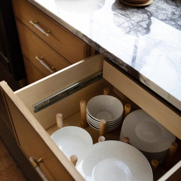
To complement the grandeur of the kitchen, we designed a combination of stain-grade and paint-grade cabinets in a thin raised panel door style. This choice adds an elegant yet simple look to the overall design. Inside each cabinet and drawer, custom interiors were meticulously designed to provide maximum functionality and organization for the day-to-day cooking activities. A vintage Turkish runner dating back to the 1960s, evokes a sense of history and character.
The breakfast nook boasts a stunning, vivid, and colorful artwork created by one of Dallas' top artist, Kyle Steed, who is revered for his mastery of his craft. Some of our favorite art pieces from the inspiring Haylee Yale grace the coffee station and media console, adding the perfect moment to pause and loose yourself in the story of her art.
The project extends beyond the kitchen into the living room, where the family's changing needs and growing children demanded a new design approach. Accommodating their new lifestyle, we incorporated a large sectional for family bonding moments while watching TV. The living room now boasts bolder colors, striking artwork a coffered accent wall, and cayenne velvet curtains that create an inviting atmosphere. Completing the room is a custom 22' x 15' rug, adding warmth and comfort to the space. A hidden coat closet door integrated into the feature wall adds an element of surprise and functionality.
This project is not just about aesthetics; it's about pushing the boundaries of design and showcasing the possibilities. By curating an out-of-the-box approach, we bring texture and depth to the space, employing different materials and original applications. The layered design achieved through repeated use of the same material in various forms, shapes, and locations demonstrates that unexpected elements can create breathtaking results.
The reason behind this redesign and remodel was the homeowners' desire to have a kitchen that not only provided functionality but also served as a beautiful backdrop to their cherished family moments. The previous kitchen lacked the "wow" factor they desired, prompting them to seek our expertise in creating a space that would be a source of joy and inspiration.
Inspired by well-curated European vignettes, sculptural elements, clean lines, and a natural color scheme with pops of color, this design reflects an elegant organic modern style. Mixing metals, contrasting textures, and utilizing clean lines were key elements in achieving the desired aesthetic. The living room introduces bolder moments and a carefully chosen color scheme that adds character and personality.
The client's must-haves were clear: they wanted a show stopping centerpiece for their home, enhanced natural light in the kitchen, and a design that reflected their family's dynamic. With the transformation of the range wall into a wall of windows, we fulfilled their desire for abundant natural light and breathtaking views of the surrounding landscape.
Our favorite rooms and design elements are numerous, but the kitchen remains a standout feature. The painstaking process of hand-cutting and crafting each reeded panel in the island to match the marble's veining resulted in a labor of love that emanates warmth and hospitality to all who enter.
In conclusion, this tastefully lux project in University Park, Dallas is an extraordinary example of a full gut remodel that has surpassed all expectations. The meticulous attention to detail, the masterful use of materials, and the seamless blend of functionality and aesthetics create an unforgettable space. It serves as a testament to the power of design and the transformative impact it can have on a home and its inhabitants.
Project by Texas' Urbanology Designs. Their North Richland Hills-based interior design studio serves Dallas, Highland Park, University Park, Fort Worth, and upscale clients nationwide.
 Urbanology Designs
A captivating transformation in the coveted neighborhood of University Park, Dallas
The heart of this home lies in the kitchen, where we embarked on a design endeavor that would leave anyone speechless. By opening up the main kitchen wall, we created a magnificent window system that floods the space with natural light and offers a breathtaking view of the picturesque surroundings. Suspended from the ceiling, a steel-framed marble vent hood floats a few inches from the window, showcasing a mesmerizing Lilac Marble. The same marble is skillfully applied to the backsplash and island, featuring a bold combination of color and pattern that exudes elegance.
Adding to the kitchen's allure is the Italian range, which not only serves as a showstopper but offers robust culinary features for even the savviest of cooks. However, the true masterpiece of the kitchen lies in the honed reeded marble-faced island. Each marble strip was meticulously cut and crafted by artisans to achieve a half-rounded profile, resulting in an island that is nothing short of breathtaking. This intricate process took several months, but the end result speaks for itself.
To complement the grandeur of the kitchen, we designed a combination of stain-grade and paint-grade cabinets in a thin raised panel door style. This choice adds an elegant yet simple look to the overall design. Inside each cabinet and drawer, custom interiors were meticulously designed to provide maximum functionality and organization for the day-to-day cooking activities. A vintage Turkish runner dating back to the 1960s, evokes a sense of history and character.
The breakfast nook boasts a stunning, vivid, and colorful artwork created by one of Dallas' top artist, Kyle Steed, who is revered for his mastery of his craft. Some of our favorite art pieces from the inspiring Haylee Yale grace the coffee station and media console, adding the perfect moment to pause and loose yourself in the story of her art.
The project extends beyond the kitchen into the living room, where the family's changing needs and growing children demanded a new design approach. Accommodating their new lifestyle, we incorporated a large sectional for family bonding moments while watching TV. The living room now boasts bolder colors, striking artwork a coffered accent wall, and cayenne velvet curtains that create an inviting atmosphere. Completing the room is a custom 22' x 15' rug, adding warmth and comfort to the space. A hidden coat closet door integrated into the feature wall adds an element of surprise and functionality.
This project is not just about aesthetics; it's about pushing the boundaries of design and showcasing the possibilities. By curating an out-of-the-box approach, we bring texture and depth to the space, employing different materials and original applications. The layered design achieved through repeated use of the same material in various forms, shapes, and locations demonstrates that unexpected elements can create breathtaking results.
The reason behind this redesign and remodel was the homeowners' desire to have a kitchen that not only provided functionality but also served as a beautiful backdrop to their cherished family moments. The previous kitchen lacked the "wow" factor they desired, prompting them to seek our expertise in creating a space that would be a source of joy and inspiration.
Inspired by well-curated European vignettes, sculptural elements, clean lines, and a natural color scheme with pops of color, this design reflects an elegant organic modern style. Mixing metals, contrasting textures, and utilizing clean lines were key elements in achieving the desired aesthetic. The living room introduces bolder moments and a carefully chosen color scheme that adds character and personality.
The client's must-haves were clear: they wanted a show stopping centerpiece for their home, enhanced natural light in the kitchen, and a design that reflected their family's dynamic. With the transformation of the range wall into a wall of windows, we fulfilled their desire for abundant natural light and breathtaking views of the surrounding landscape.
Our favorite rooms and design elements are numerous, but the kitchen remains a standout feature. The painstaking process of hand-cutting and crafting each reeded panel in the island to match the marble's veining resulted in a labor of love that emanates warmth and hospitality to all who enter.
In conclusion, this tastefully lux project in University Park, Dallas is an extraordinary example of a full gut remodel that has surpassed all expectations. The meticulous attention to detail, the masterful use of materials, and the seamless blend of functionality and aesthetics create an unforgettable space. It serves as a testament to the power of design and the transformative impact it can have on a home and its inhabitants.
Project by Texas' Urbanology Designs. Their North Richland Hills-based interior design studio serves Dallas, Highland Park, University Park, Fort Worth, and upscale clients nationwide.

 Jessica Meister
To save money, we used an existing house design our builder had worked on previously and made changes to the layout to open up the space and maximize on our incredible lake views.
The first thing we changed was to flip the kitchen layout and move the stove and hood to the side wall to make room for a window and some open shelving over a farmhouse sink. This allowed us to maximize the partial lake views on the south side of the house and saved money on additional custom cabinets.
We also removed a smaller pantry that was closing off the open space between the kitchen and living room. Instead, we turned the corner of the kitchen into a much larger, walk-in pantry that also saved us a bit on granite costs and added a ton of storage.
Granite: iCloud, leathered finish
Island Cabinets: Medallion Appaloosa finish, Brookhill door style
Perimeter Cabinets: Divinity Classic painted finish, Potters Mill door style beaded with wide cove top moldings
Floors: Castle Combe Hardwood in Corsham
Backsplash: Daltile Brickwork in Terrace
Appliances: Bertazoni 36-inch all gas oven and range and coordinating appliances
Paint Color: Revere Pewter by Benjamin Moore
Trim: White Dove by Benjamin Moore
Windows: Anderson 400 series with pine casings stained in minwax jacobean
Pendants: Austin Allen & Company
Kitchen Design: Home Again by Hancock Lumber
Builder: Island Cove Building and Development
Floating Shelves with Jute Rope custom designed and built by Rowe Station Woodworks of New Gloucester, Maine
Decor by My Sister's Garage of Windham, Maine

 MIG Furniture Design, Inc.
SPAR Modern Italian Platform Bed Oliver 07, Notte Collection. Made in Italy by real professionals according to the latest and highest European standards. Oliver bed features simple, but very modern and elegant style. The bed is available in standard US queen and king sizes and available for your choice in 4 different versions (two platform bed designs and two storage bed designs). Optional "Onda" casegoods: nightstands and dresser, that feature wave-shaped fronts are also available to complement your bedroom interior. Large, style and color matching Sliding Door Wardrobe is also offered (in three sizes and several finishes) to provide your bedroom with lots of storage opportunities.
The starting price is for the Queen Size Bed (platform version #2).
Dimensions:
Queen Size Bed: W67.5" x D88" x H36.2"
King Size Bed: W84" x D88" x H36.2"
Nightstand: W22" x D19" x H17.3"
Dresser: W48.4" x D22.5" x H31"
Wall Mirror: W37.4" x D1" x H26.8"
Floor Mirror: W27.6" x D1" x H65"
*2-Door Wardrobe: W104.5" x D26.8" x H98.4"
*2-Door Wardrobe: W113.1" x D26.8" x H98.4"
*3-Door Wardrobe: W156.3" x D26.8" x H98.4"
Sponsored
Sunbury, OH

J.Holderby - Renovations
Franklin County's Leading General Contractors - 2X Best of Houzz!

 Brooks + Scarpa Architects
Located in a neighborhood characterized by traditional bungalow style single-family residences, Orange Grove is a new landmark for the City of West Hollywood. The building is sensitively designed and compatible with the neighborhood, but differs in material palette and scale from its neighbors. Referencing architectural conventions of modernism rather than the pitched roof forms of traditional domesticity, the project presents a characteristic that is consistent with the eclectic and often unconventional demographic of West Hollywood. Distinct from neighboring structures, the building creates a strong relationship to the street by virtue of its large amount of highly usable balcony area in the front façade.
While there are dramatic and larger scale elements that define the building, it is also broken down into comprehensible human scale parts, and is itself broken down into two different buildings. Orange Grove displays a similar kind of iconoclasm as the Schindler House, an icon of California modernism, located a short distance away. Like the Schindler House, the conventional architectural elements of windows and porches become part of an abstract sculptural ensemble. At the Schindler House, windows are found in the gaps between structural concrete wall panels. At Orange Grove, windows are inserted in gaps between different sections of the building.
The design of Orange Grove is generated by a subtle balance of tensions. Building volumes and the placement of windows, doors and balconies are not static but rather constitute an active three-dimensional composition in motion. Each piece of the building is a strong and clearly defined shape, such as the corrugated metal surround that encloses the second story balcony in the east and north facades. Another example of this clear delineation is the use of two square profile balcony surrounds in the front façade that set up a dialogue between them—one is small, the other large, one is open at the front, the other is veiled with stainless steel slats. At the same time each balcony is balanced and related to other elements in the building, the smaller one to the driveway gate below and the other to the roll-up door and first floor balcony. Each building element is intended to read as an abstract form in itself—such as a window becoming a slit or windows becoming a framed box, while also becoming part of a larger whole. Although this building may not mirror the status quo it answers to the desires of consumers in a burgeoning niche market who want large, simple interior volumes of space, and a paradigm based on space, light and industrial materials of the loft rather than the bungalow.

 Nandina Home & Design
Bedrooms with dark wooden bed frames, blue and white blankets, wooden side tables, seahorse wall art, wooden sideboard, patterned chair, wooden dresser, cream walls, pale green walls, pale blue walls, wooden framed mirrors, grid windows, patterned curtains, and a patterned area rug.
Home designed by Aiken interior design firm, Nandina Home & Design. They serve Augusta, GA, and Columbia and Lexington, South Carolina.
For more about Nandina Home & Design, click here: https://nandinahome.com/

 Alair Homes Plano
Our clients drastically needed to update this master suite from the original forest green floral wallpaper to something more clean and simple. They wanted to open up the dated cultured marble enclosed tub and shower and remove all soffits and plant ledges above the vanities. They wanted to explore the possibilities of opening up the shower with glass and look at installing a freestanding bathtub and they definitely wanted to keep the double sided fireplace but update the look of it.
First off, we did some minor changes to the bedroom. We replaced the carpet with a beautiful soft multi-color gray low pile carpet and painted the walls a soft white. The fireplace surround was replaced with Carrara 12×12 polished porcelain tile for a more elegant look. Finally, we tore out a corner built in desk and squared off and textured the wall, making it look as though it were never there.
We needed to strip this bathroom down and start from scratch. We demoed the cabinets, counter tops, all plumbing fixtures, ceiling fan, track lighting, tub and tub surround, fireplace surround, shower door, shower walls and ceiling above the shower, all flooring, soffits above vanity areas, saloon doors on the water closet and of course the wallpaper!
We changed the walls around the shower to pony walls with glass on the upper half, opening up the shower. The tile was lined with Premium Antasit 12×24 tile installed vertically in a 50/50 brick pattern. The shower floor and the floor below the tub is Solo River Grey Pebble mosaic tile. A contemporary Jaclo Collection shower system was installed including a contemporary handshower and square shower head. The large freestanding tub is a white Hydro Sytsems “Picasso” with “Steelnox” wall mounted tub filler and hardware from Graff.
All of the cabinets were replaced with Waypoint maple mocha glazed flat front doors and drawers. Quartzmasters Calacatta Grey countertops were installed with 2 Icera “Muse” undermount sinks for a clean modern look. The cabinet hardware the clients chose is ultra modern ”Sutton” from Hardware Resources and the faucet and other hardware is all from the Phylrich “Mix” collection.
Pulling it all together, Premium Antasit 12×14 installed floor tile was installed in a 50/50 brick pattern. The pebble tile that was installed in the shower floor was also installed in an oval shape under the bathtub for a great modern look and to break up the solid gray flooring.
Addison Oak Wood planks were installed vertically behind the bathtub, below the fireplace surround and behind the potty for a modern finished look. The fireplace was surrounded with Carrara 12×12 polished porcelain, as well as the wood planks. Finally, to add the finishing touches, Z-Lite brushed nickel vanity lights were installed above each vanity sink. The clients are so pleased to be able to enjoy and relax in their new contemporary bathroom!
 highland
Norfolk is one of the UK's most charming destinations, known for its peaceful coastlines, historic towns, and beautiful countryside. Every year, thousands of visitors choose to stay in travel lodges across the region — and it's easy to understand why. These accommodations offer convenience, comfort, and value, making them a favourite among solo travellers, couples, and families exploring Eastern England. In this article, we look at the main reasons travellers love staying in travel lodges in Norfolk, and what makes the region such a welcoming place for a relaxing break.
1. Prime Locations Close to Popular Attractions
Travel lodges in Norfolk are often located near the region's top sights, making it easy for visitors to explore without long travel times. Some of the most popular spots nearby include:
- The Norfolk Broads National Park
- Great Yarmouth's sandy beaches
- Norwich Cathedral and historic streets
- Cromer and Sheringham coastal towns
- Holkham and Wells-next-the-Sea
Being close to these attractions means travellers save time and enjoy more of their holiday without worrying about complicated transport.
2. Comfortable Rooms at Affordable Prices
One of the biggest reasons travellers love travel lodges is the balance of comfort and affordability. The rooms are clean, modern, and designed for a relaxing stay without the high cost of luxury hotels. This makes them ideal for:
- Weekend trips
- Family holidays
- Road trips
- Business stays
Visitors know they will get a good night's sleep without overspending, which is especially helpful for longer stays when exploring Norfolk's many villages and landmarks. 3. Perfect for Road Trips Around Norfolk Norfolk is a great destination for road trips thanks to its open landscapes and scenic coastal routes. Travel lodges often have:
- Free or affordable parking
- Easy access to major roads
- Nearby restaurants and services
For travellers driving across the region, staying in a lodge makes the journey simple and stress-free. 4. Family-Friendly and Flexible for All Types of Guests Many travel lodges in Norfolk are designed to welcome families and groups. They offer:
- Spacious family rooms
- Extra beds when needed
- Nearby food outlets and supermarkets
- Quiet environments for restful nights
This flexibility is one of the reasons parents choose travel lodges — they are comfortable, predictable, and suitable for all ages. 5. Consistent Quality Across Locations Whether a traveller stays in Norwich, King's Lynn, Great Yarmouth, or the Norfolk Broads area, the experience is usually consistent. People appreciate knowing what to expect:
- Clean rooms
- Reliable service
- Comfortable bedding
- Practical amenities
This consistency builds trust and encourages repeat stays, both within Norfolk and across the UK. 6. Great Base for Exploring Nature and the Coast Many travellers come to Norfolk for nature. From bird-watching at Cley Marshes to long walks along the coast, the region offers endless opportunities for outdoor activities. Travel lodges make the perfect base for:
- Wildlife trips
- Coastal hikes
- Boat rides on the Broads
- Countryside cycling routes
Visitors can enjoy full days out in nature and return to a comfortable, quiet room. 7. Modern Amenities Without Extra Hassle Travel lodges typically include practical amenities that travellers appreciate, such as:
- Free Wi-Fi
- Comfortable workspaces
- Hot showers
- Tea and coffee facilities
These small but important details make short stays more convenient and enjoyable. Conclusion Travellers love travel lodges in Norfolk because they offer everything people need for an enjoyable stay: excellent locations, affordable comfort, family-friendly features, and easy access to the region's beautiful landscapes. Whether someone is exploring historic Norwich, relaxing on the coast, or discovering the Norfolk Broads, travel lodges provide a simple and reliable
Sponsored
Columbus, OH

Structural Remodeling
Franklin County's Heavy Timber Specialists | Best of Houzz 2020!
 Klopf Architecture
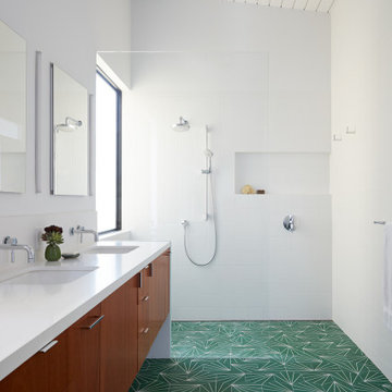
The Roger Lee designed house from 1962 was purchased by the current homeowners in almost original condition, as the previous owners elected to defer most maintenance projects over the years. The clients were able to see beyond the dated materials and finishes, single-paned glass and uninsulated walls and they approached Klopf Architecture to help them expand and update the entire home, one the family could settle into and enjoy for years to come. It was important that the new designs were aligned with Lee's original intent not only because of the client's appreciation for mid-century modern architecture, but also because the house was deemed historical. The Stanford Real Estate Office requires a stringent design review which safeguards the integrity of the community, which Klopf Architecture was happy to oblige going into their updated designs.
As with many original mid-century modern homes, the house was scaled to the 1960s lifestyle where rooms were smaller and openings to views were limited and tightly framed. The original conditions defined the direction the family of four would take in updating the house and making it comfortable for their modern lifestyle. Klopf designed a full gut remodel and major addition to bring the house into the 21st century and provide the living area needed for the client's family. The newly expanded house added just about 1,100 sf to create an airy, comfortable and family friendly house, taking full advantage of the beautiful southwestern views that extend out to the hills beyond. The enclosed garage created an additional 240 sf of covered space for long-term storage.
A cracked swimming pool created an eyesore taking up a majority of the backyard landscape, so it was one of the first elements to go during the transformation. Working with Outer Space Landscape Architects, the family asked for a mix of relaxing outdoor patio spaces that eventually blend into the native landscaping, extending their views outward toward the natural greenery of the trees beyond their property. Filling in the old pool was a smart way to expand the living spaces outward. The orientation of the house was designed to enjoy the views, but the original architecture provided the first homeowners with mere glimpses of the landscape outside.
Klopf was able to broaden those views, continuing and extending on the original architecture to take full advantage of the unobstructed natural views across the rear facade of the house. Small horizontal openings in the primary bedroom and office were replaced with much taller windows that now follow the angled roof line upward, extending across almost all of the facade. We worked with Western Windows, whose designs included an oblique-shaped, operable casement that allowed our design to rise with the slope. A new corner office added to the primary suite, offers a bright and functional work-from-home solution that looks out at the distant views and added natural light from the expanded window configuration that now wraps around the corner.
The existing lower level was designed by Lee as a utilitarian space, serving as a wet pool room with a drain in the center of the floor, bathroom, laundry and storage areas. Without the need for a pool room, Klopf was able to convert the area into a much more comfortable and functional living space with a new family room and guest suite. The new spaces enjoy easy access to a new outdoor patio through floor to ceiling, full-width glass sliders.
Continuing along the rear facade, a previously exposed deck extending from the living room and hallway provided access to the backyard through a single set of stairs leading toward the side of the house which made sense when the pool was in place. The new deck was re-envisioned as an extension of the main living room and now serves as a second outdoor living room. A new slatted pergola above provides the homeowners welcome relief from the hot afternoon sun. A second set of stairs now creates a better connection to the redesigned lower level. Klopf was able to reconfigure the spaces, extending the living room outward toward the views, where the family now claims it as the heart of the home, spending a large majority of their time outdoors.
Back inside, the original wood-burning Malm fireplace was beautifully restored and a gas burner installed to comply with California's strict air standards. It now rests in front of a wall of Heath accent tiles where a dated red brick wall used to stand. A new taller window brings more light and views into the refreshed interior living room. The original glass doors opposite the fireplace were replaced by larger sliders that when fully opened, create a seamless transition to the new outdoor living area so the two spaces feel like one connected space. The original utilitarian kitchen was needlessly tucked into the far back corner and closed-off, out of sight from the living room, so the clients asked Klopf to open it up and expand the kitchen forward so it felt more connected. Today the much larger kitchen is connected to the living area where a short wall with a cutout offers a visual glimpse into the kitchen and a handy pass-through counter for serving guests. A new breakfast nook was also added to create another spot where the family can gather for casual meals. Just outside, a new built-in outdoor grill and prep area extends the kitchen outside and connects to a new outdoor dining spot nestled amongst the trees, taking advantage of the views out back.
Klopf was able to expand the other two bedrooms, add a new laundry room and half-bath and convert the carport to an enclosed garage to add more storage areas which was lost when the pool house was converted to the family and guest room.
To maintain a historical connection to the original designs, the exterior siding was repeated on all exterior walls, a full-height stained glass window at the front entryway restored, and an interior slatted screen element repeated outside at the exterior entry courtyard and over the new outdoor living room to create a shade trellis. The new house stands proudly and shines against it's new landscaping features, while respecting and expanding on the original intent of Roger Lee's designs epitomizing the comforts of indoor-outdoor living in Northern California.
Completion year: 2020
Klopf Architecture project team: John Klopf, Klara Kevane, Noel Andrade
Contractor: ORB Construction, Brendan O'Reilly
Structural engineer: Sezen and Moon
Landscape architect: Outer space
Furnishings and decoration: Urbanism Designs
Photographer: Mariko Reed

 Randy Angell Designs
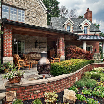
This project is proof that the challenges posed by limited space and accessibility can always be overcome in order to deliver stunning results. The space itself was rather small and also very close to the neighboring residence. Not only was the neighboring wall imposing, it was also of a completely different design style.
The goal here was to create a layering effect with numerous features of varying heights. Not only would this add depth and dimension to the overall design, but it would cause the viewer to shift their focus from the encroaching wall to the beauty of the pool space.
Instead of trying to maximize the water area by squaring off the pool, I decided to instead maximize the visual interest by gracefully rounding off the back wall of the pool. This was accomplished by implementing a raised stucco wall, and also a shorter, matching curved wall, featuring a "Sheer Descent" waterfall.
Inside the taller, deep-plum stucco wall, I created three vertical windows which are all highlighted by LED uplighting. To give depth, dimension and some natural beauty, I implemented a simple bed of Horse Tail Reeds behind the short wall, and chose to place Banana Trees behind the taller wall.
The main seating area is just outside the home's master suite, and is separated by a "Leuder" limestone fire pit. Aside from being a striking design feature, the floating stepper pads accomplish a number of things; they serve triple-duty as a walkway, a seating area adjacent to the fire pit, and also as a poolside rest for beverages.
After discovering that the narrow courtyard acted as a sort of wind tunnel between the two houses, we opted to install tempered glass in order to better control the behavior of the flames. This solved the problem while remaining visually pleasing to the client as well.
You'll notice in some of the leading photos for this project that I had originally intended to implement stepper pads on both sides of the pool closest to the house. And despite a thorough understanding of what would be necessary on an engineering and structural-design basis, we were eventually forced to turn this into a solid deck due to unrelenting city-required setbacks. However the client remained very understanding due to encountering a number of similar issues in their home-build process.
In the end, they were delivered an outstanding pool design that had come to fruition only after coming up with numerous solutions to a number of challenges that only a unique space like this could provide.

 Décor Aid
Having an eye for great interior design yet no clue on where to start or how to narrow down their aesthetic vision, a young family turned to Décor Aid to bring their drab pre-war Upper West Side apartment to life. With two young daughters in tow, our clients were looking for high style décor grounded in practicality and function – namely for their foyer, living room, dining room, and den.
Armed with a variety of inspiration from traditional to ultra-modern, they knew that they wanted their apartment’s interior design to look put together and thought through, but were short on a concise design direction.
In comes Décor Aid interior designer Gabrielle G. to revive their stark home with inspired design. After their initial in-home consultation, Gabrielle honed in on key decorative touchstones the couple had interest in and compiled a list of must-haves as an aesthetic foundation for the home.
Starting with fresh coats of pure white paint to liven up and brighten each room, Gabrielle took advantage of the apartments closed floor plan and gave each room it’s own design signature rather than having to ensure that everything flowed together – in turn, giving her more freedom.
Save for a china cabinet and formal dining table, Gabrielle was tasked with sourcing furnishings and accessories and went for clean simplicity as the couple also expressed that they’d like to have pieces that can move with them as their family grows while also being conducive for family life.
As you can see, the space is grounded with soothing neutrals so Gabrielle brought in pops of color and texture through accessories and abstract art for a sophisticated yet casual vibe.
The end result boasts concise design and pulled together everyday glamor for this modern family home that our clients adore, and so do we.
230