
Search results for "So called mandela" in Home Design Ideas
 InnovationLand
Houston Interior Designer Lisha Maxey took this Museum District condo from the dated, mirrored walls of the 1980s to Mid Century Modern with a gallery look featuring the client's art collection.
"The place was covered with glued-down, floor-to-ceiling mirrors," says Lisha Maxey, senior designer for Homescapes of Houston and principal at LGH Design Services in Houston. "When we took them off the walls, the walls came apart. We ended up taking them down to the studs."
The makeover took six months to complete, primarily because of strict condo association rules that only gave the Houston interior designers very limited access to the elevator - through which all materials and team members had to go.
"Monday through Friday, we could only be noisy from 10 a.m. to 2 p.m., and if we had to do something extra loud, like sawing or drilling, we had to schedule it with the management and they had to communicate that to the condo owners. So it was just a lot of coordination. But a lot of Inner City Loopers live in these kinds of buildings, so we're used to handling that kind of thing."
The client, a child psychiatrist in her 60s, recently moved to Houston from northeast Texas to be with friends. After being widowed three years ago, she decided it was time to let go of the traditionally styled estate that wasn't really her style anyway. An avid diver who has traveled around the world to pursue her passion, she has amassed a large collection of art from her travels. Downsizing to 1,600 feet and wanting to go more contemporary, she wanted the display - and the look - more streamlined.
"She wanted clean lines and muted colors, with the main focus being her artwork," says Maxey. "So we made the space a palette for that."
Enter the white, gallery-grade paint she chose for the walls: "It's halfway between satin and flat," explains Maxey. "It's not glossy and it's not chalky - just very smooth and clean."
Adding to the gallery theme is the satin nickel track lighting with lamps aimed to highlight pieces of art. "This lighting has no wires," notes Maxey. "It's powered by a positive and negative conduit."
The new flooring throughout is a blended-grey porcelain tile that looks like wood planks. "It's gorgeous, natural-looking and combines all the beauty of wood with the durability of tile," says Maxey. "We used it throughout the condo to unify the space."
After Maxey started looking at the client's bright, vibrant, colorful artwork, she felt the palette couldn't stay as muted anymore. Hence the Mid Century Modern orange leather sofas from West Elm and bright green chairs from Joybird, plus the throw pillows in different textures, patterns and shades of gold, orange and green.
The concave lines of the Danish-inspired chairs, she notes, help them look beautiful from all the way around - a key to designing spaces for loft living.
"The table in the living room is very interesting," notes Maxey. "It was handmade for the client in 1974 and has a signature on it from the artist. She was adamant about including the piece, which has all these hand-painted black-and-white art tiles on the top. I took one look at it and said 'It's not really going to go.'"
However, after cutting 6 inches off the bottom and making it look a little distressed, the table ended up being the perfect complement to the sofas.
The dining room table - from Design Within Reach - is a solid piece of mahogany, the chair upholstery a mix of grey velvet and leather and the legs a shiny brass. "The side chairs are leather and the end ones are velvet," says Maxey. "It's a nice textural mix that lends depth and texture."
The galley kitchen, meanwhile, has been lightened and brightened, with white quartz countertops and backsplashes mimicking the look of Carrara marble, stainless steel appliances and a velvet green bench seat for a punch of color. The cabinets are painted a cool grey color called "Silverplate."
The two bathrooms have been updated with contemporary white vanities and vessel sinks and the master bath now features a walk-in shower tiled in Dolomite white marble (the floor is Bianco Carrara marble mosaic, done in a herringbone pattern.
In the master bedroom, Homescapes of Houston knocked down a wall between two smaller closets with swing doors to make one large walk-in closet with pocket doors. The closet in the guest bedroom also came out 13 more inches.
The client's artwork throughout personalizes the space and tells the story of a life. There's a huge bowl of shells from the client's diving adventures, framed art from her child psychiatry patients and a 16th century wood carving from a monastery that's been in her family forever.
"Her collection is quite impressive," says Maxey. "There's even a framed piece of autographed songs written by John Lennon." (You can see this black-framed piece of art on the wall in the photo above of two green chairs).
"We're extremely happy with how the project turned out, and so is the client," says Maxey. "No expense was spared for her. It was a labor of love and we were excited to do it."
 Donald Lococo Architects
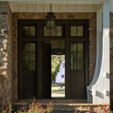
Located on farmland in McLean, Virginia, the American Farmhouse balances the expected comforts of a new home with the bucolic beauty of an old farmhouse. The final site plan still has evidence showing parallel courses of the barn’s destiny. The house mass is broken and lowered so that the home can remain secondary to the monolithic barn structure. Earthy and elemental materials are selected for the home that reference the barn without directly mimicking it. Wooden members found inside the barn and from other barns bridge ceilings and are used in floors along with rustic slate adding to a sense of simplicity to the farmhouse design.
The age and patina of the barn is reflected in the house’s textural use of board and batten and field stone layered similar to stone foundations. The original development plan was to demolish the existing barn and construct three suburban homes. Part of an endangered breed, as one of the few remaining barns in the area, it was originally viewed as a challenge in a luxury home construction with several difficulties posed to the impending project: it would be expensive to renovate, vulnerable to demolition, and threatened by urban sprawl. However, instead of trying to alter or destroy the barn, the structure was fully embraced into the traditional architecture project as a centerpiece and was used as the inspiration for the home. The new house was sited parallel to the barn so that views to the barn gable were accessible.
 User
UserJaime Alvarez jaimephoto.com
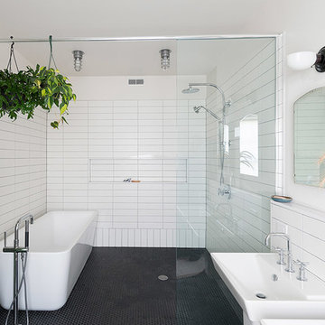
Example of an urban black and white tile mosaic tile floor and black floor bathroom design in Philadelphia with a wall-mount sink and white walls
Example of an urban black and white tile mosaic tile floor and black floor bathroom design in Philadelphia with a wall-mount sink and white walls
Find the right local pro for your project
 TVL Creative Ltd.
This 1910 West Highlands home was so compartmentalized that you couldn't help to notice you were constantly entering a new room every 8-10 feet. There was also a 500 SF addition put on the back of the home to accommodate a living room, 3/4 bath, laundry room and back foyer - 350 SF of that was for the living room. Needless to say, the house needed to be gutted and replanned.
Kitchen+Dining+Laundry-Like most of these early 1900's homes, the kitchen was not the heartbeat of the home like they are today. This kitchen was tucked away in the back and smaller than any other social rooms in the house. We knocked out the walls of the dining room to expand and created an open floor plan suitable for any type of gathering. As a nod to the history of the home, we used butcherblock for all the countertops and shelving which was accented by tones of brass, dusty blues and light-warm greys. This room had no storage before so creating ample storage and a variety of storage types was a critical ask for the client. One of my favorite details is the blue crown that draws from one end of the space to the other, accenting a ceiling that was otherwise forgotten.
Primary Bath-This did not exist prior to the remodel and the client wanted a more neutral space with strong visual details. We split the walls in half with a datum line that transitions from penny gap molding to the tile in the shower. To provide some more visual drama, we did a chevron tile arrangement on the floor, gridded the shower enclosure for some deep contrast an array of brass and quartz to elevate the finishes.
Powder Bath-This is always a fun place to let your vision get out of the box a bit. All the elements were familiar to the space but modernized and more playful. The floor has a wood look tile in a herringbone arrangement, a navy vanity, gold fixtures that are all servants to the star of the room - the blue and white deco wall tile behind the vanity.
Full Bath-This was a quirky little bathroom that you'd always keep the door closed when guests are over. Now we have brought the blue tones into the space and accented it with bronze fixtures and a playful southwestern floor tile.
Living Room & Office-This room was too big for its own good and now serves multiple purposes. We condensed the space to provide a living area for the whole family plus other guests and left enough room to explain the space with floor cushions. The office was a bonus to the project as it provided privacy to a room that otherwise had none before.
 M House Development
Picture Perfect House
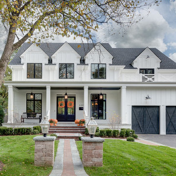
Inspiration for a large farmhouse white two-story wood house exterior remodel in Chicago with a shingle roof
Inspiration for a large farmhouse white two-story wood house exterior remodel in Chicago with a shingle roof
 TKS Design Group
Free ebook, Creating the Ideal Kitchen. DOWNLOAD NOW
The Klimala’s and their three kids are no strangers to moving, this being their fifth house in the same town over the 20-year period they have lived there. “It must be the 7-year itch, because every seven years, we seem to find ourselves antsy for a new project or a new environment. I think part of it is being a designer, I see my own taste evolve and I want my environment to reflect that. Having easy access to wonderful tradesmen and a knowledge of the process makes it that much easier”.
This time, Klimala’s fell in love with a somewhat unlikely candidate. The 1950’s ranch turned cape cod was a bit of a mutt, but it’s location 5 minutes from their design studio and backing up to the high school where their kids can roll out of bed and walk to school, coupled with the charm of its location on a private road and lush landscaping made it an appealing choice for them.
“The bones of the house were really charming. It was typical 1,500 square foot ranch that at some point someone added a second floor to. Its sloped roofline and dormered bedrooms gave it some charm.” With the help of architect Maureen McHugh, Klimala’s gutted and reworked the layout to make the house work for them. An open concept kitchen and dining room allows for more frequent casual family dinners and dinner parties that linger. A dingy 3-season room off the back of the original house was insulated, given a vaulted ceiling with skylights and now opens up to the kitchen. This room now houses an 8’ raw edge white oak dining table and functions as an informal dining room. “One of the challenges with these mid-century homes is the 8’ ceilings. I had to have at least one room that had a higher ceiling so that’s how we did it” states Klimala.
The kitchen features a 10’ island which houses a 5’0” Galley Sink. The Galley features two faucets, and double tiered rail system to which accessories such as cutting boards and stainless steel bowls can be added for ease of cooking. Across from the large sink is an induction cooktop. “My two teen daughters and I enjoy cooking, and the Galley and induction cooktop make it so easy.” A wall of tall cabinets features a full size refrigerator, freezer, double oven and built in coffeemaker. The area on the opposite end of the kitchen features a pantry with mirrored glass doors and a beverage center below.
The rest of the first floor features an entry way, a living room with views to the front yard’s lush landscaping, a family room where the family hangs out to watch TV, a back entry from the garage with a laundry room and mudroom area, one of the home’s four bedrooms and a full bath. There is a double sided fireplace between the family room and living room. The home features pops of color from the living room’s peach grass cloth to purple painted wall in the family room. “I’m definitely a traditionalist at heart but because of the home’s Midcentury roots, I wanted to incorporate some of those elements into the furniture, lighting and accessories which also ended up being really fun. We are not formal people so I wanted a house that my kids would enjoy, have their friends over and feel comfortable.”
The second floor houses the master bedroom suite, two of the kids’ bedrooms and a back room nicknamed “the library” because it has turned into a quiet get away area where the girls can study or take a break from the rest of the family. The area was originally unfinished attic, and because the home was short on closet space, this Jack and Jill area off the girls’ bedrooms houses two large walk-in closets and a small sitting area with a makeup vanity. “The girls really wanted to keep the exposed brick of the fireplace that runs up the through the space, so that’s what we did, and I think they feel like they are in their own little loft space in the city when they are up there” says Klimala.
Designed by: Susan Klimala, CKD, CBD
Photography by: Carlos Vergara
For more information on kitchen and bath design ideas go to: www.kitchenstudio-ge.com
 Ivy Lane Living
Angie Seckinger
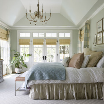
Inspiration for a timeless carpeted and gray floor bedroom remodel in DC Metro with gray walls
Inspiration for a timeless carpeted and gray floor bedroom remodel in DC Metro with gray walls

Sponsored
Columbus, OH

Structural Remodeling
Franklin County's Heavy Timber Specialists | Best of Houzz 2020!
 Studio Dearborn
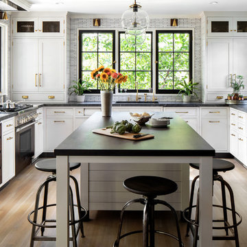
INTERNATIONAL AWARD WINNER. 2018 NKBA Design Competition Best Overall Kitchen. 2018 TIDA International USA Kitchen of the Year. 2018 Best Traditional Kitchen - Westchester Home Magazine design awards.
The designer's own kitchen was gutted and renovated in 2017, with a focus on classic materials and thoughtful storage. The 1920s craftsman home has been in the family since 1940, and every effort was made to keep finishes and details true to the original construction. For sources, please see the website at www.studiodearborn.com. Photography, Adam Kane Macchia and Timothy Lenz
 SoCal Contractor
Lori Dennis Interior Design
SoCal Contractor Construction
Mark Tanner Photography
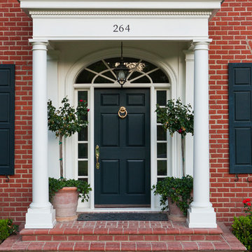
Inspiration for a large timeless entryway remodel in Los Angeles with a black front door
Inspiration for a large timeless entryway remodel in Los Angeles with a black front door
 Haven Design and Construction
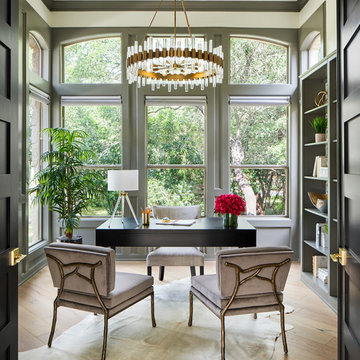
This beautiful study was part of a whole house design and renovation by Haven Design and Construction. For this room, our objective was to create a feminine and sophisticated study for our client. She requested a design that was unique and fresh, but still warm and inviting. We wallpapered the back of the bookcases in an eye catching metallic vine pattern to add a feminine touch. Then, we selected a deep gray tone from the wallpaper and painted the bookcases and wainscoting in this striking color. We replaced the carpet with a light wood flooring that compliments the gray woodwork. Our client preferred a petite desk, just large enough for paying bills or working on her laptop, so our first furniture selection was a lovely black desk with feminine curved detailing and delicate star hardware. The room still needed a focal point, so we selected a striking lucite and gold chandelier to set the tone. The design was completed by a pair of gray velvet guest chairs. The gold twig pattern on the back of the chairs compliments the metallic wallpaper pattern perfectly. Finally the room was carefully detailed with unique accessories and custom bound books to fill the bookcases.
 Kowalske Kitchen & Bath
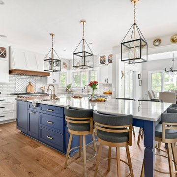
Inspiration for a huge transitional u-shaped vinyl floor and brown floor eat-in kitchen remodel in Milwaukee with a farmhouse sink, shaker cabinets, blue cabinets, quartzite countertops, white backsplash, subway tile backsplash, stainless steel appliances, an island and white countertops
 SoYoung Mack Design, Assoc. AIA
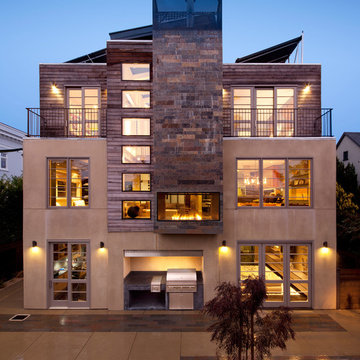
Renovation of a Mediterranean style home into a contemporary, loft-like, light filled space with skylight roof, 2 story slate fireplace, exposed I-beams, blue glass stairwell, glass tiled baths, and walnut and Koa kitchen. The palette is a soothing blend of browns, neutrals, and slate blue with modern furnishings and art, and Asian artifacts.
SoYoung Mack Design
Feldman Architecture
Paul Dyer Photography
 StoneWorks, Inc.
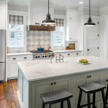
Beautiful subdued elegance permeates this kitchen, with its hints of farmhouse style and gorgeous stones. The counter and large island are finished in a Brazilian granite called New Kashmir. The Farmhouse sink is a nice feature for the island. The beautiful backsplash above the stovetop is made with blue-gray hand painted Ceramic tiles, called Duquesa. The white Shaker cabinets, warm hardwood flooring and the large island all speak of the lowcountry, easy living and coastal charm. Love this kitchen!


 StoneUnlimited Kitchen and Bath Remodeling
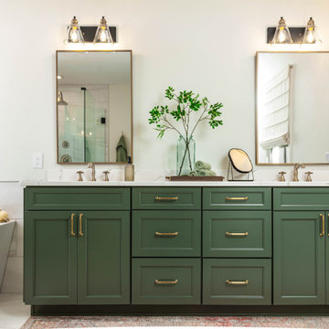
This aesthetically pleasing master bathroom is the perfect place for our clients to start and end each day. Fully customized shower fixtures and a deep soaking tub will provide the perfect solutions to destress and unwind. Our client's love for plants translates beautifully into this space with a sage green double vanity that brings life and serenity into their master bath retreat. Opting to utilize softer patterned tile throughout the space, makes it more visually expansive while gold accessories, natural wood elements, and strategically placed rugs throughout the room, make it warm and inviting.
Committing to a color scheme in a space can be overwhelming at times when considering the number of options that are available. This master bath is a perfect example of how to incorporate color into a room tastefully, while still having a cohesive design.
Items used in this space include:
Waypoint Living Spaces Cabinetry in Sage Green
Calacatta Italia Manufactured Quartz Vanity Tops
Elegant Stone Onice Bianco Tile
Natural Marble Herringbone Tile
Delta Cassidy Collection Fixtures
Want to see more samples of our work or before and after photographs of this project?
Visit the Stoneunlimited Kitchen and Bath website:
www.stoneunlimited.net
Stoneunlimited Kitchen and Bath is a full scope, full service, turnkey business. We do it all so that you don’t have to. You get to do the fun part of approving the design, picking your materials and making selections with our guidance and we take care of everything else. We provide you with 3D and 4D conceptual designs so that you can see your project come to life. Materials such as tile, fixtures, sinks, shower enclosures, flooring, cabinetry and countertops are ordered through us, inspected by us and installed by us. We are also a fabricator, so we fabricate all the countertops. We assign and manage the schedule and the workers that will be in your home taking care of the installation. We provide painting, electrical, plumbing as well as cabinetry services for your project from start to finish. So, when I say we do it, we truly do it all!
 Lucy Call
Photo: Lucy Call © 2013 Houzz
Design: Imbue Design and Sausage Space
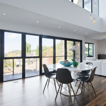
Minimalist great room photo in Salt Lake City
Minimalist great room photo in Salt Lake City
 ProRail Systems Ltd
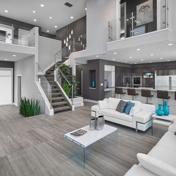
Inspiration for a contemporary open concept gray floor living room remodel in Edmonton with gray walls
 O’Hara Interiors
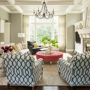
Martha O'Hara Interiors, Interior Design | L. Cramer Builders + Remodelers, Builder | Troy Thies, Photography | Shannon Gale, Photo Styling
Please Note: All “related,” “similar,” and “sponsored” products tagged or listed by Houzz are not actual products pictured. They have not been approved by Martha O’Hara Interiors nor any of the professionals credited. For information about our work, please contact design@oharainteriors.com.

Sponsored
Sunbury, OH

J.Holderby - Renovations
Franklin County's Leading General Contractors - 2X Best of Houzz!
 Lucy Call
Photo: Lucy Call © 2015 Houzz
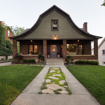
Inspiration for a craftsman two-story mixed siding exterior home remodel in Salt Lake City
Inspiration for a craftsman two-story mixed siding exterior home remodel in Salt Lake City
 Cantoni Irvine
Designed By: Richard Bustos Photos By: Jeri Koegel
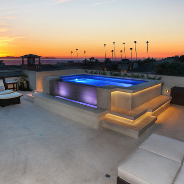
Ron and Kathy Chaisson have lived in many homes throughout Orange County, including three homes on the Balboa Peninsula and one at Pelican Crest. But when the “kind of retired” couple, as they describe their current status, decided to finally build their ultimate dream house in the flower streets of Corona del Mar, they opted not to skimp on the amenities. “We wanted this house to have the features of a resort,” says Ron. “So we designed it to have a pool on the roof, five patios, a spa, a gym, water walls in the courtyard, fire-pits and steam showers.”
To bring that five-star level of luxury to their newly constructed home, the couple enlisted Orange County’s top talent, including our very own rock star design consultant Richard Bustos, who worked alongside interior designer Trish Steel and Patterson Custom Homes as well as Brandon Architects. Together the team created a 4,500 square-foot, five-bedroom, seven-and-a-half-bathroom contemporary house where R&R get top billing in almost every room. Two stories tall and with lots of open spaces, it manages to feel spacious despite its narrow location. And from its third floor patio, it boasts panoramic ocean views.
“Overall we wanted this to be contemporary, but we also wanted it to feel warm,” says Ron. Key to creating that look was Richard, who selected the primary pieces from our extensive portfolio of top-quality furnishings. Richard also focused on clean lines and neutral colors to achieve the couple’s modern aesthetic, while allowing both the home’s gorgeous views and Kathy’s art to take center stage.
As for that mahogany-lined elevator? “It’s a requirement,” states Ron. “With three levels, and lots of entertaining, we need that elevator for keeping the bar stocked up at the cabana, and for our big barbecue parties.” He adds, “my wife wears high heels a lot of the time, so riding the elevator instead of taking the stairs makes life that much better for her.”
 Wow Great Place
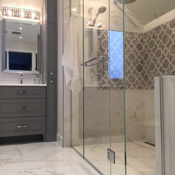
The shower was designed to accommodate a curbless install, so the floor was sloped down towards the linear drain. The glass was ordered in "extra clear" so as not to cast the typical blue-green hue that most shower glass has. We also ordered the anti-smudge glass, so squeegeeing is not as critical after every shower.
17