
Search results for "Spaces" in Home Design Ideas
 FineLine Kitchens, Inc.
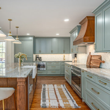
Hi everyone, I'm Sarah and Ogun we are here with fine line kitchens. So we are a couple working together. I do the interior design and remodeling of the space material selection meeting with the clients. And I handled operations outside, you know meaning all the construction work that is taking place the inside. The houses that we work in. I handle all the aspects of the construction, so today's project is very special. We're in Vienna and the client had a very big family. It's a family of seven that lives here. So we had a few aspects that we needed to keep in mind while designing this one. Having everybody be able to sit on the island. So we wanted plenty of seating all the way around. We didn't want anybody standing or anything like that. So what we did is we maximize the space. The center island is the biggest part of the kitchen. We use a natural stone to kind of give it a beautiful texture versus quartz. It's kind of standard white or kind of fabricated, so I wanted something very natural. We did this because I took my inspiration from the outside, so the inspiration if you look at the view right in front of me is there are so many greens there's a lot of brass accents and I wanted to bring this. Into this kitchen while designing it for my clients. She is very warm very. She wanted a very homey, comfy kind of look for the kitchen. So that's what we did today. As you can see, the cabinets are sage green, very light, so I still think it's a neutral, but it's a lighter color that again brings the outside in and we combine that with the oak right behind me so it's a slightly warm oak. It's not very dark. It's not very light. It's a medium brown and the same color went on the island. To kind of tie these two in and the backsplash, my favorite part is where you can see a little bit of design. It is, in my opinion still classic, but includes a pattern so the outside part is as we said in the beginning, is handled by my husband. I'd like him to speak a little bit about that. Thanks, Sarah, I want to talk to you guys a little bit about the construction part of this project. Originally this kitchen was located mostly in this area. They had their stove there sing. It was more of a peninsula layout in Sarah's and the customer vision they wanted. They wanted to get rid of the peninsula and they want to be able to have a huge island that can at least sit seven people because they're familiar with seven. So we wanted to make sure that we can achieve this design and bring it to life so that they can be happy with this layout. Some of the challenges we had, the house, the home being, you know, old home. There were a lot of you know the older electrical and plumbing that had to be replaced. We had to relocate the stove from here to this area. Over here we had put a nice foot fan that we had to relocate all the ductwork and the plumbing. Was being on the peninsula area. We had to relocate it to the center islands. So we achieved all this and kind of like bring it to bring in this kitchen up to date it looks beautiful. That's true, so yes, the old layout did not function for my clients because everything was kind of gathered on one side of the kitchen. So there was like a peninsula right there. So the end of this island kind of continued straight. And that was just the L shape. Kind of where everything was and there used to be another big table here, so they were using only kind of half of the space. So like I said at the beginning, our vision was to kind of feed everybody at the island, create some symmetry. 'cause I love that. So as you can see behind me, this is kind of the focal point symmetrical. Everything is kind of even we wanted to also panel the fridge here so it mimics the pantry and another size. So when you're looking at it, it is bringing again that symmetry back again. I hope you enjoyed this kitchen and this video and I'll see you soon. So how do you think this project turned out? It's nice. I like the color. I think it turned out nice. It's kind of like a little bit different color than what we always do. So I realize. Are you giving me a little bit of credit here that I did something different? Are you proud? I'm so proud of you. Other than that I like it. That they have kind of like a two sink. So if this was our kitchen, if we ever like you can have your own. I can have mine if we ever get into a fight then this can be like my own kitchen. Why are we gonna bring in a fight right now? So I'm cooking anyway. You're grilling most of the time, So what are you even talking about? My kitchen? That's my kitchen. You can just take the small sink. That's fine. It's always good to have your own space right there, so anyways. Thank you guys for watching. We hope to see you soon and if you have any questions please click the link below. It'll lead you to our website, house, YouTube and all of the social media is so nice to have you guys. We'll see you soon. Thanks bye bye-bye.

 User
http://mollywinnphotography.com
Example of a mid-sized cottage chic open concept medium tone wood floor living room design in Austin with white walls and no tv
Example of a mid-sized cottage chic open concept medium tone wood floor living room design in Austin with white walls and no tv

 Klopf Architecture
Inspiration for a small 1950s single-wall black floor dedicated laundry room remodel in San Francisco with flat-panel cabinets, white cabinets, white walls, a side-by-side washer/dryer and gray countertops
Find the right local pro for your project


Inspiration for a transitional galley dark wood floor wet bar remodel in Detroit with dark wood cabinets and recessed-panel cabinets


 360-Vip Photography
Dean Riedel of 360Vip Photography
Elegant u-shaped utility room photo in Minneapolis with an utility sink, recessed-panel cabinets, white cabinets, gray walls and a side-by-side washer/dryer
Elegant u-shaped utility room photo in Minneapolis with an utility sink, recessed-panel cabinets, white cabinets, gray walls and a side-by-side washer/dryer
Sponsored
Columbus, OH
Free consultation for landscape design!

Peabody Landscape Group
Columbus' Reliable Landscape Design & Contracting

 Renew Doors and Closets LLC
Walk-in closet - small transitional gender-neutral slate floor and multicolored floor walk-in closet idea with flat-panel cabinets and white cabinets

 Lisa Adams, LA Closet Design
Meghan Beierle-O'Brien
Inspiration for a timeless dressing room remodel in Los Angeles
Inspiration for a timeless dressing room remodel in Los Angeles

 Patio Pools and Spas
This gorgeous backyard project covered every square inch of this customer’s backyard and was nestled in to a tight backyard access without disturbing the existing trees or golf course. The customer had very contemporary and modern tastes and wanted that reflected in their pool and backyard design.
A stunning 1” blue glass tiled raised planter box* with 5 water features gracefully separates this geometrically perfect Pebble Sheen swimming pool from the golf course it overlooks and green low-maintenance Southwest plants & floral separate the view. A dam wall separates the roomy therapeutic in-ground semi-circle spa from the pool area. The side of the pool closest to the home is a straight parallel line, with the opposing side geometrically rounded with both the raised pattern pavers and the wrought iron fence matching patterns precisely.
The ( wireless EZ Touch remote operated ) pool equipment is on the side of the home allowing spacious deck space for those who enjoy this contemporary backyard.
Of note, the same 1” glass tiles from the raised planter were used throughout the home’s interior to integrate outdoor & indoor elements.

 Innovative Design Build
Innovative Construction is a different kind of renovation company because of the people that work there. They do very high quality work as well, which is not a common combination! Many of the construction guys have been working with Innovative Construction for years and they are the most thoughtful, happiest and hardworking crew we have ever been around. The office crew are very responsive and always go the extra mile to be helpful (thanks, Aisling)! Our recent job was smaller than our first job, and we still received personal service and great attention to detail (thanks, Trevor). I was amazed at how willing they all are to investigate the best options for our specific job, whether it be a different material or product or design. Innovative Construction is determined to make sure you are satisfied with the work done, and Clark is always willing to address any issues or concerns quickly and in such a pleasant and non confrontational matter. Believe me, these are people you want working on your house… or just people that you would want in your house at any time!! This was our second time using Innovative Construction and we will certainly use them again in the future and we highly recommend them.


Sponsored
Columbus, OH
Free consultation for landscape design!
Peabody Landscape Group
Columbus' Reliable Landscape Design & Contracting

 Henrietta Heisler Interiors Inc
This little laundry room uses hidden tricks to modernize and maximize limited space. The main wall features bumped out upper cabinets above the washing machine for increased storage and easy access. Next to the cabinets are open shelves that allow space for the air vent on the back wall. This fan was faux painted to match the cabinets - blending in so well you wouldn’t even know it’s there!
Between the cabinetry and blue fantasy marble countertop sits a luxuriously tiled backsplash. This beautiful backsplash hides the door to necessary valves, its outline barely visible while allowing easy access.
Making the room brighter are light, textured walls, under cabinet, and updated lighting. Though you can’t see it in the photos, one more trick was used: the door was changed to smaller french doors, so when open, they are not in the middle of the room. Door backs are covered in the same wallpaper as the rest of the room - making the doors look like part of the room, and increasing available space.


 O’Hara Interiors
Martha O'Hara Interiors, Interior Design | L. Cramer Builders + Remodelers, Builder | Troy Thies, Photography | Shannon Gale, Photo Styling
Please Note: All “related,” “similar,” and “sponsored” products tagged or listed by Houzz are not actual products pictured. They have not been approved by Martha O’Hara Interiors nor any of the professionals credited. For information about our work, please contact design@oharainteriors.com.

 Paul N. Brow, Architect, LLC
Inside view of pantry showing stainless steel mesh drawer fronts for dry-good storage and adjustable shelves.
Example of a mid-sized classic u-shaped beige floor and travertine floor kitchen pantry design in Houston with open cabinets, gray cabinets and no island
Example of a mid-sized classic u-shaped beige floor and travertine floor kitchen pantry design in Houston with open cabinets, gray cabinets and no island


 Bilotta Kitchen & Home
For this project, the entire kitchen was designed around the “must-have” Lacanche range in the stunning French Blue with brass trim. That was the client’s dream and everything had to be built to complement it. Bilotta senior designer, Randy O’Kane, CKD worked with Paul Benowitz and Dipti Shah of Benowitz Shah Architects to contemporize the kitchen while staying true to the original house which was designed in 1928 by regionally noted architect Franklin P. Hammond. The clients purchased the home over two years ago from the original owner. While the house has a magnificent architectural presence from the street, the basic systems, appointments, and most importantly, the layout and flow were inappropriately suited to contemporary living.
The new plan removed an outdated screened porch at the rear which was replaced with the new family room and moved the kitchen from a dark corner in the front of the house to the center. The visual connection from the kitchen through the family room is dramatic and gives direct access to the rear yard and patio. It was important that the island separating the kitchen from the family room have ample space to the left and right to facilitate traffic patterns, and interaction among family members. Hence vertical kitchen elements were placed primarily on existing interior walls. The cabinetry used was Bilotta’s private label, the Bilotta Collection – they selected beautiful, dramatic, yet subdued finishes for the meticulously handcrafted cabinetry. The double islands allow for the busy family to have a space for everything – the island closer to the range has seating and makes a perfect space for doing homework or crafts, or having breakfast or snacks. The second island has ample space for storage and books and acts as a staging area from the kitchen to the dinner table. The kitchen perimeter and both islands are painted in Benjamin Moore’s Paper White. The wall cabinets flanking the sink have wire mesh fronts in a statuary bronze – the insides of these cabinets are painted blue to match the range. The breakfast room cabinetry is Benjamin Moore’s Lampblack with the interiors of the glass cabinets painted in Paper White to match the kitchen. All countertops are Vermont White Quartzite from Eastern Stone. The backsplash is Artistic Tile’s Kyoto White and Kyoto Steel. The fireclay apron-front main sink is from Rohl while the smaller prep sink is from Linkasink. All faucets are from Waterstone in their antique pewter finish. The brass hardware is from Armac Martin and the pendants above the center island are from Circa Lighting. The appliances, aside from the range, are a mix of Sub-Zero, Thermador and Bosch with panels on everything.

 CG&S Design-Build
Design by Joanna Hartman
Photography by Ryann Ford
Styling by Adam Fortner
This space features 3cm Bianco Carrera Marble, oak floors, Restoration Hardware for the cabinets, and a large West Elm white capiz shell pendant to top it off.

 Daniel Conlon Architects
Tim Lee Photography
Fairfield County Award Winning Architect
Mudroom - large traditional slate floor mudroom idea in New York with gray walls and a white front door
Mudroom - large traditional slate floor mudroom idea in New York with gray walls and a white front door
70