
Search results for "Specially selected" in Home Design Ideas
 FineLine Kitchens, Inc.
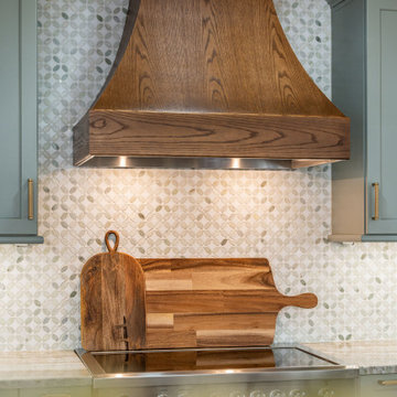
Hi everyone, I'm Sarah and Ogun we are here with fine line kitchens. So we are a couple working together. I do the interior design and remodeling of the space material selection meeting with the clients. And I handled operations outside, you know meaning all the construction work that is taking place the inside. The houses that we work in. I handle all the aspects of the construction, so today's project is very special. We're in Vienna and the client had a very big family. It's a family of seven that lives here. So we had a few aspects that we needed to keep in mind while designing this one. Having everybody be able to sit on the island. So we wanted plenty of seating all the way around. We didn't want anybody standing or anything like that. So what we did is we maximize the space. The center island is the biggest part of the kitchen. We use a natural stone to kind of give it a beautiful texture versus quartz. It's kind of standard white or kind of fabricated, so I wanted something very natural. We did this because I took my inspiration from the outside, so the inspiration if you look at the view right in front of me is there are so many greens there's a lot of brass accents and I wanted to bring this. Into this kitchen while designing it for my clients. She is very warm very. She wanted a very homey, comfy kind of look for the kitchen. So that's what we did today. As you can see, the cabinets are sage green, very light, so I still think it's a neutral, but it's a lighter color that again brings the outside in and we combine that with the oak right behind me so it's a slightly warm oak. It's not very dark. It's not very light. It's a medium brown and the same color went on the island. To kind of tie these two in and the backsplash, my favorite part is where you can see a little bit of design. It is, in my opinion still classic, but includes a pattern so the outside part is as we said in the beginning, is handled by my husband. I'd like him to speak a little bit about that. Thanks, Sarah, I want to talk to you guys a little bit about the construction part of this project. Originally this kitchen was located mostly in this area. They had their stove there sing. It was more of a peninsula layout in Sarah's and the customer vision they wanted. They wanted to get rid of the peninsula and they want to be able to have a huge island that can at least sit seven people because they're familiar with seven. So we wanted to make sure that we can achieve this design and bring it to life so that they can be happy with this layout. Some of the challenges we had, the house, the home being, you know, old home. There were a lot of you know the older electrical and plumbing that had to be replaced. We had to relocate the stove from here to this area. Over here we had put a nice foot fan that we had to relocate all the ductwork and the plumbing. Was being on the peninsula area. We had to relocate it to the center islands. So we achieved all this and kind of like bring it to bring in this kitchen up to date it looks beautiful. That's true, so yes, the old layout did not function for my clients because everything was kind of gathered on one side of the kitchen. So there was like a peninsula right there. So the end of this island kind of continued straight. And that was just the L shape. Kind of where everything was and there used to be another big table here, so they were using only kind of half of the space. So like I said at the beginning, our vision was to kind of feed everybody at the island, create some symmetry. 'cause I love that. So as you can see behind me, this is kind of the focal point symmetrical. Everything is kind of even we wanted to also panel the fridge here so it mimics the pantry and another size. So when you're looking at it, it is bringing again that symmetry back again. I hope you enjoyed this kitchen and this video and I'll see you soon. So how do you think this project turned out? It's nice. I like the color. I think it turned out nice. It's kind of like a little bit different color than what we always do. So I realize. Are you giving me a little bit of credit here that I did something different? Are you proud? I'm so proud of you. Other than that I like it. That they have kind of like a two sink. So if this was our kitchen, if we ever like you can have your own. I can have mine if we ever get into a fight then this can be like my own kitchen. Why are we gonna bring in a fight right now? So I'm cooking anyway. You're grilling most of the time, So what are you even talking about? My kitchen? That's my kitchen. You can just take the small sink. That's fine. It's always good to have your own space right there, so anyways. Thank you guys for watching. We hope to see you soon and if you have any questions please click the link below. It'll lead you to our website, house, YouTube and all of the social media is so nice to have you guys. We'll see you soon. Thanks bye bye-bye.
 J Design Group - Interior Designers Miami - Modern
Projects by J Design Group, Your friendly Interior designers firm in Miami, FL. at your service.
AVENTURA MAGAZINE selected our client’s luxury 5000 Sf ocean front apartment in Miami Beach, to publish it in their issue and they Said:
Story by Linda Marx, Photography by Daniel Newcomb
Light & Bright
New York snowbirds redesigned their Miami Beach apartment to take advantage of the tropical lifestyle.
New York snowbirds redesigned their Miami Beach apartment to take advantage of the tropical lifestyle.
WHEN INTERIOR DESIGNER JENNIFER CORREDOR was asked to recreate a four-bedroom, six-bath condominium at The Bath Club in Miami Beach, she seized the opportunity to open the rooms and better utilize the vast ocean views.
In five months last year, the designer transformed a dark and closed 5,000-square-foot unit located on a high floor into a series of sweeping waterfront spaces and updated the well located apartment into a light and airy retreat for a sports-loving family of five.
“They come down from New York every other weekend and wanted to make their waterfront home a series of grand open spaces,” says Jennifer Corrredor, of the J. Design Group in Miami, a firm specializing in modern and contemporary interiors. “Since many of the rooms face the ocean, it made sense to open and lighten up the home, taking advantage of the awesome views of the sea and the bay.”
The designer used 40 x 40 all white tile throughout the apartment as a clean base. This way, her sophisticated use of color would stand out and bring the outdoors in.
The close-knit family members—two parents and three boys in college—like to do things together. But there were situations to overcome in the process of modernizing and opening the space. When Jennifer Corredor was briefed on their desires, nothing seemed too daunting. The confident designer was ready to delve in. For example, she fixed an area at the front door
that was curved. “The wood was concave so I straightened it out,” she explains of a request from the clients. “It was an obstacle that I overcame as part of what I do in a redesign. I don’t consider it a difficult challenge. Improving what I see is part of the process.”
She also tackled the kitchen with gusto by demolishing a wall. The kitchen had formerly been enclosed, which was a waste of space and poor use of available waterfront ambience. To create a grand space linking the kitchen to the living room and dining room area, something had to go. Once the wall was yesterday’s news, she relocated the refrigerator and freezer (two separate appliances) to the other side of the room. This change was a natural functionality in the new open space. “By tearing out the wall, the family has a better view of the kitchen from the living and dining rooms,” says Jennifer Corredor, who also made it easier to walk in and out of one area and into the other. “The views of the larger public space and the surrounding water are breathtaking.
Opening it up changed everything.”
They clients can now see the kitchen from the living and dining areas, and at the same time, dwell in an airy and open space instead of feeling stuck in a dark enclosed series of rooms. In fact, the high-top bar stools that Jennifer Corredor selected for the kitchen can be twirled around to use for watching TV in the living room.
In keeping with the theme of moving seamlessly from one room to the other, Corredor designed a subtle wall of glass in the living room along with lots of comfortable seating. This way, all family members feel at ease while relaxing, talking, or watching sporting events on the large flat screen television. “For this room, I wanted more open space, light and a supreme airy feeling,” she says. “With the glass design making a statement, it quickly became the star of the show.”…….
….. To add texture and depth, Jennifer Corredor custom created wood doors here, and in other areas of the home. They provide a nice contrast to the open Florida tropical feel. “I added character to the openness by using exotic cherry wood,” she says. “I repeated this throughout the home and it works well.”
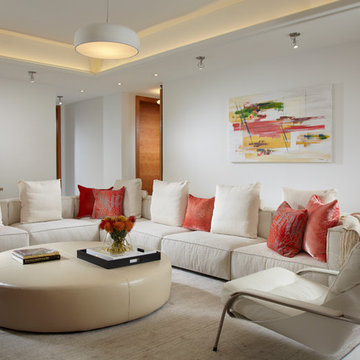
Known for capturing the client’s vision while adding her own innovative twists, Jennifer Corredor lightened the family room, giving it a contemporary and modern edge with colorful art and matching throw pillows on the sofas. She added a large beige leather ottoman as the center coffee table in the room. This round piece was punctuated with a bold-toned flowering plant atop. It effortlessly matches the pillows and colors of the contemporary canvas.
Jennifer Corredor also gutted all of the bathrooms, resulting in a major redesign of the master. She jettisoned the whirlpool and created the dazzling illusion of a floating tub. From an area where there were two toilets, she eliminated one to make a grand rectangular shower, which became an overall showpiece. The master bath went from being just a functional water closet to a sophisticated spa-like space. “The client said I was ‘delicious’ after seeing the change,” laughed Jennifer Corredor, who emphasized that her clients love their part-time life
in South Florida more each time they come down. Even when the husband has to work from their Miami Beach digs, he is surrounded by tropical beauty. For instance, there are times when the master bedroom must double as the husband’s home office.
The room had to be large enough to accommodate a working space for this purpose. So Jennifer Corredor placed an appropriate table near the window and across from the king-size bed. “No blocking of the amazing water view was necessary,” she says. “I kept an open space with a lot of white so It functions well and the work space fits right in.” She repeated the bold modern art in the
room as well as in the guest bedroom, which also has a workspace for the sons when they are home from school and need to study.
The designer is still happy and glowing with the results of her toil in this apartment. She gets a “spiritual feeling” when she walks inside. “It is so peaceful and serene, with subtle hints of explosive statements,” she says. “The entire space is open, yet anchored by the warmth of the exotic woods.” The client wrote Jennifer Corredor a letter at the end of the project congratulating her on a
job well done. She revealed that owning a Miami Beach home was her husband’s dream 30 years ago. “Now we have a quality perfect yet practical home,” she wrote to the designer. “You solved the challenges, and the end
result far exceeds our expectations. We love it.”
Thanks for your interest in our Contemporary Interior Design projects and if you have any question please do not hesitate to ask us.
http://www.JDesignGroup.com
305.444.4611
Modern Interior designer Miami. Contemporary
Miami
Miami Interior Designers
Miami Interior Designer
Interior Designers Miami
Interior Designer Miami
Modern Interior Designers
Modern Interior Designer
Modern interior decorators
Modern interior decorator
Contemporary Interior Designers
Contemporary Interior Designer
Interior design decorators
Interior design decorator
Interior Decoration and Design
Black Interior Designers
Black Interior Designer
Interior designer
Interior designers
Interior design decorators
Interior design decorator
Home interior designers
Home interior designer
Interior design companies
Interior decorators
Interior decorator
Decorators
Decorator
Miami Decorators
Miami Decorator
Decorators Miami
Decorator Miami
Interior Design Firm
Interior Design Firms
Interior Designer Firm
Interior Designer Firms
Interior design
Interior designs
home decorators
Interior decorating Miami
Best Interior Designers.
225 Malaga Ave.
Coral Gable, FL 33134
http://www.JDesignGroup.com
305.444.4611
 FineLine Kitchens, Inc.
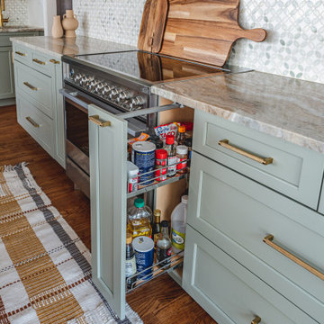
Hi everyone, I'm Sarah and Ogun we are here with fine line kitchens. So we are a couple working together. I do the interior design and remodeling of the space material selection meeting with the clients. And I handled operations outside, you know meaning all the construction work that is taking place the inside. The houses that we work in. I handle all the aspects of the construction, so today's project is very special. We're in Vienna and the client had a very big family. It's a family of seven that lives here. So we had a few aspects that we needed to keep in mind while designing this one. Having everybody be able to sit on the island. So we wanted plenty of seating all the way around. We didn't want anybody standing or anything like that. So what we did is we maximize the space. The center island is the biggest part of the kitchen. We use a natural stone to kind of give it a beautiful texture versus quartz. It's kind of standard white or kind of fabricated, so I wanted something very natural. We did this because I took my inspiration from the outside, so the inspiration if you look at the view right in front of me is there are so many greens there's a lot of brass accents and I wanted to bring this. Into this kitchen while designing it for my clients. She is very warm very. She wanted a very homey, comfy kind of look for the kitchen. So that's what we did today. As you can see, the cabinets are sage green, very light, so I still think it's a neutral, but it's a lighter color that again brings the outside in and we combine that with the oak right behind me so it's a slightly warm oak. It's not very dark. It's not very light. It's a medium brown and the same color went on the island. To kind of tie these two in and the backsplash, my favorite part is where you can see a little bit of design. It is, in my opinion still classic, but includes a pattern so the outside part is as we said in the beginning, is handled by my husband. I'd like him to speak a little bit about that. Thanks, Sarah, I want to talk to you guys a little bit about the construction part of this project. Originally this kitchen was located mostly in this area. They had their stove there sing. It was more of a peninsula layout in Sarah's and the customer vision they wanted. They wanted to get rid of the peninsula and they want to be able to have a huge island that can at least sit seven people because they're familiar with seven. So we wanted to make sure that we can achieve this design and bring it to life so that they can be happy with this layout. Some of the challenges we had, the house, the home being, you know, old home. There were a lot of you know the older electrical and plumbing that had to be replaced. We had to relocate the stove from here to this area. Over here we had put a nice foot fan that we had to relocate all the ductwork and the plumbing. Was being on the peninsula area. We had to relocate it to the center islands. So we achieved all this and kind of like bring it to bring in this kitchen up to date it looks beautiful. That's true, so yes, the old layout did not function for my clients because everything was kind of gathered on one side of the kitchen. So there was like a peninsula right there. So the end of this island kind of continued straight. And that was just the L shape. Kind of where everything was and there used to be another big table here, so they were using only kind of half of the space. So like I said at the beginning, our vision was to kind of feed everybody at the island, create some symmetry. 'cause I love that. So as you can see behind me, this is kind of the focal point symmetrical. Everything is kind of even we wanted to also panel the fridge here so it mimics the pantry and another size. So when you're looking at it, it is bringing again that symmetry back again. I hope you enjoyed this kitchen and this video and I'll see you soon. So how do you think this project turned out? It's nice. I like the color. I think it turned out nice. It's kind of like a little bit different color than what we always do. So I realize. Are you giving me a little bit of credit here that I did something different? Are you proud? I'm so proud of you. Other than that I like it. That they have kind of like a two sink. So if this was our kitchen, if we ever like you can have your own. I can have mine if we ever get into a fight then this can be like my own kitchen. Why are we gonna bring in a fight right now? So I'm cooking anyway. You're grilling most of the time, So what are you even talking about? My kitchen? That's my kitchen. You can just take the small sink. That's fine. It's always good to have your own space right there, so anyways. Thank you guys for watching. We hope to see you soon and if you have any questions please click the link below. It'll lead you to our website, house, YouTube and all of the social media is so nice to have you guys. We'll see you soon. Thanks bye bye-bye.
Find the right local pro for your project
 FineLine Kitchens, Inc.
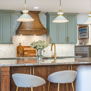
Hi everyone, I'm Sarah and Ogun we are here with fine line kitchens. So we are a couple working together. I do the interior design and remodeling of the space material selection meeting with the clients. And I handled operations outside, you know meaning all the construction work that is taking place the inside. The houses that we work in. I handle all the aspects of the construction, so today's project is very special. We're in Vienna and the client had a very big family. It's a family of seven that lives here. So we had a few aspects that we needed to keep in mind while designing this one. Having everybody be able to sit on the island. So we wanted plenty of seating all the way around. We didn't want anybody standing or anything like that. So what we did is we maximize the space. The center island is the biggest part of the kitchen. We use a natural stone to kind of give it a beautiful texture versus quartz. It's kind of standard white or kind of fabricated, so I wanted something very natural. We did this because I took my inspiration from the outside, so the inspiration if you look at the view right in front of me is there are so many greens there's a lot of brass accents and I wanted to bring this. Into this kitchen while designing it for my clients. She is very warm very. She wanted a very homey, comfy kind of look for the kitchen. So that's what we did today. As you can see, the cabinets are sage green, very light, so I still think it's a neutral, but it's a lighter color that again brings the outside in and we combine that with the oak right behind me so it's a slightly warm oak. It's not very dark. It's not very light. It's a medium brown and the same color went on the island. To kind of tie these two in and the backsplash, my favorite part is where you can see a little bit of design. It is, in my opinion still classic, but includes a pattern so the outside part is as we said in the beginning, is handled by my husband. I'd like him to speak a little bit about that. Thanks, Sarah, I want to talk to you guys a little bit about the construction part of this project. Originally this kitchen was located mostly in this area. They had their stove there sing. It was more of a peninsula layout in Sarah's and the customer vision they wanted. They wanted to get rid of the peninsula and they want to be able to have a huge island that can at least sit seven people because they're familiar with seven. So we wanted to make sure that we can achieve this design and bring it to life so that they can be happy with this layout. Some of the challenges we had, the house, the home being, you know, old home. There were a lot of you know the older electrical and plumbing that had to be replaced. We had to relocate the stove from here to this area. Over here we had put a nice foot fan that we had to relocate all the ductwork and the plumbing. Was being on the peninsula area. We had to relocate it to the center islands. So we achieved all this and kind of like bring it to bring in this kitchen up to date it looks beautiful. That's true, so yes, the old layout did not function for my clients because everything was kind of gathered on one side of the kitchen. So there was like a peninsula right there. So the end of this island kind of continued straight. And that was just the L shape. Kind of where everything was and there used to be another big table here, so they were using only kind of half of the space. So like I said at the beginning, our vision was to kind of feed everybody at the island, create some symmetry. 'cause I love that. So as you can see behind me, this is kind of the focal point symmetrical. Everything is kind of even we wanted to also panel the fridge here so it mimics the pantry and another size. So when you're looking at it, it is bringing again that symmetry back again. I hope you enjoyed this kitchen and this video and I'll see you soon. So how do you think this project turned out? It's nice. I like the color. I think it turned out nice. It's kind of like a little bit different color than what we always do. So I realize. Are you giving me a little bit of credit here that I did something different? Are you proud? I'm so proud of you. Other than that I like it. That they have kind of like a two sink. So if this was our kitchen, if we ever like you can have your own. I can have mine if we ever get into a fight then this can be like my own kitchen. Why are we gonna bring in a fight right now? So I'm cooking anyway. You're grilling most of the time, So what are you even talking about? My kitchen? That's my kitchen. You can just take the small sink. That's fine. It's always good to have your own space right there, so anyways. Thank you guys for watching. We hope to see you soon and if you have any questions please click the link below. It'll lead you to our website, house, YouTube and all of the social media is so nice to have you guys. We'll see you soon. Thanks bye bye-bye.
 Jenni Leasia Interior Design
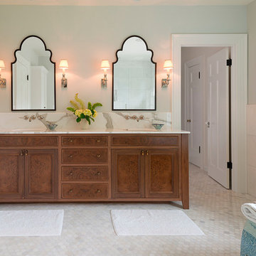
The bathroom enjoys great views. The standalone white bathtub placed beside a large window is equipped with a Hans Grohe tub filler. The window features a soft custom made roman shade. We furnished the area with a blue patterned garden stool. The bathroom floor features a hexagon mosaic tile. We designed the walnut vanity with a marble countertop and backsplash, and his and her undermount sinks. The vanity is paired with unique mirrors flanked by tiny lamp sconced lighting.
Project by Portland interior design studio Jenni Leasia Interior Design. Also serving Lake Oswego, West Linn, Vancouver, Sherwood, Camas, Oregon City, Beaverton, and the whole of Greater Portland.
For more about Jenni Leasia Interior Design, click here: https://www.jennileasiadesign.com/
To learn more about this project, click here:
https://www.jennileasiadesign.com/breyman
 SV Design
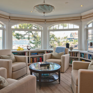
A desire for a more modern and zen-like environment in a historical, turn of the century stone and stucco house was the drive and challenge for this sophisticated Siemasko + Verbridge Interiors project. Along with a fresh color palette, new furniture is woven with antiques, books, and artwork to enliven the space. Carefully selected finishes enhance the openness of the glass pool structure, without competing with the grand ocean views. Thoughtfully designed cabinetry and family friendly furnishings, including a kitchenette, billiard area, and home theater, were designed for both kids and adults.
 Architectural Designs
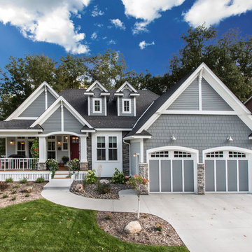
Exclusive House Plan 73345HS is a 3 bedroom 3.5 bath beauty with the master on main and a 4 season sun room that will be a favorite hangout.
The front porch is 12' deep making it a great spot for use as outdoor living space which adds to the 3,300+ sq. ft. inside.
Ready when you are. Where do YOU want to build?
Plans: http://bit.ly/73345hs
Photo Credit: Garrison Groustra


 Marvin
Architect: Blaine Bonadies, Bonadies Architect
Photography By: Jean Allsopp Photography
“Just as described, there is an edgy, irreverent vibe here, but the result has an appropriate stature and seriousness. Love the overscale windows. And the outdoor spaces are so great.”
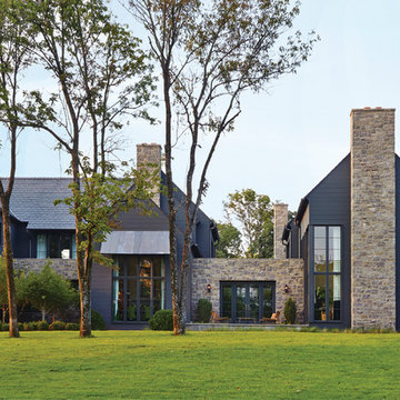
Situated atop an old Civil War battle site, this new residence was conceived for a couple with southern values and a rock-and-roll attitude. The project consists of a house, a pool with a pool house and a renovated music studio. A marriage of modern and traditional design, this project used a combination of California redwood siding, stone and a slate roof with flat-seam lead overhangs. Intimate and well planned, there is no space wasted in this home. The execution of the detail work, such as handmade railings, metal awnings and custom windows jambs, made this project mesmerizing.
Cues from the client and how they use their space helped inspire and develop the initial floor plan, making it live at a human scale but with dramatic elements. Their varying taste then inspired the theme of traditional with an edge. The lines and rhythm of the house were simplified, and then complemented with some key details that made the house a juxtaposition of styles.
The wood Ultimate Casement windows were all standard sizes. However, there was a desire to make the windows have a “deep pocket” look to create a break in the facade and add a dramatic shadow line. Marvin was able to customize the jambs by extruding them to the exterior. They added a very thin exterior profile, which negated the need for exterior casing. The same detail was in the stone veneers and walls, as well as the horizontal siding walls, with no need for any modification. This resulted in a very sleek look.
MARVIN PRODUCTS USED:
Marvin Ultimate Casement Window
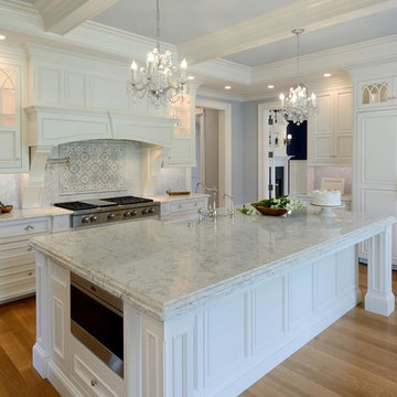
 Vartanian Custom Cabinets
Enclosed kitchen - large shabby-chic style l-shaped light wood floor and brown floor enclosed kitchen idea in Boston with a farmhouse sink, beaded inset cabinets, white cabinets, marble countertops, gray backsplash, mosaic tile backsplash, paneled appliances and an island
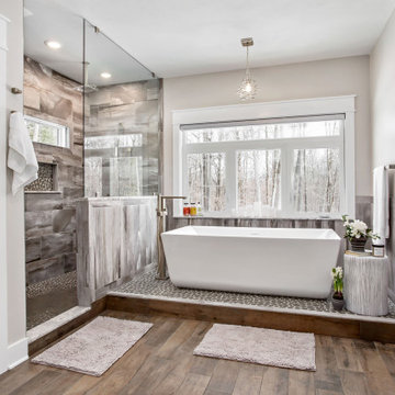
 A la Maison Home and Lifestyle LLC
Freestanding bathtub - cottage master gray tile dark wood floor and brown floor freestanding bathtub idea in New York with gray walls and a niche

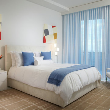 J Design Group - Interior Designers Miami - Modern
Modern Guest Bedroom, Miami Beach.
Ocean front, Luxury home in Miami Beach.
Projects by J Design Group, Your friendly Interior designers firm in Miami, FL. at your service.
AVENTURA MAGAZINE selected our client’s luxury 5000 Sf ocean front apartment in Miami Beach, to publish it in their issue and they Said:
Story by Linda Marx, Photography by Daniel Newcomb
Light & Bright
New York snowbirds redesigned their Miami Beach apartment to take advantage of the tropical lifestyle.
New York snowbirds redesigned their Miami Beach apartment to take advantage of the tropical lifestyle.
WHEN INTERIOR DESIGNER JENNIFER CORREDOR was asked to recreate a four-bedroom, six-bath condominium at The Bath Club in Miami Beach, she seized the opportunity to open the rooms and better utilize the vast ocean views.
In five months last year, the designer transformed a dark and closed 5,000-square-foot unit located on a high floor into a series of sweeping waterfront spaces and updated the well located apartment into a light and airy retreat for a sports-loving family of five.
“They come down from New York every other weekend and wanted to make their waterfront home a series of grand open spaces,” says Jennifer Corrredor, of the J. Design Group in Miami, a firm specializing in modern and contemporary interiors. “Since many of the rooms face the ocean, it made sense to open and lighten up the home, taking advantage of the awesome views of the sea and the bay.”
The designer used 40 x 40 all white tile throughout the apartment as a clean base. This way, her sophisticated use of color would stand out and bring the outdoors in.
The close-knit family members—two parents and three boys in college—like to do things together. But there were situations to overcome in the process of modernizing and opening the space. When Jennifer Corredor was briefed on their desires, nothing seemed too daunting. The confident designer was ready to delve in. For example, she fixed an area at the front door
that was curved. “The wood was concave so I straightened it out,” she explains of a request from the clients. “It was an obstacle that I overcame as part of what I do in a redesign. I don’t consider it a difficult challenge. Improving what I see is part of the process.”
She also tackled the kitchen with gusto by demolishing a wall. The kitchen had formerly been enclosed, which was a waste of space and poor use of available waterfront ambience. To create a grand space linking the kitchen to the living room and dining room area, something had to go. Once the wall was yesterday’s news, she relocated the refrigerator and freezer (two separate appliances) to the other side of the room. This change was a natural functionality in the new open space. “By tearing out the wall, the family has a better view of the kitchen from the living and dining rooms,” says Jennifer Corredor, who also made it easier to walk in and out of one area and into the other. “The views of the larger public space and the surrounding water are breathtaking.
Opening it up changed everything.”
They clients can now see the kitchen from the living and dining areas, and at the same time, dwell in an airy and open space instead of feeling stuck in a dark enclosed series of rooms. In fact, the high-top bar stools that Jennifer Corredor selected for the kitchen can be twirled around to use for watching TV in the living room.
In keeping with the theme of moving seamlessly from one room to the other, Corredor designed a subtle wall of glass in the living room along with lots of comfortable seating. This way, all family members feel at ease while relaxing, talking, or watching sporting events on the large flat screen television. “For this room, I wanted more open space, light and a supreme airy feeling,” she says. “With the glass design making a statement, it quickly became the star of the show.”…….
….. To add texture and depth, Jennifer Corredor custom created wood doors here, and in other areas of the home. They provide a nice contrast to the open Florida tropical feel. “I added character to the openness by using exotic cherry wood,” she says. “I repeated this throughout the home and it works well.”
Known for capturing the client’s vision while adding her own innovative twists, Jennifer Corredor lightened the family room, giving it a contemporary and modern edge with colorful art and matching throw pillows on the sofas. She added a large beige leather ottoman as the center coffee table in the room. This round piece was punctuated with a bold-toned flowering plant atop. It effortlessly matches the pillows and colors of the contemporary canvas.
Jennifer Corredor also gutted all of the bathrooms, resulting in a major redesign of the master. She jettisoned the whirlpool and created the dazzling illusion of a floating tub. From an area where there were two toilets, she eliminated one to make a grand rectangular shower, which became an overall showpiece. The master bath went from being just a functional water closet to a sophisticated spa-like space. “The client said I was ‘delicious’ after seeing the change,” laughed Jennifer Corredor, who emphasized that her clients love their part-time life in South Florida more each time they come down. Even when the husband has to work from their Miami Beach digs, he is surrounded by tropical beauty. For instance, there are times when the master bedroom must double as the husband’s home office.
The room had to be large enough to accommodate a working space for this purpose. So Jennifer Corredor placed an appropriate table near the window and across from the king-size bed. “No blocking of the amazing water view was necessary,” she says. “I kept an open space with a lot of white so It functions well and the work space fits right in.” She repeated the bold modern art in the room as well as in the guest bedroom, which also has a workspace for the sons when they are home from school and need to study.
The designer is still happy and glowing with the results of her toil in this apartment. She gets a “spiritual feeling” when she walks inside. “It is so peaceful and serene, with subtle hints of explosive statements,” she says. “The entire space is open, yet anchored by the warmth of the exotic woods.” The client wrote Jennifer Corredor a letter at the end of the project congratulating her on a
job well done. She revealed that owning a Miami Beach home was her husband’s dream 30 years ago. “Now we have a quality perfect yet practical home,” she wrote to the designer. “You solved the challenges, and the end
result far exceeds our expectations. We love it.”
Thanks for your interest in our Contemporary Interior Design projects and if you have any question please do not hesitate to ask us.
http://www.JDesignGroup.com
305.444.4611
Modern Interior designer Miami. Contemporary
Miami
Miami Interior Designers
Miami Interior Designer
Interior Designers Miami
Interior Designer Miami
Modern Interior Designers
Modern Interior Designer
Modern interior decorators
Modern interior decorator
Contemporary Interior Designers
Contemporary Interior Designer
Interior design decorators
Interior design decorator
Interior Decoration and Design
Black Interior Designers
Black Interior Designer
Interior designer
Interior designers
Interior design decorators
Interior design decorator
Home interior designers
Home interior designer
Interior design companies
Interior decorators
Interior decorator
Decorators
Decorator
Miami Decorators
Miami Decorator
Decorators Miami
Decorator Miami
Interior Design Firm
Interior Design Firms
Interior Designer Firm
Interior Designer Firms
Interior design
Interior designs
home decorators
Interior decorating Miami
Best Interior Designers.
225 Malaga Ave.
Coral Gable, FL 33134
http://www.JDesignGroup.com
305.444.4611


 Haven Design and Construction
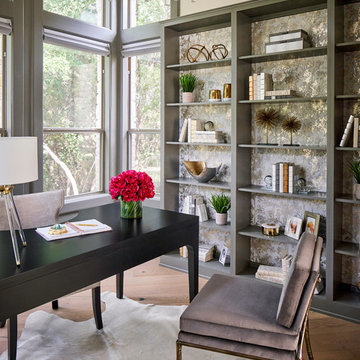
This beautiful study was part of a whole house design and renovation by Haven Design and Construction. For this room, our objective was to create a feminine and sophisticated study for our client. She requested a design that was unique and fresh, but still warm and inviting. We wallpapered the back of the bookcases in an eye catching metallic vine pattern to add a feminine touch. Then, we selected a deep gray tone from the wallpaper and painted the bookcases and wainscoting in this striking color. We replaced the carpet with a light wood flooring that compliments the gray woodwork. Our client preferred a petite desk, just large enough for paying bills or working on her laptop, so our first furniture selection was a lovely black desk with feminine curved detailing and delicate star hardware. The room still needed a focal point, so we selected a striking lucite and gold chandelier to set the tone. The design was completed by a pair of gray velvet guest chairs. The gold twig pattern on the back of the chairs compliments the metallic wallpaper pattern perfectly. Finally the room was carefully detailed with unique accessories and custom bound books to fill the bookcases.

 Tina Colebrook Architect
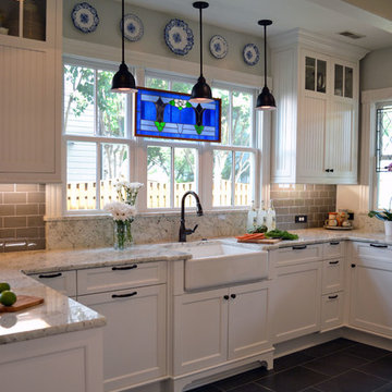
The existing quirky floor plan of this 17 year old kitchen created 4 work areas and left no room for a proper laundry and utility room. We actually made this kitchen smaller to make it function better. We took the cramped u-shaped area that housed the stove and refrigerator and walled it off to create a new more generous laundry room with room for ironing & sewing. The now rectangular shaped kitchen was reoriented by installing new windows with higher sills we were able to line the exterior wall with cabinets and counter, giving the sink a nice view to the side yard. To create the Victorian look the owners desired in their 1920’s home, we used wall cabinets with inset doors and beaded panels, for economy the base cabinets are full overlay doors & drawers all in the same finish, Nordic White. The owner selected a gorgeous serene white river granite for the counters and we selected a taupe glass subway tile to pull the palette together. Another special feature of this kitchen is the custom pocket dog door. The owner’s had a salvaged door that we incorporated in a pocket in the peninsula to corale the dogs when the owner aren’t home. Tina Colebrook
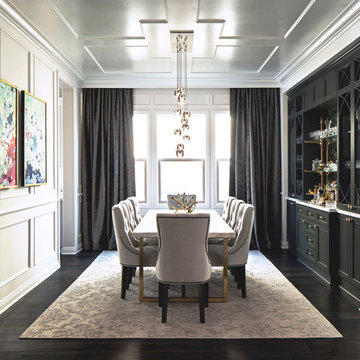
 Corine Maggio Design
This builder-house was purchased by a young couple with high taste and style. In order to personalize and elevate it, each room was given special attention down to the smallest details. Inspiration was gathered from multiple European influences, especially French style. The outcome was a home that makes you never want to leave.
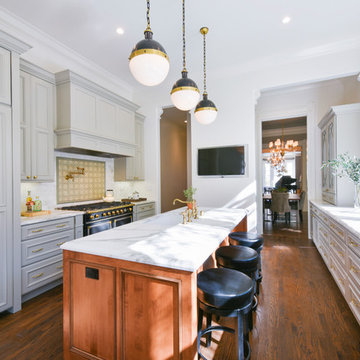
 Dura Supreme Cabinetry
With an ideal location in the Pacific Heights neighborhood of San Francisco, this dated Victorian residence had "beautiful bones" but had been sitting on the market for a year before being purchased with plans to revitalize the interior. Interior designer, Noel Han, explained, "Historical Victorian homes in this area often have beautiful architectural elements that I aim to preserve, but the floor plan and layout tend to be stuffy, not live-able and not light filled. Modern families want bright, light-filled, spacious rooms that take advantage of outdoor views and living spaces, and function well for storage, meals and entertaining."
Preserving the architectural integrity and special features of the home was one of Han's goals but at the same time, she re-designed the space, moving walls and adding windows to create an open floorplan that flowed easily between the kitchen and outdoor living spaces. Where the range once stood in the original design, now an entire wall of windows provides panoramic views of the outdoors and fills the kitchen with light. Below the windows, Han designed a long bank of base cabinets with drawers to provide plenty of storage and work surface. Light now pours into the space even on foggy days. The range was moved to the opposite wall so that beautiful window views could be added to the kitchen.
Han selected a palette of finishes with an eye toward creating a "soft color aesthetic". "White painted finishes are very popular right now but would have felt stark and cold in this space," she explained. "The French grey paint from Dura Supreme was a perfect complement for this vintage Victorian home, to create a classic color scheme".
"This beautiful home already had hardware elements with a vintage brass finish, so I carefully selected antiqued, brushed brass hardware, plumbing and metal finishes to blend with the original elements," said Han. She continued, "The La Cornue French Range adds modern function with a French antique look."
"I appreciate working with Dura Supreme cabinetry because of the quality of the cabinetry, fast delivery and the custom options. I'm able to create beautiful architectural details like the pull-out columns on both sides of the range and the curved mullion doors on the furniture hutch, and they offer a stunning palette of finishes and styles," explained Han. For the bath cabinetry, Han created a similar palette of finishes and styles to create a complementary look throughout the entire home.
Product Details:
Perimeter: Dura Supreme Cabinetry shown in the St. Augustine door style and Mullion Pattern #15 door style with a “Zinc” painted finish.
Kitchen Island: Dura Supreme Cabinetry shown in the St. Augustine door style with a Clove stain and Black Accent finish on Cherry wood.
For more information about Noel Han, Interior Designer, click to her website here www.atelnoel.com.
For more information about Gilmans Kitchens and Baths, click to their website here www.gkandb.com.
Photography by: Ned Bonzi www.nedbonzi.com.
Request a FREE Dura Supreme Brochure Packet:
http://www.durasupreme.com/request-brochure
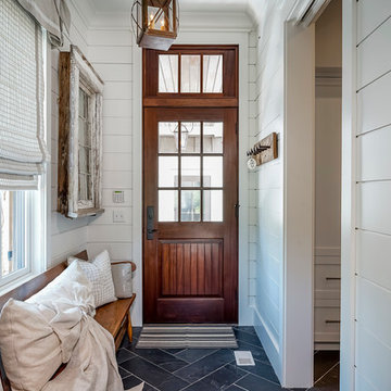
 Tom Jenkins Films
Photo: Tom Jenkins
TomJenkinsksFilms.com
Vestibule - country slate floor vestibule idea in Atlanta with white walls and a dark wood front door
Vestibule - country slate floor vestibule idea in Atlanta with white walls and a dark wood front door
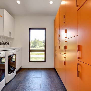
 Berghuis Construction LLC
Photos by Kaity
Inspiration for a mid-sized contemporary galley slate floor dedicated laundry room remodel in Grand Rapids with flat-panel cabinets, quartz countertops, a side-by-side washer/dryer, orange cabinets and white walls
Inspiration for a mid-sized contemporary galley slate floor dedicated laundry room remodel in Grand Rapids with flat-panel cabinets, quartz countertops, a side-by-side washer/dryer, orange cabinets and white walls
5