
Search results for "Split complementary color scheme" in Home Design Ideas
 Luminosus Designs LLC
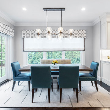
Breakfast Area, custom bench, custom dining chair, custom window treatment, custom area rug, custom window treatment, gray, teal, cream color
Inspiration for a mid-sized coastal dark wood floor kitchen/dining room combo remodel in New York with gray walls and no fireplace
Inspiration for a mid-sized coastal dark wood floor kitchen/dining room combo remodel in New York with gray walls and no fireplace
 O’Hara Interiors
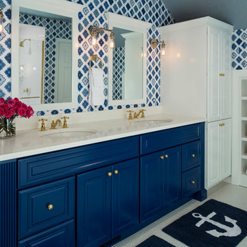
Martha O'Hara Interiors, Interior Design & Photo Styling | Nor-Son Inc, Remodel | Troy Thies, Photography
Please Note: All “related,” “similar,” and “sponsored” products tagged or listed by Houzz are not actual products pictured. They have not been approved by Martha O’Hara Interiors nor any of the professionals credited. For information about our work, please contact design@oharainteriors.com.
 Amazing Spaces
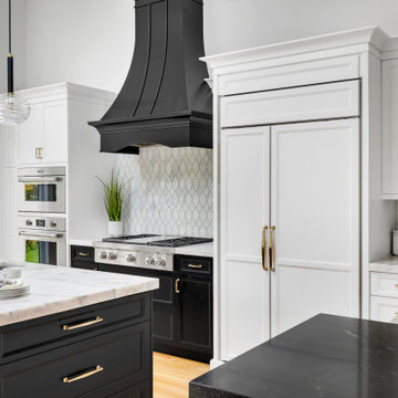
The existing U-shaped kitchen was tucked away in a small corner while the dining table was swimming in a room much too large for its size. The client’s needs and the architecture of the home made it apparent that the perfect design solution for the home was to swap the spaces.
The homeowners entertain frequently and wanted the new layout to accommodate a lot of counter seating, a bar/buffet for serving hors d’oeuvres, an island with prep sink, and all new appliances. They had a strong preference that the hood be a focal point and wanted to go beyond a typical white color scheme even though they wanted white cabinets.
While moving the kitchen to the dining space gave us a generous amount of real estate to work with, two of the exterior walls are occupied with full-height glass creating a challenge how best to fulfill their wish list. We used one available wall for the needed tall appliances, taking advantage of its height to create the hood as a focal point. We opted for both a peninsula and island instead of one large island in order to maximize the seating requirements and create a barrier when entertaining so guests do not flow directly into the work area of the kitchen. This also made it possible to add a second sink as requested. Lastly, the peninsula sets up a well-defined path to the new dining room without feeling like you are walking through the kitchen. We used the remaining fourth wall for the bar/buffet.
Black cabinetry adds strong contrast in several areas of the new kitchen. Wire mesh wall cabinet doors at the bar and gold accents on the hardware, light fixtures, faucets and furniture add further drama to the concept. The focal point is definitely the black hood, looking both dramatic and cohesive at the same time.
Find the right local pro for your project
 Anna Jacoby Interiors
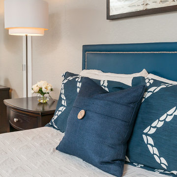
This master bedroom features a neutral wall color called Tumbled Stone, accented with navy blue. Pendant lights frame the bed, and the large blue area rug adds warmth to the wood floor.
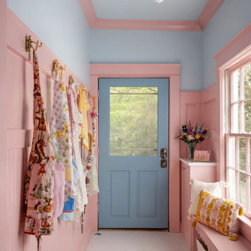
 Copper Sky Design + Remodel
The homeowners of a 1930s Tudor in East Atlanta Village envisioned a colorful renovation that blended original charm with modern updates. The creative couple, who cherish antiques and quirky collectibles, aimed to preserve the home's historic layout and architectural elements. The overall color palette and aesthetic was inspired by their grandmother's fine China collection.
The renovation encompassed the kitchen, mudroom, breakfast nook, living room, bar, powder room, and primary bathroom. Copper Sky Design + Remodel placed emphasis on integrating color, patterns, and specialty details to honor the home's history while reflecting the homeowners' unique style.
Key design choices included retaining the functional galley kitchen, featuring a dishrack over the sink to display the clients' depression-era glass and antique China. Floral cutouts on cabinet doors and refrigerator panels, reminiscent of the 1930s, were incorporated. A scalloped built-in cabinet in the butler’s pantry, designed to fit a niche previously housing an original piece, ties into the brass scalloped hood in the kitchen. The mudroom and butler’s pantry cabinets also feature a scallop motif.
Custom mosaic floor tiles, typical of the 1930s, required meticulous planning and execution. The 2” hexagon mosaic tile pattern in the kitchen, mudroom, and butler’s pantry was digitally designed and hand-laid on site. The primary bathroom's wall tile pattern demanded precision, resulting in a symmetrical and stunning design.
The primary bathroom was expanded to include a Japanese-style soaking tub and a bidet within its modest 10’ x 9’ size. The powder room, though small, is vibrant with “Dinosauria” wallpaper, Tiffany-style lighting, and a square mosaic tile floor.
This thoughtful renovation preserved the Tudor's historical integrity while infusing it with the homeowners' vibrant aesthetic, creating a harmonious blend of past and present.
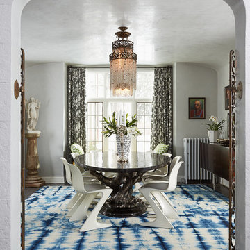
 Andrew Flesher Interiors
Photography by Susan Gillmore
Inspiration for a large contemporary dark wood floor enclosed dining room remodel in Minneapolis with gray walls
Inspiration for a large contemporary dark wood floor enclosed dining room remodel in Minneapolis with gray walls
 E. F. San Juan
Southern Beach Getaway in WaterColor
Private Residence / WaterColor, Florida
Architect: Geoff Chick & Associates
Builder: Chris Clark Construction
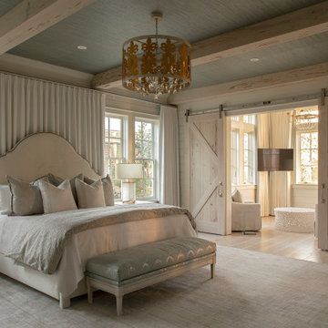
The E. F. San Juan team collaborated closely with architect Geoff Chick, builder Chris Clark, interior designer Allyson Runnels, and the homeowners to bring their design vision to reality. This included custom interior and exterior millwork, pecky cypress ceilings in various rooms of the home, different types of wall and ceiling paneling in each upstairs bedroom, custom pecky cypress barn doors and beams in the master suite, Euro-Wall doors in the living area, Weather Shield windows and doors throughout, Georgia pine porch ceilings, and Ipe porch flooring.
Challenges:
Allyson and the homeowners wanted each of the children’s upstairs bedrooms to have unique features, and we addressed this from a millwork perspective by producing different types of wall and ceiling paneling for each of these rooms. The homeowners also loved the look of pecky cypress and wanted to see this unique type of wood featured as a highlight throughout the home.
Solution:
In the main living area and kitchen, the coffered ceiling presents pecky cypress stained gray to accent the tiled wall of the kitchen. In the adjoining hallway, the pecky cypress ceiling is lightly pickled white to make a subtle contrast with the surrounding white paneled walls and trim. The master bedroom has two beautiful large pecky cypress barn doors and several large pecky cypress beams that give it a cozy, rustic yet Southern coastal feel. Off the master bedroom is a sitting/TV room featuring a pecky cypress ceiling in a stunning rectangular, concentric pattern that was expertly installed by Edgar Lara and his skilled team of finish carpenters.
We also provided twelve-foot-high floor-to-ceiling Euro-Wall Systems doors in the living area that lend to the bright and airy feel of this space, as do the Weather Shield windows and doors that were used throughout the home. Finally, the porches’ rich, South Georgia pine ceilings and chatoyant Ipe floors create a warm contrast to the bright walls, columns, and railings of these comfortable outdoor spaces. The result is an overall stunning home that exhibits all the best characteristics of the WaterColor community while standing out with countless unique custom features.
---
Photography by Jack Gardner

Sponsored
Fredericksburg, OH

High Point Cabinets
Columbus' Experienced Custom Cabinet Builder | 4x Best of Houzz Winner
 DesignARC
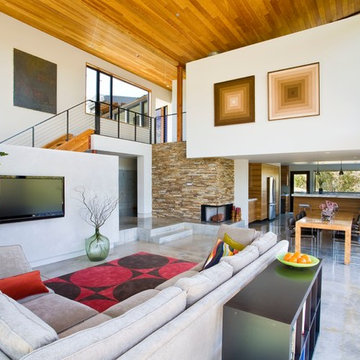
Falcon House is located on Falcon Ridge Road, which winds along a steeply inclined ridge in a stretch of foothills within Carmel Valley in Monterey County. An old lichen covered barn and split rail, cedar fences characterize this area known as Markham Ranch, and contrast sharply with the preponderance of sprawling, large estate-style homes, many more at-home in the Italian countryside than any landscape of California.
Designed for a young family, Falcon House responds to the family’s desire to live a more modest lifestyle, eschewing overt displays of extravagance for an intimate and deferential relation to nature.
The 3,200-square-foot residence occupies a difficult portion of the northern slope of a hillside, overlooking a verdant valley and oriented toward Castle Rock in the distance. The steep terrain necessitated a compartmentalized plan capable of negotiating the gentle hillock at the center of the site. A corridor bridge spans two pieces of the house, uniting living and sleeping spaces and allowing an existing watercourse to flow essentially through the house unobstructed.
Large panels of glass open the living spaces to the landscape, beneath the deep overhang of a butterfly roof. Operable clerestories placed high on the window-wall allow prevailing breezes to cool the interior spaces. The bedroom wing of the house hugs the hillside as it turns to the west, ensuring privacy from the main living spaces. The sense of seclusion and protection of this wing is reinforced by its lower roofline and its embedment into the hill.
Initial resistance by neighboring homeowners has given way to appreciation, having seen the results of careful siting and a material and color palate sympathetic to the surrounding hillsides. The dwelling embodies an attitude of respect for the landscape, and through that perspective Falcon House has become as natural a part of its environment as the hawks flying overhead.
2008 AIA Orange County Chapter Merit Award
 Tim Barber Architects
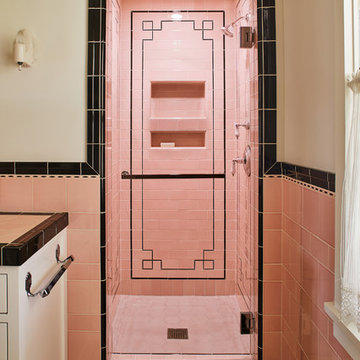
Girl's bathroom designed by Tim Barber Ltd. Architecture. Photography by Sam Frost.
Elegant pink tile pink floor alcove shower photo in Los Angeles with pink walls, a hinged shower door and white cabinets
Elegant pink tile pink floor alcove shower photo in Los Angeles with pink walls, a hinged shower door and white cabinets
 TKS Design Group
Free ebook, CREATING THE IDEAL KITCHEN
Download now → http://bit.ly/idealkitchen
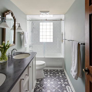
The hall bath for this client started out a little dated with its 1970’s color scheme and general wear and tear, but check out the transformation!
The floor is really the focal point here, it kind of works the same way wallpaper would, but -- it’s on the floor. I love this graphic tile, patterned after Moroccan encaustic, or cement tile, but this one is actually porcelain at a very affordable price point and much easier to install than cement tile.
Once we had homeowner buy-in on the floor choice, the rest of the space came together pretty easily – we are calling it “transitional, Moroccan, industrial.” Key elements are the traditional vanity, Moroccan shaped mirrors and flooring, and plumbing fixtures, coupled with industrial choices -- glass block window, a counter top that looks like cement but that is actually very functional Corian, sliding glass shower door, and simple glass light fixtures.
The final space is bright, functional and stylish. Quite a transformation, don’t you think?
Designed by: Susan Klimala, CKD, CBD
Photography by: Mike Kaskel
For more information on kitchen and bath design ideas go to: www.kitchenstudio-ge.com
 Angie Keyes CKBD
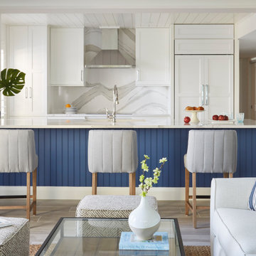
This Condo was in sad shape. The clients bought and knew it was going to need a over hall. We opened the kitchen to the living, dining, and lanai. Removed doors that were not needed in the hall to give the space a more open feeling as you move though the condo. The bathroom were gutted and re - invented to storage galore. All the while keeping in the coastal style the clients desired. Navy was the accent color we used throughout the condo. This new look is the clients to a tee.
 Malgosia Migdal, ASID, CID
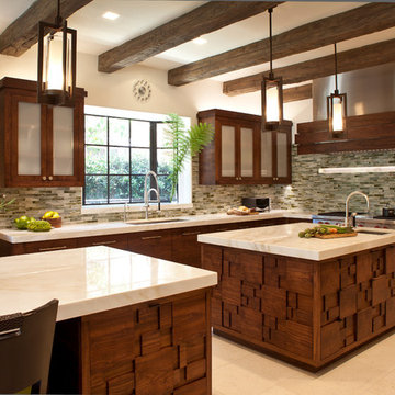
In the kitchen, a color scheme of sea-green, silver and creamy limestone combined with the use of walnut creates a warm, vintage feel.
Enclosed kitchen - large contemporary u-shaped limestone floor enclosed kitchen idea in Los Angeles with an undermount sink, flat-panel cabinets, dark wood cabinets, multicolored backsplash, mosaic tile backsplash, stainless steel appliances, marble countertops and two islands
Enclosed kitchen - large contemporary u-shaped limestone floor enclosed kitchen idea in Los Angeles with an undermount sink, flat-panel cabinets, dark wood cabinets, multicolored backsplash, mosaic tile backsplash, stainless steel appliances, marble countertops and two islands
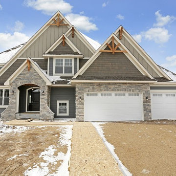
 Gonyea Custom Homes
Mixed siding exterior with gray tones. Peaked timber detail. Split three car garage.
Photography by Spacecrafting.
Example of a large transitional gray two-story mixed siding exterior home design in Minneapolis
Example of a large transitional gray two-story mixed siding exterior home design in Minneapolis

 Wilson Kelsey Design
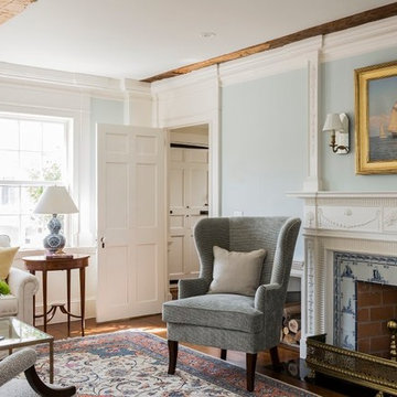
WKD’s design specialty in quality historic preservation ensured that the integrity of this home’s interior and exterior architecture was kept intact. The design mission was to preserve, restore and renovate the home in a manner that celebrated its heritage, while recognizing and accommodating today’s lifestyle and technology. Drawing from the home’s original details, WKD re-designed a friendly entry (including the exterior landscape approach) and kitchen area, integrating it into the existing hearth room. We also created a new stair to the second floor, eliminating the small, steep winding stair. New colors, wallpaper, furnishings and lighting make for a family friendly, welcoming home.
The project has been published several times. Click below to read:
October 2014 Northshore Magazine
Spring 2013 Kitchen Trends Magazine
Spring 2013 Bathroom Trends Magazine
Photographer: MIchael Lee
 Lesley Glotzl
Todd Wright
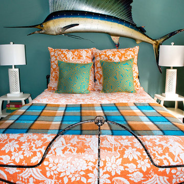
Inspiration for a mid-sized eclectic guest bedroom remodel in Other with blue walls and no fireplace
Inspiration for a mid-sized eclectic guest bedroom remodel in Other with blue walls and no fireplace

 Twelve Stones Designs, LLC
The owners of this kitchen had spent the money to upgrade the finishes in their kitchen upon building the home 12 years ago, but after living in the space for several years they realized how nonfunctional the layout really was. The (then) two preschool aged children had grown into busy, hungry teenagers with many friends who also liked to hang out at the house. So the family needed a more functional kitchen with better traffic flow, space for daily activities revolving around the kitchen at different times of day, and a kitchen that could accommodate cooking for and serving large groups. Furthermore, the dark, traditional finishes no longer reflected the homeowners’ style. They requested a brighter, more relaxed, coastal style that reflected their love of the seaside cities they like to visit.
Originally, the kitchen was U-shaped with a narrow island in the middle. The island created narrow aisles that bottle-necked at the dishwasher, refrigerator, and cooktop areas. There was a pass-through from the foyer into the kitchen, but the owners never liked that the pass-through was also located so close to the powder room. The awkward proximity was unappealing and made guests feel uncomfortable.
The kitchen’s storage was made up of lots of narrow cabinets, apothecary drawers, clipped corner units, and very few drawers. It lacked useful storage for the larger items the family used on a daily basis. And the kitchen’s only pantry was small closet that had only builder-grade, narrow shelving with no illumination to be able to see the contents inside.
Overall, the kitchen’s lighting plan was poorly executed. Only six recessed cans illuminated the entire kitchen and nook areas. The under cabinet lighting was not evenly distributed either. In fact, the builder had mis-placed the under cabinet lighting around the decorative pilasters which made for choppy, dark cubbies. Further, the builder didn’t include any lighting over the sink or the bar area, which meant whoever was doing the dishes was always in their own shadow. That, coupled with the steep overhang of the game room above made the bar area feel like a dim, cavernous space that wasn’t inviting or task oriented. The kitchen looked out into the main living space, but the raised bar and a narrow wall (which held the only large cabinet in the kitchen) created more of a barrier than a relationship to the living room or breakfast nook. In fact, one couldn’t even see the breakfast nook from the cooktop or sink areas due to its orientation. The raised bar top was too narrow to comfortably sit to either dine at or chat from due to the lack of knee space. The the homeowners confided that the kitchen felt more like a dark, dirty prison than place where the family, or their guests, wanted to gather and commune.
The clients' needs and desires were:
➢ to create a kitchen that would be a space the family loved to be in; to relate to the adjacent spaces all around, and to have better flow for entertaining large groups
➢ to remove the walls between the breakfast nook and living area and to be able to utilize the natural light from the windows in both those areas
➢ to incorporate a functional chopping block for prepping fresh food for home cooked meals, an island with a large sink and drain board, 2 pull out trash cans, and seating for at least the 2 teens to eat or do homework
➢ to design a kitchen and breakfast nook with an airy, coastal, relaxed vibe that blended with the rest of the house's coastal theme
➢ to integrate a layered lighting plan which would include ample general illumination, specific task lighting, decorative lighting, and lots of illuminated storage
➢ to design a kitchen with not only more storage for all the husband’s kitchen gadgets and collection of oils and spices, but smart storage, including a coffee/breakfast bar and a place to store and conceal the toaster oven and microwave
➢ to find a way to utilize the large open space between the kitchen, pantry area, and breakfast nook
Twelve Stones Designs achieved the owner's goals by:
➢ removing the walls between the kitchen and living room to allow the natural light to filter in from the adjacent rooms and to create a connection between the kitchen, nook, and living spaces for a sense of unity and communion
➢ removing the existing pantry and designing 3 large pantry style cabinets with LED tape lights and rollout drawers to house lots of kitchen appliances, gadgets, and tons of groceries. We also took the cabinets all the way up to the 9’ ceiling for additional storage for seasonal items and bulk storage.
➢ designing 2 islands - 1 with a gorgeous black walnut chopping block that houses a drawer for chopping and carving knives and a custom double pull out trash unit for point of use utilization - and 1 that houses the dishwasher, a large Blanco Gourmet sink with integrated drain board, woven baskets for fresh root vegetables and kitchen towels, plenty of drawer storage for kitchen items, and bar seating for up to 4 diners.
➢ closing off the space between the kitchen and the powder room to create a beautiful new private alcove for the powder room as well as adding some decorative storage. This also gave us space to include more tall storage near the new range for precision placement of the husband’s extensive oil and spice collection as well as a location for a combo-steam oven the wife wanted for baking and cooking healthy meals.
The project is enhanced functionally by:
➢ incorporated USB and standard receptacles for the kids’ laptops and phone charging in the large island
➢ designing the small island to include additional open shelving for items used on a daily basis such as a variety of bowls, plates, and colanders. This set up also works well for the husband who prefers to “plate” his dinners in restaurant-style fashion before presenting them to the table.
➢ the integration of specific storage units, such as double stacked cutlery drawers, a custom spice pull-out, a Kuerig coffee and tea pod drawer, and custom double stacked utensil drawers
➢ moving the refrigerator to the old oven location - this eliminated the bottle neck as well as created a better relationship to the eating table. It also utilizes the floor space between the pantry, nook, and kitchen
➢ creating a banquet style breakfast nook - this banquette seating not only doubles the amount of seating for large gatherings but it better utilizes the odd space between the kitchen and the previous nook area. It also helps to create a distinct pathway from the mudroom room through the pantry area, kitchen, nook, and living room.
➢ the coffee/breakfast bar area which includes the perfect location for the concealed microwave and toaster oven, convenient storage for the coffee pods and tea accoutrements. Roll-out drawers below also house the smoothie maker, hot water kettle, and a plethora of smoothie-making ingredients such as protein powders, smoothie additives, etc. Furthermore, the drawers below the Keurig house measuring utensil, cutlery, baking supplies and tupperware storage.
➢ incorporating lots of wide drawers and pullouts to accommodate large cookware.
➢ utilizing as much vertical space as possible by building storage to the ceiling which accommodates the family’s abundant amount of serving platters, baking sheets, bakeware, casserole dishes, and additional cutting boards.
The project is enhanced aesthetically by:
➢ new 5-piece Versailles pattern porcelain tile that now seamlessly joins the entire down stairs area together creating a bright, cohesiveness feeling instead of choppy separated spaces - it also adds a coastal feeling
➢ designing a cabinet to conceal the microwave and toaster oven
➢ the coastal influenced light fixtures over the nook table and island
➢ the sandy colors of the Langdon Cambria countertops. The swirling pattern and sparkling quartz pieces remind the homeowner of black-and-tan sandy beaches
➢ the striped banquet seating whose creamy white background and blue-green stripes were the inspiration for the cabinet and wall colors.
➢ All the interior doors were painted black to coordinate with the blacks and grays in the backsplash tile and countertop. This also adds a hint of tailored formality to an otherwise casual space.
➢ the use of WAC's Oculux small aperture LED units for the overhead lighting complimented with Diode LED strips for task lighting under the cabinets and inside the pantry and glass wall cabinets. All of the lighting applications are on separate dimmer switches.
Innovative uses of materials or construction methods by Realty Restoration LLC:
➢ Each 1-1/2” x 3” block of reclaimed end-grain black walnut that makes up the center island chopping block was hand milled and built in the shop. It was designed to look substantial and proportional to the surrounding elements, executed by creating the 4 inch tall top with a solid wood chamfered edge band.
➢ The metal doors on either side of the vent hood were also custom designed for this project and built in the Realty Restoration LLC shop. They are made 1x2, 11-gauge mild steel with ribbed glass. Weighing 60 lbs a piece, heavy duty cabinet hinges were added to support the weight of the door and keep them from sagging.
➢ Under-cabinet receptacles were added along the range wall in order to have a clean, uninterrupted backsplash.
Design obstacles to overcome:
➢ Because we were removing the demising walls between the kitchen and living room, we had to find a way to plumb and vent the new island. We did this by tunneling through the slab (the slab had post tension cables which prevented us from just trenching) to run a new wet vent through a nearby structural wall. We pulled the existing hot and cold lines between upper floor joists and ran them down the structural wall as well and up through a conduit in the tunnel.
➢ Since we were converting from wall overs to a gas range it allowed us to utilize the 220 feed for the wall ovens to provide a new sub panel for all the new kitchen circuits
➢ Due to framing deficiencies inherited from the original build there was a 1-1/2” differential in the floor-to-ceiling height over a 20 foot span; by utilizing the process of cutting and furring coupled with the crown moulding details on the cabinet elevations we were able to mask the problem and provide seamless transitions between the cabinet components.
Evidence of superior craftsmanship:
➢ uniquely designed, one-of-a-kind metal “X” end panels on the large island. The end panels were custom made in the Realty Restoration LLC shop and fitted to the exact dimensions of the island. The welding seams are completely indistinguishable - the posts look like they are cut from a single sheet of metal
➢ square metal posts on the small island were also custom made and designed to compliment and carry through the metal element s throughout the kitchen
➢ the beautiful, oversized end panels on the pantry cabinets which give the breakfast nook a tailored look
➢ integrating a large format 5 piece Versailles tile pattern to seamlessly flow from the existing spaces into the new kitchen space
➢ By constructing a custom cabinet that jogged around a corner we could not remodel (housing the entry way coat closet) we were able to camouflage the adjacent wall offset within the upper and lower cabinets. By designing around the existing jog in the structural walls we accomplished a few things: we were able to find the space to house, and hide, the microwave and toaster oven yet still have a clean cohesive appearance from the kitchen side. Additionally, the owners were able to keep their much needed coat closet and we didn’t have to increase the budget with unnecessary structural work.
 Kahrs
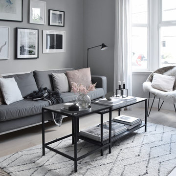
KahrsPopular Scandinavian-style interiors blog 'These Four Walls' has collaborated with Kährs for a scandi-inspired, soft and minimalist living room makeover. Kährs worked with founder Abi Dare to find the perfect hard wearing and stylish floor to work alongside minimalist decor. Kährs' ultra matt 'Oak Sky' engineered wood floor design was the perfect fit.
"I was keen on the idea of pale Nordic oak and ordered all sorts of samples, but none seemed quite right – until a package arrived from Swedish brand Kährs, that is. As soon as I took a peek at ‘Oak Sky’ ultra matt lacquered boards I knew they were the right choice – light but not overly so, with a balance of ashen and warmer tones and a beautiful grain. It creates the light, Scandinavian vibe that I love, but it doesn’t look out of place in our Victorian house; it also works brilliantly with the grey walls. I also love the matte finish, which is very hard wearing but has
none of the shininess normally associated with lacquer" says Abi.
Oak Sky is the lightest oak design from the Kährs Lux collection of one-strip ultra matt lacquer floors. The semi-transparent white stain and light and dark contrasts in the wood makes the floor ideal for a scandi-chic inspired interior. The innovative surface treatment is non-reflective; enhancing the colour of the floor while giving it a silky, yet strong shield against wear and tear. Kährs' Lux collection won 'Best Flooring' at the House Beautiful Awards 2017.
Kährs have collaborated with These Four Walls and feature in two blog posts; My soft, minimalist
living room makeover reveal and How to choose wooden flooring.
All photography by Abi Dare, Founder of These Four Walls
Sponsored
Fredericksburg, OH
High Point Cabinets
Columbus' Experienced Custom Cabinet Builder | 4x Best of Houzz Winner
 Lincorp / Borchert
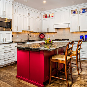
A choice of red painted cabinets on the island breaks up the expansion of white in this space. Clean lines and a simple shaker door stay in trend with current styles. Cambria quartz on the countertops in Laneshaw, compliment the color palette beautifully. Photo by Brian Walters
 Simply Unique Finds & Design
Saunders Real Estate Photography
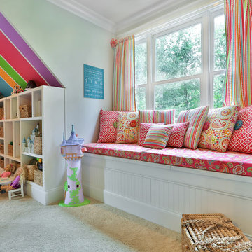
Example of a classic girl carpeted kids' room design in Atlanta
Example of a classic girl carpeted kids' room design in Atlanta
 Alison Kandler Interior Design
Mark Lohman
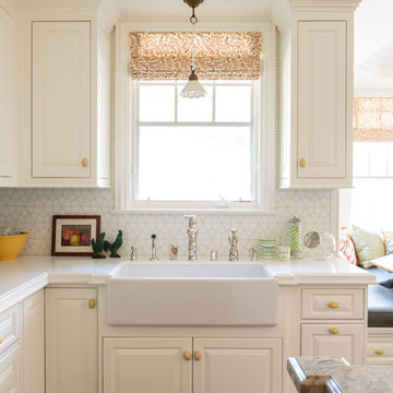
Elegant medium tone wood floor kitchen photo in Los Angeles with a farmhouse sink, recessed-panel cabinets, white cabinets, white backsplash, ceramic backsplash and an island
Elegant medium tone wood floor kitchen photo in Los Angeles with a farmhouse sink, recessed-panel cabinets, white cabinets, white backsplash, ceramic backsplash and an island
42