
Search results for "Start direct" in Home Design Ideas


 Klopf Architecture
Klopf Architecture, Arterra Landscape Architects and Henry Calvert of Calvert Ventures Designed and built a new warm, modern, Eichler-inspired, open, indoor-outdoor home on a deeper-than-usual San Mateo Highlands property where an original Eichler house had burned to the ground.
The owners wanted multi-generational living and larger spaces than the original home offered, but all parties agreed that the house should respect the neighborhood and blend in stylistically with the other Eichlers. At first the Klopf team considered re-using what little was left of the original home and expanding on it. But after discussions with the owner and builder, all parties agreed that the last few remaining elements of the house were not practical to re-use, so Klopf Architecture designed a new home that pushes the Eichler approach in new directions.
One disadvantage of Eichler production homes is that the house designs were not optimized for each specific lot. A new custom home offered the team a chance to start over. In this case, a longer house that opens up sideways to the south fit the lot better than the original square-ish house that used to open to the rear (west). Accordingly, the Klopf team designed an L-shaped “bar” house with a large glass wall with large sliding glass doors that faces sideways instead of to the rear like a typical Eichler. This glass wall opens to a pool and landscaped yard designed by Arterra Landscape Architects.
Driving by the house, one might assume at first glance it is an Eichler because of the horizontality, the overhanging flat roof eaves, the dark gray vertical siding, and orange solid panel front door, but the house is designed for the 21st Century and is not meant to be a “Likeler.” You won't see any posts and beams in this home. Instead, the ceiling decking is a western red cedar that covers over all the beams. Like Eichlers, this cedar runs continuously from inside to out, enhancing the indoor / outdoor feeling of the house, but unlike Eichlers it conceals a cavity for lighting, wiring, and insulation. Ceilings are higher, rooms are larger and more open, the master bathroom is light-filled and more generous, with a separate tub and shower and a separate toilet compartment, and there is plenty of storage. The garage even easily fits two of today's vehicles with room to spare.
A massive 49-foot by 12-foot wall of glass and the continuity of materials from inside to outside enhance the inside-outside living concept, so the owners and their guests can flow freely from house to pool deck to BBQ to pool and back.
During construction in the rough framing stage, Klopf thought the front of the house appeared too tall even though the house had looked right in the design renderings (probably because the house is uphill from the street). So Klopf Architecture paid the framer to change the roofline from how we had designed it to be lower along the front, allowing the home to blend in better with the neighborhood. One project goal was for people driving up the street to pass the home without immediately noticing there is an "imposter" on this lot, and making that change was essential to achieve that goal.
This 2,606 square foot, 3 bedroom, 3 bathroom Eichler-inspired new house is located in San Mateo in the heart of the Silicon Valley.
Klopf Architecture Project Team: John Klopf, AIA, Klara Kevane
Landscape Architect: Arterra Landscape Architects
Contractor: Henry Calvert of Calvert Ventures
Photography ©2016 Mariko Reed
Location: San Mateo, CA
Year completed: 2016

 Ferguson Bath, Kitchen & Lighting Gallery
Large trendy master white tile and porcelain tile ceramic tile and beige floor alcove shower photo in San Francisco with an integrated sink, flat-panel cabinets, white cabinets, white walls, a wall-mount toilet, quartz countertops, a hinged shower door and white countertops
Find the right local pro for your project

 John Kraemer & Sons
Builder: John Kraemer & Sons | Architect: Swan Architecture | Interiors: Katie Redpath Constable | Landscaping: Bechler Landscapes | Photography: Landmark Photography

 The Property Sisters
This vintage style bathroom was inspired by it's 1930's art deco roots. The goal was to recreate a space that felt like it was original. With lighting from Rejuvenation, tile from B&W tile and Kohler fixtures, this is a small bathroom that packs a design punch. Interior Designer- Marilynn Taylor Interiors, Contractor- Allison Allain, Plumb Crazy Contracting.

 Tanamera Construction / TC Homes
Vance Fox
Large mountain style master medium tone wood floor bedroom photo in Sacramento with beige walls, a ribbon fireplace and a metal fireplace
Large mountain style master medium tone wood floor bedroom photo in Sacramento with beige walls, a ribbon fireplace and a metal fireplace

 Advance Design Studio, Ltd.
Mike and Stacy moved to the country to be around the rolling landscape and feed the birds outside their Hampshire country home. After living in the home for over ten years, they knew exactly what they wanted to renovate their 1980’s two story once their children moved out. It all started with the desire to open up the floor plan, eliminating constricting walls around the dining room and the eating area that they didn’t plan to use once they had access to what used to be a formal dining room.
They wanted to enhance the already warm country feel their home already had, with some warm hickory cabinets and casual granite counter tops. When removing the pantry and closet between the kitchen and the laundry room, the new design now just flows from the kitchen directly into the smartly appointed laundry area and adjacent powder room.
The new eat in kitchen bar is frequented by guests and grand-children, and the original dining table area can be accessed on a daily basis in the new open space. One instant sensation experienced by anyone entering the front door is the bright light that now transpires from the front of the house clear through the back; making the entire first floor feel free flowing and inviting.
Photo Credits- Joe Nowak



 Andrew Snow Photography
Photo: Andrew Snow © 2015 Houzz
Inspiration for a contemporary gray two-story mixed siding gable roof remodel in Toronto
Inspiration for a contemporary gray two-story mixed siding gable roof remodel in Toronto


 Tammara Stroud Design
In 1949, one of mid-century modern’s most famous NW architects, Paul Hayden Kirk, built this early “glass house” in Hawthorne Hills. Rather than flattening the rolling hills of the Northwest to accommodate his structures, Kirk sought to make the least impact possible on the building site by making use of it natural landscape. When we started this project, our goal was to pay attention to the original architecture--as well as designing the home around the client’s eclectic art collection and African artifacts. The home was completely gutted, since most of the home is glass, hardly any exterior walls remained. We kept the basic footprint of the home the same—opening the space between the kitchen and living room. The horizontal grain matched walnut cabinets creates a natural continuous movement. The sleek lines of the Fleetwood windows surrounding the home allow for the landscape and interior to seamlessly intertwine. In our effort to preserve as much of the design as possible, the original fireplace remains in the home and we made sure to work with the natural lines originally designed by Kirk.

 Marker Girl Home
This home office is traditional intended for him and has old family photos to add that personal touch. The cabinetry was white and built-in with a marble top. Benjamin Moore Color from their Classic Colors Collection 244 Strathmore Manor wall color

 MH2G
MH2GThis family room is modern yet warm and inviting. The TV is installed on a walnut panel with LED lights behind which seems to be floating separated from the wall. Below, the white lacquer floor unit provides functional concealed storage to all TV related equipment while keeping the room neat. A natural teak root serves with a beveled glass top as the coffee table. Two modern accent chairs upholstered with an innovative “magazine” print fabric provide comfortable seating while blending seamlessly with the mixture of natural elements in the room. Interior Design by Julissa De los Santos and the MH2G Design Team. Photography by Francisco Aguila
 TKS Design Group
Download our free ebook, Creating the Ideal Kitchen. DOWNLOAD NOW
Lakefront property in the northwest suburbs of Chicago is hard to come by, so when we were hired by this young family with exactly that, we were immediately inspired by not just the unusually large footprint of this 1950’s colonial revival but also the lovely views of the manmade lake it was sited on. The large 5-bedroom home was solidly stuck in the 1980’s, but we saw tons of potential. We started out by updating the existing staircase with a fresh coat of paint and adding new herringbone slate to the entry hall.
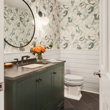
The powder room off the entryway also got a refresh - new flooring, new cabinets and fixtures. We ran the new slate right through into this space for some consistency. A fun wallpaper and shiplap trim add a welcoming feel and set the tone for the home.
Next, we tackled the kitchen. Located away from the rest of the first floor, the kitchen felt a little isolated, so we immediately began planning for how to better connect it to the rest of the first floor. We landed on removing the wall between the kitchen and dining room and designed a modified galley style space with separate cooking and clean up zones. The cooking zone consists of the refrigerator, prep sink and cooktop, along with a nice long run of prep space at the island. The cleanup side of the kitchen consists of the main sink and dishwasher. Both areas are situated so that the user can view the lake during prep work and cleanup!
One of the home’s main puzzles was how to incorporate the mudroom and area in front of the patio doors at the back of the house. We already had a breakfast table area, so the space by the patio doors was a bit of a no man’s land. We decided to separate the kitchen proper from what became the new mudroom with a large set of barn doors. That way you can quickly hide any mudroom messes but have easy access to the light coming in through the patio doors as well as the outdoor grilling station. We also love the impact the barn doors add to the overall space.
The homeowners’ first words to us were “it’s time to ditch the brown,” so we did! We chose a lovely blue pallet that reflects the home’s location on the lake which is also vibrant yet easy on the eye. Countertops are white quartz, and the natural oak floor works well with the other honey accents. The breakfast table was given a refresh with new chairs, chandelier and window treatments that frame the gorgeous views of the lake out the back.
We coordinated the slate mudroom flooring with that used in the home’s main entrance for a consistent feel. The storage area consists of open and closed storage to allow for some clutter control as needed.
Next on our “to do” list was revamping the dated brown bar area in the neighboring dining room. We eliminated the clutter by adding some closed cabinets and did some easy updates to help the space feel more current. One snag we ran into here was the discovery of a beam above the existing open shelving that had to be modified with a smaller structural beam to allow for our new design to work. This was an unexpected surprise, but in the end we think it was well worth it!
We kept the colors here a bit more muted to blend with the homeowner’s existing furnishings. Open shelving and polished nickel hardware add some simple detail to the new entertainment zone which also looks out onto the lake!
Next we tackled the upstairs starting with the homeowner’s son’s bath. The bath originally had both a tub shower and a separate shower, so we decided to swap out the shower for a new laundry area. This freed up some space downstairs in what used to be the mudroom/laundry room and is much more convenient for daily laundry needs.
We continued the blue palette here with navy cabinetry and the navy tile in the shower. Porcelain floor tile and chrome fixtures keep maintenance to a minimum while matte black mirrors and lighting add some depth the design. A low maintenance runner adds some warmth underfoot and ties the whole space together.
We added a pocket door to the bathroom to minimize interference with the door swings. The left door of the laundry closet is on a 180 degree hinge to allow for easy full access to the machines. Next we tackled the master bath which is an en suite arrangement. The original was typical of the 1980’s with the vanity outside of the bathroom, situated near the master closet. And the brown theme continued here with multiple shades of brown.
Our first move was to segment off the bath and the closet from the master bedroom. We created a short hall from the bedroom to the bathroom with his and hers walk-in closets on the left and right as well as a separate toilet closet outside of the main bathroom for privacy and flexibility.
The original bathroom had a giant soaking tub with steps (dangerous!) as well as a small shower that did not work well for our homeowner who is 6’3”. With other bathtubs in the home, they decided to eliminate the tub and create an oversized shower which takes up the space where the old tub was located. The double vanity is on the opposite wall and a bench is located under the window for morning conversations and a place to set a couple of towels.
The pallet in here is light and airy with a mix of blond wood, creamy porcelain and marble tile, and brass accents. A simple roman shade adds some texture and it’s top-down mechanism allows for light and privacy.
This large whole house remodel gave our homeowners not only the ability to maximize the potential of their home but also created a lovely new frame from which to view their fabulous lake views.
Designed by: Susan Klimala, CKD, CBD
Photography by: Michael Kaskel
For more information on kitchen and bath design ideas go to: www.kitchenstudio-ge.com


 Balodemas Architects
Anice Hoachlander, Hoachlander Davis Photography
Inspiration for a mid-sized 1960s gray one-story mixed siding gable roof remodel in DC Metro
Inspiration for a mid-sized 1960s gray one-story mixed siding gable roof remodel in DC Metro


 Minglewood, LLC
Angela Kearney, Minglewood, LLC
Design ideas for a small traditional full sun and drought-tolerant front yard stone and wood fence garden path in Boston for summer.
Design ideas for a small traditional full sun and drought-tolerant front yard stone and wood fence garden path in Boston for summer.
 Klopf Architecture
Klopf Architecture, Arterra Landscape Architects and Henry Calvert of Calvert Ventures Designed and built a new warm, modern, Eichler-inspired, open, indoor-outdoor home on a deeper-than-usual San Mateo Highlands property where an original Eichler house had burned to the ground.
The owners wanted multi-generational living and larger spaces than the original home offered, but all parties agreed that the house should respect the neighborhood and blend in stylistically with the other Eichlers. At first the Klopf team considered re-using what little was left of the original home and expanding on it. But after discussions with the owner and builder, all parties agreed that the last few remaining elements of the house were not practical to re-use, so Klopf Architecture designed a new home that pushes the Eichler approach in new directions.
One disadvantage of Eichler production homes is that the house designs were not optimized for each specific lot. A new custom home offered the team a chance to start over. In this case, a longer house that opens up sideways to the south fit the lot better than the original square-ish house that used to open to the rear (west). Accordingly, the Klopf team designed an L-shaped “bar” house with a large glass wall with large sliding glass doors that faces sideways instead of to the rear like a typical Eichler. This glass wall opens to a pool and landscaped yard designed by Arterra Landscape Architects.
Driving by the house, one might assume at first glance it is an Eichler because of the horizontality, the overhanging flat roof eaves, the dark gray vertical siding, and orange solid panel front door, but the house is designed for the 21st Century and is not meant to be a “Likeler.” You won't see any posts and beams in this home. Instead, the ceiling decking is a western red cedar that covers over all the beams. Like Eichlers, this cedar runs continuously from inside to out, enhancing the indoor / outdoor feeling of the house, but unlike Eichlers it conceals a cavity for lighting, wiring, and insulation. Ceilings are higher, rooms are larger and more open, the master bathroom is light-filled and more generous, with a separate tub and shower and a separate toilet compartment, and there is plenty of storage. The garage even easily fits two of today's vehicles with room to spare.
A massive 49-foot by 12-foot wall of glass and the continuity of materials from inside to outside enhance the inside-outside living concept, so the owners and their guests can flow freely from house to pool deck to BBQ to pool and back.
During construction in the rough framing stage, Klopf thought the front of the house appeared too tall even though the house had looked right in the design renderings (probably because the house is uphill from the street). So Klopf Architecture paid the framer to change the roofline from how we had designed it to be lower along the front, allowing the home to blend in better with the neighborhood. One project goal was for people driving up the street to pass the home without immediately noticing there is an "imposter" on this lot, and making that change was essential to achieve that goal.
This 2,606 square foot, 3 bedroom, 3 bathroom Eichler-inspired new house is located in San Mateo in the heart of the Silicon Valley.
Klopf Architecture Project Team: John Klopf, AIA, Klara Kevane
Landscape Architect: Arterra Landscape Architects
Contractor: Henry Calvert of Calvert Ventures
Photography ©2016 Mariko Reed
Location: San Mateo, CA
Year completed: 2016



 Nordaas American Homes
Julie Sahr Photography - Bricelyn, MN
Family room - mid-sized craftsman open concept dark wood floor family room idea with a stone fireplace, a wall-mounted tv, beige walls and a ribbon fireplace
Family room - mid-sized craftsman open concept dark wood floor family room idea with a stone fireplace, a wall-mounted tv, beige walls and a ribbon fireplace


 Ready Set Remodel
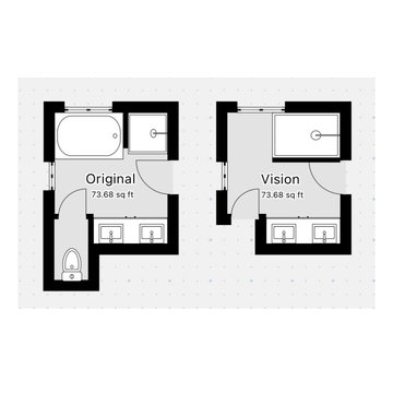
We build visions before projects to ensure our clients know exactly what direction their project is going before it gets started.
Example of a transitional bathroom design in Raleigh
Example of a transitional bathroom design in Raleigh
15