
Search results for "Start thinking" in Home Design Ideas
 Advance Design Studio, Ltd.
Jennifer and Dan have lived in their Deer Park Illinois home for 15 years, slowly making minor fixes like painting and decorating; but they had a new plan for their kitchen the entire time. An awkwardly placed garage door, and an island cooktop with a terrible downdraft made a full-scale kitchen remodel an absolute must. Jennifer had many ideas in mind and wanted to work with a company that could provide high-end work, while partnering with a designer that would tailor the kitchen to her ideas.
She was intrigued by the phrase “Common Sense Remodeling” in Advance Design’s feature she discovered while perusing an issue of the community’s Quintessential Barrington Magazine. Doing further research on the company’s website, as she looked through project profiles and read about Advance Design’s “Common Sense Remodeling” philosophy, she promptly scheduled an appointment to see if the people and ideas she read about were truly who they said they were. The more she read, the more she knew that the “Common Sense” approach to remodeling they described was exactly the type of company she was looking for.
The partnership was sealed after an initial consultation with Owner Todd Jurs and Project Designer Michelle Lecinski. They displayed a combination of friendliness, professionalism and respect that was unmatched by any of the other companies Jennifer talked to. She knew that with Advance Design, she would be able to retain the vision that she had in mind with high-quality craftsmanship.
“I reached out to Advance Design because of the ‘Common Sense Remodeling’ tagline,” Jennifer said. “That’s what lingered for me”. “Advance Design was the most respectful- of the house and of my design ideas, and the most professional of the handful of companies that looked at my project”.
Soon after the meeting Jennifer began working with Michelle on the project design. They quickly developed chemistry. Jennifer loved how Michelle researched and located every detail that Jennifer wanted for the kitchen. Between the two of them, every concept and idea was worked through and perfected. “Jennifer had definite ideas about what she wanted the new kitchen to look like, she just didn’t know how to bring it all together. We worked together really well to make her ideas into the practical reality necessary for a well-functioning kitchen, with the look and feel that she had envisioned”, says Michelle.
“Michelle was wonderful in using the CAD system she would show me new drawings every time we changed the layout while working through the design,” Jennifer said. “She was a really wonderful partner in execution, she made sure everything happened quickly and easily.”
The finished design drew out elements of Jennifer’s style and personality. The pair call the look “sophisticated farmhouse” to describe the kitchen renovation to family and friends. The result was a beautifully crafted, authentic-feeling space that satisfied Jennifer’s dreams 15 years in the making. The whole project consisted of a kitchen remodel, mudroom upgrade with powder room, and garage entry relocation. “The projects I personally like the best, are the ones that put the client’s dreams on display,” Project Designer Michelle said. “And this is one of those projects.”
The main focal point of the kitchen is custom zinc and brass ventilation hood with a vintage sheen, which was hand made to order by a small company in Indiana named Vogler Metalworking. “It’s like sculpture, a true work of art”, says Jennifer. Your eye is immediately drawn towards this elegant yet practical hood that eliminated the home’s downdraft problem and added a striking conversation piece at the same time. The carpenters had to use special gloves when transporting and installing it, so they didn’t smudge it with fingerprints. The beautiful hood centers proudly over the stunning black enamel and brass LaCornue Range. “I had a friend who had a LaCornue range and after learning how easy it was to cook perfect meals, I was convinced I wanted to have one”, says Jennifer. This unique, breathtaking combination anchors the entire kitchen and is apparent immediately as you walk into the great room the surrounds the space.
DuraSupreme Crestwood cabinets with a Kendall Panel add function and sophistication. A custom gray paint color paired with a storm blue was developed so that the new kitchen looked like it belonged to the existing space. Unlacquered brass faucets and hardware were important to Jennifer because she wanted the living finishes to age over time. Remarkable brass diamond mesh cabinet door inserts imported from the UK continue to add this one-of-a-kind kitchen renovation; giving it a “you won’t see this everywhere” quality. The use of old railcar flooring for the coffee bar countertop and reclaimed oak for the open shelving gives an authenticity to the space uncommon in kitchens today.
Jennifer and Michelle fell in love with the Limestone Grey Stone while they were investigating unique island countertop ideas. They liked the fact that the limestone as a living finish will age and change over time. Calcutta Miel Quartz countertops made for an excellent pairing around the perimeter, as it’s durable and perfect for cooking preparations. A textured white subway tile backsplash that runs to the ceiling keeps your eye moving towards the open shelving, and to the main focal point of the stunning range hood combination.
“The kitchen functions beautifully, and it’s gorgeous,” beams Jennifer as she gestures with both hands while smiling ear to ear. “The most important thing was I wanted a kitchen that had a wonderful flow, cooked beautiful meals and was a great gathering place for family and friends, and this space does that perfectly! Beauty wise, it turned out exactly how I had envisioned. I felt the function part was the hardest part, and that was nailed”!
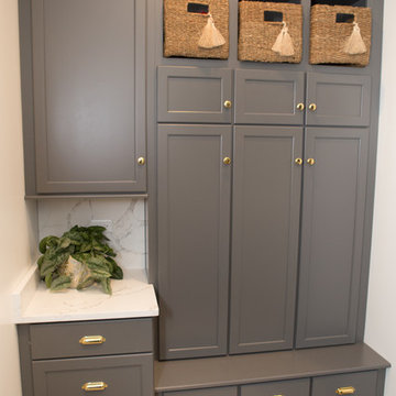
Relocating the garage entry to the new mudroom was a huge priority and has finally separated the family’s arriving home functions from their kitchen. Now coats and shoes and bags have their own area for dropping once members arrive home. Matching gray DuraSupreme cabinetry helped create gorgeous, purposeful lockers for the family. A reclaimed vintage sink and custom wall paper were added to the tiny powder room to beautify the once previously only functional space. Advance Design was even able to create a custom space for their dog to sleep while the family is away.
“It was unbelievable that a project of this size was completed in such a short time, and I think that’s because of the large amount of planning and preparation that went into it,” Jennifer marveled, “When we started, we were ready, and everything was prepared”.
When it came to execution, Project Manager Justin Davis and his crew were quick, accessible, and organized. Projects like this kitchen are typically completed in as little as 8-10 weeks. Jennifer’s kitchen however despite the relocation of some challenging HVAC in a soffit and moving of an exterior door was completed remarkably fast in part because the team was working with an existing tile floor that ran throughout the first floor that the client really loved.
“You get to know these people really well because they’re living in your house while you’re living in your house. They were so fast and really good, it didn’t take as long as even planned” reported Jennifer. “I would text Justin and he always responded almost immediately. I got to know all the guys who were working in our house and they were all wonderful people”.
Details in a customized kitchen like this one require skill and care from the people who install it. “All the guys on the job were skilled at what the did. I wanted small details like little feet to look like furniture, that is where their carpentry skill came in to make these all perfect”, said Jennifer. “The tile guys were wonderful. They even let me determine how I wanted the texture with the grout to appear for a salt and pepper look; now that is a very skilled trade person making it custom”.
In Jennifer’s interview, she continued to reference Advance Design’s “Common Sense Remodeling”, so I took a minute to ask her exactly what that phrase meant to her and how it played out in her experience with her project and the Advance Design team. Here is what she said: “I was intrigued about Common Sense Remodeling and in my head that there would be clear costs and prices, great communication between the design team, the execution team and me”, said Jennifer. They did deliver on that, it was so clear about the cost breakdown, what I could expect from everyone who came to my house, and everything that we had ordered. That to me is the Common Sense”!
It’s great to see a client take literally our assertion that a well-planned remodeling project is simply “Common Sense”! She anticipated each step of the way would be clear, concise, and predictable, all the while protecting the outcome due to the careful upfront planning. “Advance Design delivered on their ‘Common Sense Remodeling’ promise,” Jennifer said. “From the design team, to the execution team - everything was straight forward like I imagined. The project turned out exactly how I envisioned, I enjoyed this process and absolutely would recommend Advance Design Studio to anyone.”
 DL Rees Contracting, LLC
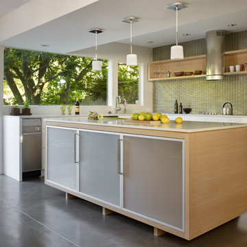
Modern update of a Paul Kirk mid century design. Use of semi-custom materials and high quality craftsmanship. Project managed by Doug Rees for Odyssey Builders. Design By Bjarko Serra
 Markalunas Architecture and Design, LLC
Lisa Carroll
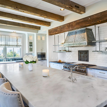
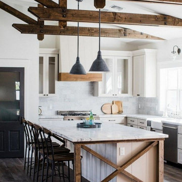
Mid-sized farmhouse l-shaped light wood floor and beige floor kitchen photo in Atlanta with a farmhouse sink, beaded inset cabinets, white cabinets, marble countertops, white backsplash, subway tile backsplash, paneled appliances and an island
Mid-sized farmhouse l-shaped light wood floor and beige floor kitchen photo in Atlanta with a farmhouse sink, beaded inset cabinets, white cabinets, marble countertops, white backsplash, subway tile backsplash, paneled appliances and an island
Find the right local pro for your project

 TKS Design Group
Free ebook, CREATING THE IDEAL KITCHEN
Download now → http://bit.ly/idealkitchen
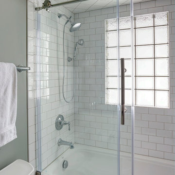
The hall bath for this client started out a little dated with its 1970’s color scheme and general wear and tear, but check out the transformation!
The floor is really the focal point here, it kind of works the same way wallpaper would, but -- it’s on the floor. I love this graphic tile, patterned after Moroccan encaustic, or cement tile, but this one is actually porcelain at a very affordable price point and much easier to install than cement tile.
Once we had homeowner buy-in on the floor choice, the rest of the space came together pretty easily – we are calling it “transitional, Moroccan, industrial.” Key elements are the traditional vanity, Moroccan shaped mirrors and flooring, and plumbing fixtures, coupled with industrial choices -- glass block window, a counter top that looks like cement but that is actually very functional Corian, sliding glass shower door, and simple glass light fixtures.
The final space is bright, functional and stylish. Quite a transformation, don’t you think?
Designed by: Susan Klimala, CKD, CBD
Photography by: Mike Kaskel
For more information on kitchen and bath design ideas go to: www.kitchenstudio-ge.com
 Paintbox Garden
Photo: Charlotte Albers © 2014 Houzz
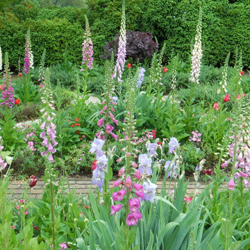
This is an example of a traditional landscaping in Burlington.
This is an example of a traditional landscaping in Burlington.
 Mark S. Garff, Landscape Architect
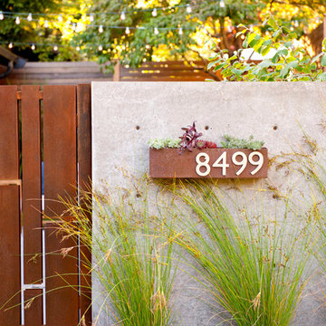
Already partially enclosed by an ipe fence and concrete wall, our client had a vision of an outdoor courtyard for entertaining on warm summer evenings since the space would be shaded by the house in the afternoon. He imagined the space with a water feature, lighting and paving surrounded by plants.
With our marching orders in place, we drew up a schematic plan quickly and met to review two options for the space. These options quickly coalesced and combined into a single vision for the space. A thick, 60” tall concrete wall would enclose the opening to the street – creating privacy and security, and making a bold statement. We knew the gate had to be interesting enough to stand up to the large concrete walls on either side, so we designed and had custom fabricated by Dennis Schleder (www.dennisschleder.com) a beautiful, visually dynamic metal gate.
Other touches include drought tolerant planting, bluestone paving with pebble accents, crushed granite paving, LED accent lighting, and outdoor furniture. Both existing trees were retained and are thriving with their new soil.
Photography by: http://www.coreenschmidt.com/



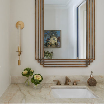
 KitchenLab Interiors
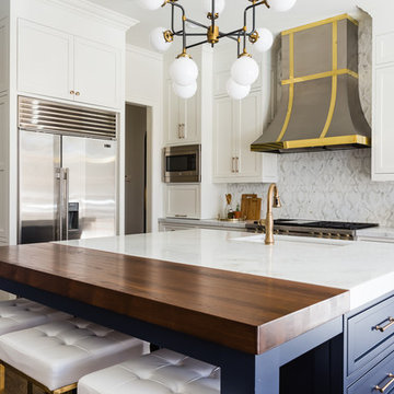
KitchenLab Interiors’ first, entirely new construction project in collaboration with GTH architects who designed the residence. KLI was responsible for all interior finishes, fixtures, furnishings, and design including the stairs, casework, interior doors, moldings and millwork. KLI also worked with the client on selecting the roof, exterior stucco and paint colors, stone, windows, and doors. The homeowners had purchased the existing home on a lakefront lot of the Valley Lo community in Glenview, thinking that it would be a gut renovation, but when they discovered a host of issues including mold, they decided to tear it down and start from scratch. The minute you look out the living room windows, you feel as though you're on a lakeside vacation in Wisconsin or Michigan. We wanted to help the homeowners achieve this feeling throughout the house - merging the causal vibe of a vacation home with the elegance desired for a primary residence. This project is unique and personal in many ways - Rebekah and the homeowner, Lorie, had grown up together in a small suburb of Columbus, Ohio. Lorie had been Rebekah's babysitter and was like an older sister growing up. They were both heavily influenced by the style of the late 70's and early 80's boho/hippy meets disco and 80's glam, and both credit their moms for an early interest in anything related to art, design, and style. One of the biggest challenges of doing a new construction project is that it takes so much longer to plan and execute and by the time tile and lighting is installed, you might be bored by the selections of feel like you've seen them everywhere already. “I really tried to pull myself, our team and the client away from the echo-chamber of Pinterest and Instagram. We fell in love with counter stools 3 years ago that I couldn't bring myself to pull the trigger on, thank god, because then they started showing up literally everywhere", Rebekah recalls. Lots of one of a kind vintage rugs and furnishings make the home feel less brand-spanking new. The best projects come from a team slightly outside their comfort zone. One of the funniest things Lorie says to Rebekah, "I gave you everything you wanted", which is pretty hilarious coming from a client to a designer.
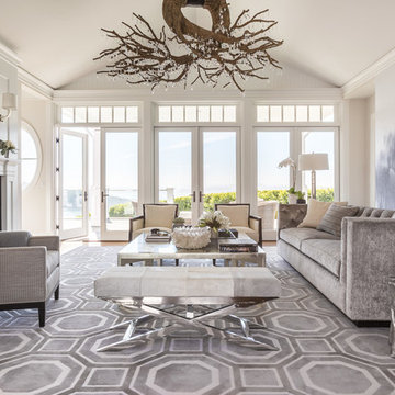
 Ann Lowengart Interiors
The large pattern of the custom rug is the perfect contrast to the organic pattern of the fireplace and the open, modern concept of the room. A wall of large glass doors open up to views of the Bay, Angel Island, and the San Francisco cityscape.
Photo credit: David Duncan Livingston
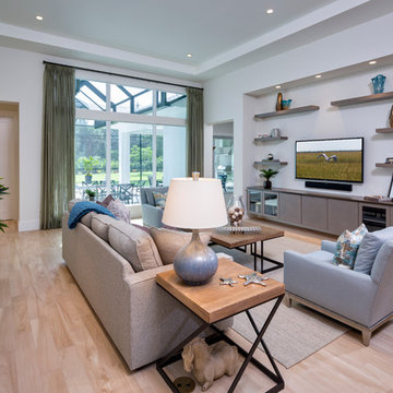
 41 West
41 West Coastal Retreat Series reveals creative, fresh ideas, for a new look to define the casual beach lifestyle of Naples.
More than a dozen custom variations and sizes are available to be built on your lot. From this spacious 3,000 square foot, 3 bedroom model, to larger 4 and 5 bedroom versions ranging from 3,500 - 10,000 square feet, including guest house options.
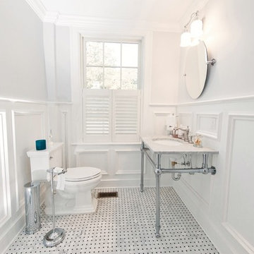
 Passacantando Architects AIA
Photographer: Kevin Colquhoun
Example of a mid-sized classic porcelain tile powder room design in New York with a console sink, marble countertops, white walls and a two-piece toilet
Example of a mid-sized classic porcelain tile powder room design in New York with a console sink, marble countertops, white walls and a two-piece toilet
 American Beauty Landscaping Inc.
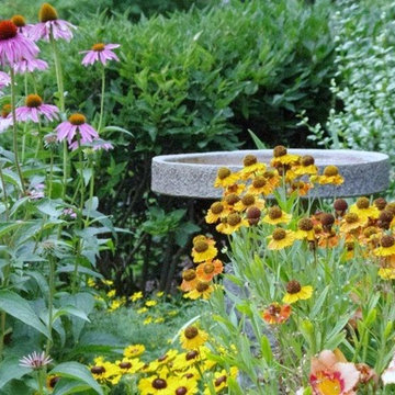
Inspiration for a mid-sized full sun backyard landscaping in Other for spring.


 TKS Design Group
Free ebook, CREATING THE IDEAL KITCHEN
Download now → http://bit.ly/idealkitchen
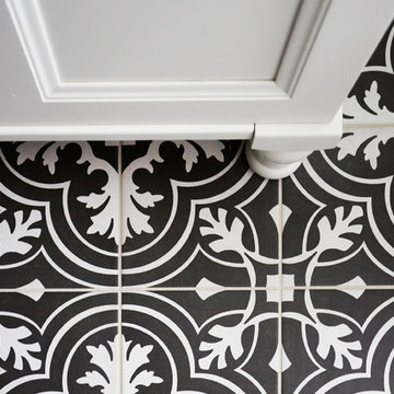
The hall bath for this client started out a little dated with its 1970’s color scheme and general wear and tear, but check out the transformation!
The floor is really the focal point here, it kind of works the same way wallpaper would, but -- it’s on the floor. I love this graphic tile, patterned after Moroccan encaustic, or cement tile, but this one is actually porcelain at a very affordable price point and much easier to install than cement tile.
Once we had homeowner buy-in on the floor choice, the rest of the space came together pretty easily – we are calling it “transitional, Moroccan, industrial.” Key elements are the traditional vanity, Moroccan shaped mirrors and flooring, and plumbing fixtures, coupled with industrial choices -- glass block window, a counter top that looks like cement but that is actually very functional Corian, sliding glass shower door, and simple glass light fixtures.
The final space is bright, functional and stylish. Quite a transformation, don’t you think?
Designed by: Susan Klimala, CKD, CBD
Photography by: Mike Kaskel
For more information on kitchen and bath design ideas go to: www.kitchenstudio-ge.com
 BRADSHAW DESIGNS LLC
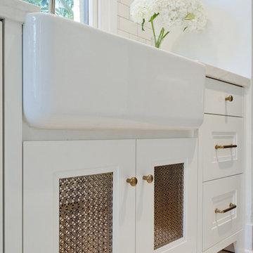
This Award-winning kitchen proves vintage doesn't have to look old and tired. This previously dark kitchen was updated with white, gold, and wood in the historic district of Monte Vista. The challenge is making a new kitchen look and feel like it belongs in a charming older home. The highlight and starting point is the original hex tile flooring in white and gold. It was in excellent condition and merely needed a good cleaning. The addition of white calacatta marble, white subway tile, walnut wood counters, brass and gold accents keep the charm intact. Cabinet panels mimic original door panels found in other areas of the home. Custom coffee storage is a modern bonus! Sub-Zero Refrig, Rohl sink.
 The Property Sisters
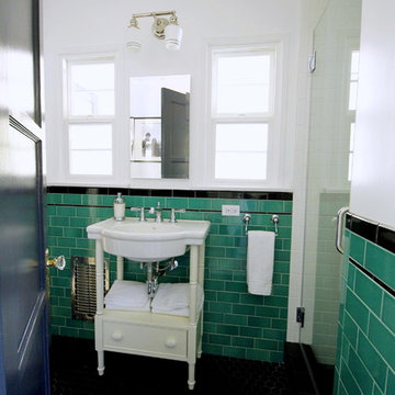
This vintage style bathroom was inspired by it's 1930's art deco roots. The goal was to recreate a space that felt like it was original. With lighting from Rejuvenation, tile from B&W tile and Kohler fixtures, this is a small bathroom that packs a design punch. Interior Designer- Marilynn Taylor Interiors, Contractor- Allison Allain, Plumb Crazy Contracting.
 TKS Design Group
Free ebook, Creating the Ideal Kitchen. DOWNLOAD NOW
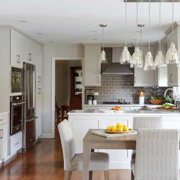
Our clients had been in their home since the early 1980’s and decided it was time for some updates. We took on the kitchen, two bathrooms and a powder room.
The layout in the kitchen was functional for them, so we kept that pretty much as is. Our client wanted a contemporary-leaning transitional look — nice clean lines with a gray and white palette. Light gray cabinets with a slightly darker gray subway tile keep the northern exposure light and airy. They also purchased some new furniture for their breakfast room and adjoining family room, so the whole space looks completely styled and new. The light fixtures are staggered and give a nice rhythm to the otherwise serene feel.
The homeowners were not 100% sold on the flooring choice for little powder room off the kitchen when I first showed it, but now they think it is one of the most interesting features of the design. I always try to “push” my clients a little bit because that’s when things can get really fun and this is what you are paying for after all, ideas that you may not come up with on your own.
We also worked on the two upstairs bathrooms. We started first on the hall bath which was basically just in need of a face lift. The floor is porcelain tile made to look like carrera marble. The vanity is white Shaker doors fitted with a white quartz top. We re-glazed the cast iron tub.
The master bath was a tub to shower conversion. We used a wood look porcelain plank on the main floor along with a Kohler Tailored vanity. The custom shower has a barn door shower door, and vinyl wallpaper in the sink area gives a rich textured look to the space. Overall, it’s a pretty sophisticated look for its smaller fooprint.
Designed by: Susan Klimala, CKD, CBD
Photography by: Michael Alan Kaskel
For more information on kitchen and bath design ideas go to: www.kitchenstudio-ge.com

 Siena Custom Builders, Inc.
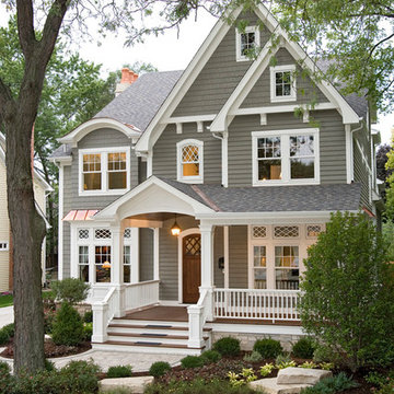
One of our most popular exteriors - its the details that make this such a favorite!
Landmark Photography
Example of a classic exterior home design in Chicago
Example of a classic exterior home design in Chicago


59