
Search results for "Start unique" in Home Design Ideas
 TOC design & construction inc.
DESIGNED BY TOC design
CONSTRUCTION BY TOC design & Construction inc.
PHOTOS BY : Tania Scardellato
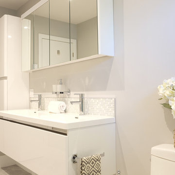
I was fortunate to have a young family approach me in desperate need to renovate there only 3 piece bathroom. This space was In dire need of a remodel, with old brown wall to wall tiles and a dated bulky yellow brown single sink vanity.
Storage was a must, lighting a necessity, and proper accessibility to the shower bath area.
We had a tight budget to respect, but a full gut of this bathroom was required. And a good thing too, once we started doing the demolition we noticed that mildew and rotting floors and walls had accumulated throughout the years. Doing it right the first time is no joke when dealing with water and electrical issues.
We discarded all reminisce of old and built from scratch, new walls, new plumbing, new electrical ,new insulation and a new window, a new fan that actually exhausted outside ( I say this laughing as you would be amazed at how many fans are installed but don’t exhaust outside, and you the client would never know unless you go inside the attic space.
Once all the hard stuff was done, the rest is just a matter of smart design. If you have a small bathroom here are some tips to guide you.
10 tips for making a small bathroom feel larger
Is your tiny bathroom cramping your functionality and style, leaving you longing for the enormous bathrooms gracing the pages of design magazines? Even if your bathroom is a fraction of the size, all it takes is some design savvy to make the most of the space you have. Consider these 10 smart tips that will help your bathroom look, feel and function like those larger contenders.
1-Get creative with corners
Space is at a premium in small bathrooms, so it's important to maximize every inch. Corners, for example, provide extra space for shelving, storage units and even hooks. Get creative and install unique design solutions that are not only functional, but also eye-catching. If you love the airiness of floating cabinets, add baskets or decorative boxes under for extra storage. If you are installing floating cabinets insure that they are installed securely to studs or plywood at wall.
2- Let solid colors shine
Busy patterns have a shrinking effect and make small bathrooms seem even smaller. Conversely, light natural hues make a space feel more open. If you're itching to get creative with design, experiment with textures but keep overpowering patterns to a minimum. Tone on tone is the best to achieve this.
3 - Maximize your bathtub
A bathtub takes up a significant portion of the room, but modern, compact options with curved basins, can make the tub feel larger when in use, all while conserving space.
4 - Select a smaller faucet
A faucet is jewelry for the bathroom. And just as accessories can overpower an outfit, a big bulky faucet isn't flattering in a small bath. Single-handle designs conserve counter space, while a wall-mount installation frees it up all together and can create quite the wow-factor, if the budget can accommodate the required changes to plumbing behind the wall.
5 - Make vanity storage simple
If you're in a storage war with your small bathroom, you're not alone in the battle. Toiletries and personal supplies without a place to call home only add clutter and chaos. Store smart with a space-saving vanity, the dual sink vanity shown here, looks quite simple, but in reality it has 4 sets of full extension drawers, and the vanity tower adds extra storage without overpowering the use of space.
6 - Show off the shower
Shower curtains may be pretty, but they interrupt the visual flow of a bathing space and make it feel significantly smaller. In bathrooms with small footprints, opt for a clear glass sliding shower door that doesn't require the clearance of one with a hinged design. Or as shown in this design and for fraction less expensive a half hinged panel installed on a fixed tempered glass panel. If you're embarking on a big remodel, create the illusion of more space by using same tile in the shower that's used throughout; instead of seeing them as two separate zones, the eye will read them as one.
7 - Discover the treasure of hidden storage
Work with a contractor, and you just might find some serious storage potential hidden behind your walls. Whether it's utilizing space between the studs for shallow shelving or a creating a small linen closet by annexing space from an adjacent room, even small additions can make a big difference.
8 - Focal Point
Tile is a beautiful, durable addition to any bathroom. For dainty spaces, consider installing tile at a diagonal to accentuate the focal point or as in this bathroom I used an oversized textured pattern to bring depth to the space at the window wall.
9 - Choose the right lights
Strategically install light to reflect and brighten a small bathroom to make it appear larger. Recessed lighting is an affordable solution for tiny rooms, offering ample light while taking up little space. Wall sconces alongside a mirror also reflect off the walls and make a room feel bright and airy. I always recommend going with LED lighting at 2800 to 3000K.
10 – Accessorize
This is your time to shine in your decorating skills, have fun with your towels, you can change the color scheme daily just by adding pops of color in your accessories, make sure to get items that serve a dual purpose, like baskets, boxes they can always be used as hampers, storing of towels and even a nice display for your guest.
 Tobin Dougherty Architects
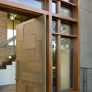
This new 6400 s.f. two-story split-level home lifts upward and orients toward unobstructed views of Windy Hill. The deep overhanging flat roof design with a stepped fascia preserves the classic modern lines of the building while incorporating a Zero-Net Energy photovoltaic panel system. From start to finish, the construction is uniformly energy efficient and follows California Build It Green guidelines. Many sustainable finish materials are used on both the interior and exterior, including recycled old growth cedar and pre-fabricated concrete panel siding.
Photo by:
www.bernardandre.com
 Endless Pools
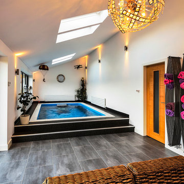
A partially in-ground Endless Pool installation. The clean modern lines of this room get a lift from the quirky chandelier, bowed shelving, and playful aerial accents.
To plan an Endless Pool that's as unique as you are, start with a Free Idea Kit from www.endlesspools.com.
Find the right local pro for your project
 Wilco Bos: Design + Remodels
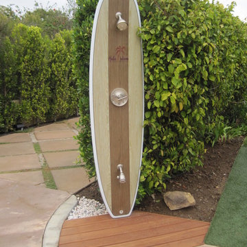
Contact us for your own custom surfboard shower.
Outdoor shower designed and custom made from a real surfboard.
Wilco Bos, LLC.
Mid-sized beach style backyard outdoor patio shower photo in Denver with no cover
Mid-sized beach style backyard outdoor patio shower photo in Denver with no cover
 TKS Design Group
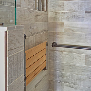
This project was completed for clients who wanted a comfortable, accessible 1ST floor bathroom for their grown daughter to use during visits to their home as well as a nicely-appointed space for any guest. Their daughter has some accessibility challenges so the bathroom was also designed with that in mind.
The original space worked fairly well in some ways, but we were able to tweak a few features to make the space even easier to maneuver through. We started by making the entry to the shower flush so that there is no curb to step over. In addition, although there was an existing oversized seat in the shower, it was way too deep and not comfortable to sit on and just wasted space. We made the shower a little smaller and then provided a fold down teak seat that is slip resistant, warm and comfortable to sit on and can flip down only when needed. Thus we were able to create some additional storage by way of open shelving to the left of the shower area. The open shelving matches the wood vanity and allows a spot for the homeowners to display heirlooms as well as practical storage for things like towels and other bath necessities.
We carefully measured all the existing heights and locations of countertops, toilet seat, and grab bars to make sure that we did not undo the things that were already working well. We added some additional hidden grab bars or “grabcessories” at the toilet paper holder and shower shelf for an extra layer of assurance. Large format, slip-resistant floor tile was added eliminating as many grout lines as possible making the surface less prone to tripping. We used a wood look tile as an accent on the walls, and open storage in the vanity allowing for easy access for clean towels. Bronze fixtures and frameless glass shower doors add an elegant yet homey feel that was important for the homeowner. A pivot mirror allows adjustability for different users.
If you are interested in designing a bathroom featuring “Living In Place” or accessibility features, give us a call to find out more. Susan Klimala, CKBD, is a Certified Aging In Place Specialist (CAPS) and particularly enjoys helping her clients with unique needs in the context of beautifully designed spaces.
Designed by: Susan Klimala, CKD, CBD
Photography by: Michael Alan Kaskel
 Advance Design Studio, Ltd.
Jennifer and Dan have lived in their Deer Park Illinois home for 15 years, slowly making minor fixes like painting and decorating; but they had a new plan for their kitchen the entire time. An awkwardly placed garage door, and an island cooktop with a terrible downdraft made a full-scale kitchen remodel an absolute must. Jennifer had many ideas in mind and wanted to work with a company that could provide high-end work, while partnering with a designer that would tailor the kitchen to her ideas.
She was intrigued by the phrase “Common Sense Remodeling” in Advance Design’s feature she discovered while perusing an issue of the community’s Quintessential Barrington Magazine. Doing further research on the company’s website, as she looked through project profiles and read about Advance Design’s “Common Sense Remodeling” philosophy, she promptly scheduled an appointment to see if the people and ideas she read about were truly who they said they were. The more she read, the more she knew that the “Common Sense” approach to remodeling they described was exactly the type of company she was looking for.
The partnership was sealed after an initial consultation with Owner Todd Jurs and Project Designer Michelle Lecinski. They displayed a combination of friendliness, professionalism and respect that was unmatched by any of the other companies Jennifer talked to. She knew that with Advance Design, she would be able to retain the vision that she had in mind with high-quality craftsmanship.
“I reached out to Advance Design because of the ‘Common Sense Remodeling’ tagline,” Jennifer said. “That’s what lingered for me”. “Advance Design was the most respectful- of the house and of my design ideas, and the most professional of the handful of companies that looked at my project”.
Soon after the meeting Jennifer began working with Michelle on the project design. They quickly developed chemistry. Jennifer loved how Michelle researched and located every detail that Jennifer wanted for the kitchen. Between the two of them, every concept and idea was worked through and perfected. “Jennifer had definite ideas about what she wanted the new kitchen to look like, she just didn’t know how to bring it all together. We worked together really well to make her ideas into the practical reality necessary for a well-functioning kitchen, with the look and feel that she had envisioned”, says Michelle.
“Michelle was wonderful in using the CAD system she would show me new drawings every time we changed the layout while working through the design,” Jennifer said. “She was a really wonderful partner in execution, she made sure everything happened quickly and easily.”
The finished design drew out elements of Jennifer’s style and personality. The pair call the look “sophisticated farmhouse” to describe the kitchen renovation to family and friends. The result was a beautifully crafted, authentic-feeling space that satisfied Jennifer’s dreams 15 years in the making. The whole project consisted of a kitchen remodel, mudroom upgrade with powder room, and garage entry relocation. “The projects I personally like the best, are the ones that put the client’s dreams on display,” Project Designer Michelle said. “And this is one of those projects.”
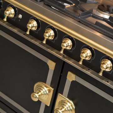
The main focal point of the kitchen is custom zinc and brass ventilation hood with a vintage sheen, which was hand made to order by a small company in Indiana named Vogler Metalworking. “It’s like sculpture, a true work of art”, says Jennifer. Your eye is immediately drawn towards this elegant yet practical hood that eliminated the home’s downdraft problem and added a striking conversation piece at the same time. The carpenters had to use special gloves when transporting and installing it, so they didn’t smudge it with fingerprints. The beautiful hood centers proudly over the stunning black enamel and brass LaCornue Range. “I had a friend who had a LaCornue range and after learning how easy it was to cook perfect meals, I was convinced I wanted to have one”, says Jennifer. This unique, breathtaking combination anchors the entire kitchen and is apparent immediately as you walk into the great room the surrounds the space.
DuraSupreme Crestwood cabinets with a Kendall Panel add function and sophistication. A custom gray paint color paired with a storm blue was developed so that the new kitchen looked like it belonged to the existing space. Unlacquered brass faucets and hardware were important to Jennifer because she wanted the living finishes to age over time. Remarkable brass diamond mesh cabinet door inserts imported from the UK continue to add this one-of-a-kind kitchen renovation; giving it a “you won’t see this everywhere” quality. The use of old railcar flooring for the coffee bar countertop and reclaimed oak for the open shelving gives an authenticity to the space uncommon in kitchens today.
Jennifer and Michelle fell in love with the Limestone Grey Stone while they were investigating unique island countertop ideas. They liked the fact that the limestone as a living finish will age and change over time. Calcutta Miel Quartz countertops made for an excellent pairing around the perimeter, as it’s durable and perfect for cooking preparations. A textured white subway tile backsplash that runs to the ceiling keeps your eye moving towards the open shelving, and to the main focal point of the stunning range hood combination.
“The kitchen functions beautifully, and it’s gorgeous,” beams Jennifer as she gestures with both hands while smiling ear to ear. “The most important thing was I wanted a kitchen that had a wonderful flow, cooked beautiful meals and was a great gathering place for family and friends, and this space does that perfectly! Beauty wise, it turned out exactly how I had envisioned. I felt the function part was the hardest part, and that was nailed”!
Relocating the garage entry to the new mudroom was a huge priority and has finally separated the family’s arriving home functions from their kitchen. Now coats and shoes and bags have their own area for dropping once members arrive home. Matching gray DuraSupreme cabinetry helped create gorgeous, purposeful lockers for the family. A reclaimed vintage sink and custom wall paper were added to the tiny powder room to beautify the once previously only functional space. Advance Design was even able to create a custom space for their dog to sleep while the family is away.
“It was unbelievable that a project of this size was completed in such a short time, and I think that’s because of the large amount of planning and preparation that went into it,” Jennifer marveled, “When we started, we were ready, and everything was prepared”.
When it came to execution, Project Manager Justin Davis and his crew were quick, accessible, and organized. Projects like this kitchen are typically completed in as little as 8-10 weeks. Jennifer’s kitchen however despite the relocation of some challenging HVAC in a soffit and moving of an exterior door was completed remarkably fast in part because the team was working with an existing tile floor that ran throughout the first floor that the client really loved.
“You get to know these people really well because they’re living in your house while you’re living in your house. They were so fast and really good, it didn’t take as long as even planned” reported Jennifer. “I would text Justin and he always responded almost immediately. I got to know all the guys who were working in our house and they were all wonderful people”.
Details in a customized kitchen like this one require skill and care from the people who install it. “All the guys on the job were skilled at what the did. I wanted small details like little feet to look like furniture, that is where their carpentry skill came in to make these all perfect”, said Jennifer. “The tile guys were wonderful. They even let me determine how I wanted the texture with the grout to appear for a salt and pepper look; now that is a very skilled trade person making it custom”.
In Jennifer’s interview, she continued to reference Advance Design’s “Common Sense Remodeling”, so I took a minute to ask her exactly what that phrase meant to her and how it played out in her experience with her project and the Advance Design team. Here is what she said: “I was intrigued about Common Sense Remodeling and in my head that there would be clear costs and prices, great communication between the design team, the execution team and me”, said Jennifer. They did deliver on that, it was so clear about the cost breakdown, what I could expect from everyone who came to my house, and everything that we had ordered. That to me is the Common Sense”!
It’s great to see a client take literally our assertion that a well-planned remodeling project is simply “Common Sense”! She anticipated each step of the way would be clear, concise, and predictable, all the while protecting the outcome due to the careful upfront planning. “Advance Design delivered on their ‘Common Sense Remodeling’ promise,” Jennifer said. “From the design team, to the execution team - everything was straight forward like I imagined. The project turned out exactly how I envisioned, I enjoyed this process and absolutely would recommend Advance Design Studio to anyone.”
 Pamela Harvey Interiors
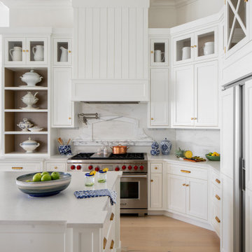
Our St. Pete studio designed this stunning home in a Greek Mediterranean style to create the best of Florida waterfront living. We started with a neutral palette and added pops of bright blue to recreate the hues of the ocean in the interiors. Every room is carefully curated to ensure a smooth flow and feel, including the luxurious bathroom, which evokes a calm, soothing vibe. All the bedrooms are decorated to ensure they blend well with the rest of the home's decor. The large outdoor pool is another beautiful highlight which immediately puts one in a relaxing holiday mood!
---
Pamela Harvey Interiors offers interior design services in St. Petersburg and Tampa, and throughout Florida's Suncoast area, from Tarpon Springs to Naples, including Bradenton, Lakewood Ranch, and Sarasota.
For more about Pamela Harvey Interiors, see here: https://www.pamelaharveyinteriors.com/
To learn more about this project, see here: https://www.pamelaharveyinteriors.com/portfolio-galleries/waterfront-home-tampa-fl


 Advance Design Studio, Ltd.
Curtis and Peggy had been thinking of a kitchen remodel for quite some time, but they knew their house would have a unique set of challenges. Their older Victorian house was built in 1891. The kitchen cabinetry was original, and they wanted to keep the authenticity of their period home while adding modern comforts that would improve their quality of life.
A friend recommended Advance Design Studio for their exceptional experience and quality of work. After meeting with designer Michelle Lecinski at Advance Design, they were confident they could partner with Advance to accomplish the unique kitchen renovation they’d been talking about for years. “We wanted to do the kitchen for a long, long time,” Curtis said. “(We asked ourselves) what are we actually going to do? How are we going to do this? And who are we going to find to do exactly what we want?”
The goal for the project was to keep the home renovation and new kitchen feeling authentic to the time in which it was built. They desperately wanted the modern comforts that come with a larger refrigerator and the dishwasher that they never had! The old home was also a bit drafty so adding a fireplace, wall insulation and new windows became a priority. They very much wanted to create a comfortable hearth room adjacent to the kitchen, complete with old world brick.
The original cabinetry had to go to make way for beautiful new kitchen cabinetry that appears as if it was a hundred years old, but with all the benefits of cutting-edge storage, self-closing drawers, and a brand-new look. “We just wanted to keep it old looking, but with some modern updates,” Peggy said.
Dura Supreme Highland Cabinets with a Heritage Old World Painted Finish replaced the original 1891 cabinets. The hand-applied careful rubbed-off detailing makes these exquisite cabinets look as if they came from a far-gone era. Despite the small size of the kitchen, Peggy, Curtis and Michelle utilized every inch with custom cabinet sizes to increase storage capacity. The custom cabinets allowed for the addition of a 24” Fisher Paykel dishwasher with a concealing Dura Supreme door panel. Michelle was also able to work into the new design a larger 30” Fisher Paykel French refrigerator. “We made every ¼ inch count in this small space,” designer Michelle said. “Having the ability to custom size the cabinetry was the only way to achieve this.”
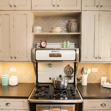
“The kitchen essentially was designed around the Heartland Vintage range and oven,” says Michelle. A classic appliance that combines nostalgic beauty and craftsmanship for modern cooking, with nickel plated trim and elegantly shaped handles and legs; the not to miss range is a striking focal point of the entire room and an engaging conversation piece.
Granite countertops in Kodiak Satin with subtle veining kept with the old-world style. The delicate porcelain La Vie Crackle Sonoma tile kitchen backsplash compliments the home’s style perfectly. A handcrafted passthrough designed to show off Peggy’s fine china was custom built by project carpenters Justin Davis and Jeff Dallain to physically and visually open the space. Additional storage was created in the custom panty room with Latte Edinburg cabinets, hand-made weathered wood shelving with authentic black iron brackets, and an intricate tin copper ceiling.
Peggy and Curtis loved the idea of adding a Vermont stove to make the hearth-room not only functional, but a truly beckoning place to be. A stunning Bordeaux red Vermont Castings Stove with crisp black ventilation was chosen and combined with the authentic reclaimed Chicago brick wall. Advance’s talented carpenters custom-built elegant weathered shelves to house family memorabilia, installed carefully chosen barn sconces, and made the hearth room an inviting place to relax with a cup of coffee and a good book.
“Peggy and Curtis’ project was so much fun to work on. Creating a space that looks and feels like it always belonged in this beautiful old Victorian home is a designer’s dream. To see the delight in their faces when they saw the design details coming together truly made it worth the time and effort that went into making the very compact kitchen space work”, said Michelle. “The result is an amazing custom kitchen, packed with functionality in every inch, nook and cranny!” exclaims Michelle.
The renovation didn’t end with the kitchen. New Pella windows were added to help lessen the drafts. The removal of the original windows and trim necessitated the re-creation of hand-made corbels and trim details no longer available today. The talented carpenter team came to the rescue, crafting new pieces and masterfully finishing them as if they were always there. New custom gutters were formed and installed with a front entry rework necessary to accommodate the changes.
The whole house functions better, but it still feels like the original 1891 home. “From start to finish it’s just a much better space than we used to have,” Peggy said. “Jeff and Justin were amazing.” Curtis added; “We were lucky to find Advance Design, because they really came through for us. I loved that they had everything in house, anything you needed to have done, they could do it”.
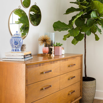
 Kimberlee Marie Interiors
This one is near and dear to my heart. Not only is it in my own backyard, it is also the first remodel project I've gotten to do for myself! This space was previously a detached two car garage in our backyard. Seeing it transform from such a utilitarian, dingy garage to a bright and cheery little retreat was so much fun and so rewarding! This space was slated to be an AirBNB from the start and I knew I wanted to design it for the adventure seeker, the savvy traveler, and those who appreciate all the little design details . My goal was to make a warm and inviting space that our guests would look forward to coming back to after a full day of exploring the city or gorgeous mountains and trails that define the Pacific Northwest. I also wanted to make a few bold choices, like the hunter green kitchen cabinets or patterned tile, because while a lot of people might be too timid to make those choice for their own home, who doesn't love trying it on for a few days?At the end of the day I am so happy with how it all turned out!
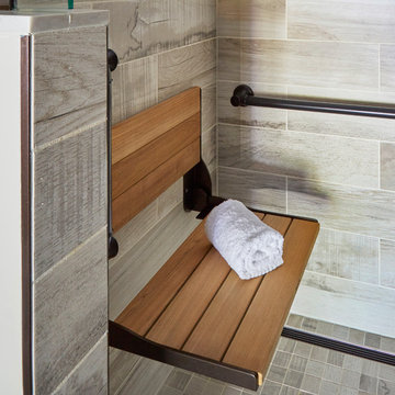 TKS Design Group
This project was completed for clients who wanted a comfortable, accessible 1ST floor bathroom for their grown daughter to use during visits to their home as well as a nicely-appointed space for any guest. Their daughter has some accessibility challenges so the bathroom was also designed with that in mind.
The original space worked fairly well in some ways, but we were able to tweak a few features to make the space even easier to maneuver through. We started by making the entry to the shower flush so that there is no curb to step over. In addition, although there was an existing oversized seat in the shower, it was way too deep and not comfortable to sit on and just wasted space. We made the shower a little smaller and then provided a fold down teak seat that is slip resistant, warm and comfortable to sit on and can flip down only when needed. Thus we were able to create some additional storage by way of open shelving to the left of the shower area. The open shelving matches the wood vanity and allows a spot for the homeowners to display heirlooms as well as practical storage for things like towels and other bath necessities.
We carefully measured all the existing heights and locations of countertops, toilet seat, and grab bars to make sure that we did not undo the things that were already working well. We added some additional hidden grab bars or “grabcessories” at the toilet paper holder and shower shelf for an extra layer of assurance. Large format, slip-resistant floor tile was added eliminating as many grout lines as possible making the surface less prone to tripping. We used a wood look tile as an accent on the walls, and open storage in the vanity allowing for easy access for clean towels. Bronze fixtures and frameless glass shower doors add an elegant yet homey feel that was important for the homeowner. A pivot mirror allows adjustability for different users.
If you are interested in designing a bathroom featuring “Living In Place” or accessibility features, give us a call to find out more. Susan Klimala, CKBD, is a Certified Aging In Place Specialist (CAPS) and particularly enjoys helping her clients with unique needs in the context of beautifully designed spaces.
Designed by: Susan Klimala, CKD, CBD
Photography by: Michael Alan Kaskel
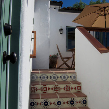
 Santa Barbara Home Design
Design Consultant Jeff Doubét is the author of Creating Spanish Style Homes: Before & After – Techniques – Designs – Insights. The 240 page “Design Consultation in a Book” is now available. Please visit SantaBarbaraHomeDesigner.com for more info.
Jeff Doubét specializes in Santa Barbara style home and landscape designs. To learn more info about the variety of custom design services I offer, please visit SantaBarbaraHomeDesigner.com
Jeff Doubét is the Founder of Santa Barbara Home Design - a design studio based in Santa Barbara, California USA.
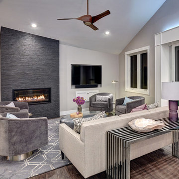
 Nar Design Group
This home remodel is a celebration of curves and light. Starting from humble beginnings as a basic builder ranch style house, the design challenge was maximizing natural light throughout and providing the unique contemporary style the client’s craved.
The Entry offers a spectacular first impression and sets the tone with a large skylight and an illuminated curved wall covered in a wavy pattern Porcelanosa tile.
The chic entertaining kitchen was designed to celebrate a public lifestyle and plenty of entertaining. Celebrating height with a robust amount of interior architectural details, this dynamic kitchen still gives one that cozy feeling of home sweet home. The large “L” shaped island accommodates 7 for seating. Large pendants over the kitchen table and sink provide additional task lighting and whimsy. The Dekton “puzzle” countertop connection was designed to aid the transition between the two color countertops and is one of the homeowner’s favorite details. The built-in bistro table provides additional seating and flows easily into the Living Room.
A curved wall in the Living Room showcases a contemporary linear fireplace and tv which is tucked away in a niche. Placing the fireplace and furniture arrangement at an angle allowed for more natural walkway areas that communicated with the exterior doors and the kitchen working areas.
The dining room’s open plan is perfect for small groups and expands easily for larger events. Raising the ceiling created visual interest and bringing the pop of teal from the Kitchen cabinets ties the space together. A built-in buffet provides ample storage and display.
The Sitting Room (also called the Piano room for its previous life as such) is adjacent to the Kitchen and allows for easy conversation between chef and guests. It captures the homeowner’s chic sense of style and joie de vivre.
 Craftsman Design and Renovation
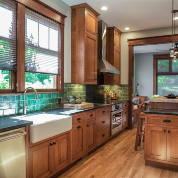
 This craftsman home needed a kitchen update that maximized the storage potential of this home while maintaining the historic character of the era. We installed new DeWils custom cabinetry that extends all the way to the ceiling as well as creating new mudroom storage and built in seating. We installed beautiful soapstone countertops with an undermount farmhouse sink. The show stopper of the kitchen though is the green glazed terracotta backsplash tile. Unique but in line with the craftsman aesthetic.
Photo: Pete Eckert

 Valentini Kids Furniture Brooklyn NY
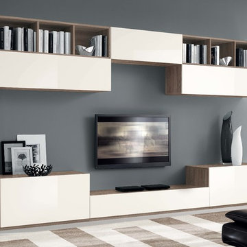
Modern Italian Wall Unit VV 3930
Made in Italy
Perfect for both modern and contemporary styled interiors, this modular wall unit line offers lots of customization options so everyone could adjust the composition according to the individual's size and color requirements, creating an entertainment center of the dream. The wall unit line features lots of different units, that are available in several sizes and can wall mounted both vertically and horizontally. All the units from this entertainment center furniture collection are available in walnut, white ash, ivory ash and mink ash wood structure finishes as well as white and mud high gloss lacquers. The structure and the front doors of the same unit can be ordered in different finishes/lacquers to add unique and elegant contrast look to the wall unit design.
Features:
E1-Class ecological panels, which are produced exclusively through a wood recycling production process
The structure and the front in wood finishes are made of chipboard
The lacquered structures and fronts are made of REAL POLISH SCRATCH PROOF LACQUERING, which is non toxic and non allergic products
All the panels are 0.7" thick
Drawers mounted on metal runners with MDF bottom panel, height adjustable and soft-close system
Metal snap-on hinges with adjustable height
The starting price is for the VV Wall Unit Composition 3930 as shown in the main picture in Walnut / White Lacquered finishes. (Consists of: Two Base Drawer Cabinets H17.7" x W35.4" each, Base Drawer Cabinet H10.2" x W59", Two Horizontal Hanging Units W47.2" each, Horizontal Hanging Unit W35.4", Two Horizontal Hanging Bookcases W47.2" each).
Dimensions:
Wall Unit: W130" x D18.3" x H74.8"
Individual Components:
Base Drawer Cabinet: W59" x D18.3" x H10.2"
Base Drawer Cabinet: W35.4" x D18.3" x H17.7"
Horizontal Hanging Bookcase: W47.2" x D13" x H13.4"
Horizontal Hanging Unit: W47.2" x D13.8" x H13.4"
Horizontal Hanging Unit: W35.4" x D13.8" x H13.4"
 TOC design & construction inc.
DESIGNED BY TOC design
CONSTRUCTION BY TOC design & Construction inc.
PHOTOS BY : Tania Scardellato
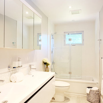
I was fortunate to have a young family approach me in desperate need to renovate there only 3 piece bathroom. This space was In dire need of a remodel, with old brown wall to wall tiles and a dated bulky yellow brown single sink vanity.
Storage was a must, lighting a necessity, and proper accessibility to the shower bath area.
We had a tight budget to respect, but a full gut of this bathroom was required. And a good thing too, once we started doing the demolition we noticed that mildew and rotting floors and walls had accumulated throughout the years. Doing it right the first time is no joke when dealing with water and electrical issues.
We discarded all reminisce of old and built from scratch, new walls, new plumbing, new electrical ,new insulation and a new window, a new fan that actually exhausted outside ( I say this laughing as you would be amazed at how many fans are installed but don’t exhaust outside, and you the client would never know unless you go inside the attic space.
Once all the hard stuff was done, the rest is just a matter of smart design. If you have a small bathroom here are some tips to guide you.
10 tips for making a small bathroom feel larger
Is your tiny bathroom cramping your functionality and style, leaving you longing for the enormous bathrooms gracing the pages of design magazines? Even if your bathroom is a fraction of the size, all it takes is some design savvy to make the most of the space you have. Consider these 10 smart tips that will help your bathroom look, feel and function like those larger contenders.
1-Get creative with corners
Space is at a premium in small bathrooms, so it's important to maximize every inch. Corners, for example, provide extra space for shelving, storage units and even hooks. Get creative and install unique design solutions that are not only functional, but also eye-catching. If you love the airiness of floating cabinets, add baskets or decorative boxes under for extra storage. If you are installing floating cabinets insure that they are installed securely to studs or plywood at wall.
2- Let solid colors shine
Busy patterns have a shrinking effect and make small bathrooms seem even smaller. Conversely, light natural hues make a space feel more open. If you're itching to get creative with design, experiment with textures but keep overpowering patterns to a minimum. Tone on tone is the best to achieve this.
3 - Maximize your bathtub
A bathtub takes up a significant portion of the room, but modern, compact options with curved basins, can make the tub feel larger when in use, all while conserving space.
4 - Select a smaller faucet
A faucet is jewelry for the bathroom. And just as accessories can overpower an outfit, a big bulky faucet isn't flattering in a small bath. Single-handle designs conserve counter space, while a wall-mount installation frees it up all together and can create quite the wow-factor, if the budget can accommodate the required changes to plumbing behind the wall.
5 - Make vanity storage simple
If you're in a storage war with your small bathroom, you're not alone in the battle. Toiletries and personal supplies without a place to call home only add clutter and chaos. Store smart with a space-saving vanity, the dual sink vanity shown here, looks quite simple, but in reality it has 4 sets of full extension drawers, and the vanity tower adds extra storage without overpowering the use of space.
6 - Show off the shower
Shower curtains may be pretty, but they interrupt the visual flow of a bathing space and make it feel significantly smaller. In bathrooms with small footprints, opt for a clear glass sliding shower door that doesn't require the clearance of one with a hinged design. Or as shown in this design and for fraction less expensive a half hinged panel installed on a fixed tempered glass panel. If you're embarking on a big remodel, create the illusion of more space by using same tile in the shower that's used throughout; instead of seeing them as two separate zones, the eye will read them as one.
7 - Discover the treasure of hidden storage
Work with a contractor, and you just might find some serious storage potential hidden behind your walls. Whether it's utilizing space between the studs for shallow shelving or a creating a small linen closet by annexing space from an adjacent room, even small additions can make a big difference.
8 - Focal Point
Tile is a beautiful, durable addition to any bathroom. For dainty spaces, consider installing tile at a diagonal to accentuate the focal point or as in this bathroom I used an oversized textured pattern to bring depth to the space at the window wall.
9 - Choose the right lights
Strategically install light to reflect and brighten a small bathroom to make it appear larger. Recessed lighting is an affordable solution for tiny rooms, offering ample light while taking up little space. Wall sconces alongside a mirror also reflect off the walls and make a room feel bright and airy. I always recommend going with LED lighting at 2800 to 3000K.
10 – Accessorize
This is your time to shine in your decorating skills, have fun with your towels, you can change the color scheme daily just by adding pops of color in your accessories, make sure to get items that serve a dual purpose, like baskets, boxes they can always be used as hampers, storing of towels and even a nice display for your guest.
 Cummings Architecture + Interiors
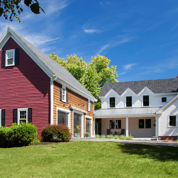
When Cummings Architects first met with the owners of this understated country farmhouse, the building’s layout and design was an incoherent jumble. The original bones of the building were almost unrecognizable. All of the original windows, doors, flooring, and trims – even the country kitchen – had been removed. Mathew and his team began a thorough design discovery process to find the design solution that would enable them to breathe life back into the old farmhouse in a way that acknowledged the building’s venerable history while also providing for a modern living by a growing family.
The redesign included the addition of a new eat-in kitchen, bedrooms, bathrooms, wrap around porch, and stone fireplaces. To begin the transforming restoration, the team designed a generous, twenty-four square foot kitchen addition with custom, farmers-style cabinetry and timber framing. The team walked the homeowners through each detail the cabinetry layout, materials, and finishes. Salvaged materials were used and authentic craftsmanship lent a sense of place and history to the fabric of the space.
The new master suite included a cathedral ceiling showcasing beautifully worn salvaged timbers. The team continued with the farm theme, using sliding barn doors to separate the custom-designed master bath and closet. The new second-floor hallway features a bold, red floor while new transoms in each bedroom let in plenty of light. A summer stair, detailed and crafted with authentic details, was added for additional access and charm.
Finally, a welcoming farmer’s porch wraps around the side entry, connecting to the rear yard via a gracefully engineered grade. This large outdoor space provides seating for large groups of people to visit and dine next to the beautiful outdoor landscape and the new exterior stone fireplace.
Though it had temporarily lost its identity, with the help of the team at Cummings Architects, this lovely farmhouse has regained not only its former charm but also a new life through beautifully integrated modern features designed for today’s family.
Photo by Eric Roth
 House of L
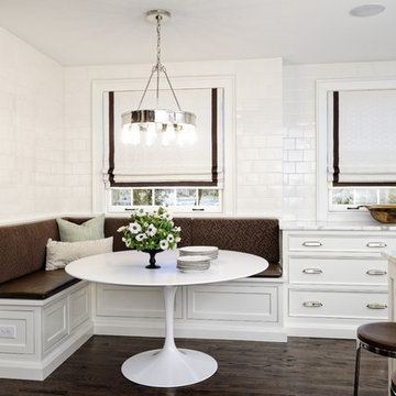
A 1927 colonial home in Shaker Heights, Ohio, received a breathtaking renovation that required extensive work, transforming it from a tucked away, utilitarian space, to an all-purpose gathering room, a role that most kitchens embrace in a home today. The scope of work changed over the course of the project, starting more minimalistically and then quickly becoming the main focus of the house's remodeling, resulting in a staircase being relocated and walls being torn down to create an inviting focal point to the home where family and friends could connect. The focus of the functionality was to allow for multiple prep areas with the inclusion of two islands and sinks, two eating areas (one for impromptu snacking and small meals of younger family members and friends on island no. two and a built-in bench seat for everyday meals in the immediate family). The kitchen was equipped with all Subzero and Wolf appliances, including a 48" range top with a 12" griddle, two double ovens, a 42" built-in side by side refrigerator and freezer, a microwave drawer on island no. one and a beverage center and icemaker in island no. two. The aesthetic feeling embraces the architectural feel of the home while adding a modern sensibility with the revamped layout and graphic elements that tie the color palette of whites, chocolate and charcoal. The cabinets were custom made and outfitted with beaded inset doors with a Shaker panel frame and finished in Benjamin Moore's OC-17 White Dove, a soft white that allowed for the kitchen to feel warm while still maintaining its brightness. Accents of walnut were added to create a sense of warmth, including a custom premium grade walnut countertop on island no. one from Brooks Custom and a TV cabinet with a doggie feeding station beneath. Bringing the cabinet line to the 8'6" ceiling height helps the room feel taller and bold light fixtures at the islands and eating area add detail to an otherwise simpler ceiling detail. The 1 1/4" countertops feature Calacatta Gold Marble with an ogee edge detail. Special touches on the interiors include secret storage panels, an appliance garage, breadbox, pull-out drawers behind the cabinet doors and all soft-close hinges and drawer glides. A kneading area was made as a part of island no. one for the homeowners' love of baking, complete with a stone top allowing for dough to stay cool. Baskets beneath store kitchen essentials that need air circulation. The room adjacent to the kitchen was converted to a hearth room (from a formal dining room) to extend the kitchen's living space and allow for a natural spillover for family and guests to spill into.
Jason Miller, Pixelate
 Nathan Taylor for Obelisk Home
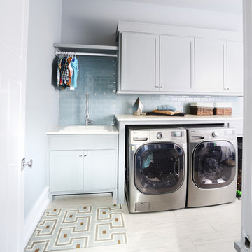
Preliminary architecture renderings were given to Obelisk Home with a challenge. The homeowners needed us to create an unusual but family friendly home, but also a home-based business functioning environment. Working with the architect, modifications were made to incorporate the desired functions for the family. Starting with the exterior, including landscape design, stone, brick and window selections a one-of-a-kind home was created. Every detail of the interior was created with the homeowner and the Obelisk Home design team.
Furnishings, art, accessories, and lighting were provided through Obelisk Home. We were challenged to incorporate existing furniture. So the team repurposed, re-finished and worked these items into the new plan. Custom paint colors and upholstery were purposely blended to add cohesion. Custom light fixtures were designed and manufactured for the main living areas giving the entire home a unique and personal feel.
Photos by Jeremy Mason McGraw

 Designing Interiors Inc
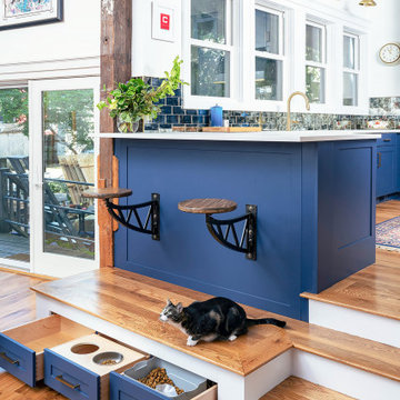
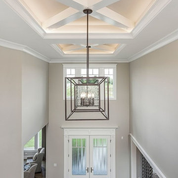
Mid-sized transitional dark wood floor and brown floor entryway photo in Chicago with beige walls and a white front door
69