
Search results for "Station hanging" in Home Design Ideas

 Everingham Design
Example of a mid-sized trendy single-wall medium tone wood floor and brown floor eat-in kitchen design in Columbus with an undermount sink, recessed-panel cabinets, blue cabinets, quartz countertops, multicolored backsplash, glass tile backsplash, stainless steel appliances and white countertops

 Susan Brook Interiors
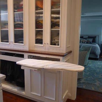
This walk through Master Dressing room has multiple storage areas, from pull down rods for higher hanging clothes, organized sock storage, double laundry hampers and swing out ironing board. The large mirrored door swings open to reveal costume jewelry storage. This was part of a very large remodel, the dressing room connects to the project Master Bathroom floating wall and Master with Sitting Room.
Find the right local pro for your project

 FRAME design co.
Open shelving and graphic tile give a modern look to a farmhouse-style kitchen. AGA appliances, cabinet hardware from Anthropologie. Backsplash tile is Pratt & Larson.
Photo by David Agnello

 Brandon Architects, Inc.
Beach style u-shaped multicolored floor dedicated laundry room photo in Orange County with shaker cabinets, white cabinets, white walls, a side-by-side washer/dryer and gray countertops

 Amy Krause Design, LLC.
Making every corner perform with storage galore. Drawers, charging station, laundry shelves and baskets, huge workspace, hanging and folding station, and laundry hampers.

 Design Loft Cabinets
Bathroom - traditional master white floor bathroom idea in Charlotte with recessed-panel cabinets, white cabinets, gray walls and gray countertops


 TKS Design Group
Download our free ebook, Creating the Ideal Kitchen. DOWNLOAD NOW
For many, extra time at home during COVID left them wanting more from their homes. Whether you realized the shortcomings of your space or simply wanted to combat boredom, a well-designed and functional home was no longer a want, it became a need. Tina found herself wanting more from her Old Irving Park home and reached out to The Kitchen Studio about adding function to her kitchen to make the most of the available real estate.
At the end of the day, there is nothing better than returning home to a bright and happy space you love. And this kitchen wasn’t that for Tina. Dark and dated, with a palette from the past and features that didn’t make the most of the available square footage, this remodel required vision and a fresh approach to the space. Lead designer, Stephanie Cole’s main design goal was better flow, while adding greater functionality with organized storage, accessible open shelving, and an overall sense of cohesion with the adjoining family room.
The original kitchen featured a large pizza oven, which was rarely used, yet its footprint limited storage space. The nearby pantry had become a catch-all, lacking the organization needed in the home. The initial plan was to keep the pizza oven, but eventually Tina realized she preferred the design possibilities that came from removing this cumbersome feature, with the goal of adding function throughout the upgraded and elevated space. Eliminating the pantry added square footage and length to the kitchen for greater function and more storage. This redesigned space reflects how she lives and uses her home, as well as her love for entertaining.
The kitchen features a classic, clean, and timeless palette. White cabinetry, with brass and bronze finishes, contrasts with rich wood flooring, and lets the large, deep blue island in Woodland’s custom color Harbor – a neutral, yet statement color – draw your eye.
The kitchen was the main priority. In addition to updating and elevating this space, Tina wanted to maximize what her home had to offer. From moving the location of the patio door and eliminating a window to removing an existing closet in the mudroom and the cluttered pantry, the kitchen footprint grew. Once the floorplan was set, it was time to bring cohesion to her home, creating connection between the kitchen and surrounding spaces.
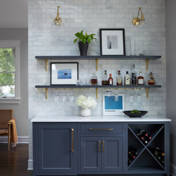
The color palette carries into the mudroom, where we added beautiful new cabinetry, practical bench seating, and accessible hooks, perfect for guests and everyday living. The nearby bar continues the aesthetic, with stunning Carrara marble subway tile, hints of brass and bronze, and a design that further captures the vibe of the kitchen.
Every home has its unique design challenges. But with a fresh perspective and a bit of creativity, there is always a way to give the client exactly what they want [and need]. In this particular kitchen, the existing soffits and high slanted ceilings added a layer of complexity to the lighting layout and upper perimeter cabinets.
While a space needs to look good, it also needs to function well. This meant making the most of the height of the room and accounting for the varied ceiling features, while also giving Tina everything she wanted and more. Pendants and task lighting paired with an abundance of natural light amplify the bright aesthetic. The cabinetry layout and design compliments the soffits with subtle profile details that bring everything together. The tile selections add visual interest, drawing the eye to the focal area above the range. Glass-doored cabinets further customize the space and give the illusion of even more height within the room.
While her family may be grown and out of the house, Tina was focused on adding function without sacrificing a stunning aesthetic and dreamy finishes that make the kitchen the gathering place of any home. It was time to love her kitchen again, and if you’re wondering what she loves most, it’s the niche with glass door cabinetry and open shelving for display paired with the marble mosaic backsplash over the range and complimenting hood. Each of these features is a stunning point of interest within the kitchen – both brag-worthy additions to a perimeter layout that previously felt limited and lacking.
Whether your remodel is the result of special needs in your home or simply the excitement of focusing your energy on creating a fun new aesthetic, we are here for it. We love a good challenge because there is always a way to make a space better – adding function and beauty simultaneously.

 Ernesto Santalla PLLC
Custom floating desks inspired by midcentury classics provide ample workspace for two. Warm colors and terrazzo floors complete this serene basement home office.
Photos by Geoffrey Hodgdon

 accents + interiors
Doing laundry is less of a chore when you have a beautiful, dedicated space to do it in. This laundry room situated right off the mud room with easy access from the master suite. High ceilings and light finishes keep it bright and fresh. Shaker-style cabinets provide plenty of storage and the maple counter makes for the perfect folding station.
Photo: Kerry Bern www.prepiowa.com

 White Oak Construction LLC
Inspiration for a large coastal dark wood floor hallway remodel in Atlanta with white walls

 Jim Bulejski Architects
Laundary niche
Inspiration for a small timeless laundry room remodel in St Louis
Inspiration for a small timeless laundry room remodel in St Louis
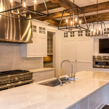

 Habitations Residential Design Group
Large arts and crafts u-shaped utility room photo in Salt Lake City with an undermount sink, shaker cabinets, white cabinets, granite countertops, beige walls and a side-by-side washer/dryer
 Ridgecrest Designs
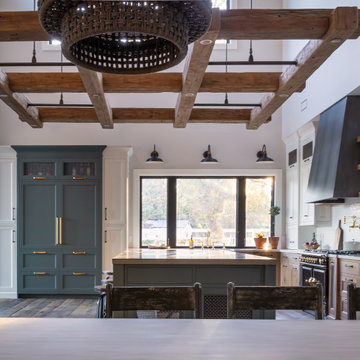
Kitchen featuring white oak lower cabinetry, white painted upper cabinetry with blue accent cabinetry, including the island. Custom steel hood fabricated in-house by Ridgecrest Designs. Custom wood beam light fixture fabricated in-house by Ridgecrest Designs. Steel mesh cabinet panels, brass and bronze hardware, La Cornue French range, concrete island countertop and engineered quartz perimeter countertop. The 10' AG Millworks doors open out onto the California Room.

 BCI Custom Homes
Mid-sized elegant backyard concrete patio kitchen photo in Austin with a roof extension
 TKS Design Group
Free ebook, Creating the Ideal Kitchen. DOWNLOAD NOW
The Klimala’s and their three kids are no strangers to moving, this being their fifth house in the same town over the 20-year period they have lived there. “It must be the 7-year itch, because every seven years, we seem to find ourselves antsy for a new project or a new environment. I think part of it is being a designer, I see my own taste evolve and I want my environment to reflect that. Having easy access to wonderful tradesmen and a knowledge of the process makes it that much easier”.
This time, Klimala’s fell in love with a somewhat unlikely candidate. The 1950’s ranch turned cape cod was a bit of a mutt, but it’s location 5 minutes from their design studio and backing up to the high school where their kids can roll out of bed and walk to school, coupled with the charm of its location on a private road and lush landscaping made it an appealing choice for them.
“The bones of the house were really charming. It was typical 1,500 square foot ranch that at some point someone added a second floor to. Its sloped roofline and dormered bedrooms gave it some charm.” With the help of architect Maureen McHugh, Klimala’s gutted and reworked the layout to make the house work for them. An open concept kitchen and dining room allows for more frequent casual family dinners and dinner parties that linger. A dingy 3-season room off the back of the original house was insulated, given a vaulted ceiling with skylights and now opens up to the kitchen. This room now houses an 8’ raw edge white oak dining table and functions as an informal dining room. “One of the challenges with these mid-century homes is the 8’ ceilings. I had to have at least one room that had a higher ceiling so that’s how we did it” states Klimala.
The kitchen features a 10’ island which houses a 5’0” Galley Sink. The Galley features two faucets, and double tiered rail system to which accessories such as cutting boards and stainless steel bowls can be added for ease of cooking. Across from the large sink is an induction cooktop. “My two teen daughters and I enjoy cooking, and the Galley and induction cooktop make it so easy.” A wall of tall cabinets features a full size refrigerator, freezer, double oven and built in coffeemaker. The area on the opposite end of the kitchen features a pantry with mirrored glass doors and a beverage center below.
The rest of the first floor features an entry way, a living room with views to the front yard’s lush landscaping, a family room where the family hangs out to watch TV, a back entry from the garage with a laundry room and mudroom area, one of the home’s four bedrooms and a full bath. There is a double sided fireplace between the family room and living room. The home features pops of color from the living room’s peach grass cloth to purple painted wall in the family room. “I’m definitely a traditionalist at heart but because of the home’s Midcentury roots, I wanted to incorporate some of those elements into the furniture, lighting and accessories which also ended up being really fun. We are not formal people so I wanted a house that my kids would enjoy, have their friends over and feel comfortable.”
The second floor houses the master bedroom suite, two of the kids’ bedrooms and a back room nicknamed “the library” because it has turned into a quiet get away area where the girls can study or take a break from the rest of the family. The area was originally unfinished attic, and because the home was short on closet space, this Jack and Jill area off the girls’ bedrooms houses two large walk-in closets and a small sitting area with a makeup vanity. “The girls really wanted to keep the exposed brick of the fireplace that runs up the through the space, so that’s what we did, and I think they feel like they are in their own little loft space in the city when they are up there” says Klimala.
Designed by: Susan Klimala, CKD, CBD
Photography by: Carlos Vergara
For more information on kitchen and bath design ideas go to: www.kitchenstudio-ge.com

 Leonard Unander Associates, Inc.
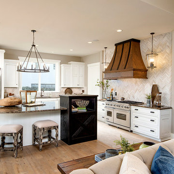
Example of a trendy l-shaped kitchen design in Santa Barbara with flat-panel cabinets, dark wood cabinets, stainless steel appliances and an island


 Studio Dearborn
INTERNATIONAL AWARD WINNER. 2018 NKBA Design Competition Best Overall Kitchen. 2018 TIDA International USA Kitchen of the Year. 2018 Best Traditional Kitchen - Westchester Home Magazine design awards. The designer's own kitchen was gutted and renovated in 2017, with a focus on classic materials and thoughtful storage. The 1920s craftsman home has been in the family since 1940, and every effort was made to keep finishes and details true to the original construction. For sources, please see the website at www.studiodearborn.com. Photography, Adam Kane Macchia
61