
Search results for "Straightforward" in Home Design Ideas
 Anderson & Rodgers Construction
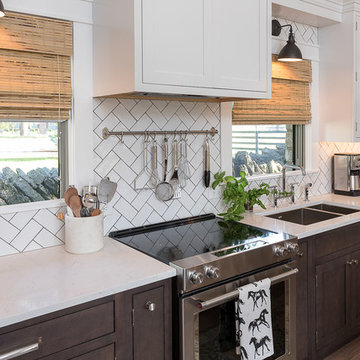
Open concept kitchen - mid-sized country single-wall light wood floor and brown floor open concept kitchen idea with an undermount sink, beaded inset cabinets, white cabinets, quartz countertops, white backsplash, subway tile backsplash, stainless steel appliances and an island
 Adams + Beasley Associates
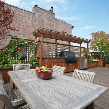
This Beacon Hill brownstone started with a new rubber roof, bare and sprawling, the ideal spot for a great family gathering place. After thoughtful consideration, a master plan was developed to provide all the amenities an urban outdoor space could offer; comfortable seating, customized storage, mature plantings, a fully functioning outdoor kitchen, comprehensive irrigation, discrete lighting, natural materials and open space for larger groups.
As this project was completed in the context of a comprehensive renovation of the building, we were easily afforded access below the deck to augment the structure and accommodate the added weight of the roof deck elements. A new staircase and generous hatch were added from the top floor inside to home to provide easy and convenient use of the deck. Similarly, bringing gas to the large grill, and hot and cold water to the sink, ice-maker and irrigation system were relatively straightforward.
Through the careful use of natural materials and the well designed layout, the space feels like an extension of the inside living space and welcomes its visitors to sounds of music coming from the Hatch Shell steps away and views unique to the character and history of Boston.
Photographer: Eric Roth
 JLC Architecture
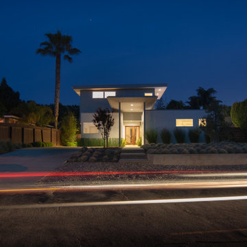
The desire for a modern, energy efficient home on a modest budget necessitated a tight plan and simple, durable materials. The uncomplicated program consists of an open plan living space, master suite and home office, all with ample connection to the outdoors. Straightforward construction techniques yield light-filled volumes that take advantage of passive heating and natural ventilation. Coming in at a modest 1,700 square feet of living space with a 200 square foot detached garage, this dwelling delivers all the comforts of home in a compact package.
Find the right local pro for your project
 Pulse Design
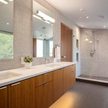
Clean, streamlined and straightforward, this soothingly neutral bathroom is a welcome retreat. The textured warm taupe tile lines the oversized shower and blends with the soothing slatted wood look tile without the worry of water damage. Textures are a principal aspect of design, grounding the space with pattern and texture.
 MODANI
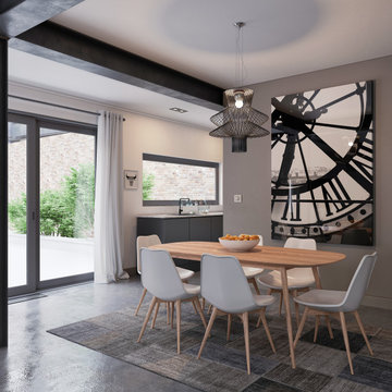
Boldly Nordic, the Skandinavia Dining Table embodies that classic, straightforward aesthetic that is taking over the design world. With four ash wood legs and a wood MDF top coated in ash wood veneer, this dining table will soon become the most beloved part of your day-to-day life.
 NITZAN DESIGN
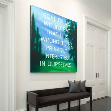
Custom bench in dark stained walnut, upholstered in
a silk velvet.
(Art - ED RUSCHA)
Inspiration for a modern hallway remodel in New York
Inspiration for a modern hallway remodel in New York
 Get My Rugs LLC
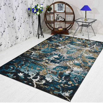
This exquisite shift pattern machine woven area rug in cream, beige and blue color is bound to bring a elegant look to your area. This area rug out there in numerous sizes options top quality material that makes it terribly durable in high traffic areas. This floor covering is extremely straightforward to wash and maintain. Get this machine created vogue in numerous sizes.
 Miller Haus Cabinetry
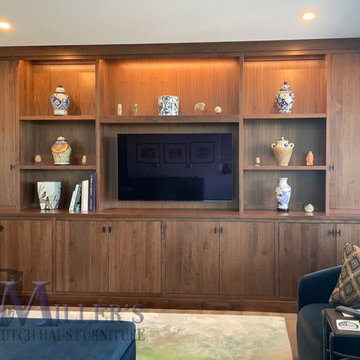
A custom modern wall unit design with mid-century flair. Slab doors and straight crown molding keep details minimalistic and straightforward. Available in custom sizes and configurations. Built from solid walnut hardwood. Amish made in the USA.
 Virginia Ironworks
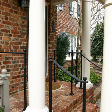
The lovely Downing railing features a straightforward, traditional-styled design. This steel railing has a 2” x 3/8” flat-bar top rail with beveled edges.
 Marilyn Hill Interiors
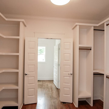
Mid-sized beach style gender-neutral medium tone wood floor walk-in closet photo in Nashville with open cabinets and white cabinets
 JLC Architecture
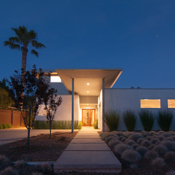
The desire for a modern, energy efficient home on a modest budget necessitated a tight plan and simple, durable materials. The uncomplicated program consists of an open plan living space, master suite and home office, all with ample connection to the outdoors. Straightforward construction techniques yield light-filled volumes that take advantage of passive heating and natural ventilation. Coming in at a modest 1,700 square feet of living space with a 200 square foot detached garage, this dwelling delivers all the comforts of home in a compact package.
 Art & Smart Inc
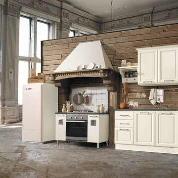
Tuscany presents a series of furnishings
and concepts that offer a fresh, contemporary answer to the longing
for a harmonious, inviting, practical
kitchen, offering all the comforts that
make a house truly feel like home. A
kitchen imbued with a sense of straightforward authenticity – of a deep
love for the simplest, most important
things in life – it’s been designed to
create the ideal conditions for cooking,
so that mouthwatering aromas will waft through your house as you share special moments with those nearest and dearest.
 Tierney Conner Architecture
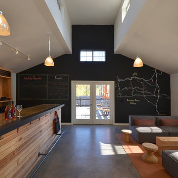
This Sonoma County tasting room facelift uses inexpensive, “off-the-shelf” materials and straightforward design to reflect the Taft Street brand of “quality, everyday wine at a good value”. Having started in a garage, the owners wanted humble and approachable materials – so the space relies on plywood and rough framing lumber as finish materials. Concrete floors continue the industrial feel of the nearby production areas, while chalk-board black walls, gray and orange wool furnishings and cork stools make the space inviting and fun.
Architecture by Tierney Conner Design Studio
 Virginia Ironworks
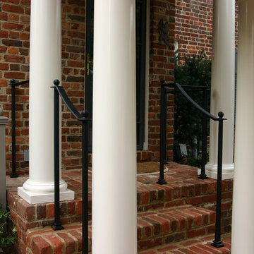
The lovely Downing railing features a straightforward, traditional-styled design. This steel railing has a 2” x 3/8” flat-bar top rail with beveled edges.
 California Closets HQ
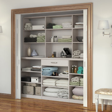
This straightforward storage configuration provides organization for sheets, blankets, and other necessities.
• Tesoro Linen finish provides a soft, neutral backdrop.
• Linen slab drawer front contributes to the sleek, minimal look.
• Floor-based system with toe-kick offers accessibility.
• Adjustable shelving creates flexibility for changing needs.
• Cubbies create space for towels.
• Natural aluminum decorative handles add polish.
• Deep lower shelves provide storage for bulky items.
 Tierney Conner Architecture
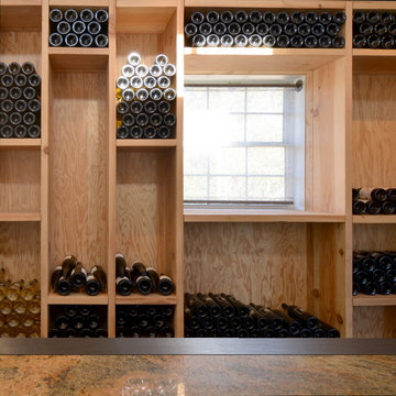
This Sonoma County tasting room facelift uses inexpensive, “off-the-shelf” materials and straightforward design to reflect the Taft Street brand of “quality, everyday wine at a good value”. Having started in a garage, the owners wanted humble and approachable materials – so the space relies on plywood and rough framing lumber as finish materials. Concrete floors continue the industrial feel of the nearby production areas, while chalk-board black walls, gray and orange wool furnishings and cork stools make the space inviting and fun.
Architecture by Tierney Conner Design Studio
 California Closets NY
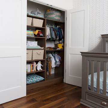
Blending hanging space with adjustable shelves, this closet suits a newborn's needs with room to grow.
Lago® Roman Walnut finish provides rich contrast to the room's light color palette.
Oil-rubbed bronze round closet poles provide space for hanging clothing.
Floor-based system offers a built-in look.
Adjustable shelves enable adaptability.
Minimalist design offers elegant yet straightforward storage and organization.
 Duncan McRoberts Associates, LLC
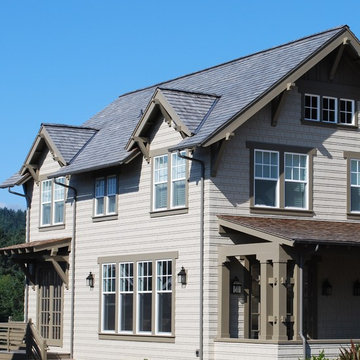
Belhaven is a new "walkable" village of charming beach houses located on the Oregon Coast. Its architecture is a simple, straightforward vernacular...using traditional elements and proportions to inspire beauty and compliment the natural habitat...photography by Duncan McRoberts.
 Ohio Home Improvement
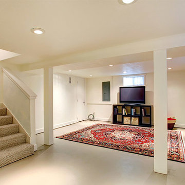
Example of a large classic walk-out vinyl floor basement design in Cleveland with white walls
 HAUS | Architecture For Modern Lifestyles
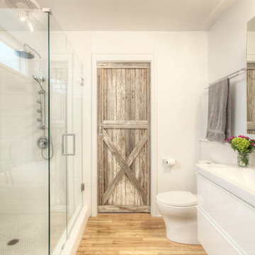
Open-concept Master Bathroom opens to Bedroom and Master Closet beyond via sliding barn door - Interior Architecture: HAUS | Architecture + BRUSFO - Construction Management: WERK | Build - Photo: HAUS | Architecture
18