
Search results for "Straightforward" in Home Design Ideas
 The Design Firm
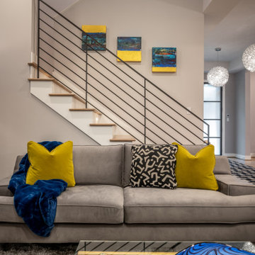
This modern living room has enduring style in mind. Low-profile furniture with a retro, mid-century vibe sets the inviting tone. The classic pieces are both comfy and straightforward, both hallmarks of modern style. Above it all is a statement light fixture, which puts a contemporary spin on the quintessential chandelier.
 Cliff Young Ltd.
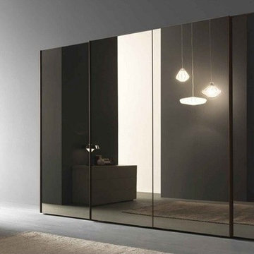
A straightforward wardrobe that maximizes closet space and makes a room appear larger, the Reflective Sliding Door Wardrobe is a beautifully simple solution to clothing storage needs.
This sliding door wardrobe is framed in matte lacquer with an incorporated handle. Its sliding panels are available in matte lacquer, gloss or matte lacquered glass, mirror, or clear glass.
 Rejuvenation
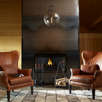
Small details make a big statement with our Yeon Pendant. Inspired by a 1930s design crafted from an antique Japanese fishing buoy, it combines clean lines with handblown glass to add a subtle glow from above. Like the original, designed by influential architect John Yeon for the legendary Watzek House in Portland, Oregon, our Yeon Pendant offers a trident hanging system and exposed fasteners for a detailed yet straightforward statement lighting look ideal in entryways, kitchens, dining rooms, and living spaces. a trident hanging system and exposed fasteners for a detailed yet straightforward statement lighting look ideal in entryways, kitchens, dining rooms, and living spaces.
Find the right local pro for your project
 MHB
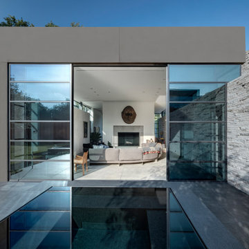
MHBThe design of this exquisite villa uses powerful straight lines giving it a straightforward look. The enormous steel sliding doors provide an immense amount of light and the large patio doors bring daylight throughout the villa. Sober shapes, but enormously rich due to the dimensions and used materials. The luxurious look is emphasized in the evening by the reflection of the windows in outside pool. The stylishly decorated interior with high-quality artifacts makes it a beautiful luxurious whole.
 Duncan McRoberts Associates, LLC
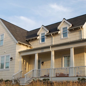
Belhaven is a new "walkable" village of charming beach houses located on the Oregon Coast. Its architecture is a simple, straightforward vernacular...using traditional elements and proportions to inspire beauty and compliment the natural habitat...Photography by Duncan McRoberts.
 Donald Lococo Architects
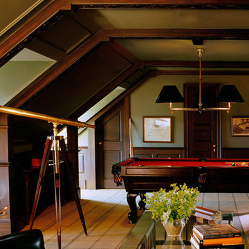
Situated in Kenwood, Maryland just outside of Washington, D.C., this whole-house renovation reinterprets a 1950s split-level into a rustic French country house. Published 3 times, The French country house plans for this renovation inform and guide the remodel. Short double-hung existing windows of various sizes on a 1950s brick front wall (see below) were replaced by straightforward openings along the front facade. By replacing them with a series of similar openings, the end result is a principled, simple elegance inspired by French country style homes. The rustic application of field stone arches and rough stucco are both inviting and enchanting, echoing French country interior design.
Elements of French country home decor complement the home. The traditional French country home design has been widely published, including features in Renovation Style and Maryland Life magazines, among others. One singular continuous walkway runs the entire length of the main front under each of the French doors, and a courtyard created by stucco walls and stone piers create an inner sanctum in the front yard. In the back of the property, added French gates lead to a newly constructed pavilion.
 Greystone Kitchens
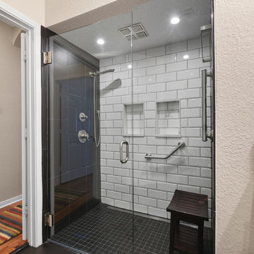
This modern, one of a kind bathroom makes the best of the space small available. The shower itself features the top of the line Delta Trinsic 17 Series hand held shower and the Kohler Watertile flush mounted Rainhead as well as two niche shelves and a grab bar. The shower is set with a zero-entry, flush transition from the main bath and sports a bar drain to avoid under foot pooling with full height glass doors. Outside of the shower, the main attraction is the ultra-modern wall mounted Kohler commode with touchscreen controls and hidden tank. All of the details perfectly fit in this high-contrast but low-stress washroom, it truly is a dream of a small bathroom!
Kim Lindsey Photography

 Robert Miller FAIA Architects
Images by Nic LeHoux
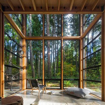
Designed as a home and studio for a photographer and his young family, Lightbox is located on a peninsula that extends south from British Columbia across the border to Point Roberts. The densely forested site lies beside a 180-acre park that overlooks the Strait of Georgia, the San Juan Islands and the Puget Sound.
Having experienced the world from under a black focusing cloth and large format camera lens, the photographer has a special fondness for simplicity and an appreciation of unique, genuine and well-crafted details.
The home was made decidedly modest, in size and means, with a building skin utilizing simple materials in a straightforward yet innovative configuration. The result is a structure crafted from affordable and common materials such as exposed wood two-bys that form the structural frame and directly support a prefabricated aluminum window system of standard glazing units uniformly sized to reduce the complexity and overall cost.
Accessed from the west on a sloped boardwalk that bisects its two contrasting forms, the house sits lightly on the land above the forest floor.
A south facing two-story glassy cage for living captures the sun and view as it celebrates the interplay of light and shadow in the forest. To the north, stairs are contained in a thin wooden box stained black with a traditional Finnish pine tar coating. Narrow apertures in the otherwise solid dark wooden wall sharply focus the vibrant cropped views of the old growth fir trees at the edge of the deep forest.
Lightbox is an uncomplicated yet powerful gesture that enables one to view the subtlety and beauty of the site while providing comfort and pleasure in the constantly changing light of the forest.
 Katz Novoa Architects
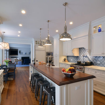
The Clients asked us to help them renovate the Kitchen and create a Mud Room and small informal Powder Room in their home. The Kitchen had been redone a number of years earlier by prior Homeowners without regard for the style and detailing of the 1920’s Architecture. The layout was inefficient and awkward, and the ceiling had been lowered, clashing with the window heads. We reconfigured existing angled walls and some closets to obtain unobstructed, straightforward spaces in which to layout the elements that our Clients wanted, and raised the ceiling to match the original height.
Simplicity, symmetry and sensitivity to the existing Architecture of the home were our guiding principles in the design of this graceful, elegant Kitchen and Mud Room.
 MAC Reno Design Build LTD ( MAC Renovations)
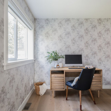
A dedicated office doesn't need to be oversized to work well. Natural light, a straightforward furniture layout and a quiet wall pattern create a comfortable place to focus while still giving the room some character.
 Planeta Design Group
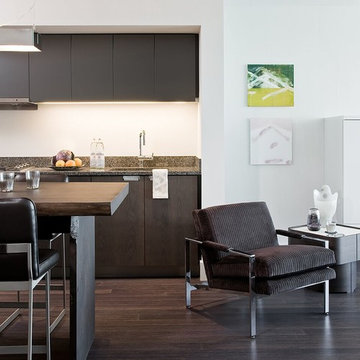
Planeta Design Group was invited to participate in a marketing plan to create seven designer model units on the 20th floor at The Residences W Boston. The plan was to show potential buyers layout possibilities for each unit type. We selected a one-bedroom residence with a southern exposure. To create a larger feeling room we used soft white sheers to accentuate the height of the room and give a luminous hint, even when fully closed, of the city beyond. Materials and finishes are natural and straightforward, creating an immediate calmness in which to unwind from the city's chaos. This unit is designed for anyone who thinks that less is more, but quality is everything.
Photography by Michael J Lee
 Luxury Elements
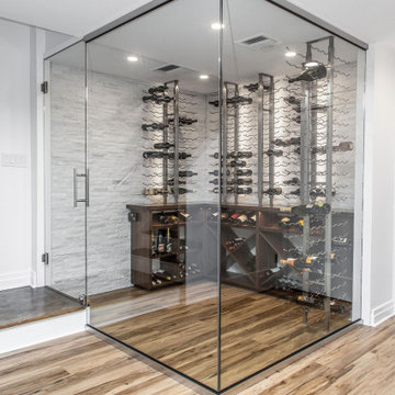
 Luxury Elements completed the design and build of this glass enclosed cellar with great lighting featuring metal and custom-made walnut wine racks. This contemporary walk in wine cellar in Chicago offers a very straightforward and open feel to storing your most prized wines.
 Georgia Contractor Group Home Builders
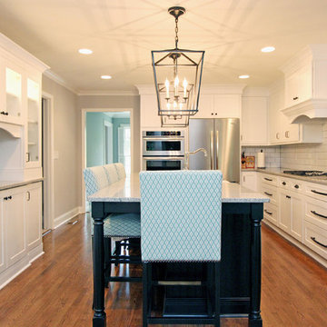
Inspiration for a mid-sized transitional u-shaped medium tone wood floor and brown floor enclosed kitchen remodel in Atlanta with a farmhouse sink, white cabinets, granite countertops, white backsplash, subway tile backsplash, stainless steel appliances, gray walls, an island, shaker cabinets and gray countertops
 Christie Hausmann Design
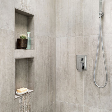
The homeowners wanted a simple, clean, modern bathroom. Sounds straightforward enough. But with a tight budget, a funky layout and a requirement not to move any plumbing, it was more of a puzzle than expected. Good thing we like puzzles! We added a wall to separate the bathroom from the master, installed a ‘tub with a view,’ and put in a free-standing vanity and glass shower to provide a sense of openness. The before pictures don’t begin to showcase the craziness that existed at the start, but we’re thrilled with the finish!
 NITZAN DESIGN
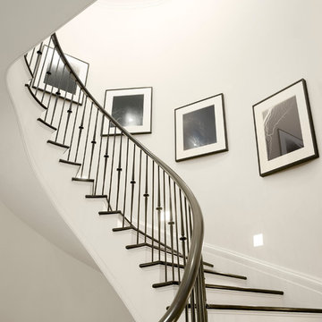
The main stairway leading up to the public spaces of the townhouse features special frameless, recessed stair lights, where light appears to emanate from within the walls.
(Art - HIROSHI SUGIMOTO 'Lighting Fields').

 The Renowned Group
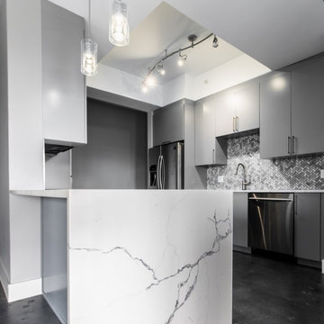
For an industrial look, this condo kitchen used a concrete finish to add more character to the space. The flooring was stained a dark gray, and the structural concrete walls are exposed to accent the floors. The walls were skim coated and sealed with a natural coating.
The kitchen countertops are stunning yet straightforward featuring Statuary Classique Quartz from MSI Surfaces which is elegant, durable and requires no maintenance. This marble-look quartz is a soothing white background, and delicate veins make for great countertops with waterfalls.
The Backsplash wall tile is a Bergamo Herringbone Mosaic by MSI Surfaces which is an elegant natural beautiful white marble tile that features soft gray tones in the veins. The herringbone design reflects a modern take on a traditional pattern as seen on Vimeo.
 AIBD - American Institute of Building Design
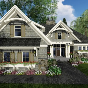
This plan was designed for the move-up buyer, a family of stable size that wants a higher level of luxury without unnecessary space. A straightforward footprint saves construction dollars that can be allocated instead to the architectural details associated with upscale homes, while a perfectly executed layout provides elegant efficiency. The stone-and-shake façade features an appealing entry portico and unique shutter detailing that builds on the barn door trend.
An ARDA for Published designs goes to
Royal Oaks Design
Designer: Kieran Liebl
From: Oakdale, Minnesota
 Adams + Beasley Associates
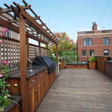
This Beacon Hill brownstone started with a new rubber roof, bare and sprawling, the ideal spot for a great family gathering place. After thoughtful consideration, a master plan was developed to provide all the amenities an urban outdoor space could offer; comfortable seating, customized storage, mature plantings, a fully functioning outdoor kitchen, comprehensive irrigation, discrete lighting, natural materials and open space for larger groups.
As this project was completed in the context of a comprehensive renovation of the building, we were easily afforded access below the deck to augment the structure and accommodate the added weight of the roof deck elements. A new staircase and generous hatch were added from the top floor inside to home to provide easy and convenient use of the deck. Similarly, bringing gas to the large grill, and hot and cold water to the sink, ice-maker and irrigation system were relatively straightforward.
Through the careful use of natural materials and the well designed layout, the space feels like an extension of the inside living space and welcomes its visitors to sounds of music coming from the Hatch Shell steps away and views unique to the character and history of Boston.
Photographer: Eric Roth
25