
Search results for "Strategic choices" in Home Design Ideas
 Everything Home
The centerpiece of this exquisite kitchen is the deep navy island adorned with a stunning quartzite slab. Its rich hue adds a touch of sophistication and serves as a captivating focal point. Complementing this bold choice, the two-tone color-blocked cabinet design elevates the overall aesthetic, showcasing a perfect blend of style and functionality. Light counters and a thoughtfully selected backsplash ensure a bright and inviting atmosphere.
The intelligent layout separates the work zones, allowing for seamless workflow, while the strategic placement of the island seating around three sides ensures ample space and prevents any crowding. A larger window positioned above the sink not only floods the kitchen with natural light but also provides a picturesque view of the surrounding environment. And to create a cozy corner for relaxation, a delightful coffee nook is nestled in front of the lower windows, allowing for moments of tranquility and appreciation of the beautiful surroundings.
---
Project completed by Wendy Langston's Everything Home interior design firm, which serves Carmel, Zionsville, Fishers, Westfield, Noblesville, and Indianapolis.
For more about Everything Home, see here: https://everythinghomedesigns.com/
To learn more about this project, see here:
https://everythinghomedesigns.com/portfolio/carmel-indiana-elegant-functional-kitchen-design
 Renovisions
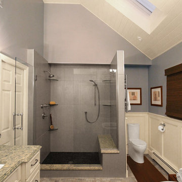
On the top of these South Shore of Boston homeowner’s master bath desires was a fireplace and TV set in ledger tile and a stylish slipper tub strategically positioned to enjoy them! They also requested a larger walk-in shower with seat and several shelves, cabinetry with plenty of storage and no-maintenance quartz countertops.
To create this bath’s peaceful feel, Renovisions collaborated with the owners to design with a transitional style in mind and incorporated luxury amenities to reflect the owner’s personalities and preferences. First things first, the blue striped wall paper was out along with the large Jacuzzi tub they rarely used.
Designing this custom master bath was a delight for the Renovisions team.
The existing space was large enough to accommodate a soaking tub and a free-standing glass enclosed shower for a clean and sophisticated look. Dark Brazilian cherry porcelain plank floor tiles were stunning against the natural stone-look border while the larger format textured silver colored tiles dressed the shower walls along with the attractive black pebble stone shower floor.
Renovisions installed tongue in groove wood to the entire ceiling and along with the moldings and trims were painted to match the soft ivory hues of the cabinetry. An electric fireplace and TV recessed into striking ledger stone adds a touch of rustic glamour to the room.
Other luxurious design elements used to create this relaxing retreat included a heated towel rack with programmable thermostat, shower bench seat and curbing that matched the countertops and five glass shelves that completed the sleek look. Gorgeous quartz countertops with waterfall edges was the perfect choice to tie in nicely with the furniture-style cream colored painted custom cabinetry with silver glaze. The beautiful matching framed mirrors were picturesque.
This spa-like master bath ‘Renovision’ was built for relaxation; a soothing sanctuary where these homeowners can retreat to de-stress at the end of a long day. By simply dimming the beautifully adorned chandelier lighting, these clients enjoy the sense-soothing amenities and zen-like ambiance in their own master bathroom.
 Boss Design Center
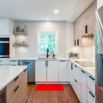
Step into a realm where contemporary design meets natural charm. In this kitchen renovation journey, we've married the sleek allure of glossy white cabinets with the earthy touch of light-toned natural wood accents.
? Sleek and Shine: The glossy white cabinets reflect not just light but also the essence of modern elegance, ensuring that the kitchen not only looks spacious but feels it too.
? Warm Wood Wonders: Strategically integrated natural wood elements bring warmth and texture, creating a beautiful contrast to the polished surfaces and celebrating the beauty of nature.
? Layout & Flow: The modern layout optimizes space and functionality, and with the open-concept design, we've ensured a seamless transition between the kitchen and adjoining spaces, perfect for entertaining or family bonding.
Join us in this video as we take you from blueprint to breathtaking. Witness the magic of design, choice of materials, and the little details that make all the difference. If you've been dreaming of a kitchen that's both chic and cozy, this transformation might just be your muse!
Find the right local pro for your project
 Living with Lolo
Kitchen in 45th Place | Budget-Friendly Kitchen Remodel in Phoenix, AZ |
Room Type: Kitchen Remodel |
Project Name: 45th Place |
Key Feature: A transitional kitchen remodel that proves smart material selections and a clear design vision can deliver a high-impact result without a luxury budget.
Challenge: The kitchen needed a full refresh but the project had real budget constraints. The challenge was making intentional material choices that looked elevated and cohesive without overspending, while still delivering the clean, transitional aesthetic the clients wanted.
Solution: Living with Lolo approached this as a design problem first, identifying where to invest and where to pull back without sacrificing the overall look. Budget-friendly materials were selected strategically so the finished kitchen felt intentional and designed rather than value-engineered. The result is a space that punches above its price point because the design thinking behind it was sound from the start.
Materials: Budget-conscious cabinetry, transitional hardware and fixtures, and durable countertop surfaces selected for both value and visual impact.
Budget: $30,000 to $75,000 |
Timeline: Completed approximately 2019, roughly 2 to 4 months from design through completion.
 Renovisions
On the top of these South Shore of Boston homeowner’s master bath desires was a fireplace and TV set in ledger tile and a stylish slipper tub strategically positioned to enjoy them! They also requested a larger walk-in shower with seat and several shelves, cabinetry with plenty of storage and no-maintenance quartz countertops.
To create this bath’s peaceful feel, Renovisions collaborated with the owners to design with a transitional style in mind and incorporated luxury amenities to reflect the owner’s personalities and preferences. First things first, the blue striped wall paper was out along with the large Jacuzzi tub they rarely used.
Designing this custom master bath was a delight for the Renovisions team.
The existing space was large enough to accommodate a soaking tub and a free-standing glass enclosed shower for a clean and sophisticated look. Dark Brazilian cherry porcelain plank floor tiles were stunning against the natural stone-look border while the larger format textured silver colored tiles dressed the shower walls along with the attractive black pebble stone shower floor.
Renovisions installed tongue in groove wood to the entire ceiling and along with the moldings and trims were painted to match the soft ivory hues of the cabinetry. An electric fireplace and TV recessed into striking ledger stone adds a touch of rustic glamour to the room.
Other luxurious design elements used to create this relaxing retreat included a heated towel rack with programmable thermostat, shower bench seat and curbing that matched the countertops and five glass shelves that completed the sleek look. Gorgeous quartz countertops with waterfall edges was the perfect choice to tie in nicely with the furniture-style cream colored painted custom cabinetry with silver glaze. The beautiful matching framed mirrors were picturesque.
This spa-like master bath ‘Renovision’ was built for relaxation; a soothing sanctuary where these homeowners can retreat to de-stress at the end of a long day. By simply dimming the beautifully adorned chandelier lighting, these clients enjoy the sense-soothing amenities and zen-like ambiance in their own master bathroom.
 lavish
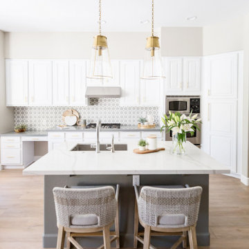
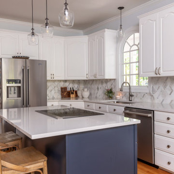
This multi-room refresh is a masterclass in how targeted, strategic updates can completely transform the feeling of a home without requiring a full gut renovation. By keeping the existing raised-panel cabinetry and investing instead in new countertops, a showstopping backsplash, updated lighting, and bold paint choices, this project delivers maximum impact for the investment — and the results are stunning.
The Kitchen
The existing white raised-panel cabinetry — with its elegant arched door profiles and traditional detailing — was retained and freshly painted in a crisp, bright white, instantly modernizing what was there and giving it new life. The real transformation came through the new materials layered in around those cabinets. White quartz countertops with a subtle veining pattern replace dated surfaces throughout, their clean, polished surface making the entire kitchen feel newer, lighter, and more refined.
The backsplash is the kitchen's true conversation piece — a full field of diamond-pattern marble mosaic tile in soft white, warm gray, and cool silver. The geometric pattern adds visual movement and texture across every wall surface, catching the light beautifully and giving the kitchen a jewel-like quality that feels both traditional and fashion-forward. Up close, the variation in the natural marble within each tile adds depth and complexity that no painted or printed surface could replicate.
The island received the boldest treatment of all — repainted in a deep navy blue that creates a dramatic two-tone contrast against the white perimeter cabinets. Topped with matching white quartz and fitted with an induction cooktop flush to the surface, it functions as both a culinary workhorse and a design anchor. Warm wood bar stools pull up to the island's overhang, adding an organic contrast to the cool navy and white palette.
New lighting completes the kitchen's transformation. A cluster of three clear glass pendant lights with oil-rubbed bronze hardware hangs above the island in staggered heights, their Edison-style bulbs casting a warm, ambient glow that feels simultaneously modern and nod to vintage industrial style. A matching single pendant illuminates the arched sink window — a beautiful architectural feature that frames a garden view and floods the space with natural light.
The Powder Rooms
Two powder rooms received personality-packed makeovers that prove small spaces are the perfect canvas for bold design statements.
The main powder room is an absolute showstopper: floor-to-ceiling botanical wallpaper in deep navy blue covered in delicate white magnolia blossoms creates an immersive, garden-in-the-evening atmosphere. A classic white pedestal sink, a frameless oval mirror, and polished nickel wall sconces with white drum shades keep the fixtures restrained and elegant — letting the wallpaper be the undisputed star. Crown molding at the ceiling and warm oak flooring ground the space beautifully.
A second bathroom refresh features a textured blue-gray grasscloth-look wallcovering that adds subtle, sophisticated texture to every surface. Paired with a warm wood vanity, quartz countertop, and brushed nickel fixtures, this space feels calm and collected — a quiet retreat that balances the more dramatic main powder room.
 Design Solution Group
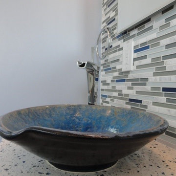
The custom made vessels and the accent tiles were the inspiration for this bathroom. These pieces were custom made by the artist, Samuel L. Hoffman, a potter, based on our specifications, color and inspiration. The detail on the front of the vessels represents the perfect wave to be out in the ocean surfing! My client wanted an ocean/sea feel for his master bathroom and blue was his color of choice. The crystals in the accent tiles, makes the perfect representation of the deep sea with a beautiful perfect dark blue to match the outside of the vessels. The rest of the materials were carefully chosen to help bring the sea feel to it - the rocks, the wood planks and the "sea salt" wall tile. Each accent tile was specifically placed to balance the bathroom. The sink wall was carefully tailored - we remove some of the white liners and inserted glass blue liners strategically to bring the blue to the wall without taking over the vessels. The shower has a trench drain and is curbless to allow for a clean smooth shower floor. Bathroom has all the contemporary amenities my client was looking for!
Designed by: Olga Sacasa, CKD
Interior designer
Vessels & accent tiles custom made by:
Samuel L. Hoffman Pottery
Construction done by: Jeffrey V. Silva of Silva Bros Construction

Sponsored
Delaware, OH

Buckeye Basements, Inc.
Central Ohio's Basement Finishing ExpertsBest Of Houzz '13-'21
 Crystal Kitchen + Bath
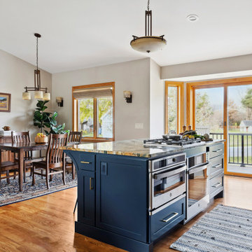
At the core of this transformation was the client’s aspiration for an open, interconnected space.
The removal of barriers between the kitchen, dining, and living areas created an expansive, fluid layout, elevating the home’s ambiance and facilitating seamless interaction among spaces.
The new open layout is the perfect space to cook and entertain merging sophistication with functionality.
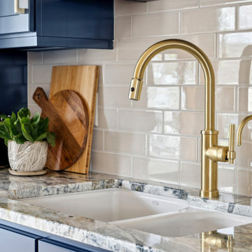
The journey began with the client’s exploration of colors, eventually embracing Benjamin Moore’s Hale Navy blue as the cornerstone for the cabinetry. This choice set the stage for a harmonious palette that tied in with the living and dining room furniture and rugs.
Integrating a natural stone countertop became a focal point, incorporating these varied hues while gold fixtures added a touch of luxury and sophistication.
Throughout the design process, challenges were met with innovative solutions. Space optimization was key, requiring strategic placement of appliances like a smaller-width refrigerator alongside a pull-out pantry cabinet. The island, a central feature, not only provided additional seating but replaced the need for a separate table and chairs, optimizing the space for gatherings and enhancing the flow between the kitchen and the adjoining areas.
The revitalized kitchen now stands as a vibrant hub for social interaction. The homeowner seamlessly integrates into gatherings, no longer confined by kitchen walls, while guests engage effortlessly in the cooking process at the island. This transformation embodies the convergence of beauty and functionality, where every design element tells a story of thoughtful innovation and meticulous attention to detail.
 Living with Lolo
Kitchen in 45th Place | Budget-Friendly Kitchen Remodel in Phoenix, AZ |
Room Type: Kitchen Remodel |
Project Name: 45th Place |
Key Feature: A transitional kitchen remodel that proves smart material selections and a clear design vision can deliver a high-impact result without a luxury budget.
Challenge: The kitchen needed a full refresh but the project had real budget constraints. The challenge was making intentional material choices that looked elevated and cohesive without overspending, while still delivering the clean, transitional aesthetic the clients wanted.
Solution: Living with Lolo approached this as a design problem first, identifying where to invest and where to pull back without sacrificing the overall look. Budget-friendly materials were selected strategically so the finished kitchen felt intentional and designed rather than value-engineered. The result is a space that punches above its price point because the design thinking behind it was sound from the start.
Materials: Budget-conscious cabinetry, transitional hardware and fixtures, and durable countertop surfaces selected for both value and visual impact.
Budget: $30,000 to $75,000 |
Timeline: Completed approximately 2019, roughly 2 to 4 months from design through completion.
 Builders Flooring & Design
The kitchen area underwent a remarkable transformation, with a complete gutting and strategic movement of walls to create a more open and inviting space. Enhancing the aesthetics of the space with blue cabinets that are complimented with a white quartz top.
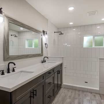
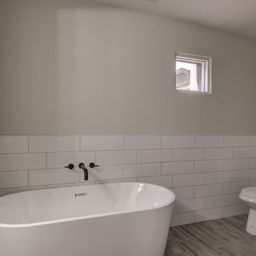
The bathroom renovation elegantly phased out the aged oak cabinets, introducing a striking dark brown stain beautifully complemented by a pristine white quartz top. The showers have been upgraded with timeless subway tiles, a design choice that stands the test of time.
Every inch of flooring has been revamped, with sleek, wood-style tiles providing a fresh, modern look. Exceptionally, some areas received a plush carpet upgrade, for that extra touch of comfort.
 May Construction, Inc.
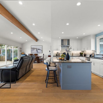
The new Milgard Tuscany window above the sink, with its dual glaze, ensures energy efficiency while offering a picturesque view. The interior walls, painted in a clean white, further accentuate the kitchen island, painted in a soft baby blue, harmonizing with the light blue tiles, and creating a visually pleasing palette.
This remodel isn't just about aesthetics; functionality is at its core. The kitchen island, seating four comfortably, is equipped with multiple outlets, perfect for the modern, multitasking San Jose household. The choice of matte brushed nickel for the cabinet knobs and pulls unifies the kitchen's design elements with a touch of understated elegance.
A significant architectural change in this remodel is the removal of the wall separating the great room and kitchen. This strategic decision by May Construction has transformed the space into an open floor plan, fostering a sense of togetherness and fluidity. An exposed beam adorns the ceiling, subtly defining the kitchen and great room areas while maintaining an open, airy feel.
May Construction has masterfully transformed a once segmented and dim space into an open, light-filled haven of modern luxury and efficiency. This San Jose kitchen and great room remodel is a testament to their commitment to quality, functionality, and aesthetic excellence. For those in San Jose and beyond looking to rejuvenate their homes, May Construction remains a beacon of innovation and craftsmanship in home remodeling.
 Houston Bath and Kitchen
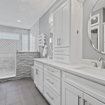
In a beautiful suburb on the north side of Houston, Texas, Joe and Kristen discovered their dream home—a property with a great lot, situated in a fantastic neighborhood with a thoughtfully designed floor plan. They had been drawn to the house for its charm and had admired the kitchen, which had been tastefully remodeled a few years earlier by a contractor who, despite doing excellent work, was no longer in business. However, upon moving in, they quickly realized that their master bathroom was woefully inadequate and in dire need of immediate repair.
Determined to turn their bathroom into a luxurious retreat, Joe and Kristen sought out Houston Bath & Kitchen, a reputable design-build firm renowned for their meticulous process and outstanding results. They were impressed from the outset with the efficiency and expertise. In just 90 minutes, their design team presented a complete concept plan and provided a detailed estimate—a promising start to what would become an inspiring collaboration.
Guided by Houston Bath & Kitchen's comprehensive approach, Joe and Kristen embarked on a thorough "design tour." The team expertly navigated them through the selection process, ensuring every choice aligned perfectly with their aesthetic preferences and practical needs. Together, they crafted a vision that included an oversized shower for two, creatively integrating a freestanding tub within the shower area—an innovative solution that maximized space and luxury.
As the project progressed, The Houston Bath & Kitchen production team conducted a thorough "trade walk," meticulously inspecting the jobsite to uncover potential complexities and ensure no detail was overlooked. This step was crucial in setting reliable expectations and eliminating surprises.
Detailing the scope of work was another pivotal phase, emphasizing transparency and clarity. Joe and Kristen felt reassured knowing exactly what to expect at each stage of the remodel. Houston Bath & Kitchen then moved into the "master planning phase," coordinating materials, surveys, and permits with precision. Trades were scheduled, and critical paths were identified—laying a solid foundation for a seamless execution.
Throughout the process, communication remained robust, and the meticulous planning ensured the project stayed on track both in terms of time and budget. One of the standout features of the design was the intricate tile work that adorned the walls and floors, fulfilling Joe and Kristen's desire for a design with variation and detail. Natural light was ingeniously incorporated through strategically placed windows and skylights, providing a serene ambiance without sacrificing privacy—a testament to Houston Bath & Kitchen's expertise in balancing functionality with aesthetics.
The final touch of luxury came in the form of a heated floor, adding warmth and comfort to the space—a detail that epitomized Houston Bath & Kitchen's commitment to fulfilling every customer priority.
Less than a year after the project was complete, Joe and Kristen made a decision to sell their home. Remarkably, the property went on the market and sold for $75,000 over asking price—a testament to the transformative impact of their newly remodeled master bathroom. While the exact influence of the bathroom on the bidding war remains speculative, it undoubtedly played a significant role in the home's appeal and ultimate sale price.
The success of their home sale not only underscored the value of their investment but also highlighted the expertise and dedication of Houston Bath & Kitchen in delivering a space that not only met but exceeded their expectations. Joe and Kristen stepped into their newly remodeled master bathroom with hearts full of joy. The space surpassed their dreams, reflecting their style and enhancing their daily lives—a sanctuary that would be cherished for years to come, thanks to Houston Bath & Kitchen's skillful guidance and commitment to excellence.
 Living with Lolo
Dining Room in 45th Place | Budget-Friendly Kitchen Remodel in Phoenix, AZ |
Room Type: Kitchen Remodel |
Project Name: 45th Place |
Key Feature: A transitional kitchen remodel that proves smart material selections and a clear design vision can deliver a high-impact result without a luxury budget.
Challenge: The kitchen needed a full refresh but the project had real budget constraints. The challenge was making intentional material choices that looked elevated and cohesive without overspending, while still delivering the clean, transitional aesthetic the clients wanted.
Solution: Living with Lolo approached this as a design problem first, identifying where to invest and where to pull back without sacrificing the overall look. Budget-friendly materials were selected strategically so the finished kitchen felt intentional and designed rather than value-engineered. The result is a space that punches above its price point because the design thinking behind it was sound from the start.
Materials: Budget-conscious cabinetry, transitional hardware and fixtures, and durable countertop surfaces selected for both value and visual impact.
Budget: $30,000 to $75,000 |
Timeline: Completed approximately 2019, roughly 2 to 4 months from design through completion.
 Builders Flooring & Design
The kitchen area underwent a remarkable transformation, with a complete gutting and strategic movement of walls to create a more open and inviting space. Enhancing the aesthetics of the space with blue cabinets that are complimented with a white quartz top.
The bathroom renovation elegantly phased out the aged oak cabinets, introducing a striking dark brown stain beautifully complemented by a pristine white quartz top. The showers have been upgraded with timeless subway tiles, a design choice that stands the test of time.
Every inch of flooring has been revamped, with sleek, wood-style tiles providing a fresh, modern look. Exceptionally, some areas received a plush carpet upgrade, for that extra touch of comfort.
 Crystal Kitchen + Bath
At the core of this transformation was the client’s aspiration for an open, interconnected space.
The removal of barriers between the kitchen, dining, and living areas created an expansive, fluid layout, elevating the home’s ambiance and facilitating seamless interaction among spaces.
The new open layout is the perfect space to cook and entertain merging sophistication with functionality.
The journey began with the client’s exploration of colors, eventually embracing Benjamin Moore’s Hale Navy blue as the cornerstone for the cabinetry. This choice set the stage for a harmonious palette that tied in with the living and dining room furniture and rugs.
Integrating a natural stone countertop became a focal point, incorporating these varied hues while gold fixtures added a touch of luxury and sophistication.
Throughout the design process, challenges were met with innovative solutions. Space optimization was key, requiring strategic placement of appliances like a smaller-width refrigerator alongside a pull-out pantry cabinet. The island, a central feature, not only provided additional seating but replaced the need for a separate table and chairs, optimizing the space for gatherings and enhancing the flow between the kitchen and the adjoining areas.
The revitalized kitchen now stands as a vibrant hub for social interaction. The homeowner seamlessly integrates into gatherings, no longer confined by kitchen walls, while guests engage effortlessly in the cooking process at the island. This transformation embodies the convergence of beauty and functionality, where every design element tells a story of thoughtful innovation and meticulous attention to detail.
 Dwellify
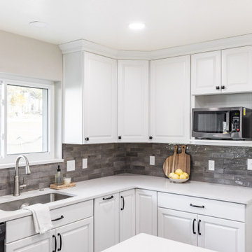
this Traditional-inspired kitchen remodel, we aimed to transition an outdated, warm-wooded space into a vibrant, expansive gathering spot with minimal layout alterations. By introducing new cabinets and adopting a fresh color scheme, we swiftly revitalized the area, giving it an added brightness and a sense of airiness. The key to the transformation lay in reimagining the layout – removing the counter barstool space and replacing it with an island instantly ushered in an open-concept plan, enhancing the kitchen's spaciousness and facilitating seamless movement within the area. What's remarkable about this renovation is that it leveraged existing elements while making only minor adjustments, yet the impact was nothing short of profound. Through thoughtful design choices, strategic modifications, and plenty of smart storage solutions, we achieved a complete new creation.
 Dwellify
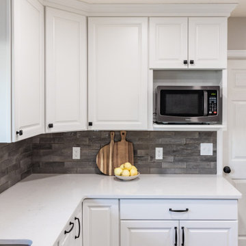
this Traditional-inspired kitchen remodel, we aimed to transition an outdated, warm-wooded space into a vibrant, expansive gathering spot with minimal layout alterations. By introducing new cabinets and adopting a fresh color scheme, we swiftly revitalized the area, giving it an added brightness and a sense of airiness. The key to the transformation lay in reimagining the layout – removing the counter barstool space and replacing it with an island instantly ushered in an open-concept plan, enhancing the kitchen's spaciousness and facilitating seamless movement within the area. What's remarkable about this renovation is that it leveraged existing elements while making only minor adjustments, yet the impact was nothing short of profound. Through thoughtful design choices, strategic modifications, and plenty of smart storage solutions, we achieved a complete new creation.
 NILES
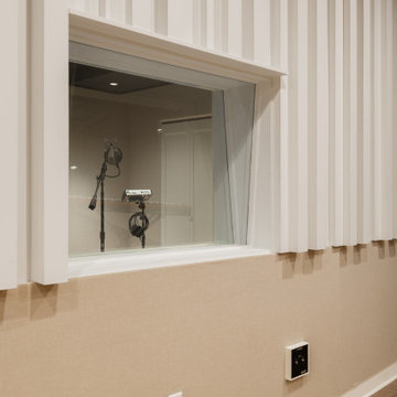
NILESThis 2022 project for Sovereign Grace Music was a full-scale, purpose-built recording and production facility designed to support songwriting, live tracking, mixing, and video content creation. Working alongside the extraordinary Sovereign Grace team—and in collaboration with Authentic Carpentry—NILES handled sound reduction, audio integration, and all acoustic treatment design and installation.
The facility features a full Control Room, a spacious Live Room, and a large Isolation Booth engineered for dry drum capture or vocal tracking during full-band sessions. Each space was crafted for accuracy, clarity, and intuitive workflow, ensuring that engineers and artists can move seamlessly between rooms without breaking creative momentum.
Clear sightlines, generous lighting, and intentional layout choices make the studio equally suited for recording and video production. Every room is wired for a plug-and-play workflow, supporting multi-camera shoots, ensemble tracking, and efficient session flow.
Behind the aesthetic, the acoustic infrastructure is highly robust. The Control Room, Live Room, and ISO Booth sit on independent floor systems with tailored sound-reducing wall assemblies and strategic treatments throughout. No suite is mechanically bonded, allowing simultaneous use of all rooms with minimal sound transmission.
Monitoring in the Control Room centers around PMC 6-2 loudspeakers, precisely tuned to ensure accurate translation from mix position to the final master.
The result is a balanced, inviting, and technically exact environment—built to serve the diverse creative needs of Sovereign Grace Music for years to come.
 Golden Shore Design and Build
This bathrooms remodel is a stunning blend of modern design and functional elegance, designed for both style and accessibility. Here are the standout features:
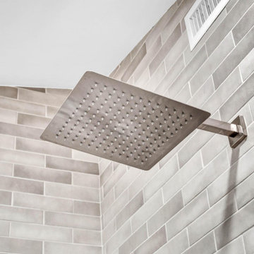
• Contemporary Walk-In Shower: The frameless glass enclosure gives the space an open and airy feel, while the mix of neutral-tone subway tiles and a mosaic accent strip adds visual interest and depth.
• Textured Pebble Flooring: The pebble tile shower floor not only enhances the aesthetic but also provides a natural, spa-like experience with added slip resistance.
• Built-In Storage & Accessibility: Thoughtful design elements such as a recessed niche, a built-in bench, and strategically placed grab bars make this shower both stylish and functional.
• Custom Vanity with Smart Storage: The corner vanity with warm wood cabinetry and sleek white countertops maximizes space while adding warmth and character.
• High-End Finishes & Neutral Tones: The combination of soft grays, warm wood, and crisp white surfaces creates a timeless and calming atmosphere.
This remodel perfectly balances modern aesthetics, accessibility, and everyday functionality, making it an ideal choice for homeowners who want a sophisticated yet practical bathroom upgrade.
 Daniel Scerri Periti
We were approached with a request to design the furnishings for an existing ‘finished’ apartment. The intention was to move in relatively fast, and the property already had an existing marble floor, kitchen and bathrooms which had to be kept. The property also boasted a fantastic 270 degree view, seen from most of the apartment. The clients had a very important role in the completion of the project. They were very involved during the design process and through various decoration choices. The final design was kept as a rigid guideline when faced with picking out all the different elements.
Once clear of all previous furniture, the space felt cold and bare; so we immediately felt the need for warmth, and raw, natural elements and textures to complement the cold marble floor while visually tying in the design of the whole apartment together.
Since the existing kitchen had a touch of dark walnut stain, we felt this material was one we should add to the palette of materials to contest the stark materials. A raw cement finish was another material we felt would add an interesting contrast and could be used in a variety of ways, from cabinets to walls and ceilings, to tie up the design of various areas of the apartment.
To warm up the living/dining area, keeping the existing marble floor but visually creating zones within the large living/dining area without hindering the flow, a dark timber custom-made soffit, continuous with a floor-to-ceiling drinks cabinet zones the dining area, giving it a degree of much-needed warmth.
The various windows with a stupendous 270 degree view needed to be visually tied together. This was done by introducing a continuous sheer [drape] which also doubled up as a sound-absorbing material along 2 of the 4 walls of the space.
A very large sofa was required to fill up the space correctly, also required for the size of the young family.
Services were integrated within the units and soffits, while a customized design in the corner between the kitchen and the living room took into consideration the viewpoints from the main areas to create a pantry without hindering the flow or views. A strategically placed floor-to-ceiling mirror doubles up the space and extends the view to the inner parts of the apartment.
The daughter’s bedroom was a small challenge in itself, and a fun task, where we wanted to achieve the perception of a cozy niche with its own enclosed reading nook [for reading fairy tales], behind see-through curtains and a custom-ordered wall print sporting the girl’s favorite colors.
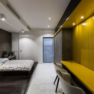
The sons’ bedroom had double the requirements in terms of space needed: more wardrobe, more homework desk space, a tv/play station area… “We combined a raised platform area between the boys’ beds to become an area with cushions where the kids can lay down and play, and face a hidden screen behind the homework desk’s sliding back panel for their play station”. The color of the homework desk was chosen in relation to the boys’ ages. A more masculine material palette was chosen for this room, in contrast to the light pastel palette of the girl’s bedroom. Again, this colour can easily be changed over time for a more mature look.
PROJECT DATA:
St. Paul’s Bay, Malta
DESIGN TEAM:
Perit Rebecca Zammit, Perit Daniel Scerri, Elyse Tonna
OTHER CREDITS:
Photography: Tonio Lombardi
Styling : TKS
24