
Search results for "Strategic choices" in Home Design Ideas
 Renovisions
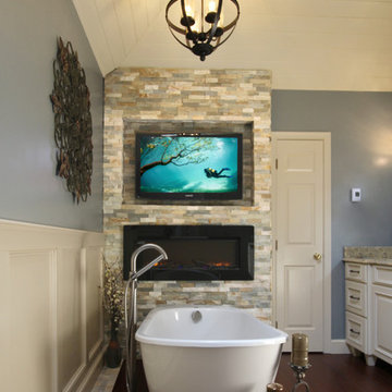
On the top of these South Shore of Boston homeowner’s master bath desires was a fireplace and TV set in ledger tile and a stylish slipper tub strategically positioned to enjoy them! They also requested a larger walk-in shower with seat and several shelves, cabinetry with plenty of storage and no-maintenance quartz countertops.
To create this bath’s peaceful feel, Renovisions collaborated with the owners to design with a transitional style in mind and incorporated luxury amenities to reflect the owner’s personalities and preferences. First things first, the blue striped wall paper was out along with the large Jacuzzi tub they rarely used.
Designing this custom master bath was a delight for the Renovisions team.
The existing space was large enough to accommodate a soaking tub and a free-standing glass enclosed shower for a clean and sophisticated look. Dark Brazilian cherry porcelain plank floor tiles were stunning against the natural stone-look border while the larger format textured silver colored tiles dressed the shower walls along with the attractive black pebble stone shower floor.
Renovisions installed tongue in groove wood to the entire ceiling and along with the moldings and trims were painted to match the soft ivory hues of the cabinetry. An electric fireplace and TV recessed into striking ledger stone adds a touch of rustic glamour to the room.
Other luxurious design elements used to create this relaxing retreat included a heated towel rack with programmable thermostat, shower bench seat and curbing that matched the countertops and five glass shelves that completed the sleek look. Gorgeous quartz countertops with waterfall edges was the perfect choice to tie in nicely with the furniture-style cream colored painted custom cabinetry with silver glaze. The beautiful matching framed mirrors were picturesque.
This spa-like master bath ‘Renovision’ was built for relaxation; a soothing sanctuary where these homeowners can retreat to de-stress at the end of a long day. By simply dimming the beautifully adorned chandelier lighting, these clients enjoy the sense-soothing amenities and zen-like ambiance in their own master bathroom.
 In Detail Interiors
Small coastal condo gets a new life!
This project started as a consultation that really focused on whether or not it was feasible to maximize functionality out of a tight kitchen area in a condo on the beach. The cabinetry was sort of dated but not terrible terrible.
Refresh or total gut of this small kitchen
The client wanted to give it a refresh worked but we had worked with her before…so she could not quite decide how far to go. Maybe just repaint the existing cabinets? She needed some furniture. She wanted a little more ambiance and pizazz. And she wanted the Cheryl magic.
Ok finally, decision made. Kitchen had to go@!
Decision made- a new kitchen to go with the new living!
After further review on site with her during the consult meeting, and pitching a few inquiries around for bids on cabinetry and countertops – she ultimately decided to gut and re-do the whole layout. And man-oh-man what a difference some well executed design makes!!
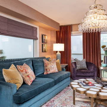
This layout was unique and truly optimized every inch we could muster from the kitchen. (Working around that spiral staircase and navigating the soffit that wrapped the entire kitchen and adjacent living room!!) Colors needed to be bold while still feeling fresh so we paired a deep aubergine and a sort of “matte” Caribbean blue which laid the groundwork for a stunning living area palette.
Tough layout to enlarge much
There were a lot of other “givens” in this space that made the execution of the design a highly strategized process. We knew we had to work around the large wall space that starts the kitchen because it had the laundry room hiding on the other side… the awkward nook with windows on all sides that was a small breakfast area before the remodel… oh, and did we mention that dang spiral staircase?! Multiple site visits to plot the cabinetry and countertop curve paid off all said and done, though!
Living space that work with the open floor plan kitchen
Designing the furnishings then became the fun part! With a smaller living space flanked by windows and sliders – but one that needed to balance the kitchen in substance – we had to break a few preferred design rules to make up the amount of seating desired.
The deep grape-y purple barrel swivels were the perfect “transition” piece by the slider offering access to the views while being versatile enough to still afford safe use of the slider and passage outside. Adding some graphic punch with the droplet shaped, stone and brass cocktail table and bold multicolored rug we love the balance of these weightier aesthetic choices with the adjacent kitchen.
Signature pieces make all the difference
Carrying through little pops of that blue green between the counter stools (I die! Seriously! SO GORGEOUS) and the sofa (with those brass nails!) — these colors really created a sturdy but eclectic tonal feel that the client was just over the moon for. The art and grasscloth on the walls throughout developed the architecture of the space in an overall structure that was really lacking – it feels warm, inviting, comfortable – BEAUTIFUL – but not too priss and pomp.
Now if we could just keep the pup off the sofa!
 Living with Lolo
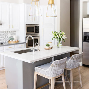
Kitchen in 45th Place | Budget-Friendly Kitchen Remodel in Phoenix, AZ |
Room Type: Kitchen Remodel |
Project Name: 45th Place |
Key Feature: A transitional kitchen remodel that proves smart material selections and a clear design vision can deliver a high-impact result without a luxury budget.
Challenge: The kitchen needed a full refresh but the project had real budget constraints. The challenge was making intentional material choices that looked elevated and cohesive without overspending, while still delivering the clean, transitional aesthetic the clients wanted.
Solution: Living with Lolo approached this as a design problem first, identifying where to invest and where to pull back without sacrificing the overall look. Budget-friendly materials were selected strategically so the finished kitchen felt intentional and designed rather than value-engineered. The result is a space that punches above its price point because the design thinking behind it was sound from the start.
Materials: Budget-conscious cabinetry, transitional hardware and fixtures, and durable countertop surfaces selected for both value and visual impact.
Budget: $30,000 to $75,000 |
Timeline: Completed approximately 2019, roughly 2 to 4 months from design through completion.
Find the right local pro for your project
 Archadeck of Austin
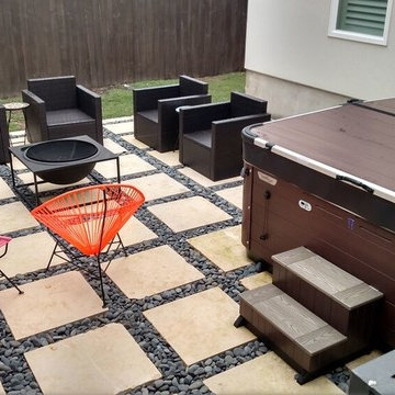
Jim Schallon, our lead designer for the project came up with this urban-chic oasis while meeting requirements necessary for an addition that will allow moisture to be retained and released properly into the natural aquifers, in and around the Austin area. Strategic planning was necessary to find the right material that would allow the proper drainage for water runoff.
To meet these requirements, Schallon designed the backyard patio compacted with layers of gravel and soil, topping it with Mexican river rock, which will allow water to flow naturally through the surface while providing a smooth texture. Not only is the river rock easy on bare feet but also provides a cooling feel as it retains the natural temperature of the ground at all times. The patio was finished off with 2×2 sawn cream Limestone pavers throughout, but the design didn’t stop at the patio pavers and rock choice. In addition with the contemporary design, electrical was installed to incorporate the last piece of this urban chic oasis; the hot tub!
 Griffith Indoor & Outdoor Living
This Old Littleton, Colorado, interior renovation transformed the home’s main living areas into a warm, inviting modern farmhouse interior. The homeowners wanted a more current look that complemented the character of their home while remaining within a carefully planned budget. Griffith Designs created a personalized renovation strategy that focused investment on the areas with the greatest visual and functional impact.
The existing layout was reworked into a brighter, more open-concept living space, improving the connection between the kitchen and surrounding gathering areas. New flooring established a cohesive foundation throughout the interior, while updated doors and carefully placed wood accents introduced the natural warmth and texture associated with modern farmhouse design.
A modern fireplace became a refreshed focal point for the living area, combining clean lines with comfortable, timeless character. The upgraded kitchen and living spaces were designed to feel connected and welcoming, giving the homeowners a more functional setting for everyday routines, entertaining and time with family.
The completed renovation balances modern style with relaxed farmhouse warmth, creating an interior that feels fresh without losing its sense of home. Through thoughtful design choices, strategic updates and budget-conscious planning, Griffith Designs gave this Old Littleton home a personalized new look that improves both its beauty and livability.
 Archadeck of Austin
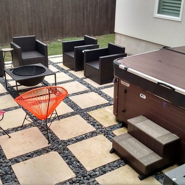
Jim Schallon, our lead designer for the project came up with this urban-chic oasis while meeting requirements necessary for an addition that will allow moisture to be retained and released properly into the natural aquifers, in and around the Austin area. Strategic planning was necessary to find the right material that would allow the proper drainage for water runoff.
To meet these requirements, Schallon designed the backyard patio compacted with layers of gravel and soil, topping it with Mexican river rock, which will allow water to flow naturally through the surface while providing a smooth texture. Not only is the river rock easy on bare feet but also provides a cooling feel as it retains the natural temperature of the ground at all times. The patio was finished off with 2×2 sawn cream Limestone pavers throughout, but the design didn’t stop at the patio pavers and rock choice. In addition with the contemporary design, electrical was installed to incorporate the last piece of this urban chic oasis; the hot tub!
 Crystal Kitchen + Bath
At the core of this transformation was the client’s aspiration for an open, interconnected space.
The removal of barriers between the kitchen, dining, and living areas created an expansive, fluid layout, elevating the home’s ambiance and facilitating seamless interaction among spaces.
The new open layout is the perfect space to cook and entertain merging sophistication with functionality.
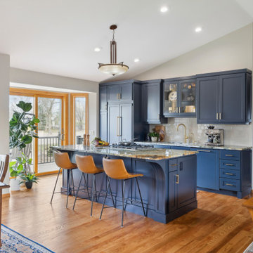
The journey began with the client’s exploration of colors, eventually embracing Benjamin Moore’s Hale Navy blue as the cornerstone for the cabinetry. This choice set the stage for a harmonious palette that tied in with the living and dining room furniture and rugs.
Integrating a natural stone countertop became a focal point, incorporating these varied hues while gold fixtures added a touch of luxury and sophistication.
Throughout the design process, challenges were met with innovative solutions. Space optimization was key, requiring strategic placement of appliances like a smaller-width refrigerator alongside a pull-out pantry cabinet. The island, a central feature, not only provided additional seating but replaced the need for a separate table and chairs, optimizing the space for gatherings and enhancing the flow between the kitchen and the adjoining areas.
The revitalized kitchen now stands as a vibrant hub for social interaction. The homeowner seamlessly integrates into gatherings, no longer confined by kitchen walls, while guests engage effortlessly in the cooking process at the island. This transformation embodies the convergence of beauty and functionality, where every design element tells a story of thoughtful innovation and meticulous attention to detail.

Sponsored
Delaware, OH

Buckeye Basements, Inc.
Central Ohio's Basement Finishing ExpertsBest Of Houzz '13-'21
 Dwellify
In this farmhouse-style home remodeling project, the homeowners aimed to achieve a cohesive and inviting aesthetic throughout their kitchen, bathrooms, bedrooms, and closets. The kitchen underwent a complete transformation with the removal of existing cabinets, appliances, and walls, providing a clean slate for the renovation. The new kitchen features bright cabinets, a kitchen island, and a peninsula, offering functional workspace and a stylish focal point. The addition of floating shelves and an updated dining room further enhanced the farmhouse charm. The strategic removal of walls and the incorporation of mirrors created an illusion of spaciousness, making the room feel larger and more open. To enhance organization, storage solutions were introduced, including the addition of a small mudroom space, providing ample room for belongings upon entering the home. The bathrooms were revitalized from dark and uninviting spaces to relaxing and functional retreats. Clean tile choices and updated showers contribute to the farmhouse aesthetic, while offering a fresh and modern feel. The bedrooms and hallways received a fresh coat of paint, adding the finishing touch to the overall remodeling job. The newly updated spaces now exude farmhouse style throughout, creating an inviting and cohesive atmosphere that reflects the homeowners' vision.
 Griffith Indoor & Outdoor Living
This Old Littleton, Colorado, interior renovation transformed the home’s main living areas into a warm, inviting modern farmhouse interior. The homeowners wanted a more current look that complemented the character of their home while remaining within a carefully planned budget. Griffith Designs created a personalized renovation strategy that focused investment on the areas with the greatest visual and functional impact.
The existing layout was reworked into a brighter, more open-concept living space, improving the connection between the kitchen and surrounding gathering areas. New flooring established a cohesive foundation throughout the interior, while updated doors and carefully placed wood accents introduced the natural warmth and texture associated with modern farmhouse design.
A modern fireplace became a refreshed focal point for the living area, combining clean lines with comfortable, timeless character. The upgraded kitchen and living spaces were designed to feel connected and welcoming, giving the homeowners a more functional setting for everyday routines, entertaining and time with family.
The completed renovation balances modern style with relaxed farmhouse warmth, creating an interior that feels fresh without losing its sense of home. Through thoughtful design choices, strategic updates and budget-conscious planning, Griffith Designs gave this Old Littleton home a personalized new look that improves both its beauty and livability.
 Crystal Kitchen + Bath
At the core of this transformation was the client’s aspiration for an open, interconnected space.
The removal of barriers between the kitchen, dining, and living areas created an expansive, fluid layout, elevating the home’s ambiance and facilitating seamless interaction among spaces.
The new open layout is the perfect space to cook and entertain merging sophistication with functionality.
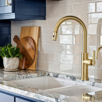
The journey began with the client’s exploration of colors, eventually embracing Benjamin Moore’s Hale Navy blue as the cornerstone for the cabinetry. This choice set the stage for a harmonious palette that tied in with the living and dining room furniture and rugs.
Integrating a natural stone countertop became a focal point, incorporating these varied hues while gold fixtures added a touch of luxury and sophistication.
Throughout the design process, challenges were met with innovative solutions. Space optimization was key, requiring strategic placement of appliances like a smaller-width refrigerator alongside a pull-out pantry cabinet. The island, a central feature, not only provided additional seating but replaced the need for a separate table and chairs, optimizing the space for gatherings and enhancing the flow between the kitchen and the adjoining areas.
The revitalized kitchen now stands as a vibrant hub for social interaction. The homeowner seamlessly integrates into gatherings, no longer confined by kitchen walls, while guests engage effortlessly in the cooking process at the island. This transformation embodies the convergence of beauty and functionality, where every design element tells a story of thoughtful innovation and meticulous attention to detail.
 Post Services Inc
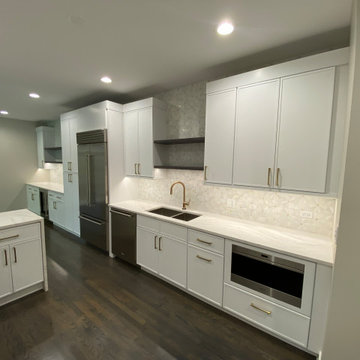
This kitchen is a haven of luxury, meticulously crafted with premium materials that harmonize to create a sophisticated yet functional space. The Sub-Zero refrigerator anchors the kitchen with its sleek stainless steel finish, integrated seamlessly into the custom cabinetry. This appliance not only provides unparalleled refrigeration but also complements the kitchen’s clean, cohesive lines.
The countertops and island are crafted from exquisite quartz, featuring subtle veining that enhances the visual appeal and offers a polished, durable surface perfect for meal preparation and entertaining. The waterfall edge on the island adds a modern touch, extending the quartz's beauty and creating a seamless flow from top to floor.
The backsplash is a work of art, composed of delicate marble tiles in a geometric pattern. Each tile adds texture and depth, with a soft shimmer that captures the light, adding a layer of visual intrigue to the kitchen. Dark wood open shelving complements the cabinetry and provides a practical yet stylish space for showcasing decorative items, adding warmth and contrast to the overall light palette.
A brushed brass faucet over the deep stainless steel sink serves as a stunning focal point, with the warm brass finish echoed in the hardware throughout the cabinetry. This choice of material brings warmth and elegance to the space, pairing beautifully with the quartz counters and adding a touch of opulence.
The custom cabinetry, finished in a soft, matte white, provides ample storage, keeping the kitchen organized and clutter-free. Each cabinet and drawer is adorned with brushed brass handles, adding a refined detail that enhances the room’s luxurious ambiance.
Dark hardwood floors anchor the space, their rich tones adding depth and providing a striking contrast to the light cabinetry and counters. The recessed lighting is strategically placed, casting a warm glow over the entire room, highlighting the textures and finishes that make this kitchen a feast for the senses.
This kitchen is the ultimate blend of form and function, where every material and design element has been carefully selected to create a space that is as beautiful as it is practical. From the high-end appliances to the artful finishes, this kitchen offers an elevated experience, turning the everyday act of cooking into an indulgent pleasure.
 THE Remodel Group
A luxurious en suite bath was created within this classic 1925 Portland bungalow by reconfiguring the second story’s original small bedrooms and tiny half bath. In this welcoming new urban boho space, eclectic finishes mingle harmoniously, integrated through subtle repetition of shapes and materials.
A furniture-style vanity sets the tone for this luxurious space, introducing materials, colors, shapes, and textures that repeat throughout. Individual walnut hexagons join to create distinctive vanity doors, offset beautifully by horizontal-grain drawers. Topping the cabinetry is a simple concrete countertop with integral sinks. An expansive framed mirror above enlarges and brightens the room. Within the mirror, sconces float, their globes a nod to the hexagons below. Champagne bronze fixtures reflect the warm walnut glow. Nestled into the back corner, a stunning shower features waterjet tiles in a double herringbone pattern, each precisely cut and laid to maintain design integrity at every surface transition. Teak floor tiles and a pebbled niche hint at the classic spa experience. Across from the shower, a large hexagonal window provides a treetop view from the free-standing tub below. The gentle oval of the tub and the beaded chandelier above provide a pleasing contrast to the strong lines surrounding it, as do the softly-shaded pebbles in the full-length niche. Shiplap wainscotting wraps the room, creating an illusion of height in the compact space. Subtle flooring and soft green walls create an understated backdrop for the bold mix of materials, unifying them into a serene oasis.
Asking a century-old home to accommodate a modern luxury bath is a tall order. Asbestos-laden plaster and flooring had to be abated. The subfloor had to be leveled and reinforced to increase strength and prevent deflection. Water lines and multiple electrical circuits had to be brought across and up without disturbing a beautifully-paneled ceiling, something we accomplished by firring out stair walls to hide the chases. Our client had visions of a leafy view from her tub, but the new layout eliminated existing windows. Placing a new window was complicated by deep eaves and flat soffits. By pushing the header into the roofline, however, we were able to accommodate a picture window. The flat soffit was replaced by an inverse hip lined with stained tongue and groove cedar, tying it to the bathroom finishes. Bringing materials up a narrow staircase became truly challenging when it was time to install the big items. However, strategic removal of drywall around the landing got the job done. Our attention to detail is showcased in the shower tile, where precise cuts were required at surface transitions to maintain the integrity of a complex double herringbone lay. The project was delivered on time.
Savvy layout choices minimized spending on structural changes. Because we were dealing with dormer space, head height was an issue. Raising the ceiling would have been complex and expensive so our design accommodated the constraints – tub on the low outside wall, shower on the full-height interior wall. The vanity spanned the spread, accommodating our petite client on the exterior side and her taller husband on the interior side. An under-eave closet was closed off to create room for both a freestanding tub and a separate shower. Rather than building replacement storage elsewhere, we simply added a new door into the closet from the primary bedroom. This was made possible by absorbing the short hallway separating the existing bed and bathroom into the primary bedroom. This new layout also created an en suite relationship between the primary bedroom and the new bath. We saved additional dollars by selecting a furniture-style vanity rather than using custom cabinetry, and the countertop with integral sinks provided a cost savings over a more traditional quartz countertop with undermount sinks. Affordable shower tiles allowed us to put more money into a dynamic tile layout. The project was delivered within budget.
 United Porte Inc
SET INCLUDES:
2 Doors Slabs
Track
Pivot Set
Pivot Brackets
Converging Panel Aliger
Door Knob
Installation Manual
Screws for hardware
Doors are not pre-drilled!
Thickness of the door slab is 40 mm or 1 9/16"".
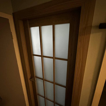
Introducing the Felicia collection of Classic Bi-Fold doors, a stunning addition to any interior design. Crafted from high-quality wood with a solid core, these doors are not only aesthetically pleasing but also sturdy and durable.
The Ginger Ash color of the doors adds warmth and natural beauty to any space. The unique wood grain pattern gives the doors a rustic feel that is perfect for any traditional or contemporary setting. The frosted glass panels provide privacy while still allowing natural light to pass through, creating a warm and welcoming atmosphere.
The 12 lites on the doors provide a unique touch that will surely catch the eye of anyone who enters the room. The lites are strategically placed to offer a balanced look that complements the overall design of the doors.
These Classic Bi-Fold doors from the Felicia collection are ideal for use as new york doors. They are easy to install and operate, making them a perfect fit for homes, offices, and other commercial spaces.
Whether you're looking to upgrade your interior design or add a touch of elegance to your space, the Felicia collection of Classic Bi-Fold doors is an excellent choice. They are sure to impress anyone who sees them and add a touch of sophistication to any space they are placed in. Order yours today and experience the ultimate in style, quality, and durability!
SOLID CORE
Solid wood core made by laminated wood using Ciplex technology.
CIPLEX by SARTO
High-end film layer that is applied on top of the laminated wood Made in Italy.
NO FORMALDEHYDE
Environmentally friendly using only latest eco-friendly materials. Company requires use of only the safest materials. We care about our planet, the environment and you and your loved ones. Sarto Doors are Ideal for use in hospitals and childcare centers.
SOUND ATTENUATION
Door's 40mm thick solid wood construction yields 30% noise reduction over standard doors.
CONSTRUCTION
Door is manufactured from a single piece of wood and will give several generations of normal usage with minimal care.
 Griffith Indoor & Outdoor Living
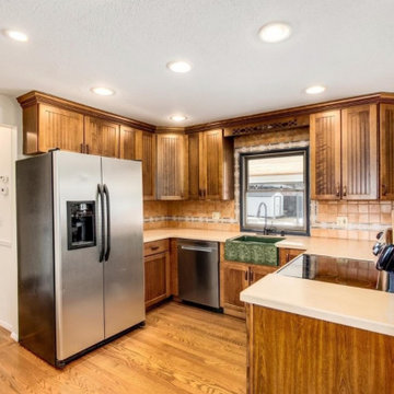
This Old Littleton, Colorado, interior renovation transformed the home’s main living areas into a warm, inviting modern farmhouse interior. The homeowners wanted a more current look that complemented the character of their home while remaining within a carefully planned budget. Griffith Designs created a personalized renovation strategy that focused investment on the areas with the greatest visual and functional impact.
The existing layout was reworked into a brighter, more open-concept living space, improving the connection between the kitchen and surrounding gathering areas. New flooring established a cohesive foundation throughout the interior, while updated doors and carefully placed wood accents introduced the natural warmth and texture associated with modern farmhouse design.
A modern fireplace became a refreshed focal point for the living area, combining clean lines with comfortable, timeless character. The upgraded kitchen and living spaces were designed to feel connected and welcoming, giving the homeowners a more functional setting for everyday routines, entertaining and time with family.
The completed renovation balances modern style with relaxed farmhouse warmth, creating an interior that feels fresh without losing its sense of home. Through thoughtful design choices, strategic updates and budget-conscious planning, Griffith Designs gave this Old Littleton home a personalized new look that improves both its beauty and livability.
 Builders Flooring & Design
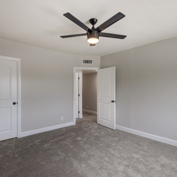
The kitchen area underwent a remarkable transformation, with a complete gutting and strategic movement of walls to create a more open and inviting space. Enhancing the aesthetics of the space with blue cabinets that are complimented with a white quartz top.
The bathroom renovation elegantly phased out the aged oak cabinets, introducing a striking dark brown stain beautifully complemented by a pristine white quartz top. The showers have been upgraded with timeless subway tiles, a design choice that stands the test of time.
Every inch of flooring has been revamped, with sleek, wood-style tiles providing a fresh, modern look. Exceptionally, some areas received a plush carpet upgrade, for that extra touch of comfort.
 Golden Shore Design and Build
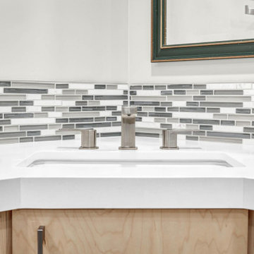
This bathrooms remodel is a stunning blend of modern design and functional elegance, designed for both style and accessibility. Here are the standout features:
• Contemporary Walk-In Shower: The frameless glass enclosure gives the space an open and airy feel, while the mix of neutral-tone subway tiles and a mosaic accent strip adds visual interest and depth.
• Textured Pebble Flooring: The pebble tile shower floor not only enhances the aesthetic but also provides a natural, spa-like experience with added slip resistance.
• Built-In Storage & Accessibility: Thoughtful design elements such as a recessed niche, a built-in bench, and strategically placed grab bars make this shower both stylish and functional.
• Custom Vanity with Smart Storage: The corner vanity with warm wood cabinetry and sleek white countertops maximizes space while adding warmth and character.
• High-End Finishes & Neutral Tones: The combination of soft grays, warm wood, and crisp white surfaces creates a timeless and calming atmosphere.
This remodel perfectly balances modern aesthetics, accessibility, and everyday functionality, making it an ideal choice for homeowners who want a sophisticated yet practical bathroom upgrade.
 Design Solution Group
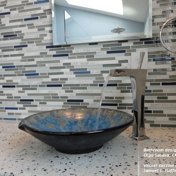
The custom made vessels and the accent tiles were the inspiration for this bathroom. These pieces were custom made by the artist, Samuel L. Hoffman, a potter, based on our specifications, color and inspiration. The detail on the front of the vessels represents the perfect wave to be out in the ocean surfing! My client wanted an ocean/sea feel for his master bathroom and blue was his color of choice. The crystals in the accent tiles, makes the perfect representation of the deep sea with a beautiful perfect dark blue to match the outside of the vessels. The rest of the materials were carefully chosen to help bring the sea feel to it - the rocks, the wood planks and the "sea salt" wall tile. Each accent tile was specifically placed to balance the bathroom. The sink wall was carefully tailored - we remove some of the white liners and inserted glass blue liners strategically to bring the blue to the wall without taking over the vessels. The shower has a trench drain and is curbless to allow for a clean smooth shower floor. Bathroom has all the contemporary amenities my client was looking for!
Designed by: Olga Sacasa, CKD
Interior designer
Vessels & accent tiles custom made by:
Samuel L. Hoffman Pottery
Construction done by: Jeffrey V. Silva of Silva Bros Construction
 Daniel Scerri Periti
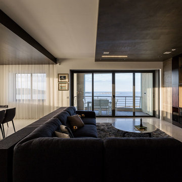
We were approached with a request to design the furnishings for an existing ‘finished’ apartment. The intention was to move in relatively fast, and the property already had an existing marble floor, kitchen and bathrooms which had to be kept. The property also boasted a fantastic 270 degree view, seen from most of the apartment. The clients had a very important role in the completion of the project. They were very involved during the design process and through various decoration choices. The final design was kept as a rigid guideline when faced with picking out all the different elements.
Once clear of all previous furniture, the space felt cold and bare; so we immediately felt the need for warmth, and raw, natural elements and textures to complement the cold marble floor while visually tying in the design of the whole apartment together.
Since the existing kitchen had a touch of dark walnut stain, we felt this material was one we should add to the palette of materials to contest the stark materials. A raw cement finish was another material we felt would add an interesting contrast and could be used in a variety of ways, from cabinets to walls and ceilings, to tie up the design of various areas of the apartment.
To warm up the living/dining area, keeping the existing marble floor but visually creating zones within the large living/dining area without hindering the flow, a dark timber custom-made soffit, continuous with a floor-to-ceiling drinks cabinet zones the dining area, giving it a degree of much-needed warmth.
The various windows with a stupendous 270 degree view needed to be visually tied together. This was done by introducing a continuous sheer [drape] which also doubled up as a sound-absorbing material along 2 of the 4 walls of the space.
A very large sofa was required to fill up the space correctly, also required for the size of the young family.
Services were integrated within the units and soffits, while a customized design in the corner between the kitchen and the living room took into consideration the viewpoints from the main areas to create a pantry without hindering the flow or views. A strategically placed floor-to-ceiling mirror doubles up the space and extends the view to the inner parts of the apartment.
The daughter’s bedroom was a small challenge in itself, and a fun task, where we wanted to achieve the perception of a cozy niche with its own enclosed reading nook [for reading fairy tales], behind see-through curtains and a custom-ordered wall print sporting the girl’s favorite colors.
The sons’ bedroom had double the requirements in terms of space needed: more wardrobe, more homework desk space, a tv/play station area… “We combined a raised platform area between the boys’ beds to become an area with cushions where the kids can lay down and play, and face a hidden screen behind the homework desk’s sliding back panel for their play station”. The color of the homework desk was chosen in relation to the boys’ ages. A more masculine material palette was chosen for this room, in contrast to the light pastel palette of the girl’s bedroom. Again, this colour can easily be changed over time for a more mature look.
PROJECT DATA:
St. Paul’s Bay, Malta
DESIGN TEAM:
Perit Rebecca Zammit, Perit Daniel Scerri, Elyse Tonna
OTHER CREDITS:
Photography: Tonio Lombardi
Styling : TKS
 Humà Design + Architecture
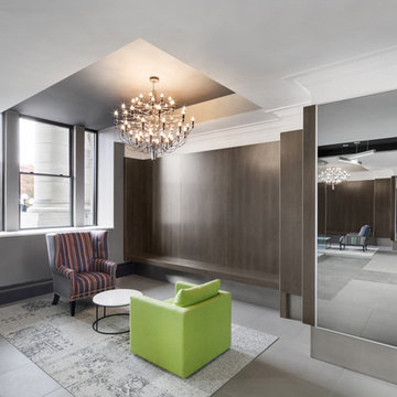
Established in a patrimonial building, the Castelnau condo project reflects its history throughout the entire design and is represented in the classical nature of the main entrance lobby. A strong perpendicular axe is created by the symmetrical layout and by a strategic ceiling recess, creating three blacks stripes directing the eyes on the openings to the exterior and taking charge of the lighting distribution. An arrangement of Flos chandeliers overlook the double height and confer elegance to the space, contrasting with the use of fluorescent fixtures that underlines the way to the elevators. Two symmetrical lounges serve as relaxation areas and are complemented by a built-in seat nestled in the hollow wood wall, which enfolds the elevators wall. The choice of materials and the construction details support the contemporary approach and honor the classic architecture filled with history. © Adrien Williams / Lorelei L’Affeter
 Design Square
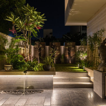
Luminous Welcome with Statement Lighting-
Illuminate your grand entrance with statement lighting as it becomes a radiant centrepiece and emerges as a hallmark of grandeur. Cascading pendants, dazzling chandeliers, or other elegant fixtures in sculptural forms, illuminate the entryway and captivate the eye. The strategic placement of these fixtures creates an interplay of light and shadow, elevating the entry into a visual spectacle. Further, the choice of lighting fixtures becomes a reflection of design sensibilities, whether it be a contemporary crystal chandelier emanating grandeur or a sleek modern pendant lending a sense of understated elegance.
20