
Search results for "Stuck staring">stuck" in Home Design Ideas
 Amy Birdsong
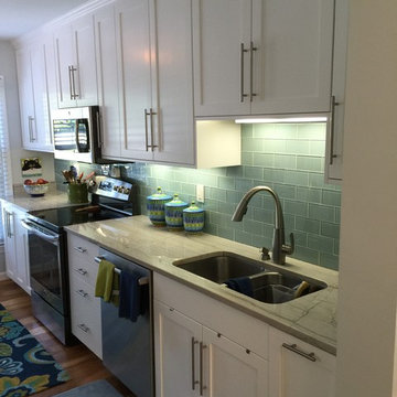
Sometimes you get an opportunity to completely transform and improve the function of a space. This job was so fun. The townhouse front door opened directly into the kitchen space- which left no walls for appliances and counters. The kitchen only had 7.5 linear feet of countertop- and the fridge stuck out opposite the sink, creating claustrophobia at best, a traffic jam at worse. The owner was willing to think outside the box- and we designed a layout that actually built walls and closed the kitchen off from the entrance, creating a new pantry, a recessed spot for the fridge, and freed up space to add an L-shaped sit down counter height eating area. Now the kitchen has 17 1/4 linear feet of counter space and feels so much larger. The owner chose the beautiful countertops, backsplash and color scheme. This is definitely one of the most transformed spaces I've ever worked on!
 Simply Perfect
Advice on interior design is available everywhere—from TV shows and websites to books, magazines and apps.
We love seeing people become engaged in design and educated on the wide range of possibilities. But we hope you’ll proceed with caution.
It’s not that style errors are a matter of life and death. It’s just that it’s easy to choose designs that aren’t necessarily reflective of your own personality and character. And since you’re typically stuck with your interior design decisions for years, styles that don’t quite fit can tend to grate on you.
Interiors that give one person comfort may unleash chaos in someone else. This goes beyond favorite colors or hot trends, right to the heart of interior design, where you find questions of composition, balance, repetition, space and more.
The goal is to find that unique combination of design elements that gives you comfort, support and balance.
In one home, that perfect balance was struck through the use of symmetry. A pair of comfortable swivel chairs sit beneath matching indigo patterned paintings. Matching bookcases below the paintings contain similar, but not identical, arrangements of books, vases and bowls. Woods and bronzes help warm up the simple white bookcase shelving.
Two matching poufs in front of the fireplace provide additional seating. The sofa is accented with a pair of pillows with a blue pattern that echoes the artwork.
The effect of the symmetry is to achieve order and simplicity, which I promote at every opportunity. After all, your home interiors should be the setting or the backdrop of your life—not center stage.
Antique bronze and blue are complementary colors. Together, they offer a rich palette of richness and depth, which brings out the beauty of wood and stone.
In the home office, a unique, whitewash-stained wooden desk rests on metal, Sawhorse-inspired legs for a warm, rustic look. The black leather chair features a contemporary silhouette with an antique brass frame. An adjustable desk lamp has bronze accents.
The bookcase combines a sleek, black metal frame with concrete shelves, for another unusual pairing. It’s kept uncluttered for an orderly, peaceful look. Items on the shelves include a bronze-accented lamp and a pair
of high gloss-finished wooden bookends.
The elegant artwork behind the desk is a simple midnight-blue and bronze with mottled white. Deep blues are again picked up in the rug, which adds a stately vibe with a modern pattern and satisfying texture.
Within the framework of symmetry, the living room repeats the blue-and-bronze color scheme.
A large midcentury brass clock above the fireplace keeps the natural stone visible, rather than hidden behind a painting or television, while its straight lines and color create a beautiful contrast.
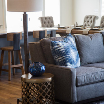
The sofa is a soft, neutral blue. The pattern on the round brass side table features echoes the darker blue-patterned rug, as well as the rug in the office, tying the rooms together.
Indigo blue books adjacent to bronze vases on the shelves repeat the color scheme. The soapstone-topped coffee table echoes the shape of the fireplace. A pair of tall, matching floor lamps with long wooden bases, brass pulls and simple linen shades combine both the colors and symmetry found throughout the home.
 Dimensions in Wood Inc
We have completed our new Showroom display Kitchen where we highlight the latest and greatest Dimensions In Wood has to offer for your Kitchen Remodels, Wet Bar Installation, Bathroom Renovations, and more!
This display features our factory line of Bridgewood Cabinets, a Bridgewood Wooden Vent Hood, plus Carlisle Wide Plank Flooring Luxury Vinyl floor (LVP).
There is a custom pantry with sliding doors designed and built in house by Dimensions In Wood’s master craftsmen. The pantry has soft close door hardware, pull out drawer storage, TASK LED Lighting and tons more!
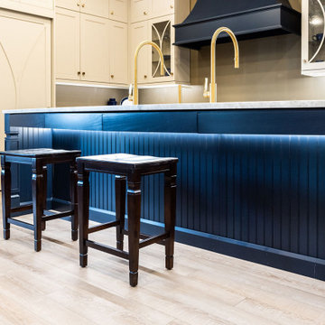
The eat-in kitchen island features a 5 Foot side Galley Workstation Sink with Taj Mahal Quartzite countertops.
The island even has four, soft-close drawers. This extra storage would be great in any home for devices, papers, or anything you want hidden away neatly. Friends and family will enjoying sitting at the island on bar stools.
All around the island and cabinets Task Lighting with a Voice Control Module provides illumiation. This allows you to turn your kitchen lights on and off using, Alexa, Apple Siri, Google Assistant and more! The floor lighting is also perfect for late night snacks or when you first come home.
One cabinet has a Kessebohmer Clever Storage pull down shelf. These can grant you easy access to items in tall cabinets.
A new twist for lazy susans, the Lemans II Set for Blind Corner Cabinets replaces old spinning shelves with completely accessible trays that pull out fully. These makes it super easy to access everything in your corner cabinet, while also preventing items from getting stuck in a corner.
Another cabinet sports a Mixer Lift. This shelf raises up into a work surface with your baking mixer attached. It easily drops down to hide your baking mixer in the cabinet. Similar to an Appliance Garage, this allows you to keep your mixer ready and accessible without cluttering your countertop.
Spice and Utensil Storage pull out racks are hidden in columns on either side of the 48″ gas range stove! These are just such a cool feature which will wow anyone visiting your home. What would have been several inches of wasted space is now handy storage and a great party trick.
Two of the cabinets sport a glass facia with custom double bowed mullions. These glass doored cabinets are also lit by LED TASK Lighting.
This kitchen is replete with custom features that Dimensions In Wood can add to your home! Call us Today to come see our showroom in person, or schedule a video meeting.
Find the right local pro for your project
 Cubist Engineering
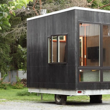
Don’t get stuck in remodel hell adding a room onto your house. The 12.5’x8.5’ Adirondack is spare room that can live in any environment—from your backyard to the back woods. A wood-burning stove and garapa trim throughout make it warm and inviting, while the wall of glass and optional wraparound deck make it more expansive. With a modern sofa by Article, 42-inch LCD TV and hidden pull-out bed, it’s the guest room, man cave or office that won’t crowd your home.
 Gallery KBNY
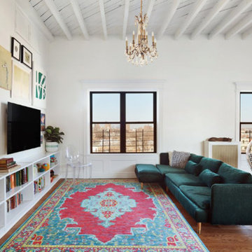
For this Brooklyn condo renovation, Gallery Kitchen and Bath updated the entire kitchen and both bathrooms, as well as painted and laid out new flooring throughout the entire apartment. The owners wanted to unite the seeming medley of the existing space into a cohesive design more representative of their own style. With its ultra-high ceilings and exposed joints and beams, the space already lent itself to the farmhouse look. The end result is a modernized, eclectic farmhouse style that we keenly carried throughout the home.
MORE DETAILS
Compelling textures and color combos reign supreme. The kitchen features semi-custom Shaker-style stone gray cabinets, a white subway tile backsplash running all the way up the wall, and white quartz countertops. We built the island in part to create a pleasing yet efficient flow from the kitchen into the living and dining areas as the space was opened up. We also painted the plumbing stack white to not make it stand out.
We also redesigned the bathrooms, giving each a unique treatment. In the master bath, we took a Victorian-goes-modern approach with coral walls, champagne fixtures, and a clawfoot tub. In the guest bathroom, we stuck to a transitional style that approaches modern without becoming contemporary, pairing herringbone marble floor tiles with a mix of subway and penny tiles on the walls and in the shower. Both maintain elements, such as tiles, fixtures, and colors, that coordinate with the overall eclectic farmhouse look.
HOW WE COLLABORATE
Collaboration with our clients to their desired degree is one of our core pillars. In this condo renovation, the clients wanted central air and were initially considering a true central air system. We advised against it, as not only would it take away from the unique beauty of unusually tall ceilings by adding unsightly ductwork, but it would also significantly detract from the farmhouse look. Instead, we suggested a mini-split system. Our recommended units were both cost-effective and much more complementary to the comprehensive theme. Of course, we ultimately always honor the clients’ choices but it’s just as important to us that we make sure to provide all the necessary information so our clients can make educated decisions that are best for their needs.
SPACE PLANNING
Another key element of the renovation process is space planning. From this perspective, we consider the placement and positioning of objects with regard to the overall flow of space. The building where this renovation took place is U-shaped at one end, which happens to be where this particular apartment is located. Uniquely-shaped spaces naturally require more concentration than those built in the standard rectangular shape. Questions we consider include: Where will people really spend time in this space? What will the flow of foot traffic be? Is there easy access to the kitchen island? Does it flow well into the hallways? Does the island protrude into anything? Working in New York, with its variety of homes and architectural styles, has greatly developed our experience with standard spaces and unconventional ones alike.
SOME HIGHLIGHTS
- Ultra-tall ceilings, allowing for stacked cabinets in the kitchen, as well as long pendant light fixtures and more chandeliers than usual throughout the home
- Completely refurbished cast iron clawfoot tub in one bathroom, with a 270-degree shower curtain around the tub
- Vibrant color choices, including an all-blue bedroom in various shades
- Treated exposed brick walls
Fun Fact: A client once showed us inspiration photos that they sourced online of this exact project, having no idea it was one of ours.
Thinking about renovating your condo? Contact us today to find out how you can benefit from our expertise in remodeling New York City condos. We are a design-and-build firm with a full-scale approach that handles every single aspect of your condo renovation from start to finish.
 Cape Associates, Inc.
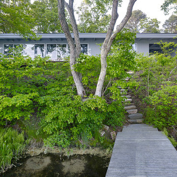
Overthinking a situation isn’t always a bad thing, particularly when the home in question is one in which the past is suddenly meeting the present. Originally designed by Finnish architect Olav Hammarstrom in 1952 for fellow architect Eero Saarinen, this unique home recently received its first transformation in decades. Still in its 1950s skin, it was completely gutted, inside and out. It was a serious undertaking, as the homeowner wanted modern upgrades, while keeping an eye toward retaining the home’s 1950s charm. She had a vision for her home, and she stuck to it from beginning to end.
Perched on a rise of land and overlooking the tranquil Wellfleet Herring Pond, the home initially appears split, with the guest house on the left, and the main house of the right, but both ends are connected with a breezeway. The original home’s bones were in good shape, but many upgrades and replacements were necessary to bring the house up to date.
New siding, roofing, gutters, insulation and mechanical systems were all replaced. Doors and windows with metal frames were custom made by a company in Long Island that fabricates doors for office buildings. Modern heating and cooling systems were added, and the three bathrooms were all updated. The footprint of the home remained unchanged. Inside, the only expansion was more closet space.
The attention to detail in retaining the 50s-style look took a lot of online searching, from handles and knobs to lighting fixtures, with bits and pieces arriving from all over the world, including a doorstop from New Zealand. The homeowner selected many of the fixtures herself, while a very detail-oriented foreman exhaustively researched as well, looking for just the right piece for each and every location.
High-end appliances were purchased to modernize the kitchen and all of the old cabinetry was removed, replaced and refaced with NUVACOR, a versatile surfacing material that not only provided a sleek, modern look, but added convenience and ease of use.
Bare, wood-beamed ceilings throughout give a nod to the home’s natural surroundings, while the main living area (formerly a fisherman’s cabin), with a brick fireplace, was completely trimmed in walnut, while multiple windows of varying sizes welcome sunlight to brighten the home. Here, the sheetrock ceiling with faux rafters provides an interesting and room-brightening feature.
Behind the house sits the serene pond, which can now be enjoyed from the stunning new deck. Here, decking material was not laid out side by side, as it typically is but, instead, meticulously laid out on edge, creating an unusual and eye-catching effect. A railing of tempered glass panels allows unobstructed views of the surrounding natural beauty, and keeps consistent with the open, airy feel of the place. A new outdoor shower is accessible via the deck and left open to the wilderness and the pond below, completing the bold yet sophisticated feeling of this retro-modern home.
 The Highpoint House
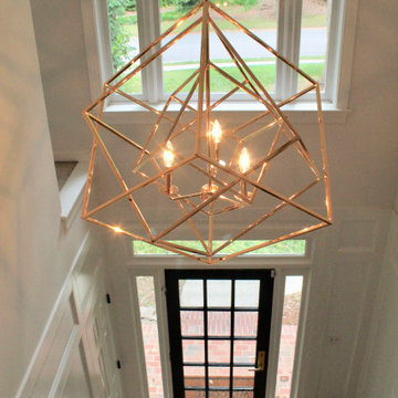
All this classic home needed was some new life and love poured into it. The client's had a very modern style and were drawn to Restoration Hardware inspirations. The palette we stuck to in this space incorporated easy neutrals, mixtures of brass, and black accents. We freshened up the original hardwood flooring throughout with a natural matte stain, added wainscoting to enhance the integrity of the home, and brightened the space with white paint making the rooms feel more expansive than reality.

 Castle Building & Remodeling
With a master bath and second bathroom stuck in the 1970’s, the homeowners of this unique Minneapolis home were looking to upgrade their bathroom to fit their sophisticated minimalist taste. In the hall bath, the tub was removed and replaced with a no-threshold tiled shower and glass enclosure. To make the space feel larger a custom floating vanity was designed. Drawers were designed with a plumbing chase and built in cubbies to help keep everything neatly in one place. Outlets, a mirror de-fogger and a nightlight included in the medicine cabinet increase usable storage and add functionality. Porcelain tile was installed in the shower and on the floor of the bathroom. The old wallpaper was replaced with a modern navy windowpane patter.
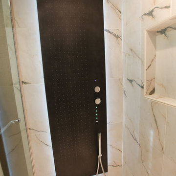
To create a cohesive look, the same porcelain tile was installed throughout the master bathroom. Meanwhile, the swinging door to the toilet room was replaced with a pocket door to save size. The original vanity was replaced with a 42” high high-gloss cherry cabinet, Cambria top and toe-kick rope lighting. To create a spa-like experience, the tiled shower received an Italian shower unit by Fantini called the Acquapura – it includes a waterfall head and various body sprays. The walls were wallpapered with a neutral textured paper that picks up on the taupe running through the tile. A simple mirror and light fixture in chrome complete this modern minimalist bath.
 Kitchens by Good Guys
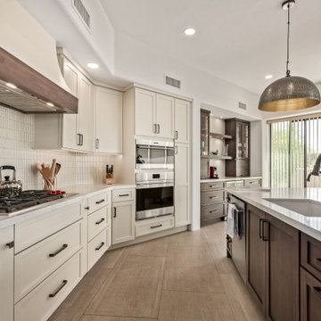
At our Nolina project, we touched just about every room in the house. The homeowner had recently updated the flooring throughout the home, which gave us the perfect neutral base to build upon. From the beginning, our homeowner knew he wanted to brighten up the space but keep elements of drama and contrast. You’ll see that we stuck with a handful of finishes throughout these spaces to give a cohesive & luxurious feel.
 Reyes Creative Concepts LLC.
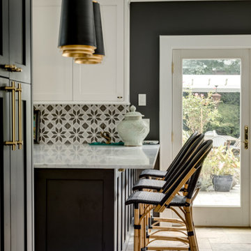
We recently renovated our kitchen. It is so challenging for an interior designer to design their own home. I am so critical of myself and I would hate to have me as a client. I get stuck.
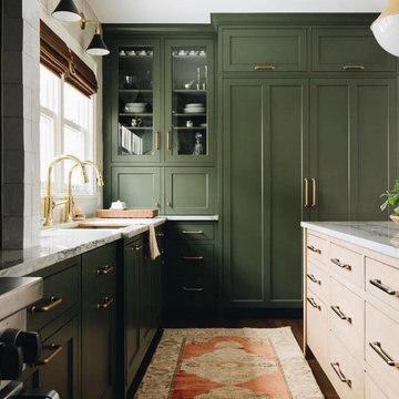
So, I decided to keep it simple and focus on the elements, influences and colors I love and never get tired of. All my “loves” are in this space - contrasting black and white, Art Deco era, chinoiserie, porcelain and color green, the perfect color of nature. Of course I did not forget about all the important functional things like good flow, functionality, plenty of storage and a large peninsula for entertainment.
I love this eclectic space and. all the elements in it.
 Hallmark Floors
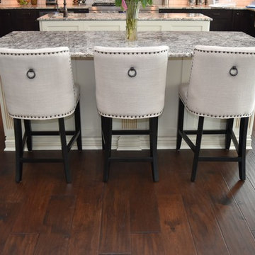
“We really enjoy the 7" wide planks and random lengths; people are always complementing us on the floors when they 1st see our home. We are so glad we spent a little extra for the upgrade to the Hallmark Hardwood floors - also happy we stuck with the white shoe molding to help show our larger base molding a little better.“ - Home Owner Testimonial
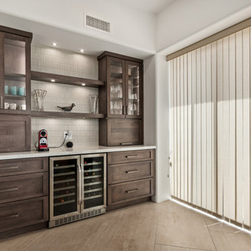 Kitchens by Good Guys
At our Nolina project, we touched just about every room in the house. The homeowner had recently updated the flooring throughout the home, which gave us the perfect neutral base to build upon. From the beginning, our homeowner knew he wanted to brighten up the space but keep elements of drama and contrast. You’ll see that we stuck with a handful of finishes throughout these spaces to give a cohesive & luxurious feel.
 Metropolis Drafting and Construction Inc
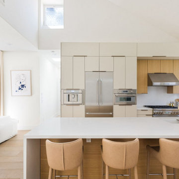
When our client bought this house, it was stuck in limbo between the traditional interior and a 90's modern structure.
The direction we took was a combination of calm beige color scheme with clean lines and smooth surfaces.
The continuation of the same materials throughout the house finally bonded all the different spaces into a singular home.
The two guest bathrooms were made with Cloe zellige style tiles and custom floating vanities made from white oak.
The same oak was used also for the built-in TV wall as floating shelves and base cabinets with a large, tiled center piece for the recessed TV and the electric fireplace.
The kitchen also received some of the white oak love in the form of the Island and the recessed cooking area.
The biggest issue with the kitchen space was the lack of proportions between the width and its length vs. the extreme height of the vaulted ceiling.
The solution I came up with was a secondary line of wall cabinets to be the same depth as the full height units to create a wrap around and make the space more proportionate.
Continuing to the master bathroom, here we have a true walk-in master bath suite, no door needed with this size of space.
All the walls received porcelain semi slab treatment. (72x36 porcelain tile) a lot of work went into selecting the correct tile pieces to give it the effect of a single slab installation but without the added cost.
All fixtures are by Kohler with their fantastic modern gold finish.
The result was a perfect flow of calm beige colors and warmth of natural wood throughout.
 S Squared Design, LLC
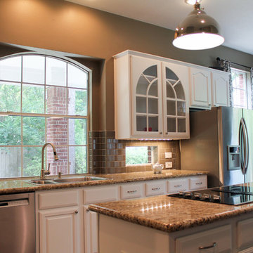
Client wanted to update their kitchen but wanted to incorporate their original cabinets, which were a blonde wood. They wanted to lighten the kitchen and so we did a white satin finish on the cabinets, installed a grey glazed subway tile backsplash, got ride of the old pick floor tile and laid a grey/brown porcelain tile that grounds the kitchen and breakfast areas very nicely. Under cabinet lighting for a little shine as well as give a functional element for cooking. Added two new shiny chrome industrial pendant lights. Also the double sided fireplace got a redesign. The old outdated mantle that stuck out way too far into the walkway was removed and in its place is now a custom mantle with a mini brick slate tile insert. Arches we added to the walkways to give more architectural detail that is found in other areas of the home.
 Pinnacle Design & Remodeling
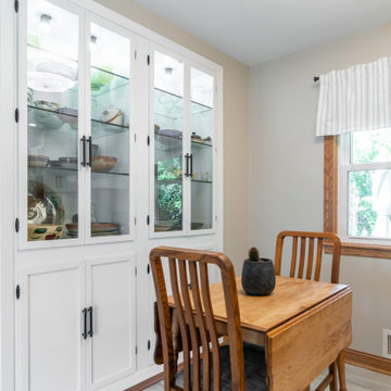
Galley kitchen with two tone cabinets to work with the preexisting wood tones throughout the home. We stuck with flat panel doors for easy cleaning and a simple bar pull for everywhere for easy grabbing. A multi tone flooring to "hide" the grime that can come from kitchens and back entryway paired with a simple subway tile that has a timeless design for years to come.
 FA Design Build
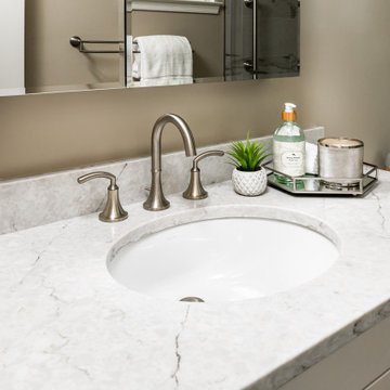
Eventually things wear out – including bathrooms! Our clients had updated one of their three bathrooms, but the other two were still stuck in the 1960s, with small floor plans, vanities lacking storage, and poor lighting. They decided to tackle both of these bathroom renovations at once. For the master bath, we were able to take about four square feet from the master bedroom by reframing a wall and doorway. This additional space allowed us to convert a tub to a shower, add a hand shower, and install a longer vanity, countertop, and mirror. The extra square footage, plus a glass door and furniture-style vanity, gives the space a larger appearance. The finishes in warm grays and traditional patterns complete the update.

 Tango Design Studio
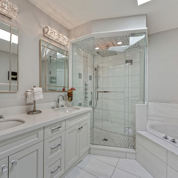
This is a shot of the bathroom. We stuck to clean lines and an all white neutral look.
Example of a large transitional master white tile and porcelain tile porcelain tile and white floor corner bathtub design in Toronto with shaker cabinets, white cabinets, white walls, an undermount sink, quartz countertops and a hinged shower door
Example of a large transitional master white tile and porcelain tile porcelain tile and white floor corner bathtub design in Toronto with shaker cabinets, white cabinets, white walls, an undermount sink, quartz countertops and a hinged shower door

19