
Search results for "Stuck staring">stuck" in Home Design Ideas

 Elza B. Design, Inc.
A busy family moves to a new home stuck in the 90's in metro Boston and requests a full refresh and renovation. Lots of family friendly materials and finishes are used. Some areas feel more modern, others have more of a transitional flair. Elegance is not impossible in a family home, as this project illustrates. Spaces are designed and used for adults and kids. For example the family room doubles as a kids craft room, but also houses a piano and guitars, a library and a sitting area for parents to hang out with their children. The living room is family friendly with a stain resistant sectional sofa, large TV screen but also houses refined decor, a wet bar, and sophisticated seating. The entry foyer offers bins to throw shoes in, and the dining room has an indoor outdoor rug that can be hosed down as needed! The master bedroom is a romantic, transitional space.
Photography: Michael J Lee
 User
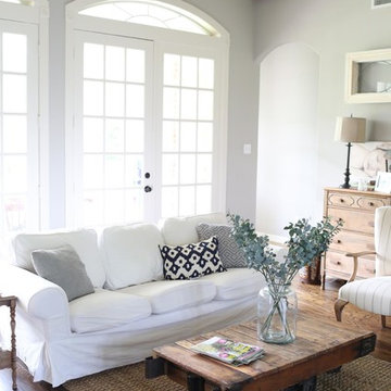
UserThis traditional home was stuck in 1990 when we came into this project--deep red walls, faux painting, & lots of brown paint colors. We redesigned this entire house & turned it into an elegant farmhouse with new paint colors, hardwood floors, and a new kitchen.
Chelsea Davis Photography
 Ellie K Design
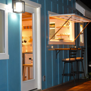
Round windows and cedarwood accent panel.
This tropical modern coastal Tiny Home is built on a trailer and is 8x24x14 feet. The blue exterior paint color is called cabana blue. The large circular window is quite the statement focal point for this how adding a ton of curb appeal. The round window is actually two round half-moon windows stuck together to form a circle. There is an indoor bar between the two windows to make the space more interactive and useful- important in a tiny home. There is also another interactive pass-through bar window on the deck leading to the kitchen making it essentially a wet bar. This window is mirrored with a second on the other side of the kitchen and the are actually repurposed french doors turned sideways. Even the front door is glass allowing for the maximum amount of light to brighten up this tiny home and make it feel spacious and open. This tiny home features a unique architectural design with curved ceiling beams and roofing, high vaulted ceilings, a tiled in shower with a skylight that points out over the tongue of the trailer saving space in the bathroom, and of course, the large bump-out circle window and awning window that provides dining spaces.
Find the right local pro for your project
 Simply Perfect
Advice on interior design is available everywhere—from TV shows and websites to books, magazines and apps.
We love seeing people become engaged in design and educated on the wide range of possibilities. But we hope you’ll proceed with caution.
It’s not that style errors are a matter of life and death. It’s just that it’s easy to choose designs that aren’t necessarily reflective of your own personality and character. And since you’re typically stuck with your interior design decisions for years, styles that don’t quite fit can tend to grate on you.
Interiors that give one person comfort may unleash chaos in someone else. This goes beyond favorite colors or hot trends, right to the heart of interior design, where you find questions of composition, balance, repetition, space and more.
The goal is to find that unique combination of design elements that gives you comfort, support and balance.
In one home, that perfect balance was struck through the use of symmetry. A pair of comfortable swivel chairs sit beneath matching indigo patterned paintings. Matching bookcases below the paintings contain similar, but not identical, arrangements of books, vases and bowls. Woods and bronzes help warm up the simple white bookcase shelving.
Two matching poufs in front of the fireplace provide additional seating. The sofa is accented with a pair of pillows with a blue pattern that echoes the artwork.
The effect of the symmetry is to achieve order and simplicity, which I promote at every opportunity. After all, your home interiors should be the setting or the backdrop of your life—not center stage.
Antique bronze and blue are complementary colors. Together, they offer a rich palette of richness and depth, which brings out the beauty of wood and stone.
In the home office, a unique, whitewash-stained wooden desk rests on metal, Sawhorse-inspired legs for a warm, rustic look. The black leather chair features a contemporary silhouette with an antique brass frame. An adjustable desk lamp has bronze accents.
The bookcase combines a sleek, black metal frame with concrete shelves, for another unusual pairing. It’s kept uncluttered for an orderly, peaceful look. Items on the shelves include a bronze-accented lamp and a pair
of high gloss-finished wooden bookends.
The elegant artwork behind the desk is a simple midnight-blue and bronze with mottled white. Deep blues are again picked up in the rug, which adds a stately vibe with a modern pattern and satisfying texture.
Within the framework of symmetry, the living room repeats the blue-and-bronze color scheme.
A large midcentury brass clock above the fireplace keeps the natural stone visible, rather than hidden behind a painting or television, while its straight lines and color create a beautiful contrast.
The sofa is a soft, neutral blue. The pattern on the round brass side table features echoes the darker blue-patterned rug, as well as the rug in the office, tying the rooms together.
Indigo blue books adjacent to bronze vases on the shelves repeat the color scheme. The soapstone-topped coffee table echoes the shape of the fireplace. A pair of tall, matching floor lamps with long wooden bases, brass pulls and simple linen shades combine both the colors and symmetry found throughout the home.
 Breathe Design Studio
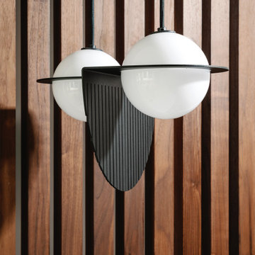
We had the pleasure of working with a wonderful photography studio called Portraits by Ryan. Through our thoughtful designs, we created an open, light space for Ryan to work in with a contrasting white interior and black furniture that oozes class. In the reception area, we wanted to display his beautiful logo above the counter to make it a big statement when you enter. Beautiful pendant lighting against warm wood creates a stylish appeal. Inside, we stuck to the monochrome look throughout the studio, including using this grey wire to hang parts of Ryan’s amazing portfolio.
 Michael Nash Design, Build & Homes
2011 CAPITAL COTY AWARD HONORABLE MENTION AWARD WINNER
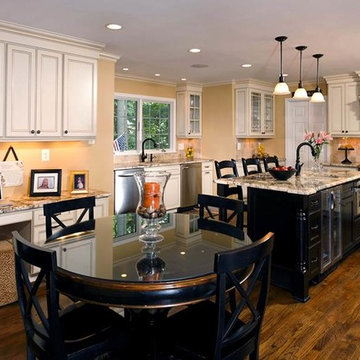
Built circa 1980, a young couple with three children originally purchased this home for their growing family. After four years of karate, soccer, piano and other activities, however, the home was becoming too small to meet their needs.
Problems started upon entering the front foyer. A 25-foot long dark hallway separated the family room and the kitchen, ending in a tiny powder room stuck in the middle of the layout. The kitchen was especially isolated, a cramped L-shaped design with a box bay breakfast bump out that was literally falling apart.
The new design started with the core of the problem—the maze and separation created by the long hallways.
First, the 25’ load bearing wall separating the foyer from family room was totally taken out and replaced with a long supporting beam. A French door replaced a small door and window leading to a screen porch . This action allowed lots of light to get into family and foyer. Then, the powder room was removed and the partition wall between the kitchen and family room was taken down. This created a large open concept design and greatly increased the size of the kitchen.
The box bay was demolished and replaced with new walls and a large window. The plumbing for main sink and dishwasher got relocated into this box bay allowing a total transformation of the space. Now there are cabinets and counters on all sides.
The doorway to the dining room was reconfigured to allow a butler area on its left. While the right side was occupied with new 36” gas range top with a decorative wood hood above it. The refrigerator, microwave/oven and pantries—the space’s tall elements—occupy one wall..
A large Island with a prep sink and beverage center for the kids occupies the center of the layout. Capable of seating up to four, family and friends can now keep the cook company. A large built-in desk area lets the kids do their homework so the parents can supervise while they prepare meals.
Light cabinetry with a touch of caramel glazing and exotic granite countertops by our designers contributed to this kitchen’s elegant design. The contrasting distressed island’s darker finish matches the dinette set and other furnishings.
New hardwood floors were installed throughout the first floor for a seamless look, while recess, pendant and task lighting make the space even brighter. Importantly, there’s plenty of space for parents and kids to hang out together. The kitchen is truly the heart of their home.
 Gallery KBNY
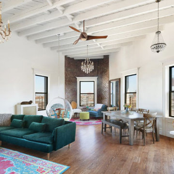
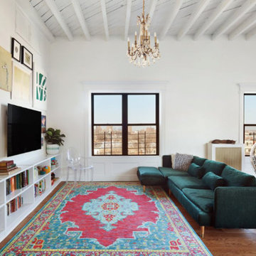
For this Brooklyn condo renovation, Gallery Kitchen and Bath updated the entire kitchen and both bathrooms, as well as painted and laid out new flooring throughout the entire apartment. The owners wanted to unite the seeming medley of the existing space into a cohesive design more representative of their own style. With its ultra-high ceilings and exposed joints and beams, the space already lent itself to the farmhouse look. The end result is a modernized, eclectic farmhouse style that we keenly carried throughout the home.
MORE DETAILS
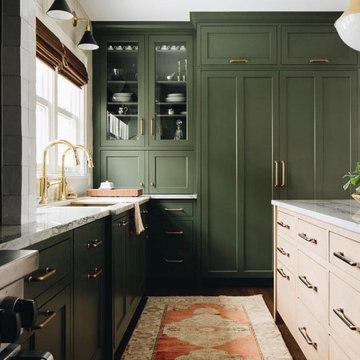
Compelling textures and color combos reign supreme. The kitchen features semi-custom Shaker-style stone gray cabinets, a white subway tile backsplash running all the way up the wall, and white quartz countertops. We built the island in part to create a pleasing yet efficient flow from the kitchen into the living and dining areas as the space was opened up. We also painted the plumbing stack white to not make it stand out.
We also redesigned the bathrooms, giving each a unique treatment. In the master bath, we took a Victorian-goes-modern approach with coral walls, champagne fixtures, and a clawfoot tub. In the guest bathroom, we stuck to a transitional style that approaches modern without becoming contemporary, pairing herringbone marble floor tiles with a mix of subway and penny tiles on the walls and in the shower. Both maintain elements, such as tiles, fixtures, and colors, that coordinate with the overall eclectic farmhouse look.
HOW WE COLLABORATE
Collaboration with our clients to their desired degree is one of our core pillars. In this condo renovation, the clients wanted central air and were initially considering a true central air system. We advised against it, as not only would it take away from the unique beauty of unusually tall ceilings by adding unsightly ductwork, but it would also significantly detract from the farmhouse look. Instead, we suggested a mini-split system. Our recommended units were both cost-effective and much more complementary to the comprehensive theme. Of course, we ultimately always honor the clients’ choices but it’s just as important to us that we make sure to provide all the necessary information so our clients can make educated decisions that are best for their needs.
SPACE PLANNING
Another key element of the renovation process is space planning. From this perspective, we consider the placement and positioning of objects with regard to the overall flow of space. The building where this renovation took place is U-shaped at one end, which happens to be where this particular apartment is located. Uniquely-shaped spaces naturally require more concentration than those built in the standard rectangular shape. Questions we consider include: Where will people really spend time in this space? What will the flow of foot traffic be? Is there easy access to the kitchen island? Does it flow well into the hallways? Does the island protrude into anything? Working in New York, with its variety of homes and architectural styles, has greatly developed our experience with standard spaces and unconventional ones alike.
SOME HIGHLIGHTS
- Ultra-tall ceilings, allowing for stacked cabinets in the kitchen, as well as long pendant light fixtures and more chandeliers than usual throughout the home
- Completely refurbished cast iron clawfoot tub in one bathroom, with a 270-degree shower curtain around the tub
- Vibrant color choices, including an all-blue bedroom in various shades
- Treated exposed brick walls
Fun Fact: A client once showed us inspiration photos that they sourced online of this exact project, having no idea it was one of ours.
Thinking about renovating your condo? Contact us today to find out how you can benefit from our expertise in remodeling New York City condos. We are a design-and-build firm with a full-scale approach that handles every single aspect of your condo renovation from start to finish.

 Gallery KBNY
For this Brooklyn condo renovation, Gallery Kitchen and Bath updated the entire kitchen and both bathrooms, as well as painted and laid out new flooring throughout the entire apartment. The owners wanted to unite the seeming medley of the existing space into a cohesive design more representative of their own style. With its ultra-high ceilings and exposed joints and beams, the space already lent itself to the farmhouse look. The end result is a modernized, eclectic farmhouse style that we keenly carried throughout the home.
MORE DETAILS
Compelling textures and color combos reign supreme. The kitchen features semi-custom Shaker-style stone gray cabinets, a white subway tile backsplash running all the way up the wall, and white quartz countertops. We built the island in part to create a pleasing yet efficient flow from the kitchen into the living and dining areas as the space was opened up. We also painted the plumbing stack white to not make it stand out.
We also redesigned the bathrooms, giving each a unique treatment. In the master bath, we took a Victorian-goes-modern approach with coral walls, champagne fixtures, and a clawfoot tub. In the guest bathroom, we stuck to a transitional style that approaches modern without becoming contemporary, pairing herringbone marble floor tiles with a mix of subway and penny tiles on the walls and in the shower. Both maintain elements, such as tiles, fixtures, and colors, that coordinate with the overall eclectic farmhouse look.
HOW WE COLLABORATE
Collaboration with our clients to their desired degree is one of our core pillars. In this condo renovation, the clients wanted central air and were initially considering a true central air system. We advised against it, as not only would it take away from the unique beauty of unusually tall ceilings by adding unsightly ductwork, but it would also significantly detract from the farmhouse look. Instead, we suggested a mini-split system. Our recommended units were both cost-effective and much more complementary to the comprehensive theme. Of course, we ultimately always honor the clients’ choices but it’s just as important to us that we make sure to provide all the necessary information so our clients can make educated decisions that are best for their needs.
SPACE PLANNING
Another key element of the renovation process is space planning. From this perspective, we consider the placement and positioning of objects with regard to the overall flow of space. The building where this renovation took place is U-shaped at one end, which happens to be where this particular apartment is located. Uniquely-shaped spaces naturally require more concentration than those built in the standard rectangular shape. Questions we consider include: Where will people really spend time in this space? What will the flow of foot traffic be? Is there easy access to the kitchen island? Does it flow well into the hallways? Does the island protrude into anything? Working in New York, with its variety of homes and architectural styles, has greatly developed our experience with standard spaces and unconventional ones alike.
SOME HIGHLIGHTS
- Ultra-tall ceilings, allowing for stacked cabinets in the kitchen, as well as long pendant light fixtures and more chandeliers than usual throughout the home
- Completely refurbished cast iron clawfoot tub in one bathroom, with a 270-degree shower curtain around the tub
- Vibrant color choices, including an all-blue bedroom in various shades
- Treated exposed brick walls
Fun Fact: A client once showed us inspiration photos that they sourced online of this exact project, having no idea it was one of ours.
Thinking about renovating your condo? Contact us today to find out how you can benefit from our expertise in remodeling New York City condos. We are a design-and-build firm with a full-scale approach that handles every single aspect of your condo renovation from start to finish.
 Cape Associates, Inc.
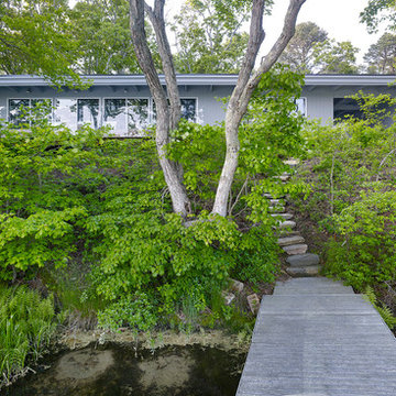
Overthinking a situation isn’t always a bad thing, particularly when the home in question is one in which the past is suddenly meeting the present. Originally designed by Finnish architect Olav Hammarstrom in 1952 for fellow architect Eero Saarinen, this unique home recently received its first transformation in decades. Still in its 1950s skin, it was completely gutted, inside and out. It was a serious undertaking, as the homeowner wanted modern upgrades, while keeping an eye toward retaining the home’s 1950s charm. She had a vision for her home, and she stuck to it from beginning to end.
Perched on a rise of land and overlooking the tranquil Wellfleet Herring Pond, the home initially appears split, with the guest house on the left, and the main house of the right, but both ends are connected with a breezeway. The original home’s bones were in good shape, but many upgrades and replacements were necessary to bring the house up to date.
New siding, roofing, gutters, insulation and mechanical systems were all replaced. Doors and windows with metal frames were custom made by a company in Long Island that fabricates doors for office buildings. Modern heating and cooling systems were added, and the three bathrooms were all updated. The footprint of the home remained unchanged. Inside, the only expansion was more closet space.
The attention to detail in retaining the 50s-style look took a lot of online searching, from handles and knobs to lighting fixtures, with bits and pieces arriving from all over the world, including a doorstop from New Zealand. The homeowner selected many of the fixtures herself, while a very detail-oriented foreman exhaustively researched as well, looking for just the right piece for each and every location.
High-end appliances were purchased to modernize the kitchen and all of the old cabinetry was removed, replaced and refaced with NUVACOR, a versatile surfacing material that not only provided a sleek, modern look, but added convenience and ease of use.
Bare, wood-beamed ceilings throughout give a nod to the home’s natural surroundings, while the main living area (formerly a fisherman’s cabin), with a brick fireplace, was completely trimmed in walnut, while multiple windows of varying sizes welcome sunlight to brighten the home. Here, the sheetrock ceiling with faux rafters provides an interesting and room-brightening feature.
Behind the house sits the serene pond, which can now be enjoyed from the stunning new deck. Here, decking material was not laid out side by side, as it typically is but, instead, meticulously laid out on edge, creating an unusual and eye-catching effect. A railing of tempered glass panels allows unobstructed views of the surrounding natural beauty, and keeps consistent with the open, airy feel of the place. A new outdoor shower is accessible via the deck and left open to the wilderness and the pond below, completing the bold yet sophisticated feeling of this retro-modern home.
 Castle Building & Remodeling
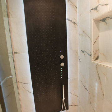
With a master bath and second bathroom stuck in the 1970’s, the homeowners of this unique Minneapolis home were looking to upgrade their bathroom to fit their sophisticated minimalist taste. In the hall bath, the tub was removed and replaced with a no-threshold tiled shower and glass enclosure. To make the space feel larger a custom floating vanity was designed. Drawers were designed with a plumbing chase and built in cubbies to help keep everything neatly in one place. Outlets, a mirror de-fogger and a nightlight included in the medicine cabinet increase usable storage and add functionality. Porcelain tile was installed in the shower and on the floor of the bathroom. The old wallpaper was replaced with a modern navy windowpane patter.
To create a cohesive look, the same porcelain tile was installed throughout the master bathroom. Meanwhile, the swinging door to the toilet room was replaced with a pocket door to save size. The original vanity was replaced with a 42” high high-gloss cherry cabinet, Cambria top and toe-kick rope lighting. To create a spa-like experience, the tiled shower received an Italian shower unit by Fantini called the Acquapura – it includes a waterfall head and various body sprays. The walls were wallpapered with a neutral textured paper that picks up on the taupe running through the tile. A simple mirror and light fixture in chrome complete this modern minimalist bath.
 Kitchens by Good Guys
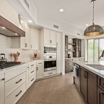
At our Nolina project, we touched just about every room in the house. The homeowner had recently updated the flooring throughout the home, which gave us the perfect neutral base to build upon. From the beginning, our homeowner knew he wanted to brighten up the space but keep elements of drama and contrast. You’ll see that we stuck with a handful of finishes throughout these spaces to give a cohesive & luxurious feel.
 Cape Associates, Inc.
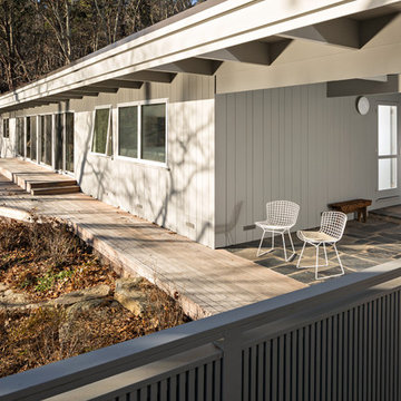
Overthinking a situation isn’t always a bad thing, particularly when the home in question is one in which the past is suddenly meeting the present. Originally designed by Finnish architect Olav Hammarstrom in 1952 for fellow architect Eero Saarinen, this unique home recently received its first transformation in decades. Still in its 1950s skin, it was completely gutted, inside and out. It was a serious undertaking, as the homeowner wanted modern upgrades, while keeping an eye toward retaining the home’s 1950s charm. She had a vision for her home, and she stuck to it from beginning to end.
Perched on a rise of land and overlooking the tranquil Wellfleet Herring Pond, the home initially appears split, with the guest house on the left, and the main house of the right, but both ends are connected with a breezeway. The original home’s bones were in good shape, but many upgrades and replacements were necessary to bring the house up to date.
New siding, roofing, gutters, insulation and mechanical systems were all replaced. Doors and windows with metal frames were custom made by a company in Long Island that fabricates doors for office buildings. Modern heating and cooling systems were added, and the three bathrooms were all updated. The footprint of the home remained unchanged. Inside, the only expansion was more closet space.
The attention to detail in retaining the 50s-style look took a lot of online searching, from handles and knobs to lighting fixtures, with bits and pieces arriving from all over the world, including a doorstop from New Zealand. The homeowner selected many of the fixtures herself, while a very detail-oriented foreman exhaustively researched as well, looking for just the right piece for each and every location.
High-end appliances were purchased to modernize the kitchen and all of the old cabinetry was removed, replaced and refaced with NUVACOR, a versatile surfacing material that not only provided a sleek, modern look, but added convenience and ease of use.
Bare, wood-beamed ceilings throughout give a nod to the home’s natural surroundings, while the main living area (formerly a fisherman’s cabin), with a brick fireplace, was completely trimmed in walnut, while multiple windows of varying sizes welcome sunlight to brighten the home. Here, the sheetrock ceiling with faux rafters provides an interesting and room-brightening feature.
Behind the house sits the serene pond, which can now be enjoyed from the stunning new deck. Here, decking material was not laid out side by side, as it typically is but, instead, meticulously laid out on edge, creating an unusual and eye-catching effect. A railing of tempered glass panels allows unobstructed views of the surrounding natural beauty, and keeps consistent with the open, airy feel of the place. A new outdoor shower is accessible via the deck and left open to the wilderness and the pond below, completing the bold yet sophisticated feeling of this retro-modern home.
 Hallmark Floors
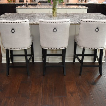
“We really enjoy the 7" wide planks and random lengths; people are always complementing us on the floors when they 1st see our home. We are so glad we spent a little extra for the upgrade to the Hallmark Hardwood floors - also happy we stuck with the white shoe molding to help show our larger base molding a little better.“ - Home Owner Testimonial
 Designer Melita at Closettec
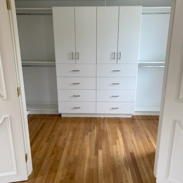
This Arlington, MA walk-in closet in the Boston area got a fresh look with drawers, hang bars and shelves. This customer wanted hidden shelves, so we added doors above the drawers. Our drawers are a generous size, at 30" wide and 20" deep, they will give you lots of room to store undergarments, jeans, sweaters and more. Notice the inset toe base at the bottom of the closet system. We love building closets like this, the closet has a finished look and it's super easy to run your vacuum all the way around the closet, not getting stuck on panels going down to the floor. It's details like this that make all the difference when buying a closet from Closettec, a local New England closet company in business since 1985. Visit our showroom at Jordan's Furniture in Reading, MA for a free consultation!
Closettec is the Boston and Providence area’s ONLY custom closet fabricators to combine custom closet, cabinetry, wood, stone, metal and glass fabrication all under one roof. We also serve the following areas outside of Boston – East Lyme, Niantic, Waterford, Mystic, Stonington, North Reading, Middleton, Lynnfield, Wakefield, Peabody, Danvers, Beverly, Salem, Marblehead, Lynn, Saugus, Revere, Stoneham, Melrose, Winchester, Woburn, Burlington, Wilmington, Billerica, Tewksbury, Nashua, Lowell, Chelmsford, Derry, Andover, Lawrence, Methuen, Haverill, Amesbury, Newburyport, Newton, Medford, Arlington, Somerville, Belmont, Cambridge, Watertown, Waltham, Weston, Wellesley, Needham, Dedham, Natick, Framingham, Westborough, Lincoln, Lexington, Wayland, Worcester, Narragansett, Newport, Jamestown.

 Tango Design Studio
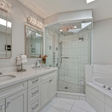
This is a shot of the bathroom. We stuck to clean lines and an all white neutral look.
Example of a large transitional master white tile and porcelain tile porcelain tile and white floor corner bathtub design in Toronto with shaker cabinets, white cabinets, white walls, an undermount sink, quartz countertops and a hinged shower door
Example of a large transitional master white tile and porcelain tile porcelain tile and white floor corner bathtub design in Toronto with shaker cabinets, white cabinets, white walls, an undermount sink, quartz countertops and a hinged shower door
 UnBox. Design
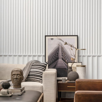
One moves from the foyer into the heart of the house - the spacious living room. This is where our client likes to entertain, so we wanted this space to make a statement. We have stuck to a monochrome colour palette while playing with textures. This pared-down palette is the perfect backdrop for the eclectic artworks, photographs, and travel memorabilia collected over the years. White fluting along one wall guides the eye towards the pièce de résistance - a ‘bindu’/red dot painting, nestled amidst books in the study.
20