
Search results for "Subdued" in Home Design Ideas
 Claire Jefford, Inc.
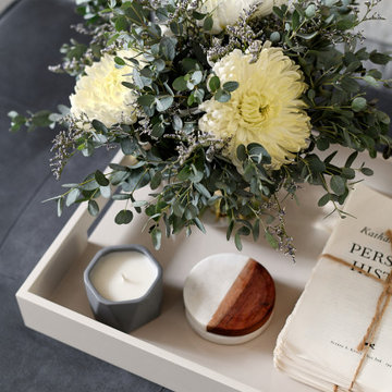
We used cool tones of blue and gray for this client's serene basement renovation project paired with subdued coastal accents.
One of our main goals for this project was to transform our client's office space complete with a soft blue and gray accent wall, flat roman window treatment, and walnut floating shelves; as well as subtle gold accents in both the artwork and hardware on this gorgeous custom desk.
 nC2 architecture llc
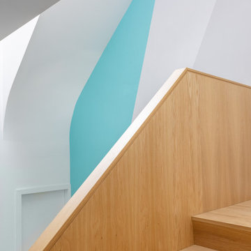
A new, ground-up attached house facing Cooper Park in Williamsburg Brooklyn. The site is in a row of small 1950s two-story, split-level brick townhouses, some of which have been modified and enlarged over the years and one of which was replaced by this building.
The exterior is intentionally subdued, reminiscent of the brick warehouse architecture that occupies much of the neighborhood. In contrast, the interior is bright, dynamic and highly-innovative. In a nod to the original house, nC2 opted to explore the idea of a new, urban version of the split-level home.
The house is organized around a stair oriented laterally at its center, which becomes a focal point for the free-flowing spaces that surround it. All of the main spaces of the house - entry hall, kitchen/dining area, living room, mezzanine and a tv room on the top floor - are open to each other and to the main stair. The split-level configuration serves to differentiate these spaces while maintaining the open quality of the house.
A four-story high mural by the artist Jerry Inscoe occupies one entire side of the building and creates a dialog with the architecture. Like the building itself, it can only be truly appreciated by moving through the spaces.
 nC2 architecture llc
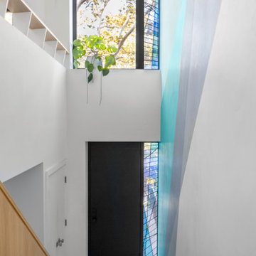
A new, ground-up attached house facing Cooper Park in Williamsburg Brooklyn. The site is in a row of small 1950s two-story, split-level brick townhouses, some of which have been modified and enlarged over the years and one of which was replaced by this building.
The exterior is intentionally subdued, reminiscent of the brick warehouse architecture that occupies much of the neighborhood. In contrast, the interior is bright, dynamic and highly-innovative. In a nod to the original house, nC2 opted to explore the idea of a new, urban version of the split-level home.
The house is organized around a stair oriented laterally at its center, which becomes a focal point for the free-flowing spaces that surround it. All of the main spaces of the house - entry hall, kitchen/dining area, living room, mezzanine and a tv room on the top floor - are open to each other and to the main stair. The split-level configuration serves to differentiate these spaces while maintaining the open quality of the house.
A four-story high mural by the artist Jerry Inscoe occupies one entire side of the building and creates a dialog with the architecture. Like the building itself, it can only be truly appreciated by moving through the spaces.
Find the right local pro for your project
 Brandon Oriental Rugs
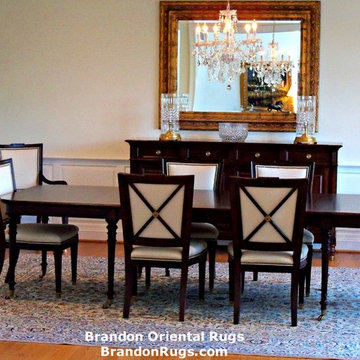
 Our customer engaged us to use our Rug-Search (tm) service to find a real hand-knotted Persian Kashan rug to provide the quiet foundation to an elegant, but simply decorated, dining room. The rug chosen was of a type sometimes called a "Five Color Kashan" which have been popular in the USA since the 1960's for their limited and subdued palette, intricate detailing, and affordable price-points. (These rugs resemble much more costly Nain rugs for design and color.) This rug is approximately 10 x 13, was produced in Iran, and imported prior to the embargo imposition in 2011. BrandonRugs.com/ Pamela Ward
 Pier 1
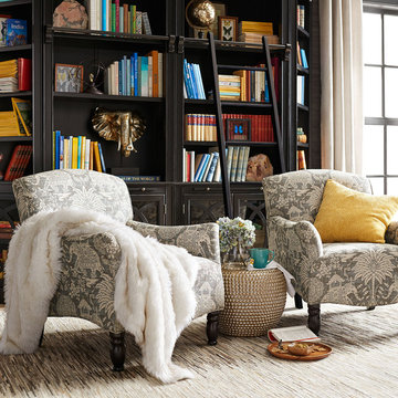
Traditional form meets modern details—and everyone discovers they're quite comfortable with each other. That's the story of our Frankie Armchair, an inviting design with a classic camelback silhouette, flared arms and a deep seat cushion, all built on a birch frame. The fresh addition: Our Dewan Gray upholstery that displays marching elephants and palm trees in a bold pattern done in a subdued neutral.
 Rockledge Design + Architecture
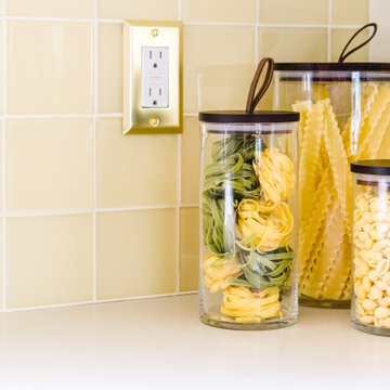
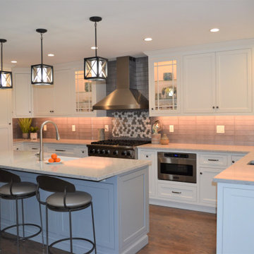
If “desert retro” could be translated as a design style, this MCM-inspired kitchen would be it. Our goal for these clients — a young couple who recently relocated to the Pittsburgh-area from Phoenix, AZ — was to bring a touch of the sunny Sonoran into their new home. This subdued, sun-bleached palette feels both vibrant and earthy. A dramatic, shifting landscape that comes alive with the day’s changing light.
Large format terrazzo tiles ground the space with muted, dusty green, ochre and amber. A nod to the tough skins of cacti, agave, and creosote bushes. A mixed finish glass tile backsplash adds pale yellow accents found in parched sand dunes. Three different cabinet finishes form our rocky canyons. Deep brown and clay purple hues like ancient cliff faces stained by manganese and iron oxide. Washed out skies reflecting warm white light. Golden brass details throughout gleam like the desert sun.
By removing a wall in between the kitchen and dining room, we were able to add a working peninsula and pull the range out of the corner. This change opened up the space, solving layout and storage puzzles for our clients — without making the kitchen feel cold or contemporary. Smooth, slab-style cabinet faces paired with streamlined appliances and fixtures keep things low maintenance.

 Impressions Flooring Collection
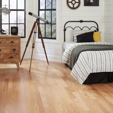
If you’re looking for hardwood flooring that offers incredible value and timeless style, you’ll love the Blue Ridge Series. This series features a solid hardwood core, which provides great stability. It also has an eco-friendly Perma Finish coating that repels most common household substances, providing one of the most durable finishes on the market.
This 3/8-inch engineered hardwood flooring is available in Oak and Maple in five warm colors designed to complement any decor. The Blue Ridge Series is prefinished for ease of installation. With its beauty, value, and lifetime integrity, this product has become an enduring favorite among homeowners.
Please note: Brazilian Cherry will darken from exposure to natural sunlight. Maple is a beautiful natural material that can vary from an off-white cream color to reddish or golden hues with dark reddish brown tones. The grain is subdued and generally straight but can be wavy.
 Fresh Start Interiors
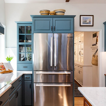
This coastal kitchen needed a refresh. Its solid wood cabinets were painted in a sage green, with putty colored trim and a cherry island and dark countertop. We painted the cabinetry and replaced countertops and appliances. We also moved the refrigerator to a side wall to create a better work space flow and added two windows to provide symmetry on the cooktop wall. A new custom wood hood and patterned marble backsplash help add a cheerful upbeat vibe to a previously subdued and muted space.
 Shepel Homes - Kitchen and Bath
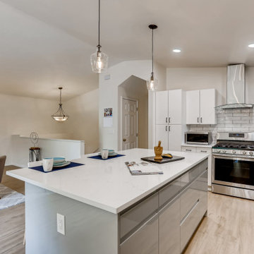
In this home remodel project, we worked together with our clients to create a modern coastal home design that incorporates natural elements with clean lines and functionality. The home now features an open space layout that exudes simplicity and formality, while also being casually elegant and relaxed.
The home already had the foundation of a modern coastal home, however, there were some things that needed to be removed, such as a wall dividing the living room and the kitchen, and things that needed to be updated, such as the floors and the cabinetry.
Overall, the remodeled home is all about being fresh, put-together, and welcoming. The subdued color palette is mostly composed of creamy whites, neutral browns, and subtle grays, with a pop of blue here and there to tie the whole modern coastal look together. The bare walls and ceilings, and the crisp and clean lines, make the space airy and contemporary. Meanwhile, traditional wood elements and a few bohemian decors acting as accent pieces infuse a cozy feeling to the space.
 OTO Design
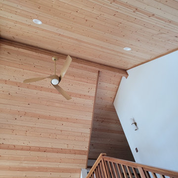
The compact subdued cabin nestled under a lush second-growth forest overlooking Lake Rosegir. Built over an existing foundation, the new building is just over 800 square feet. Early design discussions focused on creating a compact, structure that was simple, unimposing, and efficient. Hidden in the foliage clad in dark stained cedar, the house welcomes light inside even on the grayest days. A deck sheltered under 100 yr old cedars is a perfect place to watch the water.
Project Team | Lindal Home
Architectural Designer | OTO Design
General Contractor | Love and sons
Photography | Patrick
 Moss Building & Design
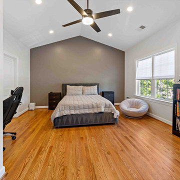
Our MOSS customers came to us knowing they wanted to stay in their home in their McLean community, with friendly neighbors and good schools for their children. The problem? Their home, a standard split foyer, didn’t suit their needs as their children grew older. Knowing that yard space comes at a premium in Northern Virginia, they instead chose to add on an entire second floor above the home’s main structure, which would include a new master suite with ensuite bathroom, two bedrooms for their children with a connecting “jack and jill” bathroom, a new laundry room for the main level, and a stunning staircase to connect the top two levels. MOSS also transformed an old bedroom into a new home gym and updated the basement with built-ins and a fireplace to mimic the new built-ins and fireplace on the main level, plus added on a front porch with beautiful stonework. By focusing on our customers’ needs, the end result is beautiful and functional. To boot? The entire exterior was updated with new siding and a subdued blue color scheme – a dramatic difference from the original brick exterior.
 Bilotta Kitchen & Home
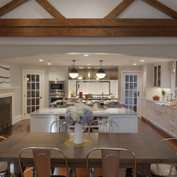
For this project, the entire kitchen was designed around the “must-have” Lacanche range in the stunning French Blue with brass trim. That was the client’s dream and everything had to be built to complement it. Bilotta senior designer, Randy O’Kane, CKD worked with Paul Benowitz and Dipti Shah of Benowitz Shah Architects to contemporize the kitchen while staying true to the original house which was designed in 1928 by regionally noted architect Franklin P. Hammond. The clients purchased the home over two years ago from the original owner. While the house has a magnificent architectural presence from the street, the basic systems, appointments, and most importantly, the layout and flow were inappropriately suited to contemporary living.
The new plan removed an outdated screened porch at the rear which was replaced with the new family room and moved the kitchen from a dark corner in the front of the house to the center. The visual connection from the kitchen through the family room is dramatic and gives direct access to the rear yard and patio. It was important that the island separating the kitchen from the family room have ample space to the left and right to facilitate traffic patterns, and interaction among family members. Hence vertical kitchen elements were placed primarily on existing interior walls. The cabinetry used was Bilotta’s private label, the Bilotta Collection – they selected beautiful, dramatic, yet subdued finishes for the meticulously handcrafted cabinetry. The double islands allow for the busy family to have a space for everything – the island closer to the range has seating and makes a perfect space for doing homework or crafts, or having breakfast or snacks. The second island has ample space for storage and books and acts as a staging area from the kitchen to the dinner table. The kitchen perimeter and both islands are painted in Benjamin Moore’s Paper White. The wall cabinets flanking the sink have wire mesh fronts in a statuary bronze – the insides of these cabinets are painted blue to match the range. The breakfast room cabinetry is Benjamin Moore’s Lampblack with the interiors of the glass cabinets painted in Paper White to match the kitchen. All countertops are Vermont White Quartzite from Eastern Stone. The backsplash is Artistic Tile’s Kyoto White and Kyoto Steel. The fireclay apron-front main sink is from Rohl while the smaller prep sink is from Linkasink. All faucets are from Waterstone in their antique pewter finish. The brass hardware is from Armac Martin and the pendants above the center island are from Circa Lighting. The appliances, aside from the range, are a mix of Sub-Zero, Thermador and Bosch with panels on everything.
 Allan Rug Company
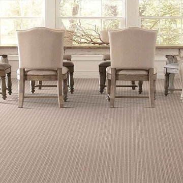
We take pride in the fact that we have an extensive selection of designs for you to choose from - from a minimalist or extensive point of view. This look is displayed for those who aspire to create a simple yet patterned look of subdued stripes in their home.
 Claire Jefford, Inc.
We used cool tones of blue and gray for this client's serene basement renovation project paired with subdued coastal accents.
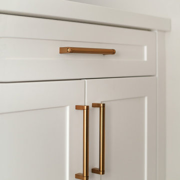
One of our main goals for this project was to transform our client's office space complete with a soft blue and gray accent wall, flat roman window treatment, and walnut floating shelves; as well as subtle gold accents in both the artwork and hardware on this gorgeous custom desk.
 HouseHome
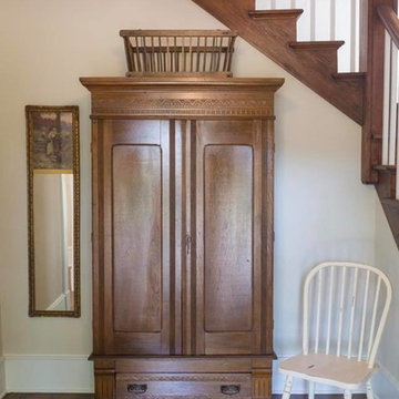
For this HouseHome project, we transformed the main floor of a classic 1940s home into a luxury living space that balances historical integrity with contemporary refinement.
The renovation emphasizes ornate detailing and timeless architectural elements, celebrating the precision and craftsmanship of mid-century design while introducing modern functionality. The design aesthetic is rooted in discipline, subtlety, and quality, using a subdued color palette that enhances the home’s architectural features and highlights the care put into every detail.
Custom fine millwork and meticulously crafted trim elevate the spaces, adding depth, elegance, and a sense of permanence that only true artisanal work can achieve. This luxury main floor renovation in Colorado demonstrates HouseHome’s signature approach: blending historical inspiration, refined materials, and thoughtful design to create spaces that feel sophisticated, intentional, and timeless.
Every element—from layout to finishes—reflects a commitment to quality, craftsmanship, and enduring beauty...just the way the client likes it, and what we love to deliver at HouseHome.

 Dan Kitchens Australia
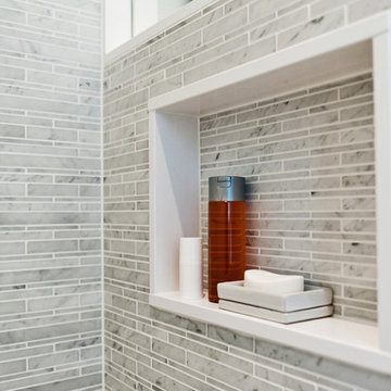
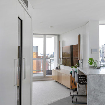
This apartment kitchen is emblematic of Dan Kitchen Australia's design style: clean-edged, thoughtfully laid out and well appointed with luxurious materials and high-end appliances. A subdued colour palette allows the real hero of the space to shine - jaw-dropping vistas of Sydney Harbour.
Paul Worsley @ Live By The Sea
 Marlene Oliphant Designs LLC
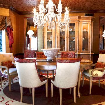
This dining room in a traditionall tudor-style home features a subdued version of the owner's favorite color: red. The ceiling is covered in a burgundy damask;; the walls are covered in a gold silk grasscloth. The chairs, table, rug and window treatments are all custom. Asian-themed sconces are showcased on mirrored panels flanking the sideboard. Harry Chamberlain
 Charles Martin Custom Homes
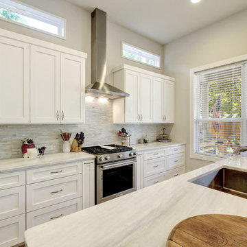
Inspiration for a mid-sized victorian light wood floor and beige floor kitchen remodel in Austin with a single-bowl sink, shaker cabinets, white cabinets, marble countertops, gray backsplash, stone tile backsplash, stainless steel appliances and an island
68