
Search results for "Sufferers" in Home Design Ideas
 Kitchen Solvers of the Gulf Coast
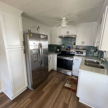
For this kitchen remodeling project, the homeowner’s mobile home suffered from water damage and the kitchen needed to be completely redone. We got busy tearing out all the old cabinets and flooring. The new cabinets were done in a birch Maui door in a polar white color. Next, we installed a new quartz countertop done in Blanco Maple and a Raku Ocean backsplash. To finish the new kitchen, we installed a new laminate plank floor. See how this kitchen went from a nightmare into a dream kitchen.
 iCork Floor
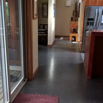
- Installation Type: Floating
- Licensed Uniclic Flooring system
- Square Edge Plank (seamless floor)
- Finish: Three coats water based polyurethane
- Wear Layer: 3mm genuine cork
- Middle Layer: 7mm E1 Class High Density Fiberboard (HDF)
- Integrated Underlayment: 1mm agglomerated cork.
- Plank Width: 12” (315mm)
- Plank Length: 36" (915mm)
- Plank Thickness: 7/16" (11mm)
- Carton coverage: 21.03 sqft
- Pieces per carton: 7
- 25 year warranty (residential installation)
- Underlayment not required
- Hypo-allergenic
- Healthy alternative to carpet
- Excellent thermal and acoustic insulation
- Stain resistant
- Naturally resistant to insects, mould, mildew due to anti-microbial properties
- Low slip surface
- Excellent surface for seniors, children or people suffering from arthritis or joint pain
Price may change without notice. Please check our website for the guaranteed price.
Order FREE SAMPLES on our website: www.icorkfloor.com
 Plain & Posh
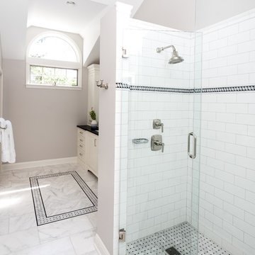
This master bath was long and narrow and suffered from a 1990's renovation with a huge tub no one used and a tiny shower area. The vanity was also quite small. By removing the tub and relocating the shower from the toilet room to the main area, the shower was able to double in size.
The vanity area is also almost twice as large as before.
Find the right local pro for your project
 The Brooklyn Studio
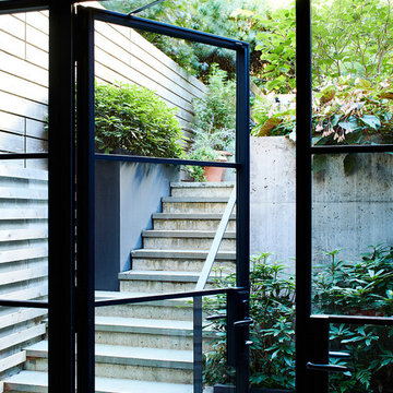
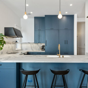
This residence was a complete gut renovation of a 4-story row house in Park Slope, and included a new rear extension and penthouse addition. The owners wished to create a warm, family home using a modern language that would act as a clean canvas to feature rich textiles and items from their world travels. As with most Brooklyn row houses, the existing house suffered from a lack of natural light and connection to exterior spaces, an issue that Principal Brendan Coburn is acutely aware of from his experience re-imagining historic structures in the New York area. The resulting architecture is designed around moments featuring natural light and views to the exterior, of both the private garden and the sky, throughout the house, and a stripped-down language of detailing and finishes allows for the concept of the modern-natural to shine.
Upon entering the home, the kitchen and dining space draw you in with views beyond through the large glazed opening at the rear of the house. An extension was built to allow for a large sunken living room that provides a family gathering space connected to the kitchen and dining room, but remains distinctly separate, with a strong visual connection to the rear garden. The open sculptural stair tower was designed to function like that of a traditional row house stair, but with a smaller footprint. By extending it up past the original roof level into the new penthouse, the stair becomes an atmospheric shaft for the spaces surrounding the core. All types of weather – sunshine, rain, lightning, can be sensed throughout the home through this unifying vertical environment. The stair space also strives to foster family communication, making open living spaces visible between floors. At the upper-most level, a free-form bench sits suspended over the stair, just by the new roof deck, which provides at-ease entertaining. Oak was used throughout the home as a unifying material element. As one travels upwards within the house, the oak finishes are bleached to further degrees as a nod to how light enters the home.
The owners worked with CWB to add their own personality to the project. The meter of a white oak and blackened steel stair screen was designed by the family to read “I love you” in Morse Code, and tile was selected throughout to reference places that hold special significance to the family. To support the owners’ comfort, the architectural design engages passive house technologies to reduce energy use, while increasing air quality within the home – a strategy which aims to respect the environment while providing a refuge from the harsh elements of urban living.
This project was published by Wendy Goodman as her Space of the Week, part of New York Magazine’s Design Hunting on The Cut.
Photography by Kevin Kunstadt
 Irene Designs
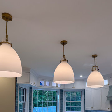
Kitchen — Project Description (Bolton, CT)
(Full Renovation • Reconfiguration • Architectural Corrections)
The original kitchen suffered from spatial imbalance and limited functionality: the right side was visually and physically heavy with cabinetry and appliances, the 135-degree angled walls lacked symmetry due to a missing window on the driveway side, and the small island could only seat two. Circulation was obstructed by a desk positioned in the main traffic flow, and the low French door felt disproportionate in scale compared to the large windows and adjacent two-story Great Room.
Major Structural & Functional Improvements
Repositioned window on the front elevation to the right, creating a long-desired view to the driveway while freeing space for a centered cooktop and statement hood — visually aligning with the Great Room’s redesigned fireplace focal wall.
Installed a new custom sliding door, significantly taller and wider than the original French door. This upgrade enhances natural light, visually opens the kitchen to the deck, and provides unobstructed traffic flow thanks to its sliding operation.
New Kitchen Layout & Enhanced Functionality
Designed an entirely new layout centered around a 10' double-slab island, providing expansive workspace and a natural gathering zone.
Added conversational seating for the whole family, allowing comfortable interaction on all sides of the island.
Introduced purpose-designed storage solutions, including pullouts, rollouts, spice towers, tray organizers, and deep drawers to maximize usability.
Reallocated the desk area to a dedicated window spot overlooking the backyard, removing it from traffic paths and improving both functionality and comfort.
Cabinetry & Architectural Detailing
Custom two-tone cabinetry in soft white and a serene blue-green tone reflects the visual language of the adjacent Great Room, creating whole-home cohesion.
Installed lit upper glass cabinets along the entire perimeter, balancing vertical proportions and creating an elegant display band throughout the kitchen.
A custom range hood was designed and painted to match the base cabinetry, becoming a focal point framed by symmetrical windows.
Surfaces, Lighting & Finishes
The island features a double-thickness quartz slab with a soft ogee radius for a timeless, furniture-like feel.
A full-height, handcrafted aqua subway tile backsplash introduces depth, texture, and a gentle reflective quality.
New layered lighting concept, including recessed lights, pendants, task lighting, and integrated cabinet lighting, ensures a warm and functional workspace at any time of day.
 Centoni Restoration & Development, Inc.
This lovely 2-story townhome suffered the effects of more than 120 years of “remuddling” and “modernization” through significant modification of the structural framing. With a large section of a load-bearing wall removed and shear walls, the full 3-story building was structurally compromised.
The program included the installation of a steel beam and structural reframing, beginning at the ground floor and through to the 3rd-floor living space.
The new structural design allowed for a significantly improved living space. The kitchen was relocated and expanded, as were the living room and dining room.
Several upgrades were made to the home, including incorporating all-electrical appliances. 1900 Victorian now boasts several eco-friendly and energy-efficient features.
 Wood Front Kitchens
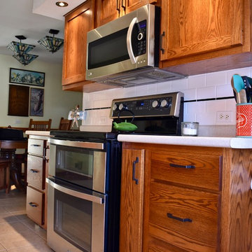
This customer spent over 40 years building and renovating his home. In his younger days, he was an amazing building and craftsman. Recently, he suffered a stroke and lost the ability to build. He wants to leave his home to his daughter, so he planned one last renovation project. For this project, he wanted to choose a renovation company that could build a kitchen as well as he could. Luckily, he chose Wood Front Kitchens. He was thrilled with the result. He loved that we were able to keep storage features he had built in his previous cabinets and transfer them to the new cabinets.
This homeowner chose shaker-style oak cabinets stained in Michels. He chose Amerock Conrad Square hardware in oil-rubbed bronze to give his rustic cabinets an industrial feel. He and his daughter are both pleased with the results, and with their huge increase in storage space.
 360 Yardware
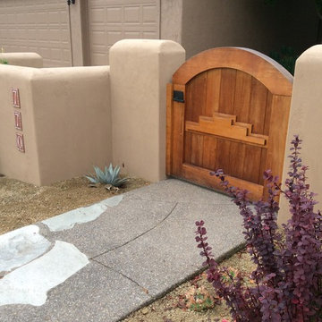
The gate has a wooden gate stop built into the stucco wall, shown left. The gate stop provides protection for the gate latch’s arm, so if the gate slams, the latch arm does not suffer the force of the slamming gate’s weight.
Client-provided photos.
 Paradox Interior Design Inc.
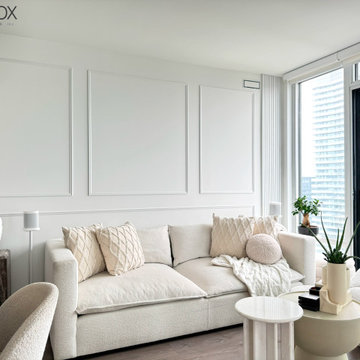
Challenge: Our client needed their downtown Toronto condo to serve as a peaceful retreat from the demanding pace of urban professional life. The space suffered from the sterile, impersonal aesthetic typical of many Toronto condos, lacking the warmth and tranquility needed to truly unwind after busy workdays in the city's core.
Solution: We approached this project in thoughtful stages, transforming the condo into a serene sanctuary that promotes relaxation and rejuvenation. By incorporating a palette of light, calming colors and introducing rich textural elements throughout the space, we elevated the sterile interior into a sophisticated retreat. Each design decision was made with the goal of creating visual and tactile interest that would engage the senses and promote a sense of calm.
Highlights: • Staged design approach that allowed for thoughtful evolution of the space • Light color palette that enhances natural light and creates an airy, peaceful atmosphere • Rich variety of textures that add warmth and visual interest to combat sterile condo interiors • Strategic material selection that transforms typical condo finishes into sophisticated design elements
Results: The transformed Downtown Zen condo now serves as the perfect urban escape—a space that immediately shifts the client's mindset from work mode to relaxation. This project demonstrates how thoughtful design can overcome the limitations of typical Toronto condo interiors, creating a personalized sanctuary that enhances daily life and well-being.
 Budget Blinds of Madison
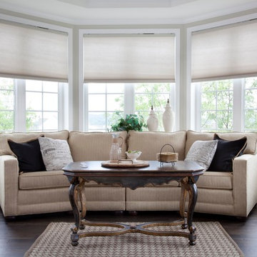
If you suffer from mobility or dexterity issues, or are just tired of dealing with tangled cords, investing in motorization can help your window coverings function flawlessly.
 Weckenmann Architecture, LLC
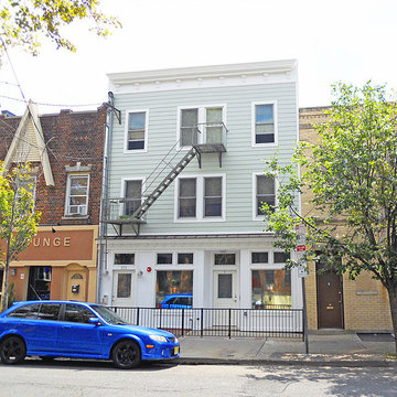
Located in the Village neighborhood in downtown Jersey City, the original building dates from the mid 1800's. In the 1970's the ground floor commercial space was converted into an apartment, the original storefront was bricked over and most of the building's historic features were lost. Suffering from years of neglect and in a state of severe disrepair, the new owner sought to renovate the building to modern standards and restore the facade back to its original appearance.
The apartment count was maintained but redistributed throughout the building to maximize efficiency. The oversized ground floor unit was divided into two one-bedroom units and the second and third floors each house a single two-bedroom apartment. The building was completely gutted and extensive structural work was required to stabilize the building. The original staircase, the only surviving historical element, was also rebuilt and preserved. The facade was reconstructed with clapboard siding and decorative moldings to match the original profiles, new windows, a refurbished fire escape, and a new ground floor storefront to match the original configuration.
This project was completed for Sionas Architecture, PC
 Cancork Floor Inc.
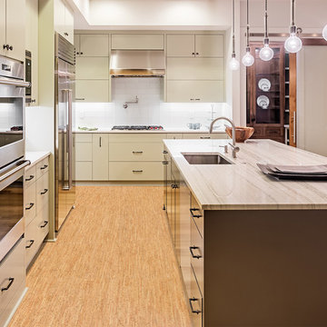
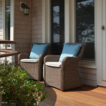
Floating cork floors are naturally resistant to invasive organisms such as mold and mildew. It is one of the better hypoallergenic flooring options available, making it an first-rate choice for allergy sufferers. Available in dozens of colors and natural tones, floating cork flooring can easily suit any home’s design aesthetic. It also an easier install in comparison with other flooring choices.
 Poore & Company
The original house was built as a kit on the coast. The potential view was spectacular but the existing house suffered from a deep sense of tunnel vision and the interior was a maze of disconnected spaces. By changing the location of the kitchen to a more commanding location and unfolding the spaces into a more logical flow the house not only captures the panoramic view but feels twice as big without adding one square foot to the building footprint. Small changes in the deck sizes with some sweeping curves and more logical exterior stair locations connect the interior with the surrounding natural landscape. An “away” space, affectionately called the Quiet Room, is crowned with a sculptural plaster ceiling that evokes a wave, or a shell, or a soft sky canopy floating above this unusual living area. Outdoors is an infinity edge spa overlooking Gloucester’s Eastern Point Lighthouse and the ocean beyond.
 KURV Architecture DPC (Alex Hughes Architects)
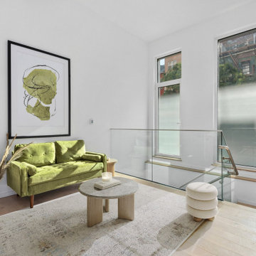
Located in the heart of Manhattan’s Lower East Side, the building was erected on a shallow commercial lot between two 120 year old masonry buildings and a new residential rental building. 330 Grand Street is a mix of 725 SF 1BRs and 1050 SF 2BR apartments. It also contains a 1100 SF two story duplex as well as private and public rooftop space, large private balconies for most units and two large private terraces for the ground floor units.
330 Grand Street was originally designed and approved at the NYC DOB as a prefabricated modular building. During the pandemic, as shipping costs skyrocketed putting the project at risk, we suggested redesigning the building as a reinforced cast-in-place concrete structure. Concrete was readily available and prices had not been affected by the demand increase that many other materials suffered in the pandemic. We took this opportunity to raise floor to ceiling heights, enlarge high performance windows and redistribute the buildings MEPFS and Structural Systems to create very open floor plans.
The challenge was to create a luxurious sensorial living experience with very limited means. In a city with very high construction costs, low cost residential buildings in the area are usually devoid of good quality, design and character. Our approach was to aim high for the end user, prioritizing natural light, open space with long visual perspectives, high ceilings and as always, rejecting the use of predefined building templates.
Our biggest challenge was to ensure that the small spaces feel as clean cut, large and bright as possible. Several unique design decisions were made to ensure low cost and high quality;
Floor plans were laid out so that spaces were wide open and free of clutter from mechanical or structural interruptions. Therefore all infrastructure was placed in lateral demising walls, which in turn act as the unit’s storage and kitchen. The apartments feel wide open, are super quiet and have more storage space than any other comparable apartment in the city.
To solve the problem of the site’s shallow commercial lot which is typically prone to dark interior spaces we focused our attention on the building’s envelope. Instead of the usual small punched window openings, oversized high performance windows were designed to ensure that light penetrated as far as possible into the units. In the smaller 1BR units, the full 50’ depth of the lot is perceived by partitioning spaces with sliding pocket doors that can be retracted to allow deep visual perspectives, making the sight lines in the space feel longer, larger, more ample than normal. In addition to the full height glazing, each unit above the 2nd floor receives a 7 foot covered balcony, adding 120 to 240 sf to each apartment, something unusual in New York City buildings. The space is large enough for a full size dining table, when the weather permits being outside.
We also worked hard to ensure modularity. For example, all kitchen units are all identical throughout the building. The idea of modularity and the economy of the repetitive unit is exercised to the maximum through the building.
Hardware, appliances, flooring, wall coverings and material finishes are all carefully selected to feel bespoke, high quality and unique.
It was important to KURV that the result of this work manifest into something that would deeply connect with the end user and sustain relationships with the consumers of this space.
All images by KURV Architecture ©
 Tile Doctor Ltd
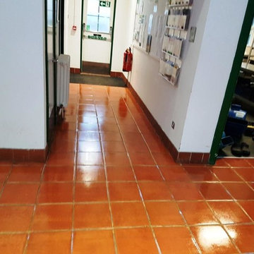
A local cleaning contractor called us in to work on the Terracotta tiled floors at a council building in Amersham. The Terracotta had not been deep cleaned and resealed for about ten years and the sealer had worn off leaving the tile vulnerable to dirt becoming ingrained in the pores of the tile. The grout had also suffered the same fate and had almost gone black in many areas.
This is a common problem with Terracotta which is quite porous and once those pores become ingrained with dirt the tile becomes difficult to clean effectively. The solution is to seal the tile however sealers wear off over time and this was basically the problem.
After discussing the issues we agreed on a plan of action to deep clean the Terracotta tile and grout and then re-seal to protect it. Due to the busy nature of the building we agreed to do the work between Christmas and New Year when we knew the building would be empty.
We started by applying a strong dilution of Tile Doctor Oxy-Gel which is a strong tile cleaning product that being in a gel form ensures it sits on the tile for longer, giving it a longer effective dwell time so it can really eat into and loose the dirt. After approximately twenty minutes the gel was scrubbed into the tile with a black scrubbing pad fitted to a rotary machine. This broke down most of the dirt and removed any remaining sealer. Once the whole floor had been treated in this manner it was rinsed thoroughly with water which was then extracted using a wet vacuum.
With the soiled cleaning solution removed I could see the next step would be to spot clean stubborn staining and clean the grout. For this task I used a strong dilution of Tile Doctor Pro-Clean scrubbing it in by hand using stiff brushes and aided with a hand-held steamer to help treat the stubborn staining. Once done the floor was given a final rinse and then as much moisture as possible removed with the wet vacuum.
We then left the floor to dry off completely and came back a couple of days later to seal the Terracotta tile.
I mentioned earlier that Terracotta is porous; in fact it’s probably the most porous material I deal with, so to fully seal the floor I had to apply eight coats of Tile Doctor Seal and Go which will provide complete and long lasting protection against staining and dirt. Seal and Go also adds an appealing satin sheen to the tile and the new seal will make it much easier to clean in future.
The floor tile and grout now look much healthier and I’m sure the council will be very impressed when they go back to work after the holidays.
Happy New Year…
Andrew Newstead
North Buckinghamshire Tile Doctor
 MAAM
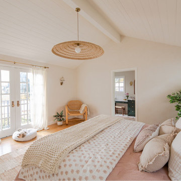
MAAMThis charming house was built in 1924 with all the aspiration of the California transplants of that era - mimicking a traditional, English cottage built into the hillside of scenic Los Feliz. When our clients moved in, nearly 100 years later, the house was suffering from a poorly-built, 2006 addition which was a jumble of walls and bathrooms that also turned out to be a breeding ground for black mold. After careful remediation, the clients decided to make the most of the fact that their primary suite had been taken down to the studs by reconceiving the layout of the 300 sf wing to accommodate a generous new primary bathroom, walk-in closet and convertible home office / guest bedroom.
 StudioLAB
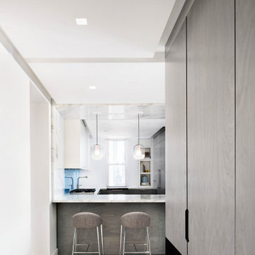
Close to Lincoln Center Plaza, two existing apartments were combined into a single custom tailored 4-bedroom residence. Characteristic with other buildings from the same post-war era, the existing apartments suffered greatly from a low, monotonous ceiling slab. To break up the ceiling, floating planes containing low-profile LED recessed lighting were incorporated throughout. Grey-washed birch veneer millwork is seen as you enter into the new foyer space. A blackened steel inlaid panel serves as a datum that continues throughout the apartment, wrapping the entry unit and extending around the corner to then transform into a floating bookshelf. The unit not only divides the entry area from the Living room, but also serves its utilitarian purpose on the foyer side as coat and storage closets, and then an entertaining function on the opposing side with a TV niche and custom liquor bar. Whitewashed rift and quartered white oak floors were used to brighten the space. In the kitchen, marble counters extend up the wall and onto the ceiling marking the separation of the kitchen/dining area from the living room/entry area. The kid’s room contains a custom curved desk area built beneath the bay windows to take advantage of the views. In the master bedroom, the blackened steel inlay reappears inset into the wardrobe wall unit.
 Kaoud Carpet & Rugs
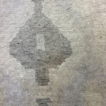
This silk area rug had suffered heavy staining in one section approximately 5 inches in diameter. After several failed attempts by the client to remove the stain with grocery cleaning agents, the client gave us a call. The area rug was an expensive purchase and the client's were clearly distraught about what had happened to their rug. After working with our team of master area rug cleaning experts, we were successful in removing the stain. Take a look at the before and after photos.
 Spring Creek Design
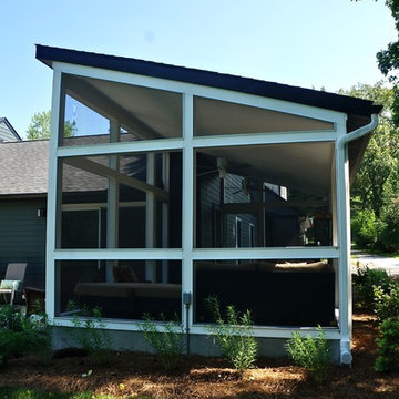
The homeowners loved the lot this home sat on, but it lacked a garage and the exterior suffered from years of deferred maintenance before they purchased. With new siding, windows, roof, and an attached two-car garage addition with bonus room above, they have more living and storage space, and a clearly dedicated path to the front door — the addition also added a foyer. Corrugated metal accents add interest. The new screened porch is convenient to the pool and house.
Photo by Liz Smutko
 Ploughshare Design | Build
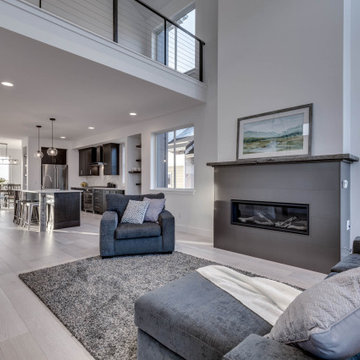
The common space in The Maslow House at Flanders Mill. Many Montanans suffer some degree of seasonal affective disorder during the long winter months. To help, generous windows and crisp white walls pipe daylight into every corner of the home's communal living areas.
25