
Search results for "Tackles" in Home Design Ideas
 Studio Dearborn
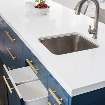
A hip young family moving from Boston tackled an enormous makeover of an antique colonial revival home in downtown Larchmont. The kitchen area was quite spacious but benefitted from a small bump out for a banquette and additional windows. Navy blue island and tall cabinetry matched to Benjamin Moore’s Van Deusen blue is balanced by crisp white (Benjamin Moore’s Chantilly Lace) cabinetry on the perimeter. The mid-century inspired suspended fireplace adds warmth and style to the kitchen. A tile covered range hood blends the ventilation into the walls. Brushed brass hardware by Lewis Dolan in a contemporary T-bar shape offer clean lines in a warm metallic tone.
White Marble countertops on the perimeter are balanced by white quartz composite on the island. Kitchen design and custom cabinetry by Studio Dearborn. Countertops by Rye Marble. Refrigerator--Subzero; Range—Viking French door oven--Viking. Dacor Wine Station. Dishwashers—Bosch. Ventilation—Best. Hardware—Lewis Dolan. Lighting—Rejuvenation. Sink--Franke. Stools—Soho Concept. Photography Adam Kane Macchia.
 John Lum Architecture, Inc. AIA
Paul Dyer
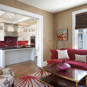
Mid-sized elegant formal and enclosed dark wood floor and brown floor living room photo in San Francisco with white walls, a standard fireplace, a stone fireplace and no tv
Mid-sized elegant formal and enclosed dark wood floor and brown floor living room photo in San Francisco with white walls, a standard fireplace, a stone fireplace and no tv
 Progressive Design Build
Challenge
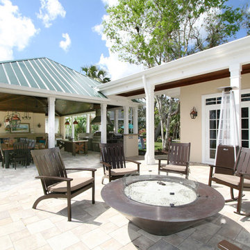
This 2001 riverfront home was purchased by the owners in 2015 and immediately renovated. Progressive Design Build was hired at that time to remodel the interior, with tentative plans to remodel their outdoor living space as a second phase design/build remodel. True to their word, after completing the interior remodel, this young family turned to Progressive Design Build in 2017 to address known zoning regulations and restrictions in their backyard and build an outdoor living space that was fit for entertaining and everyday use.
The homeowners wanted a pool and spa, outdoor living room, kitchen, fireplace and covered patio. They also wanted to stay true to their home’s Old Florida style architecture while also adding a Jamaican influence to the ceiling detail, which held sentimental value to the homeowners who honeymooned in Jamaica.
Solution
To tackle the known zoning regulations and restrictions in the backyard, the homeowners researched and applied for a variance. With the variance in hand, Progressive Design Build sat down with the homeowners to review several design options. These options included:
Option 1) Modifications to the original pool design, changing it to be longer and narrower and comply with an existing drainage easement
Option 2) Two different layouts of the outdoor living area
Option 3) Two different height elevations and options for the fire pit area
Option 4) A proposed breezeway connecting the new area with the existing home
After reviewing the options, the homeowners chose the design that placed the pool on the backside of the house and the outdoor living area on the west side of the home (Option 1).
It was important to build a patio structure that could sustain a hurricane (a Southwest Florida necessity), and provide substantial sun protection. The new covered area was supported by structural columns and designed as an open-air porch (with no screens) to allow for an unimpeded view of the Caloosahatchee River. The open porch design also made the area feel larger, and the roof extension was built with substantial strength to survive severe weather conditions.
The pool and spa were connected to the adjoining patio area, designed to flow seamlessly into the next. The pool deck was designed intentionally in a 3-color blend of concrete brick with freeform edge detail to mimic the natural river setting. Bringing the outdoors inside, the pool and fire pit were slightly elevated to create a small separation of space.
Result
All of the desirable amenities of a screened porch were built into an open porch, including electrical outlets, a ceiling fan/light kit, TV, audio speakers, and a fireplace. The outdoor living area was finished off with additional storage for cushions, ample lighting, an outdoor dining area, a smoker, a grill, a double-side burner, an under cabinet refrigerator, a major ventilation system, and water supply plumbing that delivers hot and cold water to the sinks.
Because the porch is under a roof, we had the option to use classy woods that would give the structure a natural look and feel. We chose a dark cypress ceiling with a gloss finish, replicating the same detail that the homeowners experienced in Jamaica. This created a deep visceral and emotional reaction from the homeowners to their new backyard.
The family now spends more time outdoors enjoying the sights, sounds and smells of nature. Their professional lives allow them to take a trip to paradise right in their backyard—stealing moments that reflect on the past, but are also enjoyed in the present.
Find the right local pro for your project
 Studio Dearborn
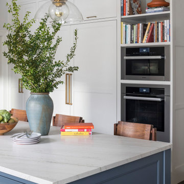
A young family moving from NYC tackled a makeover of their young colonial revival home to make it feel more personal. The kitchen area was quite spacious but needed a facelift and a banquette for breakfast. Painted cabinetry matched to Benjamin Moore’s Light Pewter is balanced by Benjamin Moore Ocean Floor on the island. Mixed metals on the lighting by Allied Maker, faucets and hardware and custom tile by Pratt and Larson make the space feel organic and personal. Photos Adam Macchia. For more information, you may visit our website at www.studiodearborn.com or email us at info@studiodearborn.com.
 TKS Design Group
WATCH the time lapse video of this kitchen remodel: https://youtu.be/caemXXlauLU
Free ebook, Creating the Ideal Kitchen. DOWNLOAD NOW
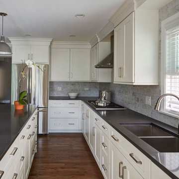
This Glen Ellyn homeowner came to us, frustrated with the layout and size of their current kitchen, looking for help generating ideas for how to maximize functionality within the constraints of the space. After visiting with them and seeing the home’s layout, I realized that looking at the bigger picture of how they used the entire first floor might bring us some dramatic solutions. We ended up flipping the kitchen and family room and taking down the wall separating the two creating one big open floor plan for the family to enjoy. There is still a visual separation between the rooms because of their different lengths and the overall space now relates nicely to the dining room which was also opened up to both rooms.
The new kitchen is an L-shaped space that is no longer cramped and small and is truly a cook’s dream. The fridge is on one end, a large cooktop and sink are located along the main perimeter and double ovens located at the end of the “L” complete the layout. Ample work surface along the perimeter and on the large island makes entertaining a breeze. An existing door to the patio remains, floods the room with light and provides easy access to the existing outdoor deck for entertaining and grilling.
White cabinetry with quartz countertops, Carrera marble backsplash tile and a contrasting gray island give the space a clean and modern feel. The gray pendant lights and stainless appliances bring a slight industrial feel to the space letting you know that some serious cooking will take place here.
Once we had their Dream Kitchen design completed, the homeowners decided to tackle another project at the same time. We made plans to create a master suite upstairs by combining two existing bedrooms into a larger bedroom, bathroom and walk-in closet. The existing spaces were not overly large so getting everything on the wish list into the design was a challenge. In the end, we came up with a design that works. The two bedrooms were adjoined, one wall moved back slightly to make for a slightly larger bedroom, and the remaining space was allotted to the new bathroom and a walk in closet.
The bathroom consists of a double vanity and a large shower with a barn door shower door. A skylight brings light into the space and helps make it feel larger and more open. The new walk-in closet is accessible through the bathroom, and we even managed to fit in a small entry vestibule that houses some additional storage and makes a nice transition from the hallway. A white vanity, Carrera tops and gray floor tile make for a serene space that feels just right for this home.
Designed by: Susan Klimala, CKD, CBD
Photography by: Mike Kaskel
For more information on kitchen and bath design ideas go to: www.kitchenstudio-ge.com
 Urbanology Designs
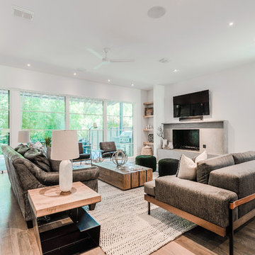
Living room - large contemporary open concept light wood floor living room idea in Dallas with white walls, a standard fireplace, a concrete fireplace and a wall-mounted tv
 Studio Dearborn
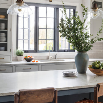
A young family moving from NYC tackled a makeover of their young colonial revival home to make it feel more personal. The kitchen area was quite spacious but needed a facelift and a banquette for breakfast. Painted cabinetry matched to Benjamin Moore’s Light Pewter is balanced by Benjamin Moore Ocean Floor on the island. Mixed metals on the lighting by Allied Maker, faucets and hardware and custom tile by Pratt and Larson make the space feel organic and personal. Photos Adam Macchia. For more information, you may visit our website at www.studiodearborn.com or email us at info@studiodearborn.com.
 Chango
Photography by Jacob Snavely
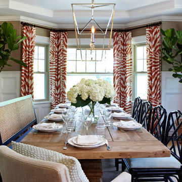
Large transitional dark wood floor enclosed dining room photo in New York with no fireplace
Large transitional dark wood floor enclosed dining room photo in New York with no fireplace
 Boss Design Center
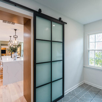
Welcome to our charming laundry room featuring rich green cabinets, a timeless black and white tile floor, and elegant brass handles. The green cabinets bring a touch of nature's tranquility, while the classic black and white tile exudes sophistication. The addition of brass handles adds a dash of opulence, creating a delightful and stylish space to tackle laundry tasks with ease and grace.
 TKS Design Group
WATCH the time lapse video of this kitchen remodel: https://youtu.be/caemXXlauLU
Free ebook, Creating the Ideal Kitchen. DOWNLOAD NOW
This Glen Ellyn homeowner came to us, frustrated with the layout and size of their current kitchen, looking for help generating ideas for how to maximize functionality within the constraints of the space. After visiting with them and seeing the home’s layout, I realized that looking at the bigger picture of how they used the entire first floor might bring us some dramatic solutions. We ended up flipping the kitchen and family room and taking down the wall separating the two creating one big open floor plan for the family to enjoy. There is still a visual separation between the rooms because of their different lengths and the overall space now relates nicely to the dining room which was also opened up to both rooms.
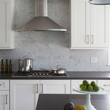
The new kitchen is an L-shaped space that is no longer cramped and small and is truly a cook’s dream. The fridge is on one end, a large cooktop and sink are located along the main perimeter and double ovens located at the end of the “L” complete the layout. Ample work surface along the perimeter and on the large island makes entertaining a breeze. An existing door to the patio remains, floods the room with light and provides easy access to the existing outdoor deck for entertaining and grilling.
White cabinetry with quartz countertops, Carrera marble backsplash tile and a contrasting gray island give the space a clean and modern feel. The gray pendant lights and stainless appliances bring a slight industrial feel to the space letting you know that some serious cooking will take place here.
Once we had their Dream Kitchen design completed, the homeowners decided to tackle another project at the same time. We made plans to create a master suite upstairs by combining two existing bedrooms into a larger bedroom, bathroom and walk-in closet. The existing spaces were not overly large so getting everything on the wish list into the design was a challenge. In the end, we came up with a design that works. The two bedrooms were adjoined, one wall moved back slightly to make for a slightly larger bedroom, and the remaining space was allotted to the new bathroom and a walk in closet.
The bathroom consists of a double vanity and a large shower with a barn door shower door. A skylight brings light into the space and helps make it feel larger and more open. The new walk-in closet is accessible through the bathroom, and we even managed to fit in a small entry vestibule that houses some additional storage and makes a nice transition from the hallway. A white vanity, Carrera tops and gray floor tile make for a serene space that feels just right for this home.
Designed by: Susan Klimala, CKD, CBD
Photography by: Mike Kaskel
For more information on kitchen and bath design ideas go to: www.kitchenstudio-ge.com
 Studio Dearborn
A hip young family moving from Boston tackled an enormous makeover of an antique colonial revival home in downtown Larchmont. The kitchen area was quite spacious but benefitted from a small bump out for a banquette and additional windows. Navy blue island and tall cabinetry matched to Benjamin Moore’s Van Deusen blue is balanced by crisp white (Benjamin Moore’s Chantilly Lace) cabinetry on the perimeter. The mid-century inspired suspended fireplace adds warmth and style to the kitchen. A tile covered range hood blends the ventilation into the walls. Brushed brass hardware by Lewis Dolan in a contemporary T-bar shape offer clean lines in a warm metallic tone.
White Marble countertops on the perimeter are balanced by white quartz composite on the island. Kitchen design and custom cabinetry by Studio Dearborn. Countertops by Rye Marble. Refrigerator--Subzero; Range—Viking French door oven--Viking. Dacor Wine Station. Dishwashers—Bosch. Ventilation—Best. Hardware—Lewis Dolan. Lighting—Rejuvenation. Sink--Franke. Stools—Soho Concept. Photography Adam Kane Macchia.

 Kitchen Design Concepts
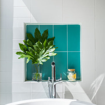
After reviving their kitchen, this couple was ready to tackle the master bathroom by getting rid of some Venetian plaster and a built in tub, removing fur downs and a bulky shower surround, and just making the entire space feel lighter, brighter, and bringing into a more mid-century style space.
The cabinet is a freestanding furniture piece that we allowed the homeowner to purchase themselves to save a little bit on cost, and it came with prefabricated with a counter and undermount sinks. We installed 2 floating shelves in walnut above the commode to match the vanity piece.
The faucets are Hansgrohe Talis S widespread in chrome, and the tub filler is from the same collection. The shower control, also from Hansgrohe, is the Ecostat S Pressure Balance with a Croma SAM Set Plus shower head set.
The gorgeous freestanding soaking tub if from Jason - the Forma collection. The commode is a Toto Drake II two-piece, elongated.
Tile was really fun to play with in this space so there is a pretty good mix. The floor tile is from Daltile in their Fabric Art Modern Textile in white. We kept is fairly simple on the vanity back wall, shower walls and tub surround walls with an Interceramic IC Brites White in their wall tile collection. A 1" hex on the shower floor is from Daltile - the Keystones collection. The accent tiles were very fun to choose and we settled on Daltile Natural Hues - Paprika in the shower, and Jade by the tub.
The wall color was updated to a neutral Gray Screen from Sherwin Williams, with Extra White as the ceiling color.
 Grandeur Hills Group,Inc.
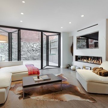
The main feature of this living room is light. The room looks light because of many glass surfaces. The wide doors and windows not only allow daylight to easily enter the room, but also make the room filled with fresh and clean air.
In the evenings, the owners can use additional sources of light such as lamps built in the ceiling or sconces. The upholstered furniture, ceiling and walls are decorated in white.This feature makes the living room look lighter.
If you find the interior design of your living room dull and ordinary, tackle this problem right now with the best NYC interior designers and change the look of your home for the better!
 User
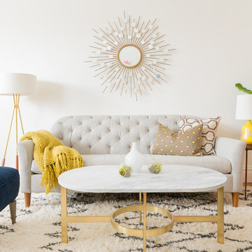
UserDecorist customer Jessica came to us with an assignment that our designer Chrissy couldn't wait to tackle: help me re-invent my living room channeling Emily Henderson and a bit of Madmen, and mixing colors, patterns and styles into one cohesive look.
Jessica already had her eye on a few pieces when she bought her Decorist makeover: the sophisticated, tufted West Elm Ainslie sofa and the Crate & Barrel Arietta chair, which Chrissy recommended upholstering in a luxurious blue velvet. Chrissy worked around a palette of three colors: blues, greens and purples, layering in gold-finished metals and adding textures through the plush Moroccan-inspired rug, green leather pouf and patterned silk purple pillow. She also helped Jessica re-think her living room layout, moving the placement of the sofa to another wall to create a more open feeling.
Don't miss the before ... can you believe the transformation? Far from the neutral and boring that Jessica wanted to avoid. It's cheerful and colorful and cozy! Shop the look http://www.decorist.com/makeovers/6/a-mid-century-inspired-living-room-makeover
Jessica Delaney
 Kirk Riley Design
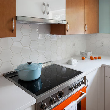
This original 1950's kitchen with a pink backsplash and pale blue appliances needed a fresh take. Hardwood floors were installed to match the existing wood on the first floor. Bright white quartz countertops and a white backsplash created using both flat/glossy and matte/raised hex tiles created a textured flower pattern. Slab front cabinets in a mixture of wood and white tackled the storage issues. The pop of orange of the Bertazonni oven is the counter balance to the cool fresh wall color and tons of natural light. A beautiful, functional space to create healthy meals for her family was paramount to our client. We created this fresh space by dropping a touch of Palm Springs into the Pacific Northwest.

 Margot Hartford Photography
Photo: Margot Hartford © 2017 Houzz
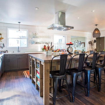
Example of a transitional kitchen design in Other
Example of a transitional kitchen design in Other
 Susan Yeley Homes
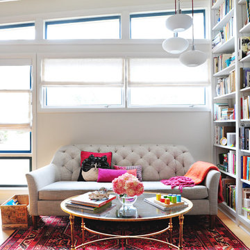
Our poster project for The Three P's, this small midcentury home south of campus has great bones but lacked vibrancy - a je ne sais quoi that the clients were searching to savoir once and for all. SYI worked with them to nail down a design direction and furniture plan, and they decided to invest in the big-impact items first: built-ins and lighting and a fresh paint job that included a beautiful deep blue-green line around the windows. The vintage rug was an Etsy score at an awesome price, but only after the client spent months scouring options and sources online that matched the vision and dimensions of the plan. A good year later, the West Elm sofa went on sale, so the client took advantage; some time after that, they painted the kitchen, created the drop zone / bench area, and rounded out the room with occasional tables and accessories. Their lesson: in patience, and details, there is beauty.
Photography by Gina Rogers Photography
25