
Search results for "Traffic areas" in Home Design Ideas
 Inviting Spaces By Kim
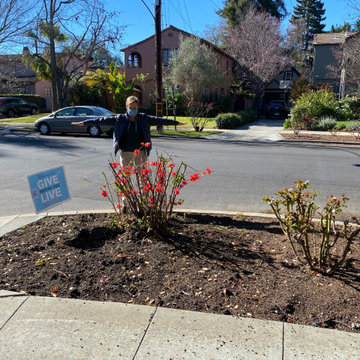
This centrally located intersection to a main thoroughfare a block away was a concern because of the corner lot visibility issue for cars making a turn driving in either direction. The Quince tree bloomed annually for just a short time and was originally planted by the prior home owners decades ago. Keeping it maintained to a height of 4’ maximum, dictated for safety reasons, was still obstructing and limiting the visibility of oncoming traffic at this busy intersection.
The existing roses planted in the same space as the Quince were a perfect backdrop to the new perennials and annuals planted to paint this corner with flowers. The project also included expanding the beautification to both corner areas in coordination with several other planting areas already seasonally updated on the property. With the Redwood Tree as a focal point and Roses, Daphnes, Iris, Azaleas, Fuchsias, Hydrangeas and Camilias highlighting the planting beds the addition of color, including around the driveway and side entrance, transformed the entire space.
Painting With Flowers Is Adding Beauty to Benefit Homeowners & Neighbors!
Kim Beber

 Braswell Design+Build
This classy kitchen has better traffic flow and a bigger footprint after removing the wall between the kitchen and dining area. The glass wall between dining room and living room is functional, but also enhances the open feel of the space without being the focus. White quartz countertops and modern black and white glass and marble tile add a contemporary feel to the traditional kitchen cabinets. The pantry to the right of the fridge was sized to be the same as the freezer panel on the left to enhance symmetry.
Architect Erin May, Photographer Greg Hadley.

 Kitchens and Baths by Curio
Mid-sized elegant galley ceramic tile enclosed kitchen photo in Boston with an undermount sink, raised-panel cabinets, medium tone wood cabinets, granite countertops, beige backsplash, ceramic backsplash, stainless steel appliances and an island
Find the right local pro for your project
 Inviting Spaces By Kim
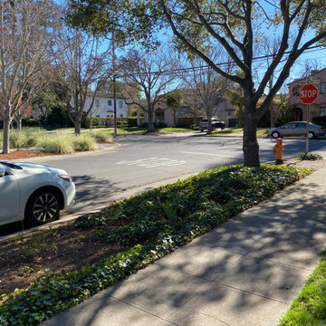
This centrally located intersection to a main thoroughfare a block away was a concern because of the corner lot visibility issue for cars making a turn driving in either direction. The Quince tree bloomed annually for just a short time and was originally planted by the prior home owners decades ago. Keeping it maintained to a height of 4’ maximum, dictated for safety reasons, was still obstructing and limiting the visibility of oncoming traffic at this busy intersection.
The existing roses planted in the same space as the Quince were a perfect backdrop to the new perennials and annuals planted to paint this corner with flowers. The project also included expanding the beautification to both corner areas in coordination with several other planting areas already seasonally updated on the property. With the Redwood Tree as a focal point and Roses, Daphnes, Iris, Azaleas, Fuchsias, Hydrangeas and Camilias highlighting the planting beds the addition of color, including around the driveway and side entrance, transformed the entire space.
Painting With Flowers Is Adding Beauty to Benefit Homeowners & Neighbors!
Kim Beber

 The Artisans Group, Inc.
Overlooking the Puget Sound, this 2,000 sf Pacific Northwest modern home effortlessly opens onto classic water views while optimizing privacy and Southern exposure with a private patio.
Our clients sought a poetically minimalist and practical retirement home infused with rhythm and geometry. With dramatic roof lines and a projecting great room that define its form, the architecture’s simplicity frames its dramatic site to incredible effect while the interior playfully loops the spacious traffic patterns of this 3 bedroom 2.5 bath.

 Pro-Pack Contracting & Design Inc.
Client had a closed in tight space in their existing kitchen prior to the renovation. Their island was in a high traffic area and so seating was minimal. Removing the wall and add the peninsula gave ample seating and work space making it a much welcomed flow to this now functioning kitchen. . Revival Arts Photography

 Parker & Parker Design, LLC
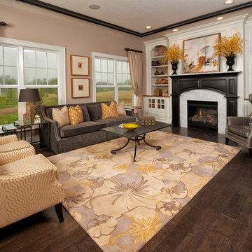
The design scope was to decorate a family room, home office and dining room for a young, growing family with two full-time working parents. The client was inspired by summers in Martha’s Vineyard – specifically the combination of coastal beaches and farms. We pulled in some modern, rustic design elements with the farmhouse table and oil rubbed bronze light fixtures. The grounding color palette was designed to be neutral and timeless with pops of color - we used navy & raspberry in the family room and sage & purple in the dining room. We kept the high traffic areas like the breakfast nook and family room kid-friendly with performance fabrics and wipeable chairs.

 Parker & Parker Design, LLC
The design scope was to decorate a family room, home office and dining room for a young, growing family with two full-time working parents. The client was inspired by summers in Martha’s Vineyard – specifically the combination of coastal beaches and farms. We pulled in some modern, rustic design elements with the farmhouse table and oil rubbed bronze light fixtures. The grounding color palette was designed to be neutral and timeless with pops of color - we used navy & raspberry in the family room and sage & purple in the dining room. We kept the high traffic areas like the breakfast nook and family room kid-friendly with performance fabrics and wipeable chairs.
 GREENLAND FURNITURE
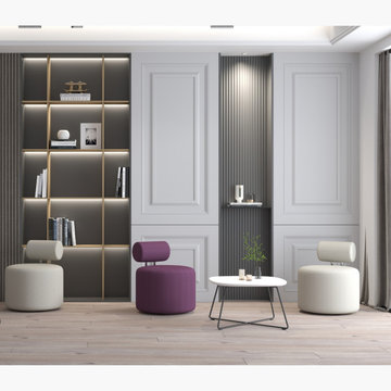
This project highlights a curated selection of modern office seating solutions designed for commercial environments, including executive offices, conference rooms, collaborative workspaces, and reception areas. The collection features ergonomic task chairs, premium executive models, and stylish lounge seating with a focus on comfort, durability, and contemporary aesthetics. All products are contract-grade and suitable for high-traffic professional spaces such as corporate offices, hotels, and business centers.

 Pool Environments, Inc.
The client purchased this property with grand plans of renovating the entire place; from top to bottom, and from inside to outside. And while the inside canvas was very generous and even somewhat forgiving, the outside space would be anything but.
We wanted to squeeze in as much seating space as possible in their limited courtyard area, without encroaching on the already compact-sized pool. The first and most obvious solution was to get rid of the trees and shrubs that separated this house from its zero-lot-line neighbor. With the addition of Lueder limestone slabs, this alone would free up nearly 120 additional square feet, which happened to be the perfect amount of space for a mobile gas fire pit and sectional sofa. And all of this would make for the perfect place to enjoy the afternoon sunset with the implementation of a custom-built metal pergola standing above it all.
The next problem we saw was that around the patio area, there were too many levels of steps and stairs, which meant that it would have been difficult to have any sort of traditional furniture arrangement. Randy knew that it only made sense to bring in a wood deck that could be mated to the highest level of the patio, thus creating gaining the most continuous amount of flat space that the client was wanting. But even so, that flat space would be limited to a tight "L-shape" around the pool. And knowing this, the client decided that the larger space would be more valuable to them than the spa, so they opted to have a portion of the deck built over it in order to allow for a more generous amount of patio space.
And with the edge of the patio/deck dropping off almost 2 feet to the waterline, it now created the perfect opportunity to have a visually compelling raised wall that could be adorned with different hues of plank-shaped tiles. From inside the pool, the varying shades of brown were a great accent to the wood deck that sat just above.
However, the true visual crowning jewel of this project would end up being the raised back wall along the fence, fully encased in a large format, 24x24 slate grey tile, complete with a custom stainless steel, square-tube scupper bank, installed at just the right height to create the perfect amount of water noise.
But Randy wasn't done just yet. With two entirely new entertaining areas opened up at opposite ends of the pool, the only thing left to do now was to connect them. Knowing that he nor the client wanted to eliminate any more water space, he decided to bring a new traffic pattern right into the pool by way of two "floating", Lueder limestone stepper pads. It would be a visually perfect union of both pool and walking spaces.
The existing steps and walkways were then cut away and replaced with matching Lueder limestone caps and steppers. All remaining gaps were then filled with Mexican beach pebble, which helped to promote a very "zen-like" feel in this outdoor space.
The interior of the pool was coated with Wet Edge Primerastone "Blue Pacific Coast" plaster, and lit up with Pentair GloBrite LED pool lights.
In the end, the client ended up gaining the additional entertaining and seating space that they needed, and the updated, modern feel that they loved.

 Schroeder Design/Build, Inc.
Schroeder Design/Build created seven different layout options and our clients selected an “L” shaped design that required removing a bearing wall. This allowed us to open up the kitchen area and create a laundry area that was formerly an under stair closet. The new kitchen features loads of counter space for working and cabinets and drawers for storage. Appliances were placed to maximize flow and prevent traffic jams. A well-planned layered light plan offers overhead, task and accent lighting throughout. The peninsula seating area allows the kids to sit and do homework or socialize while mom’s preparing meals.
This kitchen remodel includes many special touches that make it perfectly suited for this family.
The knee wall under the peninsula is tiled to prevent damage to the cabinets from accidental kicking while the kids sit on stools. There’s a niche behind the sink to add extra counter depth for plants.
 Burrow & Nest
The mudroom received an updated palette that suited the coastal area, with fresh whites and navy. New sconces were added, as well as durable rugs for this high-traffic area that has entries from the back, front and garage. Additional storage was added with a free-standing bench seat, a great place to pull on boots in the winter. Pillows and local art soften the space. Custom hooks were designed to mark each cubby for Mom, Dad, Thing 1 & Thing 2.
 Inviting Spaces By Kim
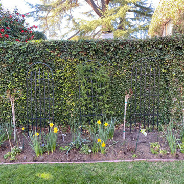
This centrally located intersection to a main thoroughfare a block away was a concern because of the corner lot visibility issue for cars making a turn driving in either direction. The Quince tree bloomed annually for just a short time and was originally planted by the prior home owners decades ago. Keeping it maintained to a height of 4’ maximum, dictated for safety reasons, was still obstructing and limiting the visibility of oncoming traffic at this busy intersection.
The existing roses planted in the same space as the Quince were a perfect backdrop to the new perennials and annuals planted to paint this corner with flowers. The project also included expanding the beautification to both corner areas in coordination with several other planting areas already seasonally updated on the property. With the Redwood Tree as a focal point and Roses, Daphnes, Iris, Azaleas, Fuchsias, Hydrangeas and Camilias highlighting the planting beds the addition of color, including around the driveway and side entrance, transformed the entire space.
Painting With Flowers Is Adding Beauty to Benefit Homeowners & Neighbors!
Kim Beber


 Deck and Patio Company "Outdoor Living Experts"
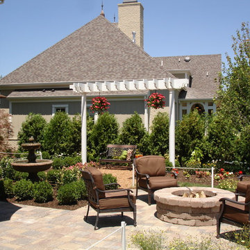
Techo-Bloc pavers were used to make this idyllic small patio sitting area next to the water feature. Engineered in Canada, these pavers can well handle the freeze/thaw that occurs in our corner of the Northeast.
www.deckandpatio.com

 Kate Glicksberg Photography
A recent renovation of a luxury 1 bedroom apartment on Manhattan's Park Avenue. Elegant and simple, modern aesthetic.
Kate Glicksberg Photography
Eat-in kitchen - mid-sized contemporary l-shaped medium tone wood floor and brown floor eat-in kitchen idea in New York with flat-panel cabinets, white cabinets, marble countertops, white backsplash, marble backsplash, stainless steel appliances, an island, white countertops and an undermount sink
Eat-in kitchen - mid-sized contemporary l-shaped medium tone wood floor and brown floor eat-in kitchen idea in New York with flat-panel cabinets, white cabinets, marble countertops, white backsplash, marble backsplash, stainless steel appliances, an island, white countertops and an undermount sink

 Kat Nelson Designs
Lisa Konz Photography
This was such a fun project working with these clients who wanted to take an old school, traditional lake house and update it. We moved the kitchen from the previous location to the breakfast area to create a more open space floor plan. We also added ship lap strategically to some feature walls and columns. The color palette we went with was navy, black, tan and cream. The decorative and central feature of the kitchen tile and family room rug really drove the direction of this project. With plenty of light once we moved the kitchen and white walls, we were able to go with dramatic black cabinets. The solid brass pulls added a little drama, but the light reclaimed open shelves and cross detail on the island kept it from getting too fussy and clean white Quartz countertops keep the kitchen from feeling too dark.
There previously wasn't a fireplace so added one for cozy winter lake days with a herringbone tile surround and reclaimed beam mantle.
To ensure this family friendly lake house can withstand the traffic, we added sunbrella slipcovers to all the upholstery in the family room.
The back screened porch overlooks the lake and dock and is ready for an abundance of extended family and friends to enjoy this beautiful updated and classic lake home.

 Custom Couture Rugs
Example of a large classic open concept white floor living room design in Miami with gray walls, no fireplace and a wall-mounted tv
Sponsored
Columbus, OH
Free consultation for landscape design!

Peabody Landscape Group
Franklin County's Reliable Landscape Design & Contracting
 Braswell Design+Build
This classy kitchen has better traffic flow and a bigger footprint after removing the wall between the kitchen and dining area. The glass wall between dining room and living room is functional, but also enhances the open feel of the space without being the focus. White quartz countertops and modern black and white glass and marble tile add a contemporary feel to the traditional kitchen cabinets. The pantry to the right of the fridge was sized to be the same as the freezer panel on the left to enhance symmetry.
Architect Erin May, Photographer Greg Hadley.
 Schroeder Design/Build, Inc.
Schroeder Design/Build created seven different layout options and our clients selected an “L” shaped design that required removing a bearing wall. This allowed us to open up the kitchen area and create a laundry area that was formerly an under stair closet. The new kitchen features loads of counter space for working and cabinets and drawers for storage. Appliances were placed to maximize flow and prevent traffic jams. A well-planned layered light plan offers overhead, task and accent lighting throughout. The peninsula seating area allows the kids to sit and do homework or socialize while mom’s preparing meals.
This kitchen remodel includes many special touches that make it perfectly suited for this family.
The knee wall under the peninsula is tiled to prevent damage to the cabinets from accidental kicking while the kids sit on stools. There’s a niche behind the sink to add extra counter depth for plants.

 Mark W. Todd Architects, Inc.
Inspiration for a rustic l-shaped brick floor home bar remodel in Houston with an undermount sink and dark wood cabinets
116