
Search results for "Unusable" in Home Design Ideas
 3 Lights Design
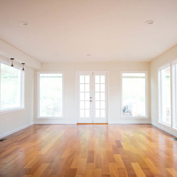
The far wall used to house a unused fireplace. It now has french doors leading to an exterior fire pit and the terraced gardens in the back.
http://www.houzz.com/pro/kuohphotography/thomas-kuoh-photography
 Susan Yeley Homes
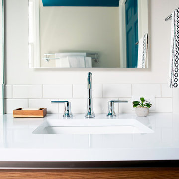
White kitchens are, truly, not for everyone. These clients, settling in Bloomington with a newborn and collections of quilts, fiestaware and jam band tour posters, were drawn to how bright and clean a white kitchen can be, but reluctant to lose color and interest. At SYI, we agreed! It would have felt like too sudden a drain of intensity to go from so much vibrancy to a complete white out. At the same time, all that vibrancy needed a backdrop that didn't compete. Enter the bright green island! And yellow sconces! And red bird runner! And upstairs, in a complete makeover of an awkward ensuite, the turquoise ceiling and door! (You really can't speak of these things without exclamation marks, we find.) True to its 1960s era colonial bones, the kitchen was formerly a tight U of wood stained cabinetry, adjacent to but cut off from an eating nook (where, if it's like most households, previous occupants likely ate most if not all of their meals, leaving the nearby dining room awfully lonely and unused). The eating nook's picture window became a door to a new deck, and one side of the U went away, leaving room for one of the most functional types of kitchen layouts we know of: an L with big windows to the back yard and a nice big island.
Contractor: Loren Wood Builders
Cabinetry: Stoll's Woodworking
Photography: Gina Rogers and Michiko Owaki
 Angelina Miller @ Closet Factory
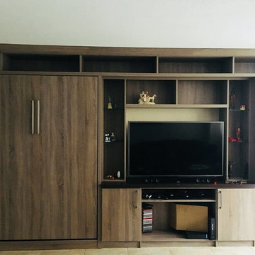
My client’s one bedroom, beach front condo lacked furniture, a guest room and adequate storage. I designed a wall unit that houses a Murphy bed, two wardrobe closets, a section for his tv & components and plenty of shelves for displaying his artifacts. Additionally, I created a clothing and storage closet in an unused hallway recess that matches the living room perfectly!
Find the right local pro for your project

 J.T. McDermott Remodeling
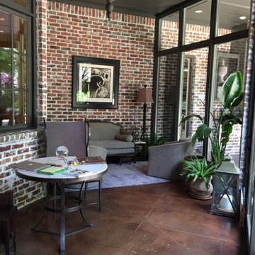
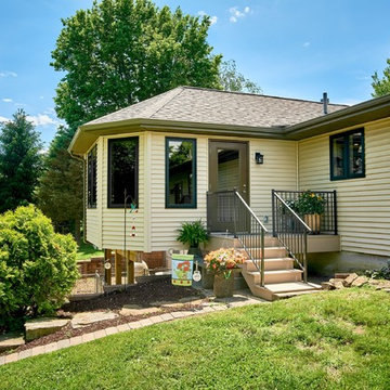
The original deck was nearly the same shape and size of the new sunroom but was completely unusable because the sun made it unbearable to sit and relax.
Chris Malacarne Photography
 Renovation Ernst Hellrung
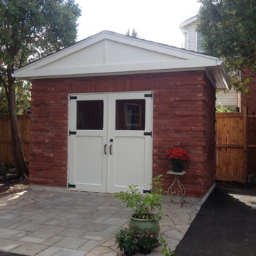
Our brick potting and storage shed built to replace a decrepit garage that was unusable. The bricks are recycled original 80 year old brick from the previous structure. The trim is PVC for rot resistance, the roof gutters are connected a rain barrel reservoir for the garden. The custom made mini barn doors allow for easy access to bicycles and lawn equipment.
 Chicagoland Home Products
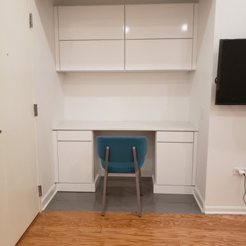
City living often means that you need to make the most of inch of space. In this recent project for a high-rise condo in Chicago, we helped the owners maximize their square footage by installing a a built-in desk with storage in an unused nook in their home.
With a high-gloss white finish and base molding, this built-in workspace is stylish and fully integrated with the surrounding space. Push release doors and drawers eliminate the need for hardware, giving the custom storage system and even sleeker look.
 Village Home Stores
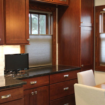
Cabinet design jogs back into alcove area and adds storage in a previously unused area below the window in a beautiful new cherry kitchen remodeled by Village Home Stores.
 Walsh's Remodeling
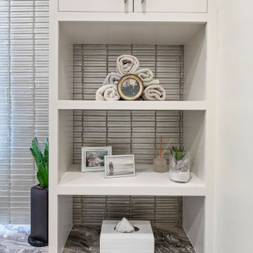
Miles and his team repurposed the homeowner's unused space- a laundry room, into this gorgeous powder room. The powder room features unique details such as the floating vanity with a vessel sink, a custom site-built cabinet, and a glass tile back wall. The room also has custom LED lighting details, such as a backlit mirror and under-cabinet LED lights.
 REEDesign Interiors by Roderick Reed
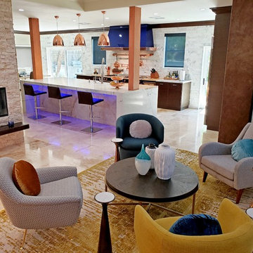
A welcoming lounge now resides alongside a full custom bar. This space was originally an unused Living Room space. A dramatic and bespoke kitchen can be seen in the background.
 Corinthian Fine Homes
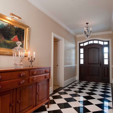
This homeowner lived on a very prominent golf course and wanted to feel like he was on the putting green of the 9th hole while standing at his family room window. The existing layout of the home had the garage enjoying that view with the outdated dining room, family room and kitchen further back on the lot. We completely demoed the garage and a section of the home, allowing us to design and build with that view in mind. The completed project has the family room at the back of the home with a gorgeous view of the golf course from two large curved bay windows. A new fireplace with custom cabinetry and shelf niches and coffered high ceilings makes this room a treasure. The new kitchen boasts of white painted cabinetry, an island with wood top and a 6 burner Wolf cooktop with a custom hood, white tile with multiple trim details and a pot filler faucet. A Butler’s Pantry was added for entertaining complete with beautiful white painted cabinetry with glass upper cabinets, marble countertops and a prep sink and faucet. We converted an unused dining room into a custom, high-end home office with beautiful site- built mahogany bookcases to showcase the homeowners book collections. To complete this renovation, we added a “friends” entry and a mudroom for improved access and functionality. The transformation is not only efficient but aesthetically pleasing to the eye and exceeded the homeowner’s expectations to enjoy their view of the 9th hole.
 Maddox Garden Center and Landscaping
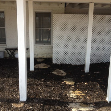
Under the deck was unusable space that had all mulch and made for a messy pool area.
Design ideas for a landscaping in Cincinnati.
Design ideas for a landscaping in Cincinnati.
 Donovan Lord Design
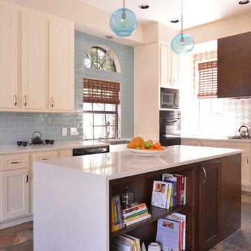
Edict Inc - Completely remodeled and expanded kitchen from smaller galley style kitchen. Expanded into unused bedroom, added windows at end of kitchen to visually expand the space.
 Hamish Murray Construction, Inc.
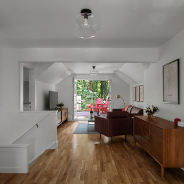
To maximize the area, a door opening in the living room was created to recapture an unusable storage space and turn it into a small bedroom with a single bed. This modification transformed a cramped one-bedroom apartment into a comfortable and spacious two bedroom apartment.
 Lagois Design Build Renovate
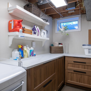
Living in place with flex:
The mother of the homeowner needed a home that is fully accessible for living in place, so we created a barrier-free entry and installed grab bars. The new suite contains a full bedroom and bath and a small living room with a kitchenette.
One of the homeowners especially loves to cook. Now he has a new kitchen with more space, more storage, and better functionality.
Fresh paint, wallpaper and a new look:
We refinished the hardwood floors throughout and gave the whole home a fresh new look. We updated a powder room with paint, new tile, new fixtures, new lighting, and wallpaper.
Kitchen with space, flow, and storage:
The kitchen was cut off from the rest of the home. It had a long peninsula with awkward flow around the kitchen that just didn’t work. We removed the peninsula and instead created a large island with seating for three. With the new island, counter space is much more usable now. We put hidden cupboards underneath for added storage. The island also holds the built-in microwave with a steel drawer front below for continuity. We used banked drawers rather than cupboards for ease of access. We also installed new large appliances.
Coffee station, cookbooks, and spices:
We removed two clumsy closed pantries and an unused main door, and this allowed space for more cabinetry. We added an open shelf section with herringbone tile and a counter for a coffee station and cookbooks. Other features were a waste bin pullout with garbage bag storage and a tall spice pullout drawer.
The kitchen now has a big double-wide appliance garage where all small appliances are stored and organized in a big pantry with a light inside. All the appliances are front and centre (rather than buried in the back somewhere), yet hidden behind a door.
Flex space means other new spaces for everyone:
In creating a flex space for the mother on the main floor, the homeowners lost their space for a family room, although there is still a formal living and dining room on that floor. We solved it by creating a new finished basement with a family room to replace the one upstairs. This gives the family and the mother their own spaces and at the same time comfortable places for all of them.
 Kitchen Solvers of North Raleigh
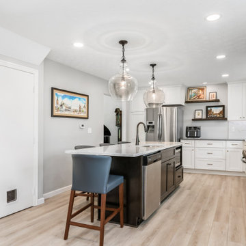
This old and outdated kitchen was transformed into an open, inviting, modern and functioning space that everyone wants to gather and hang out in. This was achieved by reconfiguring the space, eliminating walls and adding and incorporating the unused dining space. The new kitchen cabinets were done in the Manhattan door from the Kitchen Solvers Classic Collection line in an Alabaster color while the island was done in a black tea color. We next installed a Cambria Quartz countertop in Carrick around the kitchen while the island was done in Minuet. To finish the new look we added a Ceramic white with marble veining backsplash around the kitchen, while around the hood they went with a gray glass backsplash. The two-toned cabinets topped with two beautiful different Cambria quartz and backsplash gave it the added sophistication.
 KCBR Design | Remodel
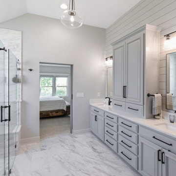
This remodel project consisted of the primary (master) bathroom, bedroom, closet, hall bathroom, and laundry room. In the primary bathroom, we removed the walk-in shower, which felt cave-like, to add much-needed closet space. The unused jetted bath was then replaced with a zero-entry spa shower. Honed Grecian marble covers the floors and shower for a casually elevated sanctuary. In addition, the quiet texture of the shiplap balances the shower. To finish, a tranquil color pallet was chosen to sweep throughout the space, accented with matte black fixtures.
 Distinctively Mollie Interior Design and Staging
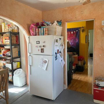
Our Homeowner loves all of the uniqueness of this treasured space, but the lack of functionality and finish made the space unusable. Step into the heart of Old Colorado City and discover a kitchen that blends historic charm with modern functionality. Our team at Distinctively Mollie Interior Design specializes in tailoring spaces to reflect your unique style and needs. From selecting the perfect colors and finishes to overseeing every detail of the project, we ensured that this cozy kitchen became a radiant centerpiece in its charming home. Let us turn your dream space into a reality too.
 Kitchens by Good Guys
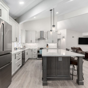
Our second Tonto Trail project in Rio Verde was quite the transformation for Phase 1. The existing flooring throughout was a stamped concrete, the kitchen was outdated and the pantry was a bizarre shape that made it almost unusable. It was time for some changes!
We removed soffits and re-arranged the kitchen a little to make it feel more open and functional. Selecting Repose Grey painted cabinetry for the perimeter, a warm grey wood stained island and bar to coordinate, marble quartz, Cloe white subway tile laid in herringbone pattern for the backsplash and a wood tile plank flooring that tied all the tones together, really brightened up the home. Lighting was extremely important to our client, so we added can lighting throughout and LED lighting under all the uppers.
For the pantry, it was also important to our client for it to be functional. We reconfigured the surrounding walls to make the pantry more square and bigger on the inside, allowing space for cabinetry, countertops and floating shelves to keep it visually open. By their slider and dining area, we created a bar area to have a beverage fridge and more storage. With changes to openings and existing closets, we were able to gain additional functional storage for our client as well.
This remodel has made our clients home more functional, lighter and brighter with updated finishes throughout!
 Northwest Construction & Landscape, LLC
Formal Backyard Garden Showcases the Beauty of Natural Gray Concrete
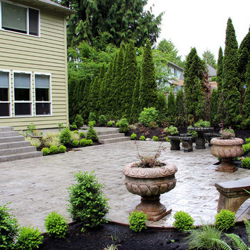
This Pacific Northwest project called for a total backyard transformation that required a significant reduction in lawn space, most of which was saturated and mossy. Emily of Emily Russell Landscape Architecture designed this formal backyard garden which was installed by Northwest Construction & Landscape, LLC.
Previously unused space was organized through the creation of a courtyard patio which functions as an extension of the house that the homeowner can use for family gatherings, entertaining, or reflection. Budgetary concerns led her to opt for concrete rather than a mortared flagstone patio. “I always let homeowners know that we can do either for them, but to me, going with concrete is an easy choice to make because of the cost savings,” says Colby Brand, President of Northwest of Construction & Landscape, LLC.
Ashlar slate stamped concrete was suggested by Colby to mimic the pattern used in Emily’s conceptual design. The final plan featured natural gray, ashlar slate stamped concrete with antique coloring for texture. Colby and his team poured the steps first. Substantial in size – the rise is 4’ with a run of 5,’ and includes a 4’ landing on top – the steps allow an easy and fluid transition from inside to outside.
After the steps were completed, the curved walkway on the side of the house was poured, connecting the backyard to the front yard. Instead of a conventional, rectangular shape for the 647 sf courtyard patio area, the formality of the plan called for sections of the concrete to bump out into the garden beds against the back side of the house, tying the contrasting elements together.
Granite urns and curved, concrete benches purchased by the homeowner rest atop the rounded portion of the concrete and provide a space for sitting and an inviting view from the house. Regarding the final product, Emily Russell states, “My client and I are extremely happy with the finished patio. It's such an inviting space that is well loved and used on a regular basis.”
106