
Search results for "Unusable" in Home Design Ideas
 Amy Pearson Design
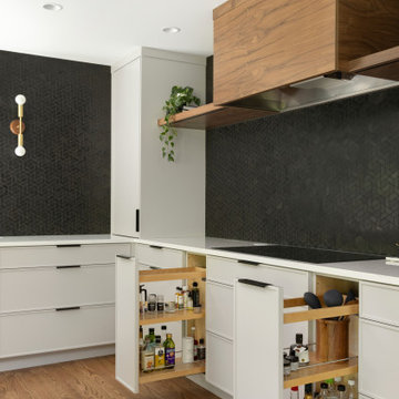
While the root of the scope stayed the same - open the kitchen to the dining and living rooms - this project grew into so much more than just reconfiguring spaces. The design team loved the creativity that comes from working with a trusting client and our opportunity to flex our design muscles in the mid century category. The goal was to not be literal with the design style, but to be respectful of the home’s original architecture and features while making it decidedly Pacific Northwest by letting it’s setting in the trees really shine!
We doubled the size of the kitchen, taking over an unused second eat-in space that sat immediately next to the homes dining room. We opened the walls between the dining/kitchen/and hallway creating an expansive open feel. Step in pantry closet that was lacking in efficiency and took up precious walk-way space was removed in favor of a custom pantry cabinet with roll-out shelves for easy use. The custom walnut stair railing is a welcomed greeting near the front door and ties all of the spaces together.
 Countrywide Construction & Design LLC
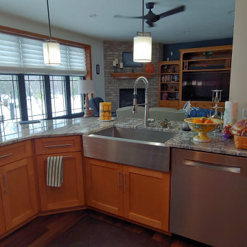
This galley kitchen was opened up to the dining room and extended back into an unused breakfast nook to create more space. The large peninsula opens the kitchen to the Living Room, while creating seating for six.
 Penn Contractors Inc
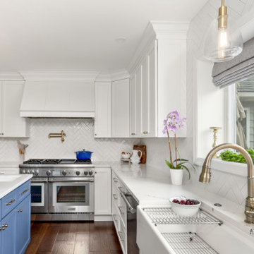
Details make a difference, especially when working with an open-concept floor plan. In this
Center Valley kitchen remodel, previous clients trusted us to update their
outdated space while bringing new life and purpose to a large, unused dining area.
Previously featuring dark wood cabinetry beneath low ceilings, the kitchen’s 90’s design was
ready for refresh. The area diagonal to the kitchen - a “breakfast room” sitting nearly empty, was
also redundant with the formal dining room nearby. Because of the open floor plan, the space
was noticeable immediately upon entering the home.
The clients knew that there was potential, but had never committed to transforming the extra
square footage into anything more than additional seating. Our designer’s idea was to extend
the kitchen into the dining area by adding cabinetry and a coffee bar, using the same custom
cabinets for a cohesive look. Navy blue paint defines the coffee bar, while touches of blue on the kitchen island, and the veining of the white quartz countertops tie the design together.
Other favorite features of the design include the chef oven with a custom hood, the farmhouse
sink from Blanco, and custom bench seating under the windows.
Find the right local pro for your project
 Greystone Kitchens
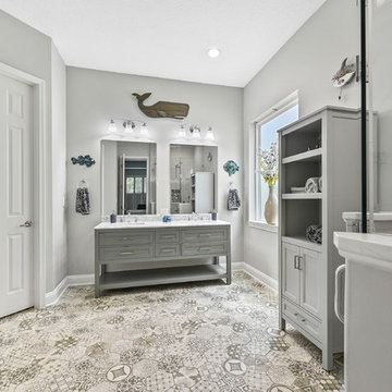
This bathroom was actually mainly chosen by outside designers, but we were able to pull it off flawlessly. There was a Garden tub beneath the window completely unused, and now it is a perfect open airy pop of color with an extravagant zero-entry walk in shower with full glass enclosure. How dreamy!
Kim Lindsey Photography
 J.P. Hoffman Design Build
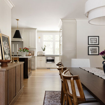
The original kitchen felt undersized for a 4,500-square-foot home, with adjacent formal spaces left unused and disconnected from daily life. The homeowners envisioned a larger, more welcoming kitchen that could better support cooking, entertaining, and gathering.
The renovation reworked the layout by incorporating the underutilized sitting room, allowing the kitchen to expand and open directly to the formal dining area. This created a more spacious and highly functional flow between spaces. A 10-foot walnut-stained island anchors the kitchen, complemented by a matching glass-front curio cabinet, chef-grade appliances, and dual sinks designed to support multiple cooks. A large window above the sink brings in natural light and frames views of the backyard, while a dedicated scullery provides additional pantry storage and prep space, keeping the main kitchen organized.
The result is a kitchen that feels open, intentional, and well-suited for both everyday living and entertaining.
 Kitchen & Bath Gallery of the Finger Lakes, Inc.
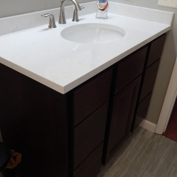
This master bathroom was a small unusable space before we took out the tub, opened the shower and gave more room for the toilet area.
Inspiration for a mid-sized transitional master gray tile and porcelain tile porcelain tile and gray floor bathroom remodel in New York with shaker cabinets, dark wood cabinets, a two-piece toilet, gray walls, an undermount sink, quartz countertops and white countertops
Inspiration for a mid-sized transitional master gray tile and porcelain tile porcelain tile and gray floor bathroom remodel in New York with shaker cabinets, dark wood cabinets, a two-piece toilet, gray walls, an undermount sink, quartz countertops and white countertops
 Living with Lolo
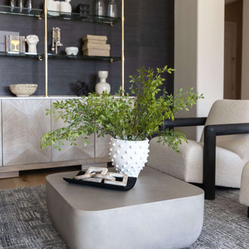
Living Room in Alyssa Lane | Key Feature: A complete kitchen + living room transformation designed for a young, growing family who loved their home, but needed it to work harder and reflect their personality. The updated kitchen became the heart of the home, featuring a hidden smoothie station to keep daily essentials out of sight, plus a dedicated cocktail bar setup for entertaining. In the living room, the fireplace wall was fully reimagined by centering the previously cornered fireplace and creating a multifunctional media wall with custom furnishings and a statement chandelier. To top it off, the former formal dining room was transformed into a bar lounge with custom brass shelving, a black grasscloth backdrop, and a bold, elevated vibe perfect for hosting friends and family.
Challenge: This home belonged to a young couple with two small kids and a growing business, and while they loved the house itself, the spaces didn’t support the way they actually lived. The kitchen lacked function and storage, everyday routines (like smoothie-making) created visual clutter, and cocktail entertaining essentials were being shoved into the pantry with no dedicated space. The living room also felt awkward and unfinished due to the cornered fireplace, which made it difficult to create a centered, functional media wall. On top of that, the formal dining room wasn’t being used, leaving valuable square footage underutilized and disconnected from their lifestyle and personality.
Solution: We redesigned the home around how the family truly uses it day-to-day, focusing on function, personality, and elevated livability. In the kitchen, we created a modern, highly organized layout complete with a hidden smoothie station so daily supplies stay accessible but out of sight. For entertaining, we designed a dedicated bar area for Ryan, giving him a more inspired space to make cocktails without relying on pantry storage. In the living room, we centered the fireplace and fully revamped the feature wall into a multifunctional entertainment/media wall, then layered in custom furniture pieces and a statement chandelier to bring warmth and style. Finally, we converted the unused formal dining room into a bar lounge with custom brass shelving, a striking black grasscloth wall, and a sophisticated hangout space perfect for entertaining family and friends.
Budget: $100k-$150k |
Timeline: 4 months
 Done Rite Handyman & Remodeling Service
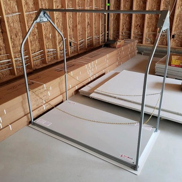
This is the view inside the unused storage space of the garage attic during the process
Inspiration for a small attached carport remodel in Detroit
Inspiration for a small attached carport remodel in Detroit
 LaMantia Design and Remodeling
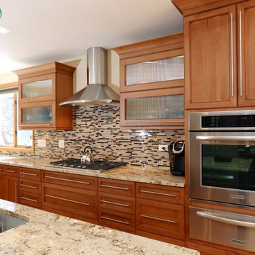
The kitchen sparkles like a jewel with it’s new open floor plan; gone is the restrictive Peninsula replaced with a longer Island and a sturdy long artisan table at the Island’s end. A dry Bar replaced the unused kitchen desk area and a built-in Banquet, bordered with a stepped-up base cabinet housing a Micro/Convection Oven, now offers additional seating when entertaining. The warm toasty finish of the Alder cabinetry is completed by the granite and tiled glass backsplash.
 Nicole Arnold Interiors
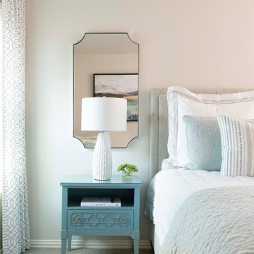
This late 90’s home was ready for a refresh, and boy did we have fun delivering just that! Fully renovating the kitchen, family room, dining room, laundry room, entry, and study as well as converting an unused formal room to a wine lounge allowed us to update the first floor of this home in a meaningful way. Lightening and brightening the walls and completely redoing all furnishings and decor, were just the beginning. The kitchen’s complete redesign involved moving obtrusive walls, creating more functional spaces, and incorporating current design trends. Fresh greens and blues were chosen to brighten the spaces, and texture was integrated to keep an organic feel. The clients are so pleased, we’re now embarking on Phase 2!
 Sams Brothers, Inc.
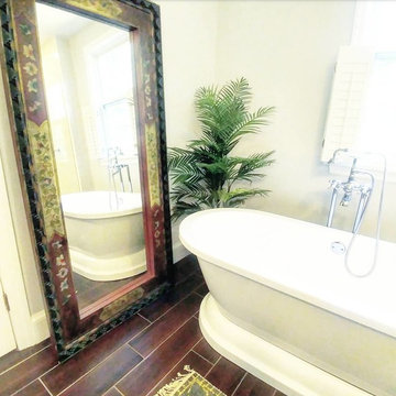
We took an unused bedroom and converted it into this amazing bathroom with a relaxing free standing tub, gorgeous walk in shower, functional and beautiful wood look tile floors and clean, yet functional bathroom vanity.
 Castle Building & Remodeling
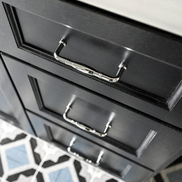
These repeat clients came back to Castle to do a kitchen refresh. The kitchen refresh replaced the appliances to new panel-ready appliances, painted the cabinetry and upgraded the countertops. The new space utilizes a bright and interesting blue/green island color that compliments the warm wood walnut hardwood floors that were refinished as well. Brass and black accents were added in new fixtures and hardware.
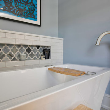
The primary bathroom remodel mostly kept the same layout but converted an old dated and unused corner tub to a new modernized freestanding soaking tub. The black granite and darker colors of the original 90’s bathroom were replaced with luxurious brighter and more transitional materials like white tiles, marble accents and a travertine style floor. A rich warm wood vanity compliments the cool colors from the marble accents and the plumbing fixtures offer a high end, more traditional feel.
 Kowalske Kitchen & Bath
The design of this Milwaukee bathroom remodel fits this 1930s home with a built-in linen cabinet, a leaded glass window, 3 arched doorways, and historic trim, doors and door knobs. This 1930s bathroom remodel in Milwaukee’s Story Hill neighborhood includes accessibility features including grab bars, a walk-in shower and a handheld showerhead.
The goals of this project:
+ Maintain the historic charm of the 1930s bathroom
+ Design with accessibility features for aging in place
Highlights of this Milwaukee Bathroom Remodel:
Walk-In Shower & Bathtub – The homeowners wanted their bathroom to include accessibility features. We added grab bars and reinforced some areas for future grab bars if needed. The walk-in shower has a minimal threshold and a handheld showerhead for easy use.
Heated Floors & Built-In Linen Cabinet – A built-in linen cabinet had been deteriorating over the years and was partly unusable because of the radiator being in the way. We removed the radiator and installed electric floors as the heat source. We also refaced, painted and added roll outs behind the bottom doors of the cabinet.
New Vanity – The homeowners needed more storage and countertop space so we replaced the pedestal sink with a vanity. A traditional style faucet fixture looks similar to what you would have originally seen in this 1930s home. The countertop is quartz that looks like a classic marble without the maintenance of marble. A traditional profile edge gives it an elevated look. A new medicine cabinet over the sink also provides storage in a bathroom the entire family uses.
Arched Doorways – This bathroom features three arched doorways – one in the entryway, one over the bathtub and one near the toilet. Our team carefully worked around the arches, as It was important to keep these architectural elements.
Tilework – The patterned floor tile is a fresh take on the traditional black and white historical bathrooms. It pairs seamlessly with the traditional subway tile walls and hexagon shower floor tile.
Historic Design Elements – Custom doors and trim match the existing in the home, as well as door knobs. It was important to salvage and clean up the leaded glass window and keep the existing arches. Bead board walls, cabinet hardware and overhead lighting were carefully selected to fit the period of the home.
 Michael Nash Design, Build & Homes
This older couple residing in a golf course community wanted to expand their living space and finish up their unfinished basement for entertainment purposes and more.
Their wish list included: exercise room, full scale movie theater, fireplace area, guest bedroom, full size master bath suite style, full bar area, entertainment and pool table area, and tray ceiling.
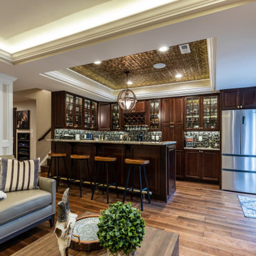
After major concrete breaking and running ground plumbing, we used a dead corner of basement near staircase to tuck in bar area.
A dual entrance bathroom from guest bedroom and main entertainment area was placed on far wall to create a large uninterrupted main floor area. A custom barn door for closet gives extra floor space to guest bedroom.
New movie theater room with multi-level seating, sound panel walls, two rows of recliner seating, 120-inch screen, state of art A/V system, custom pattern carpeting, surround sound & in-speakers, custom molding and trim with fluted columns, custom mahogany theater doors.
The bar area includes copper panel ceiling and rope lighting inside tray area, wrapped around cherry cabinets and dark granite top, plenty of stools and decorated with glass backsplash and listed glass cabinets.
The main seating area includes a linear fireplace, covered with floor to ceiling ledger stone and an embedded television above it.
The new exercise room with two French doors, full mirror walls, a couple storage closets, and rubber floors provide a fully equipped home gym.
The unused space under staircase now includes a hidden bookcase for storage and A/V equipment.
New bathroom includes fully equipped body sprays, large corner shower, double vanities, and lots of other amenities.
Carefully selected trim work, crown molding, tray ceiling, wainscoting, wide plank engineered flooring, matching stairs, and railing, makes this basement remodel the jewel of this community.
 S.J. Janis Company, Inc.
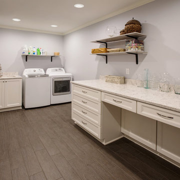
The larger laundry area with new utility sink replaced the unused storage space behind the new bar. Low maintenance materials such as the quartz countertops and ceramic wood floor tiles are ideal for the space. A long countertop and storage drawers allow the homeowner newfound space for crafts and giftwrapping.
 Castle Building & Remodeling
The couple desired to fully utilize their unused attic area in their house, which was built in the 1950’s with a story and a half layout. To make the most of the available square footage, they opted to construct a full shed dormer along the house’s rear side. They devised a detailed plan to transform this space into a functional area with different uses. This included an office for work-related tasks, a 3/4 bathroom for convenience, and a sizable family room. This room was designed to cater to their hobbies like listening to records and storage, indulging in good books, and unwinding in a relaxed setting. The space was also equipped with a gas stove, adding a cozy feel and a touch of vintage style. Being plant enthusiasts, the couple wanted to ensure enough sunlight to nourish their indoor greens. Hence, numerous windows and skylights were thoughtfully added to invite natural light. The new space is a true reflection of the couple’s personality, with its unique finishes and style that echo their fondness for mid-century designs. The outcome is a vibrant, neat, and entertaining area where the couple, along with their pets, can relish for many more years to come.
 Advance Design Studio, Ltd.
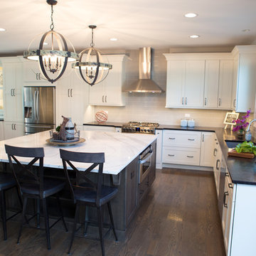
Jackie and Sean loved the Algonquin neighborhood they lived in with the peaceful neighborhood and the close proximity to work and school. What they didn’t love was how outdated their home had become. With a cramped kitchen and an unused dining room, they decided a remodel was the perfect solution to their problem. They would be able to continue to live in the area they loved, while at the same time they could have the dream home they envisioned.
After a thorough search, Jackie came across Advance Design Studio. She was impressed by all of the positive reviews she saw on the internet and saw herself identifying with all of the project stories she saw on the website. Once they met with designer Scott Christensen and owner Todd Jurs, they knew Advance Design was the right company to make their dreams a reality.
The project consisted of four main areas: the kitchen/dining/powder room, the laundry room, the master bathroom, and the kid’s bathroom. They wanted to expand the kitchen into the seldom used dining room and add a large island for hosting parties and family gatherings. They also wanted new hardwood flooring throughout the first level. The laundry room needed to be more functional, and all three bathrooms were in dire need of updating.
The closed off kitchen was opened up to create a sweeping space between the new eating area and the much larger kitchen. A handsome dry bar complete with a beverage refrigerator and lighted glass door cabinetry makes an elegant transition across from a peninsula area filled with storage. An additional decorative cabinet lighting up elegant dishware through the mullioned glass sits directly across from the drybar.
An expansive island was critical to the kitchen plans. Jackie, Sean and Scott worked closely together to create just the right details for their design. They wanted the island to be functional in addition to being the centerpiece of the room. Added storage for the kid’s school supplies was hidden behind cabinet doors so the children could do their schoolwork right at the island, and a microwave drawer glides open with the touch of a finger hidden inconspicuously within the island space. The easy to care for Cambria Britannica Quartz island top with its sweeping grey and white marble look perched atop hand-carved Craftsman corbels was absolutely what they were hoping for, blending both beauty and function perfectly.
Adding a nice contrast to the brightness of the quartz and the white cabinetry, Kodiak - Leather granite countertops were used to balance the light and dark tones of the space. Dura Supreme Classic White painted cabinets grace the perimeter, while Maple Poppy Seed stained cabinets with a beautiful soft grey woodgrain were used in the beverage center and island. The two tones compliment the large space balancing it out nicely creating interest and elegance with the simple Craftsman style full overlay doors.
A deep warm Barnwood White Oak flooring was added throughout the lower level. The new floor brings additional contrast to the bright kitchen and provides unity with the now open floorplan as it rolls in to the foyer and family room. Final details like the show-stopping lunar like duo light fixtures complete the space and intermix expertly with crisscross details of the glass door mullions, the island bar seating and even accessories in the space.
The small cluttered laundry room needed more space and more storage. With a busy family it seemed to overflow daily and did not have anywhere to hide the families “in and out stuff.” Scott designed the new space with a stackable washer and dryer and much more efficiently organized cabinetry. Doing laundry is now (almost!) a pleasure and keeping everyone’s “stuff” hidden, but readily accessible is now a snap.
The master bath was not a place where the couple enjoyed spending time getting ready for their day. The tub almost never was used, so removing it made it possible to build an extra-large shower, replacing the small cramped cube of the previous shower they hated. Clean, horizontal lines softly draw your eye around the space with porcelain tile called Driftwood Sea spray. Full overlay cabinetry in a soft white vanity with double sinks makes getting ready for the day much more convenient for the busy couple.
Long floor planks made of porcelain tile mimic real hardwood floors in a soft grey to compliment the shower, but with the ease and care of a tile surface. Cambrian Black Granite counters with a matte finish and under mount porcelain sinks with handsome brushed chrome hardware complete the handsome space. A real bonus in any master bath; a custom built in storage nook was tucked in the corner of the space for linens and heavenly storage.
The kid’s bath was in sad shape because it was original to the house. To keep the budget in control, the tub which was in great condition was retained, but focus was on the new large brick style porcelain charcoal tile on the floor, crisp white new Craftsman style cabinetry with pretty furniture details on the corner base, a striking granite top with white under mount porcelain sinks and fresh hardware and faucets. Some beautiful soft grey wood mirrors to match mom and dads were custom sized and placed under new lighting, and 4 hooks were smartly arranged down the wall for kids’ towels.
This couple was determined not to move, and made their house their dream home. Not only does their home function greatly now, but Jackie says, “When the neighbors come to visit, they’re asking if they can “steal” the design”! The added functionality, elegance, and open floor plan were exactly what this family needed in order to stay.
Advance Design Studio, Joe Nowak
 Amy Pearson Design
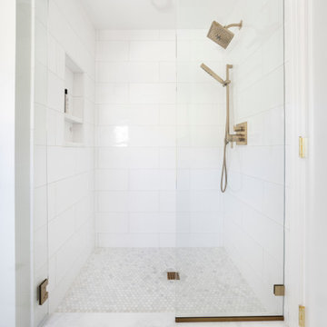
Upstairs, a hall bath was updated with fresh fixtures and surfaces blending the traditional with the contemporary. A cramped corner shower stall was expanded, easing every day use for the family of three. Unused space in the bathroom was given to the adjacent bedroom closet - which currently serves as a primary suite but will eventually be given to their daughter after a planned second phase dormer addition is completed!
 Elaina Blazei Interior Design
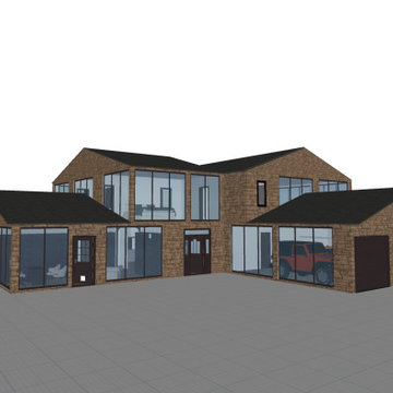
This house was a project that I had started over a year ago. I was not sold with my original design and left this project to sit for a while. Recently I came across the floor plan and was once again inspired. I adjusted the floor plan slightly to fit the space better and was once again excited to work on this project. The second floor had originally taken up the same amount of space as the main floor, but there was too much unusable open space and long hallways. I adjusted the space to be more accessible and open.
 Native Edge Landscape
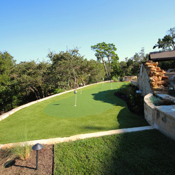
Truly a backyard playground for kids of all ages, the sports court, putting green, swimming pool, jacuzzi, firepit, and outdoor kitchen all look out over the beautiful hills of west Austin.
This unique five-hole putting green employs unused space behind the pool's water feature. With artificial turf in two different lengths to mimic the rough and the fairway, and accented with landscape lighting so tee time can be any time, this is every linksman's dream.
108