
Search results for "Unusable" in Home Design Ideas
 J.THOM Residential Design & Cabinetry
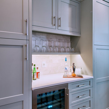
Our goal with this project was to combine a cramped kitchen and small dining room into an airy, open kitchen which serves many functions for this busy couple with young children. A central island provides plenty of space for food prep, school projects as well as everyday family dinners.
We rearranged the large front room to create both an intimate conversation area and a more formal dining area. As the main floor lacked a powder room and closet for coats and boots, we annexed an unused portion of the house's airshaft to create both. The addition also features a skylight which along with the enlarged rear window, floods the new kitchen with sunshine.
The richly cool palette of grays and white offers a soothing backdrop in what has become the hub of this family's colorful life...
 Everything Home
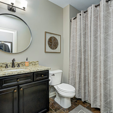
This home renovation project transformed unused, unfinished spaces into vibrant living areas. Each exudes elegance and sophistication, offering personalized design for unforgettable family moments.
In this stylish bathroom, a spacious vanity and sleek round mirror harmonize to create a sophisticated yet functional space, offering both elegance and practicality in equal measure.
Project completed by Wendy Langston's Everything Home interior design firm, which serves Carmel, Zionsville, Fishers, Westfield, Noblesville, and Indianapolis.
For more about Everything Home, see here: https://everythinghomedesigns.com/
To learn more about this project, see here: https://everythinghomedesigns.com/portfolio/fishers-chic-family-home-renovation/
 Homes And Such LLC
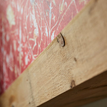
The master bedroom is a cozy space, capturing the character of the previous roofline with a rustic beam detail. A built in dog bed takes advantage of unused attic space and a new niche became the perfect spot to house the current reading list. Because of the age of the home, the design was about embracing the cottage feel of the home. This was done with modern windows that let in abundant natural light for their size and location. Supply chain issues significantly delayed the project when the windows took far longer than expected or planned, but they were absolutely worth the wait. They fit the aesthetic of the home, maximize natural light, and complement the eclectic vibe within the master suite.
The space was further personalized with bold wallpaper that features an antique vibe. The chandelier was curated for the space to add interest and uniqueness to the room. Instead of a door, the opening to the closet gives a spatial feel to the suite and maximizes function and flow.
Find the right local pro for your project
 Edgewater Design Group
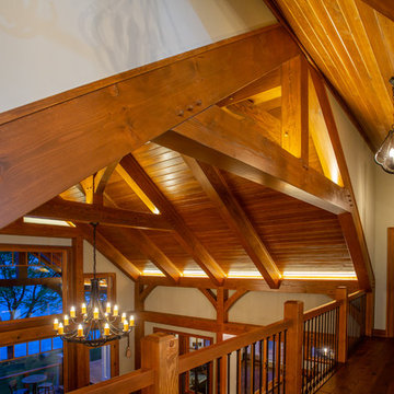
Our clients already had a cottage on Torch Lake that they loved to visit. It was a 1960s ranch that worked just fine for their needs. However, the lower level walkout became entirely unusable due to water issues. After purchasing the lot next door, they hired us to design a new cottage. Our first task was to situate the home in the center of the two parcels to maximize the view of the lake while also accommodating a yard area. Our second task was to take particular care to divert any future water issues. We took necessary precautions with design specifications to water proof properly, establish foundation and landscape drain tiles / stones, set the proper elevation of the home per ground water height and direct the water flow around the home from natural grade / drive. Our final task was to make appealing, comfortable, living spaces with future planning at the forefront. An example of this planning is placing a master suite on both the main level and the upper level. The ultimate goal of this home is for it to one day be at least a 3/4 of the year home and designed to be a multi-generational heirloom.
- Jacqueline Southby Photography
 Hinman Construction
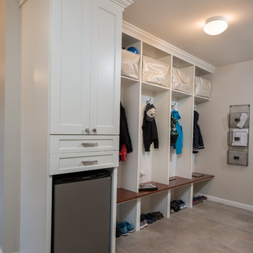
Reclaimed unused garage space stolen for mudroom. built in mini fridge for childs snacks, lunches etc.
Example of an entryway design in Other
Example of an entryway design in Other
 Mike Farley Pool Designer, SWD, ASLA
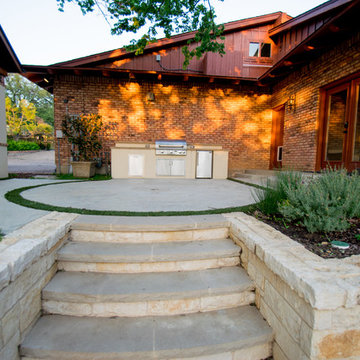
This unusable concrete backyard hillside was turned into a beautiful place for the family to play, relax and entertain friends. There is a large cabana with curtains next to the outdoor kitchen on the upper level. Step down to the spa with Spanish tile or into the pool on the lower level. See Mike's pool tour for full detail on his Youtube channel or website. FarleyPoolDesigns.com
 Sweeney Design Remodel
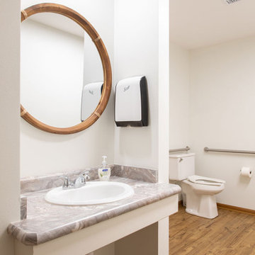
The bathrooms were reconfigured to create private, single-user spaces and convert unused showers into accessible storage space for folding tables and chairs and event supplies.
 Great Northern Construction
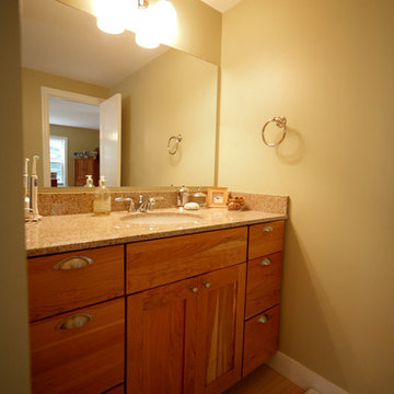
This second story addition gave the homeowner a master suite and made use of a narrow, formerly unusable, space for her new bathroom. A cherry vanity, quartzite countertop with undermount sink and custom shower enclosure give her privacy and a beautiful new space.
 Alair Homes Plano
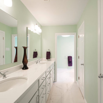
This crisp, bright Master bathroom once had a cultured marble built-in tub, an enclosed shower, an unused seated make up area at the vanity and no door going into the bedroom. We demoed the shower and tub and started over! The Signature Hardware Leith freestanding tub opened up and updated the bathroom immensely. We installed Vicostone Statuario bathroom counter tops and all new Quality cabinets with a cotton paint. We opened up the once enclosed shower by demoing the full wall into a pony wall and installing glass to the upper portion, along with a frameless glass door. Naos Blanco 12"x24" large tile was used for the majority of the shower walls with a feature using 3"x6" Biltmore marble subway tile installed vertically creating a wow factor for this once dark enclosed shower. The shower floor is the same Biltmore tumbled polished tile but 2"x2" square. The existing glass in the three windows behind the tub were changed for a more updated look. We added new lighting, mirrors and polished chrome faucets and hardware that really brighten up the space even more. Design & Construction by Hatfield Builders & Remodelers | Photography by Versatile Imaging
 Drury Design
THE SETUP
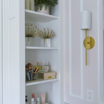
The original primary bathroom was characterized by a disjointed and segmented layout. The shower featured a bulky glass-block enclosure that overwhelmed the space visually. There was a considerable amount of open, unused space, and despite having a his and hers vanity, the arrangement lacked personal space for each user, as they shared the conjoined space between the sinks. The toilet was inconveniently located right by the door, with a half-wall partition meant to provide privacy but instead contributing to a cramped and unbalanced feel. Overall, the bathroom’s layout and design were fragmented, failing to make the most of the available space and lacking adequate storage solutions.
Design objectives:
- Reconfigure the layout to enhance functionality and flow.
- Create an elegant, upscale aesthetic that is light and bright.
- Incorporate specialized storage solutions for female hair care needs.
- Increase overall storage capacity.
- Develop a spa-like shower experience.
- Provide a significant wow factor to the space.
THE REMODEL
Design challenges to be solved:
- Repositioning the toilet to a more suitable location.
- Designing hair care storage solutions without cluttering the elegant space.
- Balancing an upscale, elegant design with a feminine touch in the color palette.
- Increasing the brightness of the room without adding windows.
- Completely replacing the existing shower to create a spa-like experience.
- Planning new storage solutions without adding bulkiness or clutter to the cabinetry.
THE RENEWED SPACE
Design solutions:
Toilet Relocation: Moved the toilet by the window, creating a better overall layout that also opened up two full walls for cabinetry and storage solutions.
Specialized Vanity Storage: The left side of the left vanity is the wife’s. Open shelves facing across the vanity can be used for decorative or daily needs items. Pull-out docking drawers with power outlets and metal basins handle hot hair appliances.
Bright and Elegant Color Scheme: White cabinets, countertops, floors, and shower walls keep the space bright. The just-off-white wall color with a hint of pink adds a feminine touch. Thin wainscoting with white trim offers traditional-leaning elegance.
Layered Lighting Strategy: Ceiling can lights, sconces, lighted mirrors, and toe-kick lighting were installed. Natural light-rated bulbs keep the space bright and natural-feeling.
Spa-Like Shower: An extra-large shower was created using the same floor tile materials for continuity. Equipped with a Kohler Anthem system with a shower head, hand-held, and four body sprays. His and Hers niches for separate body care product storage.
Enhanced Storage Solutions: Added a linen cabinet within the vanity area for efficient storage of towels and bathroom essentials.
This elegant bathroom feels incredibly spacious now. The color palette and lights keep the room bright and cheery. Gold fixtures, the herringbone pattern on the floor, and exquisite trim work add an elegant touch. With the husband and wife having their own vanity wall sections joined at the corner, each user truly has their own space within the space. The clients are very happy with the final result.
 Outdoor Space Designs
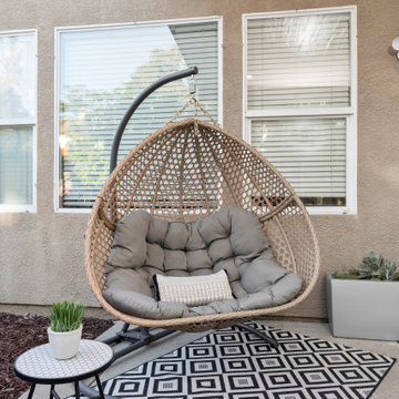
This patio was part of a surprise patio makeover called Patio Flip. This patio is now fit to entertain any crowd and provide several areas to entertain. The unused side yard was turned into a beautiful dining space.
This stunning outdoor kitchen also received a makeover as well and was repositioned to become more functional in the space. The outdoor lounge area provides a contemporary, casual seating area.
Overall Design, Layout, Plants, Furniture and Accessories by
Outdoor Space Designs and Kate Bowers Landscape Design
 Eve Castles Design
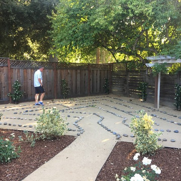
Tucking in a labyrinth into an unused corner of the yard provides a meditative space. We used river rock on DG (Decomposed Granite) in a low cost, low maintenance design for the space.
 Chesapeake Designs
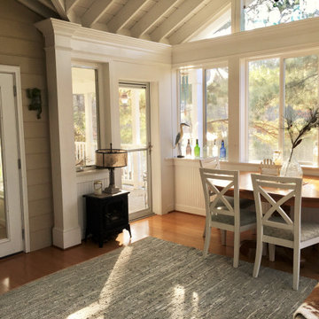
The rear of this suburban home was transformed with the addition of a sunroom and covered porch. A sunny southern exposure made the original 12' x 12' wood deck practically unusable. The original design was for a screened porch, but we decided to add sliding windows so that furnishings would stay clean and dry. The open rater ceiling added great volume and architectural interest to the space.
 Kustom Home Design
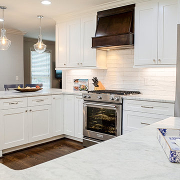
When Family comes first, you spend a lot of time surrounded by the family you were born into and the ones you “adopted” along the way. Some of your kids crawl, some walk on two legs and some on four. No matter how they get there, they always end up in the kitchen. This home needed a kitchen designed for an ever growing family.
By borrowing unused space from a formal dining room, removing some walls while adding back others, we were able to expand the kitchen space, add a main level laundry room with home office center and provide much needed pantry storage. Sightlines were opened up and a peninsula with seating provides the perfect spot for gathering. A large bench seat provides additional storage and seating for an oversized family style table.
Crisp white finishes coupled with warm rich stains, balances out the space and makes is feel like home. Meals, laundry, homework and stories about your day come to life in this kitchen designed for family living and family loving.
Kustom Home Design specializes in creating unique home designs crafted for your life.
 Bilotta Kitchen & Home
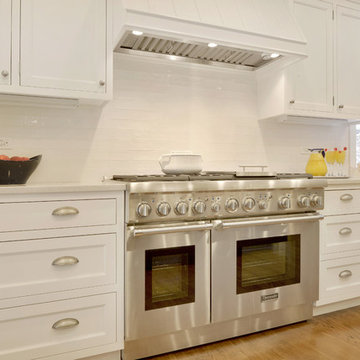
“It’s hard to believe these two sets of photos are actually the same space! The 1950s “modern” kitchen was tiny and dark, and the adjoining family room went largely unused by the family. Yet the owners love to cook and entertain, so this kitchen needed to go! Designer Fabrice Garson removed the wall between the two spaces and created one multi-purpose space: an open kitchen with abundant storage and prep space at the large range and island; a banquette for casual family meals or homework; and a separate table for dinner parties. Because they’d be losing their formal dining room, Fabrice recommended adding the coffered ceiling to lend an air of elegance to the new space. This once-gloomy cave morphed into an airy, luminous room. Pops of dark blue on the island, the banquette upholstery, and the banquette wallpaper add a fun element to temper the traditional tone of the inset cabinetry. And the mixture of stainless appliances with the brushed gold faucet, gold accents on the pendant fixtures, and the bronze crystal chandelier create an eclectic but elegant look.” (This blurb was part of Bilotta’s Blog Post written by Paulette Gambacorta)
The finished space features Signature Custom Cabinetry in a mix of white paint on the perimeter and a custom navy paint on the island. All hardware is a mixed of brushed nickel knobs and cup pulls. The countertops are Ceasarstone’s Bianco Drift and the backsplash is a classic and clean white ceramic subway tile. Appliances are all by Thermador with the exception of the Best hood insert which is hidden by the custom white painted hood. The sink is an apron front by Kohler in cast iron with a white enamel finish and is accented by a brushed copper faucet and water filter. The decorative lighting adding to the elegance of the space is by EuroStyle. The custom-built banquette and coffered ceiling were both designed by Fabrice and brought to life by his long time contractor Breton Contracting.
Designer: Fabrice Garson Photo Credit: After Photos by Peter Krupenye
 Cabinet Warehouse
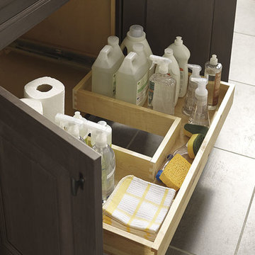
Under counter obstructions like plumbing and electrical wiring need not cause designing dead ends thanks to the new U-Shaped Drawer modification. Suddenly, spaces that were once unusable become easily accessible storage workhorses.
From Decora
 Castle Building & Remodeling
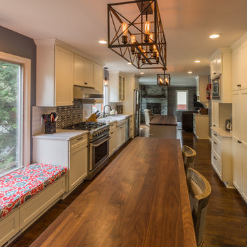
Our clients came to us with a desire to expand what was a fairly small kitchen in a large 1977 home. Many of the main living spaces were unused, so the existing kitchen and former dining room were combined into a new, large kitchen that includes 2 large walnut topped islands, a bar area, and an organizational area for mail and crafts. What was created was a room that allows the family to cook, entertain and play all in one area. The amount of storage space in this kitchen was fully maximized through custom pantry cabinets, pull out accessories and more. The perimeter cabinets were topped off with beautiful, classic Cambria quartz counters that resemble marble – a finish that fits perfectly into this traditionally styled home. The traditional style was played up through unique cement tiles, subway tiles, wired glass cabinet door inserts, a farm style sink, and oil rubbed bronze finishes. The appliances were a definite upgrade as well, reusing the single oven in the island and adding a large 36” range. In the end, this show-stopping kitchen is now a family friendly oasis for everyone from the cooks to the kids.
 Design By Alicia
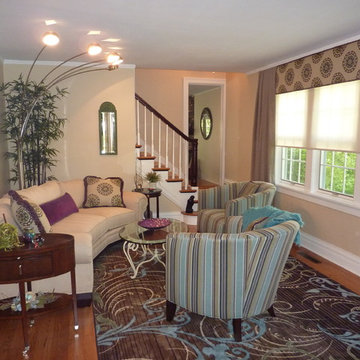
Narrow spaces don't have to be unusable spaces. With the use of bright neutral wall colors, you can provide a cheerful and entertaining living room with patterns, color and comfortable seating. This curved sofa and 2 club chairs provide adequate seating for a quaint conversation. Keeping some curve to the space allows more movement around the furniture in a tight space. Don't be afraid of pattern, it can provide visual movement around a small space and provide life!
 CITYDESKSTUDIO, Inc.
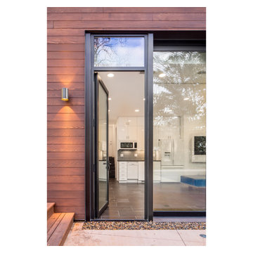
A family that spends a lot of time in and around their beautiful saltwater pool, did not have a place in their home that provided them a visual or physical connection. They also lacked any storage for all their pool “stuff”. With small children and a love for entertaining, they needed a room that served and supported their watery lifestyle. We took over an empty and unused notch along the back of the house adjacent to the pool patio to create a new bright and airy pool house.
The new out building attempts to unify 4 areas; an existing deck, an upper master bedroom balcony, a lower lawn, and the pool itself, and provide the missing storage. By locating the pool house at the juxtaposition of these areas, the new room was able to provide a new expanded rooftop balcony for the master, anchor and define the dining and barbeque deck, extend and connect to the pool and patio, and create a new access to integrate the lower lawn – and carve out the much needed storage for the variety of pool toys and equipment.
The building itself is 400 sf with bath, laundry, storage, mechanical, kitchen, and living. A single new secure connection is made into the house through the existing mudroom. Clad with crisply detailed ship lap cedar, it draws on the existing material palate of the house and nods to the boat aesthetic in expression and efficiency. With pocketing glass walls the pool house is both the utility building needed, and an expansion of the vibrant pool scene itself, inside and outside, along the poolside.
Photographer: Brandon Stengelwww.farmkidstudios.com
Location: Edina, MN
Completed: 2013
Project Team:
Ben Awes AIA, Principal-In-Charge
Bob Ganser AIA
Christian Dean AIA
Nate Dodge
 Enchanted Kitchens, LLC
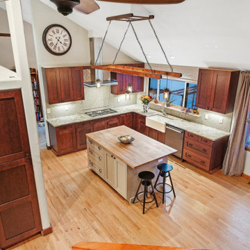
The space was unusable for family and entertaining. It was too small, with poor space planning. This complete remodel required structural wall removal, appliance relocate, floor replace and refinish. The peninsula was replaced with island for better traffic flow. The bridge at hood avoided the need for tile to the ceiling. The client was a fireman and the ladder makes him feel right at home!
122