
Search results for "Unusable" in Home Design Ideas
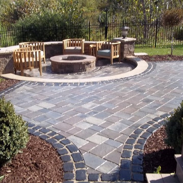
 Forest Landscaping
This client contacted us with a two fold purpose. The first was that his yard was constantly wet no matter how much or how little he irrigated, which kept him and his pets from enjoying the yard. The second was to give him and his wife a patio that fit the space well. We designed a retaining wall that diverted water away from his property that was draining off several neighbor's lots onto his. Along with excavating and removing some poor soils, this succeeded in drying out what had previously been a saturated and largely unusable backyard. We also designed a spacious, curved layout that compliments the rolling nearby terrain. We also sealed the hardscape elements to give it a lustrous, wet look without making it slippery!
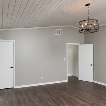
 BDS Design Build Remodel
Previously unusable space renovated into a modern family living area and bedroom.
Bedroom - mid-sized transitional guest dark wood floor bedroom idea in Chicago with gray walls and no fireplace
Bedroom - mid-sized transitional guest dark wood floor bedroom idea in Chicago with gray walls and no fireplace
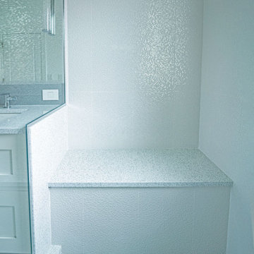
 Drury Design
This client is in the beauty industry, so – in additional to great style – she has more beauty products than most people do. Before the renovation, there were products all over the counters and in temporary roll-in shelving units that got wheeled into the bathroom.
It was time for a change.
Design objectives:
-Add tons of storage
-Feature blingy, reflective materials
-Improve lighting
-Omit unused built-in tub
-Create a large luxurious shower
-Include large mirrors to the ceiling
THE REMODEL
With the right storage solutions, a bathroom loaded with products and gadgets can look virtually empty. Elegance and order contribute to living life artfully.
Design challenges:
-Standard vanities don’t offer much storage
-The existing window was in an ideal spot for a shower
-The client prefers large mirrors, so we needed an alternative to medicine cabinets
Design solutions:
-Replace the existing window with a waterproof privacy window
-Create dresser-style vanities with u-shaped drawers for maximum storage
-Include a tall cabinet with roll-out shelves for maximum storage and organization
THE RENEWED SPACE
Beauty products and daily needs are organized and out of the way – out of sight but easy to access. With a creative, modern palette of colors, patterns and textures, the bathroom’s aura is inviting, relaxing and luxurious.
Find the right local pro for your project
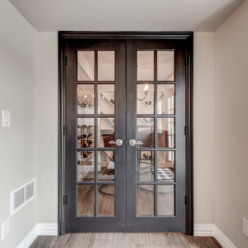
 FBC Remodel
Step through elegant French doors into a stylish basement wine cellar that’s both functional and inviting. This cleverly designed space maximizes storage with a custom built-in, geometric wine rack and industrial wall-mounted holders against a warm, exposed brick accent wall. Rich wood tones in the high-top table and leather barstools create a cozy tasting nook, perfect for entertaining guests or enjoying a quiet moment. The traditional chandelier overhead adds a touch of vintage charm, while large windows bathe the room in natural light. This basement remodel transformed an unused corner into a sophisticated wine lover’s retreat.
 LEEHAR HOME LTD
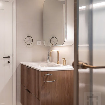
A bathroom built in a reclaimed, unusable space of the apartment.
Bathroom - modern bathroom idea in Hong Kong
Bathroom - modern bathroom idea in Hong Kong
 CO Interiors
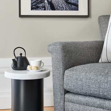
A comfortable swivel chair and compact pedestal table transform an unused corner into an inviting place to pause with a cup of tea. The table’s crisp marble top and sculptural black base introduce modern contrast, while the textured upholstery, layered rug and fine-art photography add warmth and personality to this collected living room.
 Julia Chasman Design
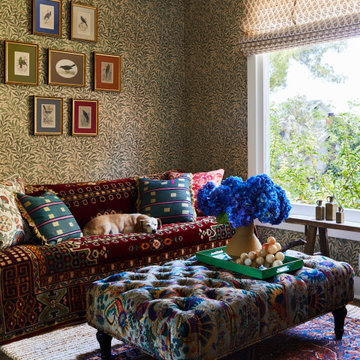
An unused Dining space was converted into a Family Room that converts to a Guest Room by drawing the double-sided curtains to close the space off.
Family room - small eclectic open concept dark wood floor and wallpaper family room idea in Los Angeles with a media wall
Family room - small eclectic open concept dark wood floor and wallpaper family room idea in Los Angeles with a media wall
 Beth Krupa Interiors
Our client and I began with just her living room, then moved to the custom designed mohair sectional, and floor to ceiling detail in the family room, finished the powder room, then added the dining room and lastly the master suite.
At the end of this first floor project that began only with the living room she asked if I could transform her unused finished third floor into a master retreat. It’s funny, at the beginning of our relationship, she didn’t feel she had a clearly defined style. After we began working together it evolved into the perfect house for her and her new husband. Beth Krupa, Interior Designer
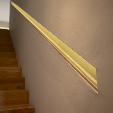
 camilleriparismode
camilleriparismode projects and design team were approached to rethink a previously unused double height room in a wonderful villa. the lower part of the room was planned as a sitting and dining area, the sub level above as a tv den and games room. as the occupants enjoy their time together as a family, as well as their shared love of books, a floor-to-ceiling library was an ideal way of using and linking the large volume. the large library covers one wall of the room spilling into the den area above. it is given a sense of movement by the differing sizes of the verticals and shelves, broken up by randomly placed closed cupboards. the floating marble fireplace at the base of the library unit helps achieve a feeling of lightness despite it being a complex structure, while offering a cosy atmosphere to the family area below. the split-level den is reached via a solid oak staircase, below which is a custom made wine room. the staircase is concealed from the dining area by a high wall, painted in a bold colour on which a collection of paintings is displayed.
photos by: brian grech
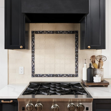
 Amy Pearson Design
APD was hired to update the kitchen, powder bathroom, and second floor primary bathroom classical urban townhome. The home had previously undergone some “unfortunate” remodels and our design focus was to reinfuse traditional character back into her bones while adding some modern and truly custom amenities. The traditional layout of the home meant our kitchen was a distinct room (not a great room style layout) and the new space plan took advantage of all four walls of the space. Where an unused chimney previously existed, now stands the concealed and built-in refrigerator while the microwave was hidden within adjacent cabinetry. A custom blue and brass range flanked in black cabinetry, backed by a traditional marble tile inset, and capped with a plaster hood in black to match the cabinetry - providing a seamless transition to the rest of the space. Floating shelves with a brass bar rail and decorative sconces provide both functional and decorative storage.
A huge change was made at the back wall of the kitchen. Windows are topped with decorative sconces with counter height seating below (offering a smooth transition to the deck just outside for entertaining!). Both sides of the window are flanked with ample storage and a food and water station (with pot filler for easy top-off!) was incorporated for the homeowner’s four-legged family member (who was sadly lost before the project completed but sits in loving memory of him and waiting for a new loved one to join the family when their hearts are ready!)
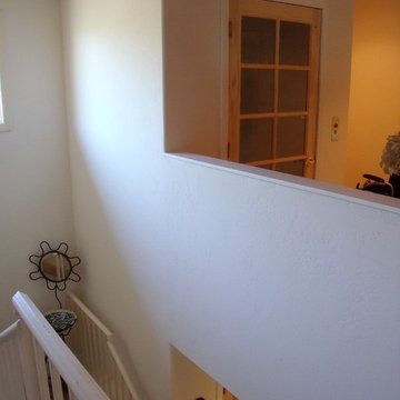
 Aging-In-Place Remodeling
Aging-In-Place Remodeling was able to install a residential elevator in a previously unused space. The current photo shows both the upstairs and downstairs entry to the elevator with a decorative door.
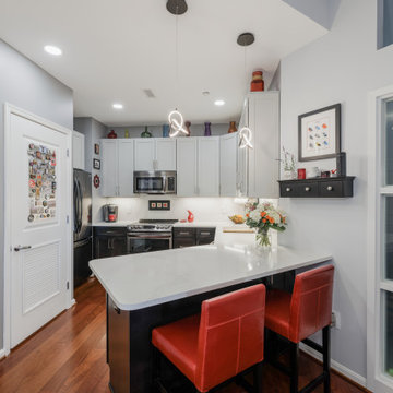
 House to Home Solutions
A fresh start created a connected space that makes sense in this Arlington (Shirlington), VA condo. The old kitchen was tired and outdated and felt cut off from the rest of the living area. The homeowner's collection of glassware and art was lost in the busyness.
While the footprint remained essentially the same, smart touches were added throughout to maximize the functionality and aesthetic. The manmade Quartz counter material continued up the walls for a stunning backsplash look. An enlarged cabinet above the refrigerator transformed that space from unused to functional. An LG double oven range was added to the space of a conventional range. Giant drawers in the peninsula make accessing sullies a breeze. On the back of the peninsula, a cabinet was added in previously wasted space.
The cabinetry is Durasupreme with a shaker door style. The lowers are a Lucious Cherry in Dark Stain and the uppers are painted a soft grey. The hardwood floors from the main living area are now carried into the kitchen. New Led slim profile lighting, including stunning geometric LED pendants brighten up the space.
The result is a bright kitchen that cohesively brings the living space together and highlights the homeowner’s collected art and glassware.
 TVL Creative Ltd.
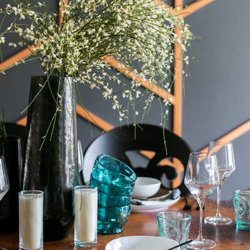
Cramped kitchen be gone! That was the project motto and top priority. The goal was to transform the current layout from multiple smaller spaces into a connected whole that would activate the main level for our clients, a young family of four.
The biggest obstacle was the wall dividing the kitchen and the dining room. Removing this wall was central to opening up and integrating the main living spaces, but the existing ductwork that ran right through the center of the wall posed a design challenge, er design opportunity. The resulting design solution features a central pantry that captures the ductwork and provides valuable storage- especially when compared to the original kitchen's 18" wide pantry cabinet. The pantry also anchors the kitchen island and serves as a visual separation of space between the kitchen and homework area.
Through our design development process, we learned the formal living room was of no service to their lifestyle and therefore space they rarely spent time in. With that in mind, we proposed to eliminate the unused living room and make it the new dining room. Relocating the dining room to this space inherently felt right given the soaring ceiling and ample room for holiday dinners and celebrations. The new dining room was spacious enough for us to incorporate a conversational seating area in the warm, south-facing window alcove.
Now what to do with the old dining room?! To answer that question we took inspiration from our clients' shared profession in education and developed a craft area/homework station for both of their boys. The semi-custom cabinetry of the desk area carries over to the adjacent wall and forms window bench base with storage that we topped with butcher block for a touch of warmth. While the boys are young, the bench drawers are the perfect place for a stash of toys close to the kitchen.
The kitchen begins just beyond the window seat with their refrigerator enclosure. Opposite the refrigerator is the new pantry with twenty linear feet of shelving and space for brooms and a stick vacuum. Extending from the backside of the pantry the kitchen island design incorporates counter seating on the family room side and a cabinetry configuration on the kitchen side with drawer storage, a trashcan center, farmhouse sink, and dishwasher.
We took careful time in design and execution to align the range and sink because while it might seem like a small detail, it plays an important role in supporting the symmetrical configuration of the back wall of the kitchen. The rear wall design utilizes an appliance garage mirrors the visual impact of the refrigerator enclosure and helps keep the now open kitchen tidy. Between the appliance garage and refrigerator enclosure is the cooking zone with 30" of cabinetry and work surface on either side of the range, a chimney style vent hood, and a bold graphic tile backsplash.
The backsplash is just one of many personal touches we added to the space to reflect our client's modern eclectic style and love of color. Swooping lines of the mid-mod style barstools compliment the pendants and backsplash pattern. A pop of vibrant green on the frame of the pantry door adds a fresh wash of color to an otherwise neutral space. The big show stopper is the custom charcoal gray and copper chevron wall installation in the dining room. This was an idea our clients softly suggested, and we excitedly embraced the opportunity. It is also a kickass solution to the head-scratching design dilemma of how to fill a large and lofty wall.
We are so grateful to bring this design to life for our clients and now dear friends.
 Love Your Room LLC
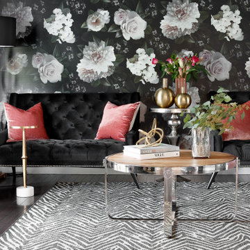
This room as an unused dining room. This couple loves to entertain so we designed the room to be dramatic to look at, and allow for movable seating, and of course, a very sexy functional custom bar.
 Saikley Architects
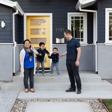
Our busy Silicon Valley clients asked us to convert their tight-quartered 1960’s ranch house to a gracious family home that would meet their long term needs. Ease of living was paramount, both in functionality and in ordered design.
The project was completed on a moderate budget.While retaining most of the structure of the existing house to avoid costly structural changes, we opened walls to improve the sight lines and flow of the house and bring in more light. We made small additions at the front and back bedrooms to gain space for the family and relatives. An existing underused patio area was improved with a simple outdoor kitchen and overhang to extend the living space to the outside. Costs were kept down with choices of modest materials.
Everything was made to be functional. Ample storage has been built into the right places. The details of the kitchen were carefully worked out to accommodate all the wishes of the various cooks in the family. The house is set up to be easy to keep clean. Acoustic walls separate living from bedroom spaces so adults can enjoy time together while children sleep. The outdoor kitchen has easy access to the indoor kitchen and the garage, and its setup promotes socializing while cooking outdoors.
A large part of the narrow back yard was previously unusable space due to a steep slope up to a neighbor’s higher fence. With a new retaining wall and some re-grading we took back more of the yard for the patio and play space on a new lawn.
The remodeled house is a mix of contemporary and traditional elements. Cool colors have a calming effect. Traditional items such as prairie style windows, trellis, mosaic tiles, and Shaker style cabinets, break down the scale in an otherwise streamlined, contemporary design. A new gabled roof with a broad arch at the front of the house marks the entry and resolves a challenging form where the central entry is set back from walls on both sides.
Photography: Kurt Manley
https://saikleyarchitects.com/portfolio/modern-ranch/
 Karl Grunder Designs
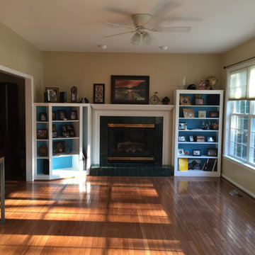
This empty family room got a warm and inviting update. A fireplace transformation was the first thing to be planned. Repaint bookcase backs. Comfortable furniture, re-organized bookcases, and a variety of textures for a wonderful ambiance was my overall plan for this empty unused space. My color palette would be warm and updated.
 Advance Design Studio, Ltd.
Bud Kane has remodeled nearly every room in his own home over many years. Now reaching his 70’s, he contemplated heading up a major kitchen and laundry room renovation himself, planning on doing the carpentry work with his own hands. “I was not convinced I would ever meet anyone who could do it as well as I could do it myself”, said Bud. Ruth and Bud spent 5 years visiting kitchen firms and interviewing designers. They couldn’t however bring themselves to pull the trigger on the project, until they met Advance Design Studio in 2015.
“No one understood what I wanted”, said Ruth. She was continually frustrated by experiences with designers who weren’t hearing what was important to her. “Everyone kept designing my kitchen with what they thought it should look like; I couldn’t find anyone who would listen to me”!
When they met designer Scott Christensen from Advance Design Studio, they liked him right away. He listened to Ruth and designed a kitchen that she loved, all the while interjecting years of wisdom and design expertise that Ruth appreciated. “The finished product is better than I expected”, says Ruth. “I respected Scott’s opinions and together we created the perfect place for me to bake with my grandkids and truly enjoy the kitchen and laundry room I’ve been dreaming of for many years!”
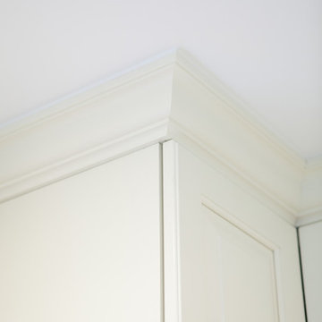
The kitchen transformation began with removing the home’s soffits, and extending new painted maple cabinetry to the ceiling with the addition of an elegant crown molding. Ruth’s new Vita Mix holds a coveted place on her counter, and adjustments were planned to size the cabinets in conjunction with the under cabinet decorative light molding to fit this appliance just right. “This one small detail was really important to me”, says Ruth smiling. An elegant new island replaced the original island, complete with room for 3 stools where her grandchildren will sit to make home-made pasta every Thanksgiving, and cookies at Christmas time. “Traditions are very important in my family, and making my kitchen work to suit cherished activities with my family was the number one reason this renovation was so desired”, replied Ruth when asked about the island.
A picture perfect new tea station replaced a cluttered unused desk area, creating a wonderful place to prepare hot drinks for sipping any season of the year while overlooking the couple’s wonderfully manicured gardens from the lovely 3 season’s room just off the kitchen. The soft sage island bead panel detail was repeated on the backsplash, replicating the feel of a fine old piece of furniture.
The biggest problem with the laundry room was 3 doors, one from the garage, one from the closet, and one to the hallway. “Scott designed a pocket door, and oh what a dream it is now to bring groceries in from the garage!” exclaims Bud who grew to disdain this task! Doing laundry is now a breeze in this attractive new space that doubles as a wonderful pantry for the kitchen with room to store food items that didn’t have a home in the poorly designed original space.
New Hickory distressed wood flooring was laid both in the kitchen and leading to the hall foyer. Soft gray wood-replicating porcelain was placed in the laundry area, making for an easily cleanable surface for what doubles as a mud room from the garage. Creamy tumbled marble graces an unobtrusive backsplash spilling onto shiny granite counter tops in a rich earthy pattern of fall colors that mimic colors throughout the home. Advance is known details that included custom crafted furniture toe kicks, luxurious crown moldings, and beaded under cabinet moldings. The kitchen is complete with a glass display cabinet showing Ruth’s treasured china tea collection.
Early on, it was initially only their intention of purchasing cabinets for the new design. They were so impressed however with Advance Design’s complete program for budgeting, design, installation and management that it became clear to them both that they wanted Advance to handle the entire project from start to finish. “After seeing the quality work they did, coupled with the in-house team completely dedicated to our satisfaction, it became apparent there was no other choice but to hire them to handle everything. And we’re so glad we did, we have not one regret”, says Bud.
“The attention to detail by the carpentry crew more than satisfied my perfectionist expectations of the finished carpentry,” exclaimed Bud. “Every one of Advance Design’s people we encountered from design through construction was wonderful. We’ve never met a group of people so dedicated to making sure we were happy with every single detail, and every single part of this experience”, said Ruth and Bud.
Designer: Scott Christensen
Photographer: Joe Nowak
 Sprouted Slopes
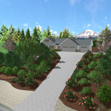
The front of this property had major elevation change and unusable space. We transformed this space by adding deer resistant plantings to create visual interest year round, and fill the space. The boulders were added for slope stablization.
 regroup architecture
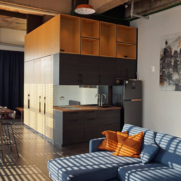
An unused office got a second life as spacious industrial loft-style apartment. Previously, the 66sqm office had a standard three-meter-high fake ceiling, a small internal toilet and was divided into rooms. However, this corner location on a commercial floor, between car parking and apartment floors of an older condominium building in the Huay Khwang area of Bangkok, has become a hidden gem.
regroup architecture remodeled the space after reducing the old office to its bare shell. The basic design idea uses the central core provided by the kitchen and bathroom to separate the space into different zones. There is a more private zone behind the core for the bed, a living zone with a TV and sofa, and an in-between space for a multipurpose bar-height desk. This basic zoning could potentially also work for other functions like an artist atelier, yoga studio, exhibition space, or even for a small office once again.
 GKY DESIGNS INC.
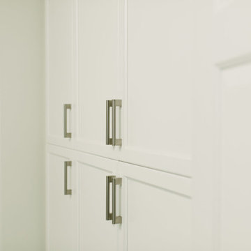
AFTER: Powder Room Full height custom built-in linen closets replace the unused tub in the powder room.
Inspiration for a bathroom remodel in Vancouver
Inspiration for a bathroom remodel in Vancouver
158