
Search results for "Update" in Home Design Ideas
 Landis Architects | Builders
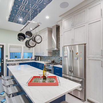
This 1890 rowhouse had been renovated over time, most recently in the 70s. Our clients wanted to renovate every floor. The floors and walls were out of level, and most of the systems were old. We gutted the structure to the studs, leveled and reframed the walls and floors, added insulation and updated the plumbing, electrical and HVAC. Once the structural and systems work was complete, our crew installed a new expanded kitchen, updated all the bathrooms, and updated the basement.
Reconfiguring the first floor plan involved taking down the wall between the kitchen and dining room to create one large entertaining space. To bring more natural light and provide sight lines from the front to the back of the rowhouse, we added new windows to the back wall and moved the opening to the other side as a full-light door.
Kitchen features include:
• Cabinetry that extends to the ceiling to maximize storage
• Large island with seating for four
• Painting that imitates the pattern of the ceiling we uncovered during the renovation
• Buffet cabinetry in the dining room with a built-in wine cooler
HDBros
 Agnieszka Jakubowicz PHOTOGRAPHY
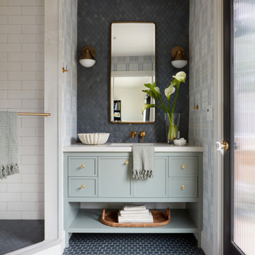
Design: KBG Design / Build: Silva Custom Construction / Photography: Agnieszka Jakubowicz
Example of a transitional bathroom design in San Francisco
Example of a transitional bathroom design in San Francisco
 David Lund Design
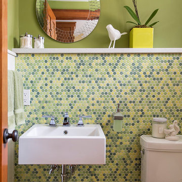
Like many older homes, this Craftsman lacked a main level bathroom. Powder rooms are the perfect opportunity to introduce a bit of updated color and pattern to a traditional home - they seem to welcome a little whimsy. Here, a modern sink, a round faceted mirror, and a wall-mounted soap dispenser off set a traditional penny round tile pattern. And as an added twist, a contemporary color pallet was chosen, introducing a more transitional, updated look. In a powder room, don't hesitate to be a little bolder than you might typically be with your material, fixture, and color choices.
Eric & Chelsea Eul Photography
Find the right local pro for your project


 Santa Barbara Designs of the Interior
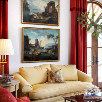
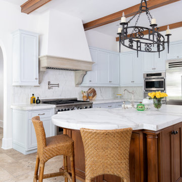
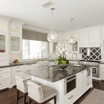
From Tuscan to this updated, clean, more functional kitchen, this couldn't be a more dramatic change. Flanking this kitchen space is a large kitchen table that can seat 8, with an inviting patio beyond. We love the clean, crisp look, with black dramatic details.
 Simply Home Decorating
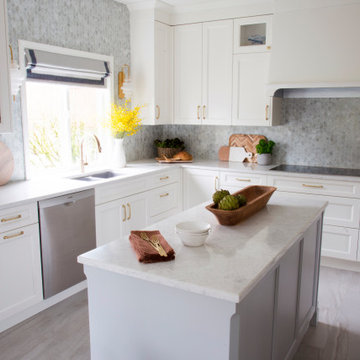
This spacious home in North Vancouver's Deep Cove community had been built and decorated just over 20 years ago and was in need of updating. Our clients who are empty nesters, spend much of their time in the kitchen and family room so we focused on these spaces keeping in mind that the more formal spaces on the main floor will follow in a few years time. For the most part the layout of their kitchen worked well for them so our role was to tweak the kitchen and family room furniture layout and to select updated finishes and furnishings. Since this home transformation is not happening all at once, we purposefully selected classic finishes, like antique brass hardware, that will tie in with the rest of the home's decor until it can be updated. The resulting refresh stays true to the original feel of the house while giving it a clean, updated look.
Sponsored
Columbus, OH

Snider & Metcalf Interior Design, LTD
Leading Interior Designers in Columbus, Ohio & Ponte Vedra, Florida
 Plain & Posh
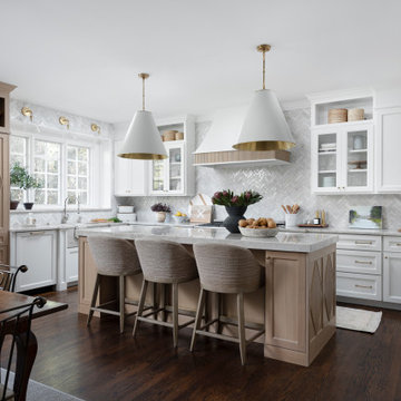
These homeowners were ready to update the home they had built when their girls were young. This was not a full gut remodel. The perimeter cabinetry mostly stayed but got new doors and height added at the top. The island and tall wood stained cabinet to the left of the sink are new and custom built and I hand-drew the design of the new range hood. The beautiful reeded detail came from our idea to add this special element to the new island and cabinetry. Bringing it over to the hood just tied everything together. We were so in love with this stunning Quartzite we chose for the countertops we wanted to feature it further in a custom apron-front sink. We were in love with the look of Zellige tile and it seemed like the perfect space to use it in.
 Milgard Windows & Doors
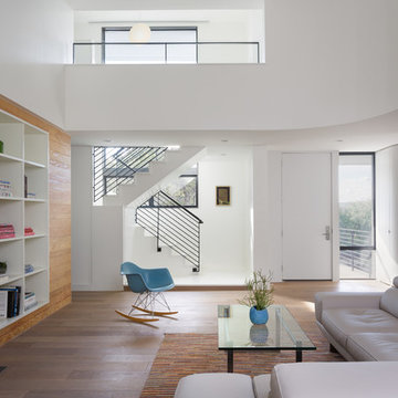
The Kiguchi family moved into their Austin, Texas home in 1994. Built in the 1980’s as part of a neighborhood development, they happily raised their family here but longed for something more contemporary. Once they became empty nesters, they decided it was time for a major remodel. After spending many years visiting Austin AIA Home Tours that highlight contemporary residential architecture, they had a lot of ideas and in 2013 were ready to interview architects and get their renovation underway.
The project turned into a major remodel due to an unstable foundation. Architects Ben Arbib and Ed Hughey, of Arbib Hughey Design were hired to solve the structural issue and look for inspiration in the bones of the house, which sat on top of a hillside and was surrounded by great views.
Unfortunately, with the old floor plan, the beautiful views were hidden by small windows that were poorly placed. In order to bring more natural light into the house the window sizes and configurations had to be addressed, all while keeping in mind the homeowners desire for a modern look and feel.
To achieve a more contemporary and sophisticated front of house, a new entry was designed that included removing a two-story bay window and porch. The entrance of the home also became more integrated with the landscape creating a template for new foliage to be planted. Older exterior materials were updated to incorporate a more muted palette of colors with a metal roof, dark grey siding in the back and white stucco in the front. Deep eaves were added over many of the new large windows for clean lines and sun protection.
“Inside it was about opening up the floor plan, expanding the views throughout the house, and updating the material palette to get a modern look that was also warm and inviting,” said Ben from Arbib Hughey Design. “Prior to the remodel, the house had the typical separation of rooms. We removed the walls between them and changed all of the windows to Milgard Thermally Improved Aluminum to connect the inside with the outside. No matter where you are you get nice views and natural light.”
The architects wanted to create some drama, which they accomplished with the window placement and opening up the interior floor plan to an open concept approach. Cabinetry was used to help delineate intimate spaces. To add warmth to an all-white living room, white-washed oak wood floors were installed and pine planks were used around the fireplace. The large windows served as artwork bringing the color of nature into the space.
An octagon shaped, elevated dining room, (named “the turret”), had a big impact on the design of the house. They architects rounded the corners and added larger window openings overlooking a new sunken garden. The great room was also softened by rounding out the corners and that circular theme continued throughout the house, being picked up in skylight wells and kitchen cabinetry. A staircase leading to a catwalk was added and the result was a two-story window wall that flooded the home with natural light.
When asked why Milgard® Thermally Improved Aluminum windows were selected, the architectural team listed many reasons:
1) Aesthetics: “We liked the slim profiles and narrow sightlines. The window frames never get in the way of the view and that was important to us. They also have a very contemporary look that went well with our design.”
2) Options: “We liked that we could get large sliding doors that matched the windows, giving us a very cohesive look and feel throughout the project.”
3) Cost Effective: “Milgard windows are affordable. You get a good product at a good price.”
4) Custom Sizes: “Milgard windows are customizable, which allowed us to get the right window for each location.”
Ready to take on your own traditional to modern home remodeling project? Arbib Hughey Design advises, “Work with a good architect. That means picking a team that is creative, communicative, listens well and is responsive. We think it’s important for an architect to listen to their clients and give them something they want, not something the architect thinks they should have. At the same time you want an architect who is willing and able to think outside the box and offer up design options that you may not have considered. Design is about a lot of back and forth, trying out ideas, getting feedback and trying again.”
The home was completely transformed into a unique, contemporary house perfectly integrated with its site. Internally the home has a natural flow for the occupants and externally it is integrated with the surroundings taking advantage of great natural light. As a side note, it was highly praised as part of the Austin AIA homes tour.
 Reed Design Group
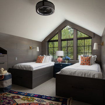
Example of a mid-sized transitional carpeted and gray floor bedroom design in Denver with brown walls and no fireplace
 Alair Homes Plano
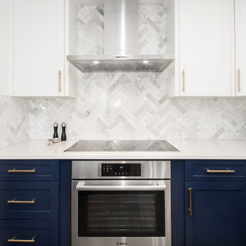
We loved updating this 1977 house giving our clients a more transitional kitchen, living room and powder bath. Our clients are very busy and didn’t want too many options. Our designers narrowed down their selections and gave them just enough options to choose from without being overwhelming.
In the kitchen, we replaced the cabinetry without changing the locations of the walls, doors openings or windows. All finished were replaced with beautiful cabinets, counter tops, sink, back splash and faucet hardware.
In the Master bathroom, we added all new finishes. There are two closets in the bathroom that did not change but everything else did. We.added pocket doors to the bedroom, where there were no doors before. Our clients wanted taller 36” height cabinets and a seated makeup vanity, so we were able to accommodate those requests without any problems. We added new lighting, mirrors, counter top and all new plumbing fixtures in addition to removing the soffits over the vanities and the shower, really opening up the space and giving it a new modern look. They had also been living with the cold and hot water reversed in the shower, so we also fixed that for them!
In their living room, they wanted to update the dark paneling, remove the large stone from the curved fireplace wall and they wanted a new mantel. We flattened the wall, added a TV niche above fireplace and moved the cable connections, so they have exactly what they wanted. We left the wood paneling on the walls but painted them a light color to brighten up the room.
There was a small wet bar between the living room and their family room. They liked the bar area but didn’t feel that they needed the sink, so we removed and capped the water lines and gave the bar an updated look by adding new counter tops and shelving. They had some previous water damage to their floors, so the wood flooring was replaced throughout the den and all connecting areas, making the transition from one room to the other completely seamless. In the end, the clients love their new space and are able to really enjoy their updated home and now plan stay there for a little longer!
Design/Remodel by Hatfield Builders & Remodelers | Photography by Versatile Imaging
Less
 Reagan Jobe Photography
2014 Reagan V. Jobe Photography
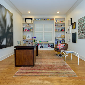
Inspiration for a transitional freestanding desk light wood floor home office remodel in Dallas with white walls
Inspiration for a transitional freestanding desk light wood floor home office remodel in Dallas with white walls
 Nicole Arnold Interiors
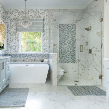
This house has great bones and just needed some current updates. We started by renovating all four bathrooms and the main staircase. All lighting was updated to be clean and bright. We then layered in new furnishings for the dining room, living room, family room and entry, increasing the functionality and aesthetics of each of these areas. Spaces that were previously avoided and unused now have meaning and excitement so that the clients eagerly use them both casually every day as well as for entertaining.
Sponsored
Columbus, OH

HomeCraft Remodeling
Custom Craftsmanship & Build Solutions in Franklin County, Ohio
 Simply Home Decorating
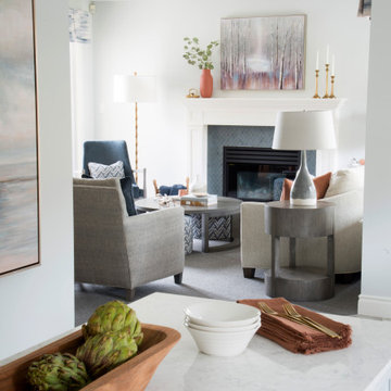
This spacious home in North Vancouver's Deep Cove community had been built and decorated just over 20 years ago and was in need of updating. Our clients who are empty nesters, spend much of their time in the kitchen and family room so we focused on these spaces keeping in mind that the more formal spaces on the main floor will follow in a few years time. For the most part the layout of their kitchen worked well for them so our role was to tweak the kitchen and family room furniture layout and to select updated finishes and furnishings. Since this home transformation is not happening all at once, we purposefully selected classic finishes, like antique brass hardware, that will tie in with the rest of the home's decor until it can be updated. The resulting refresh stays true to the original feel of the house while giving it a clean, updated look.
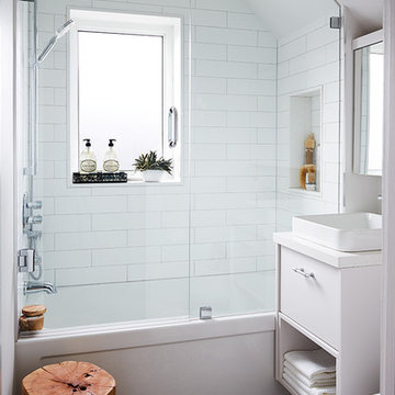

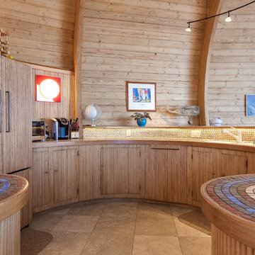

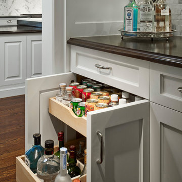
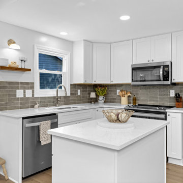
 Middlefork Luxury Home Builders
Middlefork was retained to update and revitalize this North Shore home to a family of six.
The primary goal of this project was to update and expand the home's small, eat-in kitchen. The existing space was gutted and a 1,500-square-foot addition was built to house a gourmet kitchen, connected breakfast room, fireside seating, butler's pantry, and a small office.
The family desired nice, timeless spaces that were also durable and family-friendly. As such, great consideration was given to the interior finishes. The 10' kitchen island, for instance, is a solid slab of white velvet quartzite, selected for its ability to withstand mustard, ketchup and finger-paint. There are shorter, walnut extensions off either end of the island that support the children's involvement in meal preparation and crafts. Low-maintenance Atlantic Blue Stone was selected for the perimeter counters.
The scope of this phase grew to include re-trimming the front façade and entry to emphasize the Georgian detailing of the home. In addition, the balance of the first floor was gutted; existing plumbing and electrical systems were updated; all windows were replaced; two powder rooms were updated; a low-voltage distribution system for HDTV and audio was added; and, the interior of the home was re-trimmed. Two new patios were also added, providing outdoor areas for entertaining, dining and cooking.
Tom Harris, Hedrich Blessing
Sponsored
Columbus, OH
HomeCraft Remodeling
Custom Craftsmanship & Build Solutions in Franklin County, Ohio
 Jenny Sutherland Designs
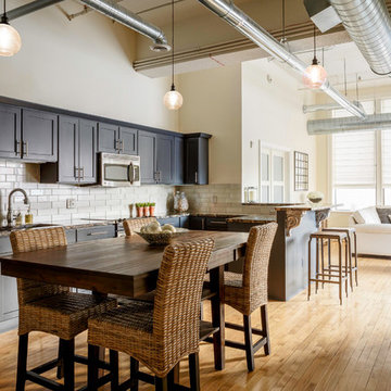
I was hired to update this condo, working around the existing countertops as they were something the owner didn't want to replace. I selected a paint color for the cabinetry, feeling like the cherry cabinets just didn't fit in this space, nor did they seem to be the right compliment to the existing granite. I hired Haven Finishing Studio to work their magic and transform the cabinets into what looks like a brand new kitchen! They did beautiful work!!! Removed the outdated backsplash and replaced it with a metallic back painted glass subway tile. Removed track lighting in the kitchen and living room and replaced with vintage industrial modern lighting. So excited to have this opportunity in downtown GR, hoping for a lot more opportunities like this!!!
Photo Credit: Ben Perfect Photo
 Spring Creek Design
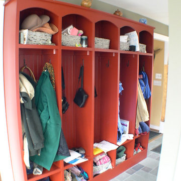
This old farmhouse (ca. late 18th century) has undergone many renovations over the years. Spring Creek Design added its stamp in 2008, with a small mudroom addition and a complete interior renovation.
The addition encompasses a 1st floor mudroom with extensive cabinetry and closetry. Upon entering the space from the driveway, cabinet and countertop space is provided to accommodate incoming grocery bags. Next in line are a series of “lockers” and cubbies - just right for coats, hats and book bags. Further inside is a wrap-around window seat with cedar shoe racks beneath. A stainless steel dog feeding station rounds out the amenities - all built atop a natural Vermont slate floor.
On the lower level, the addition features a full bathroom and a “Dude Pod” - a compact work and play space for the resident code monkey. Outfitted with a stand-up desk and an electronic drum kit, one needs only emerge for Mountain Dew refills and familial visits.
Within the existing space, we added an ensuite bathroom for the third floor bedroom. The second floor bathroom and first floor powder room were also gutted and remodeled.
The master bedroom was extensively remodeled - given a vaulted ceiling and a wall of floor-to-roof built-ins accessed with a rolling ladder.
An extensive, multi-level deck and screen house was added to provide outdoor living space, with secure, dry storage below.
Design Criteria:
- Update house with a high sustainability standard.
- Provide bathroom for daughters’ third floor bedroom.
- Update remaining bathrooms
- Update cramped, low ceilinged master bedroom
- Provide mudroom/entryway solutions.
- Provide a window seating space with good visibility of back and side yards – to keep an eye on the kids at play.
- Replace old deck with a updated deck/screen porch combination.
- Update sitting room with a wood stove and mantle.
Special Features:
- Insulated Concrete Forms used for Dude Pod foundation.
- Soy-based spray foam insulation used in the addition and master bedroom.
- Paperstone countertops in mudroom.
- Zero-VOC paints and finishes used throughout the project.
- All decking and trim for the deck/screen porch is made from 100% recycled HDPE (milk jugs, soda, water bottles)
- High efficiency combination washer/dryer.
 Alair Homes Plano
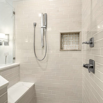
Our clients called us wanting to not only update their master bathroom but to specifically make it more functional. She had just had knee surgery, so taking a shower wasn’t easy. They wanted to remove the tub and enlarge the shower, as much as possible, and add a bench. She really wanted a seated makeup vanity area, too. They wanted to replace all vanity cabinets making them one height, and possibly add tower storage. With the current layout, they felt that there were too many doors, so we discussed possibly using a barn door to the bedroom.
We removed the large oval bathtub and expanded the shower, with an added bench. She got her seated makeup vanity and it’s placed between the shower and the window, right where she wanted it by the natural light. A tilting oval mirror sits above the makeup vanity flanked with Pottery Barn “Hayden” brushed nickel vanity lights. A lit swing arm makeup mirror was installed, making for a perfect makeup vanity! New taller Shiloh “Eclipse” bathroom cabinets painted in Polar with Slate highlights were installed (all at one height), with Kohler “Caxton” square double sinks. Two large beautiful mirrors are hung above each sink, again, flanked with Pottery Barn “Hayden” brushed nickel vanity lights on either side. Beautiful Quartzmasters Polished Calacutta Borghini countertops were installed on both vanities, as well as the shower bench top and shower wall cap.
Carrara Valentino basketweave mosaic marble tiles was installed on the shower floor and the back of the niches, while Heirloom Clay 3x9 tile was installed on the shower walls. A Delta Shower System was installed with both a hand held shower and a rainshower. The linen closet that used to have a standard door opening into the middle of the bathroom is now storage cabinets, with the classic Restoration Hardware “Campaign” pulls on the drawers and doors. A beautiful Birch forest gray 6”x 36” floor tile, laid in a random offset pattern was installed for an updated look on the floor. New glass paneled doors were installed to the closet and the water closet, matching the barn door. A gorgeous Shades of Light 20” “Pyramid Crystals” chandelier was hung in the center of the bathroom to top it all off!
The bedroom was painted a soothing Magnetic Gray and a classic updated Capital Lighting “Harlow” Chandelier was hung for an updated look.
We were able to meet all of our clients needs by removing the tub, enlarging the shower, installing the seated makeup vanity, by the natural light, right were she wanted it and by installing a beautiful barn door between the bathroom from the bedroom! Not only is it beautiful, but it’s more functional for them now and they love it!
Design/Remodel by Hatfield Builders & Remodelers | Photography by Versatile Imaging
35