
Search results for "Useable" in Home Design Ideas
 Dana Bass Designs
WINNER - ASID Design Ovation Award 2019 - First Place Residential Powder Room
Click here for a before and after image: https://www.houzz.com/hznb/photos/before-and-after-pinehurst-powder-bath-dallas-phvw-vp~143281756
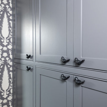
Concept: To create a Pool Powder Room with privacy from the kitchen and living room with additional storage. The client desired a Wow! feeling that was fully explosive with pattern and color. Birds and butterflies were requested as a nod to the client’s favorite hobby, gardening. The main challenge for this design was to keep the existing foot print, yet make a more private and useable bath with better storage. Closing off the two existing doorways and creating one pocket door off the main hallway solved the privacy issues from the kitchen and second living room, in addition to giving more usable square footage for storage. A larger vanity with storage drawers along with floor to ceiling wall cabinets provide for the additional storage needed for pool towels and gardening items. Layering strong color and stimulating patterns created a visually stunning space that was personalized to the client’s specific request, Wow! The strong use of color and pattern play well with each other. The antique vanity mirror has been recycled from the previous bath and given a fresh coat of bold, cobalt blue paint, which is the client’s all-time favorite color. The requested bird motif is reflected in the wall covering as well as the details of the hardware. The combination of bird and feather shaped hardware gives the Powder Room a fun flair and unique style.
 Mottram Architecture
Timber frame homes offer unique challenges during a remodel. What often makes them beautiful and attractive to most homeowners, also makes them challenging for space requirements.
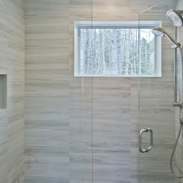
Context: The lovely couple that owned this home were struggling with some interesting floor plan challenges that just didn't work for their family. The loved the beautiful timbers and woodwork of their home, but the dramatically sloping ceilings on the second floor, particularly in the bathroom, just didn't work for this 1 1/2 bath home. Needing to use the skylight to approach the toilet was a less then ideal scenario. Although the bathroom footprint was more then adequate, the sloped ceiling only made half of the space useable. Check out the Before/After post on our blog to see the photos of the house pre-renovation. As much as they loved all the wood features in their home, another challenge they had was light. The wood ceiling made everything inside the house darker, even with a fantastic array of south facing windows, there were spaces in the home that felt dark and small. When they contacted us they wanted to know how could they make their brighter and more inviting, were there solutions to the 2nd floor sloped ceiling issues, and if they were going to do all of this work, how could they make their home more comfortable and efficient. A nagging water leak in the upstairs bathroom spurred them into action and here is how we solved their dilemma.
Conclusion: First, we added a little dormer to the rear of the house so we could get full headroom in nearly all of the upstairs bathroom! Then we decided to extend that dormer one more timber bay over to create a walk in closet with natural light and plenty of space. Since we were contemplating energy efficiency, we resolved a nagging issue that is present in a lot of timber frame construction, air tightness. Commonly found in timber frame construction, fiberglass insulation is installed in the rafter bays and board ceilings are installed over top. Unfortunately, board ceilings are anything but air tight, and fiberglass insulation needs to be in an airtight cavity for maximum effectiveness. So we were able to solve two issues at the same time for this homeowner. We removed the board ceiling and fiberglass insulation, we dense packed the rafter bays with cellulose insulation, and installed sheetrock in place of the boards. The boards were salvaged for re-use by the homeowner, and the space and light quality was dramatically improved. Some may think that losing the board ceiling took something away from the space, but what you'll see in the pictures is that it highly accentuates the heavy timbers and really makes them stand out in a beautiful way. Now with this added airtightness, better insulation, and brighter space, the homeowner hardly runs their wood stove, and it's so quiet in the space, an added bonus from changing the insulation. It became necessary to also add a sheetrock ceiling to the living room to hide the plumbing from the new bathroom layout above. Changing this ceiling gave the homeowner some real quality lighting that was lacking in the living room before. The brighter ceiling and new lighting layout completely transforms the living room into a space you want to hang out, even though the layout didn't change at all. When the homeowner saw the finished spaces she said "I can't believe this is my house, I want to live in this house"
Energy Efficiency: I touched a little on the efficiency above, but like all projects done with Mottram Architecture, we always want to leave you with a little extra. Timber frame construction with board ceilings and fiberglass insulation are notoriously leaky! If you want to know what we think about fiberglass insulation, check our our blog post on Why Fiberglass Insulation Sucks. By installing cellulose insulation and covering it with sheetrock we were able to greatly reduce the heat flowing out of this home. It not only improves cashflow it improves the comfort level in the space. Who wants to sit in their living room and feel a draft? Let us remind you, we are not saying cellulose insulation is an air barrier, we use the sheetrock to help with that, but it does significantly reduce the air flow over fiberglass insulation. And when we reduce the airflow, we reduce the heat flow. And when we reduce the heat flow, we reduce the need to re-heat that drafty air from outside. When it comes to energy efficiency the first and best place to start is air infiltration. We greatly reduced the air infiltration with the new insulation, but we also added a hat and warm boots. What I mean by that is, we improved the insulation in the roof, and we installed insulation in the basement. Maybe it's a silly analogy, but when you think about keeping warm, we always start with the hat and boots! With sustainability in mind, the next project will be to add a deck to the front of this house with rain catchment barrels from the metal roof. They are planning to plant a garden in the spring and the rain catchment system will help to irrigate the new garden.
Builder: East Shore Builders
Photographer: Michael Eric Berube
 C2 | Studio Landscape Architecture
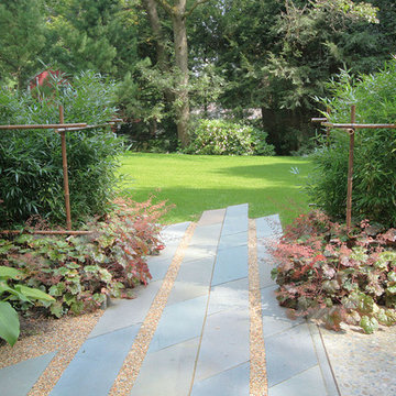
This project consisted of a re-design for an unkempt and poorly-functioning entry garden of a home in Belmont. The primary programmatic elements we incorporated into the new design were an enlarged and better defined parking area, a useable lawn space, a heightened sense of arrival for the main entrance and a seamless circulatory progression from the rear garden to the entry and front lawn.
Scott Carman
Find the right local pro for your project
 Classic Kitchens Designs & Renovations Ltd.
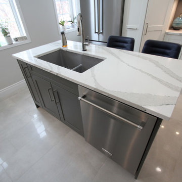
Our customer was tired of having a tiny food preparation space that occupied only a small part of their kitchen. We worked with them to make the entire kitchen space useable and the result is nothing short of an amazing change! We started with bulkhead removal to allowing cabinets extending to the ceiling. New Porcelain flooring was installed followed by Benjamin Moore custom painted cabinetry in the customers chosen colours. Beautiful quartz ounters were then installed followed by a mosaic backsplash to tie it all together. Stunning! Check out the before pics to see where we started!
 Rhodes Architecture + Light
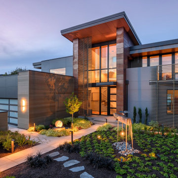
A transformation inspired by the owner’s love of modern architecture, art and color (and the adjacent sand, rock, water, and the northwest landscape), the Indianola House sought to bring the soul of a home to a colorless muted box. The original house was a drab 1990’s-era box with no personality or presence sited on a beautiful secluded bay, facing water and island views, northwest of the City of Seattle. The existing mono-colored stucco-clad exterior and pyramidal glass-block openings had led the neighborhood to dub the structure, unflatteringly, “The Miami Vice House”.
Rhodes Architecture’s Residential Architects careful use of natural light, rich, collaged finishes and ability to open the house to gardens, beach, and outdoor gathering was critical to the design. The house soon became “The Gallery”.
The original home’s grey stucco exterior made the house seem both large and featureless; the introduction of no-maintenance exterior materials that collage and complement each other was a goal of the homeowner and the Seattle Architects who teamed up for this residential design. The bloated scale of the house cried out for the establishment and definition of the parts of the structure, a breaking down of the home’s form and its apparent bland size.
Living, sleeping, and bathing areas that started as staid spaces were in need of opening to the natural environment with additions of large doors, folding glass walls and useable balconies were crucial to each space having a dialogue with the outdoors.
The owner’s extensive art collection was highlighted and became the focus of interior places, well-lit naturally and through a new lighting system. Energy use and sustainable systems were a key component of the design which used high-efficacy lighting, better cladding on a rain-screen system, high-efficiency doors and windows, new insulation and weather barriers, and which added a photovoltaic-generated electrical system. The contemporary design sought to integrate all of these systems, materials, and finishes into a seamless whole that lent interest and drama to a residence which was previously lusterless.
How radically this house was transformed is evident in the exteriors, gardens and the natural spaces the house now opens to, as well as the gallery-like interiors. This home is a stunning testament to what is possible “before-and-after” when remade by Rhodes Architecture + Light.
The clients are an older couple with long professional and political careers, a love of art and a clear desire to connect with the Northwest environment and enliven their daily lives with spaces full of color and natural light.
Rhodes Architecture + Light was hired in 2019 to add new exteriors and interiors, natural light, larger openings to beach and bay, seismic and foundation upgrades to the home, and to infuse life into the house through the re-use of existing space and varied materials, color, textures, and lighting. The only actual change to the exterior “shell” of the house was the introduction of a low “gull-wing” roof with wood soffits above the central atrium space, to add drama and bring natural light into the entry gallery space. Interior spaces, including bedrooms and bathrooms, were re-planned and opened to each other, to greater natural light, to roof decks, and to the incredible views and sea-side environment.
The Builder, Fairbank Construction Company of Bainbridge Island, Washington, met the challenge of the design, first completely deconstructing the finishes inside and out, then precisely interlocking new claddings, windows and doors, cabinetry, finishes and a new gull-wing central roof in a beautiful transformation. The construction was total, thorough, and very detailed, resulting a house that, far from seeming a “remodeling”, is far more present and fitting to the owner’s lives and the natural environment than the house we started with.
 FTC - Final Touch Construction of Colorado
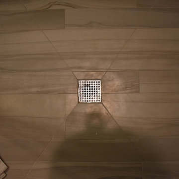
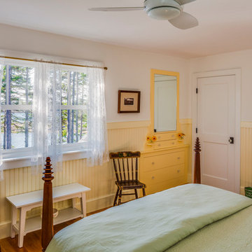
This beautiful 1950's craftsman needed a redo, inside and out. After gutting it down to it's studs, the main floor and basement were redesigned for much more useable space. Three tiny bedrooms upstairs became a large master with a double sink on suite and a guest bedroom with a beautiful new bathroom. The stairway that was in the kitchen was relocated so the kitchen became larger and much more usable. The basement went from a red and orange monstrosity to a soothing family room, bedroom and new bathroom as well as an updated laundry room and storage closet. New windows and doors, as well as an egress window was added to make it code compliant. A new roof and fireplace finished off the remodel of this cozy, colorful craftsman cottage. Photos were taken by Moore House Photos by Jett (Jett Moore Photographer).

 Spin Design Limited
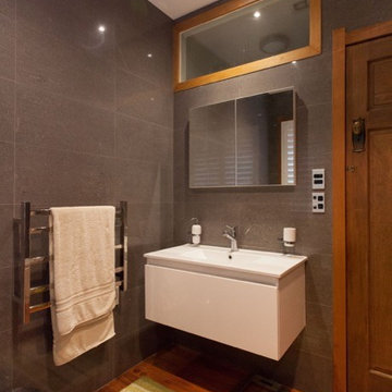
When there’s not a lot of space wall hung vanities give the impression of space.
We added a mirror cabinet above for much needed storage. We mounted a soap dispenser and toothbrush holder to the wall, keeping the vanity top clear and useable.

 358 Design
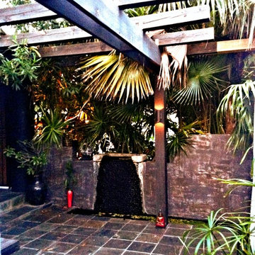
Empty and open front patio was transformed into a private Asian themed area for yoga, relaxing and entertaining.
Koi fish and fire pit add to the serene feeling of the space which now is practically an additional room, adding useable square footage to the house.
 Ashley Farrell Landscape Design
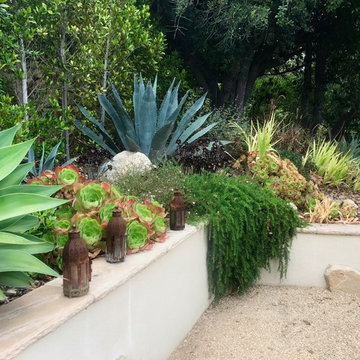
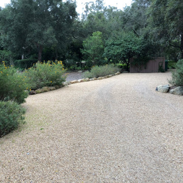
Concrete Retaining Wall With a Flagstone Cap Wall with Beautiful Drought Tolerant Landscaping. Ashley Farrell Landscape Design
Inspiration for a mediterranean landscaping in Santa Barbara.
Inspiration for a mediterranean landscaping in Santa Barbara.

 Building Designers Association of Australia
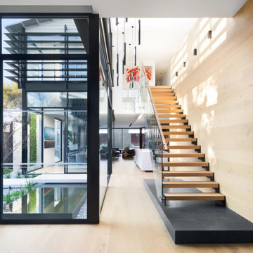
Located on a heritage-lined street in Melbourne’s Williamstown, a young family were seeking a contemporary home with ample room to grow. Benni Trajcevski of Achieve Design Group answered their call, creating the epitome of modern living concealed behind a modest façade. To achieve the long wish list including large indoor and outdoor gathering spaces to entertain family and friends, separate adult and children living and sleeping zones, and a pool suitable for year-round use, Benni has maximised every inch of the block. Seamless transitional spaces link inside with out. This flow between the indoors and outdoors is a key feature of the home, achieved through generous open floor planning and glazing. For example, large hidden sliding doors allow the pool to be closed-off for use in winter; acrylic glass panels link the pool with the sunken lounge, which includes a fire pit for year-round comfort. The inclusion of a courtyard and voids throughout create separate useable zones while maintaining the feeling of spaciousness. Orientated to the north and surrounded with floor to ceiling windows to optimise natural light, the courtyard divides the formal lounge area with the informal living area, while the first floor is divided into four separate wings for privacy and functionality. The interiors are detailed with quality materials and finishes to achieve a sleek and sophisticated aesthetic. Contrasting materials in muted tones, including tiles, steel and lightweight timbers are featured throughout. Corian and a moss green wall are unexpected features.
 Smith Farms Custom Furniture
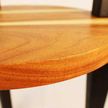
The award-winning Urbane Accent Tables feature a simple design that draws from deconstructivism yet still presents a refined, and highly functional piece of furniture.
The unique design element of these uncomplex tables is the legs. They jut far above the tabletop itself, creating a dramatic look that’s the first thing you notice. Although the legs are proportionally large, they don’t detract from the table’s functionality or take up too much of the useable space.
Made from solid American Ash, the legs are dimensionally stout but have a substantial taper that lightens their look and adds elegance to the otherwise blocky design. To produce the desired look, the legs were torch burned leaving a deeply charred surface, like the ancient Japanese technique of Shou Sugi Ban. The surface of the legs was then aggressively scrubbed with metal brushes to remove the softer wood and accentuate the open grain patterns that Ash is known for.
All six legs were built from a single slab of Ash, and they are attached to the tabletops using a large dado joint that’s very strong, requiring only glue and no mechanical fasteners.
The solid tabletops were crafted from a single slab of Argentine Mesquite that provide a beautiful contrast to the dark, chunky legs.
The tables were designed and built in 2023 but the Mesquite slab was responsibly sourced in mid-Arizona in 2016.
 358 Design
Empty and open front patio was transformed into a private Asian themed area for yoga, relaxing and entertaining.
Koi fish and fire pit add to the serene feeling of the space which now is practically an additional room, adding useable square footage to the house.
 Victory Contracting, LLC
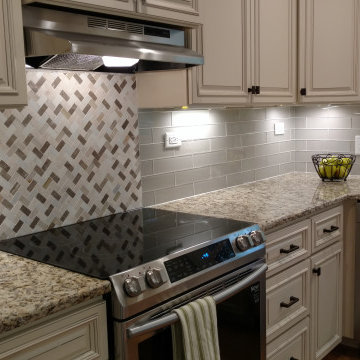
We opened up this charming North Hills split level with creative design to maximize useable space
Mid-sized transitional l-shaped medium tone wood floor and brown floor eat-in kitchen photo in Raleigh with an undermount sink, beaded inset cabinets, white cabinets, granite countertops, gray backsplash, glass tile backsplash, stainless steel appliances, an island and multicolored countertops
Mid-sized transitional l-shaped medium tone wood floor and brown floor eat-in kitchen photo in Raleigh with an undermount sink, beaded inset cabinets, white cabinets, granite countertops, gray backsplash, glass tile backsplash, stainless steel appliances, an island and multicolored countertops
 Southwest Greens New Mexico
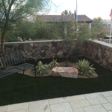
Nicely landscaped back yard with xeric plants and crusher fines. Replaced with turf for a more useable area.
Example of a mid-sized southwest home design design in Austin
Example of a mid-sized southwest home design design in Austin
 DaVinci Custom Fireplaces
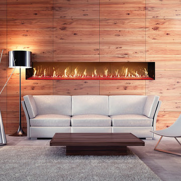
144" x 12" Single Sided, DaVinci Custom Fireplace
Example of a mid-sized trendy formal and open concept ceramic tile and gray floor living room design in Seattle with brown walls, a ribbon fireplace, a wood fireplace surround and no tv
Example of a mid-sized trendy formal and open concept ceramic tile and gray floor living room design in Seattle with brown walls, a ribbon fireplace, a wood fireplace surround and no tv
 ADR Builders, Ltd.
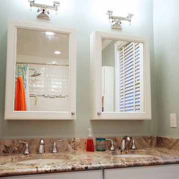
Double sinks with two medicine cabinets give you plenty of room in this small bath - ADR Builders
Small transitional kids' bathroom photo in Baltimore with an undermount sink, recessed-panel cabinets, white cabinets, granite countertops and blue walls
Small transitional kids' bathroom photo in Baltimore with an undermount sink, recessed-panel cabinets, white cabinets, granite countertops and blue walls
 FTC - Final Touch Construction of Colorado
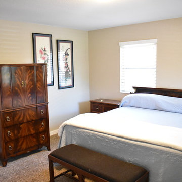
This beautiful 1950's craftsman needed a redo, inside and out. After gutting it down to it's studs, the main floor and basement were redesigned for much more useable space. Three tiny bedrooms upstairs became a large master with a double sink on suite and a guest bedroom with a beautiful new bathroom. The stairway that was in the kitchen was relocated so the kitchen became larger and much more usable. The basement went from a red and orange monstrosity to a soothing family room, bedroom and new bathroom as well as an updated laundry room and storage closet. New windows and doors, as well as an egress window was added to make it code compliant. A new roof and fireplace finished off the remodel of this cozy, colorful craftsman cottage. Photos were taken by Moore House Photos by Jett (Jett Moore Photographer).
64