
Search results for "Useable" in Home Design Ideas
 H2D Architecture + Design
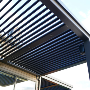
The homeowners of this Mukilteo residence partnered with H2D Architecture + Design to transform their underutilized rear deck into a highly functional outdoor living environment. The existing deck was refinished and reconfigured to create a more useable area for gathering, seamlessly extending the interior living space to the outdoors. A Struxure pergola was introduced to provide adjustable shade and light filtration, allowing the space to adapt to changing weather and seasons. Beyond the deck, the design steps down to a thoughtfully composed concrete paver patio anchored by a custom round wood hot tub, creating a warm and tactile focal point. Surrounding this feature, a built-in bench establishes a zone for relaxation and socializing, while a fire pit adds both ambiance and year-round usability. A custom screen wall was integrated to provide privacy and subtle enclosure without sacrificing openness, helping to define the space while maintaining visual connections to the landscape. The combination of multi-level seating, integrated elements, and carefully considered materials results in a cohesive outdoor retreat that supports a variety of uses.
+ Architecture + Design: H2D Architecture + Design
+ Builder: Bradley J. Rodgers Remodelling
+ Photography: Thomas Vincent
 Fusion Interiors
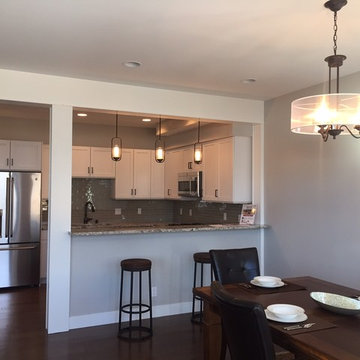
This contemporary craftsman kitchen uses of square inch of useable space. The layout gives a great amount of work space. The open concept lends a great entertaining kitchen with it opening into the living and dining room.
 Cook Construction
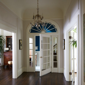
This project is the definition of where the finesse of craftsmanship and structural brute must meet and far exceed client expectations.
The massive undertaking of excavating 700 cubic yards of soil to add a new basement below the existing structure took this 2-story home to 4,000 square feet. This now 3-story Victorian boasts 1,800 additional square feet of useable space including a third living room with soundproof insulation and custom built-in cabinetry, a wet bar, full bathroom with Waterworks fixtures and intricate marble tile, private office, laundry room equipped with a chute from every floor, and a gym & guest room.
Restoring, the original upper 2 floors of this stunning Victorian to its former glory was another challenge in and of itself. Rehabbing vaulted coved ceilings & original early 19th century mantels, renovating the bedrooms and bathrooms, updating the kitchen and creating an indoor/outdoor experience by installing doors in the former window locations between the dining room and patio were just a few key elements of this project.
Find the right local pro for your project
 EF Builders and Remodelers, LLC.
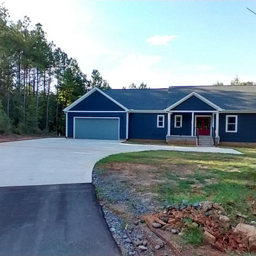
New 2500sqft. house build with a full walk-out superior wall basement, 3 bedroom 2.5 Bath home. Full LVP floors throughout, with tile in all bathrooms on the floors and shower surrounds. Hardi board siding, fiberglass exterior doors, double-hung vinyl windows, and aluminum gutters with oversized down spouts. This was a nice floor plan and had very useable space'
 Ashley Farrell Landscape Design
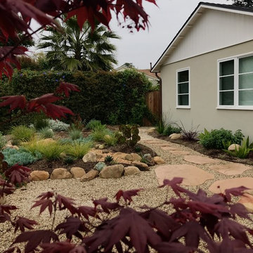
Ashley Farrell Landscape Design replaced a dead lawn with a dry creek bed and a small patio with an access path to the back yard. Great example of sustainable landscaping and useable space.
 Helene's Luxury Kitchens
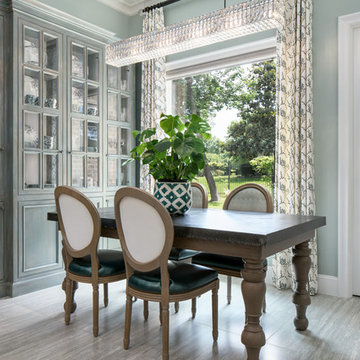
Helene Terry is an award winning Kitchen Design Specialist. She works with homeowners and designers to create a kitchen space that uses every square inch of area available. Her superb planning ability transforms the kitchen into functional, useable space that flows and performs. She creates detailed drawings, floor plans and perspectives to communicate the new design to all trades and principals.
The owner of this beautiful blue kitchen had a great sense of style This a custom remodel that included the demolition of 3 walls and the relocation of the central island. You'll note the focal point of the new island which has two (2) Miele dishwashers, a Sub Zero icemaker and various custom recycling and pull out bins. There is seasonal storage for dishes in front of the barstools. Spacious walkways between wall counters and island of 41"-48" allow 2 cooks to move easily. There are 2 sinks in the island at right angles to facilitate conversation.
On the side walls, custom cabinets go all the way to the ceiling. The custom color and glaze is from Benjamin Moore and was specified by the Interior Designer, Charlotte Comer. Flanking the Wolf 36" range and built into the wall are two appliance garages with concealed electrical outlets. One garage houses the owner's blender and pulls out on a tray. The other one houses spices.
The Sub-Zero integrated refrigerator with glass door is 36" wide. There are other integrated refrigerator drawers as well. The Vent Hood is from Best with a 900 cfm remote blower. There is a pot filler spout behind the range. To the left of the range is a plumbed Miele coffee maker.
The backsplash is recessed with contrasting tiles inserts and bullnose trim from Antique Floors. Cabinet Hardware is from Top Knob. The flooring is a Silver Travertine from Porcelanosa laid on a straight stack. The counter top is Carerra Marble from Aria Stone fabricated by Holland Marble.
The microwave and additional appliances garages are concealed behind the range wall in a former under stairway pantry. This space acts as a second staging area for large dinner parties and to conceal frequently used appliances.
 Budget Blinds of Farmington
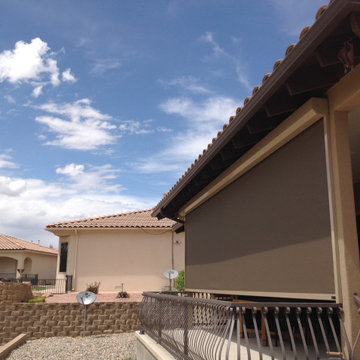
The key to energy control is to stop the sun before it heats up your glass and radiates into your home or business. Exterior Screens are the ideal retractable solar screen for maximum sun protection on your windows, doors and patios. They were designed to be a very reliable product and will stop 90% of the radiant heat before it gets into your home. Transform you patio into useable space.
 Pinnacle Design & Remodeling
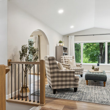
From a sunken living space, leaking windows with birds living in the siding, no electrical overhead lighting, etc. We transformed this front family living room into a one-level useable space for lots of entertaining! We made everything one level, with new windows, better lighting, and a whole new stair railing system to help elevate the space with timeless neutral features.
 Sweet Smiling Landscape Design
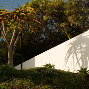
Located on a steep hill above downtown Ventura, this modern Spanish house features panoramic views of town with the ocean and Channel Islands beyond. While the views are amazing from a large front deck, the steep slope presented some constraints on the landscape design.
Although the property is about a third-of-an-acre, the only useable and open garden space is a small (about 500 square feet) area to the West of the house. The house sits at the back of the property, and another steep hill on the neighboring property behind is held back by a tall retaining wall, leaving just enough room for a narrow, hardscaped patio in the back yard.
Bright plantings along the back of the property delineate the home from the neighboring property, and we chose plantings to help stabilize the soil and further develop the Spanish garden look while creating a lush, inviting feel. Additionally, we added 52 pieces of pottery to soften and add interest to the back garden and patio areas. Succulents, herbs, and California natives fill the pottery along with bright, sweet-smelling, tropical-looking, and climate-appropriate plants.
Slope stabilization was paramount for the front hill. Beyond that, finding plants that would thrive on the steep slope was the next obstacle. Finally, the aesthetics could be addressed, and we worked to find plants that meshed with the architecture—blending plants with white and orange to play off the red-tiled roofs and white-plastered walls that are emblematic of the Spanish style of this house as well as the predominate style of the neighborhood.
The flattish area to the West was designed with the idea of creating a contemporary take on the parterre garden. Reminiscent of Mediterranean gardens, this vegetable and herb garden substitutes formal hedges with formal Corten steel planters to honor the modern Spanish architecture of the house. The citrus, herbs, and vegetables serve the foodie clients well.
 FTC - Final Touch Construction of Colorado
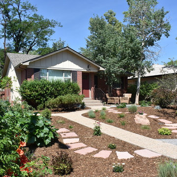
This beautiful 1950's craftsman needed a redo, inside and out. After gutting it down to it's studs, the main floor and basement were redesigned for much more useable space. Three tiny bedrooms upstairs became a large master with a double sink on suite and a guest bedroom with a beautiful new bathroom. The stairway that was in the kitchen was relocated so the kitchen became larger and much more usable. The basement went from a red and orange monstrosity to a soothing family room, bedroom and new bathroom as well as an updated laundry room and storage closet. New windows and doors, as well as an egress window was added to make it code compliant. A new roof and fireplace finished off the remodel of this cozy, colorful craftsman cottage. Photos were taken by Moore House Photos by Jett (Jett Moore Photographer).
 User
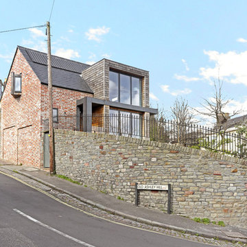
UserThis new build eco home in Bristol used a range of techniques and reclaimed materials in a pragmatic process aimed at maximising its ecological credentials whilst minimising its initial capital investment.
Aesthetically it took influence from the mismatched beauty of Bristol with a wealth of styles and era’s contradictorily played against each other to produce a juxtaposition of historic and contemporary. Its large front windows celebrate a view out over most of the city and tie it to the street scene which it fronts. It is not a house for those seeking privacy, its owners wanted to be part of the community. That said certain aspects were concealed to allow privacy where needed, the bedrooms are buried into the hillside both privatising and excluding road noise. The bathrooms and utility etc were tucked around a rising circulation core and a rear corridor given visual independence by being painted entirely yellow.
Externally a full landscaping design was prepared and implemented including over 6 flights of stairs and a number of terraces and planting banks to create the wealth of spaces maximising useable areas around the house.
 Southwest Greens New Mexico
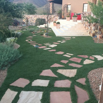
Nicely landscaped back yard with xeric plants and crusher fines. Replaced with turf for a more useable area.
Home design - mid-sized southwestern home design idea in Austin
Home design - mid-sized southwestern home design idea in Austin
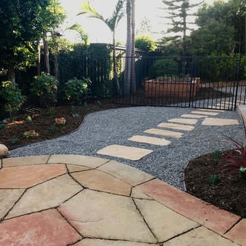 Ashley Farrell Landscape Design
Stamped Concrete Patio with a Pea Gravel Extension and Buckskin Flagstone Paver Access Path
Photo of a mediterranean landscaping in Santa Barbara.
Photo of a mediterranean landscaping in Santa Barbara.
 Turnstyle Design
As is often the case in the homes that I see, this bathroom was dark, run down and used more out of necessity than anything else. In much need of attention, I redesigned this space to be open and flooded with natural light. Highly reflective surfaces, allow the eye to bounce around the room. A re-built, high end shower now feels like a spa with multiple controls at a user’s service. A sculptural bathtub, sets relaxation up for long lingering and highlights the lake side view. Automated, custom designed window treatments are remoted controlled for ease and vanities are wide and softly cheery to leave the mornings with lots of useable space. We completely changed the footprint of this master bath, adding a water closet clad in a wonderful high gloss veneer. Giving the space richness through color, materials, texture and all of this glorious marble flooring and wall tiles, this space now makes you want to spend extra time getting ready.
 Thinkterior LLC
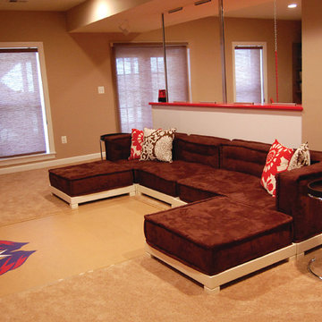
THEME There are two priorities in this
room: Hockey (in this case, Washington
Capitals hockey) and FUN.
FOCUS The room is broken into two
main sections (one for kids and one
for adults); and divided by authentic
hockey boards, complete with yellow
kickplates and half-inch plexiglass. Like
a true hockey arena, the room pays
homage to star players with two fully
autographed team jerseys preserved in
cases, as well as team logos positioned
throughout the room on custom-made
pillows, accessories and the floor.
The back half of the room is made just
for kids. Swings, a dart board, a ball
pit, a stage and a hidden playhouse
under the stairs ensure fun for all.
STORAGE A large storage unit at
the rear of the room makes use of an
odd-shaped nook, adds support and
accommodates large shelves, toys and
boxes. Storage space is cleverly placed
near the ballpit, and will eventually
transition into a full storage area once
the pit is no longer needed. The back
side of the hockey boards hold two
small refrigerators (one for adults and
one for kids), as well as the base for the
audio system.
GROWTH The front half of the room
lasts as long as the family’s love for the
team. The back half of the room grows
with the children, and eventually will
provide a useable, wide open space as
well as storage.
SAFETY A plexiglass wall separates the
two main areas of the room, minimizing
the noise created by kids playing and
hockey fans cheering. It also protects
the big screen TV from balls, pucks and
other play objects that occasionally fly
by. The ballpit door has a double safety
lock to ensure supervised use.
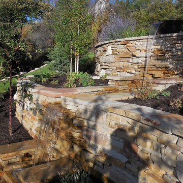
 The Ardent Gardener Landscape Design
Locally quarried sandstone walls, steps, patio and pond. The design reclaimed a steep slope and made for a visually appealing area that becomes very useable. Simple plantings allow the wall to be the star. Photo: The Ardent Gardener Landscape
 Mottram Architecture
Timber frame homes offer unique challenges during a remodel. What often makes them beautiful and attractive to most homeowners, also makes them challenging for space requirements.
Context: The lovely couple that owned this home were struggling with some interesting floor plan challenges that just didn't work for their family. The loved the beautiful timbers and woodwork of their home, but the dramatically sloping ceilings on the second floor, particularly in the bathroom, just didn't work for this 1 1/2 bath home. Needing to use the skylight to approach the toilet was a less then ideal scenario. Although the bathroom footprint was more then adequate, the sloped ceiling only made half of the space useable. Check out the Before/After post on our blog to see the photos of the house pre-renovation. As much as they loved all the wood features in their home, another challenge they had was light. The wood ceiling made everything inside the house darker, even with a fantastic array of south facing windows, there were spaces in the home that felt dark and small. When they contacted us they wanted to know how could they make their brighter and more inviting, were there solutions to the 2nd floor sloped ceiling issues, and if they were going to do all of this work, how could they make their home more comfortable and efficient. A nagging water leak in the upstairs bathroom spurred them into action and here is how we solved their dilemma.
Conclusion: First, we added a little dormer to the rear of the house so we could get full headroom in nearly all of the upstairs bathroom! Then we decided to extend that dormer one more timber bay over to create a walk in closet with natural light and plenty of space. Since we were contemplating energy efficiency, we resolved a nagging issue that is present in a lot of timber frame construction, air tightness. Commonly found in timber frame construction, fiberglass insulation is installed in the rafter bays and board ceilings are installed over top. Unfortunately, board ceilings are anything but air tight, and fiberglass insulation needs to be in an airtight cavity for maximum effectiveness. So we were able to solve two issues at the same time for this homeowner. We removed the board ceiling and fiberglass insulation, we dense packed the rafter bays with cellulose insulation, and installed sheetrock in place of the boards. The boards were salvaged for re-use by the homeowner, and the space and light quality was dramatically improved. Some may think that losing the board ceiling took something away from the space, but what you'll see in the pictures is that it highly accentuates the heavy timbers and really makes them stand out in a beautiful way. Now with this added airtightness, better insulation, and brighter space, the homeowner hardly runs their wood stove, and it's so quiet in the space, an added bonus from changing the insulation. It became necessary to also add a sheetrock ceiling to the living room to hide the plumbing from the new bathroom layout above. Changing this ceiling gave the homeowner some real quality lighting that was lacking in the living room before. The brighter ceiling and new lighting layout completely transforms the living room into a space you want to hang out, even though the layout didn't change at all. When the homeowner saw the finished spaces she said "I can't believe this is my house, I want to live in this house"
Energy Efficiency: I touched a little on the efficiency above, but like all projects done with Mottram Architecture, we always want to leave you with a little extra. Timber frame construction with board ceilings and fiberglass insulation are notoriously leaky! If you want to know what we think about fiberglass insulation, check our our blog post on Why Fiberglass Insulation Sucks. By installing cellulose insulation and covering it with sheetrock we were able to greatly reduce the heat flowing out of this home. It not only improves cashflow it improves the comfort level in the space. Who wants to sit in their living room and feel a draft? Let us remind you, we are not saying cellulose insulation is an air barrier, we use the sheetrock to help with that, but it does significantly reduce the air flow over fiberglass insulation. And when we reduce the airflow, we reduce the heat flow. And when we reduce the heat flow, we reduce the need to re-heat that drafty air from outside. When it comes to energy efficiency the first and best place to start is air infiltration. We greatly reduced the air infiltration with the new insulation, but we also added a hat and warm boots. What I mean by that is, we improved the insulation in the roof, and we installed insulation in the basement. Maybe it's a silly analogy, but when you think about keeping warm, we always start with the hat and boots! With sustainability in mind, the next project will be to add a deck to the front of this house with rain catchment barrels from the metal roof. They are planning to plant a garden in the spring and the rain catchment system will help to irrigate the new garden.
Builder: East Shore Builders
Photographer: Michael Eric Berube
 Building Designers Association of Australia
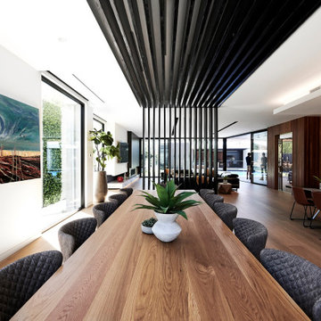
Located on a heritage-lined street in Melbourne’s Williamstown, a young family were seeking a contemporary home with ample room to grow. Benni Trajcevski of Achieve Design Group answered their call, creating the epitome of modern living concealed behind a modest façade. To achieve the long wish list including large indoor and outdoor gathering spaces to entertain family and friends, separate adult and children living and sleeping zones, and a pool suitable for year-round use, Benni has maximised every inch of the block. Seamless transitional spaces link inside with out. This flow between the indoors and outdoors is a key feature of the home, achieved through generous open floor planning and glazing. For example, large hidden sliding doors allow the pool to be closed-off for use in winter; acrylic glass panels link the pool with the sunken lounge, which includes a fire pit for year-round comfort. The inclusion of a courtyard and voids throughout create separate useable zones while maintaining the feeling of spaciousness. Orientated to the north and surrounded with floor to ceiling windows to optimise natural light, the courtyard divides the formal lounge area with the informal living area, while the first floor is divided into four separate wings for privacy and functionality. The interiors are detailed with quality materials and finishes to achieve a sleek and sophisticated aesthetic. Contrasting materials in muted tones, including tiles, steel and lightweight timbers are featured throughout. Corian and a moss green wall are unexpected features.
 The Nelson Team
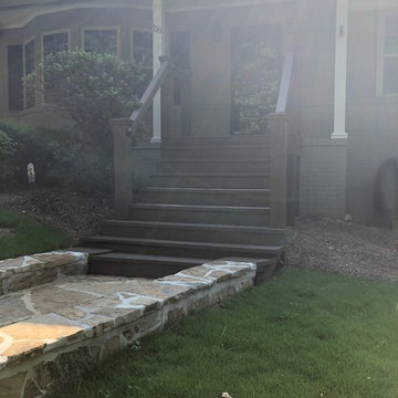
Updated pictures after 6 months to show growth and stained porch, post and railing....Outdoor flagstone staircase created to replace existing wooden staircase that was no longer useable. Porch was rebuilt to allow stairs to extend to new elevation. Irrigation was adjusted, and small retaining walls built on both sides for water drainage. Low voltage lighting installed at completion of project to highlight the beautiful stone
 Alexander Enterprises Constr. & Dev. Company, Inc.
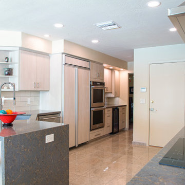
After this house flooded, the owners used it as an opportunity to re-imagine & re-invent their almost 30 yr. old kitchen. Kevin and I went to work to get every penny possible for the owners so the money paid out by insurance went a long way towards helping to update their kitchen. Between the owners, the cabinet maker and Kevin and I, we came up with a great plan to expand the kitchen's footprint by pushing into the pantry (which had a lot of wasted space) and using highly efficient built in cabinets so as to allow a new area of useable kitchen space. We put the focus on the cooktop wall and pulled all the colors in the kitchen together with the backsplash.
We used a gorgeous clear glass tile on the perimeter walls and added a waterfall edge to the end of the sink bank of cabinets. The gorgeous understated elegance is classic modern and will be relevant long into the future. The colors used are not trendy and will be easy to live with for many years to come.
Custom Cabinets by Mike Hallada, Euro-line Millworks, Inc., Photography by Derwin Photography
63