
Search results for "Workflow" in Home Design Ideas
 Allen's Fine Woodworking, Inc.
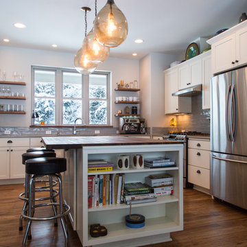
Sometimes a room just bestows a calm feeling upon all those entering. The clean lines and crisp palette of the Medallion Cabinetry in this bright kitchen flow seamlessly with the beautiful grain of the wooden floating shelves and island counter top. As always, our cabinet layout was designed with great attention to workflow efficiency, and the owners have expressed appreciation for the ease they feel in their kitchen. Stainless steel appliances keep it looking sharp, while the espresso machine does double duty as textural centerpiece and essential beverage hub.
Photos by Zach Luellen Photography
 Rebecca Blake Interiors
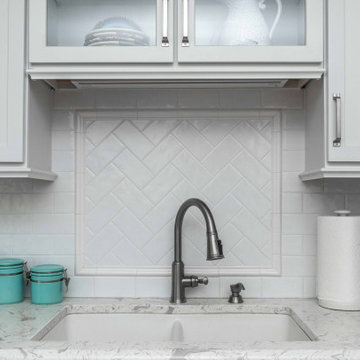
Transitional Kitchen remodel with white cabinets. Relocated appliances for better workflow!
Enclosed kitchen - small transitional u-shaped vinyl floor and brown floor enclosed kitchen idea in Raleigh with a double-bowl sink, shaker cabinets, white cabinets, quartz countertops, white backsplash, subway tile backsplash, stainless steel appliances, an island and white countertops
Enclosed kitchen - small transitional u-shaped vinyl floor and brown floor enclosed kitchen idea in Raleigh with a double-bowl sink, shaker cabinets, white cabinets, quartz countertops, white backsplash, subway tile backsplash, stainless steel appliances, an island and white countertops
 Leicht Westchester-Greenwich
Designer: Lance Marceaux
Materials:
Advance Miro Mohair
Synthia Japanese Pine
Countertops:
Emerstone Calacata Sereno Quartz
Backsplash:
Arabescato Corchia honed marble
Appliances:
All Miele
Storage & Organization Enhancements
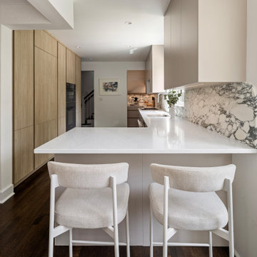
The new kitchen German engineered kitchen was designed to be efficient and function seamlessly for both everyday family routines and for small and large gatherings. Storage was maximized and dedicated task zones established to optimize workflow throughout the reimagined 1925 Tudor home. The peninsula provides casual countertop seating, and graciously defines the kitchen area from the living space, keeping sight lines open and airy.
The area beneath the staircase was skillsfully customized to extend the kitchen work space and provide even more storage solutions.
The upper wall and lower base cabinetry features the Miro line in Mohair, which introduces a soft, earthy tone to the perimeter walls. This is balanced by the tall cabinet units that showcase the Synthia line in Japanese Pine, bringing a warm wood-textured elegance to the vertical spaces. Both collections incorporate the Advance handleless system, seamlessly blending clean architectural beauty with everyday functionality.
The design is further complemented by carefully curated stone surfaces. The soft Emerstone Calacata Sereno quartz countertops alongside a striking Arabescato Corchia honed marble backsplash, adds natural movement and luxury. To complete the culinary design, premium Miele appliances are used.
Find the right local pro for your project
 Hank Coca's Downtown Furniture
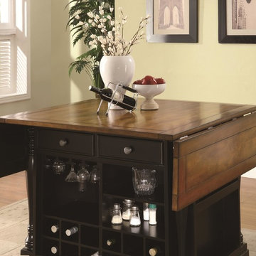
The country cottage styling of this large scale kitchen island will give your home a custom feel at an affordable price. The spacious island features a black finish for the base with tons of built-in organization including cabinets, drawers, wine storage, hanging stemware storage and a spice rack. The cherry finish top has drop leaves at each end to extend the table from 42 to 66 inches long. Fold them down to save space for an efficient kitchen workflow or rise them for a food preparation space. With the leaves up, the island is also place to pull up bar stools for breakfast or a casual meal. The turned columns add to the impressive style of this versatile piece.
The Kitchen Carts Two-Tone Kitchen Island with Drop Leaves by Coaster at Hank Coca's Downtown Furniture in the San Jose, California and San Francisco South Bay Area area. Product availability may vary. Contact us for the most current availability on this product.
 Nar Design Group
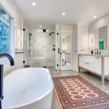
This house built in the 1990s never had renovations done prior to this whole house remodel. Filled with vibrant wallpaper and shiny brass finishes so indicative of the time the house was in need of a major upgrade and refresh.
The laundry room already had ample space and storage, but we tailored the storage for the family. An integrated shoe shelf allows for a clean space to store shoes in this no shoe household. A fold down, integrated ironing board provides functionality without crowding the space.
The powder bath is the only bath on the first floor, so is a full bath, but functions as a powder bath 90% of the time. We wanted to keep the focus away from the shower and keep the fun of a powder bath. A custom window pane patterned etched glass shower allows the shower to stay in the background.
In the master bath there was also ample space, but the design was in great need of an upgrade. With a decked-in tub and shower that you had to step up and then down into, the space needed a better flow and easier access. A freestanding tub allowed all of the decking to be removed and gave space for a larger, more luxurious shower. A huge linen storage with bench that double as a suitcase stand finishes out the space nicely. The room was given a clean, modern farmhouse feel to really freshen up the space.
The focus of this kitchen was to open up the workflow, creating a space for the family to work comfortably while also creating a beautiful and inspiring space. Placing a large refrigerator at the edge of the kitchen, adding a beverage refrigerator, using a Galley Workstation and having the island at a slightly lower height makes it highly functional for the whole family. It is rare to achieve a long line of symmetry, but with a feature wall created around the range top we were able to do so. We created an antique armoire feel with the panel ready refrigerator and custom panel design above.
A mixture of hardware was used, the gray stained hickory cabinets were paired with matte black hardware, while the designer white cabinets were paired with brass hardware. A very custom refrigerator cabinet was created that emphasized the armoire feel. A long wall of 9” deep tall cabinets created a very beautiful as well as highly functional pantry space.
 Closet Factory
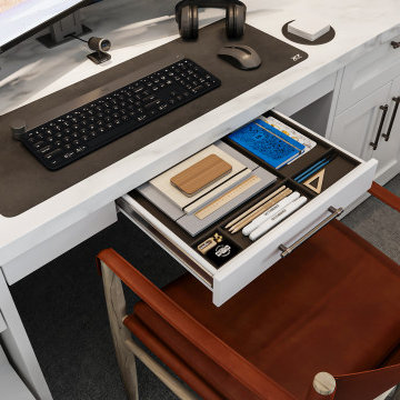
The home office has evolved into an indispensable space that seamlessly blends productivity and comfort. Tailored to the demands of remote work or personal projects, a well-designed home office often features ergonomic furniture, ample storage, and efficient technology integration.
Thoughtful placement of desks and chairs enhances workflow, while strategic lighting promotes focus and reduces eye strain. The home office is not only a functional workspace but also an expression of individual style, with personalized decor and organizational elements contributing to a conducive and inspiring atmosphere.
As the boundary between work and home blurs, the home office emerges as a versatile sanctuary that fosters concentration, creativity, and a harmonious work-life balance.
 NILES
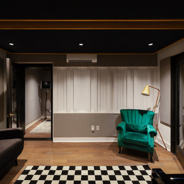
NILESTake a peek at our 2022 project for Edgehill Music Publishing, located in the heart of Nashville’s 12th South district.
This 2,500 sq. ft. commercial facility was meticulously designed to accommodate up to seven writers’ rooms and production suites—each capable of operating simultaneously without interruption, with four of the rooms built for mixing capabilities. With seamless audio integration throughout, the space ensures intuitive connectivity no matter where you are on the property.
The aesthetic palette, paired with a loud and quirky speakeasy vibe, creates a fun atmosphere that reflects the owners’ personalities. The result is not just a studio that feels effortless—it’s an inspiring environment where writing, mixing, and production can happen with minimal sound transmission.
Behind the walls, the architectural acoustics are second to none. The design emphasizes a true “plug-and-play” workflow: each control room, both isolation booths, and all common areas are acoustically isolated with extraordinary attention to detail. Each suite is equipped with dedicated, silent 1:1 HVAC systems. Eight independent floating-floor systems support the suites, while tailored sound-reducing wall assemblies and intentional treatments in the main suites deliver clarity and precision for mixing. Full-lite doors, combined with the fact that no suite is mechanically bonded, allow all rooms to operate simultaneously with minimal sound transfer.
Design, Build & Audio by NILES.
Start your studio journey at niles.co
 Bergen Furniture & Design
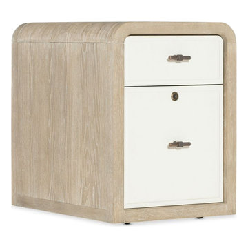
More than metal and drawers, a file cabinet organizes more than paper, it anchors productivity. Designed with sleek lines and quiet strength, it hides the clutter, holds the essentials, and brings calm to your workflow without sacrificing space or style.
 Audus Kitchens
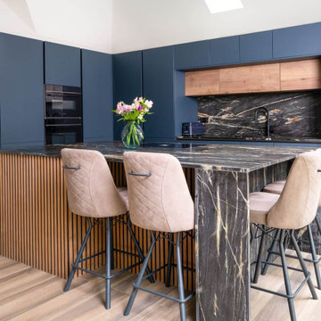
Designed for a large extended family, this stunning modern kitchen in Northwood combines sleek functionality with a warm and inviting aesthetic.
The handleless cabinetry in Fjord Blue and Havana Oak creates a striking contrast, balancing contemporary style with natural textures.
A central island, adorned with subtle panelling details, enhances the sense of warmth while offering ample workspace and casual seating for family gatherings.
The centrepiece of the design is the exquisite 20mm dark Quartz worktops, featuring elegant veining that delivers an undeniable wow factor.
High-end Bora and Siemens appliances have been seamlessly integrated, ensuring both style and performance, while a Blanco sink and Quooker tap enhance efficiency in the kitchen. Together, these features streamline workflow and add a touch of modern convenience to the space.
To maintain a super-sleek look, the kitchen has been meticulously planned with dedicated areas, including a breakfast unit and larder, keeping everything streamlined and clutter-free. Understanding the needs of an Asian family, a second kitchen was incorporated for primary cooking, allowing this space to remain a pristine and stylish heart of the home.
If you're looking for a bespoke kitchen that balances modern elegance with practicality, get in touch with us to bring your vision to life.
 Redwood Design & Build
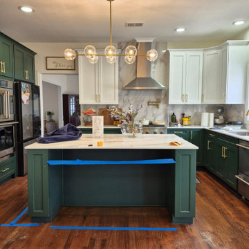
This stunning kitchen transformation combines modern elegance with practical everyday living. Rich green custom base cabinets and bright white shaker uppers create a timeless two-tone design, beautifully complemented by quartz countertops, a spacious island, stainless steel appliances, and a marble-inspired backsplash.
The layout was carefully redesigned to improve workflow, maximize storage, and bring more light into the space creating a warm, inviting kitchen perfect for cooking, gathering, and entertaining.
Built with high-quality materials and professional craftsmanship, this remodel delivers lasting beauty, comfort, and value for the homeowner.
 Le Gourmet Kitchen Ltd.
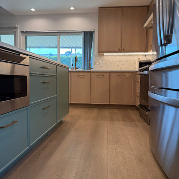
Signature custom cabinetry is featured throughout, utilizing flat panel door profiles and minimalist hardware that reinforce the post modern influence. The carefully planned layout includes a buffet and bar area, enhancing both functionality and entertaining potential. The island’s generous storage and contrasting finish anchor the space and support efficient workflow on both sides of the kitch
 NILES
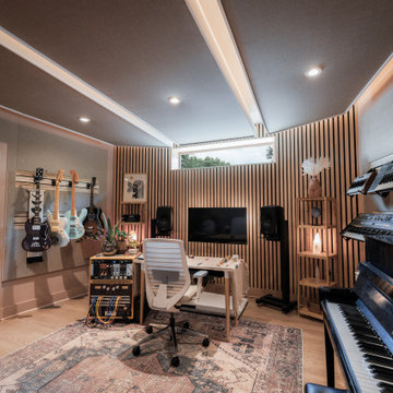
NILESThis 1,000ft² recording and production studio, built in 2021 for producer couple Latifah Alattas and Lucas Morton, was designed as a fully custom creative environment that supports writing, mixing, and collaboration at the highest level. Both Latifah and Lucas are multi-instrumentalists, engineers, and mixers, and the studio reflects the full range of their workflows—visually inspiring, technically precise, and intuitive in every room.
The facility was built from the ground up with a strong emphasis on architectural acoustics and plug-and-play connectivity. The layout includes two Control Rooms, multiple isolation booths, and shared common spaces, all tied together with seamless audio integration. No matter where you are in the studio, routing, monitoring, and communication remain effortless and consistent.
Behind the aesthetic, the acoustic design is exceptionally robust. Six independent floating-floor systems support the suites, ensuring each room operates with minimal sound transmission. Tailored sound-reducing wall assemblies, full-lite doors, engineered window systems, and intentional treatment plans deliver clarity, isolation, and precision for tracking and mixing. Each space is mechanically decoupled, allowing multiple rooms to run simultaneously without compromise.
For monitoring, both Latifah and Lucas chose Genelec “The Ones” series monitors with GLM calibration to ensure accurate translation and consistency across the entire facility.
Natural light and a warm, welcoming aesthetic anchor the visual identity of the studio, reflecting the creative energy and personality of its owners. The result is a highly functional, beautifully crafted space where ideas can move freely and production can happen without limitations.

 safe ZOnea
If you’re active on GardenWeb sharing plant photos, asking for advice, tracking seasonal progress you already understand how much detail goes into gardening. Soil pH, rainfall, emerging leaves, bloom counts, fertilizer schedules it adds up fast. But all that rich information often remains buried in posts, lists or memory. What if you could visualize that data and turn it into clear quick insights? That’s where a graph maker becomes a game-changer for your gardening workflow.
1. Why garden data belongs on a graph
On GardenWeb, you’ll find forums for everything from perennial care, vegetable gardening, patios, herbs, even cooking and craft projects. While plant lovers share observations and ask questions, many track progress manually in spreadsheets or memory. A graph maker flips that around:
Instead of a list of numbers (e.g., “Soil test: pH 6.4 in May, 6.1 in October”), you get a line graph showing the decline over time.
Instead of guessing which plant bloomed most, you see a bar chart comparing counts across plants.
Instead of manually calculating average rainfall effect, you plot scatter points of bloom count vs. rainfall.
By turning your data into visuals, you’re not just recording—you’re analysing, learning and improving. For GardenWeb users this means smarter decisions: Which fertilizer actually improves bloom count? Which shady spot recovers slower? A graph maker gives clarity.
2. What is a graph maker and how to use one
A graph maker is a web tool or software that lets you input raw data (numbers, dates, categories) and output visual charts like line graphs, bar charts, scatter plots, etc. It might allow you to import a spreadsheet, select chart type, customize colours, label axes, and export the image for your blog, forum post or personal log.
Here’s how you could apply it for gardening:
Log blooms per week for each rose plant.
Using the graph maker, choose line graph to track changes over weeks.
Label your y-axis “Number of Blooms”, x-axis “Week of Year”.
Add colour lines for each plant for easy comparison.
Export as PNG and embed it in a GardenWeb forum post: “See bloom trend for my ‘Peace’ vs ‘Knock Out’ roses”.
This isn’t just pretty-to-look-at: it makes the trend obvious, invites discussion (“Hey, your ‘Knock Out’ line dips after week 28—what changed?”) and helps you refine your routine.
3. Use these specific scenarios on GardenWeb
A. Soil pH and plant health tracking
After multiple tests you have pH values over time and bloom results. Upload both datasets into the graph maker, produce a dual-axis line graph: soil pH on one axis, bloom count on the other. Post your findings in the “Soil, Fertility & Nutrients” forum and get feedback.
B. Seasonal pest or disease appearance
Record number of aphids spotted each month and whether you used treatment. A bar chart via the graph maker can show pre- and post-treatment figures. Then ask the “Insect & Disease Control” forum for advice based on your visual data.
C. Yield comparison between varieties
You grow two zucchini varieties. You keep weekly yield in pounds. Use the graph maker for a side-by-side bar chart. Share in the “Vegetable Gardening” forum: “Which was better this year? See the chart”.
D. Rainfall vs growth rate
You log weekly rainfall and growth (in cm) of your tomato plants. Use scatter plot in graph maker. If a pattern emerges, you’re ready to post: “Is my growth plateau due to drought? Chart shows a clear correlation.”
4. Why this elevates your GardenWeb contributions
When you post with a chart made by a graph maker, you’re doing more than asking or showing off. You’re investigating. You’re analysing. You invite the community to give feedback on data, not just anecdotes. That elevates the discussion. Instead of “My plant died, any ideas?” you post “See this graph of pH drop and bloom count—what might be the limiting factor?” High-quality visuals raise your post’s value and garner more thoughtful responses.
Plus, your posts become useful references for others: someone else can say, “Cool graphic, can you share your data sheet?” You build credibility and help the forum become a learning hub—not just a Q&A board.
5. Tips for using a graph maker effectively in the GardenWeb context
Keep it simple: One chart, one insight. Don’t overcrowd.
Label clearly: Titles, axis labels, units (e.g., cm/week, mg/L, °F).
Use readable colours: Avoid faint tones that vanish on mobile.
Annotate when needed: Add notes like “Fertiliser switched week 12” or “Shade cloth added”.
Provide context in your post: Don’t leave the chart alone—write a few sentences explaining what it shows and what you’re seeking.
Embed carefully: Make sure your image displays properly in GardenWeb; check mobile view.
Share raw data: If possible link to your spreadsheet so others can replicate or comment.
Be open to feedback: The chart invites questions; embrace them.
6. Possible pitfalls and how to avoid them
Bad data = bad chart: If your measurements aren’t consistent, your graph will mislead. Use standardized data collection.
Too much complexity: Multi-axis charts, too many variables—confusing. Stick to one or two variables.
Overlooking mobile viewers: Many GardenWeb users browse via phones. Use large fonts and simple visuals.
Ignoring the narrative: Chart alone won’t answer. Explain what it means and what you need.
Outdated charts: If you update your data annually, keep your visuals current or label them clearly as “2024 data”.
7. Final thoughts
On GardenWeb you’ll find a vibrant community of gardeners, DIYers, cooks and design lovers.Using a graph maker for your posts and progress turns your experience from casual hobby-logging into smart data-driven gardening. You’ll not only learn more—your peers will learn more, too.
So next time you log your plant growth, record your yield, test your soil or track pests—don’t just note it. Plot it. Use a graph maker. Share it in the forum. Let your garden tell the story, and let the community help you write the next chapter.
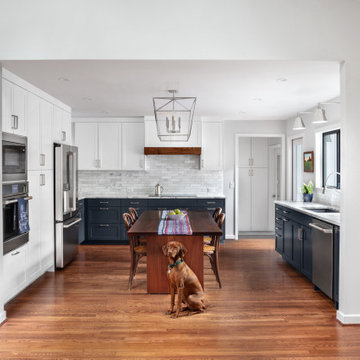
 Jameson Design Group
Inspiration for a mid-sized transitional u-shaped medium tone wood floor and brown floor eat-in kitchen remodel in Austin with a single-bowl sink, shaker cabinets, blue cabinets, quartzite countertops, gray backsplash, marble backsplash, stainless steel appliances, no island and gray countertops
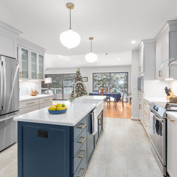
 Reico Kitchen & Bath
Emma Gerancher from Reico Kitchen & Bath in Charlottesville, VA, partnered with Luis Dorta of LED Construction to design a transitional kitchen featuring Masterpiece cabinetry. The kitchen includes the Barton door style in a Cottage finish for the perimeter and a custom Sherwin-Williams Mount Etna painted finish for the island.
The space also features MSI W Calacatta Safyra countertops, along with a Frigidaire canopy hood and microwave.
The client shared, “Gutting our old kitchen to reconfigure the space for better flow, workspace, and storage was a challenge. Emma listened to my needs and offered helpful tips and options, which made the process work. The layout followed the workflow, and my habits and style guided the final details. Reico gave me the options and confidence to trust the process, and the outcome is seamless and beautiful.”
Emma explained, “This kitchen is one of my favorites. The homeowners wanted to replace the peninsula with a custom painted island in Sherwin-Williams Mount Etna, which paired well with the Cottage perimeter cabinets, Calacatta Safyra countertops, sea glass backsplash, and honey bronze hardware. It was a pleasure working with both the homeowners and the contractors throughout the remodel.”
Photos courtesy of Regarday, LLC.
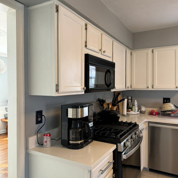
 Synergy Design & Construction
Before: In the original kitchen, the oven was awkwardly positioned on one side of the wall that separated the kitchen from the dining room. This placement further emphasized the cramped and segmented nature of the space, making meal prep inconvenient and limiting the kitchen's workflow. With the oven taking up valuable counter space and lacking nearby cabinetry, the area felt inefficient and cluttered, leaving minimal room for storage and functional use.
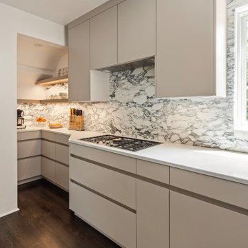 Leicht Westchester-Greenwich
Designer: Lance Marceaux
Materials:
Advance Miro Mohair
Synthia Japanese Pine
Countertops:
Emerstone Calacata Sereno Quartz
Backsplash:
Arabescato Corchia honed marble
Appliances:
All Miele
Storage & Organization Enhancements
The new kitchen German engineered kitchen was designed to be efficient and function seamlessly for both everyday family routines and for small and large gatherings. Storage was maximized and dedicated task zones established to optimize workflow throughout the reimagined 1925 Tudor home. The peninsula provides casual countertop seating, and graciously defines the kitchen area from the living space, keeping sight lines open and airy.
The area beneath the staircase was skillsfully customized to extend the kitchen work space and provide even more storage solutions.
The upper wall and lower base cabinetry features the Miro line in Mohair, which introduces a soft, earthy tone to the perimeter walls. This is balanced by the tall cabinet units that showcase the Synthia line in Japanese Pine, bringing a warm wood-textured elegance to the vertical spaces. Both collections incorporate the Advance handleless system, seamlessly blending clean architectural beauty with everyday functionality.
The design is further complemented by carefully curated stone surfaces. The soft Emerstone Calacata Sereno quartz countertops alongside a striking Arabescato Corchia honed marble backsplash, adds natural movement and luxury. To complete the culinary design, premium Miele appliances are used.
 Drury Design
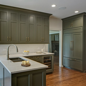
Design objectives for the remodel were aimed at maximizing the flow and functionality of a foodie-level kitchen with multiple cooks, while enhancing the family’s preferences for spending time in the space together:
Create a better workflow
Space out the appliances for better use of the kitchen area
Make the space feel larger visually
Update all materials so the kitchen isn’t all wood
No seating at an island or peninsula
Larger walkways
Brighten up the space with more lights and lighter colors
THE REMODEL
Design challenges to be solved:
The idea was to work within the current walls of the kitchen. Without removing walls, it was more of a challenge to give the kitchen a larger, new feel.
An island in the middle area was part of the original vision. Could a different countertop arrangement incorporate the same purpose?
The homeowners are big cooks so creating room for a larger refrigerator and more countertop space by the range were musts!
The sink and range were originally right next to each other, making things tough for two cooks to work at the same time. How could the new space allow for two work areas while minimizing traffic jams?
THE RENEWED SPACE
Design solutions fell into place once the overall layout was revamped to improve flow and functionality:
The refrigerator was originally in the middle of the main walkway. To gain more walk space and room for a larger refrigerator, we moved this appliance to the back wall.
The final design still has a peninsula but we flipped it to the opposite wall. This way, the walkway is more accommodating for traffic entering and exiting through the back garage door. This also gave way to a longer run of countertop space along the cooking wall.
To take cooking to another level, we implemented a speed oven!
The large window by the eating area is also nice for cooks to see, so we kept the sink in the peninsula.
To gain space for storage and make the kitchen feel larger, we brought the wall cabinets all the way to the ceiling. What once felt tight now feels grand!
 Til Mar Design Inc.
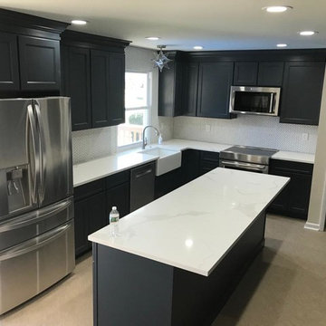
After! Efficient. New kitchen layout designed to increase efficiency in work-space and workflow., Calcutta Quartz countertop with white herringbone back-splash with silver grout and Black cabinetry.
 7 Day Kitchens
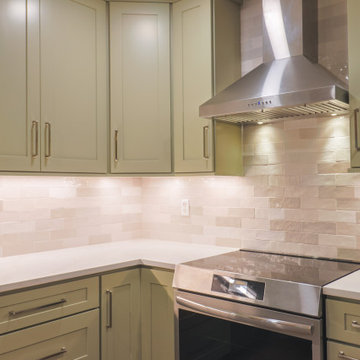
Functionality was a key priority throughout the project. The updated layout improves workflow, while integrated storage solutions maximize usability without adding visual clutter. The result is a space that feels open, efficient, and easy to live in. The overall design balances modern simplicity with subtle warmth through elements like shaker cabinetry and natural flooring, preventing the space from feeling overly stark. This kitchen reflects a clear shift toward a more modern aesthetic while maintaining the comfort and familiarity that define transitional design.
51