
Search results for "Youporn same origin" in Home Design Ideas
 StudioLAB
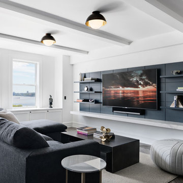
Across from Hudson River Park, the Classic 7 pre-war apartment had not renovated in over 50 years. The new owners, a young family with two kids, desired to open up the existing closed in spaces while keeping some of the original, classic pre-war details. Dark, dimly-lit corridors and clustered rooms that were a detriment to the brilliant natural light and expansive views the existing apartment inherently possessed, were demolished to create a new open plan for a more functional style of living. Custom charcoal stained white oak herringbone floors were laid throughout the space. The dark blue lacquered kitchen cabinets provide a sharp contrast to the otherwise neutral colored space. A wall unit in the same blue lacquer floats on the wall in the Den.
 Artistic Renovations of Ohio LLC
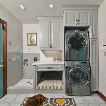
this dog wash is a great place to clean up your pets and give them the spa treatment they deserve. There is even an area to relax for your pet under the counter in the padded cabinet.
 TVL Creative Ltd.
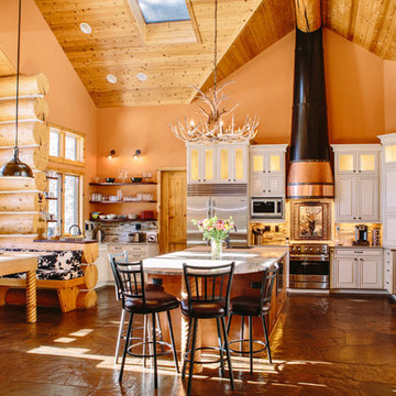
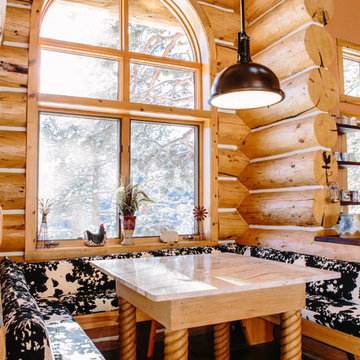
This project's final result exceeded even our vision for the space! This kitchen is part of a stunning traditional log home in Evergreen, CO. The original kitchen had some unique touches, but was dated and not a true reflection of our client. The existing kitchen felt dark despite an amazing amount of natural light, and the colors and textures of the cabinetry felt heavy and expired. The client wanted to keep with the traditional rustic aesthetic that is present throughout the rest of the home, but wanted a much brighter space and slightly more elegant appeal. Our scope included upgrades to just about everything: new semi-custom cabinetry, new quartz countertops, new paint, new light fixtures, new backsplash tile, and even a custom flue over the range. We kept the original flooring in tact, retained the original copper range hood, and maintained the same layout while optimizing light and function. The space is made brighter by a light cream primary cabinetry color, and additional feature lighting everywhere including in cabinets, under cabinets, and in toe kicks. The new kitchen island is made of knotty alder cabinetry and topped by Cambria quartz in Oakmoor. The dining table shares this same style of quartz and is surrounded by custom upholstered benches in Kravet's Cowhide suede. We introduced a new dramatic antler chandelier at the end of the island as well as Restoration Hardware accent lighting over the dining area and sconce lighting over the sink area open shelves. We utilized composite sinks in both the primary and bar locations, and accented these with farmhouse style bronze faucets. Stacked stone covers the backsplash, and a handmade elk mosaic adorns the space above the range for a custom look that is hard to ignore. We finished the space with a light copper paint color to add extra warmth and finished cabinetry with rustic bronze hardware. This project is breathtaking and we are so thrilled our client can enjoy this kitchen for many years to come!
Find the right local pro for your project
 Klopf Architecture
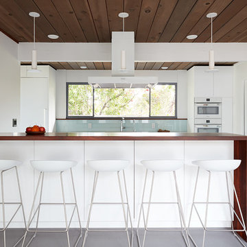
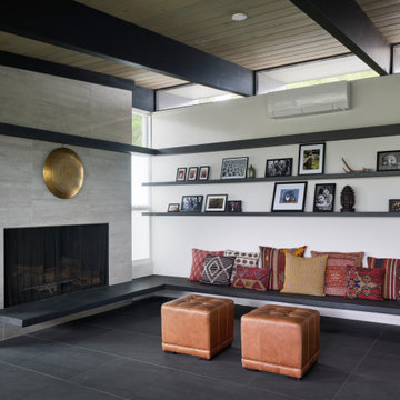
Klopf Architecture and Jesse Ososki Art remodeled an existing Eichler atrium home into a brighter, more open, and more functional version of its original self.
The goals were to preserve the Eichler look and feel without the need to strictly adhere to it. The scope of work included re-configuring the master bedroom/bath, the kitchen, and the hall bath/laundry area, as well as updating interior finishes throughout to be more sophisticated.
The owners are detail-oriented and were very involved in the design process, down to the selection of lighting controls and stainless steel faceplates.Their design aesthetic leans toward the Scandinavian — light and bright, with simple straight lines and pure geometric shapes.
The finish flooring is large porcelain tile (24” x 24”) in a neutral grey tone, providing a uniform backdrop against which other materials can stand out. The same tile continues into the shower floor (with a different finish texture for slip-resistance) and up the shower/tub walls (in a smaller size). Heath Classic Field ceramic tile in Modern Blue was used sparingly, to add color at the hall bath vanity backsplash and at the shampoo niches in both bathrooms. Back-painted soda glass in pale blue to match the Heath tile was used at the kitchen backsplash. This same accent color was also used at the front entry atrium door. Kitchen cabinetry, countertops, appliances, and light fixtures are all white, making the kitchen feel more airy and light. Countertops are Caesarstone Blizzard.
The owners chose to keep some of the original Eichler elements: the concrete masonry fireplace; the stained tongue-and-groove redwood ceiling decking; and the luan wall paneling. The luan paneling was lightly sanded, cleaned, and re-stained. The owners also kept an added element that was installed by a previous owner: sliding shoji panels at all bedroom windows and sliding glass doors, for both privacy and sun control. Grooves were cut into the new tile flooring for the shoji panels to slide in, creating a more integrated look. Walnut was used to add warmth and contrast at the kitchen bar top and niche, the bathroom vanities, and the window sill/ledge under the kitchen window.
This Burlingame Eichler Remodel is a 2,121 sf, 4 bedroom/2 bath home located in the heart of Silicon Valley.
Klopf Architecture Project Team: John Klopf, Klara Kevane and Yegvenia Torres Zavala
Contractor: Jesse Ososki Art
Structural Engineer: Emmanuel Pun
Photography ©2018 Mariko Reed
Location: Burlingame, CA
Year completed: 2017
 Klopf Architecture
Set in a quiet neighborhood and framed by mature trees, this residence presented a unique opportunity: to thoughtfully evolve a custom mid-century modern home into a space that supports the everyday rhythms of a growing family. With a deep respect for the home’s original architecture, Klopf Architecture reimagined the house to better meet the needs of its owners—introducing functional improvements while preserving the spirit and character of its mid-century roots.
The clients approached Klopf Architecture with a clear vision: refresh their home while seamlessly integrating new programmatic elements. Key goals included clarifying and enhancing the entry sequence; connecting the detached garage to the main house with a practical yet architecturally intentional intervention; adding functional spaces such as a mudroom and laundry room; expanding and remodeling the primary suite’s bathroom and closet; and creating a more engaging outdoor space that capitalized on the site’s impressive views, featuring a fire pit and outdoor kitchen.
As a couple with distinct yet complementary perspectives—one focused on modern functionality and technology, and the other dedicated to preserving the home’s architectural integrity—their collaboration with Klopf Architecture resulted in a solution that harmonized both ideals. Their shared commitment to improving the livability of their home led to a design dialogue rooted in balance. This dynamic partnership shaped the direction of the renovation, ensuring that every decision honored the spirit of the original home while aligning with the practical needs of their growing family.
Designing within the constraints of the sloped site posed one of the project’s central challenges. The detached garage sat at a higher elevation than the main house, requiring a solution that ensured architectural and geometric compatibility between the two structures. Rather than create a purely utilitarian link, Klopf Architecture introduced an intentional connection that contributes to the overall architectural language. A notable pinch point in the plan—where differing geometries converged—was treated as a hinge point, turning a potentially awkward juncture into an architectural feature. This area now functions as both a transition and a moment of design interest that unifies the overall plan.
The design also addressed the underutilized outdoor area, which was located in a shadowed portion of the site with geometrical limitations. A new connection to the rear deck was created in this same area, making the outdoor space more useful and inviting. Klopf Architecture introduced carefully positioned openings and spatial improvements that forged a strong visual and functional connection between indoor and outdoor spaces. The outdoor area now reads as a deliberate extension of the home, embracing natural light and emphasizing the dramatic views.
Working through multiple design iterations, Klopf Architecture crafted a solution that preserved the architectural language of the original home while supporting the functional needs of modern life. The garage-to-house connection became more than a passage—it evolved into an architectural moment of transition. A new mudroom and laundry space enhanced convenience without compromising the clean lines of the design. The primary suite was expanded to create a private, serene retreat. The reimagined backyard, complete with fire pit and kitchen, now plays a vital role in the family’s daily routine and social life.
Outcomes and Lasting Impact
The result is a home that balances heritage with contemporary design, technical precision with design sensibility. The redesign not only met the clients’ initial goals but also exceeded expectations in its ability to seamlessly blend past and present, function and beauty, making the outdoor kitchen a favorite gathering place.
Beyond aesthetics, the renovation has significantly improved daily life for the family. The newly integrated garage connection has streamlined routines, providing a seamless transition between arriving home, storing belongings, and entering the main living spaces. The expanded primary suite offers a retreat-like atmosphere, creating a private space to unwind at the end of the day. The redesigned outdoor areas have also become an extension of their lifestyle—whether it's casual family dinners around the fire pit, entertaining friends in the outdoor kitchen, or simply enjoying the view from the reimagined backyard.
Through a thoughtful and strategic approach, the house has been successfully evolved into a home that remains true to its mid-century modern roots while enhancing livability, functionality, and the overall quality of life for the modern-day owners.
Klopf Architecture Team: Geoffrey Campen, Fernanda Bernardes
Architectural Interior Design: Klopf Architecture
Structural Engineer: Base Design Inc.
Contractor: Golden Snail Builders
Photography: Mariko Reed
Year Completed:2022
 TVL Creative Ltd.
This project's final result exceeded even our vision for the space! This kitchen is part of a stunning traditional log home in Evergreen, CO. The original kitchen had some unique touches, but was dated and not a true reflection of our client. The existing kitchen felt dark despite an amazing amount of natural light, and the colors and textures of the cabinetry felt heavy and expired. The client wanted to keep with the traditional rustic aesthetic that is present throughout the rest of the home, but wanted a much brighter space and slightly more elegant appeal. Our scope included upgrades to just about everything: new semi-custom cabinetry, new quartz countertops, new paint, new light fixtures, new backsplash tile, and even a custom flue over the range. We kept the original flooring in tact, retained the original copper range hood, and maintained the same layout while optimizing light and function. The space is made brighter by a light cream primary cabinetry color, and additional feature lighting everywhere including in cabinets, under cabinets, and in toe kicks. The new kitchen island is made of knotty alder cabinetry and topped by Cambria quartz in Oakmoor. The dining table shares this same style of quartz and is surrounded by custom upholstered benches in Kravet's Cowhide suede. We introduced a new dramatic antler chandelier at the end of the island as well as Restoration Hardware accent lighting over the dining area and sconce lighting over the sink area open shelves. We utilized composite sinks in both the primary and bar locations, and accented these with farmhouse style bronze faucets. Stacked stone covers the backsplash, and a handmade elk mosaic adorns the space above the range for a custom look that is hard to ignore. We finished the space with a light copper paint color to add extra warmth and finished cabinetry with rustic bronze hardware. This project is breathtaking and we are so thrilled our client can enjoy this kitchen for many years to come!
 Soucie Horner, Ltd.
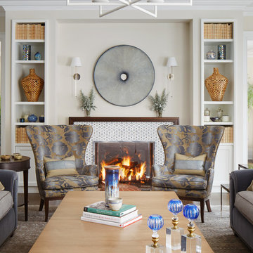
A fresh take on traditional style, this sprawling suburban home draws its occupants together in beautifully, comfortably designed spaces that gather family members for companionship, conversation, and conviviality. At the same time, it adroitly accommodates a crowd, and facilitates large-scale entertaining with ease. This balance of private intimacy and public welcome is the result of Soucie Horner’s deft remodeling of the original floor plan and creation of an all-new wing comprising functional spaces including a mudroom, powder room, laundry room, and home office, along with an exciting, three-room teen suite above. A quietly orchestrated symphony of grayed blues unites this home, from Soucie Horner Collections custom furniture and rugs, to objects, accessories, and decorative exclamationpoints that punctuate the carefully synthesized interiors. A discerning demonstration of family-friendly living at its finest.

Sponsored
Delaware, OH

Buckeye Basements, Inc.
Central Ohio's Basement Finishing ExpertsBest Of Houzz '13-'21
 Klopf Architecture
Set in a quiet neighborhood and framed by mature trees, this residence presented a unique opportunity: to thoughtfully evolve a custom mid-century modern home into a space that supports the everyday rhythms of a growing family. With a deep respect for the home’s original architecture, Klopf Architecture reimagined the house to better meet the needs of its owners—introducing functional improvements while preserving the spirit and character of its mid-century roots.
The clients approached Klopf Architecture with a clear vision: refresh their home while seamlessly integrating new programmatic elements. Key goals included clarifying and enhancing the entry sequence; connecting the detached garage to the main house with a practical yet architecturally intentional intervention; adding functional spaces such as a mudroom and laundry room; expanding and remodeling the primary suite’s bathroom and closet; and creating a more engaging outdoor space that capitalized on the site’s impressive views, featuring a fire pit and outdoor kitchen.
As a couple with distinct yet complementary perspectives—one focused on modern functionality and technology, and the other dedicated to preserving the home’s architectural integrity—their collaboration with Klopf Architecture resulted in a solution that harmonized both ideals. Their shared commitment to improving the livability of their home led to a design dialogue rooted in balance. This dynamic partnership shaped the direction of the renovation, ensuring that every decision honored the spirit of the original home while aligning with the practical needs of their growing family.
Designing within the constraints of the sloped site posed one of the project’s central challenges. The detached garage sat at a higher elevation than the main house, requiring a solution that ensured architectural and geometric compatibility between the two structures. Rather than create a purely utilitarian link, Klopf Architecture introduced an intentional connection that contributes to the overall architectural language. A notable pinch point in the plan—where differing geometries converged—was treated as a hinge point, turning a potentially awkward juncture into an architectural feature. This area now functions as both a transition and a moment of design interest that unifies the overall plan.
The design also addressed the underutilized outdoor area, which was located in a shadowed portion of the site with geometrical limitations. A new connection to the rear deck was created in this same area, making the outdoor space more useful and inviting. Klopf Architecture introduced carefully positioned openings and spatial improvements that forged a strong visual and functional connection between indoor and outdoor spaces. The outdoor area now reads as a deliberate extension of the home, embracing natural light and emphasizing the dramatic views.
Working through multiple design iterations, Klopf Architecture crafted a solution that preserved the architectural language of the original home while supporting the functional needs of modern life. The garage-to-house connection became more than a passage—it evolved into an architectural moment of transition. A new mudroom and laundry space enhanced convenience without compromising the clean lines of the design. The primary suite was expanded to create a private, serene retreat. The reimagined backyard, complete with fire pit and kitchen, now plays a vital role in the family’s daily routine and social life.
Outcomes and Lasting Impact
The result is a home that balances heritage with contemporary design, technical precision with design sensibility. The redesign not only met the clients’ initial goals but also exceeded expectations in its ability to seamlessly blend past and present, function and beauty, making the outdoor kitchen a favorite gathering place.
Beyond aesthetics, the renovation has significantly improved daily life for the family. The newly integrated garage connection has streamlined routines, providing a seamless transition between arriving home, storing belongings, and entering the main living spaces. The expanded primary suite offers a retreat-like atmosphere, creating a private space to unwind at the end of the day. The redesigned outdoor areas have also become an extension of their lifestyle—whether it's casual family dinners around the fire pit, entertaining friends in the outdoor kitchen, or simply enjoying the view from the reimagined backyard.
Through a thoughtful and strategic approach, the house has been successfully evolved into a home that remains true to its mid-century modern roots while enhancing livability, functionality, and the overall quality of life for the modern-day owners.
Klopf Architecture Team: Geoffrey Campen, Fernanda Bernardes
Architectural Interior Design: Klopf Architecture
Structural Engineer: Base Design Inc.
Contractor: Golden Snail Builders
Photography: Mariko Reed
Year Completed:2022
 Soucie Horner, Ltd.
A fresh take on traditional style, this sprawling suburban home draws its occupants together in beautifully, comfortably designed spaces that gather family members for companionship, conversation, and conviviality. At the same time, it adroitly accommodates a crowd, and facilitates large-scale entertaining with ease. This balance of private intimacy and public welcome is the result of Soucie Horner’s deft remodeling of the original floor plan and creation of an all-new wing comprising functional spaces including a mudroom, powder room, laundry room, and home office, along with an exciting, three-room teen suite above. A quietly orchestrated symphony of grayed blues unites this home, from Soucie Horner Collections custom furniture and rugs, to objects, accessories, and decorative exclamationpoints that punctuate the carefully synthesized interiors. A discerning demonstration of family-friendly living at its finest.
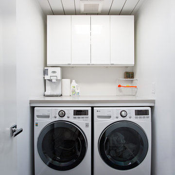 Klopf Architecture
Inspiration for a small 1950s single-wall black floor dedicated laundry room remodel in San Francisco with flat-panel cabinets, white cabinets, white walls, a side-by-side washer/dryer and gray countertops
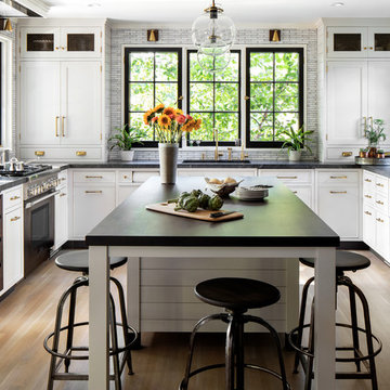
 Studio Dearborn
INTERNATIONAL AWARD WINNER. 2018 NKBA Design Competition Best Overall Kitchen. 2018 TIDA International USA Kitchen of the Year. 2018 Best Traditional Kitchen - Westchester Home Magazine design awards.
The designer's own kitchen was gutted and renovated in 2017, with a focus on classic materials and thoughtful storage. The 1920s craftsman home has been in the family since 1940, and every effort was made to keep finishes and details true to the original construction. For sources, please see the website at www.studiodearborn.com. Photography, Adam Kane Macchia and Timothy Lenz
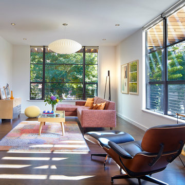
 ODS Architecture
Originally a nearly three-story tall 1920’s European-styled home was turned into a modern villa for work and home. A series of low concrete retaining wall planters and steps gradually takes you up to the second level entry, grounding or anchoring the house into the site, as does a new wrap around veranda and trellis. Large eave overhangs on the upper roof were designed to give the home presence and were accented with a Mid-century orange color. The new master bedroom addition white box creates a better sense of entry and opens to the wrap around veranda at the opposite side. Inside the owners live on the lower floor and work on the upper floor with the garage basement for storage, archives and a ceramics studio. New windows and open spaces were created for the graphic designer owners; displaying their mid-century modern furnishings collection.
A lot of effort went into attempting to lower the house visually by bringing the ground plane higher with the concrete retaining wall planters, steps, wrap around veranda and trellis, and the prominent roof with exaggerated overhangs. That the eaves were painted orange is a cool reflection of the owner’s Dutch heritage. Budget was a driver for the project and it was determined that the footprint of the home should have minimal extensions and that the new windows remain in the same relative locations as the old ones. Wall removal was utilized versus moving and building new walls where possible.
Photo Credit: John Sutton Photography.
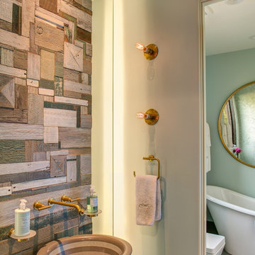
 Selle Valley Construction, Inc.
Custom layered quartz vessel sink with Kohler Purist wall mounted faucet, and the reclaimed patchwork wood wall complete this bathroom in the laundry room. The one-piece Kohler Reve dual flush toilet and Americh International Emperor freestanding tub can be seen in the background. Flooring and trim is the same Pennsylvania bluestone tiles from the entry way and laundry room. Photography by Marie-Dominique Verdier.

Sponsored
Sunbury, OH

J.Holderby - Renovations
Franklin County's Leading General Contractors - 2X Best of Houzz!
 Klopf Architecture
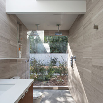
Klopf Architecture, Arterra Landscape Architects, and Flegels Construction updated a classic Eichler open, indoor-outdoor home. Expanding on the original walls of glass and connection to nature that is common in mid-century modern homes. The completely openable walls allow the homeowners to truly open up the living space of the house, transforming it into an open air pavilion, extending the living area outdoors to the private side yards, and taking maximum advantage of indoor-outdoor living opportunities. Taking the concept of borrowed landscape from traditional Japanese architecture, the fountain, concrete bench wall, and natural landscaping bound the indoor-outdoor space. The Truly Open Eichler is a remodeled single-family house in Palo Alto. This 1,712 square foot, 3 bedroom, 2.5 bathroom is located in the heart of the Silicon Valley.
Klopf Architecture Project Team: John Klopf, AIA, Geoff Campen, and Angela Todorova
Landscape Architect: Arterra Landscape Architects
Structural Engineer: Brian Dotson Consulting Engineers
Contractor: Flegels Construction
Photography ©2014 Mariko Reed
Location: Palo Alto, CA
Year completed: 2014
 Donald Lococo Architects
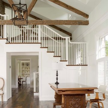
Located on farmland in McLean, Virginia, the American Farmhouse balances the expected comforts of a new home with the bucolic beauty of an old farmhouse. The final site plan still has evidence showing parallel courses of the barn’s destiny. The house mass is broken and lowered so that the home can remain secondary to the monolithic barn structure. Earthy and elemental materials are selected for the home that reference the barn without directly mimicking it. Wooden members found inside the barn and from other barns bridge ceilings and are used in floors along with rustic slate adding to a sense of simplicity to the farmhouse design.
The age and patina of the barn is reflected in the house’s textural use of board and batten and field stone layered similar to stone foundations. The original development plan was to demolish the existing barn and construct three suburban homes. Part of an endangered breed, as one of the few remaining barns in the area, it was originally viewed as a challenge in a luxury home construction with several difficulties posed to the impending project: it would be expensive to renovate, vulnerable to demolition, and threatened by urban sprawl. However, instead of trying to alter or destroy the barn, the structure was fully embraced into the traditional architecture project as a centerpiece and was used as the inspiration for the home. The new house was sited parallel to the barn so that views to the barn gable were accessible.
 Adrienne DeRosa
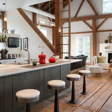
Tucked neatly into an existing bay of the barn, the open kitchen is a comfortable hub of the home. Rather than create a solid division between the kitchen and the children's TV area, Franklin finished only the lower portion of the post-and-beam supports.
The ladder is one of the original features of the barn that Franklin could not imagine ever removing. Cleverly integrated into the support post, its original function allowed workers to climb above large haystacks and pick and toss hay down a chute to the feeding area below. Franklin's children, 10 and 14, also enjoy this aspect of their home. "The kids and their friends run, slide, climb up the ladder and have a ton of fun," he explains, "It’s a barn! It is a place to share with friends and family."
Adrienne DeRosa Photography
 Flavin Architects
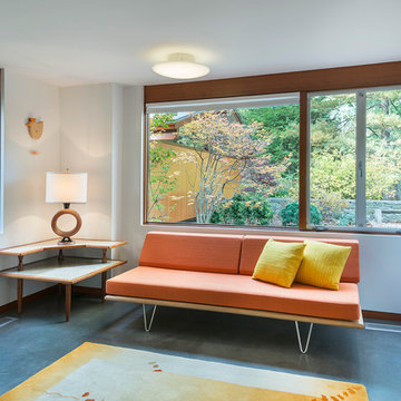
This house west of Boston was originally designed in 1958 by the great New England modernist, Henry Hoover. He built his own modern home in Lincoln in 1937, the year before the German émigré Walter Gropius built his own world famous house only a few miles away. By the time this 1958 house was built, Hoover had matured as an architect; sensitively adapting the house to the land and incorporating the clients wish to recreate the indoor-outdoor vibe of their previous home in Hawaii.
The house is beautifully nestled into its site. The slope of the roof perfectly matches the natural slope of the land. The levels of the house delicately step down the hill avoiding the granite ledge below. The entry stairs also follow the natural grade to an entry hall that is on a mid level between the upper main public rooms and bedrooms below. The living spaces feature a south- facing shed roof that brings the sun deep in to the home. Collaborating closely with the homeowner and general contractor, we freshened up the house by adding radiant heat under the new purple/green natural cleft slate floor. The original interior and exterior Douglas fir walls were stripped and refinished.
Photo by: Nat Rea Photography

Sponsored
Columbus, OH

Wannemacher Interiors
Customized Award-Winning Interior Design Solutions in Franklin Cnty OH
 Haycon Inc.
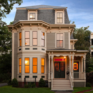
The Philip Munroe Residence consisted of the restoration and rehabilitation of the House to the standards set by the National Park Service, the Massachusetts Historical Commission, and the Mid Cambridge Neighborhood Conservation District Commission. The internal decorative stairwells, Queen Anne windows, interior and exterior doors, slate roof, and ornamental features were preserved. Replacement items such as windows and clapboards were reproduced with the same materials and specifications as those on the building when it was originally built in 1887.
 Allen Construction
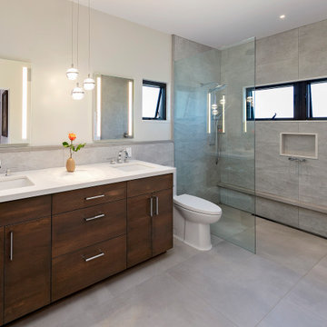
The original house was demolished to make way for a two-story house on the sloping lot, with an accessory dwelling unit below. The upper level of the house, at street level, has three bedrooms, a kitchen and living room. The “great room” opens onto an ocean-view deck through two large pocket doors. The master bedroom can look through the living room to the same view. The owners, acting as their own interior designers, incorporated lots of color with wallpaper accent walls in each bedroom, and brilliant tiles in the bathrooms, kitchen, and at the fireplace tiles in the bathrooms, kitchen, and at the fireplace.
Architect: Thompson Naylor Architects
Photographs: Jim Bartsch Photographer
 ODS Architecture
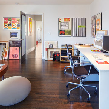
Originally a nearly three-story tall 1920’s European-styled home was turned into a modern villa for work and home. A series of low concrete retaining wall planters and steps gradually takes you up to the second level entry, grounding or anchoring the house into the site, as does a new wrap around veranda and trellis. Large eave overhangs on the upper roof were designed to give the home presence and were accented with a Mid-century orange color. The new master bedroom addition white box creates a better sense of entry and opens to the wrap around veranda at the opposite side. Inside the owners live on the lower floor and work on the upper floor with the garage basement for storage, archives and a ceramics studio. New windows and open spaces were created for the graphic designer owners; displaying their mid-century modern furnishings collection.
A lot of effort went into attempting to lower the house visually by bringing the ground plane higher with the concrete retaining wall planters, steps, wrap around veranda and trellis, and the prominent roof with exaggerated overhangs. That the eaves were painted orange is a cool reflection of the owner’s Dutch heritage. Budget was a driver for the project and it was determined that the footprint of the home should have minimal extensions and that the new windows remain in the same relative locations as the old ones. Wall removal was utilized versus moving and building new walls where possible.
Photo Credit: John Sutton Photography.
4