
Search results for "Small split foyer homes" in Home Design Ideas
 TVL Creative Ltd.
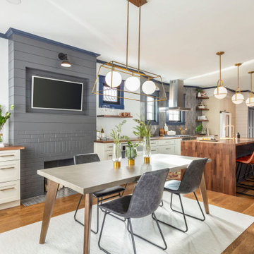
This 1910 West Highlands home was so compartmentalized that you couldn't help to notice you were constantly entering a new room every 8-10 feet. There was also a 500 SF addition put on the back of the home to accommodate a living room, 3/4 bath, laundry room and back foyer - 350 SF of that was for the living room. Needless to say, the house needed to be gutted and replanned.
Kitchen+Dining+Laundry-Like most of these early 1900's homes, the kitchen was not the heartbeat of the home like they are today. This kitchen was tucked away in the back and smaller than any other social rooms in the house. We knocked out the walls of the dining room to expand and created an open floor plan suitable for any type of gathering. As a nod to the history of the home, we used butcherblock for all the countertops and shelving which was accented by tones of brass, dusty blues and light-warm greys. This room had no storage before so creating ample storage and a variety of storage types was a critical ask for the client. One of my favorite details is the blue crown that draws from one end of the space to the other, accenting a ceiling that was otherwise forgotten.
Primary Bath-This did not exist prior to the remodel and the client wanted a more neutral space with strong visual details. We split the walls in half with a datum line that transitions from penny gap molding to the tile in the shower. To provide some more visual drama, we did a chevron tile arrangement on the floor, gridded the shower enclosure for some deep contrast an array of brass and quartz to elevate the finishes.
Powder Bath-This is always a fun place to let your vision get out of the box a bit. All the elements were familiar to the space but modernized and more playful. The floor has a wood look tile in a herringbone arrangement, a navy vanity, gold fixtures that are all servants to the star of the room - the blue and white deco wall tile behind the vanity.
Full Bath-This was a quirky little bathroom that you'd always keep the door closed when guests are over. Now we have brought the blue tones into the space and accented it with bronze fixtures and a playful southwestern floor tile.
Living Room & Office-This room was too big for its own good and now serves multiple purposes. We condensed the space to provide a living area for the whole family plus other guests and left enough room to explain the space with floor cushions. The office was a bonus to the project as it provided privacy to a room that otherwise had none before.
 Carstensen Homes
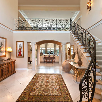
Grand Foyer with open rod-iron stair case and marble columns.
Inspiration for a mediterranean ceramic tile and beige floor foyer remodel in Milwaukee with beige walls
Inspiration for a mediterranean ceramic tile and beige floor foyer remodel in Milwaukee with beige walls
 Housing First Minnesota
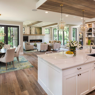
Builder: Great Neighborhood Homes
Artisan Home Tour 2016
Transitional light wood floor open concept kitchen photo in Minneapolis with an undermount sink, shaker cabinets, white cabinets, black backsplash and an island
Transitional light wood floor open concept kitchen photo in Minneapolis with an undermount sink, shaker cabinets, white cabinets, black backsplash and an island
Find the right local pro for your project
 Visbeen Architects
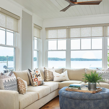
This cozy lake cottage skillfully incorporates a number of features that would normally be restricted to a larger home design. A glance of the exterior reveals a simple story and a half gable running the length of the home, enveloping the majority of the interior spaces. To the rear, a pair of gables with copper roofing flanks a covered dining area that connects to a screened porch. Inside, a linear foyer reveals a generous staircase with cascading landing. Further back, a centrally placed kitchen is connected to all of the other main level entertaining spaces through expansive cased openings. A private study serves as the perfect buffer between the homes master suite and living room. Despite its small footprint, the master suite manages to incorporate several closets, built-ins, and adjacent master bath complete with a soaker tub flanked by separate enclosures for shower and water closet. Upstairs, a generous double vanity bathroom is shared by a bunkroom, exercise space, and private bedroom. The bunkroom is configured to provide sleeping accommodations for up to 4 people. The rear facing exercise has great views of the rear yard through a set of windows that overlook the copper roof of the screened porch below.
Builder: DeVries & Onderlinde Builders
Interior Designer: Vision Interiors by Visbeen
Photographer: Ashley Avila Photography
 Pamela Harvey Interiors
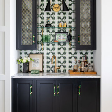
Our St. Pete studio designed this stunning pied-à-terre for a couple looking for a luxurious retreat in the city. Our studio went all out with colors, textures, and materials that evoke five-star luxury and comfort in keeping with their request for a resort-like home with modern amenities. In the vestibule that the elevator opens to, we used a stylish black and beige palm leaf patterned wallpaper that evokes the joys of Gulf Coast living. In the adjoining foyer, we used stylish wainscoting to create depth and personality to the space, continuing the millwork into the dining area.
We added bold emerald green velvet chairs in the dining room, giving them a charming appeal. A stunning chandelier creates a sharp focal point, and an artistic fawn sculpture makes for a great conversation starter around the dining table. We ensured that the elegant green tone continued into the stunning kitchen and cozy breakfast nook through the beautiful kitchen island and furnishings. In the powder room, too, we went with a stylish black and white wallpaper and green vanity, which adds elegance and luxe to the space. In the bedrooms, we used a calm, neutral tone with soft furnishings and light colors that induce relaxation and rest.
---
Pamela Harvey Interiors offers interior design services in St. Petersburg and Tampa, and throughout Florida's Suncoast area, from Tarpon Springs to Naples, including Bradenton, Lakewood Ranch, and Sarasota.
For more about Pamela Harvey Interiors, see here: https://www.pamelaharveyinteriors.com/
To learn more about this project, see here:
https://www.pamelaharveyinteriors.com/portfolio-galleries/chic-modern-sarasota-condo
 Donald Lococo Architects
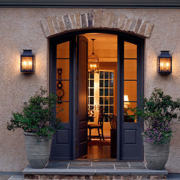
Situated in Kenwood, Maryland just outside of Washington, D.C., this whole-house renovation reinterprets a 1950s split-level into a rustic French country house. Published 3 times, The French country house plans for this renovation inform and guide the remodel. Short double-hung existing windows of various sizes on a 1950s brick front wall (see below) were replaced by straightforward openings along the front facade. By replacing them with a series of similar openings, the end result is a principled, simple elegance inspired by French country style homes. The rustic application of field stone arches and rough stucco are both inviting and enchanting, echoing French country interior design.
Elements of French country home decor complement the home. The traditional French country home design has been widely published, including features in Renovation Style and Maryland Life magazines, among others. One singular continuous walkway runs the entire length of the main front under each of the French doors, and a courtyard created by stucco walls and stone piers create an inner sanctum in the front yard. In the back of the property, added French gates lead to a newly constructed pavilion.
 The Guest House Studio, ASID
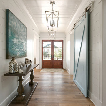
Entrance to this home features ship lap walls & ceilings that are off set with a brilliant blue barn door and abstract ocean theme art.
Photography by Patrick Brickman
Sponsored
Sunbury, OH

J.Holderby - Renovations
Franklin County's Leading General Contractors - 2X Best of Houzz!
 TVL Creative Ltd.
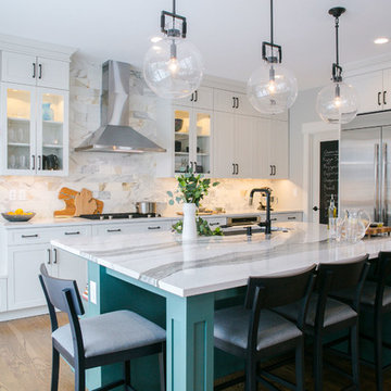
Our clients had just recently closed on their new house in Stapleton and were excited to transform it into their perfect forever home. They wanted to remodel the entire first floor to create a more open floor plan and develop a smoother flow through the house that better fit the needs of their family. The original layout consisted of several small rooms that just weren’t very functional, so we decided to remove the walls that were breaking up the space and restructure the first floor to create a wonderfully open feel.
After removing the existing walls, we rearranged their spaces to give them an office at the front of the house, a large living room, and a large dining room that connects seamlessly with the kitchen. We also wanted to center the foyer in the home and allow more light to travel through the first floor, so we replaced their existing doors with beautiful custom sliding doors to the back yard and a gorgeous walnut door with side lights to greet guests at the front of their home.
Living Room
Our clients wanted a living room that could accommodate an inviting sectional, a baby grand piano, and plenty of space for family game nights. So, we transformed what had been a small office and sitting room into a large open living room with custom wood columns. We wanted to avoid making the home feel too vast and monumental, so we designed custom beams and columns to define spaces and to make the house feel like a home. Aesthetically we wanted their home to be soft and inviting, so we utilized a neutral color palette with occasional accents of muted blues and greens.
Dining Room
Our clients were also looking for a large dining room that was open to the rest of the home and perfect for big family gatherings. So, we removed what had been a small family room and eat-in dining area to create a spacious dining room with a fireplace and bar. We added custom cabinetry to the bar area with open shelving for displaying and designed a custom surround for their fireplace that ties in with the wood work we designed for their living room. We brought in the tones and materiality from the kitchen to unite the spaces and added a mixed metal light fixture to bring the space together
Kitchen
We wanted the kitchen to be a real show stopper and carry through the calm muted tones we were utilizing throughout their home. We reoriented the kitchen to allow for a big beautiful custom island and to give us the opportunity for a focal wall with cooktop and range hood. Their custom island was perfectly complimented with a dramatic quartz counter top and oversized pendants making it the real center of their home. Since they enter the kitchen first when coming from their detached garage, we included a small mud-room area right by the back door to catch everyone’s coats and shoes as they come in. We also created a new walk-in pantry with plenty of open storage and a fun chalkboard door for writing notes, recipes, and grocery lists.
Office
We transformed the original dining room into a handsome office at the front of the house. We designed custom walnut built-ins to house all of their books, and added glass french doors to give them a bit of privacy without making the space too closed off. We painted the room a deep muted blue to create a glimpse of rich color through the french doors
Powder Room
The powder room is a wonderful play on textures. We used a neutral palette with contrasting tones to create dramatic moments in this little space with accents of brushed gold.
Master Bathroom
The existing master bathroom had an awkward layout and outdated finishes, so we redesigned the space to create a clean layout with a dream worthy shower. We continued to use neutral tones that tie in with the rest of the home, but had fun playing with tile textures and patterns to create an eye-catching vanity. The wood-look tile planks along the floor provide a soft backdrop for their new free-standing bathtub and contrast beautifully with the deep ash finish on the cabinetry.
 Carrick Custom Home Design
Built by Highland Custom Homes
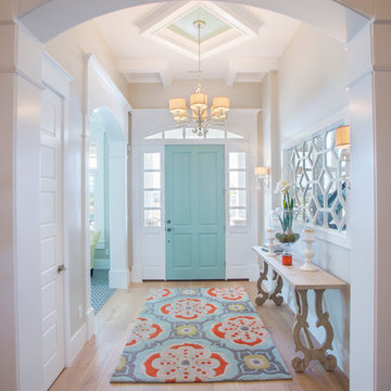
Single front door - mid-sized transitional medium tone wood floor and beige floor single front door idea in Salt Lake City with beige walls and a blue front door
Single front door - mid-sized transitional medium tone wood floor and beige floor single front door idea in Salt Lake City with beige walls and a blue front door
 TVL Creative Ltd.
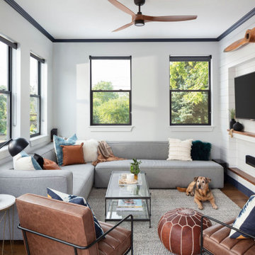
This 1910 West Highlands home was so compartmentalized that you couldn't help to notice you were constantly entering a new room every 8-10 feet. There was also a 500 SF addition put on the back of the home to accommodate a living room, 3/4 bath, laundry room and back foyer - 350 SF of that was for the living room. Needless to say, the house needed to be gutted and replanned.
Kitchen+Dining+Laundry-Like most of these early 1900's homes, the kitchen was not the heartbeat of the home like they are today. This kitchen was tucked away in the back and smaller than any other social rooms in the house. We knocked out the walls of the dining room to expand and created an open floor plan suitable for any type of gathering. As a nod to the history of the home, we used butcherblock for all the countertops and shelving which was accented by tones of brass, dusty blues and light-warm greys. This room had no storage before so creating ample storage and a variety of storage types was a critical ask for the client. One of my favorite details is the blue crown that draws from one end of the space to the other, accenting a ceiling that was otherwise forgotten.
Primary Bath-This did not exist prior to the remodel and the client wanted a more neutral space with strong visual details. We split the walls in half with a datum line that transitions from penny gap molding to the tile in the shower. To provide some more visual drama, we did a chevron tile arrangement on the floor, gridded the shower enclosure for some deep contrast an array of brass and quartz to elevate the finishes.
Powder Bath-This is always a fun place to let your vision get out of the box a bit. All the elements were familiar to the space but modernized and more playful. The floor has a wood look tile in a herringbone arrangement, a navy vanity, gold fixtures that are all servants to the star of the room - the blue and white deco wall tile behind the vanity.
Full Bath-This was a quirky little bathroom that you'd always keep the door closed when guests are over. Now we have brought the blue tones into the space and accented it with bronze fixtures and a playful southwestern floor tile.
Living Room & Office-This room was too big for its own good and now serves multiple purposes. We condensed the space to provide a living area for the whole family plus other guests and left enough room to explain the space with floor cushions. The office was a bonus to the project as it provided privacy to a room that otherwise had none before.

 Thyme & Place Design LLC
When my client had to move from her company office to work at home, she set up in the dining room. Despite her best efforts, this was not the long-term solution she was looking for. My client realized she needed a dedicated space not on the main floor of the home. On one hand, having your office space right next to the kitchen is handy. On the other hand, it made separating work and home life was not that easy.
The house was a ranch. In essence, the basement would run entire length of the home. As we came down the steps, we entered a time capsule. The house was built in the 1950’s. The walls were covered with original knotty pine paneling. There was a wood burning fireplace and considering this was a basement, high ceilings. In addition, there was everything her family could not store at their own homes. As we wound though the space, I though “wow this has potential”, Eventually, after walking through the laundry room we came to a small nicely lit room. This would be the office.
My client looked at me and asked what I thought. Undoubtedly, I said, this can be a great workspace, but do you really want to walk through this basement and laundry to get here? Without reservation, my client said where do we start?
Once the design was in place, we started the renovation. The knotty pine paneling had to go. Specifically, to add some insulation and control the dampness and humidity. The laundry room wall was relocated to create a hallway to the office.
At the far end of the room, we designated a workout zone. Weights, mats, exercise bike and television are at the ready for morning or afternoon workouts. The space can be concealed by a folding screen for party time. Doors to an old closet under the stairs were relocated to the workout area for hidden storage. Now we had nice wall for a beautiful console and mirror for storage and serving during parties.
In order to add architectural details, we covered the old ugly support columns with simple recessed millwork panels. This detail created a visual division between the bar area and the seating area in front of the fireplace. The old red brick on the fireplace surround was replaced with stack stone. A mantle was made from reclaimed wood. Additional reclaimed wood floating shelves left and right of the fireplace provides decorative display while maintaining a rustic element balancing the copper end table and leather swivel rocker.
We found an amazing rug which tied all of the colors together further defining the gathering space. Russet and burnt orange became the accent color unifying each space. With a bit of whimsy, a rather unusual light fixture which looks like roots from a tree growing through the ceiling is a conversation piece.
The office space is quite and removed from the main part of the basement. There is a desk large enough for multiple screens, a small bookcase holding office supplies and a comfortable chair for conference calls. Because working from home requires many online meetings, we added a shiplap wall painted in Hale Navy to contrast with the orange fabric on the chair. We finished the décor with a painting from my client’s father. This is the background online visitors will see.
The last and best part of the renovation is the beautiful bar. My client is an avid collector of wine. She already had the EuroCave refrigerator, so I incorporated it into the design. The cabinets are painted Temptation Grey from Benjamin Moore. The counter tops are my favorite hard working quartzite Brown Fantasy. The backsplash is a combination of rustic wood and old tin ceiling like porcelain tiles. Together with the textures of the reclaimed wood and hide poofs balanced against the smooth finish of the cabinets, we created a comfortable luxury for relaxing.
There is ample storage for bottles, cans, glasses, and anything else you can think of for a great party. In addition to the wine storage, we incorporated a beverage refrigerator, an ice maker, and a sink. Floating shelves with integrated lighting illuminate the back bar. The raised height of the front bar provides the perfect wine tasting and paring spot. I especially love the pendant lights which look like wine glasses.
Finally, I selected carpet for the stairs and office. It is perfect for noise reduction. Meanwhile for the overall flooring, I specifically selected a high-performance vinyl plank floor. We often use this product as it is perfect to install on a concrete floor. It is soft to walk on, easy to clean and does not reduce the overall height of the space.
 Liz Schupanitz Designs
A PLACE TO GATHER
Location: Eagan, MN, USA
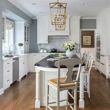
This family of five wanted an inviting space to gather with family and friends. Mom, the primary cook, wanted a large island with more organized storage – everything in its place – and a crisp white kitchen with the character of an older home.
Challenges:
Design an island that could accommodate this family of five for casual weeknight dinners.
Create more usable storage within the existing kitchen footprint.
Design a better transition between the upper cabinets on the 8-foot sink wall and the adjoining 9-foot cooktop wall.
Make room for more counter space around the cooktop. It was poorly lit, cluttered with small appliances and confined by the tall oven cabinet.
Solutions:
A large island, that seats 5 comfortably, replaced the small island and kitchen table. This allowed for more storage including cookbook shelves, a heavy-duty roll out shelf for the mixer, a 2-bin recycling center and a bread drawer.
Tall pantries with decorative grilles were placed between the kitchen and family room. These created ample storage and helped define each room, making each one feel larger, yet more intimate.
A space intentionally separates the upper cabinets on the sink wall from those on the cooktop wall. This created symmetry on the sink wall and made room for an appliance garage, which keeps the countertops uncluttered.
Moving the double ovens to the former pantry location made way for more usable counter space around the cooktop and a dramatic focal point with the hood, cabinets and marble backsplash.
Special Features:
Custom designed corbels and island legs lend character.
Gilt open lanterns, antiqued nickel grilles on the pantries, and the soft linen shade at the kitchen sink add personality and charm.
The unique bronze hardware with a living finish creates the patina of an older home.
A walnut island countertop adds the warmth and feel of a kitchen table.
This homeowner truly understood the idea of living with the patina of marble. Her grandmother’s marble-topped antique table inspired the Carrara countertops.
The result is a highly organized kitchen with a light, open feel that invites you to stay a while.
Liz Schupanitz Designs
Photographed by: Andrea Rugg
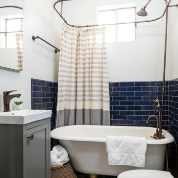 TVL Creative Ltd.
This 1910 West Highlands home was so compartmentalized that you couldn't help to notice you were constantly entering a new room every 8-10 feet. There was also a 500 SF addition put on the back of the home to accommodate a living room, 3/4 bath, laundry room and back foyer - 350 SF of that was for the living room. Needless to say, the house needed to be gutted and replanned.
Kitchen+Dining+Laundry-Like most of these early 1900's homes, the kitchen was not the heartbeat of the home like they are today. This kitchen was tucked away in the back and smaller than any other social rooms in the house. We knocked out the walls of the dining room to expand and created an open floor plan suitable for any type of gathering. As a nod to the history of the home, we used butcherblock for all the countertops and shelving which was accented by tones of brass, dusty blues and light-warm greys. This room had no storage before so creating ample storage and a variety of storage types was a critical ask for the client. One of my favorite details is the blue crown that draws from one end of the space to the other, accenting a ceiling that was otherwise forgotten.
Primary Bath-This did not exist prior to the remodel and the client wanted a more neutral space with strong visual details. We split the walls in half with a datum line that transitions from penny gap molding to the tile in the shower. To provide some more visual drama, we did a chevron tile arrangement on the floor, gridded the shower enclosure for some deep contrast an array of brass and quartz to elevate the finishes.
Powder Bath-This is always a fun place to let your vision get out of the box a bit. All the elements were familiar to the space but modernized and more playful. The floor has a wood look tile in a herringbone arrangement, a navy vanity, gold fixtures that are all servants to the star of the room - the blue and white deco wall tile behind the vanity.
Full Bath-This was a quirky little bathroom that you'd always keep the door closed when guests are over. Now we have brought the blue tones into the space and accented it with bronze fixtures and a playful southwestern floor tile.
Living Room & Office-This room was too big for its own good and now serves multiple purposes. We condensed the space to provide a living area for the whole family plus other guests and left enough room to explain the space with floor cushions. The office was a bonus to the project as it provided privacy to a room that otherwise had none before.

Sponsored
Columbus, OH

Hope Restoration & General Contracting
Columbus Design-Build, Kitchen & Bath Remodeling, Historic Renovations
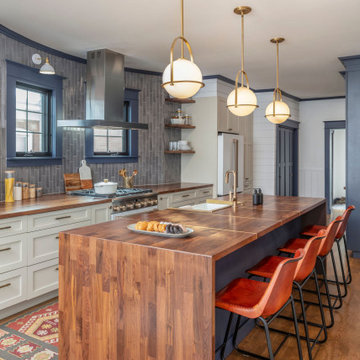 TVL Creative Ltd.
This 1910 West Highlands home was so compartmentalized that you couldn't help to notice you were constantly entering a new room every 8-10 feet. There was also a 500 SF addition put on the back of the home to accommodate a living room, 3/4 bath, laundry room and back foyer - 350 SF of that was for the living room. Needless to say, the house needed to be gutted and replanned.
Kitchen+Dining+Laundry-Like most of these early 1900's homes, the kitchen was not the heartbeat of the home like they are today. This kitchen was tucked away in the back and smaller than any other social rooms in the house. We knocked out the walls of the dining room to expand and created an open floor plan suitable for any type of gathering. As a nod to the history of the home, we used butcherblock for all the countertops and shelving which was accented by tones of brass, dusty blues and light-warm greys. This room had no storage before so creating ample storage and a variety of storage types was a critical ask for the client. One of my favorite details is the blue crown that draws from one end of the space to the other, accenting a ceiling that was otherwise forgotten.
Primary Bath-This did not exist prior to the remodel and the client wanted a more neutral space with strong visual details. We split the walls in half with a datum line that transitions from penny gap molding to the tile in the shower. To provide some more visual drama, we did a chevron tile arrangement on the floor, gridded the shower enclosure for some deep contrast an array of brass and quartz to elevate the finishes.
Powder Bath-This is always a fun place to let your vision get out of the box a bit. All the elements were familiar to the space but modernized and more playful. The floor has a wood look tile in a herringbone arrangement, a navy vanity, gold fixtures that are all servants to the star of the room - the blue and white deco wall tile behind the vanity.
Full Bath-This was a quirky little bathroom that you'd always keep the door closed when guests are over. Now we have brought the blue tones into the space and accented it with bronze fixtures and a playful southwestern floor tile.
Living Room & Office-This room was too big for its own good and now serves multiple purposes. We condensed the space to provide a living area for the whole family plus other guests and left enough room to explain the space with floor cushions. The office was a bonus to the project as it provided privacy to a room that otherwise had none before.
 User
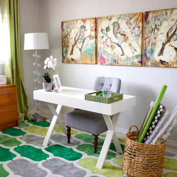
UserSmall, contemporary home office and craft room. The client loved greens, oranges and nature-inspired accessories.
Photo by Jamie Atterholt
Mid-sized trendy freestanding desk green floor craft room photo in Los Angeles with gray walls
Mid-sized trendy freestanding desk green floor craft room photo in Los Angeles with gray walls
 Stanton Homes
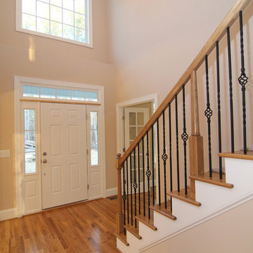
The height of a two story foyer makes a big difference in small entry spaces. In this photo get ideas for: two story barrel vaults; staircase in the foyer; picture windows; french door entry to the office.
 Wilson Kelsey Design
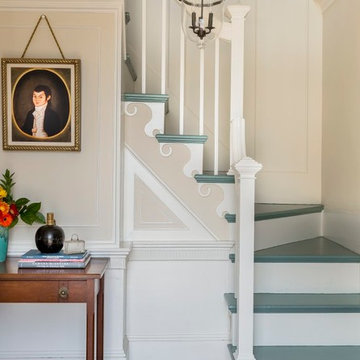
WKD’s design specialty in quality historic preservation ensured that the integrity of this home’s interior and exterior architecture was kept intact. The design mission was to preserve, restore and renovate the home in a manner that celebrated its heritage, while recognizing and accommodating today’s lifestyle and technology. Drawing from the home’s original details, WKD re-designed a friendly entry (including the exterior landscape approach) and kitchen area, integrating it into the existing hearth room. We also created a new stair to the second floor, eliminating the small, steep winding stair. New colors, wallpaper, furnishings and lighting make for a family friendly, welcoming home.
The project has been published several times. Click below to read:
October 2014 Northshore Magazine
Spring 2013 Kitchen Trends Magazine
Spring 2013 Bathroom Trends Magazine
Photographer: MIchael Lee

Sponsored
Columbus, OH
Hope Restoration & General Contracting
Columbus Design-Build, Kitchen & Bath Remodeling, Historic Renovations
 Visbeen Architects
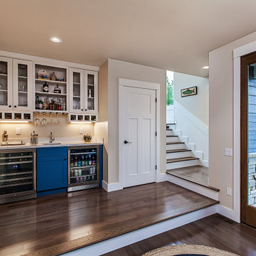
Example of a small beach style single-wall dark wood floor and brown floor wet bar design in Grand Rapids with an undermount sink, blue cabinets, quartzite countertops, white countertops and shaker cabinets
 Cameo Homes Inc.
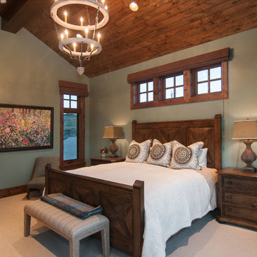
Master Bedroom. Park City Showcase of Homes 2013 by Utah Home Builder, Cameo Homes Inc., in Tuhaye, Park City, Utah. www.cameohomesinc.com
Example of a mountain style carpeted bedroom design in Salt Lake City with gray walls
Example of a mountain style carpeted bedroom design in Salt Lake City with gray walls
 Home Ingredients
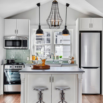
Laneway House by Smallworks -- www.smallworks.ca
Small elegant single-wall kitchen photo in Vancouver with white cabinets, blue backsplash and an island
Small elegant single-wall kitchen photo in Vancouver with white cabinets, blue backsplash and an island
1