
Search results for "Window between cabinets" in Home Design Ideas
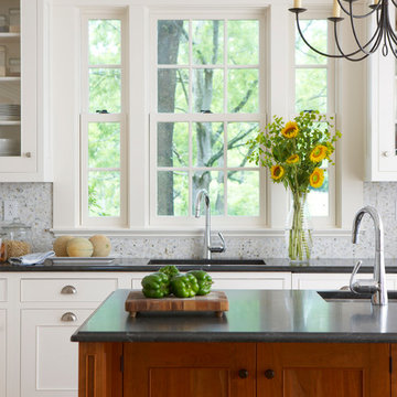
 Oak Hill Architects
Inspiration for a large cottage l-shaped medium tone wood floor and brown floor enclosed kitchen remodel in Boston with an undermount sink, white cabinets, gray backsplash, raised-panel cabinets, mosaic tile backsplash, paneled appliances and an island
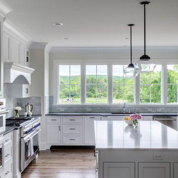
 EKA Build
Wall of windows over kitchen sink. Casement windows allow easy opening. Photo by David Berlekamp
Kitchen - large traditional l-shaped medium tone wood floor and brown floor kitchen idea in Cleveland with shaker cabinets, gray backsplash, subway tile backsplash, stainless steel appliances, an island, an undermount sink, white cabinets, quartz countertops and white countertops
Kitchen - large traditional l-shaped medium tone wood floor and brown floor kitchen idea in Cleveland with shaker cabinets, gray backsplash, subway tile backsplash, stainless steel appliances, an island, an undermount sink, white cabinets, quartz countertops and white countertops
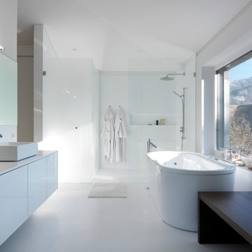
 LeichtUSA
clear and simple forms. The simplicity and architectural dialogue between form and function are the theme for inside and outside. Walnut bench that stretches under the wide windows along the entire length of the bath a, the window continues as a narrow band. The white high gloss acrylic surface of the Vanity. Leicht Program Luna-AG, with electrical drawers SensoMatic, Find a Leicht Showroom http://www.leicht.com/en-us/find-a-showroom/
Find the right local pro for your project
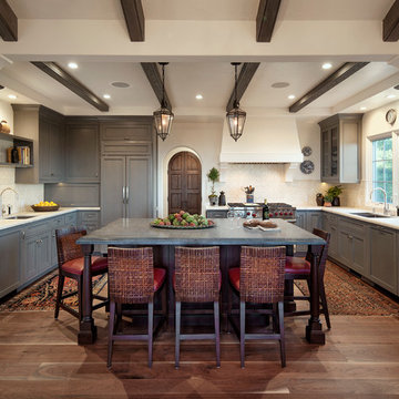
 Allen Construction
The wall between the original kitchen and dining room was removed, the ceiling raised, and beams added to match the dining room. All new cabinets, counter tops, floor, appliances, and lighting added.
Interior Designer: Deborah Campbell
Photographer: Jim Bartsch
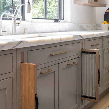
 Studio Dearborn
This expansive Victorian had tremendous historic charm but hadn’t seen a kitchen renovation since the 1950s. The homeowners wanted to take advantage of their views of the backyard and raised the roof and pushed the kitchen into the back of the house, where expansive windows could allow southern light into the kitchen all day. A warm historic gray/beige was chosen for the cabinetry, which was contrasted with character oak cabinetry on the appliance wall and bar in a modern chevron detail. Kitchen Design: Sarah Robertson, Studio Dearborn Architect: Ned Stoll, Interior finishes Tami Wassong Interiors
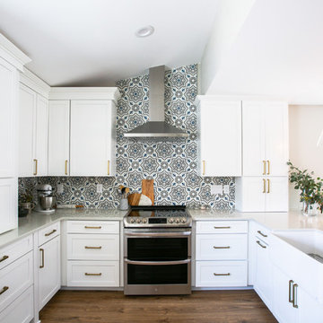
 TVL Creative Ltd.
This kitchen took a tired, 80’s builder kitchen and revamped it into a personalized gathering space for our wonderful client. The existing space was split up by the dated configuration of eat-in kitchen table area to one side and cramped workspace on the other. It didn’t just under-serve our client’s needs; it flat out discouraged them from using the space. Our client desired an open kitchen with a central gathering space where family and friends could connect. To open things up, we removed the half wall separating the kitchen from the dining room and the wall that blocked sight lines to the family room and created a narrow hallway to the kitchen. The old oak cabinets weren't maximizing storage and were dated and dark. We used Waypoint Living Spaces cabinets in linen white to brighten up the room. On the east wall, we created a hutch-like stack that features an appliance garage that keeps often used countertop appliance on hand but out of sight. The hutch also acts as a transition from the cooking zone to the coffee and wine area. We eliminated the north window that looked onto the entry walkway and activated this wall as storage with refrigerator enclosure and pantry. We opted to leave the east window as-is and incorporated it into the new kitchen layout by creating a window well for growing plants and herbs. The countertops are Pental Quartz in Carrara. The sleek cabinet hardware is from our friends at Amerock in a gorgeous satin champagne bronze. One of the most striking features in the space is the pattern encaustic tile from Tile Shop. The pop of blue in the backsplash adds personality and contrast to the champagne accents. The reclaimed wood cladding surrounding the large east-facing window introduces a quintessential Colorado vibe, and the natural texture balances the crisp white cabinetry and geometric patterned tile. Minimalist modern lighting fixtures from Mitzi by Hudson Valley Lighting provide task lighting over the sink and at the wine/ coffee station. The visual lightness of the sink pendants maintains the openness and visual connection between the kitchen and dining room. Together the elements make for a sophisticated yet casual vibe-- a comfortable chic kitchen. We love the way this space turned out and are so happy that our clients now have such a bright and welcoming gathering space as the heart of their home!
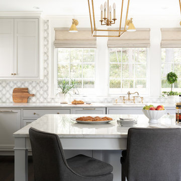
 Windhill+Co.
Kitchen cabinets Benjamin Moore light pewter with white trim Ben Moore America's Cup
Backsplash Stone Impressions Oyster on Arctic White
Countertop Tahiti Quartzite
Benjamin Moore Ballet White
Sponsored
Sunbury, OH

J.Holderby - Renovations
Franklin County's Leading General Contractors - 2X Best of Houzz!
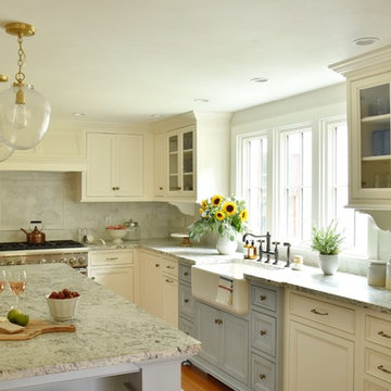
 Homestead Kitchens
Example of a cottage l-shaped medium tone wood floor and brown floor kitchen design in Boston with a farmhouse sink, granite countertops, marble backsplash, paneled appliances, an island, recessed-panel cabinets, white cabinets, gray backsplash and gray countertops
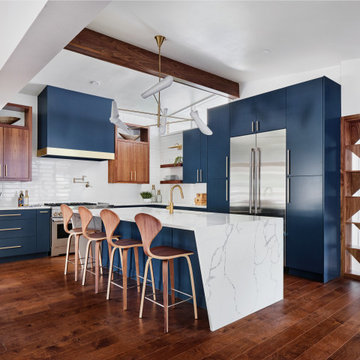
 Haven Design and Construction
The kitchen in this Mid Century Modern home is a true showstopper. The designer expanded the original kitchen footprint and doubled the kitchen in size. The walnut dividing wall and walnut cabinets are hallmarks of the original mid century design, while a mix of deep blue cabinets provide a more modern punch. The triangle shape is repeated throughout the kitchen in the backs of the counter stools, the ends of the waterfall island, the light fixtures, the clerestory windows, and the walnut dividing wall.
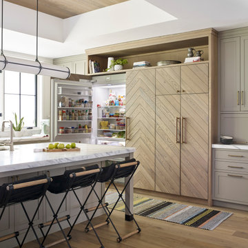 Studio Dearborn
This expansive Manor Victorian had tremendous historic charm but hadn’t seen a kitchen renovation since the 1950s. The homeowners wanted to take advantage of their views of the backyard and raised the roof and pushed the kitchen into the back of the house, where expansive windows could allow southern light into the kitchen all day. A warm historic gray/beige was chosen for the cabinetry, which was contrasted with character oak cabinetry on the appliance wall and bar in a modern chevron detail. Kitchen Design: Sarah Robertson, Studio Dearborn Architect: Ned Stoll, Interior finishes Tami Wassong Interiors
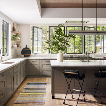 Studio Dearborn
This expansive Victorian had tremendous historic charm but hadn’t seen a kitchen renovation since the 1950s. The homeowners wanted to take advantage of their views of the backyard and raised the roof and pushed the kitchen into the back of the house, where expansive windows could allow southern light into the kitchen all day. A warm historic gray/beige was chosen for the cabinetry, which was contrasted with character oak cabinetry on the appliance wall and bar in a modern chevron detail. Kitchen Design: Sarah Robertson, Studio Dearborn Architect: Ned Stoll, Interior finishes Tami Wassong Interiors
 AV Architects + Builders
AV Architects + Builders
Location: Great Falls, VA, United States
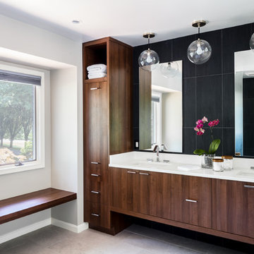
Our clients were looking to renovate their existing master bedroom into a more luxurious, modern space with an open floor plan and expansive modern bath design. The existing floor plan felt too cramped and didn’t offer much closet space or spa like features. Without having to make changes to the exterior structure, we designed a space customized around their lifestyle and allowed them to feel more relaxed at home.
Our modern design features an open-concept master bedroom suite that connects to the master bath for a total of 600 square feet. We included floating modern style vanity cabinets with white Zen quartz, large black format wall tile, and floating hanging mirrors. Located right next to the vanity area is a large, modern style pull-out linen cabinet that provides ample storage, as well as a wooden floating bench that provides storage below the large window. The centerpiece of our modern design is the combined free-standing tub and walk-in, curb less shower area, surrounded by views of the natural landscape. To highlight the modern design interior, we added light white porcelain large format floor tile to complement the floor-to-ceiling dark grey porcelain wall tile to give off a modern appeal. Last not but not least, a frosted glass partition separates the bath area from the toilet, allowing for a semi-private toilet area.
Jim Tetro Architectural Photography
 Haven Design and Construction
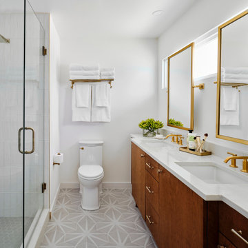
Remodeling the master bath provided many design challenges. The long and narrow space was visually expanded by removing an impeding large linen closet from the space. The additional space allowed for two sinks where there was previously only one. In addition, the long and narrow window in the bath provided amazing natural light, but made it difficult to incorporate vanity mirrors that were tall enough. The designer solved this issue by incorporating pivoting mirrors that mounted just below the long window. Finally, a custom walnut vanity was designed to utilize every inch of space. The vanity front steps in and out on the ends to make access by the toilet area more functional and spacious. A large shower with a built in quartz shower seat and hand held shower wand provide touch of luxury. Finally, the ceramic floor tile design provides a mid century punch without overpowering the tranquil space.

Sponsored
Delaware, OH

Buckeye Basements, Inc.
Central Ohio's Basement Finishing ExpertsBest Of Houzz '13-'21
 Drury Design
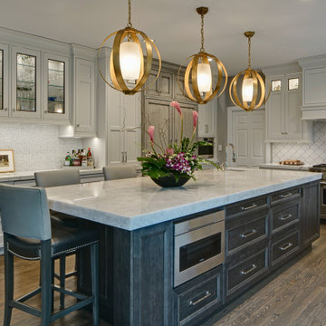
This kitchen is home to two taller individuals who both use the space equally and requested a taller workspace to comfortably accommodate their needs. The island cabinets are standard 34-1/2” tall but the Iceberg countertops were installed with a 3” build-up to add height to the island. Cabinets on the long wall were designed to break up the wall of white: buffet on the end with walnut-framed glass cabinets and seashell backsplash; double refrigerators in a painted, distressed mahogany finish were pulled forward to simulate texture and depth on the wall; wide pantry cabinets with roll-out drawers sitting on the countertops flank the refrigerators. On the opposite wall, a new window box at the kitchen sink was built to add more countertop behind the sink and to let in more light, adding dimension to the room.
The cabinetry in the original existing kitchen was disjointed at the dining room entrance and made the room appear much smaller than it really was. To remedy this, the entry to the dining room from the kitchen was closed up and relocated around the corner from the foyer; 2 simple, stacked columns were built to highlight the new opening. These transitional style columns and wider room openings at the family room and dining room entrances provide an open layout suitable for large groups to mingle comfortably; family room cabinetry and dining room fireplace surround matches kitchen cabinets.
 Dura Supreme Cabinetry
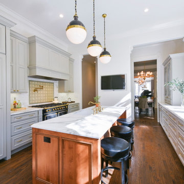
With an ideal location in the Pacific Heights neighborhood of San Francisco, this dated Victorian residence had "beautiful bones" but had been sitting on the market for a year before being purchased with plans to revitalize the interior. Interior designer, Noel Han, explained, "Historical Victorian homes in this area often have beautiful architectural elements that I aim to preserve, but the floor plan and layout tend to be stuffy, not live-able and not light filled. Modern families want bright, light-filled, spacious rooms that take advantage of outdoor views and living spaces, and function well for storage, meals and entertaining."
Preserving the architectural integrity and special features of the home was one of Han's goals but at the same time, she re-designed the space, moving walls and adding windows to create an open floorplan that flowed easily between the kitchen and outdoor living spaces. Where the range once stood in the original design, now an entire wall of windows provides panoramic views of the outdoors and fills the kitchen with light. Below the windows, Han designed a long bank of base cabinets with drawers to provide plenty of storage and work surface. Light now pours into the space even on foggy days. The range was moved to the opposite wall so that beautiful window views could be added to the kitchen.
Han selected a palette of finishes with an eye toward creating a "soft color aesthetic". "White painted finishes are very popular right now but would have felt stark and cold in this space," she explained. "The French grey paint from Dura Supreme was a perfect complement for this vintage Victorian home, to create a classic color scheme".
"This beautiful home already had hardware elements with a vintage brass finish, so I carefully selected antiqued, brushed brass hardware, plumbing and metal finishes to blend with the original elements," said Han. She continued, "The La Cornue French Range adds modern function with a French antique look."
"I appreciate working with Dura Supreme cabinetry because of the quality of the cabinetry, fast delivery and the custom options. I'm able to create beautiful architectural details like the pull-out columns on both sides of the range and the curved mullion doors on the furniture hutch, and they offer a stunning palette of finishes and styles," explained Han. For the bath cabinetry, Han created a similar palette of finishes and styles to create a complementary look throughout the entire home.
Product Details:
Perimeter: Dura Supreme Cabinetry shown in the St. Augustine door style and Mullion Pattern #15 door style with a “Zinc” painted finish.
Kitchen Island: Dura Supreme Cabinetry shown in the St. Augustine door style with a Clove stain and Black Accent finish on Cherry wood.
For more information about Noel Han, Interior Designer, click to her website here www.atelnoel.com.
For more information about Gilmans Kitchens and Baths, click to their website here www.gkandb.com.
Photography by: Ned Bonzi www.nedbonzi.com.
Request a FREE Dura Supreme Brochure Packet:
http://www.durasupreme.com/request-brochure
 Haile Kitchen & Bath LLC
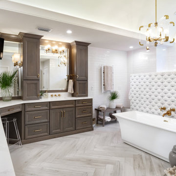
This stunning Gainesville bathroom design is a spa style retreat with a large vanity, freestanding tub, and spacious open shower. The Shiloh Cabinetry vanity with a Windsor door style in a Stonehenge finish on Alder gives the space a warm, luxurious feel, accessorized with Top Knobs honey bronze finish hardware. The large L-shaped vanity space has ample storage including tower cabinets with a make up vanity in the center. Large beveled framed mirrors to match the vanity fit neatly between each tower cabinet and Savoy House light fixtures are a practical addition that also enhances the style of the space. An engineered quartz countertop, plus Kohler Archer sinks and Kohler Purist faucets complete the vanity area. A gorgeous Strom freestanding tub add an architectural appeal to the room, paired with a Kohler bath faucet, and set against the backdrop of a Stone Impressions Lotus Shadow Thassos Marble tiled accent wall with a chandelier overhead. Adjacent to the tub is the spacious open shower style featuring Soci 3x12 textured white tile, gold finish Kohler showerheads, and recessed storage niches. A large, arched window offers natural light to the space, and towel hooks plus a radiator towel warmer sit just outside the shower. Happy Floors Northwind white 6 x 36 wood look porcelain floor tile in a herringbone pattern complete the look of this space.
 Maletz Design
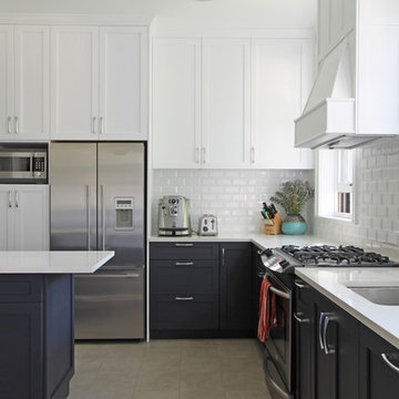
Townhouse renovation in Brooklyn: We redesigned the rear end of the house as an expanded family kitchen with a back door to the deck. We also added a new connection from the entrance hall to the kitchen and fit a small powder room under the stairs. The old windows and doors were replaced with new, larger ones, and the entire kitchen was gutted and refitted with new cabinetry and a banquette dining area. The space was designed to take advantage of the bright southern exposure, with lots of white materials, grounded by the dark base cabinets.
Photos by Maletz Design
Sponsored
Columbus, OH

Hope Restoration & General Contracting
Columbus Design-Build, Kitchen & Bath Remodeling, Historic Renovations
 YS BUILT, LLC
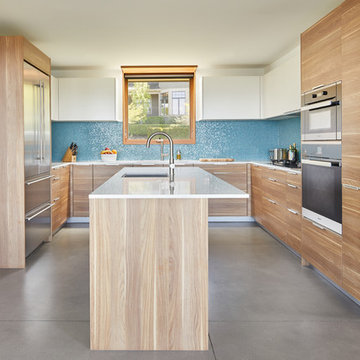
A new custom residence in the Harrison Views neighborhood of Issaquah Highlands.
The home incorporates high-performance envelope elements (a few of the strategies so far include alum-clad windows, rock wall house wrap insulation, green-roofs and provision for photovoltaic panels).
The building site has a unique upper bench and lower bench with a steep slope between them. The siting of the house takes advantage of this topography, creating a linear datum line that not only serves as a retaining wall but also as an organizing element for the home’s circulation.
The massing of the home is designed to maximize views, natural daylight and compliment the scale of the surrounding community. The living spaces are oriented to capture the panoramic views to the southwest and northwest, including Lake Washington and the Olympic mountain range as well as Seattle and Bellevue skylines.
A series of green roofs and protected outdoor spaces will allow the homeowners to extend their living spaces year-round.
With an emphasis on durability, the material palette will consist of a gray stained cedar siding, corten steel panels, cement board siding, T&G fir soffits, exposed wood beams, black fiberglass windows, board-formed concrete, glass railings and a standing seam metal roof.
A careful site analysis was done early on to suss out the best views and determine how unbuilt adjacent lots might be developed.
The total area is 3,425 SF of living space plus 575 SF for the garage.
Photos by Benjamin Benschneider. Architecture by Studio Zerbey Architecture + Design. Cabinets by LEICHT SEATTLE.
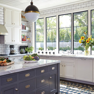
Kitchen - transitional dark wood floor kitchen idea in Nashville with shaker cabinets, white cabinets, white backsplash, subway tile backsplash, an island and white countertops
 Metropolis Drafting and Construction Inc
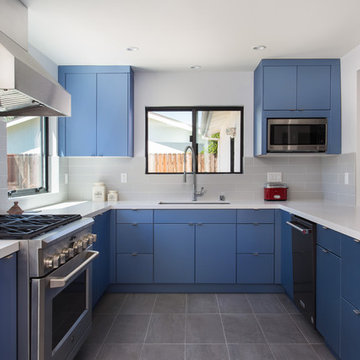
A small enclosed kitchen is very common in many homes such as the home that we remodeled here.
Opening a wall to allow natural light to penetrate the space is a must. When budget is important the solution can be as you see in this project - the wall was opened and removed but a structural post remained and it was incorporated in the design.
The blue modern flat paneled cabinets was a perfect choice to contras the very familiar gray scale color scheme but it’s still compliments it since blue is in the correct cold color spectrum.
Notice the great black windows and the fantastic awning window facing the pool. The awning window is great to be able to serve the exterior sitting area near the pool.
Opening the wall also allowed us to compliment the kitchen with a nice bar/island sitting area without having an actual island in the space.
The best part of this kitchen is the large built-in pantry wall with a tall wine fridge and a lovely coffee area that we built in the sitting area made the kitchen expend into the breakfast nook and doubled the area that is now considered to be the kitchen.
1