Software
Houzz Logo Print
jwharley50

Help please! is it a "yay" or a "nay"

9 years ago
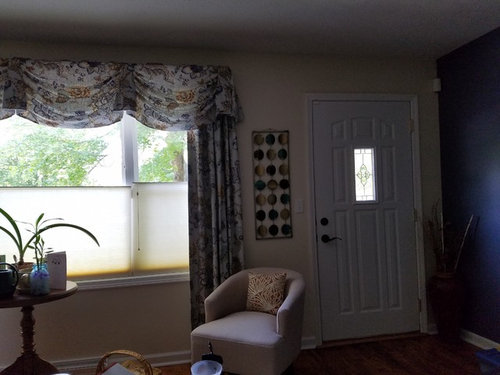
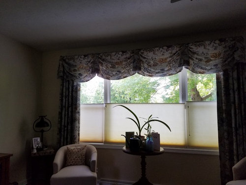
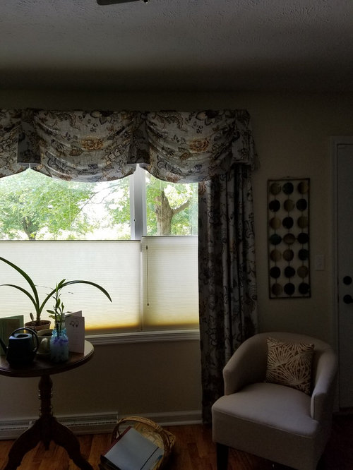
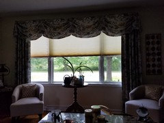
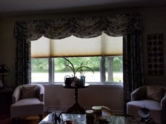
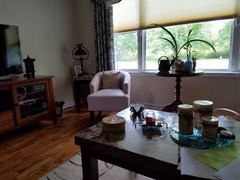
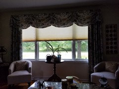
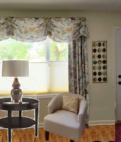
I'm just not excited about this area. My curtains and blinds are custom made, so getting rid of those can't happen. I definitely made the wrong choice of pattern or fix the area around it. A big Thank You in advance.

Comments (33)

  • 9 years ago

    I don't think you made a mistake....but can the valance be taken down? That is what is dating the look in my opinion.nn Just leave the side drapes and the pull up blinds. If you think it would not look right with out the valance....get shades that pull down from the top of your windows.

  • 9 years ago

    Can you remove the valence & leave just the panels?

  • PRO
    9 years ago
    last modified: 9 years ago
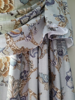
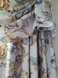
    May we see more of the room and could you take a close up of the fabric pattern, or tell us the name and manufacturer?

    The window treatments are rather formal, but the print looks casual.

  • 9 years ago

    I second (or 3rd?) ditching the valance- it immediately dates the whole look.

  • 9 years ago

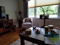
    Yeah, that doesn't look good. I'd take down the valance (maybe that fabric can be used somewhere else like over a kitchen window or something?). Those half blinds also look really bad, I'm not sure what's going on there (?) And then I can't see anything else in the room, so the only other thing I could say is ... if you have two chairs, then they need to be closer together. So push them together under the window and get rid of that table. It's too tall. Get a smaller table to put in between the two chairs. Take down that picture hanging next to the front door. Get rid of the sticks and vase in the corner. And put down a large area rug.

  • PRO
    9 years ago

    Can you raise the valance up to the ceiling? I think that might help. Other than that, it is a traditional window treatment - nothing wrong with that. I would however, move the chairs closer as suggested by others and get a more substantial piece to go between them. I would also get new pillows, in maybe a navy blue.

  • 9 years ago

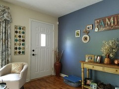
    I like the material, but you need to take down the hanging wall art between the drapes and the door, as it's a competing pattern. You could probably leave that spot empty until the right thing catches you.

  • PRO
    9 years ago

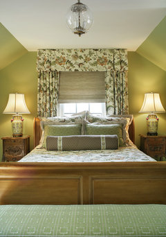
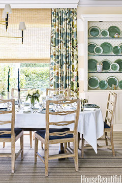
    This is obviously not a living room, but you can see how they used the colors from the curtains in the rest of the room. And the valance is up to the ceiling.

    Colorful Traditional Home · More Info

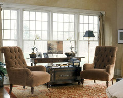
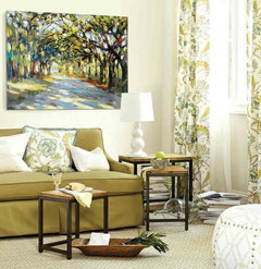
    2003 showcase · More Info

  • 9 years ago

    The art with the curtains as mentioned above is too much...You would be better off with nothing in that space. Think, "less is more" is all I can say.

  • 9 years ago
    It's me again
  • 9 years ago

    Can the valance just be straightened out like the one over the bed in the photo?

  • 9 years ago
    Not sure if the photos went through the first time.
  • 9 years ago
    More
  • 9 years ago
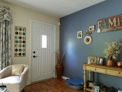
    How about some input on the style YOU like because you seem to have three competing looks going on here: traditional window treatments and the round side table, a contemporary chair and "artwork" next to the door, and that cluster of shabby/vintage style stuff on the blue wall. Nothing is cohesive, which is why it's driving you nuts. Do you have a few inspiration photos saved in Houzz that you really like? If money was no object, what would you like this room to look like?
  • 9 years ago

    Your curtain panels are actually quite a good fit with the blue wall and family pieces on that wall. I agree with the others - take down the valance, and move the chairs much closer together, centered in the window. Find a low table for between the chairs. Take the artwork between the curtains and the door down. Once you do those things, you'll see it's a "new room"!

    Also - I would move the "family" plaque and other items lower on the blue wall - that way they will related to the table and won't appear to be floating...

  • PRO
    9 years ago

    I agree with other - take the valance down and let more of the window show and more light into the room.

  • 9 years ago

    agree, the room is shut down by the valance making it dark and cave like for lack of a better word. If you can remove it and use the blinds when necessary for privacy it would lighten up the room visually. Also, removing the piece between the end of the curtain and the door.... not every wall needs decor.

  • PRO
    9 years ago

    Actually not so bad. remove valance please!

    here is the inspiration ( looks like yours)

    catherine-olasky-dining-room.jpg (980×1470) · More Info

  • 9 years ago

    I would keep the valance, and move it upwards, if it is possible. If not possible, you can remove it. Then I would paint the blue wall the same color as the other walls and remove the "family" sign and all other accompanying signs on that wall, and stuff on the table below, and remove any other extraneous goo-gaws in the entire room, and then take a good look around and see if it looks any better without so many goo-gaws here and there. Maybe put some big object (vase of flowers?) on the table that is currently under the "family" sign. I also would remove the hanging that is between your curtains and your door (it is cool though). I do like your curtains; they are in a traditional fabric -or so it appears to me - and there is nothing wrong with traditional. However, there is a "homespun" thing going on here too, like the "family" sign, and the hanging between the door and the curtains appears to me to be "modern," and it seems to be a clash of styles. The suggestion of moving the chairs closer together is spot on.

  • PRO
    9 years ago

    The drapes are done so I would leave them. Replace the too small lamp table with something in a dark finish to go with the finish on the chair legs. Move the chair closer to the table and add a table lamp.

  • 9 years ago
    Unfortunately, I like a lot of pictures from Houzz that inspire me that I can't decide on. I like modern but comfy. I want to walk into the living room and have a great sense of "wow" this living space is so well put together and not an eye sore. If money was not an object, I would have a living room totally exhilarating yet a homey feeling.
  • 9 years ago
    Thank You to all for taking time helping me to acquire a much better looking and untacky living room. I didn't like my choice of placing things or items I purchased from the start. I was inpatient and didn't think things through. Gladly some mistakes can be fixed!
  • 9 years ago

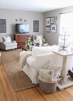
    Your room just needs a bit of tweeking and not at a great expense. I would remove all accessories/small furniture including items on wall and start slowly. Read articles on Google on how to accessorize/create vignettes -ie: first picture for your console. Your round table at the window is too high for your chairs and maybe your could exchange with the corner piece and pull your chairs closer together. Although you must have spent a lot of money on the drapery, I would still recommend removing the valance - it's too heavy for the small room and too formal. Can't tell what the rest of the room is like and if you have a couch, have you ever considered/tried the layout in second picture?


  • 9 years ago
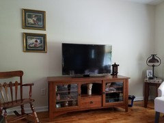
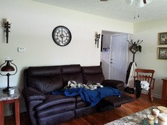
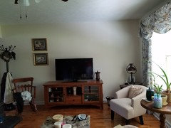
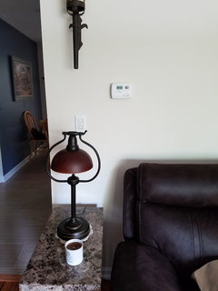
    I do have a couch and tried it in the arrangement on second picture. I have the matching love seat and I had put that on the wall where the couch is now. It was crowded, so I put the love seat in the family room. My 2 new end tables aren't helping matters to have extra space. I did pay close to $1,800.00 for the curtains and shades. The balance can be removed, but if it helps with the look, I will take the loss. Your ideas are great also! My living room furniture was bought in such a rush for I moved 1,000 miles from home for medical treatments. Disabled for too long, I did what I could on what I bought and some things I brought, unfortunately my best pride furnishings/accessories are now gone. Sorry, for the long pity story, I just can't get with it without advice. I really am thankful and appreciate the advice. The following are pictures of the other wall. Putting couch back the other way left this wall empty. Again, I can't say enough for everyone's help!! Oh and excuse the blankets bunched up on couch, my little dog loves making his snuggle place, he's under there lol.
  • 9 years ago
    picture
  • 9 years ago
    last modified: 9 years ago
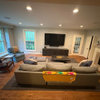
    If you like the valance...keep it or even live with it for a bit before you decide. So sorry to hear about the troubles you faced but your room is fine. I just think removing some of the smaller items and grouping will help it look less busy per console idea above for instance. It was really helpful to see the rest of the room, especially your couch. Wondering if you have the tv on the longer wall because of the cable, as I think your couch could be centered on that wall and not feel as squeezed in. Instead of the small clock above, when you can and if you want, you could look for a horizontal piece of art. In regards to the wall behind the tv, it would be great if you could balance the two prints - per my picture, see how it will feel more balanced. Find some nice pillows to compliment your drapes and you're done. All the best and decorating is a process when we are able to connect to some inspiration and have enough time and the money. Good luck.

  • 9 years ago
    Yes, the TV is on that long wall because of cable. Thank You all for the best wishes and inspiring suggestions by some very talented professional's. Keep up the good work!!
  • 9 years ago

    Here's the input from me....call me Captain Consensus....

    Since the valance is made and up, I'd leave it....and integrate it into the room better by painting all walls blue (either the same blue you have on 1 wall now, or perhaps about 2 shades lighter). (Next time, no valance for a low ceilinged-room.)

    Eliminate the circle art piece between door and curtains....it's a charming piece but just not right in that spot.

    When the console wall decor ("FAMILY" etc.) gets cleaned up and lowered, maybe the circle art could go there....try it horizontally as one of the bigger pieces to help anchor the whole arrangement.

    The chairs need a small human-height table to group towards...like a small tea table that is good for beverages. Or maybe you can find a lower piece that ahs enough room on top for your plants.

    And congrats on this room.....you've done so much right, even with all your other demanding priorities. Decorating is HARD work mentally, physically, even emotionally.....pat yourself on the back for your many great choices. You just need a bit of tweaking to achieve an incredible result.


  • 9 years ago

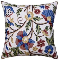
    Idea to repeat look of curtains [if pillow were not in front of curtains though] - would this also look good with sofa?

    Suzani Pillow Cover Ivory Dahlia Decorative Floral Hand embroidered Wool 18x18" · More Info

  • 9 years ago

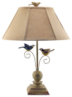
    If you feel it lightens the look / worth $62 with excellent ratings-

    Fly Away Together Table Lamp · More Info

  • 9 years ago

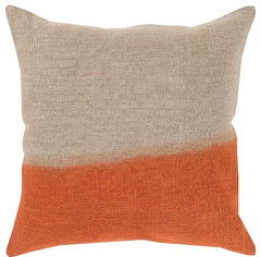
    Imo I wouldn't use any contemporary pattern - too conflicting - but I like direction of linen fabric with chunky halved reminding me of sconces.... color a bit like wood. A color whatever, is hinted at in warm gold in curtains... couldn't find.

    Dip Dyed Decorative Pillow, Neutral-Orange, Down Filler Square 18" · More Info

  • 9 years ago
    last modified: 9 years ago
    Unexpected - in chair near curtains... and repeating handmade look - like your beautiful wood chair, etc... that has a person's touch. Home Goods might call it "organic."