Software
Houzz Logo Print
vickiforman

Kitchen Reveal!

7 years ago
Hi,

I spent many months here and got such great advice so I wanted to share my before and after.

Project details:

Kitchen Remodel

Design started in January, 2018.

Demo in September, 2018.

Finished in January, 2019.


Materials:

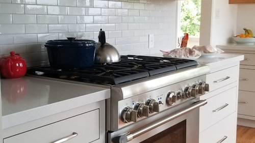
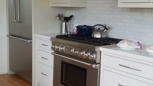
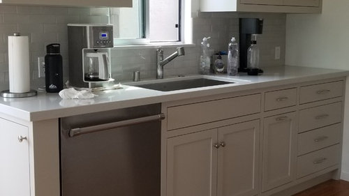
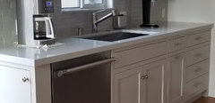
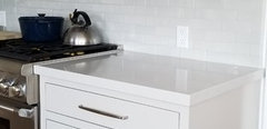
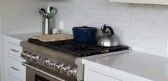
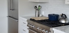
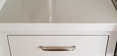
Countertop: Pental Quartz Carrara, mitered edge 1" overhang except end runs which were 3/4"

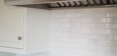
Backsplash: Ann Sacks 2X6 field tile in Cashmere Gray Gloss

Floors: hardwood, natural stain

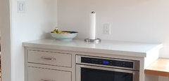
Appliances: Thermador

Cabinets: custom inset painted Benjamin Moore Seattle Mist (varnished by painter)

Hardware: Emtek Orbit pulls, Emtek 1.5" knobs in satin nickel

KWC faucet

Artisan Chef Pro 16 Gauge stainless sink

Construction was local contractor.


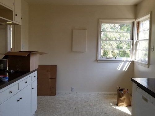
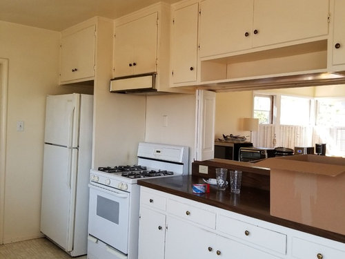
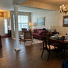
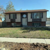
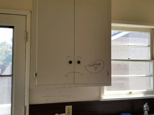
Before:


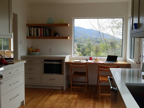
After:


Comments (36)

  • 7 years ago

    Wow! Looks great!!!

  • 7 years ago

    Just amazing. Love everything about it--especially the window! Enjoy!

  • 7 years ago

    Well done! Love the off white with the golden wood tones. That is one big transformation.

  • PRO
    7 years ago

    Wow!

  • 7 years ago

    What a lovely bright kitchen. Beautiful job. And I do appreciate a desk in the kitchen : ) .

  • 7 years ago

    Very nice, and very-very inviting. Congratulations!

  • 7 years ago

    Really pretty- great job!

  • 7 years ago

    Perfection! And your first photo from the "before" is great ;-)

    I love the restrained palette, and the super-elegant cabinets. You didn't pack too much into a small space. The window is fantastic!

    What's the skinny cabinet alongside the dishwasher?

    Well done, and hope you are enjoying it!!

  • 7 years ago

    Very pretty cabinet color and tile. Understated but extra attractive.

  • 7 years ago

    Yes! Agree with "CluelessinColorado" More pics and drawings, please!!

  • PRO
    7 years ago

    Lovely transformation! You must be thrilled!

  • 7 years ago

    Thanks for all the great compliments!

    A few notes:


    Kitchen Designer was Judith Vogt, a true gem! You can find her on Houzz.

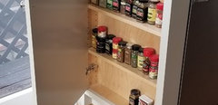
    Skinny cabinet is a spice cabinet -- I had one in the old kitchen and loved it so much the cabinet maker incorporated it into the new design.


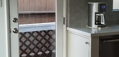
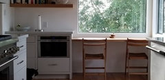
    Microwave is Thermador Drawer microwave. A splurge but truly worth it in a small kitchen.

    Chairs are NOT final choice, just place holder. Chairs are so difficult!


    Tabletop/desk was a conscious choice -- i.e., not to make it countertop height, as I wanted to be able to sit at the table and not have my feet/legs dangle. The transition from countertop to tabletop was a concern but I'm happy with how it turned out.


    The neutral palette was also intentional, although I thought the cabinets would be a bit darker. I wanted this to be a zen place, and to use color as accent. The house is transitional and we don't expect to be here more than about 5 more years, so I deliberately went for a taste that won't offend anyone, that is restful to me, that fits the house, and that would be move in ready for pretty much anyone.


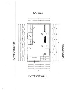
    I forgot to mention dimension -- about 150 sq. feet.


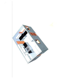
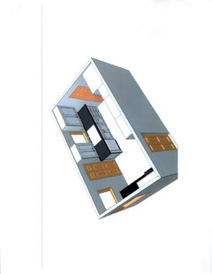
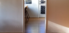
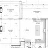
    I included floor plans and renders as well as photos that show the transition from the living room. Originally, the kitchen was "half open" to the living room and I chose to close it off all the way. Everyone said I was crazy! The house is small (1300 sq feet) and I hated being able to see the kitchen from the front door. Plus the smells travelled all the way to the bedrooms. Now the kitchen is its own space, lovely to sit in, cook in, entertain in, and is also is sort of a "surprise" when you enter from the living room. Everyone who said I was crazy now sees the logic and it really changed the whole flow of the house. So dare to go and trust your instincts!


  • 7 years ago

    I really like your new windows as well!

  • 7 years ago

    very nice. georgous views as well.

  • 7 years ago

    Simple and elegant. It's such a lovely space!

  • 7 years ago

    Lovely! And thank you for the extra eye candy :)

  • 7 years ago

    All you need to add is a bit of color...your favorite color.... art, a simple window treatment if the window ever gets direct sunlight coming through it, a few colorful accessories (potholders, dish towels, a vase, or even a runner rug or two where you spend time prepping or washing up). What a beautiful view!

  • PRO
    7 years ago

    Excellent upgrade! Very modern and beautiful. Well done.

  • 7 years ago

    Wow. So well done. Enjoy, even if only for 5 years.

  • 7 years ago

    Love the clean lines and that spice cabinet!

  • 7 years ago

    I noticed that the top drawer in your drawer stacks are separated from the others, but the 2nd and 3rd are connected. Was that to increase storage?


  • 7 years ago

    Very, very nice!

  • 7 years ago

    Love the contrast of warm wood with your cabinets, and that pane-less window at your table desk is wonderful! It is so inviting, despite the laptop (which to me means work, lol!). The location of, and cabinets with, your MW drawer seems perfect.

  • 7 years ago

    I love the spice cabinet!! Such a good idea. The desk under the window is perfect too. I hope you enjoy your beautiful kitchen :)

  • 7 years ago

    @cluelessincolorado: Yes, the cabinet maker recommended building the drawers this way to allow for more storage. That middle rail was a necessary construction element and could not be avoided. I thought it might look "weird" but I don't even notice it anymore.

    @2ManyDiversions: Thank you! We considered a wall oven there, and then a double wall over w/convection microwave on top. Many design iterations later, the wall oven went away and the MW drawer ended up next to the tabletop, along with the floating shelves (versus cabinets) to keep that wall airy and open. I can't stress enough the importance of taking time with design. I was not in any rush, had many iterations of design, did a ton of thinking, planning, envisioning and am so happy I did. The kitchen is not only well-designed but highly functional as a result, which is exactly how it should be!

  • 7 years ago

    What a lovely kitchen! Looks like a joy to be in. :) Thank you for sharing with us!

  • 7 years ago

    Good eye, cluelessincolorado, I completely missed that, and think it's very clever. Not weird at all. Smart.

    "I can't stress enough the importance of taking time with design." Agreed : ) I do wish sometimes we'd not change our minds in the midst of our rather drawn out remodel, though! Calling the drywall guy back for the 3rd time because we're adding can lights where we'd thought to put schoolhouse lights (to keep from blocking light from transoms ). 2nd time was because we had to add 1/2" to a pass through window and DH couldn't abide another can light being off-center that much. I mean, I like our dry-wall guy and all... but geez! Other than that, we were pretty well set. I think rushing or being rushed is inviting trouble. As you said, it takes time to think through function.

  • 7 years ago

    "Not weird at all. Smart."


    Yep ;)

  • PRO
    7 years ago

    Great job on the kitchen update! I love your new window. It shows a spectacular view to the outdoors!

  • 7 years ago

    I love all the whites. So clean and simple. And framing that view with the window! I know you'll enjoy this kitchen for many years. Congratulations.

  • PRO
    7 years ago

    Looks fantastic. What an improvement! juddbuilders.net

  • PRO
    7 years ago

    Looks awesome, congratulations!

  • 7 years ago

    That is lovely. It has such a peaceful feel to it, and that window/view is stunning. Congratulations on your new space!

  • 7 years ago

    Wow! You packed alot in for a kitchen with three windows and two doors! And how brilliant to use the endcap for the door of the spice cabinet. Touché !


  • 7 years ago

    Well done! It looks restful, which was your goal. Congratulations!