Software
Houzz Logo Print
djcj

To add an insert or not?

4 years ago
last modified: 4 years ago

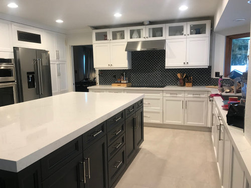
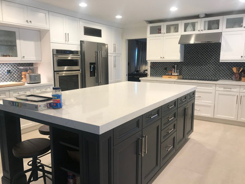
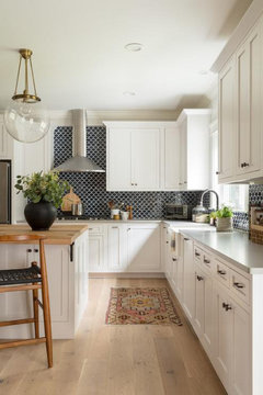
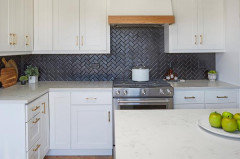
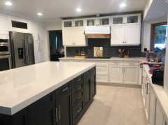
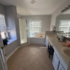
Hello, and thanks for your advice!! We just put in new backsplash tile, and it's a little overwhelming. So I am thinking of adding a tile insert above the stove in white arabesque tile. Please let me know if I will be making things worse, or making it look better?

(Added new photos)


Comments (60)

  • 4 years ago

    I agree to leave it. Match the grout to the tile.
    And then add some accents on your countertops to distract your eye.

    I think you’ll get used to it!! Looks good.

  • 4 years ago

    No. The only way I see an insert possibly looking right would be if it was a different tile design of the same color. Do a dark grout so the arabesque shape becomes noticeable with a second look, not a "look, look at me" attention grabber. I think that backsplash will be beautiful grouted!

  • 4 years ago

    No to the insert (and I’m not opposed to them in general), but for your situation, I don’t think it looks good. As others suggested, go with a grout that matches your tile and it won’t look busy at all.

    djcj thanked User
  • 4 years ago

    No to the white tile.

  • 4 years ago

    Do you still think the grout should match after seeing the larger picture?

  • PRO
    4 years ago

    I agree - no insert.

    However - I like the lighter grout. What's the point of putting in an interesting shape of tile and then matching the grout so you only really see it close up?

    You could also do something in the middle as well . I would keep some sort of contrast.

    Is it just me or does the hood seem a little high??

    Pretty kitchen !

  • 4 years ago

    I think a light gray would be a nice grout color. It will soften it, but not completely make it solid.

  • 4 years ago

    Debbi Washburn, thank you for your comment. What would you put in the middle?


  • 4 years ago

    Hard to tell but it appears that your hood vent is too far above the counter level. To me that is part of your issue. I like the backsplash. Houzz readers tend to lean towards conservative looks with tons of whites. Perhaps you are in that crowd and it isn’t that it’s “bad” but it’s unfamiliar. Kitchen looks fully of life!

  • 4 years ago

    Lovely kitchen! I think you are noticing the stove area so much because the hood is a bit too high. Could you lower it and put a piece of trim there, like the piece above your ovens? The tile with the white is beautiful.

  • 4 years ago

    *The tile with white grout would be beautiful!

  • 4 years ago

    Backsplash looks gorgeous. I would keep light grout too. We have a dark gray glass backsplash and I wish we would have done a lighter grout…it looks black at times and I wish it was lighter.

  • 4 years ago

    You kitchen looks gorgeous and I think the tile is beautiful. I too vote no insert and if you are worried about it looking too busy, go with a darker grout. You may want to give it a few days to get used to it before you make a decision. I ordered two herringbone sofas, that appeared busy and striped when I first got them. I cried, it was all I could focus on, I even got a quote for slipcovers. Once I lived with them for a bit and added some pillows, I grew to love them. Now I can't imagine them plain. Once you add accessories to the counters, you may feel differently.

  • 4 years ago

    Your kitchen looks great with just the darker tile. Now all you need is a great runner in front of your sink.

    A Light Grace · More Info

    ( I assume the crown molding above your cupboards isn't quite finished.)

  • 4 years ago

    calidesign, thank you!! Yes, you're correct, crown molding is going in next week. And, I love the runner idea, thanks!!

  • 4 years ago

    Lovely kitchen - leave as is. What I would do is paint that window trim white.

  • 4 years ago

    K R thank you for sharing that. I think your kitchen is very pretty!


  • 4 years ago

    Great kitchen. I would grout in white. The hood is way too high.

  • 4 years ago

    Didn't notice that. Perhaps could have looked better a little lower and perhaps more efficient.

    Mayabe that's why OP has question.

  • 4 years ago

    I would love to have your kitchen, just beautiful! I agree with other comment, paint window trim white. Looking at the photos you provided, you can see how nicely the tile with the white grout matches everything and brings it all together because of the lights. Maybe you need some lighting for that side to highlight the tile work, don’t try to blend it away.

  • 4 years ago

    In my previous comment, I was referring to the right-hand side of photo compared to the tile above the oven.

  • 4 years ago

    Add a pot filler on the wall

  • 4 years ago

    I happen to like stainless over the stove. It’s easier to clean and ties In the hood. If you want to try it, you can pick up a sheet at Lowe’s and prop it up to see how it would look.

  • 4 years ago

    I like it as is. Maybe find something to hang above the stovetop such as some utensils or a nice sign/plaque or some sort. I realize it is above the burners and you must be careful with material.

  • 4 years ago

    It's pretty busy but inserts can look outdated. Choose wisely if you do an insert. Maybe bring in some wood to the look?

  • 4 years ago

    Don't listen to people saying the hood is too high. Low hoods are not functional. Hoods should be at the top.

  • 4 years ago

    Go with a darker grout so the pattern is not so overwhelming. I get a bit dizzy looking at it now. I had a lightish stone backsplash in old house but I ended up getting double sided tape and sticking a Southern Living black metal embossed tray (Acanthus?) behind the stove area to give it some interest.

  • 4 years ago

    I think your right, it's not too high, it's too small for the space.

  • 4 years ago

    No insert. Grout on the darker side

  • 4 years ago

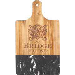
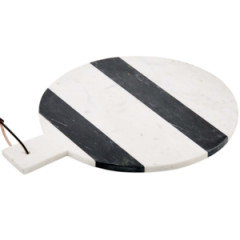
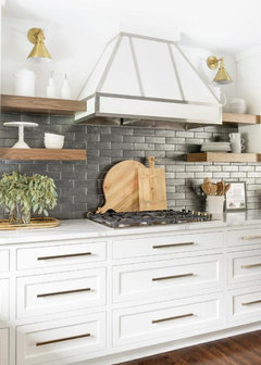
    No to the insert. Try leaning some wood cutting boards there it will soften the tile and look nice.

  • 4 years ago

    I'm no designer, but no insert, white grout, and lower the hood vent. Perfect!

  • 4 years ago

    Leave as is and live with it awhile before making that decision. i think it looks great and personally, i would not do the whie insert

  • 4 years ago

    Beautiful kitchen. Agree with others, light grout would be busy and dizzying. I’d add a little color, perhaps with pottery in the glass front cabinets and one or two countertop items.

  • 4 years ago

    I agree with most of the comments: no insert and mid-range grout color. That said, with the height of the hood the space above the range looks a bit empty. I like Terrie B.'s idea about mounting a metal tray with some sort of relief pattern in that space. If it can be removed to be cleaned occasionally, it is a great solution. You may even find multiple items that can be rotated there - even a piece of wall-mounted sculpture if it isn't too heavy and can be cleaned. I have a rustic lakehome in which I am planning to remodel the kitchen. My design includes a tile backsplash over the stove. I plan to mount an artist made steel fish sculpture in that area. Check etsy for many options you might choose from!


  • 4 years ago

    Looks great leave it!!!

  • 4 years ago

    What product did you use on your counter tops???

  • 4 years ago

    I would love to see the counter tops in a photo? Does it have a vein like appearance? Marble? Quartz?

  • 4 years ago
    last modified: 4 years ago

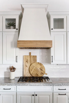
    no insert. put up some wood cutting boards and it will look perfect

    I might do a darker wood board, combined w/a marble board. gorgeous


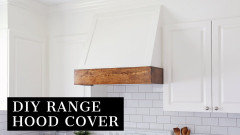
    Actually, I'd lose that SS vent hood and get a white one w/wood trim

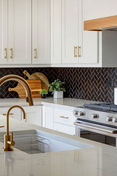
    you see how the wood just pops against the black and the white? don't forget to add some greenery near the wood cutting boards.


    I wouldn't touch your backsplash. do the other suggestions and you'll find it looks much better

    the wood w/the black will look great.


    see? stunning.


  • 4 years ago

    I like the tile, I’d go with a dark grout.
    Yes, the hood looks too high. We just lowered ours last week, it was up high and I have a center grill on our range and could not use it because I was always setting off the smoke detectors and terrifying my dog! The smoke just rolled up and was nit getting captured. I checked the specs and it was installed 4” above the recommended height.

  • 4 years ago

    Needs a larger more elaborate hood

  • PRO
    4 years ago

    no insert and mid-range grout color

  • 4 years ago

    sxb2053 what type of company lowered the hood for you?

  • 4 years ago

    I concur that you shouldn’t modify the tile nor use light grout. I also agree that a large vent hood will alleviate the problem and is certainly in vogue. Best of luck!

  • 4 years ago

    https://www.houzz.com/discussions/6178641/kitchen-backsplash-suggestions#27215338


    check out this recent posting. There is a hood that might work for you. It's in one of the postings further down posted by a kitchen designer. Hope this helps.

  • 4 years ago

    Just put a beautiful Oversized Stainless Finish TEAPOT !

  • 4 years ago

    Try black grout paint. I used it on my bathroom floor which has small black, hexagonal tiles. It looked too busy, with the rest of the bathroom. The grout paint worked beautifully. It's lasted for months now. I love it. Polyblend Grout Renew. Home Depot did not carry the black, but ordered it for me.

  • 4 years ago

    Is that a heat/AC vent over the fridge? I would paint it the same white as your cabinets so it blends in, as it isn't something you usually want to highlight.

  • PRO
    4 years ago

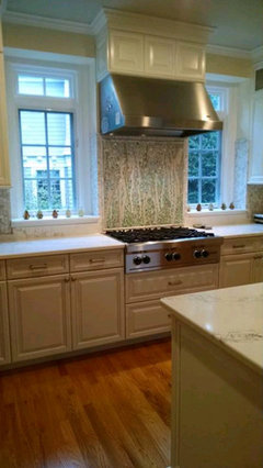
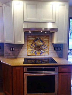
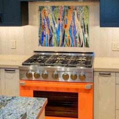
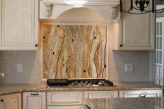
    I’d be happy to discuss a focal mosaic for that space behind your range. Check out the various backsplashes on our website we’ve created and these photos for some ideas. Http://www.AFS mosaics.com

  • PRO
    4 years ago

    I think it looks great--I'd use a light grout to accentuate the tiles, but no insert.

    Regarding the hood, it should be installed at the height the manufacturer specifies--you might verify that it's done correctly.

  • 4 years ago

    I could see a solid surface inset to match the counters, but not mosaic. And some wood trim around the bottom of the hood.