Software
Houzz Logo Print
paul_peralta

What color paint do you suggest?

12 years ago
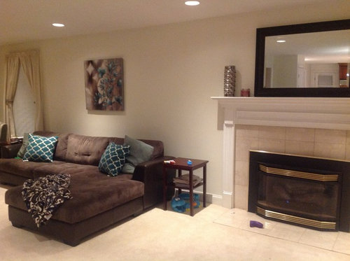
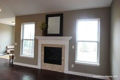
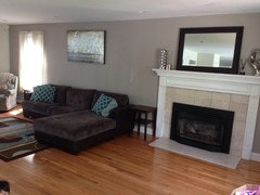
Hello everyone, I have builder white all throughout my house so I want to warm it up a bit. I'm decorating on a dime so I'd like to keep the current pieces so far.

Does anyone have any suggestions on paint color for the walls? I plan on keeping the baseboards white and would like to add white crown moldings as well. Your thoughts are appreciated!

Comments (47)

  • 12 years ago
    I see blue in your picture and pillows. Blue walls would go really well with the sofa and carpet.
  • 12 years ago
    I personally love the fireplace wall as it is...this will really date me because I used a true Taupe color about 17 years ago...and it was a beautiful taupe. Some turn pink hued when dry, others take an odd shade, as well. This was made by Dean and Berry (I don't even know if they're still an active company.) but, I'm looking for that answer, right now.
  • PRO
    12 years ago
    I haven't heard of Dean and Berry. Are you in the US?
  • 12 years ago
    Yes, years ago, when I worked with my uncle in his business, he used it a good deal because of the true color tones. I remember this one because I used it in my home at that time. He used an English company as well because of the true colortones - I'd have to look that one up, though,...it's been a long time.
  • 12 years ago
    last modified: 12 years ago
    Something like this would pull all aspects or your room.................... http://www.benjaminmoore.com/en-us/paint-color/piningforyou I see the link did not work..........Pining for you by Benjamin Moore would look wonderful.
  • 12 years ago
    Thank you all for your suggestions. I'm open to blue, but any thoughts on grey-ish tones? I'll browse your suggested color choices and will order a few samples.
  • 12 years ago
  • 12 years ago
    Not a gray but check out SW Baguette for something that warms up the room. It will work with your blue jewel tone accent color and make your white woodwork pop!
  • 12 years ago
    A blue grey would look fabulous with this
  • 12 years ago
    I was thinking about an entryway, or a wall set back where two come together in a corner.
    One of the Sea blue-green colors to introduce the quiet of the taupe walls I imagine in the room; might be a pleasant introduction.
  • 12 years ago
    For a color that has green/blue/grey all mixed together, try SW Halcyon Green.
  • 12 years ago
    Nobody has mentioned Benjamin Moore Revere Pewter. It's the go to color when everything else fails.
  • PRO
    12 years ago
    If you want to try a grey, it will need to have some brown in it to go with the sofa. I've had great success with Sherwin-Williams Accessible Beige and Balanced Beige. In blue/green tones I like SW Rain and SW Interesting Aqua.
  • 12 years ago
    Warm mocha! Blues can be dreary feeling at times, in my opinion
  • PRO
    12 years ago
    I just painted a room in Peppercorn by Sherwin Williams and it looks great. Here is a sample:
  • PRO
    12 years ago
    White dove color works great for the white if you need to redo it as well.
  • 12 years ago
    Sounds like you've got a crew helping you with paint. I wanted to ask what your focal point is since the sofa is not facing the FP. I assume it is facing a TV, but wonder why you didn't make use of the wall flanking the FP for it. Your mirror seems to be doubling the adjoining room and ceiling rather than reflecting something interesting or beautiful. Did you consider placing the TV above the mantel and floating the sofa out in front of it? Think about finishing the brass on the firescreen all black for a more up to date look.
  • 12 years ago
    coral color can look good ,try with swatches and you may come out with the choice of color which looks pleasing to you
  • 12 years ago
    Match your lighter pillow. Otherwise use taupe.
  • 12 years ago
    No gray. Blue is representing the picture and pillow she already has in the room. The room will look very well put together. An area for soothing relaxation. I am a Benjamin Moore fan. Some blue colors, tranquil vibe 32c-2, gossamer blue 2123-40 and chilled not frozen 39A-2
  • PRO
    12 years ago
    I stand by my suggestion of a greige color (grey/brown) above, or a color to go with your pillows.
  • 12 years ago
    Thank you all for your input. I definitely have some great color suggestions from all of you.

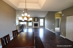
    The sofa is facing a tv on the staircase wall. I'm torn on making the FP the focal point since that area opens up to the dining area and kitchen (which is what's reflecting in the mirror).

    I'll post another pic of that side for more advice. Thank you all in advance!
  • 12 years ago
    I like the color as is. However, I'd start with a large framed print behind the sofa. The existing one is too small and I think you'll change your perspective on the color once a dominant piece of artwork attracts your attention.

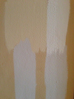
    Earlier today I mentioned how hard it is to paint walls in rooms that do not have a lot of natural light. It always looks different than in the store. Recently I tried, unsuccessfully, to paint my living room a warm gray. Six tries later I gave up. It always looked blue and sickly. I'd stick with a light beige and make sure the bulbs are either clear or warm. Attached are three of the six gray tones I tried. Nothing took.
  • 12 years ago
    Are vertical blinds still current? Remodeled a kitchen. Had verticals in old kitchen. Need some privacy due to neighbor's house facing our kitchen window. Do not want blinds. Any suggestions?
  • PRO
    12 years ago
    last modified: 12 years ago
    No, verticals are not a good choice these days, and in fact, I've always hated them! How about shutters or cellular shades? Roman shades?
    What's wrong with wood blinds?
  • 12 years ago
    I'm tired of blinds. I like roman shades but neighbors can look right in our kitchen when they would be raised. Don't want shutters. Can cellular shades be cleaned? What do u think of woven or wooden roman shades for kitchen
  • 12 years ago
    Top down/bottom up?
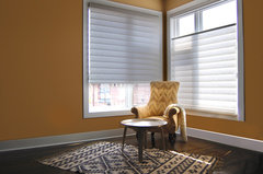
    Vignette Roman Shades · More Info
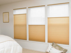
    Blinds.com Cordless Top-Down Bottom-Up Cellular Shades · More Info
  • PRO
    12 years ago
    How about a top down shade? I like woven wood shades and they come with a top down, bottom up option. But blinds give you the option of tilting to get some sunlight in the room without the neighbors looking in. Below is a top down shade.
    Mill Valley Residence · More Info
  • PRO
    12 years ago
    @fuji400 - sampling paint colors on the walls makes it much more difficult to discern the correct color. Color is a chameleon - it will change depending on what it is next to. Medium tones look lighter next to black,and darker next to white. The best way to try out colors is to sample them on a board, and hold them (have someone hold them for you to see) about a foot out from the existing wall color. Try them in darker corners and walls, and on the lighter ones. You can put the color near the flooring, behind furniture and art, and make sure the color works in each direction from which you would approach it. That way you see the full dynamic range of the color in your lighting.
    Colors point out their similarities from a distance but their differences up close. And so if your wall is a yellow-gold, leaning toward orange (which is red plus yellow) and you put on it a sample of a gray which is a purple based gray (red plus blue), the gray will look bluer than it will when you can look at it on its own. More on this at my blog - colorhelp (dot) com.
  • PRO
    12 years ago
    Paul - when you look at colors, make sure they are deep enough to give you nice contrast at the fireplace, but light enough so you don't lose the sectional in the dark paint color. Use a ceiling color a little deeper than your trim color, so that your eye goes to the top of the crown moulding. If the ceiling is white and the crown is white, the contrast is at the bottom of the crown moulding, and the result is to lower the ceiling.
    Consider leaning a framed print or other artwork, or a silk flower arrangement in front of the mirror, or look for another spot to use it vertically instead of horizontally. On the mantel as is, the effect of the mirror is to lower the ceiling, because when seated, all you see in it is the ceiling. Putting something over or in front of the center of it allows it to reflect some light, but not be what you are looking at.
  • 12 years ago
    What you have on the walls now will influence any color you test. This guide will help but for best results use a large white poster board and paint a 12-15" square in the center so the white all around it keeps your present wall color from influencing the color you're testing.
    http://www.lindaholtinteriors.com/2011/07/testing-wall-color-101/
  • 12 years ago
    Add crown, 4-5" the art over sofa too small put on another wall. Also always hang 7-8" above top of furn. Painting is the cheapest thing you can do to really change a room. Get sample paint cans. Put on your walls by furn and look at it in your light. The only way to paint. All stores carry this. Don't use more than 4-5 samples to start. It can get confusing. White trim is good.
  • 12 years ago
    You might want to get a new fire screen. Gold is dated. Place that mirror over sofa. Too big for fireplace. Get a 36" art piece for there hang 6" above mantel. New window covers, don't tie back. Just panels on ends. 2 shades darker than walls or a print in a accent color would work too.
  • 12 years ago
    Look for a taupe with a gray undertone. Ben Moore or Sherwin Williams carry great colors and paint.
  • 12 years ago
    Travisinteriors, do you know of any good taupe with grey undertone colors from Valspar?
  • PRO
    12 years ago
    A color in one of our spec homes is very popular...it is called "intellectual gray" from Sherwin Williams. We have a fireplace with a white mantle and cream tile in there, as well, so I've tried to attach that photo...if it doesn't work I will be sure to upload it to our idea books!
  • 12 years ago
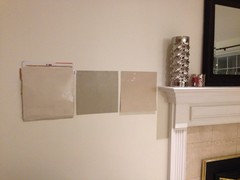
    Here's an update. I got 4 samples from SW. Pictured from left to right: accessible beige, intellectual grey, and balanced beige. I'll wait until tomorrow to see it in broad daylight against all other elements.
  • PRO
    12 years ago
    One of my favorite colors is Sherwin Williams Perfect Greige.
    Have used it in my sons home renovation as well as our showroom.
  • PRO
    12 years ago
    It would be helpful if the color you choose is a little deeper in value than the stone around the fireplace. You don't want it to look like the wall color is on the wall around the firebox, and all the other walls, and the mantle is just floating above. So by contrasting the values (how light or dark it is) of the paint color vs. the stone, the fireplace and mantel will still be a cohesive whole against the painted wall. Please post the photos after you paint - would love to see what you chose.
  • PRO
    12 years ago
    If you stay a neutral colour on the walls you are able to change the look much easier buy changing out the pillows etc.. I would also add a colour in your drapes and bring some of that colour to your fireplace . You are on the right track :)
  • 12 years ago
    Balanced beige is the color I would choose,as it creates a flow similar to the fire place area ,the gold will be highlighted .I suggest you have a nice bright floral arrangement with a circular vase ,in that way your emphasis shifts to the vivid colors of the arrangement ,just have one focal point ,in this case it can be the floral art.
    The art work over the sofa can be removed,some bright cusions with dots and stripes willl also enhance the look.Lastly you can see the window treatment.Table lamps can give a good look too on either side of the sofa..
    Certainly you are headed in the right direction
  • 12 years ago
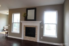
    Hello all, thank you for your input. I decided to go with SW perfect griege. I also demo'd the carpet and continued my oak hardwood flooring into this space. I sprayed the gold on the fireplace to suppress the 80's bling as well!

    Still a work in progress, but thanks again for all your input. Please keep suggestions coming!
  • PRO
    12 years ago
    Looking great!
  • PRO
    12 years ago
    a definite transformation! love the way your fireplace pops now.
  • 10 years ago

    Old post but found it googling one of your color options. Your room looks much better and spraying the fireplace black from the gold previously was really smart. The artwork looks a little high on the wall, imo. You may have completely changed it by now.....

  • 10 years ago

    Hello again ~

    The only one on my monitor that doesn't look Pink-tone (showing more red)

    is the middle example.

    I think you're absolutely on target with Greige - Beige tones without RED, and a medium tone to pop out against the white trim.