
Search results for "Adding benches" in Home Design Ideas
 Rachel Loewen Photography
Photo: Rachel Loewen © 2019 Houzz
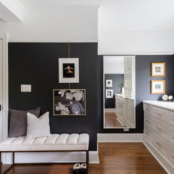
Inspiration for a transitional medium tone wood floor and brown floor bedroom remodel in Chicago with black walls
Inspiration for a transitional medium tone wood floor and brown floor bedroom remodel in Chicago with black walls
 Michael Nash Design, Build & Homes
This baby boomer couple recently settled in the Haymarket area.
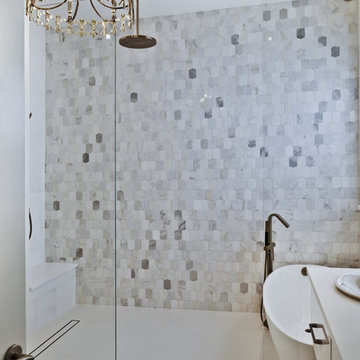
Their bathroom was located behind the garage from which we took a few inches to contribute to the bathroom space, offering them a large walk in shower, with
Digital controls designed for multiple shower heads . With a new waterfall free standing tub/ faucet slipper tub taking the space of the old large decked tub. We used a Victoria & Albert modern free standing tub, which brought spa feel to the room. The old space from the closet was used to create enough space for the bench area. It has a modern look linear drain in wet room. Adding a decorative touch and more lighting, is a beautiful chandelier outside of the wet room.
Behind the new commode area is a niche.
New vanities, sleek, yet spacious, allowing for more storage.
The large mirror and hidden medicine cabinets with decorative lighting added more of the contemporariness to the space.
Around this bath, we used large space tile. With a Classic look of black and white tile that complement the mosaic tile used creatively, making this bathroom undeniably stunning.
The smart use of mosaic tile on the back wall of the shower and tub area has put this project on the cover sheet of most design magazine.
The privacy wall offers closure for the commode from the front entry. Classy yet simple is how they described their new master bath suite.
 Wright Jenkins Home Design
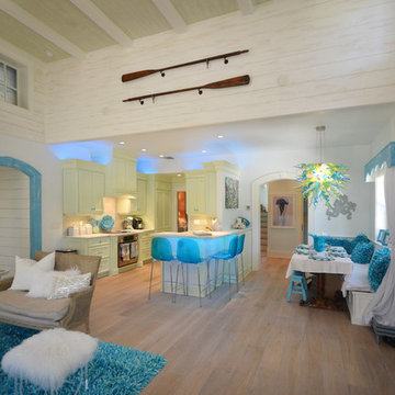
This second-story addition to an already 'picture perfect' Naples home presented many challenges. The main tension between adding the many 'must haves' the client wanted on their second floor, but at the same time not overwhelming the first floor. Working with David Benner of Safety Harbor Builders was key in the design and construction process – keeping the critical aesthetic elements in check. The owners were very 'detail oriented' and actively involved throughout the process. The result was adding 924 sq ft to the 1,600 sq ft home, with the addition of a large Bonus/Game Room, Guest Suite, 1-1/2 Baths and Laundry. But most importantly — the second floor is in complete harmony with the first, it looks as it was always meant to be that way.
©Energy Smart Home Plans, Safety Harbor Builders, Glenn Hettinger Photography
Find the right local pro for your project
 Highland Builders LLC
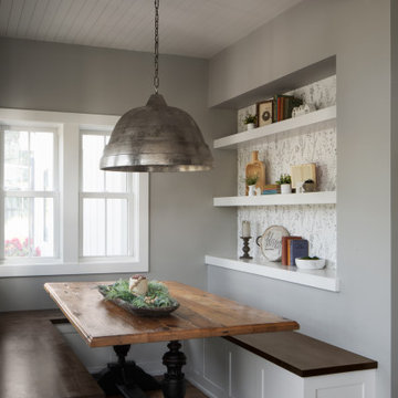
This inviting breakfast nook captures the essence of modern farmhouse living—warm, functional, and effortlessly refined. Walls painted in Sherwin Williams Mindful Gray create a soft, neutral backdrop, allowing the architectural details and layered textures to take center stage. Custom built-in bench seating and open shelving, finished in Sherwin Williams Alabaster, brighten the space while adding a clean, timeless contrast. The deep-stained bench tops introduce a rich, grounding element that ties beautifully to the warm wood tones of the table and flooring, creating a cozy, anchored feel. A saturated stained ceiling beam draws the eye upward, adding depth and architectural interest while beautifully framing the nook and reinforcing the home’s rustic character. Above, an oxidized nickel pendant light makes a striking statement. Its antique-inspired finish brings a sense of history and character, perfectly balancing the fresh, tailored lines of the space and reinforcing the modern farmhouse aesthetic. Thoughtfully styled shelving adds personality and charm, while natural light pours in through nearby windows, making this nook the perfect spot to gather, unwind, and start the day.
 Sew Beautiful
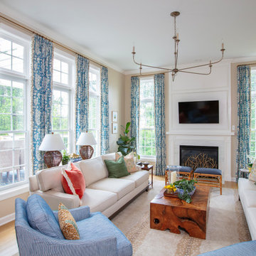
Custom window treatments balance beauty and function, softening the architecture, enhancing views, and creating a comfortable, polished environment perfect for everyday living — in this collaborative project with Barbara Galgano, of BB Interiors.
Floor-to-ceiling drapery in a soft blue and cream botanical print frames expansive windows, filling the living room with natural light while adding depth and sophistication. The tailored pleated panels, finished with a tassel trim detail and hung from custom French return rod and rings, bring a refined elegance to the space while remaining approachable and inviting.
In the inviting kitchen, custom-tailored Roman shades and seat cushions provide a refined yet welcoming layer of comfort and style. The Roman shades, feature a fabric that complements the room’s palette and coordinates with the adjacent living room draperies. Coordinating seat cushions on the barstools are expertly upholstered for both durability and comfort, adding softness to the sleek seating.
In the cheerful and highly functional laundry and mudroom, custom soft furnishings bring both comfort and personality. The built-in bench features a tailored cushion upholstered in a fresh blue geometric print, edged with piping for a polished finish—perfect for a quick seat while slipping on shoes or folding laundry. The window is dressed with a relaxed Roman shade in a lively coral-and-white pattern, framed with a crisp blue pleated tape trim. These pieces add a playful contrast to the whimsical dog-print wallpaper, creating a space that’s as stylish as it is practical.
Together, these custom elements elevate the home’s design, creating a cohesive, polished look that blends everyday function with a touch of luxury.

 Denise Quade Design
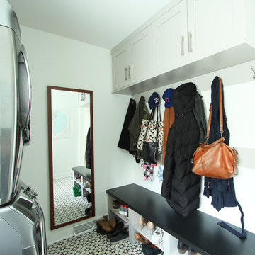
High wall cabinets were added for seasonal gear storage. Below them, two strips of hooks were added for easy coat and bag storage. Underneath the stained bench top, shoe shelves were incorporated to maximize storage. Patterned cement tile was used on the floor in a black and white repeating design.

Sponsored
Columbus, OH

Hope Restoration & General Contracting
Columbus Design-Build, Kitchen & Bath Remodeling, Historic Renovations
 Coco Maison Design
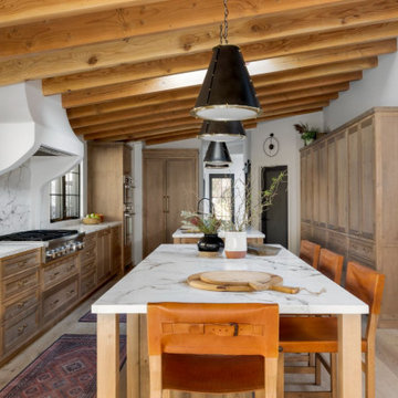
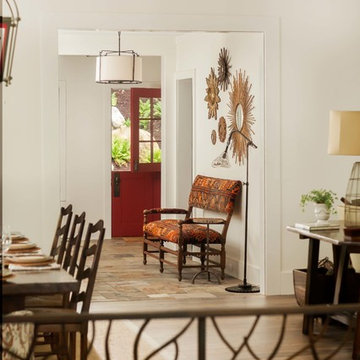
We planned a thoughtful redesign of this beautiful home while retaining many of the existing features. We wanted this house to feel the immediacy of its environment. So we carried the exterior front entry style into the interiors, too, as a way to bring the beautiful outdoors in. In addition, we added patios to all the bedrooms to make them feel much bigger. Luckily for us, our temperate California climate makes it possible for the patios to be used consistently throughout the year.
The original kitchen design did not have exposed beams, but we decided to replicate the motif of the 30" living room beams in the kitchen as well, making it one of our favorite details of the house. To make the kitchen more functional, we added a second island allowing us to separate kitchen tasks. The sink island works as a food prep area, and the bar island is for mail, crafts, and quick snacks.
We designed the primary bedroom as a relaxation sanctuary – something we highly recommend to all parents. It features some of our favorite things: a cognac leather reading chair next to a fireplace, Scottish plaid fabrics, a vegetable dye rug, art from our favorite cities, and goofy portraits of the kids.
---
Project designed by Courtney Thomas Design in La Cañada. Serving Pasadena, Glendale, Monrovia, San Marino, Sierra Madre, South Pasadena, and Altadena.
For more about Courtney Thomas Design, see here: https://www.courtneythomasdesign.com/
To learn more about this project, see here:
https://www.courtneythomasdesign.com/portfolio/functional-ranch-house-design/


 TKS Design Group
Download our free ebook, Creating the Ideal Kitchen. DOWNLOAD NOW
For many, extra time at home during COVID left them wanting more from their homes. Whether you realized the shortcomings of your space or simply wanted to combat boredom, a well-designed and functional home was no longer a want, it became a need. Tina found herself wanting more from her Old Irving Park home and reached out to The Kitchen Studio about adding function to her kitchen to make the most of the available real estate.
At the end of the day, there is nothing better than returning home to a bright and happy space you love. And this kitchen wasn’t that for Tina. Dark and dated, with a palette from the past and features that didn’t make the most of the available square footage, this remodel required vision and a fresh approach to the space. Lead designer, Stephanie Cole’s main design goal was better flow, while adding greater functionality with organized storage, accessible open shelving, and an overall sense of cohesion with the adjoining family room.
The original kitchen featured a large pizza oven, which was rarely used, yet its footprint limited storage space. The nearby pantry had become a catch-all, lacking the organization needed in the home. The initial plan was to keep the pizza oven, but eventually Tina realized she preferred the design possibilities that came from removing this cumbersome feature, with the goal of adding function throughout the upgraded and elevated space. Eliminating the pantry added square footage and length to the kitchen for greater function and more storage. This redesigned space reflects how she lives and uses her home, as well as her love for entertaining.
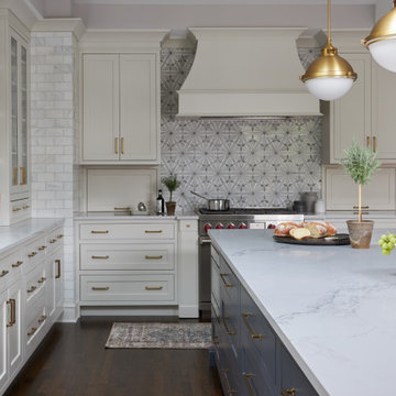
The kitchen features a classic, clean, and timeless palette. White cabinetry, with brass and bronze finishes, contrasts with rich wood flooring, and lets the large, deep blue island in Woodland’s custom color Harbor – a neutral, yet statement color – draw your eye.
The kitchen was the main priority. In addition to updating and elevating this space, Tina wanted to maximize what her home had to offer. From moving the location of the patio door and eliminating a window to removing an existing closet in the mudroom and the cluttered pantry, the kitchen footprint grew. Once the floorplan was set, it was time to bring cohesion to her home, creating connection between the kitchen and surrounding spaces.
The color palette carries into the mudroom, where we added beautiful new cabinetry, practical bench seating, and accessible hooks, perfect for guests and everyday living. The nearby bar continues the aesthetic, with stunning Carrara marble subway tile, hints of brass and bronze, and a design that further captures the vibe of the kitchen.
Every home has its unique design challenges. But with a fresh perspective and a bit of creativity, there is always a way to give the client exactly what they want [and need]. In this particular kitchen, the existing soffits and high slanted ceilings added a layer of complexity to the lighting layout and upper perimeter cabinets.
While a space needs to look good, it also needs to function well. This meant making the most of the height of the room and accounting for the varied ceiling features, while also giving Tina everything she wanted and more. Pendants and task lighting paired with an abundance of natural light amplify the bright aesthetic. The cabinetry layout and design compliments the soffits with subtle profile details that bring everything together. The tile selections add visual interest, drawing the eye to the focal area above the range. Glass-doored cabinets further customize the space and give the illusion of even more height within the room.
While her family may be grown and out of the house, Tina was focused on adding function without sacrificing a stunning aesthetic and dreamy finishes that make the kitchen the gathering place of any home. It was time to love her kitchen again, and if you’re wondering what she loves most, it’s the niche with glass door cabinetry and open shelving for display paired with the marble mosaic backsplash over the range and complimenting hood. Each of these features is a stunning point of interest within the kitchen – both brag-worthy additions to a perimeter layout that previously felt limited and lacking.
Whether your remodel is the result of special needs in your home or simply the excitement of focusing your energy on creating a fun new aesthetic, we are here for it. We love a good challenge because there is always a way to make a space better – adding function and beauty simultaneously.

 CG&S Design-Build
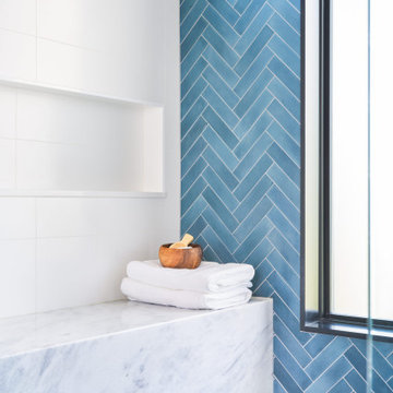
Mid-sized trendy master blue tile blue floor and double-sink shower bench photo in Austin with flat-panel cabinets, light wood cabinets, white walls, an undermount sink, marble countertops and a floating vanity

Sponsored
Delaware County, OH

Whisler Home Improvement
Franklin County's Committed Home Improvement Professionals
 Rudloff Custom Builders
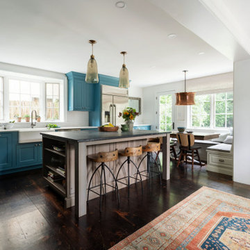
We completely renovated this Haverford home between Memorial Day and Labor Day! We maintained the traditional feel of this colonial home with Early-American heart pine floors and bead board on the walls of various rooms. But we also added features of modern living. The open concept kitchen has warm blue cabinetry, an eating area with a built-in bench with storage, and an especially convenient area for pet supplies and eating! Subtle and sophisticated, the bathrooms are awash in gray and white Carrara marble. We custom made built-in shelves, storage and a closet throughout the home. Crafting the millwork on the staircase walls, post and railing was our favorite part of the project.
Rudloff Custom Builders has won Best of Houzz for Customer Service in 2014, 2015 2016, 2017, 2019, and 2020. We also were voted Best of Design in 2016, 2017, 2018, 2019 and 2020, which only 2% of professionals receive. Rudloff Custom Builders has been featured on Houzz in their Kitchen of the Week, What to Know About Using Reclaimed Wood in the Kitchen as well as included in their Bathroom WorkBook article. We are a full service, certified remodeling company that covers all of the Philadelphia suburban area. This business, like most others, developed from a friendship of young entrepreneurs who wanted to make a difference in their clients’ lives, one household at a time. This relationship between partners is much more than a friendship. Edward and Stephen Rudloff are brothers who have renovated and built custom homes together paying close attention to detail. They are carpenters by trade and understand concept and execution. Rudloff Custom Builders will provide services for you with the highest level of professionalism, quality, detail, punctuality and craftsmanship, every step of the way along our journey together.
Specializing in residential construction allows us to connect with our clients early in the design phase to ensure that every detail is captured as you imagined. One stop shopping is essentially what you will receive with Rudloff Custom Builders from design of your project to the construction of your dreams, executed by on-site project managers and skilled craftsmen. Our concept: envision our client’s ideas and make them a reality. Our mission: CREATING LIFETIME RELATIONSHIPS BUILT ON TRUST AND INTEGRITY.
Photo Credit: Jon Friedrich
Interior Design Credit: Larina Kase, of Wayne, PA
 TKS Design Group
Free ebook, Creating the Ideal Kitchen. DOWNLOAD NOW
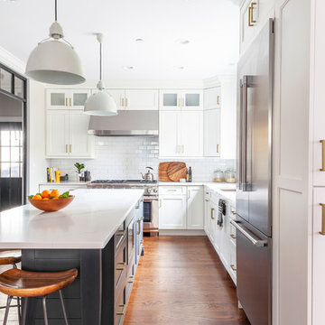
We went with a minimalist, clean, industrial look that feels light, bright and airy. The island is a dark charcoal with cool undertones that coordinates with the cabinetry and transom work in both the neighboring mudroom and breakfast area. White subway tile, quartz countertops, white enamel pendants and gold fixtures complete the update. The ends of the island are shiplap material that is also used on the fireplace in the next room.
In the new mudroom, we used a fun porcelain tile on the floor to get a pop of pattern, and walnut accents add some warmth. Each child has their own cubby, and there is a spot for shoes below a long bench. Open shelving with spots for baskets provides additional storage for the room.
Designed by: Susan Klimala, CKBD
Photography by: LOMA Studios
For more information on kitchen and bath design ideas go to: www.kitchenstudio-ge.com
 Twelve Chairs Interiors
Photo: Joyelle West
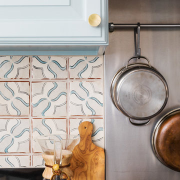
Mid-sized elegant l-shaped medium tone wood floor and brown floor eat-in kitchen photo in Boston with blue cabinets, terra-cotta backsplash, an undermount sink, raised-panel cabinets, quartz countertops, multicolored backsplash, stainless steel appliances and an island
Mid-sized elegant l-shaped medium tone wood floor and brown floor eat-in kitchen photo in Boston with blue cabinets, terra-cotta backsplash, an undermount sink, raised-panel cabinets, quartz countertops, multicolored backsplash, stainless steel appliances and an island

Sponsored
Columbus, OH
Hope Restoration & General Contracting
Columbus Design-Build, Kitchen & Bath Remodeling, Historic Renovations
 Jeanne Campana Design
Interior Design | Jeanne Campana Design
Contractor | Artistic Contracting
Photography | Kyle J. Caldwell
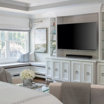
Huge transitional master medium tone wood floor and brown floor bedroom photo in New York with gray walls, a standard fireplace and a tile fireplace
Huge transitional master medium tone wood floor and brown floor bedroom photo in New York with gray walls, a standard fireplace and a tile fireplace
 Irene Designs
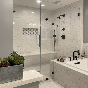
This Master Suite while being spacious, was poorly planned in the beginning. Master Bathroom and Walk-in Closet were small relative to the Bedroom size. Bathroom, being a maze of turns, offered a poor traffic flow. It only had basic fixtures and was never decorated to look like a living space. Geometry of the Bedroom (long and stretched) allowed to use some of its' space to build two Walk-in Closets while the original walk-in closet space was added to adjacent Bathroom. New Master Bathroom layout has changed dramatically (walls, door, and fixtures moved). The new space was carefully planned for two people using it at once with no sacrifice to the comfort. New shower is huge. It stretches wall-to-wall and has a full length bench with granite top. Frame-less glass enclosure partially sits on the tub platform (it is a drop-in tub). Tiles on the walls and on the floor are of the same collection. Elegant, time-less, neutral - something you would enjoy for years. This selection leaves no boundaries on the decor. Beautiful open shelf vanity cabinet was actually made by the Home Owners! They both were actively involved into the process of creating their new oasis. New Master Suite has two separate Walk-in Closets. Linen closet which used to be a part of the Bathroom, is now accessible from the hallway. Master Bedroom, still big, looks stunning. It reflects taste and life style of the Home Owners and blends in with the overall style of the House. Some of the furniture in the Bedroom was also made by the Home Owners.
 Advance Design Studio, Ltd.
After six years of living in their Huntley IL home, Chris and Meghan were tired of their dark, dingy, outdated kitchen and it was finally time for a long-anticipated change. “The kitchen is the place where we live, it’s where we do everything,” Meghan said. “It was important that it be a space where we wanted to be.” Meghan loves cooking and enjoys including their girls in healthy meal prepping, this led them to want a brighter, more enjoyable kitchen with increased functionality and improved storage.
For Chris especially, the laundry room was an entirely dysfunctional eyesore. “We had a washer and a dryer, but it was all kind-of cobbled together!” Chris said. “There were always laundry piles everywhere, we weren’t really sure what we wanted to do in there, but it was time for us to make a change.” The mess of the space was stressful every time they walked in the door from the garage each day. Kids’ backpacks and shoes piled up haphazardly in the makeshift boot-bench closet left the family feeling disorganized and stressed. They needed space for folding clothes and locker cubbies to help keep the family organized.
Having known Christine and Todd in the Huntley community for years, Chris and Meghan were familiar with their work. “We already trusted them personally and having seen their projects for years we knew they did top notch work. After we reviewed the initial round of designs, we knew that hiring them was definitely the right choice,” Meghan and Chris said. Although Chris had done a lot of work in their home himself, the kitchen and laundry room renovation was such a large undertaking that he didn’t want to steal time away from his family to spend what would surely be many long weekends doing the job himself. “That would not have been a wise choice for us,” Chris laughed.
“Our designer, Michelle was very, very, easy to work with; anything we wanted to see or weren’t sure about, she went above and beyond to make this easy for us. She was easy to get hold of and always quick to respond,” the couple said. Michelle pulled ideas that mirrored the couple’s taste and style and was adept at directing the couple to limited choices that didn’t overwhelm them and kept the process moving. “I have a hard time making decisions. Michelle made the decision-making process so easy. I loved how she listened to what I liked and then presented three great options for me to choose from,” Meghan said.
The main objectives for the kitchen were better storage solutions, they wanted the space to reflect their lifestyle and taste, and they wanted it to last for years with low maintenance. One of the first steps in creating a more functional kitchen was relocating the refrigerator, creating an improved workflow for the busy family.
“We didn’t know that we could even move the refrigerator to a new location where it is now, that was something that we never would have thought of,” Chris said. “The new refrigerator location makes the kitchen feel so much bigger. We didn’t add any space, but our whole kitchen with the new design just seems like it’s so much larger than before!” Meghan said.
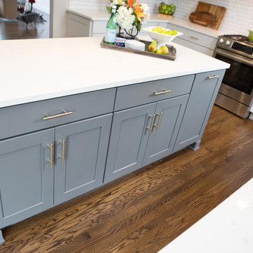
The perimeter mist colored cabinets helped warm and brighten the entire room, while the graphite colored cabinets on the island added contrast. Using this fresh, clean color palette satisfied the couple’s desire for a bright space that was the exact opposite of what they had before. Organization accessories were also added to the cabinets such as a spice drawer tray and roll outs to create hidden convenience.
“I absolutely love the hidden spices – it makes cooking so much more enjoyable!” Chris said. “And all the pull outs, and the double trash bin, who would think you could get so excited about organization!” the couple said in unison.
One thing they hated in their original kitchen was how dark the space felt. Added lighting on the ceiling with the new light fixtures combined with the lighter cabinetry colors throughout solved this problem. “Our new kitchen has this warm, almost cozy feeling that our old kitchen never had, it’s just a space that I love spending my time in now,” Meghan said. The light airy feeling was accentuated with the use of floating white shelves on either side of the decorative range hood. “We have so much cabinetry space, the new design is amazing we actually have more storage space than we will ever need,” Meghan said.
The island was extended to create more work surface and added space for stool seating. “The new island changes how we live. Now the kids can be in the kitchen with us, doing homework, eating breakfast, and the three of us have special dinners there when Chris is working late,” Meghan said.
The Carrara Marmi Quartz countertops were chosen because they are, not only beautiful, but are made from hard-working material that doesn’t require maintenance. The white subway tile backsplash that wraps to the ceiling behind the focal point cooktop range/hood compliments the crisp white countertops perfectly, while brushed brass hardware and light fixtures keep the design fresh and new.
The couple had a few fears at the beginning of the project, as most homeowners do. Their biggest fear was being out of their kitchen and laundry room for an extended time. The crew made it very easy for the family to work in a limited space keeping the washer and dryer hooked up the majority of the time, and also getting appliances working with minimal downtime.
“They above and beyond accommodated us to get us through the process,” Meghan said. “They did a great job making sure we were as comfortable as possible throughout the process,” Chris added.
“Our project manager DJ did a great job. He was very good at updating us on schedule changes, getting guys in as quickly as possible. Everyone that stepped in the house was nice and did great work,” said Chris. They thought Advance’s carpenter was phenomenal and were impressed when he took a conceptual idea from a photograph and worked with designer Michelle to create a one of a kind range/hood that has become the topic of conversation with friends and family who visit the new kitchen. “He was in our house literally every day for several weeks. He was easy to work with and good at what he did,” Meghan and Chris said.
The focal point of the kitchen; a hand-crafted, custom-built ventilation hood was clad with handpicked reclaimed barnwood. Advance Design’s carpenter built the framework and the cladding to create a one-of-a-kind design element that the couple loves.
“I think it was especially fun for him to create something unique from scratch, showcasing his talent in this area,” Meghan said. “I love that my kitchen is not like everyone else’s. I got to pick out the wood on my hood and watch it being built and was able to choose what pieces of wood went where on it. It’s totally unique.”
Red Oak flooring was toothed-in throughout the kitchen and the rest of the first floor anywhere changes were made. Then the whole floor was refinished to tone down the orange undertones in the existing floor stain, ultimately changing the color complexion of the entire first floor. The result is a completely new feeling to the entire home.
Renovating the laundry room was extremely important to Meghan and Chris, but they had trouble visualizing what the possibilities were for the seemingly small space. Michelle produced beautiful 3D illustrations that helped them envision the space in a whole new way.
“I must have told Michelle 100 times that I am a visual person, seeing the designs in 3D made it so easy to make decisions and see what we could really do with our space,” Meghan said.
A dividing wall and doorway were removed between the existing laundry room and hallway formerly containing a coat closet, providing space to design specialized graphite colored cabinetry matching the kitchen island to house custom storage cubbies for each family member. Adding the tall utility cabinetry in the new laundry area helped solve the storage issue, tucking away cleaning supplies, household items, and even the cat got its own cubby.
“I love how everything is now hidden in its own space. I can’t tell you how much I hated coming home and seeing everything sitting around on counters,” Chris said.
Electrical outlets were planned for the inside of utility cabinets, so devices could charge in hidden locations. Stacking the washer and dryer allowed for wider countertop space to provide a folding area and a special space for clothes to hang. “The way I do laundry has been completely transformed! I can actually fold clothes and hang them now right out of the washer and dryer,” Meghan said.
“The end result in the kitchen and the laundry/mud room was an updated light and bright space, with a smarter work flow that better meets the needs of this family,” Michelle said.
“I would totally recommend Advance Design,” Meghan said. “Sometimes I sit and just look at my kitchen and laundry room and think ‘Wow, I can’t believe I get to live here!’ It’s an understatement to say we love our new space.”
66