Search results for "Adding clutter" in Home Design Ideas

Morning routines shouldn’t involve a traffic jam at the sink. The 2025 Houzz Bathroom Trends Study found that 65 percent of U.S. renovators now choose a double-sink vanity to skip the wait. Designers agree: Titan Builders dubbed 2025 “the year of bigger, storage-packed double vanities,” forecasting dual-basin setups in family, guest, and even powder baths. As KBIS 2025 launches land, prototypes for 2026 layer in spa-grade wood, built-in outlets, and planet-friendly finishes. In this guide, we rank six standout models and show you how to size, install, and enjoy a clutter-free, two-sink future.
Methodology and selection criteria
A well-planned double-sink vanity keeps busy morning routines calm and clutter-free.
Before we crowned any winners, we mapped the entire 2024–2026 double-sink (dual-basin) market. That meant parsing KBIS exhibitor releases, scraping bestseller lists from Home Depot, Lowe’s, and Wayfair, and reviewing designer short lists in trade magazines. The sweep produced 110 candidate vanities, giving us visibility into every style, price tier, and material in play.
We then scored each model against six weighted factors that continue to matter long after installers leave:
- Build quality – 25 percent.Solid hardwood frames, dovetail drawers, and furniture-grade plywood backs, never particleboard in disguise.
- Design versatility – 20 percent.Lines and finishes that suit modern, classic, or farmhouse baths without dating quickly.
- Sustainability – 15 percent.FSC-certified wood, CARB 2 compliance, and low-VOC finishes for healthier air.
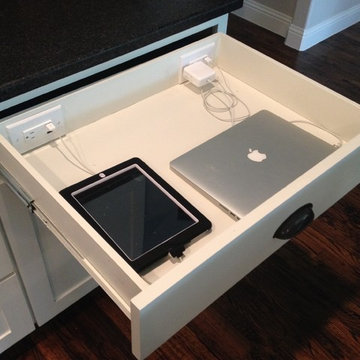
- Storage efficiency – 15 percent.Deep drawers, tilt-outs, or power cubbies that corral countertop clutter.
- Value for money – 15 percent.Fair street price for the materials, stone tops, sinks, and soft-close hardware included.
- Brand reputation and warranty – 10 percent.Manufacturers with responsive support and at least a one-year parts guarantee.
- Footprint: 72 W × 22 D × 36 H in. (183 × 56 × 91 cm)
- Crated weight: 506 lb / 230 kg
- Street price: about $2,575 with marble top and basins, Q4 2025
- Footprint: 48 W × 22 D in. (122 × 56 cm)
- Height: 34.8 in. (88 cm) with backsplash
- Sliding barn door plus 3 drawers
- Pre-drilled 8-in. faucet spacing, sinks included
- Footprint: 60 W × 21 D × 34 H in. (152 × 53 × 86 cm)
- Integrated power: 4 AC + 2 USB, UL-listed
- Crated weight: 300 lb / 136 kg
- Street price: about $2,349 at Home Depot, Q4 2025
- Footprint: 72 W × 22 D in. (183 × 56 cm)
- Height: 34 in. (86 cm) plus 4 in. backsplash
- Counter: 1 in. Carrara marble, apron-front sinks included
- Hardware: oil-rubbed bronze, soft-close doors and drawers
- Footprint: 60 W × 22 D × 34 H in. (152 × 56 × 86 cm)
- Construction: solid poplar and plywood, waterfall quartz top
- Integrated slim power bank, soft-close doors and drawers
- Target price: just under $2,300 with top and basins

Transforming a Master Bathroom
When our clients purchased their beautiful home in South Fort Myers, FL they fell in love with the expansive, sweeping space. It wasn’t long, however, before they realized the master bathroom just didn’t suit their taste. The large walk-in shower was practically cave-like. Consequentially, it completely dwarfed the bathroom. Along with bland colors, outdated finishes, and a dividing wall in the middle of the room, the whole space felt smaller than its ample dimensions implied. There was no question about it – the bathroom needed an update.
Making Room for More
First, we demolished the existing finishes and cut the concrete slab for new underground plumbing. We minimized the imposing shower and moved it to the other side of the room. Moving the shower also allowed for the installation of our Dura Supreme Alectra style cabinetry in cocoa brown. For increased functionality, we created split his-and-hers vanities. Then we added towers to match the cabinets. With interior outlets, the towers added smart storage for bathroom appliances, helping to keep the counters clutter-free. For a finishing touch, we outlined the large mirrors with crown molding trim in a complimentary finish – an essential detail to tie all the cabinetry together.
The Spa
To bring the feel of the spa to this gorgeous home, we installed our luxurious drop-in 72”x42” Kohler Air Massage bathtub. We completely surrounded it with 3cm granite countertops in Delicatus green and added a tub deck with tile backsplashes for a sumptuous ambiance.
Lighting
On either side of the his-and-hers vanity, we installed George Kovach tube sconces. Vertical placement of the sconces provided ample lighting while enhancing the contemporary style of the space. To frame the room, we added a drop ceiling with recessed lighting and outlined the tray ceiling with crown molding to match the rest of the design. To complete the bath remodel, we installed the final element – a stunningly unique 10-light polished chrome chandelier from Maxim lighting.
A Complete Transformation
When we met with our clients, it was instantly clear to us why they were unhappy with their master bathroom. The cave-like shower and cumbersome dividing wall overpowered a room in dire need of a modernizing. Furthermore, with two small children and a busy lifestyle, we could sense our clients not only desired a bathroom renovation, they needed a relaxing retreat.
Ultimately, this project was nothing less than a complete transformation of space. In fact, by the time we had finished, the only original fixtures left were the windows! With beautifully updated finishes and an improved layout, we were able to achieve the functionality our clients craved along with a new, spa-like feel. The end result was nothing short of a haven at home – the perfect spot to recharge at the end of a long day.
Find the right local pro for your project
Our clients came to us wanting to update and open up their kitchen, breakfast nook, wet bar, and den. They wanted a cleaner look without clutter but didn’t want to go with an all-white kitchen, fearing it’s too trendy. Their kitchen was not utilized well and was not aesthetically appealing; it was very ornate and dark. The cooktop was too far back in the kitchen towards the butler’s pantry, making it awkward when cooking, so they knew they wanted that moved. The rest was left up to our designer to overcome these obstacles and give them their dream kitchen.
We gutted the kitchen cabinets, including the built-in china cabinet and all finishes. The pony wall that once separated the kitchen from the den (and also housed the sink, dishwasher, and ice maker) was removed, and those appliances were relocated to the new large island, which had a ton of storage and a 15” overhang for bar seating. Beautiful aged brass Quebec 6-light pendants were hung above the island.
All cabinets were replaced and drawers were designed to maximize storage. The Eclipse “Greensboro” cabinetry was painted gray with satin brass Emtek Mod Hex “Urban Modern” pulls. A large banquet seating area was added where the stand-alone kitchen table once sat. The main wall was covered with 20x20 white Golwoo tile. The backsplash in the kitchen and the banquette accent tile was a contemporary coordinating Tempesta Neve polished Wheaton mosaic marble.
In the wet bar, they wanted to completely gut and replace everything! The overhang was useless and it was closed off with a large bar that they wanted to be opened up, so we leveled out the ceilings and filled in the original doorway into the bar in order for the flow into the kitchen and living room more natural. We gutted all cabinets, plumbing, appliances, light fixtures, and the pass-through pony wall. A beautiful backsplash was installed using Nova Hex Graphite ceramic mosaic 5x5 tile. A 15” overhang was added at the counter for bar seating.
In the den, they hated the brick fireplace and wanted a less rustic look. The original mantel was very bulky and dark, whereas they preferred a more rectangular firebox opening, if possible. We removed the fireplace and surrounding hearth, brick, and trim, as well as the built-in cabinets. The new fireplace was flush with the wall and surrounded with Tempesta Neve Polished Marble 8x20 installed in a Herringbone pattern. The TV was hung above the fireplace and floating shelves were added to the surrounding walls for photographs and artwork.
They wanted to completely gut and replace everything in the powder bath, so we started by adding blocking in the wall for the new floating cabinet and a white vessel sink. Black Boardwalk Charcoal Hex Porcelain mosaic 2x2 tile was used on the bathroom floor; coordinating with a contemporary “Cleopatra Silver Amalfi” black glass 2x4 mosaic wall tile. Two Schoolhouse Electric “Isaac” short arm brass sconces were added above the aged brass metal framed hexagon mirror. The countertops used in here, as well as the kitchen and bar, were Elements quartz “White Lightning.” We refinished all existing wood floors downstairs with hand scraped with the grain. Our clients absolutely love their new space with its ease of organization and functionality.

Richard Mandelkorn
A newly connected hallway leading to the master suite had the added benefit of a new laundry closet squeezed in; the original home had a cramped closet in the kitchen downstairs. The space was made efficient with a countertop for folding, a hanging drying rack and cabinet for storage. All is concealed by a traditional barn door, and lit by a new expansive window opposite.

Transitional master white tile and ceramic tile porcelain tile, beige floor and double-sink bathroom photo in San Diego with shaker cabinets, brown cabinets, an integrated sink, a hinged shower door, gray countertops and a built-in vanity

Rift-sawn white oak cabinetry was carried all the way to the 10-foot ceilings, maximizing storage while adding natural texture. A large island anchors the kitchen, while small appliances are tucked neatly behind pocket doors in a concealed appliance garage. Paneled refrigeration and dishwashing units maintain an uninterrupted flow of material, making the space appear larger, and Taj Mahal quartzite countertops extend seamlessly up the wall as a backsplash. A subtle shadow line detail on the island countertop adds modern refinement.

Sponsored
Delaware, OH
Buckeye Basements, Inc.
Central Ohio's Basement Finishing ExpertsBest Of Houzz '13-'21

Open concept, loft living makes this one bedroom with home office feel spacious, bright and airy. With strategically placed and well thought out built-ins and a wall hung media cabinet, everything has its place while being visual pleasing.

Eat-in kitchen - small transitional l-shaped medium tone wood floor eat-in kitchen idea in Louisville with a single-bowl sink, recessed-panel cabinets, green cabinets, quartzite countertops, gray backsplash, stone slab backsplash, stainless steel appliances, a peninsula and gray countertops

Jackie and Sean loved the Algonquin neighborhood they lived in with the peaceful neighborhood and the close proximity to work and school. What they didn’t love was how outdated their home had become. With a cramped kitchen and an unused dining room, they decided a remodel was the perfect solution to their problem. They would be able to continue to live in the area they loved, while at the same time they could have the dream home they envisioned.
After a thorough search, Jackie came across Advance Design Studio. She was impressed by all of the positive reviews she saw on the internet and saw herself identifying with all of the project stories she saw on the website. Once they met with designer Scott Christensen and owner Todd Jurs, they knew Advance Design was the right company to make their dreams a reality.
The project consisted of four main areas: the kitchen/dining/powder room, the laundry room, the master bathroom, and the kid’s bathroom. They wanted to expand the kitchen into the seldom used dining room and add a large island for hosting parties and family gatherings. They also wanted new hardwood flooring throughout the first level. The laundry room needed to be more functional, and all three bathrooms were in dire need of updating.
The closed off kitchen was opened up to create a sweeping space between the new eating area and the much larger kitchen. A handsome dry bar complete with a beverage refrigerator and lighted glass door cabinetry makes an elegant transition across from a peninsula area filled with storage. An additional decorative cabinet lighting up elegant dishware through the mullioned glass sits directly across from the drybar.
An expansive island was critical to the kitchen plans. Jackie, Sean and Scott worked closely together to create just the right details for their design. They wanted the island to be functional in addition to being the centerpiece of the room. Added storage for the kid’s school supplies was hidden behind cabinet doors so the children could do their schoolwork right at the island, and a microwave drawer glides open with the touch of a finger hidden inconspicuously within the island space. The easy to care for Cambria Britannica Quartz island top with its sweeping grey and white marble look perched atop hand-carved Craftsman corbels was absolutely what they were hoping for, blending both beauty and function perfectly.
Adding a nice contrast to the brightness of the quartz and the white cabinetry, Kodiak - Leather granite countertops were used to balance the light and dark tones of the space. Dura Supreme Classic White painted cabinets grace the perimeter, while Maple Poppy Seed stained cabinets with a beautiful soft grey woodgrain were used in the beverage center and island. The two tones compliment the large space balancing it out nicely creating interest and elegance with the simple Craftsman style full overlay doors.
A deep warm Barnwood White Oak flooring was added throughout the lower level. The new floor brings additional contrast to the bright kitchen and provides unity with the now open floorplan as it rolls in to the foyer and family room. Final details like the show-stopping lunar like duo light fixtures complete the space and intermix expertly with crisscross details of the glass door mullions, the island bar seating and even accessories in the space.
The small cluttered laundry room needed more space and more storage. With a busy family it seemed to overflow daily and did not have anywhere to hide the families “in and out stuff.” Scott designed the new space with a stackable washer and dryer and much more efficiently organized cabinetry. Doing laundry is now (almost!) a pleasure and keeping everyone’s “stuff” hidden, but readily accessible is now a snap.
The master bath was not a place where the couple enjoyed spending time getting ready for their day. The tub almost never was used, so removing it made it possible to build an extra-large shower, replacing the small cramped cube of the previous shower they hated. Clean, horizontal lines softly draw your eye around the space with porcelain tile called Driftwood Sea spray. Full overlay cabinetry in a soft white vanity with double sinks makes getting ready for the day much more convenient for the busy couple.
Long floor planks made of porcelain tile mimic real hardwood floors in a soft grey to compliment the shower, but with the ease and care of a tile surface. Cambrian Black Granite counters with a matte finish and under mount porcelain sinks with handsome brushed chrome hardware complete the handsome space. A real bonus in any master bath; a custom built in storage nook was tucked in the corner of the space for linens and heavenly storage.
The kid’s bath was in sad shape because it was original to the house. To keep the budget in control, the tub which was in great condition was retained, but focus was on the new large brick style porcelain charcoal tile on the floor, crisp white new Craftsman style cabinetry with pretty furniture details on the corner base, a striking granite top with white under mount porcelain sinks and fresh hardware and faucets. Some beautiful soft grey wood mirrors to match mom and dads were custom sized and placed under new lighting, and 4 hooks were smartly arranged down the wall for kids’ towels.
This couple was determined not to move, and made their house their dream home. Not only does their home function greatly now, but Jackie says, “When the neighbors come to visit, they’re asking if they can “steal” the design”! The added functionality, elegance, and open floor plan were exactly what this family needed in order to stay.
Advance Design Studio, Joe Nowak

 
Download our free ebook, Creating the Ideal Kitchen. DOWNLOAD NOW
 
The homeowners came to us looking to update the kitchen in their historic 1897 home. The home had gone through an extensive renovation several years earlier that added a master bedroom suite and updates to the front façade. The kitchen however was not part of that update and a prior 1990’s update had left much to be desired. The client is an avid cook, and it was just not very functional for the family.
The original kitchen was very choppy and included a large eat in area that took up more than its fair share of the space. On the wish list was a place where the family could comfortably congregate, that was easy and to cook in, that feels lived in and in check with the rest of the home’s décor. They also wanted a space that was not cluttered and dark – a happy, light and airy room. A small powder room off the space also needed some attention so we set out to include that in the remodel as well.
See that arch in the neighboring dining room? The homeowner really wanted to make the opening to the dining room an arch to match, so we incorporated that into the design.
Another unfortunate eyesore was the state of the ceiling and soffits. Turns out it was just a series of shortcuts from the prior renovation, and we were surprised and delighted that we were easily able to flatten out almost the entire ceiling with a couple of little reworks.
Other changes we made were to add new windows that were appropriate to the new design, which included moving the sink window over slightly to give the work zone more breathing room. We also adjusted the height of the windows in what was previously the eat-in area that were too low for a countertop to work. We tried to keep an old island in the plan since it was a well-loved vintage find, but the tradeoff for the function of the new island was not worth it in the end. We hope the old found a new home, perhaps as a potting table.
Designed by: Susan Klimala, CKD, CBD
Photography by: Michael Kaskel
For more information on kitchen and bath design ideas go to: www.kitchenstudio-ge.com

KuDa Photography
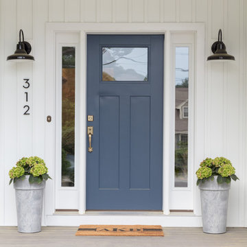
Inspiration for a timeless dark wood floor entryway remodel in Portland with beige walls and a glass front door

Sponsored
Columbus, OH
Hope Restoration & General Contracting
Columbus Design-Build, Kitchen & Bath Remodeling, Historic Renovations

Our clients came to us wanting to update and open up their kitchen, breakfast nook, wet bar, and den. They wanted a cleaner look without clutter but didn’t want to go with an all-white kitchen, fearing it’s too trendy. Their kitchen was not utilized well and was not aesthetically appealing; it was very ornate and dark. The cooktop was too far back in the kitchen towards the butler’s pantry, making it awkward when cooking, so they knew they wanted that moved. The rest was left up to our designer to overcome these obstacles and give them their dream kitchen.
We gutted the kitchen cabinets, including the built-in china cabinet and all finishes. The pony wall that once separated the kitchen from the den (and also housed the sink, dishwasher, and ice maker) was removed, and those appliances were relocated to the new large island, which had a ton of storage and a 15” overhang for bar seating. Beautiful aged brass Quebec 6-light pendants were hung above the island.
All cabinets were replaced and drawers were designed to maximize storage. The Eclipse “Greensboro” cabinetry was painted gray with satin brass Emtek Mod Hex “Urban Modern” pulls. A large banquet seating area was added where the stand-alone kitchen table once sat. The main wall was covered with 20x20 white Golwoo tile. The backsplash in the kitchen and the banquette accent tile was a contemporary coordinating Tempesta Neve polished Wheaton mosaic marble.
In the wet bar, they wanted to completely gut and replace everything! The overhang was useless and it was closed off with a large bar that they wanted to be opened up, so we leveled out the ceilings and filled in the original doorway into the bar in order for the flow into the kitchen and living room more natural. We gutted all cabinets, plumbing, appliances, light fixtures, and the pass-through pony wall. A beautiful backsplash was installed using Nova Hex Graphite ceramic mosaic 5x5 tile. A 15” overhang was added at the counter for bar seating.
In the den, they hated the brick fireplace and wanted a less rustic look. The original mantel was very bulky and dark, whereas they preferred a more rectangular firebox opening, if possible. We removed the fireplace and surrounding hearth, brick, and trim, as well as the built-in cabinets. The new fireplace was flush with the wall and surrounded with Tempesta Neve Polished Marble 8x20 installed in a Herringbone pattern. The TV was hung above the fireplace and floating shelves were added to the surrounding walls for photographs and artwork.
They wanted to completely gut and replace everything in the powder bath, so we started by adding blocking in the wall for the new floating cabinet and a white vessel sink. Black Boardwalk Charcoal Hex Porcelain mosaic 2x2 tile was used on the bathroom floor; coordinating with a contemporary “Cleopatra Silver Amalfi” black glass 2x4 mosaic wall tile. Two Schoolhouse Electric “Isaac” short arm brass sconces were added above the aged brass metal framed hexagon mirror. The countertops used in here, as well as the kitchen and bar, were Elements quartz “White Lightning.” We refinished all existing wood floors downstairs with hand scraped with the grain. Our clients absolutely love their new space with its ease of organization and functionality.

Paul Dyer Photography
Inspiration for a timeless gray tile and glass tile mosaic tile floor corner shower remodel in San Francisco with an undermount sink, white cabinets, an undermount tub, gray walls and recessed-panel cabinets

Grey stained cabinetry compliments the white perimeter cabinetry and carerra countertops. Cement backsplash in "Nantes" by Original Mission Tile in soft grey and white add flair to the muted palette. Kitchen design and custom cabinetry by Sarah Robertson of Studio Dearborn. Refrigerator by LIebherr. Cooktop by Wolf. Bosch dishwasher. Farmhouse sink by Blanco. Cabinetry pulls by Jeffrey Alexander Belcastle collection. Photo credit: Neil Landino

Sponsored
Columbus, OH
Structural Remodeling
Franklin County's Heavy Timber Specialists | Best of Houzz 2020!

Photography: Philip Ennis Productions.
Example of a large minimalist master white tile and subway tile marble floor and gray floor walk-in shower design in New York with a two-piece toilet, white walls, a pedestal sink, flat-panel cabinets, gray cabinets and marble countertops

Our clients came to us wanting to update and open up their kitchen, breakfast nook, wet bar, and den. They wanted a cleaner look without clutter but didn’t want to go with an all-white kitchen, fearing it’s too trendy. Their kitchen was not utilized well and was not aesthetically appealing; it was very ornate and dark. The cooktop was too far back in the kitchen towards the butler’s pantry, making it awkward when cooking, so they knew they wanted that moved. The rest was left up to our designer to overcome these obstacles and give them their dream kitchen.
We gutted the kitchen cabinets, including the built-in china cabinet and all finishes. The pony wall that once separated the kitchen from the den (and also housed the sink, dishwasher, and ice maker) was removed, and those appliances were relocated to the new large island, which had a ton of storage and a 15” overhang for bar seating. Beautiful aged brass Quebec 6-light pendants were hung above the island.
All cabinets were replaced and drawers were designed to maximize storage. The Eclipse “Greensboro” cabinetry was painted gray with satin brass Emtek Mod Hex “Urban Modern” pulls. A large banquet seating area was added where the stand-alone kitchen table once sat. The main wall was covered with 20x20 white Golwoo tile. The backsplash in the kitchen and the banquette accent tile was a contemporary coordinating Tempesta Neve polished Wheaton mosaic marble.
In the wet bar, they wanted to completely gut and replace everything! The overhang was useless and it was closed off with a large bar that they wanted to be opened up, so we leveled out the ceilings and filled in the original doorway into the bar in order for the flow into the kitchen and living room more natural. We gutted all cabinets, plumbing, appliances, light fixtures, and the pass-through pony wall. A beautiful backsplash was installed using Nova Hex Graphite ceramic mosaic 5x5 tile. A 15” overhang was added at the counter for bar seating.
In the den, they hated the brick fireplace and wanted a less rustic look. The original mantel was very bulky and dark, whereas they preferred a more rectangular firebox opening, if possible. We removed the fireplace and surrounding hearth, brick, and trim, as well as the built-in cabinets. The new fireplace was flush with the wall and surrounded with Tempesta Neve Polished Marble 8x20 installed in a Herringbone pattern. The TV was hung above the fireplace and floating shelves were added to the surrounding walls for photographs and artwork.
They wanted to completely gut and replace everything in the powder bath, so we started by adding blocking in the wall for the new floating cabinet and a white vessel sink. Black Boardwalk Charcoal Hex Porcelain mosaic 2x2 tile was used on the bathroom floor; coordinating with a contemporary “Cleopatra Silver Amalfi” black glass 2x4 mosaic wall tile. Two Schoolhouse Electric “Isaac” short arm brass sconces were added above the aged brass metal framed hexagon mirror. The countertops used in here, as well as the kitchen and bar, were Elements quartz “White Lightning.” We refinished all existing wood floors downstairs with hand scraped with the grain. Our clients absolutely love their new space with its ease of organization and functionality.

Martha O'Hara Interiors, Interior Design | L. Cramer Builders + Remodelers, Builder | Troy Thies, Photography | Shannon Gale, Photo Styling
Please Note: All “related,” “similar,” and “sponsored” products tagged or listed by Houzz are not actual products pictured. They have not been approved by Martha O’Hara Interiors nor any of the professionals credited. For information about our work, please contact design@oharainteriors.com.
2