
Search results for "Amplifying" in Home Design Ideas
 TKS Design Group
Download our free ebook, Creating the Ideal Kitchen. DOWNLOAD NOW
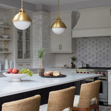
For many, extra time at home during COVID left them wanting more from their homes. Whether you realized the shortcomings of your space or simply wanted to combat boredom, a well-designed and functional home was no longer a want, it became a need. Tina found herself wanting more from her Old Irving Park home and reached out to The Kitchen Studio about adding function to her kitchen to make the most of the available real estate.
At the end of the day, there is nothing better than returning home to a bright and happy space you love. And this kitchen wasn’t that for Tina. Dark and dated, with a palette from the past and features that didn’t make the most of the available square footage, this remodel required vision and a fresh approach to the space. Lead designer, Stephanie Cole’s main design goal was better flow, while adding greater functionality with organized storage, accessible open shelving, and an overall sense of cohesion with the adjoining family room.
The original kitchen featured a large pizza oven, which was rarely used, yet its footprint limited storage space. The nearby pantry had become a catch-all, lacking the organization needed in the home. The initial plan was to keep the pizza oven, but eventually Tina realized she preferred the design possibilities that came from removing this cumbersome feature, with the goal of adding function throughout the upgraded and elevated space. Eliminating the pantry added square footage and length to the kitchen for greater function and more storage. This redesigned space reflects how she lives and uses her home, as well as her love for entertaining.
The kitchen features a classic, clean, and timeless palette. White cabinetry, with brass and bronze finishes, contrasts with rich wood flooring, and lets the large, deep blue island in Woodland’s custom color Harbor – a neutral, yet statement color – draw your eye.
The kitchen was the main priority. In addition to updating and elevating this space, Tina wanted to maximize what her home had to offer. From moving the location of the patio door and eliminating a window to removing an existing closet in the mudroom and the cluttered pantry, the kitchen footprint grew. Once the floorplan was set, it was time to bring cohesion to her home, creating connection between the kitchen and surrounding spaces.
The color palette carries into the mudroom, where we added beautiful new cabinetry, practical bench seating, and accessible hooks, perfect for guests and everyday living. The nearby bar continues the aesthetic, with stunning Carrara marble subway tile, hints of brass and bronze, and a design that further captures the vibe of the kitchen.
Every home has its unique design challenges. But with a fresh perspective and a bit of creativity, there is always a way to give the client exactly what they want [and need]. In this particular kitchen, the existing soffits and high slanted ceilings added a layer of complexity to the lighting layout and upper perimeter cabinets.
While a space needs to look good, it also needs to function well. This meant making the most of the height of the room and accounting for the varied ceiling features, while also giving Tina everything she wanted and more. Pendants and task lighting paired with an abundance of natural light amplify the bright aesthetic. The cabinetry layout and design compliments the soffits with subtle profile details that bring everything together. The tile selections add visual interest, drawing the eye to the focal area above the range. Glass-doored cabinets further customize the space and give the illusion of even more height within the room.
While her family may be grown and out of the house, Tina was focused on adding function without sacrificing a stunning aesthetic and dreamy finishes that make the kitchen the gathering place of any home. It was time to love her kitchen again, and if you’re wondering what she loves most, it’s the niche with glass door cabinetry and open shelving for display paired with the marble mosaic backsplash over the range and complimenting hood. Each of these features is a stunning point of interest within the kitchen – both brag-worthy additions to a perimeter layout that previously felt limited and lacking.
Whether your remodel is the result of special needs in your home or simply the excitement of focusing your energy on creating a fun new aesthetic, we are here for it. We love a good challenge because there is always a way to make a space better – adding function and beauty simultaneously.
 SBD-studio
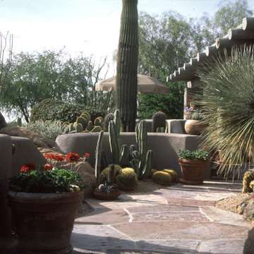
Garden addition which celebrates the beauty found in the Sonoran Desert. Sculptural saguaros, prickly pear opuntias, Senitas and golden barrels choreographed to amplify the landscape essence found at the Boulders Community.
 Uniq Inc.
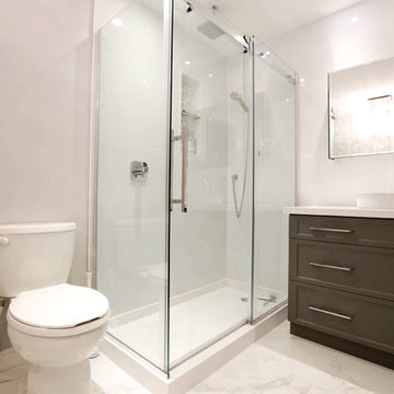
These wonderful Markham homeowners came to us looking to update their rather dark and dated existing master bath to a bright, functional and stylish space they can relax in after a long day.
To brighten the space, we included touches of a soft gray palette throughout the room and used modern lighting fixtures to amplify the light. We upgraded their worn out showers to feature a new freestanding tub coupled with a much larger and luxurious shower. The entire look was brought together with an effortlessly beautiful contemporary accent wall.
The end result is a polished ensuite that feels just ‘wright’.
For more information on how Out of Space can transform your home without the stress of a renovation visit www.outofspace.ca
Find the right local pro for your project
 Aire Theater Designs
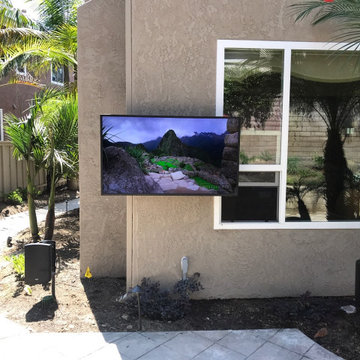
Add smart technology to your outdoor space with electronics from:
- Samsung Terrace outdoor television
- Klipsch AW650 outdoor speakers
- Sonos Amp streaming amplifier
#sonos #klipsch #samsungterrace
- Del Mar smart home project
 Flooret
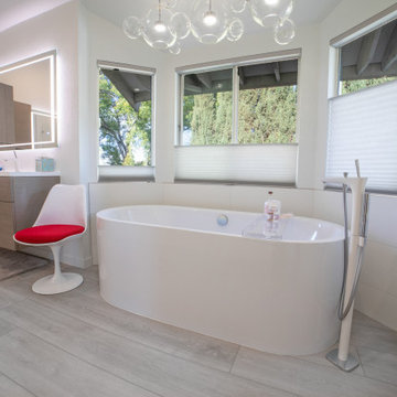
Influenced by classic Nordic design. Surprisingly flexible with furnishings. Amplify by continuing the clean modern aesthetic, or punctuate with statement pieces. With the Modin Collection, we have raised the bar on luxury vinyl plank. The result is a new standard in resilient flooring. Modin offers true embossed in register texture, a low sheen level, a rigid SPC core, an industry-leading wear layer, and so much more.
 Flooret
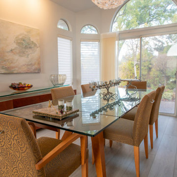
Influenced by classic Nordic design. Surprisingly flexible with furnishings. Amplify by continuing the clean modern aesthetic, or punctuate with statement pieces. With the Modin Collection, we have raised the bar on luxury vinyl plank. The result is a new standard in resilient flooring. Modin offers true embossed in register texture, a low sheen level, a rigid SPC core, an industry-leading wear layer, and so much more.
 Century Stair Company
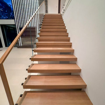
This contemporary home features two striking staircases with integrated LED lighting, glass railing, and thick wood treads. The color-changing LEDs shift from red to blue to yellow, transforming the staircases into dynamic focal points throughout the day. Wood treads and handrails are paired with frameless glass balustrades secured by black pins. Open risers amplify the LED lighting effect while maximizing transparency.
The first-level staircase uses cantilevered and field-supported construction, while the second rises on dual metal stringers. Glass railing continues on the second-floor balcony, creating a cohesive system where light and glass elevate the design beyond the purely functional.
1976-2026 © Century Stair Company
 User
UserOur approach to the dining room wall was a key decision for the entire project. The wall was load bearing and the homeowners considered only removing half of it. In the end, keeping the overall open concept design was important to the homeowners, therefore we installed a load bearing beam in the ceiling. The beam was finished with drywall to be cohesive so it looked like it was a part of the original design. Now that the kitchen and dining room were open, paint colors were used to designate the spaces and create visual boundaries. This made each area feel like it’s its own space without using any structures.
The original L-shaped kitchen was cut short because of bay windows that overlooked the backyard patio. These windows were lost in the space and not functional; they were replaced with double French doors leading onto the patio. A brick layer was brought in to patch up the window swap and now it looks like the French doors always existed. New crown molding was installed throughout and painted to match the kitchen cabinets.
This window/door replacement allowed for a large pantry cabinet to be installed next to the refrigerator which was not in the old cabinet configuration. The replaced perimeter cabinets host custom storage solutions, like a mixer stand, spice organization, recycling center and functional corner cabinet with pull out shelving. The perimeter kitchen cabinets are painted with a glaze and the island is a cherry stain with glaze to amplify the raised panel door style.
We tripled the size of the kitchen island to expand countertop space. It seats five people and hosts charging stations for the family’s busy lifestyle. It was important that the cooktop in the island had a built in downdraft system because the homeowners did not want a ventilation hood in the center of the kitchen because it would obscure the open concept design.
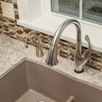
The countertops are quartz and feature an under mount granite composite kitchen sink with a low divide center. The kitchen faucet, which features hands free and touch technology, and an instant hot water dispenser were added for convenience because of the homeowners’ busy lifestyle. The backsplash is a favorite, with a teal and red glass mosaic basket weave design. It stands out and holds its own among the expansive kitchen cabinets.
All recessed, under cabinet and decorative lights were installed on dimmer switches to allow the homeowners to adjust the lighting in each space of the project. All exterior and interior door hardware, hinges and knobs were replaced in oil rubbed bronze to match the dark stain throughout the space. The entire first floor remodel project uses 12x24 ceramic tile laid in a herringbone pattern. Since tile is typically cold, the flooring was also heated from below. This will also help with the homeowners’ original heating issues.
When accessorizing the kitchen, we used functional, everyday items the homeowners use like cutting boards, canisters for dry goods and place settings on the island. Ultimately, this project transformed their small, outdated kitchen into an expansive and functional workspace.
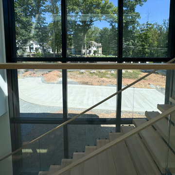 Century Stair Company
This contemporary home features two striking staircases with integrated LED lighting, glass railing, and thick wood treads. The color-changing LEDs shift from red to blue to yellow, transforming the staircases into dynamic focal points throughout the day. Wood treads and handrails are paired with frameless glass balustrades secured by black pins. Open risers amplify the LED lighting effect while maximizing transparency.
The first-level staircase uses cantilevered and field-supported construction, while the second rises on dual metal stringers. Glass railing continues on the second-floor balcony, creating a cohesive system where light and glass elevate the design beyond the purely functional.
1976-2026 © Century Stair Company
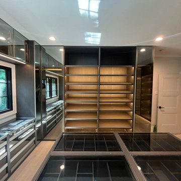
 LAZZONI
This sophisticated walk-in closet by Lazzoni combines modern luxury with functional elegance. The design features smoked glass cabinetry, LED-lit open shelving, and a central island with glass display tops, offering both visual appeal and organized storage for accessories, jewelry, and essentials.
Deep-toned matte finishes and reflective surfaces enhances the natural light from the large window, while full-height mirrored doors amplify the space. Every inch of the layout is optimized for flow and visibility, reflecting Lazzoni’s design philosophy of tailor-made, solution-driven living.
Perfect for high-end residences, this walk-in system was designed in collaboration with the homeowner and interior designer to ensure a seamless fit—both spatially and stylistically.
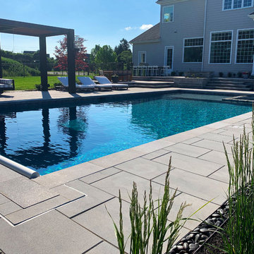
 C.E. Pontz Sons
This is the Backyard Dreams are Made of. The dream backyard project included hardscaping, landscaping, masonry, pergola with bed swing, fire features, landscape lighting, outdoor kitchen, and outdoor audio, as well as the screened in porch. The project started with a large Redi-Rock retaining wall at the back of the property. Approximately 1,340 sq ft of Techo Bloc patio was installed around the pool. The patio area features multiple tiers for seating areas, pool deck, as well as an Outdoor Kitchen. A 706 sq ft upper patio with a walkway to driveway was also installed along with a 272 sq ft front walkway. The patio walls and steps were also constructed using Techo-Bloc products. A Gas fireplace was installed on the side of porch, with gas burner insert and faced with stone veneer matching stone on home. Flooring on the screened in porch was Porcelain tile overlay which was also used on the middle tier patio as well. The pergola was a custom fabricated, powder coated aluminum pergola structure with Ipe wood beams and bed swing.
Patio gas fire pit with 350,000 BTU gas burner with 4 wall mounted gas torches on pergola and porch. Electric heaters were installed inside on the screened in porch. All landscape lighting in the front and back of home was installed using FX Luminaire ‘Luxor’ LED system, with zoning, dimming, and color options. The front landscape installation included walkway, lighting, landscaping and irrigation system for the front lawn and landscape beds.
Polished black Mexican beach pebble was installed as border around patio and patio drain areas and stepping stones were installed through mulch beds. The outdoor audio system included a TRU Audio 6 speaker system and 2-12″ outdoor subwoofers. The system also included the amplifier which is located in the home and included sonos connect to tie outdoor system to the home system. What an EPIC property!!!!
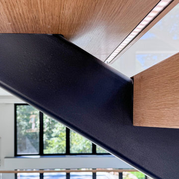 Century Stair Company
This contemporary home features two striking staircases with integrated LED lighting, glass railing, and thick wood treads. The color-changing LEDs shift from red to blue to yellow, transforming the staircases into dynamic focal points throughout the day. Wood treads and handrails are paired with frameless glass balustrades secured by black pins. Open risers amplify the LED lighting effect while maximizing transparency.
The first-level staircase uses cantilevered and field-supported construction, while the second rises on dual metal stringers. Glass railing continues on the second-floor balcony, creating a cohesive system where light and glass elevate the design beyond the purely functional.
1976-2026 © Century Stair Company
 Century Stair Company
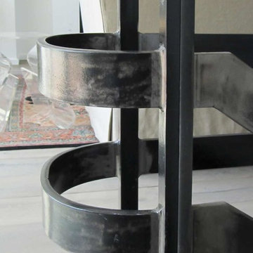
This industrial staircase rises through the heart of the home, taking center stage as an anchoring sculptural piece. The light gray treads pair flawlessly with the dark metal railings to create a refined contrast while complementing the exposed structural steel beams throughout the home. The open risers amplify the sense of volume, allowing the staircase to feel integrated rather than intrusive. The result is functional art that elevates everyday movement into an architectural experience.
1976-2025 © Century Stair Company
 dSPACE Studio Architecture
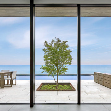
This home evokes a sensuous St. Barth lifestyle on Lake Michigan, designed for globetrotting clients who wanted a weekend sanctuary near their primary residence in Chicago. The project brief included open plan living for entertaining, a family lounge, and bedroom suites for houseguests.
The first level is a glass rectangular volume that makes the second level appear to float over the dune and offers water views through the structure. Clad in Accoya, the upper level will gray with age and blend into the landscape. These two horizontal volumes are connected by a double-height glass entry space that reveals a floating staircase.
A contemporary beach aesthetic unifies the interior through an edited palette of materials, including white oak millwork, large-format porcelain tile, and a range of warm whites. Interior tile extends out to the pool terrace, uniting the spaces and amplifying the connection to the outdoors.
The landscape design enhances the experience. A courtyard with sculptural Ginkgo trees offers refuge from lake breezes. On the pool terrace, custom Cor-Ten planters overflow with Russian Sage, selected for graceful foliage that sways in the breeze and offers a relaxing herbal aroma.
 Unpatterned
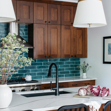
These clients had a hodgepodge of furniture mixed with a few great features and pieces - such as the William Morris wallpaper and vintage Chinese rug. We sourced a mix of vintage, new, and custom pieces to amplify the best parts of the existing features and create a space that felt less “formal” and more warm and inviting. We gutted the powder bath and created a fun statement with bright crocodile tile and subtle details. The kitchen needed a little facelift to stand up to the rest of the first floor, so we updated the tile, range, counters, hardware, plumbing fixtures, and lighting to bring the space to life.
FUN FACT: The fireplace was a dated yellow brick with a massive TV mounted above that was never used. We replaced the TV with some colorful art and framed out and Venetian Plastered the fireplace to compliment the elegance of the room.
Photography: Margaret Rajic
 Flooret
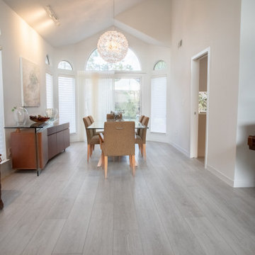
Influenced by classic Nordic design. Surprisingly flexible with furnishings. Amplify by continuing the clean modern aesthetic, or punctuate with statement pieces. With the Modin Collection, we have raised the bar on luxury vinyl plank. The result is a new standard in resilient flooring. Modin offers true embossed in register texture, a low sheen level, a rigid SPC core, an industry-leading wear layer, and so much more.
 Martin Bros. Contracting, Inc.
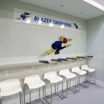
Come rain or snow, this 3-stall garage-turned-pickleball haven ensures year-round play. Climate-controlled and two stories tall, it's a regulation court with a touch of nostalgia, with walls adorned with personalized memorabilia. The Airstream bar adds character, providing a social hub. Storage cabinets maintain order, and the built-in A/V system amplifies the experience. A dedicated seating area invites friends and fans to gather, watch the thrilling matches and bask in the unique charm of this one-of-a-kind pickleball paradise.
 Eugene Pintail LLC
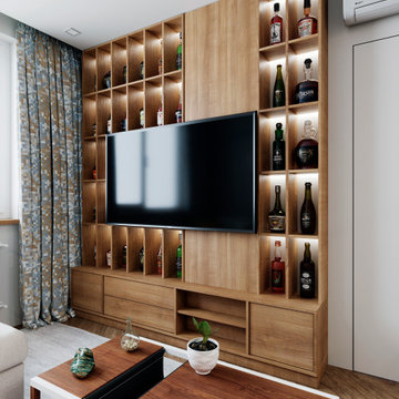
Gylden æra embraces the timeless elegance of Scandinavian minimalism in a compact apartment. By streamlining layout and materials, it creates a serene, deliberate environment where simplicity speaks volumes.
Every detail is intentionally crafted—from the seamless integration of functional areas to the uncluttered circulation paths. The design presents a visual calm that enhances both daily living and quiet reflection.
Soft woods, matte surfaces, and warm neutrals anchor the scheme. Subtle use of light tones amplifies natural light and expands spatial perception. Textural variations—like woven textiles, fine-grain wood, and matte finishes—add depth without compromising simplicity.
Minimalist lighting design—wall-mounted fixtures, linear pendants—complements the space's architectural rhythm without drawing attention away. Strategic layering of natural and ambient light enhances mood while maintaining visual clarity.
Gylden æra feels both peaceful and poised—moderated yet expressive. It captures a balance of restrained luxury and everyday comfort, honoring Scandinavian roots.
 RAJ Kitchen and Bath, LLC
**Check out the video of this transformation on our website**
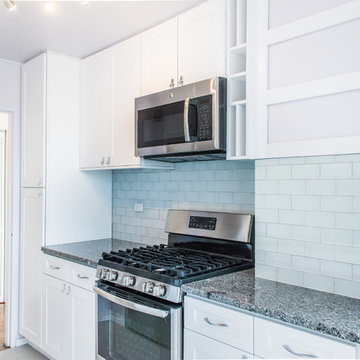
This small kitchen was way too small for this 2 bedrooms, 2 bathrooms apartment. Not only was it a very small kitchen, but the physical location of it made it very difficult to make it any bigger. There wasn't much that could have been done without incurring astronomical cost, which would get little or no return on the investment. The client wanted a kitchen that can be optimized in its current location to add a ton of value for resale.
This was difficult to do, because there was no moving of any mechanical around in the kitchen and even if we wanted to, the management of the building would not allow. For those of you who live in condos, co-ops or apartment building, you know how difficult it is to rework these foot prints. When we showed up, we saw the problems, but we also saw a huge opportunity where we can achieve those goals in the small space. This was accomplished by making some key changes and to incorporate some new things that was not possible when this kitchen was built years ago.
The crucial part of the design that would drive the entire new layout, was selecting the only appliance; that was the Refrigerator. Once we nailed down that refrigerator, we then proceeded to design the kitchen around it. We moved it to the other side of the wall where the sink was so that we can tap into the water line from the sink plumbing. It was crucial that it stays exactly 24" deep, not an inch more because we had to keep the entry as open as possible. Also, it was going to be directly in front of another big storage unit - The pantry. It is not ideal in most cases, but we needed the rest of the space to ramp up the design and open feel towards the side where all of the activities would take place, which happend to be the dining room and the view.
Once all that was figured out, we re-positioned the sink, dishwasher and the range and proceeded to wrap the cabinets around the columns to integrate them into the space. Thirty- six inches cabinets height was used so that they can be installed higher towards the ceiling height to give more room rather than the standard 18" required height between the counter tops. This was done to make the room feel a lot bigger than it really was. Not to mention, we also didn't want the faucet to be buried under the cabinets so that was also a necessary design detail for the space.
We then lowered both knee walls so that the counter top can sit on top of them, by removing that stop point that would have otherwise defined the kitchen area. This allowed us to pick up that extra footprint into the room for added prep space and enabled us to create the illusion of a kitchen that is looking longer than it really is. Every inch mattered when designing this kitchen and we made a conscious decision to use every one of that inch.
White cabinets were selected to do just what white cabinets are design to do; make a small or dark room appear bigger, brighter and more open. In this kitchen, this was amplified the more because of the kitchen location. It was perfect! We knew we did justice to the space because while we were there taking some photos, a few potential buyers walked in and went straight for the kitchen! They said its design just to fit the apartment.
Pantry roll out shelving, Double recycle bin, fancy handles, LED lighting, Quartz counter top, beautiful backslash tiles and grey linen floors finished off the kitchen which looked over a beautiful view of the George Washington Bridge from the top of this lovely 4th floor apartment.
Credit to Masterpiece Tile and Marble (Annmarie on the selection of Tiles and countertop and Val on the Construction to complete this project).
Davor Kokic Photography
 Flooret
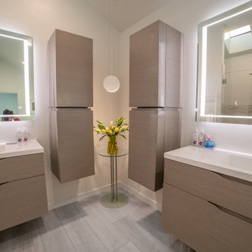
Influenced by classic Nordic design. Surprisingly flexible with furnishings. Amplify by continuing the clean modern aesthetic, or punctuate with statement pieces. With the Modin Collection, we have raised the bar on luxury vinyl plank. The result is a new standard in resilient flooring. Modin offers true embossed in register texture, a low sheen level, a rigid SPC core, an industry-leading wear layer, and so much more.
36