
Search results for "Attracting brand new" in Home Design Ideas
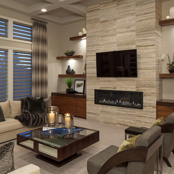
 Interiors Joan and Associates
Example of a trendy carpeted living room design in Omaha with a ribbon fireplace, a wall-mounted tv and beige walls
 TKS Design Group
Download our free ebook, Creating the Ideal Kitchen. DOWNLOAD NOW
The homeowners built their traditional Colonial style home 17 years’ ago. It was in great shape but needed some updating. Over the years, their taste had drifted into a more contemporary realm, and they wanted our help to bridge the gap between traditional and modern.
We decided the layout of the kitchen worked well in the space and the cabinets were in good shape, so we opted to do a refresh with the kitchen. The original kitchen had blond maple cabinets and granite countertops. This was also a great opportunity to make some updates to the functionality that they were hoping to accomplish.
After re-finishing all the first floor wood floors with a gray stain, which helped to remove some of the red tones from the red oak, we painted the cabinetry Benjamin Moore “Repose Gray” a very soft light gray. The new countertops are hardworking quartz, and the waterfall countertop to the left of the sink gives a bit of the contemporary flavor.
We reworked the refrigerator wall to create more pantry storage and eliminated the double oven in favor of a single oven and a steam oven. The existing cooktop was replaced with a new range paired with a Venetian plaster hood above. The glossy finish from the hood is echoed in the pendant lights. A touch of gold in the lighting and hardware adds some contrast to the gray and white. A theme we repeated down to the smallest detail illustrated by the Jason Wu faucet by Brizo with its similar touches of white and gold (the arrival of which we eagerly awaited for months due to ripples in the supply chain – but worth it!).
The original breakfast room was pleasant enough with its windows looking into the backyard. Now with its colorful window treatments, new blue chairs and sculptural light fixture, this space flows seamlessly into the kitchen and gives more of a punch to the space.
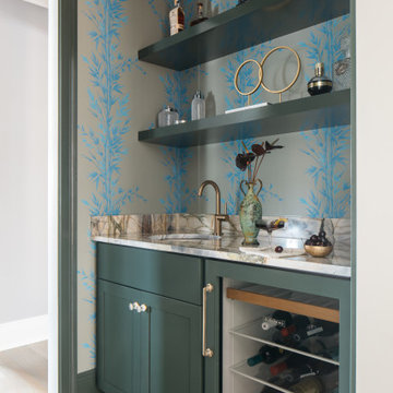
The original butler’s pantry was functional but was also starting to show its age. The new space was inspired by a wallpaper selection that our client had set aside as a possibility for a future project. It worked perfectly with our pallet and gave a fun eclectic vibe to this functional space. We eliminated some upper cabinets in favor of open shelving and painted the cabinetry in a high gloss finish, added a beautiful quartzite countertop and some statement lighting. The new room is anything but cookie cutter.
Next the mudroom. You can see a peek of the mudroom across the way from the butler’s pantry which got a facelift with new paint, tile floor, lighting and hardware. Simple updates but a dramatic change! The first floor powder room got the glam treatment with its own update of wainscoting, wallpaper, console sink, fixtures and artwork. A great little introduction to what’s to come in the rest of the home.
The whole first floor now flows together in a cohesive pallet of green and blue, reflects the homeowner’s desire for a more modern aesthetic, and feels like a thoughtful and intentional evolution. Our clients were wonderful to work with! Their style meshed perfectly with our brand aesthetic which created the opportunity for wonderful things to happen. We know they will enjoy their remodel for many years to come!
Photography by Margaret Rajic Photography
 Just the Thing Decorating, Staging, and Windows
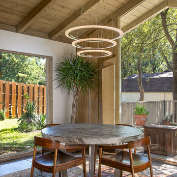
The family who has owned this home for twenty years was ready for modern update! Concrete floors were restained and cedar walls were kept intact, but kitchen was completely updated with high end appliances and sleek cabinets, and brand new furnishings were added to showcase the couple's favorite things.
Troy Grant, Epic Photo
Find the right local pro for your project
 Sarah Greenman
Photo: Sarah Greenman © 2014 Houzz
Design: New Leaf Construction
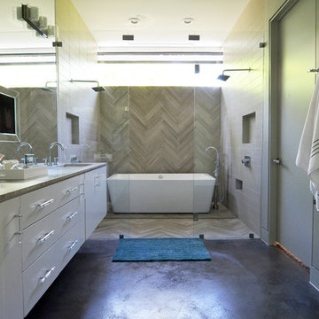
Bathroom - contemporary master gray tile concrete floor bathroom idea in Dallas with an undermount sink, flat-panel cabinets, white cabinets and beige walls
Bathroom - contemporary master gray tile concrete floor bathroom idea in Dallas with an undermount sink, flat-panel cabinets, white cabinets and beige walls
 Epic Development
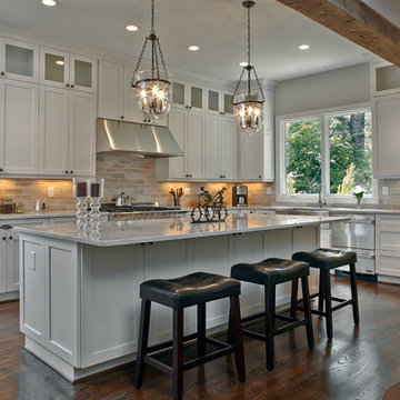
The kitchen of a new Mediterranean/Transitional style home in Atlanta. Features include custom wood cabinetry (Sherwin Williams Elder White) to the ceiling with soft close feature, quartz countertops (Quartzite Calacatta), stone backsplash (3x6 Valentino White Tile), under cabinet lighting, stainless steel farm sink, and DCS stainless steel appliances including 48" gas range, double drawer dishwasher and double door refrigerator. The huge island overlooks the family room and houses the Sharp Microwave Drawer. The wall color is Popular Gray Flat (SW 6071). Designed by Price Residential Design; Built by Epic Development; Interior Design by Mike Horton; Photo by Brian Gassel
 Just the Thing Decorating, Staging, and Windows
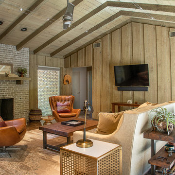
The family who has owned this home for twenty years was ready for modern update! Concrete floors were restained and cedar walls were kept intact, but kitchen was completely updated with high end appliances and sleek cabinets, and brand new furnishings were added to showcase the couple's favorite things.
Troy Grant, Epic Photo
 Roomscapes Cabinetry and Design Center
Designed by Cameron Snyder, CKD and Julie Lyons.
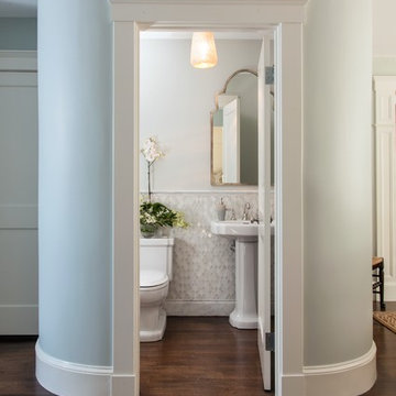
Removing the former wall between the kitchen and dining room to create an open floor plan meant the former powder room tucked in a corner needed to be relocated.
Cameron designed a 7' by 6' space framed with curved wall in the middle of the new space to locate the new powder room and it became an instant focal point perfectly located for guests and easily accessible from the kitchen, living and dining room areas.
Both the pedestal lavatory and one piece sanagloss toilet are from TOTO Guinevere collection. Faucet is from the Newport Brass-Bevelle series in Polished Nickel with lever handles.
Sponsored
Fredericksburg, OH

High Point Cabinets
Columbus' Experienced Custom Cabinet Builder | 4x Best of Houzz Winner
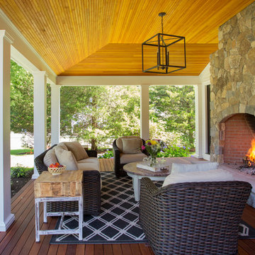
 Cummings Architecture + Interiors
When Cummings Architects first met with the owners of this understated country farmhouse, the building’s layout and design was an incoherent jumble. The original bones of the building were almost unrecognizable. All of the original windows, doors, flooring, and trims – even the country kitchen – had been removed. Mathew and his team began a thorough design discovery process to find the design solution that would enable them to breathe life back into the old farmhouse in a way that acknowledged the building’s venerable history while also providing for a modern living by a growing family.
The redesign included the addition of a new eat-in kitchen, bedrooms, bathrooms, wrap around porch, and stone fireplaces. To begin the transforming restoration, the team designed a generous, twenty-four square foot kitchen addition with custom, farmers-style cabinetry and timber framing. The team walked the homeowners through each detail the cabinetry layout, materials, and finishes. Salvaged materials were used and authentic craftsmanship lent a sense of place and history to the fabric of the space.
The new master suite included a cathedral ceiling showcasing beautifully worn salvaged timbers. The team continued with the farm theme, using sliding barn doors to separate the custom-designed master bath and closet. The new second-floor hallway features a bold, red floor while new transoms in each bedroom let in plenty of light. A summer stair, detailed and crafted with authentic details, was added for additional access and charm.
Finally, a welcoming farmer’s porch wraps around the side entry, connecting to the rear yard via a gracefully engineered grade. This large outdoor space provides seating for large groups of people to visit and dine next to the beautiful outdoor landscape and the new exterior stone fireplace.
Though it had temporarily lost its identity, with the help of the team at Cummings Architects, this lovely farmhouse has regained not only its former charm but also a new life through beautifully integrated modern features designed for today’s family.
Photo by Eric Roth
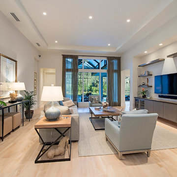
 41 West
View of Great Room/Living Room from front entry: 41 West Coastal Retreat Series reveals creative, fresh ideas, for a new look to define the casual beach lifestyle of Naples.
More than a dozen custom variations and sizes are available to be built on your lot. From this spacious 3,000 square foot, 3 bedroom model, to larger 4 and 5 bedroom versions ranging from 3,500 - 10,000 square feet, including guest house options.
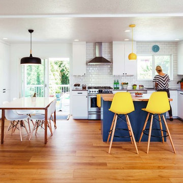
 The Jack + Mare | Portland Design & Build
Split Level 1970 home of a young and active family of four. The main public spaces in this home were remodeled to create a fresh, clean look.
The Jack + Mare demo'd the kitchen and dining room down to studs and removed the wall between the kitchen/dining and living room to create an open concept space with a clean and fresh new kitchen and dining with ample storage. Now the family can all be together and enjoy one another's company even if mom or dad is busy in the kitchen prepping the next meal.
The custom white cabinets and the blue accent island (and walls) really give a nice clean and fun feel to the space. The island has a gorgeous local solid slab of wood on top. A local artisan salvaged and milled up the big leaf maple for this project. In fact, the tree was from the University of Portland's campus located right where the client once rode the bus to school when she was a child. So it's an extra special custom piece! (fun fact: there is a bullet lodged in the wood that is visible...we estimate it was shot into the tree 30-35 years ago!)
The 'public' spaces were given a brand new waterproof luxury vinyl wide plank tile. With 2 young daughters, a large golden retriever and elderly cat, the durable floor was a must.
project scope at quick glance:
- demo'd and rebuild kitchen and dining room.
- removed wall separating kitchen/dining and living room
- removed carpet and installed new flooring in public spaces
- removed stair carpet and gave fresh black and white paint
- painted all public spaces
- new hallway doorknob harware
- all new LED lighting (kitchen, dining, living room and hallway)
Jason Quigley Photography
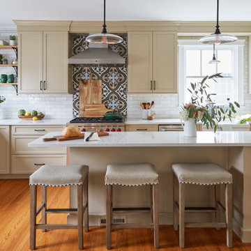 TKS Design Group
Download our free ebook, Creating the Ideal Kitchen. DOWNLOAD NOW
The homeowners came to us looking to update the kitchen in their historic 1897 home. The home had gone through an extensive renovation several years earlier that added a master bedroom suite and updates to the front façade. The kitchen however was not part of that update and a prior 1990’s update had left much to be desired. The client is an avid cook, and it was just not very functional for the family.
The original kitchen was very choppy and included a large eat in area that took up more than its fair share of the space. On the wish list was a place where the family could comfortably congregate, that was easy and to cook in, that feels lived in and in check with the rest of the home’s décor. They also wanted a space that was not cluttered and dark – a happy, light and airy room. A small powder room off the space also needed some attention so we set out to include that in the remodel as well.
See that arch in the neighboring dining room? The homeowner really wanted to make the opening to the dining room an arch to match, so we incorporated that into the design.
Another unfortunate eyesore was the state of the ceiling and soffits. Turns out it was just a series of shortcuts from the prior renovation, and we were surprised and delighted that we were easily able to flatten out almost the entire ceiling with a couple of little reworks.
Other changes we made were to add new windows that were appropriate to the new design, which included moving the sink window over slightly to give the work zone more breathing room. We also adjusted the height of the windows in what was previously the eat-in area that were too low for a countertop to work. We tried to keep an old island in the plan since it was a well-loved vintage find, but the tradeoff for the function of the new island was not worth it in the end. We hope the old found a new home, perhaps as a potting table.
Designed by: Susan Klimala, CKD, CBD
Photography by: Michael Kaskel
For more information on kitchen and bath design ideas go to: www.kitchenstudio-ge.com
 Maletz Design
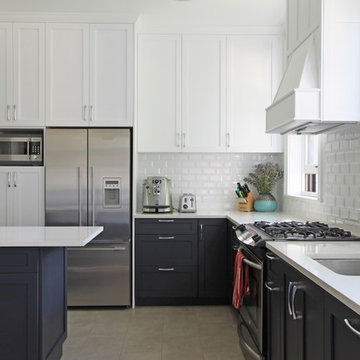
Townhouse renovation in Brooklyn: We redesigned the rear end of the house as an expanded family kitchen with a back door to the deck. We also added a new connection from the entrance hall to the kitchen and fit a small powder room under the stairs. The old windows and doors were replaced with new, larger ones, and the entire kitchen was gutted and refitted with new cabinetry and a banquette dining area. The space was designed to take advantage of the bright southern exposure, with lots of white materials, grounded by the dark base cabinets.
Photos by Maletz Design

 Advance Design Studio, Ltd.
Jennifer and Dan have lived in their Deer Park Illinois home for 15 years, slowly making minor fixes like painting and decorating; but they had a new plan for their kitchen the entire time. An awkwardly placed garage door, and an island cooktop with a terrible downdraft made a full-scale kitchen remodel an absolute must. Jennifer had many ideas in mind and wanted to work with a company that could provide high-end work, while partnering with a designer that would tailor the kitchen to her ideas.
She was intrigued by the phrase “Common Sense Remodeling” in Advance Design’s feature she discovered while perusing an issue of the community’s Quintessential Barrington Magazine. Doing further research on the company’s website, as she looked through project profiles and read about Advance Design’s “Common Sense Remodeling” philosophy, she promptly scheduled an appointment to see if the people and ideas she read about were truly who they said they were. The more she read, the more she knew that the “Common Sense” approach to remodeling they described was exactly the type of company she was looking for.
The partnership was sealed after an initial consultation with Owner Todd Jurs and Project Designer Michelle Lecinski. They displayed a combination of friendliness, professionalism and respect that was unmatched by any of the other companies Jennifer talked to. She knew that with Advance Design, she would be able to retain the vision that she had in mind with high-quality craftsmanship.
“I reached out to Advance Design because of the ‘Common Sense Remodeling’ tagline,” Jennifer said. “That’s what lingered for me”. “Advance Design was the most respectful- of the house and of my design ideas, and the most professional of the handful of companies that looked at my project”.
Soon after the meeting Jennifer began working with Michelle on the project design. They quickly developed chemistry. Jennifer loved how Michelle researched and located every detail that Jennifer wanted for the kitchen. Between the two of them, every concept and idea was worked through and perfected. “Jennifer had definite ideas about what she wanted the new kitchen to look like, she just didn’t know how to bring it all together. We worked together really well to make her ideas into the practical reality necessary for a well-functioning kitchen, with the look and feel that she had envisioned”, says Michelle.
“Michelle was wonderful in using the CAD system she would show me new drawings every time we changed the layout while working through the design,” Jennifer said. “She was a really wonderful partner in execution, she made sure everything happened quickly and easily.”
The finished design drew out elements of Jennifer’s style and personality. The pair call the look “sophisticated farmhouse” to describe the kitchen renovation to family and friends. The result was a beautifully crafted, authentic-feeling space that satisfied Jennifer’s dreams 15 years in the making. The whole project consisted of a kitchen remodel, mudroom upgrade with powder room, and garage entry relocation. “The projects I personally like the best, are the ones that put the client’s dreams on display,” Project Designer Michelle said. “And this is one of those projects.”
The main focal point of the kitchen is custom zinc and brass ventilation hood with a vintage sheen, which was hand made to order by a small company in Indiana named Vogler Metalworking. “It’s like sculpture, a true work of art”, says Jennifer. Your eye is immediately drawn towards this elegant yet practical hood that eliminated the home’s downdraft problem and added a striking conversation piece at the same time. The carpenters had to use special gloves when transporting and installing it, so they didn’t smudge it with fingerprints. The beautiful hood centers proudly over the stunning black enamel and brass LaCornue Range. “I had a friend who had a LaCornue range and after learning how easy it was to cook perfect meals, I was convinced I wanted to have one”, says Jennifer. This unique, breathtaking combination anchors the entire kitchen and is apparent immediately as you walk into the great room the surrounds the space.
DuraSupreme Crestwood cabinets with a Kendall Panel add function and sophistication. A custom gray paint color paired with a storm blue was developed so that the new kitchen looked like it belonged to the existing space. Unlacquered brass faucets and hardware were important to Jennifer because she wanted the living finishes to age over time. Remarkable brass diamond mesh cabinet door inserts imported from the UK continue to add this one-of-a-kind kitchen renovation; giving it a “you won’t see this everywhere” quality. The use of old railcar flooring for the coffee bar countertop and reclaimed oak for the open shelving gives an authenticity to the space uncommon in kitchens today.
Jennifer and Michelle fell in love with the Limestone Grey Stone while they were investigating unique island countertop ideas. They liked the fact that the limestone as a living finish will age and change over time. Calcutta Miel Quartz countertops made for an excellent pairing around the perimeter, as it’s durable and perfect for cooking preparations. A textured white subway tile backsplash that runs to the ceiling keeps your eye moving towards the open shelving, and to the main focal point of the stunning range hood combination.
“The kitchen functions beautifully, and it’s gorgeous,” beams Jennifer as she gestures with both hands while smiling ear to ear. “The most important thing was I wanted a kitchen that had a wonderful flow, cooked beautiful meals and was a great gathering place for family and friends, and this space does that perfectly! Beauty wise, it turned out exactly how I had envisioned. I felt the function part was the hardest part, and that was nailed”!
Relocating the garage entry to the new mudroom was a huge priority and has finally separated the family’s arriving home functions from their kitchen. Now coats and shoes and bags have their own area for dropping once members arrive home. Matching gray DuraSupreme cabinetry helped create gorgeous, purposeful lockers for the family. A reclaimed vintage sink and custom wall paper were added to the tiny powder room to beautify the once previously only functional space. Advance Design was even able to create a custom space for their dog to sleep while the family is away.
“It was unbelievable that a project of this size was completed in such a short time, and I think that’s because of the large amount of planning and preparation that went into it,” Jennifer marveled, “When we started, we were ready, and everything was prepared”.
When it came to execution, Project Manager Justin Davis and his crew were quick, accessible, and organized. Projects like this kitchen are typically completed in as little as 8-10 weeks. Jennifer’s kitchen however despite the relocation of some challenging HVAC in a soffit and moving of an exterior door was completed remarkably fast in part because the team was working with an existing tile floor that ran throughout the first floor that the client really loved.
“You get to know these people really well because they’re living in your house while you’re living in your house. They were so fast and really good, it didn’t take as long as even planned” reported Jennifer. “I would text Justin and he always responded almost immediately. I got to know all the guys who were working in our house and they were all wonderful people”.
Details in a customized kitchen like this one require skill and care from the people who install it. “All the guys on the job were skilled at what the did. I wanted small details like little feet to look like furniture, that is where their carpentry skill came in to make these all perfect”, said Jennifer. “The tile guys were wonderful. They even let me determine how I wanted the texture with the grout to appear for a salt and pepper look; now that is a very skilled trade person making it custom”.
In Jennifer’s interview, she continued to reference Advance Design’s “Common Sense Remodeling”, so I took a minute to ask her exactly what that phrase meant to her and how it played out in her experience with her project and the Advance Design team. Here is what she said: “I was intrigued about Common Sense Remodeling and in my head that there would be clear costs and prices, great communication between the design team, the execution team and me”, said Jennifer. They did deliver on that, it was so clear about the cost breakdown, what I could expect from everyone who came to my house, and everything that we had ordered. That to me is the Common Sense”!
It’s great to see a client take literally our assertion that a well-planned remodeling project is simply “Common Sense”! She anticipated each step of the way would be clear, concise, and predictable, all the while protecting the outcome due to the careful upfront planning. “Advance Design delivered on their ‘Common Sense Remodeling’ promise,” Jennifer said. “From the design team, to the execution team - everything was straight forward like I imagined. The project turned out exactly how I envisioned, I enjoyed this process and absolutely would recommend Advance Design Studio to anyone.”
Sponsored
Fredericksburg, OH
High Point Cabinets
Columbus' Experienced Custom Cabinet Builder | 4x Best of Houzz Winner
 Advance Design Studio, Ltd.
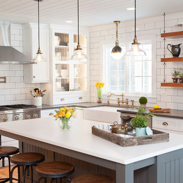
When this suburban family decided to renovate their kitchen, they knew that they wanted a little more space. Advance Design worked together with the homeowner to design a kitchen that would work for a large family who loved to gather regularly and always ended up in the kitchen! So the project began with extending out an exterior wall to accommodate a larger island and more moving-around space between the island and the perimeter cabinetry.
Style was important to the cook, who began collecting accessories and photos of the look she loved for months prior to the project design. She was drawn to the brightness of whites and grays, and the design accentuated this color palette brilliantly with the incorporation of a warm shade of brown woods that originated from a dining room table that was a family favorite. Classic gray and white cabinetry from Dura Supreme hits the mark creating a perfect balance between bright and subdued. Hints of gray appear in the bead board detail peeking just behind glass doors, and in the application of the handsome floating wood shelves between cabinets. White subway tile is made extra interesting with the application of dark gray grout lines causing it to be a subtle but noticeable detail worthy of attention.
Suede quartz Silestone graces the countertops with a soft matte hint of color that contrasts nicely with the presence of white painted cabinetry finished smartly with the brightness of a milky white farm sink. Old melds nicely with new, as antique bronze accents are sprinkled throughout hardware and fixtures, and work together unassumingly with the sleekness of stainless steel appliances.
The grace and timelessness of this sparkling new kitchen maintains the charm and character of a space that has seen generations past. And now this family will enjoy this new space for many more generations to come in the future with the help of the team at Advance Design Studio.
Photographer: Joe Nowak
Dura Supreme Cabinetry
 Ben Quie & Sons
Traditional design blends well with 21st century accessibility standards. Designed by architect Jeremiah Battles of Acacia Architects and built by Ben Quie & Sons, this beautiful new home features details found a century ago, combined with a creative use of space and technology to meet the owner’s mobility needs. Even the elevator is detailed with quarter-sawn oak paneling. Feeling as though it has been here for generations, this home combines architectural salvage with creative design. The owner brought in vintage lighting fixtures, a Tudor fireplace surround, and beveled glass for windows and doors. The kitchen pendants and sconces were custom made to match a 1912 Sheffield fixture she had found. Quarter-sawn oak in the living room, dining room, and kitchen, and flat-sawn oak in the pantry, den, and powder room accent the traditional feel of this brand-new home.
Design by Acacia Architects/Jeremiah Battles
Construction by Ben Quie and Sons
Photography by: Troy Thies
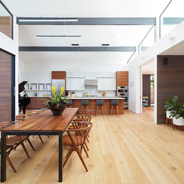
 Klopf Architecture
Klopf Architecture and Outer space Landscape Architects designed a new warm, modern, open, indoor-outdoor home in Los Altos, California. Inspired by mid-century modern homes but looking for something completely new and custom, the owners, a couple with two children, bought an older ranch style home with the intention of replacing it.
Created on a grid, the house is designed to be at rest with differentiated spaces for activities; living, playing, cooking, dining and a piano space. The low-sloping gable roof over the great room brings a grand feeling to the space. The clerestory windows at the high sloping roof make the grand space light and airy.
Upon entering the house, an open atrium entry in the middle of the house provides light and nature to the great room. The Heath tile wall at the back of the atrium blocks direct view of the rear yard from the entry door for privacy.
The bedrooms, bathrooms, play room and the sitting room are under flat wing-like roofs that balance on either side of the low sloping gable roof of the main space. Large sliding glass panels and pocketing glass doors foster openness to the front and back yards. In the front there is a fenced-in play space connected to the play room, creating an indoor-outdoor play space that could change in use over the years. The play room can also be closed off from the great room with a large pocketing door. In the rear, everything opens up to a deck overlooking a pool where the family can come together outdoors.
Wood siding travels from exterior to interior, accentuating the indoor-outdoor nature of the house. Where the exterior siding doesn’t come inside, a palette of white oak floors, white walls, walnut cabinetry, and dark window frames ties all the spaces together to create a uniform feeling and flow throughout the house. The custom cabinetry matches the minimal joinery of the rest of the house, a trim-less, minimal appearance. Wood siding was mitered in the corners, including where siding meets the interior drywall. Wall materials were held up off the floor with a minimal reveal. This tight detailing gives a sense of cleanliness to the house.
The garage door of the house is completely flush and of the same material as the garage wall, de-emphasizing the garage door and making the street presentation of the house kinder to the neighborhood.
The house is akin to a custom, modern-day Eichler home in many ways. Inspired by mid-century modern homes with today’s materials, approaches, standards, and technologies. The goals were to create an indoor-outdoor home that was energy-efficient, light and flexible for young children to grow. This 3,000 square foot, 3 bedroom, 2.5 bathroom new house is located in Los Altos in the heart of the Silicon Valley.
Klopf Architecture Project Team: John Klopf, AIA, and Chuang-Ming Liu
Landscape Architect: Outer space Landscape Architects
Structural Engineer: ZFA Structural Engineers
Staging: Da Lusso Design
Photography ©2018 Mariko Reed
Location: Los Altos, CA
Year completed: 2017
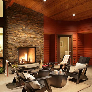
 Kraft Custom Construction
Built from the ground up on 80 acres outside Dallas, Oregon, this new modern ranch house is a balanced blend of natural and industrial elements. The custom home beautifully combines various materials, unique lines and angles, and attractive finishes throughout. The property owners wanted to create a living space with a strong indoor-outdoor connection. We integrated built-in sky lights, floor-to-ceiling windows and vaulted ceilings to attract ample, natural lighting. The master bathroom is spacious and features an open shower room with soaking tub and natural pebble tiling. There is custom-built cabinetry throughout the home, including extensive closet space, library shelving, and floating side tables in the master bedroom. The home flows easily from one room to the next and features a covered walkway between the garage and house. One of our favorite features in the home is the two-sided fireplace – one side facing the living room and the other facing the outdoor space. In addition to the fireplace, the homeowners can enjoy an outdoor living space including a seating area, in-ground fire pit and soaking tub.
Sponsored
Columbus, OH

Hope Restoration & General Contracting
Columbus Design-Build, Kitchen & Bath Remodeling, Historic Renovations
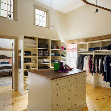 Cummings Architecture + Interiors
The beautiful, old barn on this Topsfield estate was at risk of being demolished. Before approaching Mathew Cummings, the homeowner had met with several architects about the structure, and they had all told her that it needed to be torn down. Thankfully, for the sake of the barn and the owner, Cummings Architects has a long and distinguished history of preserving some of the oldest timber framed homes and barns in the U.S.
Once the homeowner realized that the barn was not only salvageable, but could be transformed into a new living space that was as utilitarian as it was stunning, the design ideas began flowing fast. In the end, the design came together in a way that met all the family’s needs with all the warmth and style you’d expect in such a venerable, old building.
On the ground level of this 200-year old structure, a garage offers ample room for three cars, including one loaded up with kids and groceries. Just off the garage is the mudroom – a large but quaint space with an exposed wood ceiling, custom-built seat with period detailing, and a powder room. The vanity in the powder room features a vanity that was built using salvaged wood and reclaimed bluestone sourced right on the property.
Original, exposed timbers frame an expansive, two-story family room that leads, through classic French doors, to a new deck adjacent to the large, open backyard. On the second floor, salvaged barn doors lead to the master suite which features a bright bedroom and bath as well as a custom walk-in closet with his and hers areas separated by a black walnut island. In the master bath, hand-beaded boards surround a claw-foot tub, the perfect place to relax after a long day.
In addition, the newly restored and renovated barn features a mid-level exercise studio and a children’s playroom that connects to the main house.
From a derelict relic that was slated for demolition to a warmly inviting and beautifully utilitarian living space, this barn has undergone an almost magical transformation to become a beautiful addition and asset to this stately home.
 Shelley Morris Interiors
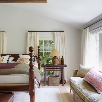
For her own home in New Canaan, CT, Shelley Morris gutted a mid-century, ranch style house, transforming it inside and out. Reinvisioning the exterior architectural elevation and interior floor plan, the designer orchestrated rich, textured materials including Venetian plaster walls, reclaimed wood beams, floor to ceiling mutton windows, wide plank white oak floors, painted custom millwork, and horizontal wainscot. Raising ceiling heights in most of the rooms (either cathedral or tray style), she also introduced round windows, French doors, a black granite surround fireplace, and all-new bathrooms, kitchen, plumbing and lighting. The furnishings are a layered collage of subtle textures and color.
 Michael Nash Design, Build & Homes
This growing family of six was struggling with a dysfunctional kitchen design. The center island had been installed at an odd angle that limited accessibility and traffic flow. Additionally, storage space was limited by poor cabinet design. Finally, doorways in and out of the kitchen were narrow and poorly located, especially for children dashing in and out.
Other design challenges included how to better use a 10’ x 12’ room for children’s jackets and toys and how to add a professional-quality gas range in a neighborhood were natural gas wasn’t available. The new design would address all of these issues.
DESIGN SOLUTIONS
The new kitchen design revolves around a more proportional island. Carefully placed in the center of the new space with seating for four, it includes a prep sink, a second dishwasher and a beverage center.
The distressed ebony-stained island and hutch provides a brilliant contrast between the white color cabinetry. White Carrera marble countertops and backsplash top both island and perimeter cabinets.
Tall, double stacked cabinetry lines two walls to maximize storage space. Across the room there was an unused wall that now contains a 36” tower fridge and freezer, both covered with matching panels, and a tall cabinet that contains a microwave, steam unit and warming drawer.
A propane tank was buried in the back yard to provide gas to a new 60” professional range and cooktop. A custom-made wood mantel hood blends perfectly with the cabinet style.
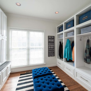
The old laundry room was reconfigured to have lots of locker space for all kids and added cabinetry for storage. A double entry door separated the new mudroom from the rest of the back hall. In the back hall the back windows were replaced with a set of French door and added decking to create a direct access to deck and backyard.
The end result is an open floor plan, high-end appliances, great traffic flow and pleasing colors. The homeowner calls it the “kitchen of her dreams.”
3