
Search results for "Avoiding" in Home Design Ideas
 SCM Design Group
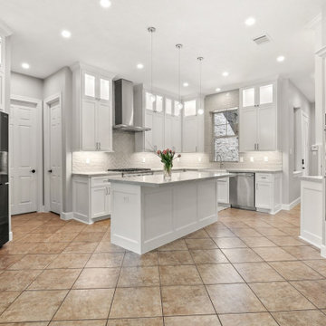
We completely transformed this custom kitchen into an open and airy space with a clean and more contemporary look! High-end tile, completely custom cabinetry built in-house by our carpenters and Thermadore Home appliances create a sophisticated atmosphere in this family home.
 Dragon Cellars
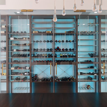
New wood, metal and acrylic wine racks that give the elegance and warmth of wood but divided in a light and transparent configuration. No clutter, just wine displayed in various forms to provide a unique ambiance to dining area as well as a key focal point for folks entering the home and even visible from outside. Ducted unit used to avoid unnecessary noise. Brass hardware for glass to coincide with other elements in the house. Also added a custom wine bar area with the same materials and finishes to serve wine and hold glasses.
 Budget Bath, Inc.
Photo by Jill Hughes
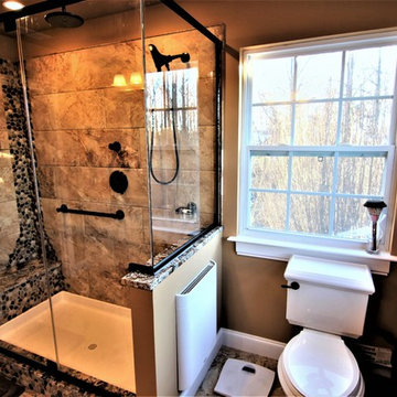
Huge minimalist master beige tile and ceramic tile ceramic tile bathroom photo in Baltimore with recessed-panel cabinets, white cabinets, a one-piece toilet, beige walls, an undermount sink and granite countertops
Huge minimalist master beige tile and ceramic tile ceramic tile bathroom photo in Baltimore with recessed-panel cabinets, white cabinets, a one-piece toilet, beige walls, an undermount sink and granite countertops
Find the right local pro for your project
 Kitchen Designs by Ken Kelly, Inc. (CKD, CBD, CR)
When we began this blue and white kitchen project, there was a room that had been previously added on to the back of the kitchen. At the time the client put addition in, they had structurally framed it keeping the post you see in the photos. We had the option of removing the post and putting in a steel header to remove it, but to avoid the expense, the decision was made to keep the post, work around it. Ken designed something spectacular to intentionally incorporate it into a large kitchen island positioning it in the most ideal location so the post wouldn’t be in the middle of the room. He built up the quartz counters to a 2” thickness and notched the countertop around the post. Before the renovation, there were no sliding doors, so we added a slider and two windows that flank the Bertazzoni range oven and hood. There was a side door where the coffee pot is now and there was no way to get to the outdoor deck from the kitchen. A large part of the design was changing the way you enter the kitchen from the front hallway and from the outdoor deck and dining area. The client wanted an open indoor/outdoor feeling in this kitchen with more storage and better functionality. We were able to create this by moving the stove from the inside wall to the outside wall, adding new windows and sliders, and allowing the natural light to flow in from the pre-existing skylight. The exquisite finishes of this blue and white kitchen are from our Brookhaven by Wood-Mode line with oak wood floors.
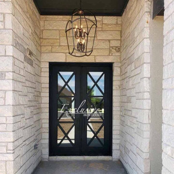
 Exclusive Iron Doors LLC
Heavy duty 14 gauge steel
Filled up with polyurethane for energy saving
Double pane E glass, tempered and sealed to avoid conditioning leaks
Included weatherstrippings to reduce air infiltration
Operable glass panels that can be opened independently from the doors
Thresholds made to prevent water infiltration
Barrel hinges which are perfect for heavy use and can be greased for a better use
Double doors include a pre-insulated flush bolt system to lock the dormant door or unlock it for a complete opening space
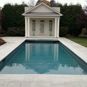
 Colony Pool Service of Delaware, Inc.
This residential in-ground swimming pool located in Greenville, Delaware is choosing a custom Mesh Safety Pool Cover.
A Safety Pool Cover is custom-designed for your own specific swimming pool providing safety and protection. Your cover will be designed and custom manufactured to accommodate pool steps, angles, and unique configurations to avoid compromising quality and safety.
Colony Pool Service of Delaware, Inc. installs a Loop-Loc Mesh Safety Pool Cover (Color-Green) into "stamped concrete deck" with masonry collars installed around brass anchors.
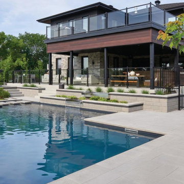
 Techo-Bloc
This unique backyard landscape was created with our Blu Grande slabs. Perfect paving slab for modern poolsides and backyard design, Blu Grande Smooth is a large concrete patio stone available in multiple colors. Its smooth texture is sleek to the eye but rougher to the touch which avoids it from getting slippery when wet.
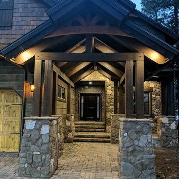
 Butler Developments
 worked as a general contractor on this two story custom home in Pinetop, AZ. Coordinating project managers for design and multiple specialists we built the home from start to finish to the owner's specifications.
The exterior design consists of a combination of masonry on the lower level and shingle siding on the second level. The modern rustic look matches the natural materials and colors used in the support beams, the brick driveway, natural wood doors and shutters, and abundant trees on the lot.
This entryway is solid and well lit with yellow bulbs to reduce insect active. We switched to brighter lighting on the porch for ease of entry and security at the door.
The natural garage door adds a touch of brighter color and allows for easy parking or storage. If the homeowner chooses exterior parking, the extended entry allows them to avoid the elements between the interior and their vehicle.
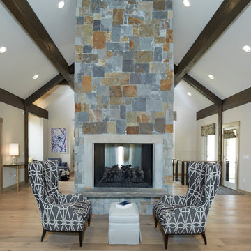
 Klebba Custom Builders
Inspiration for a large rustic open concept light wood floor and brown floor family room remodel in Denver with beige walls, a two-sided fireplace, a tile fireplace and no tv
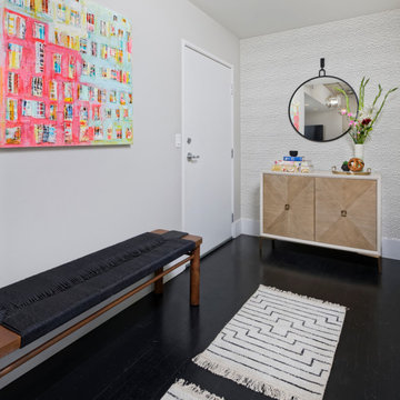
 MARGARITA BRAVO
Our amazing, fun clients for this project are relaxed, chic, modern, subtle, and clever. Our Miami studio wanted the design to reflect this beautiful, smart, and hardworking couple and their two super cute dogs. We wanted to showcase their spirit of sophistication and detail, elegance and calm simplicity throughout the condo and did it by selecting unique finishes, wonderful wallpapers, clever paint colors, beautiful furniture and light fixtures, and decor accessories. Every part of this condo is replete with crafty details that make it one-of-a-kind in Miami.
---
Project designed by Miami interior designer Margarita Bravo. She serves Miami as well as surrounding areas such as Coconut Grove, Key Biscayne, Miami Beach, North Miami Beach, and Hallandale Beach.
For more about MARGARITA BRAVO, click here: https://www.margaritabravo.com/
To learn more about this project, click here:
https://www.margaritabravo.com/portfolio/fun-eclectic-denver-condo-design/
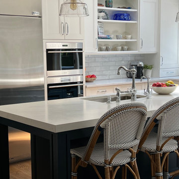 Kitchen Designs by Ken Kelly, Inc. (CKD, CBD, CR)
When we began this blue and white kitchen project, there was a room that had been previously added on to the back of the kitchen. At the time the client put addition in, they had structurally framed it keeping the post you see in the photos. We had the option of removing the post and putting in a steel header to remove it, but to avoid the expense, the decision was made to keep the post, work around it. Ken designed something spectacular to intentionally incorporate it into a large kitchen island positioning it in the most ideal location so the post wouldn’t be in the middle of the room. He built up the quartz counters to a 2” thickness and notched the countertop around the post. Before the renovation, there were no sliding doors, so we added a slider and two windows that flank the Bertazzoni range oven and hood. There was a side door where the coffee pot is now and there was no way to get to the outdoor deck from the kitchen. A large part of the design was changing the way you enter the kitchen from the front hallway and from the outdoor deck and dining area. The client wanted an open indoor/outdoor feeling in this kitchen with more storage and better functionality. We were able to create this by moving the stove from the inside wall to the outside wall, adding new windows and sliders, and allowing the natural light to flow in from the pre-existing skylight. The exquisite finishes of this blue and white kitchen are from our Brookhaven by Wood-Mode line with oak wood floors.
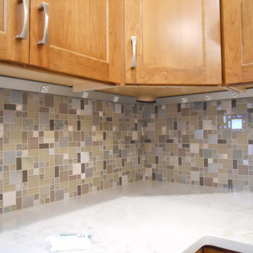
 JS Design
At first glance the kitchen looked fine, but refrigerator placement had the door hitting the countertop, the microwave occupied the entire corner countertop and the dishwasher and oven interfered with each other frustrating the homeowners.
Removing the wall between kitchen and dining room allows daylight from adjoining sunporch to brighten the entire space, expand sightlines and room for the table to expand at the holidays.
The kitchen layout was re-worked. Removing soffits lets new cherry cabinetry rise to the ceiling for the illusion of a taller space.
Refrigerator now positioned to separate work areas, each with bi-fold appliance garages. On left is beverage center for gourmet coffee making, and under the countertop an ice maker for homeowner’s desired continuous supply of ice. The microwave moved to new home in wall cabinet next to refrigerator, freeing up the corner countertop. Dishwasher moved to the other side of the sink, resolving its conflict with the oven. Now space is available for a cabinet with pull-out waste.
The peninsula angled out to open up the room. Topped with a trio of lights it includes for stools for visitors. The peninsula angle is repeated with the floor tile. The homeowners found a backsplash they loved. To avoid interrupting the tile with outlets, angled outlet strips are placed under the wall cabinets to complete the updated make-over.
 Leslie Cohen Design
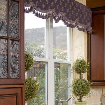
Like many projects, this began with a discussion about reconfiguring the island and refinishing the cabinets. Then the clients asked if I could change their sink (undermounted below granite), add a second dishwasher, and replace her double oven. When they realized the extent of those requests, they decided they might as well replace the cabinets and get the quality, storage, and finishes they wanted. They desired traditional styling with a French motif, and luxurious, yet durable finishes that would complement her eggplant/gold/green fabrics.
To avoid more expense, we kept the existing windows and retained the existing placement of major appliances (except the cooktop which we moved slightly for better function). I relocated the microwave to the island so that we could install a built-in, larger refrigerator.
I reconfigured the layout to better accommodate the needs of this large family – they have six children and three dogs. Everyone has breakfast, takes lunches, has dinner at home daily, and even the dog food is cooked from scratch. There are great organizational accessories in the cabinets. The full-extension quiet-close dovetail drawers minimize noise and feel like fine furniture. The cabinet and countertop finishes are extremely durable. Even the Iroko wood eating counter is easily maintained using an oil-wax that repels stains.
The island shape provides seating for three as well as room for the cooktop, warming drawer, microwave drawer, and generous storage. The sprawling countertop works well for their volume of food preparation. The desk area now functions with proper phone and electrical outlets, file drawers, and enough counter.
The choice of flooring was critical – the kitchen is part of a great room that flows into a large entry hall. The existing travertine, tile, and carpet did not wear well. I selected durable porcelain tiles that resemble limestone and wood and created a European-inspired woven design in the entry. A simpler version of the same materials in the kitchen and an inset real wood into the seating area create flow between the rooms.
To create more visual interest, I removed non-critical soffits. The remaining soffits were clad with wood so it appears that all is part of the cabinet design. The mixture of glazed cherry and black rubbed-through-paint on cherry finishes are enhanced by the dramatic black and gold veins in the creamy granite counter. We retained the straw and plaster walls that create an old-world feeling.
The custom mahogany and iron pantry door balanced the design and completed this truly unique space. Pewter cabinet hardware and patterned glass accentuate the motif. Many of the cabinet accountrements are made from a compo material and recreate historical French mouldings. The remaining adornments are hand-carved wood.
On top of beauty and function, the cabinet boxes are made from environmentally-friendly, no formaldehyde-added agriboard. So we have traditional design, ornate mouldings, multi-step finishes, and are still nice to the earth and my clients!
My scope of work encompassed the complete design process: from design concepts, through working drawings, materials specifications, purchasing, and project administration.
Ed Gohlich - photographer
 Harmonic Horticulture and Construction
I think that many carpenters today consider nails and screws to be what holds a structure together. As a result, I think that many structures today are held together by little more than nails and screws. I often see knee braces bolted to the side of a post for a pergola when they should be positioned between the post and beam to take the load directly. Fasteners should not be load-bearing! They should be used to pin a piece of lumber into a position that allows it to shoulder the load directly.
Nails and screws are fast. When used appropriately, they can keep costs down by reducing the time it takes to build something. But they are not the answer to everything. Joist hangars do little to stop a deck from pulling away from a house, just as nailing from the side is not a replacement for putting a post directly under a beam.
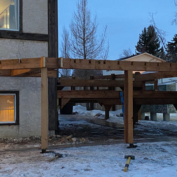
On more than one occasion I've solved a challenging framing problem by employing lap-joints. I've used lap-jointed framing to build curves without having to bend wood, and in the example shown I've used them simply to avoid having to look at an unsightly beam underneath a raised section of deck.
I cut notches half way through my beam where the joists will go, then I cut a corresponding notch into each joist that allows it to fit into the notch in the beam. This allows the joists to cantilever 'through' the beam, which gives me a number of advantages. Using this technique, I can build deck frames tight to the ground without having to rim the structure with joist-hangared beams. I can also use the cantilever to sculpt the edge of the deck into nearly any shape.
As the lumber is locked in from every direction, it is also a far stronger joint than a joist-hangared butt-end, as it resists pulling away, and it is stronger than joist-on-beam because it does not allow for any twisting or 'flopping' of the joists. The beam and joist are locked together, and they each replace the missing pieces of one another, so there is no strength lost in either member.
-Tyler Collins, Operations Manager

 Architecture Office
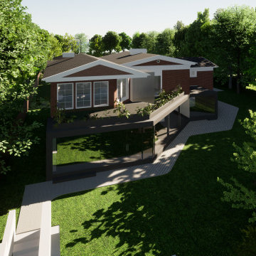
The project consists of three primary additions, one a workshop and garage, the second a basement expansion that juts out over the lake, and a third, which expands the existing living areas with a wall of glass. This third addition, originally not part of the project, was a recommendation by Architecture Office well received by the client because of how it transformed the existing living areas.
The existing architecture consists of a historic neo-classical house with a less purist addition that attempts to mimic the original. We took the approach of contrasting the existing to avoid having two additions lacking the craft and integrity of the original. This contrast is a welcoming change to previously dark interiors. The concept opens up opportunities for capturing lake views, creating modern living areas that flow from one to the next.
The rear garage and second floor workshop compliment the owners entrepreneurial spirit, a person who enjoys the act of a making. The form is simple but clearly delineates itself form the brick construction with black metal siding and a glass walkway connecting the two. The structure draws from old factory buildings that gather daylight from above, synthesized through a milky polycarbonate portion of roof.
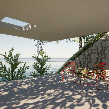
The basement addition expands on an existing subterranean space used for storage and utilities. This room is converted into a living space with sleeping quarters, wet bar, and restroom facilities. This living room is a mini oasis from the rest of the house with views secluded to the water and sky. The openness of the balcony expand the view in all directions, with the sun blocked under a cantilevered shade cover.

 Dirty Dirt Soil Company
Choosing the right soil starts with knowing where you are going to use it. Potting soil is designed for containers, raised bed soil is formulated for raised gardens, and garden or bed-building soil is intended for in-ground or landscape applications. While the products may look similar, they are designed for different growing environments.
Using the right soil can give plants a better foundation and help gardeners avoid a common mistake: assuming that one type of soil works equally well everywhere.
For gardeners in Houston and throughout Texas, where heat, heavy rain, drought and challenging native soils can all affect growing conditions, choosing the right soil for the job is particularly important.
 Chester County Kitchen & Bath
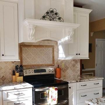
This clients kitchen had come to the end of its time. Fabuwood cabinetry in the Fusion Blanc door style was selected for the main sink and stove area paired with Fusion Chestnut door for the island and bar area. This kitchen needed a stand out focal point so we chose a hood above the range by Stanisci and custom painted it to match in our shop. Earthy toned tile flooring and backsplash were installed along with Sunset Canyon granite countertops. All the natural colors of the tile and granite tie the two cabinetry colors together for a sophisticated new look. Since the new tile floors expanded into the powder room it was a good time for a new pedestal vanity and a paint touch up for a new look in there as well.

 Pacific Coast Custom Design
Stunning home office wallbed room shown here in a deep rich two-tone finish. Task lighting and display lighting brighten up everything and the corbels and arches add to the traditional flair of the space. What a wonderful multipurpose space.
 Architecture Office
The project consists of three primary additions, one a workshop and garage, the second a basement expansion that juts out over the lake, and a third, which expands the existing living areas with a wall of glass. This third addition, originally not part of the project, was a recommendation by Architecture Office well received by the client because of how it transformed the existing living areas.
The existing architecture consists of a historic neo-classical house with a less purist addition that attempts to mimic the original. We took the approach of contrasting the existing to avoid having two additions lacking the craft and integrity of the original. This contrast is a welcoming change to previously dark interiors. The concept opens up opportunities for capturing lake views, creating modern living areas that flow from one to the next.
The rear garage and second floor workshop compliment the owners entrepreneurial spirit, a person who enjoys the act of a making. The form is simple but clearly delineates itself form the brick construction with black metal siding and a glass walkway connecting the two. The structure draws from old factory buildings that gather daylight from above, synthesized through a milky polycarbonate portion of roof.
The basement addition expands on an existing subterranean space used for storage and utilities. This room is converted into a living space with sleeping quarters, wet bar, and restroom facilities. This living room is a mini oasis from the rest of the house with views secluded to the water and sky. The openness of the balcony expand the view in all directions, with the sun blocked under a cantilevered shade cover.
204